
Chapter 7. Design Principles
“People ignore design that ignores people.”
Studying others’ work can inspire our creativity, but studying and understanding design principles will protect us from making mistakes. Design principles are the scientific laws of the usability world, much like the laws of gravity and relativity in the world of physics. Design principles are fairly constant and have been crafted over many years from the study of cognition and human behavior. They help us by providing guidance based on humans’ understanding and interpretations of their surroundings.
Having a good grasp of design principles and predictive models can help you effectively critique your work. It’s the perfect language to express what’s right or wrong with a design. Additionally, you can use these principles to educate your users, who often have a hard time expressing what they need. Help them find the right terminology by explaining the meaning of various design principles. It will give you both a common and correct language to work from.
It’s impossible to outline all of the usability principles in this book, since many of them go beyond the scope of our discussion. Consider this a high-level view of some of the most recognizable principles.
Principle of Proximity (Gestalt Principle)
The principle of proximity is one of many principles defined in the Gestalt principles of perception. While you should study all the Gestalt principles, I think the proximity principle has the greatest potential impact for your applications and requires the least amount of effort.
The principle states that we perceive relationships between objects that are closer together. Conversely, objects that are further apart would, seemingly, have less relation. Because of this, you may hear the principle of proximity referred to as the grouping principle. Basically, it’s easier to see patterns of operation when items are grouped together based on their function, as demonstrated in Figure 7-1.
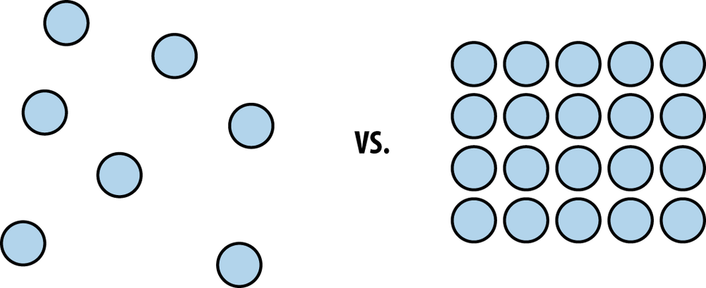
This is why the proximity principle can have the greatest impact. By simply organizing and grouping items in a way that describes their function, you can significantly improve the user’s experience with your application. An organized layout makes learning your application easier, and it puts less strain on the user to find things. Many developers miss this simple principle because they haven’t taken the time to consider how their application should be organized. They think their application layout makes sense; meanwhile, their users are confused and frustrated. The proximity principle can be used as a powerful indicator that certain features belong together.
Consider the Microsoft Office suite of applications. In 2007, Microsoft introduced the Ribbon interface, which was a grouping of Office functions along the top of an application’s window. This interface was a result of users becoming increasingly confused about the location of certain Office features. Microsoft introduced the Ribbon as a way to put similar functions in closer relation to one another.
For example, in the Word Ribbon, which is depicted in Figure 7-2, functions that alter the style of text are put in close proximity, as are functions that manipulate images, functions that change the layout of the document, and so on. Additionally, Microsoft made the Ribbon contextual, so the Ribbon actually changes based on the item that’s selected in the document. This helps users by surfacing more relevant features based on the content they are manipulating.

Nothing is more frustrating than a disorganized application. It requires the user to hunt and peck through complex menus and options, looking for the virtual needle in a haystack. This reduces our efficiency and our patience. Organizing an application by proximity helps users understand how your application functions and allows them to quickly assess the options that are available.
Visibility, Visual Feedback, and Visual Prominence
Visibility is really anything you use to bring visual focus to an element or action in your application’s user interface. There are a variety of ways to do this:
- Typeface
Different styles and sizes of text can draw a user’s attention.
- Opacity
Adjusting an item’s opaqueness helps reduce or enhance its visibility.
- Prominence
Those elements that are larger than others will bring them greater visibility, as demonstrated in Figure 7-3.
- Status
Indicates that the application is processing a request or has received input from the user.
- Color/Contrast
Traditionally, items with higher contrast or brighter colors will draw more attention.

The visibility principle can be used when you indicate the status of an application. For instance, the messaging client I use at work has an icon that turns gray to indicate when I’m no longer signed in, as shown in Figure 7-4. Upon signing in, it turns green. This small change helps me stay informed of my status while using the service.

Another aspect of the visibility principle is providing visual feedback. The visual feedback principle states that applications should respond to the user’s input. In other words, your application should display some indication that it has received information from the user. A simple example of this would be providing a spinning wheel icon or a “searching...” message when a user submits a search query. The overall point of the visual feedback principle is to notify the user that an interaction has occurred. Without this confirmation, the user is left confused about whether or not their action was received by the application.
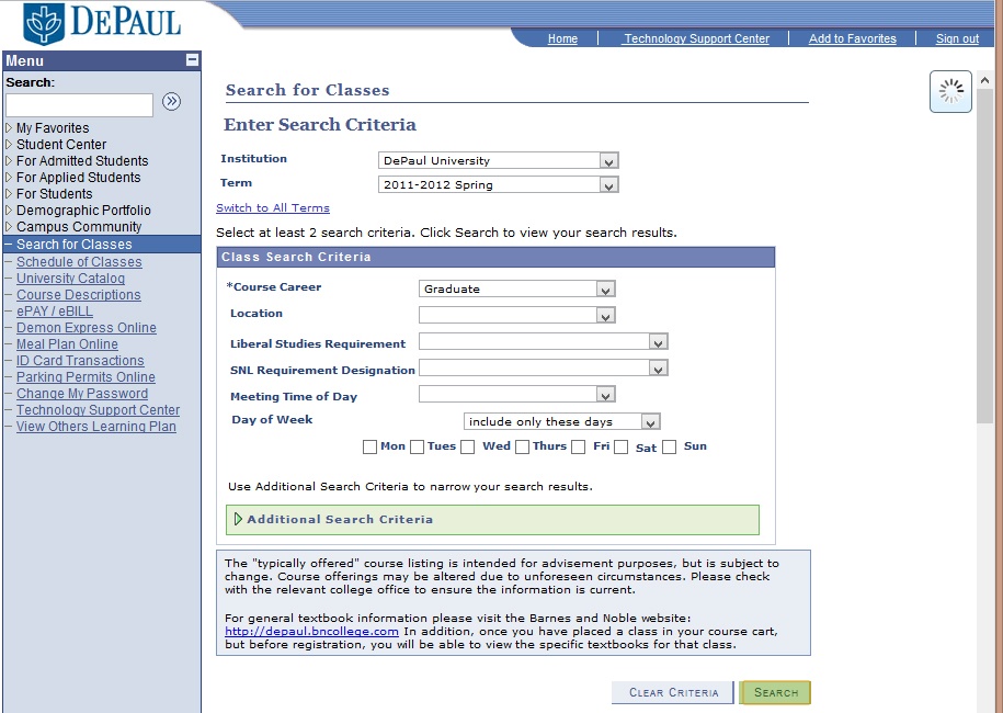
Most applications provide feedback to the user. However, I’ve seen some poor implementations of it. For instance, Figure 7-5 shows how my university’s course catalog system responds when I search for a particular class.
On the first day of registration, I was convinced that the search engine was broken because I would submit a search query and nothing would happen. It took a few minutes before I noticed the spinning wheel in the upper-right corner. In this case the system was providing visual feedback, but because it was poorly positioned, I completely missed it.
Additionally, because of the increased traffic of everyone registering at the same time, the system was slow to respond. This meant that visual feedback was even more important because queries were taking longer than normal. A more appropriate placement of the spinning wheel would’ve been near the search button, which is where my eyes were focused when I submitted my query. With this more appropriate placement, I would’ve clicked the search button and immediately seen my query being processed.
Issues with visibility and proper visual feedback are the most common usability issues I see in applications. Anytime I hear a user complaining that an interface is confusing or difficult to figure out, I start examining ways I might be violating visibility principles.
Your application should be continually providing appropriate status messages. Never make a user wonder if your application is still working. If your application requires some processing time to complete a request, make sure you’re indicating that to the user.
Hierarchy
In developing more complex systems, it can become difficult to organize all of your application’s features. The hierarchy principle, or visual hierarchy, states that applications should provide visual indicators to assist the user in perceiving how the application is organized. Most often than not, this takes the form of flyout menus and other navigational elements. It can also be applied by using the proximity principle discussed earlier in this chapter.
I’ve worked on projects that have had incredibly difficult hierarchies. The hardest part for the developer is trying to organize your application in a meaningful way. You can spend hours trying to determine where a particular feature belongs or what it should be called.
One tool that has been invaluable for these types of challenges is affinity diagramming, which is the process of laying out your application’s features (typically with sticky notes) and organizing them into meaningful groups.
I like to use brightly colored sticky notes like those shown in Figure 7-6 because they make my grouping more visual. I also use markers to put dots on the notes to indicate other things I want to see. The colors of the markers and sticky notes make it easy to quickly see patterns, and the adhesive of the notes allow me to try different arrangements.

In laying out our company portal, this type of diagramming was useful in seeing all of the features we wanted to make available to our users. There were hundreds of sections, policies, applications, and websites. With affinity diagramming, it made the challenge more digestible and it provided a way for us to quickly try different patterns of organization.
Mental Models and Metaphors
Whether we realize it or not, when confronted with a new application or product, we apply our knowledge from other products to conceptualize how it may work. In effect, our previous experiences shape our understanding of how the world works.
For example, the computer functions Cut and Paste rely on our familiarity with cutting paper into pieces and gluing them together. In fact, most applications indicate the Cut feature with a depiction of a pair of scissors. This icon helps re-enforce the metaphor of the Cut function because most of us know how scissors work. If we had never used the Cut feature in an application before, we could see the scissor icon and make a safe assumption about its purpose.
But what happens when our mental model misleads us?
In his book The Design of Everyday Things (Basic Books), Donald Norman explains the challenge of misleading mental models by describing household appliances:
Home furnaces, air conditioners, and even most household ovens have only two levels of operation: full power or off. Therefore, they are always heating or cooling to the desired temperature as rapidly as possible. In these cases, setting the thermostat too high does nothing but waste energy when the temperature overshoots the target.
Here’s an example: a woman checks into her hotel and finds her room unbearably hot. She walks over to the air conditioner control, and it reads a stifling 87°F! In her desperate attempt to get cool she presses the down arrow on the control until it reaches the minimum setting of 50°F. Her mental model of the air conditioner is incorrect. She believes that by setting the control to its coldest setting, she will get the room to her desired temperature more quickly. In reality, the air conditioner can only apply cooling at fixed rates—usually high and low. By setting the conditioner to its coldest setting, she only ensured that it would get much colder than she desired.
As developers we need to be aware of the mental models users are applying to our applications. Icons and language should accurately represent how our applications function. I’ve seen many developers choose inappropriate icons for applications. Without realizing it, they’ve implied a certain purpose, and when users click on the icon, they are confused by the outcome.
For instance, if you’re building a travel-booking website, you might think having a coconut for a search button would be cute and fun. Unfortunately, users don’t have a conceptual model of how a coconut applies. A magnifying glass has a closer relationship to searching for something. This is because many of us know that in the real world magnifying glasses are used to scan text in books and periodicals. Although I encourage you to challenge conventional wisdom and push innovation, some models should be left intact.
Another interesting mental model is the notion of Save within applications. Some of us are familiar with the traditional floppy disk as being the icon for saving files on a computer. This model was generated from older computers that used 3.5-inch floppy drives for saving documents.
Younger generations are unfamiliar with this model because many of them have never used a floppy disk. Once, I heard a boy refer to the Save icon as a “boxy thingy.” It was not only amusing, but also a powerful reminder of the importance of mental models. I imagine that at some point we’ll have to come up with an updated representation for the activity of saving documents on a computer. As we move to the concepts of the cloud for everyday storage, even mental models like documents and folders will become dated as well.
How do you think we could improve these metaphors? Interesting indeed!
Progressive Disclosure
Progressive disclosure is a great way to help users understand what features are available to them within your application. By simply hiding options that are not possible, you can reduce users’ cognitive load and guide them more effectively through their tasks. The progressive disclosure principle is a rather easy thing to employ and is especially useful in more complex applications with feature-laden menus.
For example, Adobe Photoshop, a professional photo-editing software, is full of features and tools for designers. If Adobe did not incorporate progressive disclosure, all of those features would appear to be available, regardless of what I was doing within the application. This would put a significant burden on me as I tried to discover what is and is not possible. Instead, Adobe grays out and disables items that are not applicable to my current situation, as you see in Figure 7-7. This subtle indicator provides a powerful aid in helping me navigate the many possibilities of Photoshop.
Consistency
The principle of consistency may seem obvious, but I’ve seen it overlooked by many developers. This principle maintains that users learn and understand applications more easily when they are consistent with what they already know. I’ve seen developers introduce new methods for completing tasks that have already been well established.
For instance, I remember an application that required me to create a preview of my document before printing it. In every application I’ve used up to that point, I’d never been required to create a preview of a document before printing it. The developers may have had good intentions for this workflow. Perhaps they thought it’d be best to ensure I viewed a preview of my document so I’d be less likely to print something I didn’t want. However, this design was inconsistent with what I already knew. I can appreciate the developers trying to improve on the printing process, but in this case, the act of creating a preview before printing was not obvious to me and created unnecessary confusion.
Again, I would always encourage looking for new ways to accomplish tasks within an application. However, you should be leery of introducing new workflows that are inconsistent with common understandings. And if you do introduce something new, make sure it’s better than what we already know!
An example of this is how FiftyThree implemented the action of Undo in Paper for the iPad.
The user can take two fingers, place them on the screen, and begin moving in a counter-clockwise (Undo) or clockwise (Redo) motion. Other applications provide a button for Undo. However, FiftyThree decided a button did not fit its vision for Paper. The company believed that looking for and pressing a button was unnecessary and took users out of their creative flow.
So, FiftyThree decided it was going to improve the Undo process. To do that, it had to look at new ways for implementing it. It studied other industries to gain new insights into how undoing work could be done. That’s when it uncovered how filmmakers undo their work, as Petschnigg explains.
Our interaction designer, Andrew Allen—who’s a filmmaker—he’s been working a lot with jog dials on VCRs. And for him, it was like, “We need rewind. We don’t need Undo, we need Rewind!”
And that’s, kind of, where that gesture came from. And it really fit into our way of thinking about—sort of—what does mobile creation look like? How should an app work when you’re on the go? How do we keep people in their work and, rather than having to bring up a menu, find a little button—it’s like it flows really naturally.
The developers at FiftyThree could’ve just looked at what their competitors were doing and assumed that a traditional Undo button was the standard that all users had come to understand. They could’ve been conservative and saved time by not evaluating their pre-conceived notions about how Undo should work.
Instead, the team focused on their goal to create an application that encouraged creativity. The way they saw it, the Undo paradigm was an attack on their mission. So they had intense discussions about what some would deem a trivial function. They explored how the current way of undoing work was disjointed by requiring the discovery and use of menus and buttons. They explored other industries and how they handled manipulating creative work. Through all of that, they came up with an incredible insight: we didn’t need Undo; we needed Rewind.
So, as with many things, there’s no easy answer. Consistency within your applications is critical because it reduces your users’ cognitive burden and eases them into learning how your application works. Nothing is worse than having to relearn basic functions because the developer thought it’d be neat to do things differently.
Sometimes it’s nice when an application behaves how you expect it to, when a menu item is exactly where you’d expect it to be, or an action has the proper outcome. Other times, as in the case of undoing work with Paper, it’s delightful to be surprised and experience something different.
Balancing consistency in your design can be challenging, but if it’s done correctly, it can create an application that is easy to learn and enjoyable to use.
Affordance and Constraints
Many objects, such as tools and household appliances, are designed to afford us their proper use and constrain us from using them improperly. These are the principles of affordance and constraints. An example of this is the three-pronged electrical plug and outlet. These objects are designed to not only complement each other, but also work one way. It’s virtually impossible to plug in a three-pronged electrical plug, shown in Figure 7-8, the wrong way. With its flat prongs and round post, the plug makes it immediately clear to people how to use it. And if it’s not clear, it prevents them from plugging it in wrong and hurting themselves!
At the hospital we have a saying: “Make it easy to do the right thing and difficult to the wrong thing.” Affordance makes it easy to do the right thing, while constraints make it difficult to do the wrong thing.

If you’re observing users making mistakes in your application, consider limiting options or anticipating their workflow. Develop actions that function in a way that make it impossible to do the wrong thing. Users will appreciate you looking out for them and will have greater trust in your application.
Confirmation
One way to prevent users from doing the wrong thing is by asking for confirmation. The confirmation principle states that an application should prevent undesired actions by requesting verification, as demonstrated in Figure 7-9.
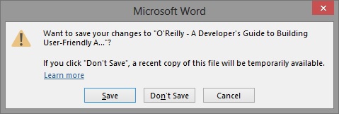
In most applications, if I’m working with a document and try to close it without saving, a prompt will be displayed. Usually it asks if I’d like to save before exiting the program. If I select Cancel and try to close the application again, the prompt will return. Essentially there’s no way for me to close the application without first addressing whether or not I want to save the document. This protects me from doing the wrong thing and losing my work.
Be sure that your application anticipates an undesired action. Nothing will make your users hate you more than allowing them to unintentionally lose their work.
Hick’s Law
Hick’s Law is a prescriptive model that helps you calculate the time it takes for users to make a decision as a result of the number of choices they have. It’s also known as reaction time, or RT, and is represented mathematically like this:
The model can prove helpful when evaluating your menus to ensure they’re not overloaded. A common question in application design is: “How many items should be present in a menu, and how should they be organized?”
For example, a company portal’s navigational scheme can be extremely difficult to manage. Consider the company portal we discussed earlier in the principle of hierarchy. More than likely, users want whatever they’re looking for to be the first item in the menu. After all, it’s the most important because they’re looking for it! See Figure 7-10 for an example.
Obviously, there can only be one first item, so being able to identify and prioritize items within a menu can be a tug-of-war battle.

Therefore, because of its linear nature, Hick’s Law suggests that we process information at a constant rate. In short, the more items you put in front of users, the more time it’s going to take them to find what they’re looking for.
It seems obvious, but I still see developers create applications or websites with incredibly complex navigational menus. I think it’s easy for our applications to get away from us. We keep adding and adding, and before we know it, they become unmanageable. So we move and reorganize items to avoid having to do the difficult work of deciding what we should get rid of.
By applying the principle of hierarchy and using Hick’s Law as a prescriptive model, we can better decide the value of each item within our menus.
Fitt’s Law
Fitt’s Law can help you determine the size of target elements, such as buttons, menus, etc., within your interface based on the distance a user’s pointing device must travel. This prescriptive model is expressed in movement time, or MT, and proves that the farther the user must travel between two elements, the less precise the user will be reaching the target. If your intention is to have a user click on a button, the size of that button will be dictated by the distance between the button and the user’s cursor. The equation is given here:
Imagine if Google made its search buttons Google Search and I’m Feeling Lucky smaller and off to the side, as shown in Figure 7-11. That would increase the distance between the search box, where our cursor is, and the buttons, or target. Therefore, our accuracy would diminish, and our movement time would go up.

The distance users have to travel from an object should dictate the size of the object they are moving to. Fitt’s Law is correlative. In other words, the farther the distance a user must travel, the larger the target objects should be. The exact size is determined by the acceptable movement time.
Fitt’s Law is useful for mouse-driven interfaces; however, there have been new studies that have adjusted the model to accommodate touch-driven interfaces as well.