
| 5 | Graphics, Drawing, and Audio |
Chapter Objectives
In this chapter you will:
Learn to draw to a canvas.
Examine the process of adding drawn elements and user interface controls to a layout.
Understand how to add and manipulate ImageViews programmatically.
Build frame-by-frame animations.
Explore a turn-based game containing animation.
Understand the Android Animate library.
Explore the MediaPlayer for audio.
■ 5.1 Graphics in Android
Graphics are an important part of any Android application. A graphic element can appear as a simple background image, an icon, a component in a sophisticated user interface, or as a moving object with interactive behavior in a game. Before developing an application, it is always a good idea to consider carefully what the graphical demands will be. Varying graphical tasks are often accomplished with varying techniques.
Two general techniques for adding graphics to an Android application are (1) placing an existing image into an ImageView, which can be inflated on the screen, or (2) drawing custom graphics in real time.
Often, ImageViews are populated with resources from drawables; images can also be read from a file on a device or downloaded from a URL. An ImageView graphic can be inflated at any time during the execution of an application. Once placed on the screen, these graphic elements can be manipulated in various ways. In the view hierarchy, parent views are responsible for editing the attributes of their child ImageViews, which can be done dynamically; this means that a graphic object can adjust to a changing environment, such as game play conditions or screen orientation. When the majority of an application’s interface is fixed, it is practical to render the interface in advance, using ImageViews, and inflate those images at runtime. For example, a chess game requires multiple ImageView graphic elements representing the chessboard and chess pieces. The chessboard element is static and therefore can be added to the XML layout representing the game activity. Chess pieces are placed on the screen during runtime, with their initial positions set according to the player’s color selection. As the chess game unfolds, chess pieces are repositioned or removed from the board when an opponent captures them.
Drawing custom graphic elements to be added to an activity is a technique that is generally suited for applications requiring more complex graphic needs. Drawing to a canvas or a View object makes use of Android native drawing tools. Custom drawing can be processor intensive and should be optimized.
■ 5.2 Adding and Manipulating ImageViews
Perhaps the easiest way to add graphics to an application is by referencing a bitmap file from the project’s resources. In earlier chapters, graphics were added during the layout design. In this chapter, we explore the concept of inflating images and modifying them in real time.
Android supports three image file types: PNG, JPG, and GIF. PNG is established as the preferred format for an image file in Android. It is also acceptable to use a JPG. GIF bitmaps should always be avoided.
Bitmap files placed in res/drawable/ may be automatically optimized with lossless image compression during the build process. For example, a true-color PNG image that does not require more than 256 colors may be converted to an 8-bit PNG with a color palette. This conversion will result in an image of equal quality but is optimized by requiring less memory.
Typically, an image resource is added to the res/drawable/ folder before it can be referenced in an XML layout file and from an Activity.
The following code segment demonstrates how to build an ImageView that uses an image from the drawable directory and add it to the layout.
Line 6: |
A |
Line 8: |
An |
Line 10: |
A photograph of Mt. Everest, defined by the drawable resource file |
Line 11: |
The bounds are set to match the Drawable’s dimensions. The argument true is used when the ImageView needs to adjust its bounds to preserve the aspect ratio of its drawable. |
Line 13: |
This sets the top position of this view relative to its parent. This method is meant to be called by the layout system and should not generally be called otherwise, because the property may be changed at any time by the layout. |
Line 15: |
The |
Line 16: |
|

The Android resource system can be used to access an application’s resources, such as the drawable bitmaps. For example, in some situations, it may be desirable to handle an image resource as a Drawable object. In the following segment of code, the object, everest, is assigned the drawable object associated with the resource ID, R.drawable.photo_of_everest.
Line 1: |
The context of the application is the information about its environment. It allows access to application-specific resources. |
Line 2: |
|
Line 3–4: |
|

A drawable resource is a general concept for a graphic that can be drawn to the screen. In addition to bitmaps, Android supports XML graphics, which are drawable resources defined in XML.
Consider the XML code segment in the example below. This code defines a graphical shape resource, as shown in Figure 5-1. As a drawable, it is placed in a drawable resource file, res/drawable/ directory.
Lines 3–4: |
The root element of the drawable graphic is |
Lines 6–8: |
The oval is outlined in dark red with a stroke width of 2dp. |
Lines 10–11: |
The interior of the oval is filled with a solid color, grey. Additional shape attributes can be applied using the tags |
Lines 12–14: |
The height and width are both set to 50dp, a perfect circle. Figure 5-1 shows the graphic produced by the XML drawable. |


 FIGURE 5-1
■ Lab Example 5-1: Fibonacci Flower Application
Bitmap graphics play a significant role in much of what we see on smart devices. Creating artwork algorithmically is an interesting endeavor, as well as an efficient method for producing remarkably detailed designs. This lab example explores the dynamic ability of manipulating ImageView objects and adding them to a layout.
Part 1: The Design
The Fibonacci Flower application allows the user to build an artwork with constraints built in. This is an ideal application for illustrating how bitmaps can be placed on the screen and altered programmatically.
The constraint for the artwork is the Golden Ratio; mathematicians, computer scientists, and graphic designers make frequent use of this ratio, which is derived from the Fibonacci series. Leonardi Fibonacci was an Italian mathematician who created the sequence of numbers in which each term is the sum of the two preceding terms. The value of the first term is 1, as is the second term. The third term in the series is computed as 1 + 1 (term 1 + term 2). The first 14 terms in the sequence are as follows:
Term 1: |
1 First Term |
Term 2: |
1 Second Term |
Term 3: |
2 = 1 + 1 |
Term 4: |
3 = 1 + 2 |
Term 5: |
5 = 2 + 3 |
Term 6: |
8 = 3 + 5 |
Term 7: |
13=5 + 8 |
Term 8: |
21 = 8 + 13 |
Term 9: |
34 = 13 + 21 |
Term 10: |
55 = 21 + 34 |
Term 11: |
89 = 34 + 55 |
Term 12: |
144 = 55 + 89 |
Term 13: |
233 = 89 + 144 |
Term 14: |
377 = 144 + 233 |
An important aspect of this sequence is the ratio produced when dividing successive terms. For example, when the 9th term is divided by the 10th term, the ratio of 0.61818182 is produced. When the 13th term is divided by the 14th term, the result is 0.61803279 is produced. As the terms become larger and larger, the ratio between two successive terms converges to approximately 0.6180339. This so-called Golden Ratio is considered to be extraordinary because of its common occurrence in nature.
For this application, the user is provided with two types of flower petals, Pink and Gold, in which to build a Fibonacci flower. The flower can be built one petal at a time by tapping one of the petal buttons, located at the top of the screen. As petals are placed on the screen, they are manipulated, using a Lorenz attractor, to produce a flower that resembles a butterfly. Figure 5-2 shows four screenshots of the application. The first screenshot shows the initial application screen as it appears when it is launched for the first time. The remaining three screenshots show petals added to the screen in a particular formation. The user can use the buttons to choose the petal to add to the flower, while the algorithm will manipulate it and arrange it on the screen.
In addition to the petal selection buttons, a “clear” button is placed on the bottom of the screen to allow users to clear away the petals to begin creating a new flower.
Part 2: Application Structure and Setup
The settings for the application are as follows:
Application Name: |
Fibonacci Flower |
Project Name: |
FibonacciFlower |
Package Name: |
|
Android Form: |
Phone and Tablet |
Minimum SDK: |
API 18: Android 4.3 (Jelly Bean) |
Target SDK: |
API 21: Android 5.0 (Lollipop) |
Compile with: |
API 21: Android 5.0 (Lollipop) |
Activity Name: |
|
Layout Name: |
|

The icon that launches the Fibonacci Flower application is set to the Android default ic_launcher.png file. The two drawable bitmap files required by the application are petal_a.png and petal_b.png. These files can be found in the textbook resources and should be placed in res/drawable.
The final project structure is shown in Figure 5-3. The Java source file, MyActivity, is the only activity of the application. Flower.java is a blueprint for a Fibonacci flower artwork.
Three XML files will be used by the application: (1) activity_my.xml, (2) petal_gold.xml, and (3) petal_pink.xml. activity_my.xml is the user interface for MyActivity. petal_gold.xml and petal_pink.xml are also technically layout files; however, their primary function is not as a user interface, but instead as a graphic bitmap container. Each is used to represent a class of petals visually. For example, when a petal graphic is created and added to the screen, it is generated from one of the petal XML files.

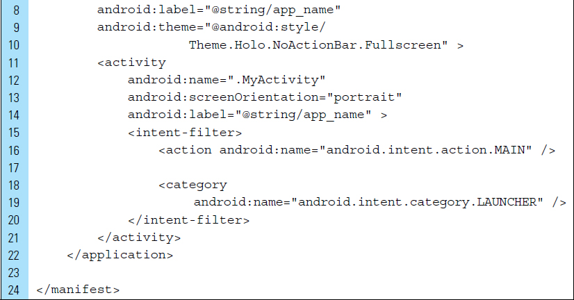
The orientation of the screen is locked into portrait mode. The screen is presented in a fullscreen configuration with the title bar eliminated. These attributes are set in the AndroidManifest.xml file, as shown below:

Part 3: The User Interface
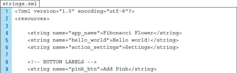
The user interface uses strings for three of the interactive buttons. The strings.xml file is shown below with the button labels added:

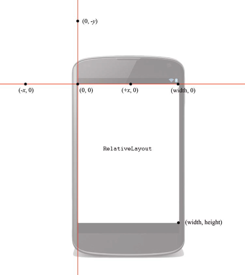
The application is controlled by a single activity, MyActivity. My Activity will launch with activity_my.xml. The root layout element for activity_my.xml is a RelativeLayout, which supports a flexible arrangement for the buttons. The coordinate system for a RelativeLayout is shown in Figure 5-4. It is important to understand the coordinate system that is supported by the layout used, because they do not all use the same system.
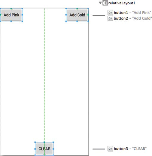
The layout graphic design for the activity_my.xml is shown in Figure 5-5. The XML code for activity_my.xml is listed as follows:
Line 10: |
The |


The two petal layout files use an ImageView as their root element. There are no other views contained within these layouts. Their view structures are shown in Figures 5-6 and 5-7. The XML code for the petal files are listed as follows:
Line 5: |
The |

Part 4: Source Code for Application
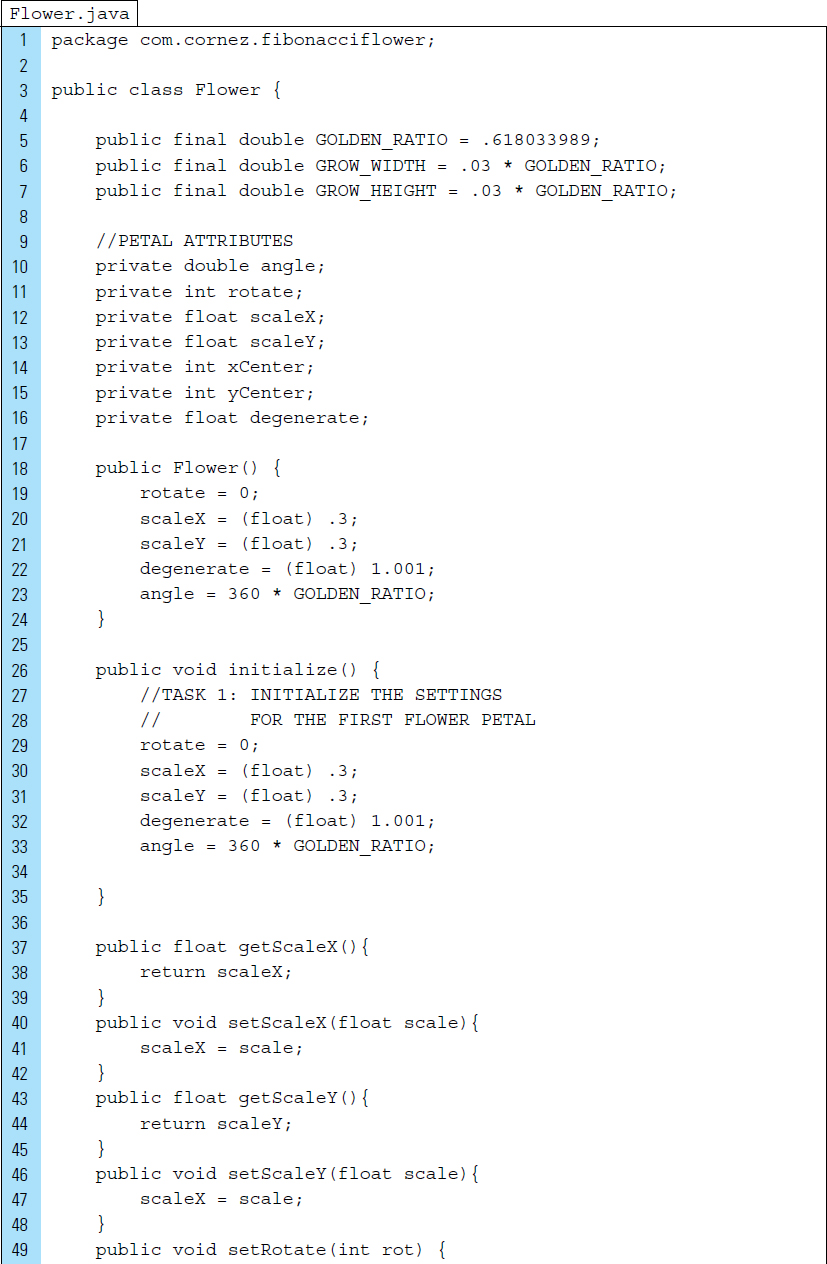
Flower.java is the blueprint for a given flower that is seen on the screen. Flower.java relies on the Golden Ratio, which is common for giving computergenerated images the appearance of natural harmony. To create a Fibonacci flower for this application, the Golden Ratio is used repeatedly to offset the angle of each petal before it is placed on the screen.
In addition, each petal added to the screen is generated 3% wider and 3% longer than the previous one. The petal’s angle of rotation is increased by 360 degrees multiplied by the Golden Ratio. This result for the first two petals placed on the screen is illustrated in Figure 5-8. The second petal is slightly wider and longer and offset at an angle of 233 degrees (360 * 0.6180339).

The Java code listing for Flower.java appears as follows:
Lines 5–7: |
The Golden Ratio and the growth factors are stored as constants. |
Lines 10–16: |
Each petal within the flower has a set of attributes that will be edited to manipulate the appearance of a petal graphic before it appears on the screen. |
Lines 18–24: |
The class constructor initializes the first petal of the flower. The data member |
Lines 76–81: |
Once a flower petal has been added to the screen, petal values will be updated, which will then be applied to the next petal in the sequence. |

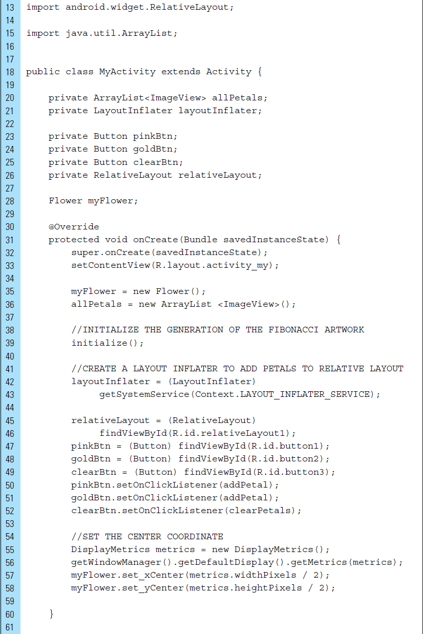
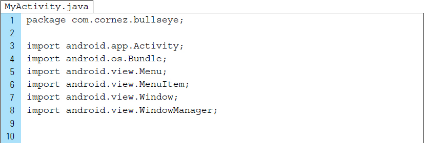
The Java code listing for MyActivity.java appears as follows:
Line 6: |
DisplayMetrics is a utility public class that is used to access general information describing the display screen. This includes its size, density, and font scaling. |
Line 7: |
The |
Line 15: |
An ArrayList is used to store all petal graphic elements placed on the screen. |
Lines 42–43: |
|
Lines 55–59: |
The RelativeLayout will hold all flower petals. The petals will be positioned in the center of the layout, which is specified as width/2, height/2. |
Lines 82–97: |
A petal ImageView object is created based on the text value of the button that was clicked. The new view hierarchy is inflated from the specified petal XML resource. |
The visual properties for the ImageView are set. |
|
|
|
Line 100: |
The petal |
Lines 112–126: |
Petals are cleared when the user clicks the “clear” button. The |


■ 5.3 Drawing and the Canvas Class
When an application requires specialized drawing, or the control of animated graphics, a Canvas can be used. A Canvas provides an interface to the actual surface upon which graphics will be drawn. The purpose of the canvas is to hold the results of the “draw” calls. By using the Canvas, a drawing is actually performed on an underlying Bitmap, which is placed into the window.
Optimizing an application that requires extensive custom drawing can sometimes be difficult. The use of custom drawing code should be limited to situations where the content display needs to change dynamically. Consider the game of Pong, as shown in Figure 5-9. Pong can be created as a drawing application, which means it requires custom drawing code to track the movement of the paddle and update the screen as the user drags the paddle back and forth. The application also needs to update the drawing of the two-dimensional ball to reflect its changing position as it bounces off the walls and the paddle.
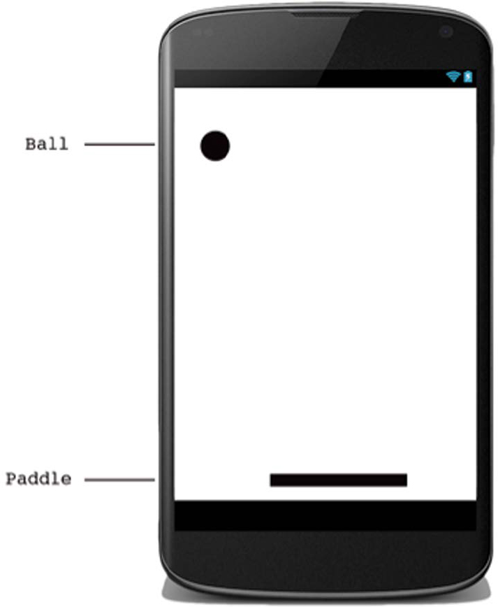
Drawing custom graphics can be performed in two ways: (1) graphics can be drawn into a View object, or (2) they can be drawn directly to a Canvas. Drawing to a View is a good choice when simple static graphics are needed. Game applications, such as Pong, need dynamic visuals that require the application to regularly redraw itself to a canvas.
The android.graphics package provides canvas tools, color filters, points, and rectangles. The Android Canvas class has a set of drawing methods, such as drawBitmap(), drawRect(), and drawText(). To draw something, four basic components are needed:
A Bitmap to hold the pixels.
A Canvas to host the draw calls (writing into the bitmap).
A drawing primitive (e.g., Rect, Path, text, Bitmap).
Paint (to describe the colors and styles for the drawing).
Consider the following code segment; in this example, a new Canvas is created. Before the canvas is instantiated, a Bitmap, upon which the drawing will be performed, is first defined. The parameters required for the bitmap are its width, height, and the bitmap configuration.
The bitmap configuration, ARGN_8888, establishes that each pixel is stored on 4 bytes. Each channel (RGB and alpha for translucency) is stored with 8 bits of precision (256 possible values.) On Line 2 of the code segment, the canvas is instantiated with the bitmap, which is always required for a new canvas.

If an application does not require a significant amount of processing or frame-rate speed, such as a turn-based game similar to chess, then a custom View component can be created specifically for drawing. Drawing with a Canvas on a view is performed with View.onDraw(). By using a View component, the Android framework will provide a predefined Canvas to hold the drawing calls.
This requires an extension of the View class and a definition of the onDraw() callback method. The Android framework calls the onDraw() method to request that the View draw itself. Within this method, you can perform calls to draw through the Canvas.
The Android framework calls onDraw() only as necessary. For example, each time your application is prepared to redraw a canvas, you must request that your View be invalidated by calling invalidate(). invalidate() indicates that the entire view will be drawn again. Android then calls the onDraw() method.
A ShapeDrawable is a good option when dynamically drawn graphics are needed for an application. Primitive shapes, such as ovals, rectangles, and lines, and simple styles can be programmatically built easily. Consider the class CustomView, implemented in the following code segment. CustomView is an extension of the View class that draws a primitive oval shape.
Line 2: |
A |
Line 13: |
The paint color for the oval shape is set. The color value |
Line 14: |
|
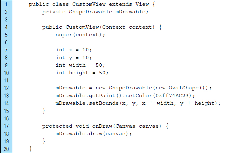
A ShapeDrawable is an extension of Drawable. This is convenient because it can be used anywhere a Drawable is expected, such as the background of a View.
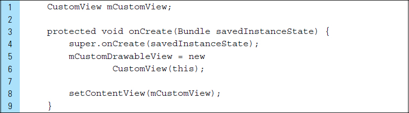
A drawable can also be built as its own custom View and then added to a layout. In the code segment below, the CustomView object is set as the layout content in onCreate().
■ Lab Example 5-2: Drawing Experiment 1: Bull’s-Eye Drawing
This lab example explores the concept of building a custom View, drawing a Bull’s Eye within the View, and displaying it on the screen as the layout associated with MyActivity. The Bull’s-Eye View is dynamic in the sense that it redraws itself when the user changes orientation on the device. Figure 5-10 shows the Bull’s Eye configured for portrait and landscape orientations.
Part 1: The Design
The width of the Bull’s Eye is set to span the width of the device, regardless of the device’s orientation. The drawing is created using five circles, with different sizes, sharing the same center.
The window containing the layout does not feature a title, and it occupies the full screen.

Part 2: Application Structure and Setup
The application structure is very simple, as this project is intended to be an experiment in drawing rather than an interactive app.
The settings for the application are as follows:
Application Name: |
Bulls Eye |
Project Name: |
BullsEye |
Package Name: |
|
Android Form: |
Phone and Tablet |
Minimum SDK: |
API 18: Android 4.3 (Jelly Bean) |
Target SDK: |
API 21: Android 5.0 (Lollipop) |
Compile with: |
API 21: Android 5.0 (Lollipop) |
Activity Name: |
|
The icon launcher will remain set to the Android default ic_launcher.png file. No changes are required. The final project structure resembles the structure shown in Figure 5-11.

MyActivity is the main Activity for the application. BullsEyeView is an extended View class with an implemented onDraw() method. The Bull’s-Eye graphic will be drawn into this View.
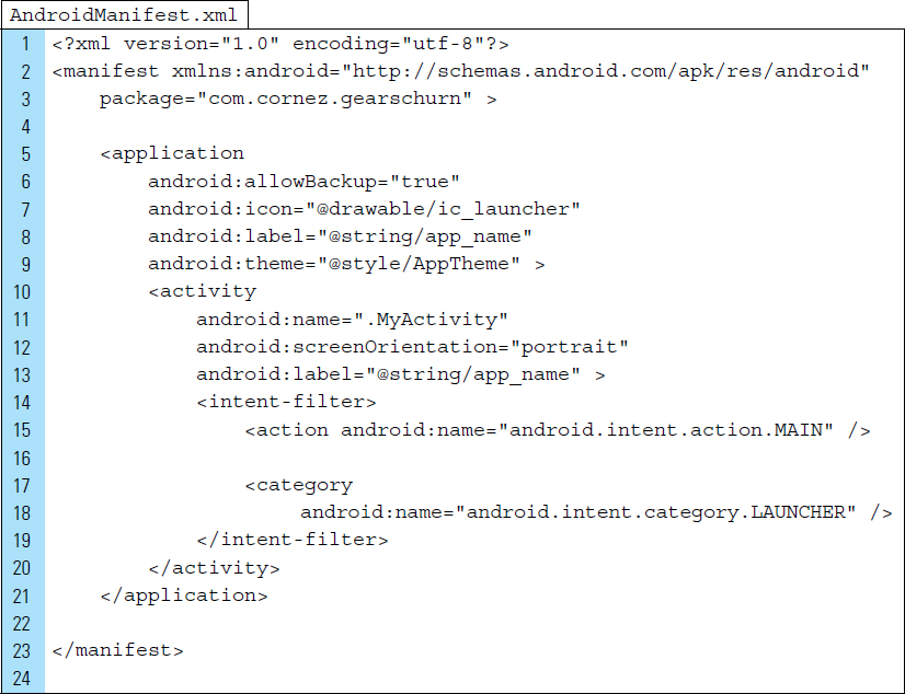
The AndroidManifest.xml file contains the settings for the main Activity. The android:theme setting is overridden in MyActivity. The XML code for AndroidManifest.xml appears as follows. No layout XML file is used in the Bull’s-Eye application. Instead, a layout will be constructed programmatically in Java.

Part 3: Source Code for Application
The Activity for the application is MyActivity. As a drawing app experiment, it performs two simple functions: (1) it configures the screen window, and (2) it sets the layout to a drawable. The drawable will be constructed programmatically.
Line 21: |
|
Lines 22–24: |
|
A call to |
|
The following is a brief list of useful window flags: |
|
|
|
|
|
|
|
|
|
Window flags are often required to be set before the first call to |
|
Line 26: |
A |
Line 27: |
The activity content is set to the explicit view, |

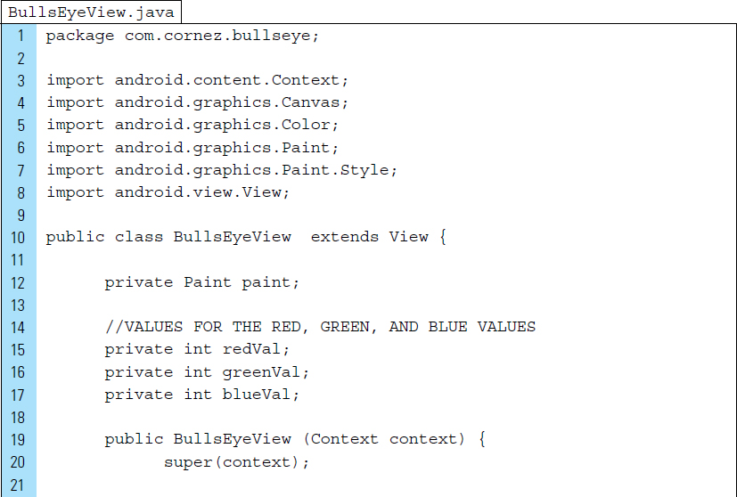
The BullsEyeView.java class is the data model for the graphic element. A mix of colors is applied to a Paint object, which is used to fill a single circle. After each circle is drawn, paint is mixed again and the process repeats itself.
Line 5: |
The |
Line 6: |
The |
Line 7: |
The Style class provides the specifics for how a primitive shape is drawn. For example, it can be filled with color, have a stroke applied, or both. The default is a filled shape. |
Line 10: |
|
Lines 22–27: |
The color values for red, green, and blue are mixed to fill the first circle of the bull’s eye. An instance of |
Line 30: |
|
Lines 31–32: |
|
Lines 41–59: |
Five circles will be drawn, each one smaller than the previous one. Each circle is colored with a new mix of red, green, and blue and is drawn on top of the previous circle. |

■ 5.4 Recursive Drawing
Drawing can be applied to an application in varied ways. One area that relies heavily on drawing is the generation of fractal terrain. The terrain in an environment can be a crucial user interface element, particularly in a game application. Fractals are inherent to the development of terrain drawings, mainly because fractal-based terrain is simple to implement and scales well, as fractals are self-similar. Recursive drawing algorithms are often used to produce landscape fractal images.
The math behind recursive drawing algorithms (fractals) can be simple or complex, depending on the requirements of the application. The key concept behind any fractal is self-similarity. An object is said to be self-similar when magnified subsets of the object are identical to the whole and to each other. Landscape terrain falls into the “self-similar” category. For example, a single branch of a tree has the same structure as the tree itself. A recursively generated tree, such as in Figure 5-12, still looks like a tree, regardless of the scale in which it is displayed.

The textures of natural objects, such as trees, mountains, and stones, have fractal properties. Almost any item that does not have an absolutely smooth, glassy surface contains bumps, pits, and grooves. The sizes of these features vary by fractal laws; many will be very small, some will be bigger, and a few are relatively large. The distribution of these bumps, pits, and grooves across an object’s surface is not entirely random, but it has a fractal nature.
When drawing fractal elements in an application, realistic-looking texture can be rendered quickly. This has advantages to the alternative, which would create hundreds of still images that would occupy memory on a device.
To be effective on a mobile device, the terrain needs to meet a number of requirements, many of which can be mutually opposing. A terrain should appear to be continuous to the user and must render quickly, yet it must be simplified, where possible, to reduce the load on a low-processing device.
■ Lab Example 5-3: C-Curve Recursive Drawing
This lab experiments with the concept of layering—including drawn elements—onto an existing layout. This is done programmatically, as well as with an XML layout. We will use recursive drawing to construct a well-recognized fractal pattern, known as the C-curve.
Part 1: The Design
The C-curve fractal is a geometric pattern that can be subdivided into many smaller imitations, that is, self-similar copies of the larger pattern. If you enlarge any small portion of the complete fractal, it will have the same structure as the larger complete work. Figure 5-13 shows several screenshots of the C-curve application.

When the application launches, the user will see a “number stepper.” This user interface control allows the user to select a C-curve level, which determines the complexity of the final design.
Part 2: Application Structure and Setup
The settings for the application are as follows:
Application Name: |
Levi C-Curve |
Project Name: |
LeviC_Curve |
Package Name: |
|
Android Form: |
Phone and Tablet |
Minimum SDK: |
API 18: Android 4.3 (Jelly Bean) |
Target SDK: |
API 21: Android 5.0 (Lollipop) |
Compile with: |
API 21: Android 5.0 (Lollipop) |
Activity Name: |
|
Layout Name: |
|
The launcher is set to Android’s default ic_launcher.png file. No bitmap files are used in this application.
The final project structure, shown in Figure 5-14, contains three source files and one layout file. The C-curve application uses a single activity, MyActivity.java, which sets the screen user interface to activity_my.xml.

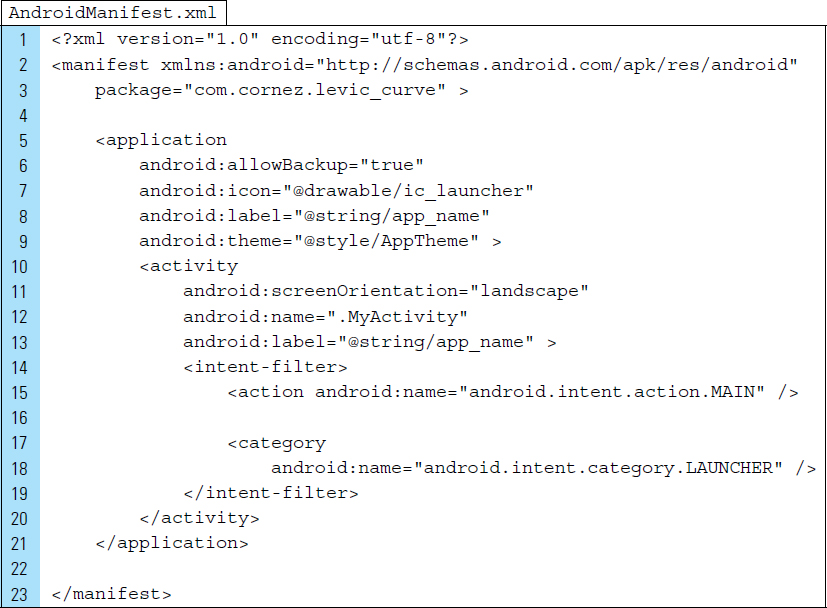
The theme for the application has been set in the AndroidManifest file, along with a landscape screen orientation. The XML code listing for AndroidManifest.xml appears as follows:
Part 3: The User Interface Design
A NumberPicker widget enables the user to select a number from a predefined range. This lab features a custom-built NumberPicker, or rather, a number stepper, which is a control that is used to limit the range of values that a user can input. The number stepper constrains input within the onClick handler. By using an increase button or decrease button, the user can choose a level from 0 through 14. As shown in Figure 5-15, the decrease button contains a minus sign, and the increase button contains a plus sign. The user does not have direct access to the numeric value that appears between these two buttons.

The strings.xml file defines the button labels used by the number stepper. In addition to the number stepper’s increment and decrement buttons, a draw button activates the C-curve recursive drawing. The label is defined on Line 9. The XML code for strings.xml is listed as follows:

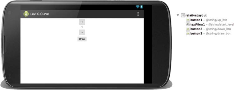
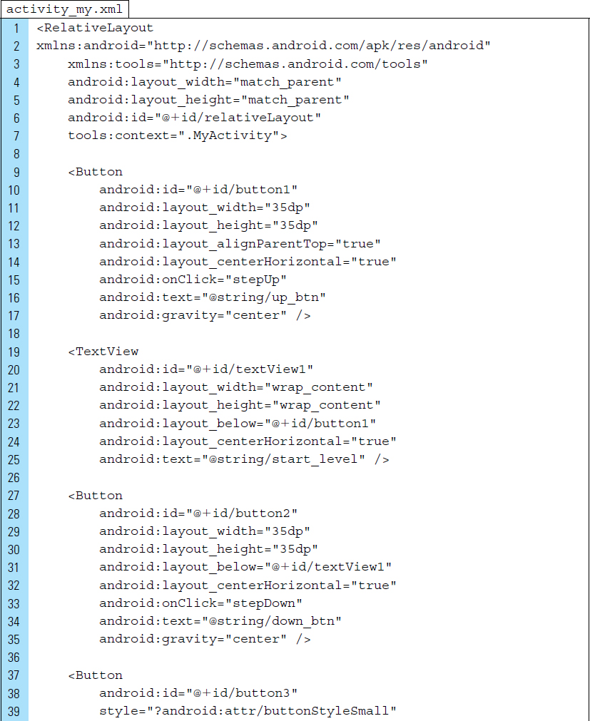
The View hierarchical structure for the layout file activity_my.xml is shown in Figure 5-16. The number stepper contains button1, textView1, and button2. The root element in activity_my.xml is set to a RelativeLayout. The XML code listing for activity_my.xml is shown below.
Line 6: |
It is important that the |
Line 15: |
The method |
Line 33: |
The method |
Line 45: |
The method |

Part 4: Source Code for Application
MyActivity, launched when the application is loaded, collects the user’s input and initiates the recursive drawing based on the input. MyActivity is primarily responsible for arranging the relevant views of the user interface and presenting them in appropriate places on the screen.
Lines 14–15: |
|
Lines 16–17: |
The user interface is arranged in layers. The main layout is the |
Line 27: |
The FractalView object is added as a child view to the Relative-Layout. The zero position is the index position at which the child object has been added. |
Line 30: |
A reference to the levels |


Lines 33–36: |
|
Lines 38–51: |
The method |

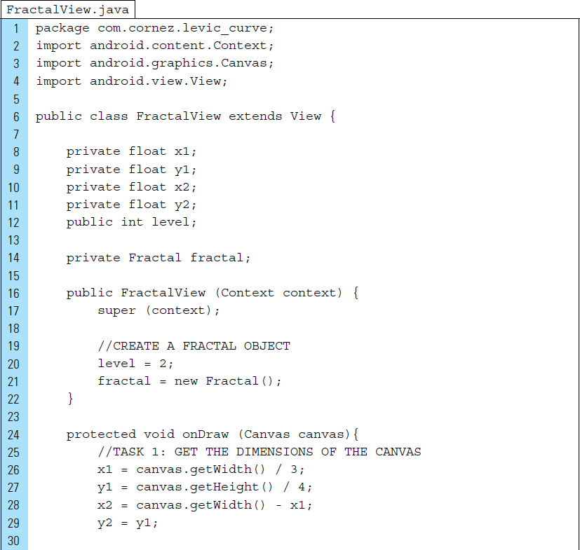
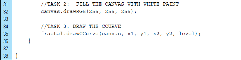
The FractalView class is a View that occupies a rectangular area on the RelativeLayout in activity_my.xml. FractalView is responsible for drawing the C-curve fractal.
Lines 8–12: |
The C-curve fractal is constructed with many line drawings that recursively begin at point (x1, y1) and end at point (x2, y2). These line drawings will occur on the canvas provided by this |
Line 14: |
The |
Lines 24–36: |
The method |
Lines 25–29: |
The initial points for the first line in the fractal are set so that the C-curve appears in the center of the screen, no matter the screen size. |
Line 32: |
If a previous recursive drawing appears on the canvas, it is wiped clean by covering the canvas in white paint. |
Line 35: |
When calling |
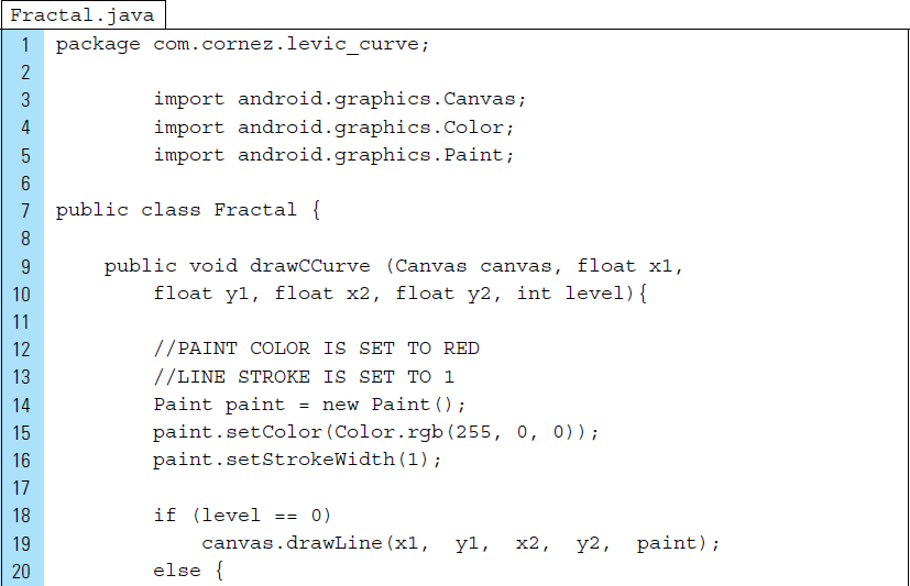
In this application, the C-curve is generated recursively. To better understand its construction, the first four levels are illustrated in Figure 5-18. Consider the most primitive level, Level 0. At this level, the fractal starts with a straight line drawn from point (x1, y1) to the point (x2, y2). This basic line always occurs at the primitive state in the recursion.

At Level 1 of the fractal, an isosceles right triangle is built using the line at Level 0 as its hypotenuse. The first line is drawn from the point (x1, y1) to the point (xn, yn). The second line is drawn between points (xn, yn) and (x2, y2).
The point at (xn, yn) is computed as follows:
xn = (x1 + x2)/2 + (y1 − y2)/2
yn = (x2 − x1)/2 + (y1 + y2)/2
At Level 2, two new lines are used to form the foundation for another right-angled isosceles triangle. At every new level, two new lines from two sides of a respective triangle are constructed to replace an existing line. At Level 0, there are 20 lines. Level 1 draws 21 lines, and Level 3 generates 23 lines. Level n would be constructed with 2n lines.
The Fractal class is simply the engine that constructs a C-curve. The class contains a recursive method, but it contains no data.
Lines 8–9: |
The Canvas parameter is required in order to draw to the FractalView. |
Lines 17–18: |
The primitive state for the recursion is Level 0. This results in a single line drawn to the canvas. |
Lines 19–24: |
The method |

■ 5.5 Frame-by-Frame and Film Loop Animations
Frame-by-frame animation is a sequence of images that are displayed in rapid succession, one after the other. A film loop is an animated sequence that you can use like a single View object. For example, to create an animation of a character dancing on the stage, a set of bitmaps is placed in the Drawable directory and the images are displayed on the screen within a View. To create a film loop, the sequence of bitmaps that shows the character dancing is created as a View object that can be animated across the screen. When the animation is run, the character dances and moves across the screen at the same time.
Any Drawable subclass that supports the inflate() method can be used to create an animation. An animated element can be defined in XML and instantiated in an application’s source code. If a Drawable animation uses properties that will change during the runtime of the application, these values can be initialized once the object is instantiated.
Transition animations are introduced in Chapter 3. Consider the following XML definition for a transition. The XML file, saved as res/drawable/open_close.xml, contains two Drawables defined in the <item> tag, image_open, and image_close. Once instantiated, this container of nested Drawables can be set as the content of an ImageView. Frame-by-frame animations and film loops can be built in a similar fashion.
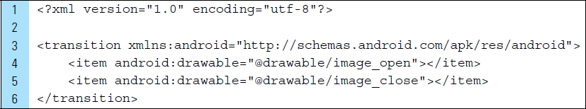
Animations in Android are Drawable animations. They require a set of drawable items, such as the items used in the above transition example, res/drawable/open_close.xml.
A frame-by-frame animation is prepared as a series of timeline frames to be displayed in an ordered sequence with a time delay. Frame and film loop animations fall under the category of View animations because the ordered sequence of images appears within an ImageView.
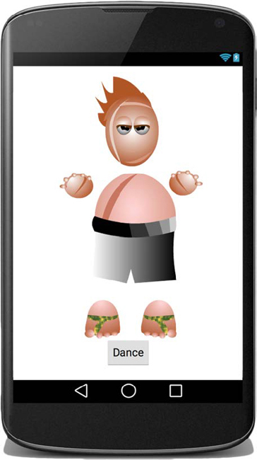
To understand Drawable animation, consider the simple Dance application shown in Figure 5-19. When the application is launched for the first time, a still image of a cartoon character appears on the screen. Below the character is a button that can activate the frame-by-frame animation. The animation relies on a sequence of dance moves that form a complete dance when it is displayed as a running loop.
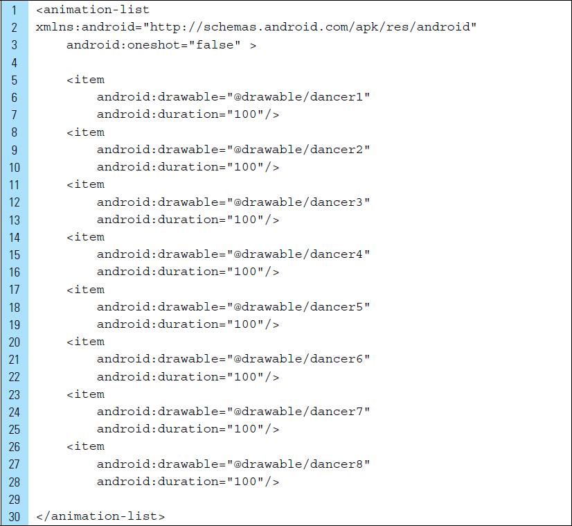
The sequence of images comprising the dance moves are placed into the application’s drawables folders. The bitmap images shown in Figure 5-20 were used to create the Dance animation. When giving images file names, consider using a numeric indicator for the order in which they will appear.
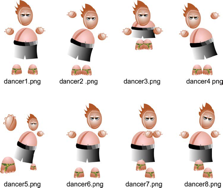
A Drawable animation relies on an ordered list specifying how the images will appear; this ordered list is defined as an XML file. The duration of an individual image on the screen is also specified in this animation resource file. For example, in the animation resource XML code below, the root element is <animation-list>. This root element is a container for a set of eight images that constitutes a dancing film loop. Each prebuilt image is located in the drawable directory, such as drawable/dancer1. The duration value for a frame image is an integer value (100 milliseconds) that indicates how long the item appears on the screen before it is replaced by the next image in the sequence.
The XML code for a Drawable dancing animation, res/anim/dance_animation.xml, appears as follows. The res/anim directory is created specifically for Drawable animations.
An ImageView is the container used for holding the animation element. In the following code segment, an ImageView, dancerView, is referenced from the main activity layout.
Lines 4–5: |
The Drawable animation |
Line 7: |
The animation is started. |

Film loops and frame-by-frame animations are suited only to cases where you have either already created the frame images or you plan to implement them as drawables. For more detailed control over animations, property or tween animations are best. These types of animations, both of which are more complex, are discussed in Chapter 6.
In many cases, an animation is intended to enhance interaction with UI items such as buttons, rather than to be a standalone component. Animations can provide the user with helpful visual cues. These animations should not intrude on a given operation or distract from it.
■ Lab Example 5-4: Animated Maze Chase
In this lab, we explore the use of a frame-by-frame animation that is programmatically added to the main activity layout. In addition, the main activity layout includes a drawn canvas. Interactions for this application feature both of these elements. Maze Chase is not a complete game in which a user competes against an opponent; instead, this is a lab exercise that examines how to combine a drawing algorithm with animation and interactivity.
Part 1: The Design
The user who launches the application is presented with a graphic image of a “perfect” maze. A different maze is generated each time the application launches. A perfect maze is one in which exactly one path exists between any two given cells, such as the one shown in the application screenshot in Figure 5-21.
A film loop animation of a pig is positioned in a maze cell. The pig is animated with nuanced facial movements. The control buttons are provided to move the pig up, down, left, or right into an open cell. If a cell is walled off, the pig will remain in its cell.
Part 2: Application Structure and Setup
The settings for the Maze Chase application are as follows:
Application Name: |
Maze Chase |
Project Name: |
MazeChase |
Package Name: |
|
Android Form: |
Phone and Tablet |
Minimum SDK: |
API 18: Android 4.3 (Jelly Bean) |
Target SDK: |
API 21: Android 5.0 (Lollipop) |
Compile with: |
API 21: Android 5.0 (Lollipop) |
Activity Name: |
|
Layout Name: |
|

The icon launcher for the application is set to Android’s default ic_launcher.png file. Seven additional bitmap files, used for the pig animation and the control buttons, are added to the drawable folders. Figure 5-22 shows the final project structure for the Maze Chase application. This application is driven by a single activity, MyActivity. The layout associated with MyActivity is activity_my.xml. Additional files are used for a drawing canvas, animation, and the data model for a maze cell.

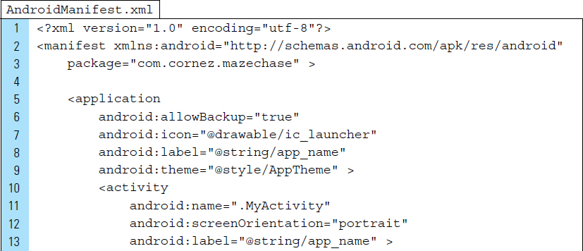
The orientation of the screen is locked into portrait mode and the main activity is set to MyActivity. The XML code listing for AndroidManifest.xml appears as follows:

Part 3: The User Interface for the Application
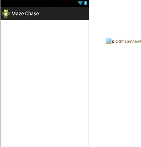
The application’s user interface is made up entirely of images. Figure 5-23 shows the control buttons of the user interface and the RelativeLayout root View. In the final user interface, a canvas for the maze drawing will be layered on top of the RelativeLayout, along with an animation.

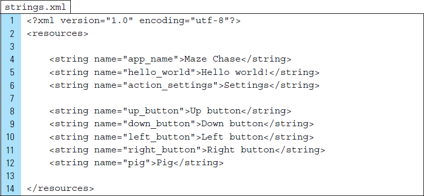
Given that the user interface consists of graphics and an animation, it appears that text strings will not be needed. Nevertheless, a well-constructed graphical application requires content descriptions for the image elements, such as the control buttons and the animated pig that moves around the maze. The XML code for strings.xml includes the descriptions for the graphic component.
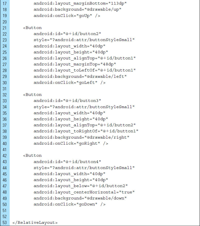
The file that provides the layout elements for MyActivity is activity_my.xml. It contains a RelativeLayout root element. Its view hierarchical structure is shown in Figure 5-23. The XML code for this layout is shown below. onClick event handlers have been identified for each of the control buttons. An id has been applied to the root element, @+id/relativeLayout, which will be used by MyActivity.java to add a canvas layer for drawing a perfect maze.

Part 4: Animation Resources
The animated component, the pig, takes the form of a film loop. The pig appears as an idle animation; it does not perform an action. The idle animation, featuring wiggling ears and blinking eyes, is constructed using three bitmap images. The bitmap images shown in Figure 5-24 contain very nuanced changes, but when they are placed as frames in a film loop, the character becomes vibrant. Small changes such as these can have an enormous impact in a game application.
The bitmap images shown in Figure 5-24 are all PNG files. A small border around each image has been left bare, making that portion of the image transparent. This allows the lines in the maze to show through when the pig is placed in a cell that is the same size as the pig.

The frame-by-frame animation is defined in XML. Each bitmap image is placed in a particular order in an animation list container, specifically the <animation-list>. The duration attribute is used to set the frame rate. For example, each pig image is displayed on the screen for the duration of 200 milliseconds. The XML code for pig_animation.xml is shown as follows. This file will be placed in res/anim.

Part 5: The Animated Film Loop
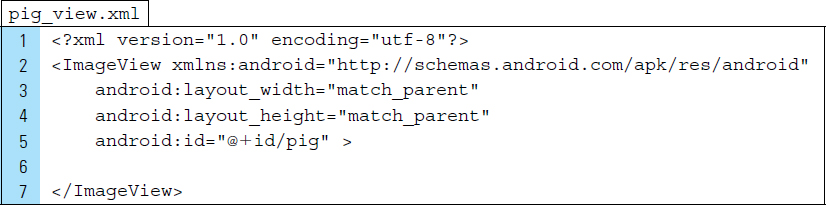
The <animation-list> in pig_animation.xml is used to define the frame structure of the animation. To create the actual film loop, an ImageView is used to hold the frame-by-frame structure. The film loop for the pig animation is stored as an independent XML file within res/layout. This file, named pig_view.xml, is structured as shown in Figure 5-25.
As a container for the pig animation, pig_view.xml requires an ImageView as its root element. For this lab exercise, the XML code does not assign an image source, leaving the View empty, as shown in Figure 5-25. An identifier value, @id/pig, will be used to access this View from the Java source code, which will assign it the animation. The XML code for pig_view.xml is listed as follows:
Part 6: Source Code for Application
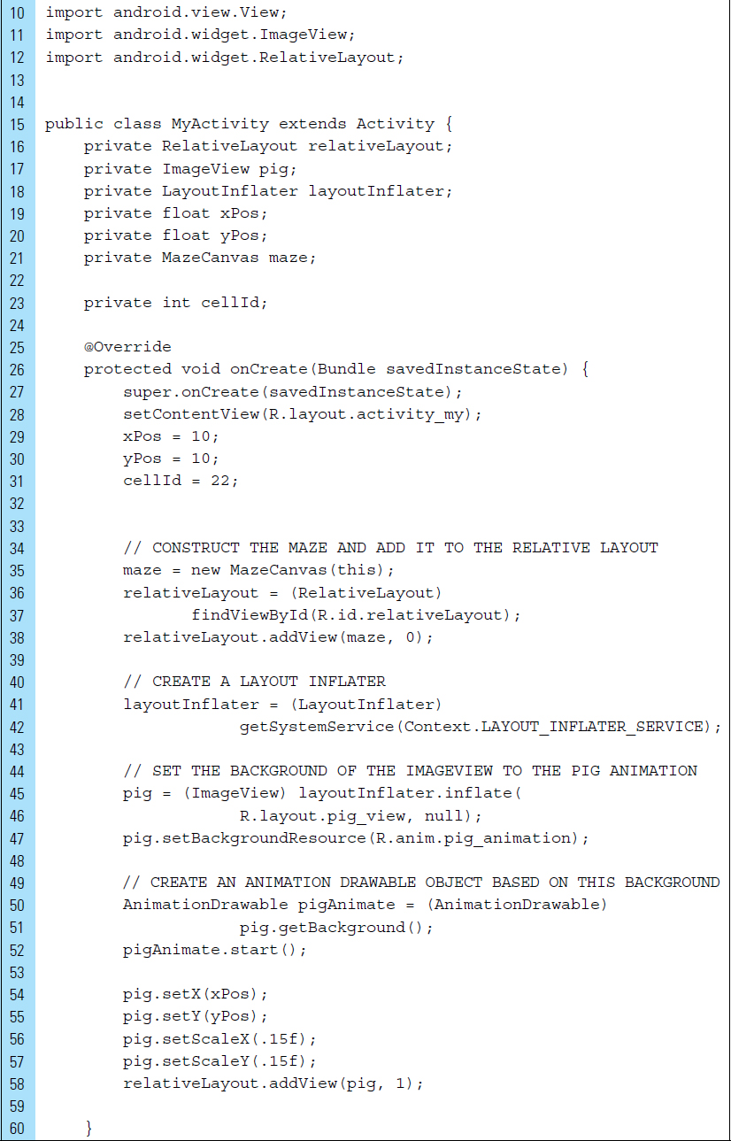
MyActivity.java drives the application.
Line 5: |
|
Line 17: |
|
Lines 19–20: |
The (x, y) location of the pig element on the screen is stored in |
Line 21: |
|
Lines 23, 31: |
Each cell in the maze can be uniquely identified by a number. The pig can be tracked by its |
Lines 34–38: |
A perfect maze is drawn on a canvas, which is then added to the |
Lines 40–42: |
Prior to placing an existing ImageView onto the RelativeLayout, a |
Lines 44–47: |
An instance of the pig film loop animation is inflated. This object’s background is set to the pig frame-by-frame animation. |
Lines 50–52: |
An |
Lines 54–58: |
The film loop is running, but the user cannot see it because it has not yet been added to the screen. The position and scale of the pig ImageView are set, and the view is added to the RelativeLayout at index 1. By adding the ImageView at index 1, it will be layered above the drawing canvas containing the maze and the controls. |


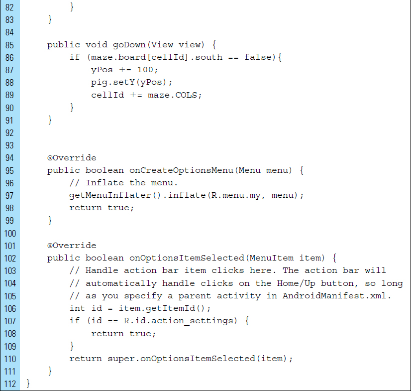
The user moves the pig, using the arrow buttons provided by the user interface. The maze structure controls the pig’s movement within the maze; in particular; the attributes of the maze cells control the movement. Four walls, as shown in Figure 5-26, characterize a maze cell: north, south, east, and west. If an adjacent wall to the pig is open, the pig may enter the cell. Lines 61–91 of MyActivity.java are the implementation of the onClick handlers that control the pig’s movement into a given cell.

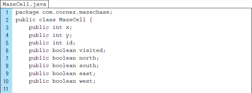
The definition of the maze cell is represented by the MazeCell.java class. The Java code for this class is as follows. All the cell data members have been made public for quick and simple access.

Part 7: Constructing a Perfect Maze
In computer science terms, a perfect maze is characterized as a minimal spanning tree over a set of cells. The task of carving out a path from one cell to the next is based on the concept of a depth-first-search, which uses a stack data structure.
Creating a perfect maze involves building the maze cell by cell while making sure that no loops exist and that no cell ends up isolated.
Lines 27–79: Lines 81–161: |
The maze for this application will be instantiated from the MazeCanvas class. Each maze cell will be drawn row by row. |
Lines 81–161: |
The Begin with an array of maze cells with all of the walls intact. Choose a starting cell. Repeatedly select a random adjacent cell in the maze—one that has been unvisited—and open the wall between the two. Continue to do this until every cell has been visited and a wall has been eliminated during the visit. |
The resulting maze contains no circular paths; every cell is connected to every other cell by exactly one path. The backtracker() method uses an iterative loop and a stack to carve out its paths.
The process of creating a perfect maze, such as the one shown in Figure 5-21, is done in stages. In Stage 1, the maze is built containing a two-dimensional array representing the maze cells. As shown in the first image of Figure 5-27, all the walls are initially intact. An empty stack is also constructed. The stack will be used to ensure that no loops exist in the path and that no cells end up isolated.
Stage 1 is the beginning of the backtracker procedure. The starting cell, 0, is selected and placed on the stack. Cell 0 cannot be visited again. At each stage in the process, a random, unvisited cell is chosen from the possible adjacent cells. Once the cell has been selected, it is tagged as visited, pushed onto the stack, and its adjacent wall is eliminated.

In Stage 7, no unvisited cells are adjacent to cell 3. At this point, the stack is used for backtracking to a cell that has unvisited neighbors. Finally, at Stage 9, the process is complete once all the cells have been visited.


■ 5.6 Animate Library
Beginning with KitKat, Android 4.4, the transitions framework allows the definition of scene animations. These are typically view hierarchies that describe how to animate or custom transform a scene based on specific properties, such as layout bounds, or visibility. There is also an abstraction for an animation that can be applied to Views, Surfaces, or other objects.
To generate simple tweened animations, Android provides a packaged called android.view.animation. The following are a collection of classes that support basic animations:
AlphaAnimation: |
Animates the changing transparency of an object |
RotateAnimation: |
Rotates animation of an object |
ScaleAnimation: |
Animates the scaling of an object |
TranslateAnimation: |
Moves an object |
Unlike frame-by-frame animations, these classes control the specific View property of an object on display on the screen. The four standard animation attributes used when generating tweens are as follows:
|
The start time (in milliseconds) of a transformation, where 0 is the start time of the root animation set. |
|
The duration (in milliseconds) of a transformation. |
|
Whether you want the transformation you apply to continue after the duration of the transformation has expired. If false, the original value will immediately be applied when the transformation is done. Suppose, for example, you want to make a dot move down and then right in an “L” shape. If this value is not true, at the end of the down motion, the text box will immediately jump back to the top before moving right. |
|
True if you want this transformation to be applied at time zero, regardless of your start time value (you will probably never need this). |
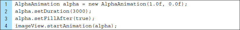
Consider the following segment of code. This code assumes that an ImageView named imageView has been inflated and placed within the layout for the running activity. The animation, alpha, controls the transparency of imageView so that it animates from full view to complete transparency. setFillAfter() is used to apply the transformation after the animation ends. If setfillAfter() is passed a true argument, the final transformation will persist once the animation is completed.
In the case of rotation, movement will take place in the X-Y plane. The center point of rotation can be specified as an x, y coordinate, where (0, 0) is the top left point. When not specified, the default point of rotation is set as (0, 0). The following segment of code rotates the imageView from a starting point of 0 degrees and an ending point of 90 degrees. Line 11 sets the acceleration curve for the animation, which defaults to a linear interpolation.

■ Lab Example 5-5: Gears Churning Basic Rotating Animation
The Android android.view.animation package provides classes that handle tween animations. This lab example explores the creation of a simple animation that involves a tweened element, such as rotation. A tween animation can perform a series of simple transformations in regard to position, size, rotation, and so on.
Part 1: The Design
The Gear Churn application contains graphics, specifically two gears, that are animated. When the user taps the button labeled “Rotate Gears,” the wheels of the gears slowly churn, as shown in Figure 5-28. Tween settings are applied so that the gears move in sync: The smallest gear rotates clockwise while the larger gear rotates counterclockwise. The tween performs the animation with a starting point and an ending point, so that the rotations are not performed continuously and eventually come to an end.

Part 2: Application Structure and Setup
The settings for the application are as follows:
Application Name: |
Gears Churn |
Project Name: |
GearsChurn |
Package Name: |
|
Android Form: |
Phone and Tablet |
Minimum SDK: |
API 18: Android 4.3 (Jelly Bean) |
Target SDK: |
API 21: Android 5.0 (Lollipop) |
Compile with: |
API 21: Android 5.0 (Lollipop) |
Activity Name: |
|
Layout Name: |
|
The AndroidManifest.xml file sets the launch icon to the Android default ic-launcher.png file. The main activity of the application is MyActivity and its associated user interface is activity_my.xml.
Two bitmap images, gear1.png and gear2.png, are added to the Drawables directory. The final project structure for this application appears in Figure 5-29. Gear class will be used as the data model for each gear.

Part 3: The User Interface
The user interface relies on strings.xml and the two drawable images: gear1 and gear2. Figure 5-30 shows the hierarchical View structure of the graphic elements and the button, which constitute the application’s layout design. The added string values are used for image descriptions and the button label that appears on the screen. The XML code for strings.xml appears as follows:


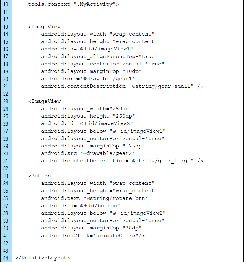
The layout design for activity_my.xml requires strict adherence to the placement of the gears. The teeth of the gears must fit together to provide an animation that appears to churn at the correct angles. The first gear is placed 10dps from the top of the screen. The larger gear has a width and height of 250dps and is positioned at −25dps below the smaller gear. This overlap allows the teeth of the smaller gear to fit correctly into the gap provided by the larger gear.
The button View is assigned an event handler named animateGears(). The button has been given a unique identifier name; however, this is a convention of RelativeLayouts, rather than a requirement. Nevertheless, the ImageViews that hold the gear bitmaps both require identifier names. This will allow MyActivity.java to be accessed and for the gears to be customized with an animation. The names that have been generically assigned to the gears are imageView1 and imageView2.
The XML code for activity_my.xml appears as follows:

Part 4: Source Code for Application
As the class that represents a gear’s data, the Gear class has two data members: mStartDegree and mEndDegree. These data members are used to customize the tween animation. For example, an idle gear has an initial starting degree before it begins to rotate. Once the animation begins, the gear rotates until it reaches an end degree, at which point it stops and becomes idle again. The Java code listing for Gear.java appears as follows:

MyActivity.java is the controller of the application, and it is the sole activity. The Java code listing for this source file appears as follows:
Lines 8–9: |
The imported Animation class provides the animation behavior that can be applied to the gears. The |
Lines 15–16: |
The two |
Lines 18–19: |
Two Gear objects are declared. |
Lines 36–46: |
The idle positions for the gears are set. The starting angle is zero for both gears. Because gear1 will move in a clockwise rotation, its ending angle will be 360 degrees. The second gear, gear2, will move counterclockwise, and therefore, its ending angle will be −360 degrees. |


Lines 50–56: |
RotateAnimation is a tween animation that controls the rotation of an object. This rotation takes place in the x, y plane. The parameters for this animation are: |
|
|
|
|
|
|
|
|
|
|
|
|
Line 57: |
|
Line 59: |
|


■ 5.7 Audio
A basic understanding of audio file formats and conversions is required when developing applications that use audio media. An audio file is characterized by its file format (audio container) and its data format (audio encoding). The data format of an audio file refers to the content and how it has been encoded. For example, WAV is a file format that can contain audio that is encoded in PCM. PCM describes the technique used to convert analog sound data into a digital format. Table 5-1 lists common data formats, or audio encoding, supported by Android.
TABLE 5-1 Android supports these common data formats.
AAC |
AAC stands for “Advanced Audio Coding,” and it was designed to be the successor of MP3. As you would guess, it compresses the original sound, resulting in disk savings but lower quality. The loss of quality is not always noticeable, however, depending on how low you set the bit rate. In practice, AAC usually does better compression than MP3, especially at bit rates below 128kbit/s). The supported file formats for AAC are: 3GPP (.3gp) MPEG-4 (.mp4, .m4a) ADTS MPEG-TS |
HE-AAC |
HE-AAC is a superset of AAC, where the HE stands for “high efficiency.” HE-AAC is optimized for low-bit-rate audio, such as streaming audio. The supported file formats for HE-AAC are the same as AAC. |
AMR |
AMR stands for “Adaptive Multi-Rate” and is another encoding optimized for speech, featuring very low bit rates. The supported file format for AMR is 3GPP (.3gp). |
MP3 |
The format we all know and love: MP3. MP3 is still a very popular format after all of these years, and it is supported by the iPhone. MP3 supports its own file format. |
PCM |
This stands for linear “Pulse Code Modulation,” and it describes the technique used to convert analog sound data into a digital format, or in simple terms, into uncompressed data. Because the data are uncompressed, PCM is the fastest to play and is the preferred encoding for audio on an Android device when space is not an issue. The supported file format for PCM is WAV. |
FLAC |
FLAC stands for “Free Lossless Audio Codec.” This audio format is similar to MP3, but it is lossless, meaning that audio is compressed in FLAC without any loss in quality. FLAC is nonproprietary and has an open-source reference implementation. FLAC supports its own file format. |
You can play audio in an Android application in several ways. Android uses two APIs for this purpose: SoundPool and MediaPlayer.
5.7.1 SoundPool
SoundPool provides an easy way to play short audio files, which is particularly useful for audio alerts and simple game sounds (such as making a “click” when moving a game piece).
It can repeat sounds and play several sounds simultaneously. Typically, sound files played with SoundPool should not exceed 1 MB.
Examine the following code segment:
Lines 1–4: |
A S |
Line 6: |
The sound R. |
Lines 8–12: |
Attributes for the explosion sound are set. The values for left volume and right volume can range from 0.0 to 1.0, with 1.0 representing the maximum volume. Priority refers to the stream priority. Zero is the lowest priority. The loop attribute refers to how many times the sound will loop. For example, zero means no loop; it will play once and end. A value of −1 forces a forever loop. The last attribute is |
Lines 14–19: |
The explosion sound, specified by its soundID, is played. Calling |


SoundPool has many advantages. You can play several sounds at once (using a different SoundPool for each sound), and you can play sounds even when your app is in the background. However, SoundPool can be extremely slow for large raw files. If a large sound has not fully loaded, there may be a noticeable delay when it is triggered.
5.7.2 MediaPlayer
MediaPlayer provides the resources for handling media playback. For example, an application can use MediaPlayer to create an interface between the user and a music file. The interface may include playback controls for interacting with playback components and for sending notification as the playback elapses.
For applications that require the retrieval of audio files located on the device, the ContentResolver class is used to access these files, the MediaPlayer class is used to play audio, and the MediaController class is used to control playback. The MediaPlayer class can be used to control playback of both audio and video files and streams.
Android supports a variety of common media types, allowing the integration of audio, video, and images into an application. Audio files used with MediaPlayer are often stand-alone files in the filesystem, or they arrive from a data stream over a network connection. As in SoundPool, audio files can also be stored in the application’s resources (raw resources).
The code segment below illustrates how a raw audio resource of an explosion is played using MediaPlayer. mediaController is a view containing controls for a MediaPlayer. Typically this view contains buttons such as “Play/Pause,” “Rewind,” “Fast Forward,” and a progress slider.
MediaController takes care of synchronizing the controls with the state of the MediaPlayer. The way to use this class is to instantiate it programatically. The MediaController creates a default set of controls and puts them in a floating window. For the control window to appear, a setAnchorView() must be specified.

The view that acts as the anchor for the playback control window will disappear if it has been left idle for three seconds. By using an onTouchEvent() shown in the following code segment, the playback controls will reappear when the user touches the anchor view.

■ Lab Example 5-6: Simple Jukebox Sound Effects
This lab explores a simple implementation of sound effects, played with the SoundPool and MediaPlayer. As Figure 5-31 illustrates, SoundPool is used to play short sound bursts, such as a brief bell clang or a quick clang on a gong. MediaPlayer is used for longer sounds, such as a drum solo.
Part 1: The Design
The Sound Jukebox application contains a collection of sound effects. The users of this application can create sound punctuations to enhance speech. For example, a scary description of an event might be followed by a “spooky cry” sound effect.
Sounds will be preloaded or configured when the application launches for the first time. Sounds using SoundPool can result in very slow loads. Often. a preloaded SoundPool audio will continue to load for a delayed period.

Part 2: Application Structure and Setup
The settings for the application are as follows:
Application Name: |
Sound Jukebox |
Project Name: |
SoundJukebox |
Package Name: |
|
Android Form: |
Phone and Tablet |
Minimum SDK: |
API 18: Android 4.3 (Jelly Bean) |
Target SDK: |
API 21: Android 5.0 (Lollipop) |
Compile with: |
API 21: Android 5.0 (Lollipop) |
Activity Name: |
|
Layout Name: |
|
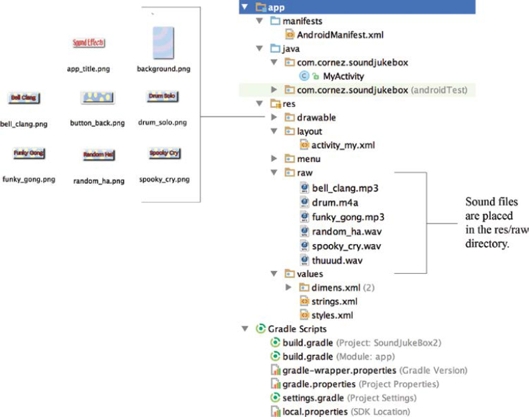
The final project structure for the Sound Jukebox application is shown in Figure 5-32. The audio files, WAVs, and MP3 are not Drawables and should not be placed in a drawable folder. A separate directory, res/raw, is used to store all audio files. This directory must be created. During the build process, the R.java class automatically stores the generated identifiers for these files. The launch icon for the application is the default Android icon.
The orientation of the screen is locked into portrait mode, and a fullscreen is used. The code listing for AndroidManifest.xml is shown as follows. The main activity of the application is MyActivity.java.

Part 3: Value Resources and the User Interface
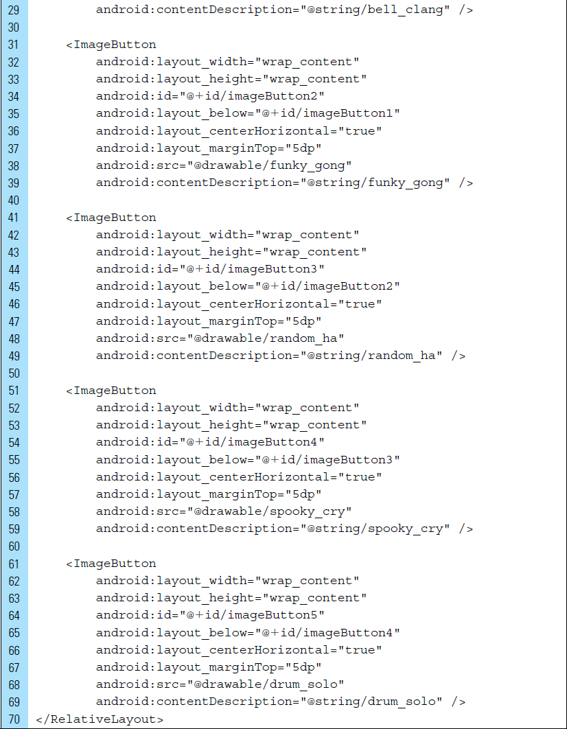
The user interface consists of buttons that allow the user to activate a sound effect. For visual interest, ImageButton widgets are used for this purpose. ImageButton widgets are treated as ImageViews in the sense that they should be assigned a content description. strings.xml, listed below, stores the content descriptions.


The layout associated with the application activity is activity_my.xml, shown in Figure 5-33. The code listing for this layout is displayed as follows:

Part 4: Source Code for Application
To simplify the implementation of audio playback, this application uses no data models. An adapter for a scrolling list of data would be implemented to construct Sound Jukebox into a sophisticated application. The code listing for the application’s activity, MyActivity.java, is listed as follows. A unique object references each ImageButton element. An onClick listener event is applied to each button, which triggers the handler playsoundEffect().
Unlike a normal array of integers, there can be gaps in the indices. Therefore, we use SparseIntArrays to map integers to integers. SparseIntArray is memory efficient because it avoids auto-boxing keys and values, and its data structure does not rely on an extra entry object for each mapping, as compared to HashMap.
The SparseIntArray container keeps its mappings in an array data structure, using a binary search to find keys. The implementation is not intended to be appropriate for data structures that may contain large numbers of items. It is generally slower than a traditional HashMap, since lookups require a binary search, and adds and removes require inserting and deleting entries in the array. For containers holding up to hundreds of items, the performance difference—less than 50%—is not significant. It is possible to iterate over the items in this container using keyAt() and valueAt(). Iterating over the keys using keyAt() with ascending values of the index returns the keys in ascending order, or the values corresponding to the keys in ascending order in the case of valueAt(). On Lines 46–49, put (int key, int value) is used to add a mapping from the specified key to the specified sound file.


■ Exercises
Describe the steps for creating an XML graphic element to be stored as a drawable resource file.
Explain when onInflate() and onActivityCreated() are called.
Describe the coordinate system used by a RelativeLayout. How does this compare with the coordinate system used in a FrameView?
List the properties that must be set for an ImageView that will result in the rotation around a pivot point.
Write a segment of code to remove an ImageView object from the screen during runtime.
What is the relationship between a Bitmap and a Canvas?
Briefly explain the purpose of requestWindowFeature()?
Create a frame-by-frame animation. Describe the steps that are required.
What parameters are required for RotateAnimation()?
Briefly describe the purpose of SoundPool and MediaPlayer.