
| 2 | Building User Interfaces and Basic Applications |
Chapter Objectives
In this chapter you will:
Become familiar with Android’s user interface (UI) structure.
Learn about text input widgets and how to configure the soft keyboard.
Understand Views, widgets, and how the R.java class is constructed.
Implement applications that require various User Interface Controls.
Examine Adaptive Design Concepts.
Learn how to organize screen content using ViewGroup containers.
Learn how to use Adapters to create sophisticated user interfaces.
■ 2.1 Android User Interface
A user interface is essentially a collection of visual objects arranged on the screen; the user can see them and interact with them. Every Android application requires a user interface that can be built in one of two ways: The visual objects can either be created in Java code or in an external XML layout file. When using Android Studio to build an app, the Graphical Layout tool is used interactively to build the external XML layout file.
The graphical user interface for an Android app is built using a hierarchy of View and ViewGroup objects. View objects are usually UI widgets, such as buttons or text fields, and ViewGroup objects are invisible view containers that define how the child views are laid out, such as in a grid or a vertical list.
Android provides an XML vocabulary that corresponds to the subclasses of View and ViewGroup so you can define your UI in XML using a hierarchy of UI elements. Android applications use a range of standard platform resources for designing and programming user interfaces. An application’s user interface is everything that the user can see and interact with on a given screen. This includes user interface control components, menus, output notifications, and dialogs. Android development relies on the Java framework; however, common Java libraries used for graphical user interfaces, such as Swing, are not supported in Android. Instead, Android applications use classes in the Java language, along with a core set of Android packages and classes, to implement various aspects of Graphical User Interface (GUI) functionality. Developers can use XML data to declare screen layouts and create Java and Android classes to define behavior.
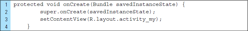
Each screen in an Android app is identified as a layout resource. Typically, an activity instructs the user’s device to treat the launch of the activity as a screen that represents the user interface for that activity. For example, in the following onCreate() method for an Activity, the instruction on Line 3 specifies an external layout file named activity_my.xml to represent the visual interface for this Activity. This layout file will be inflated on the screen when the Activity is created.
Activities can reference various visual and interactive elements stored on a layout file and can implement event handlers, such as handlers to deal with users pressing buttons and selecting menu items. Android developers can use Java and XML code to define the layouts for each Activity in an application. A Layout is simply the visual implementation of the Android application screen. It consists of a collection of UI elements for input, output, and interactions. This chapter explores Android layout concepts and basic interactions.
■ 2.2 Layouts
Visual interfaces in an Android application can be defined by one or more layout files, which specifically outline the placement of UI control elements displayed on a given screen. The term “layout” denotes the visual architecture of the application; it defines the visual display object that the user sees and interacts with on the screen. Android app developers can use Java and XML code to define the layouts for each Activity in an application. Developers typically construct a single XML layout file for each Activity class in an application. Layout XML files often contain other layout XML files allowing the reuse of screen elements for multiple locations.
The application resources folder within the project holds the XML layout files as well as graphics for the GUI. All layout files are configured in a hierarchical tree structure, with a root layout element at the highest position in the structure. The root layout is a container that holds the UI elements within the layout file. The Android platform provides a range of standard root layouts developers can use, determining the positioning of each visible element in the layout file. There are six standard root layouts as follows:

RelativeLayout
LinearLayout
TableLayout
RowLayout
GridLayout
FrameLayout
A RelativeLayout is used for screen designs that require control elements to be positioned in relation to one another. The example XML code file that follows relies on a RelativeLayout to arrange a set of generic text and button control elements on a screen. The screen display that results from this code is shown in Figure 2-2.
Alignment properties, such as layout_alignParentTop, layout_align-Left, layout_toRightOf, and layout_marginTop, are used to position individual control elements within the context of existing elements. For example, Lines 16–22 use XML code to define a TextView element identified by the name @+id/text2. This TextView element is positioned below and aligned along the left margin of the element named @+id/text1. The property layout_marginTop, from Line 22, has been set to position the TextView so that it is exactly 51 dps below @+id/text1.


A LinearLayout is used for simple arrangments that require elements to be displayed along either a horizontal or vertical line. In the case of a vertical orientation, each element is placed within the layout below the last. A horizontal layout adds elements left to right. The layout fills the available space both horizontally and vertically using the “layout_width” and “layout_height” attributes. It should be noted that the term “layout attribute” can also be referred to as “layout parameter” or “alignment property.” The visual structure of a horizontally and vertically oriented LinearLayout is shown in Figure 2-3.
A TableLayout, as the name suggests, is used to arrange elements into tabular rows and columns. A TableLayout can be used to align screen content in a way that is similar to an HTML table on a webpage. It organizes its contained elements into neatly defined rows and columns. A TableRow, also a layout root element, is simply a layout that is used by a TableLayout to store individual table rows. The idea of adding a TableRow to a layout is important when creating dynamic screens and will be explored further in subsequent chapters. A Gridlayout works with a flat-view hierarchy. Child objects can be placed into a Gridlayout using a horizontal or vertical orientation.
In following code example, XML is used to define a layout that utilizes a Gridlayout as the root element.
Line 5: |
The number of columns is set to 2. |
Line 6: |
The number of rows is set to 2. |
Line 7: |
Orientation determines the order in which the cells will be populated. A horizontal orientation will populate cells row by row, filling in values moving from left to right. The result is a layout that contains four items grouped into two rows and two columns that read from left to right. The screenshot for this layout is shown on the left in Figure 2-3. The right-hand image, shows the screenshot when the orientation on Line 6 is set to a “vertical” orientation. The text items are placed vertically and therefore read from top to bottom. |


Child elements can be added to a GridLayout in a controlled way. By specifying a row-and-column location within the grid, using the layout_row and layout_column attributes, the GridLayout can quickly position components in the grid without requiring a table. The main purpose of a GridLayout is to display tabular data from an Adapter. Adapter-based elements are primarily used when there is a significant amount of data for the user to navigate by scrolling. This topic will be explored in later chapters.
The last root layout type provided by Android is the FrameLayout. A FrameLayout is generally used to display a single element. Figure 2-4 shows two examples of a FrameLayout. The top image shows a FrameLayout that contains a drawable canvas. The bottom image of Figure 2-4 shows a FrameLayout for storing a scrollable control element. A FrameLayout can be defined within XML layout resources, but it is often created programmatically in the application’s Java code. The flexibility of a FrameLayout makes it a good choice for applications that require dynamic behavior, such as updates from the cloud or game screens with canvases. We will explore the programmatic creation and use of FrameLayout in future chapters.

■ 2.3 The View Class
An Android user interface is built around an object called a View. A View describes every interactive visual control object that appears on an application screen. This means that every control object in an Android user interface is a subclass of the Android View class, or more precisely, android.view.View. The Android SDK provides developers with a set of primitive View subclasses for building control objects, such as buttons, input and output text elements, radio buttons, and checkboxes. The layout files of an application are merely a collection of these View objects arranged on the screen and translated into an XML file for Android to use.
When a View object is placed on the screen, it occupies a rectangular area. In addition, its appearance is characterized by a collection of XML attributes that can be customized to alter how it will look to users. For example, as illustrated in the tutorials of Chapter 1, a TextView object has attributes such as textSize, textColor, and gravity. The values for these attributes can be edited to modify the appearance of a TextView object. If textSize is incremented, the size of the text will increase in pixels. The gravity attribute for the TextView object establishes the alignment.
Consider the following XML code segment. A Button View is defined using a set of attributes, such as as width, height, how it will be aligned, a background color, and the handler method that will respond to an onClick event.

As a result of the rectangular geometry of a View object, its location may be expressed as a pair of left and top coordinates. Its dimensions might be expressed as a width and a height. It is possible to retrieve the location of a View object by invoking the methods getLeft() and getTop(). The width and height can be obtained by calling the methods getWidth() and getHeight(); they can be set by calling them setWidth() and setHeight().
The user interface for your application can be built in one of two ways: (1) constructing it as a layout using XML code, or (2) building the entire layout, or pieces of the layout, programmatically at runtime. Declaring user interface elements using XML is a straightforward process. Android provides the XML vocabulary that easily corresponds to View classes and subclasses.
The Android framework gives you the flexibility to use either or both of these methods for declaring and managing your application’s View objects. For example, you could declare your application’s default layouts in XML, including the screen elements that will appear in them and their properties. You could then add code in your application that would modify the state of the screen objects at runtime, including those declared in XML.
The advantage to declaring your UI in XML is that it provides you with a better way to separate the presentation of your application from the code that controls its behavior. Your UI descriptions are external to your application code, which means that you can modify or adapt it without having to modify your source code and recompile. For example, you can create XML layouts for different screen orientations, different device screen sizes, and different languages. Additionally, declaring the layout in XML makes it easier to visualize the View structure of your UI and, therefore, easier to debug.
■ 2.4 Text Input and Output
Android provides two categories for text input and text output. TextView and Edit-Text are the two Android text field classes, both derived from the View superclass. These two classes are used to represent textual control objects and will inherit the characteristics and functionality passed on from the View class.
TextView is used primarily for text output, as well as any textual elements that are static, such as labels and titles. Text fields that are used as input controls by the app are most often represented by EditTexts.
The EditText (android.widget.EditText) class is actually a TextView, but it has been reconfigured to allow text input and editing by the user. It should be noted that there is some flexibility in the TextView class that makes it possible for a TextView object to behave as an input text field. This textbook adopts the EditText class solely for the purpose of input text fields and the TextView class for output and static textual elements.
When the user taps an EditText object on a user interface, a cursor will automatically appear within the text field and a soft keyboard will be displayed in the lower part of the screen for immediate input. EditText provides a complete text editor, allowing the user to perform tasks such as text selection, data entry with auto-completion, cut, copy, and paste. EditTexts can also be configured for single line or multiline data input.
Attributes must be applied to an EditText object to customize the type of data that can be input. EditText controls can have a range of input types, such as number, date, password, or email address. Input within an EditText can be further refined by setting multiple InputType properties. A small subset of these InputType properties are:
textCapCharacters
textAutoCorrect
textAutoComplete
textNoSuggestions
InputType properties will be used to reconfigure the soft keyboard by adjusting its keys, thereby controlling the kind of characters allowed inside the EditText field. Consider an EditText field that requires the user to input a person’s complete name. Let us assume the first letter of each name must be capitalized.
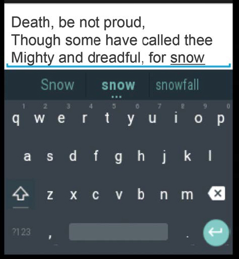
Figure 2-5 captures three snapshots of a screen containing an EditText object for the input of a person’s name. The first image shows the screen as it looks prior to the user entering the person’s name. Note that a hint appears in the EditText field, and an uppercase keyboard is activated when entering the first letter of a first name. The second image shows the screen as the user is in the process of completing the input of the first name. Note the appearance of lowercase keys in the keyboard. The last image shows the screen, with the keyboard reverting back to uppercase keys as the user begins inputing the second name.

The XML code for the layout that produces the soft keybords from Figure 2-5 is listed below.
Line 10: |
The |
Line 11: |
An input hint is provided to the user. The |
Line 12: |
The property |

EditText objects are normally added to a layout file using XML. Because the EditText class is derived from the TextView class, most static TextView control attributes (and related methods) still apply. For example, it is possible to set attributes that adjust the control’s appearance, such as the text size, color, font or other style settings.
To retrieve the value of an EditText control from within an activity, you can use the getText () method of the EditText class. For example, the following code retrieves a handler to the EditText control defined as messageEt.

Flexibility can be built into EditText controls, as well as other input controls, by using Android view control listeners. A view control listener will listen for an event that occurs on an attached View. For example, in Tutorial 1 of Chapter 1, we saw how a view control listener was attached to a button to listen for an onClick event. An onClick event indicates the user tapped a finger on a button to activate it. Similarly, a TextWatcher is a view control listener that listens for input changes in an EditText control. We will explore a TextWatcher firsthand in the first lab of this chapter.
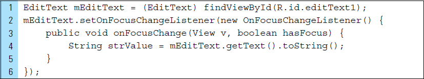
In addition to the TextWatcher, the setOnFocusChangeListener () method is useful for identifying when the user changes focus to or from a control. For example, the following code segment declares an EditText control object named mEditText that is linked to the resource “editText1.” The listener event “setOnFocusChangeListener” is applied to the control object. When the control first gets focus, an onFocusChange event will occur. Once the user moves focus away from this control, an onFocusChange event will occur again.
■ 2.5 Soft Keyboards
When a user begins the process of inputing data into an EditText control, the Android system displays an onscreen keyboard. This keyboard is called a soft keyboard, as opposed to a physical keyboard, because it can instantly generate a specific configuration that precisely fits the needs of an EditText once it receives focus. Android provides flexible soft keyboards that can easily be adapted to a specific user experience for an application. As a developer, you can set the characteristics that represent the type of input you expect for a text file (such as whether it’s a password, phone number, or email address) and how the input method should behave (such as whether it performs autocorrect for spelling mistakes).
The type of input for a text field is used to determine the kind of characters allowed within the text field. For example, an email address requires the @ symbol to be embedded in an address. When inputting an email address, it’s important that the keyboard display normal text keys along with the @ symbol prominently, as shown in Figure 2-6.
When an application requires that a password be entered into a text field, the soft keyboard should hold a normal set of keys, including uppercase and lowercase text keys, numbers, and some special characters, such as underscore. In addition, the behavior of input must be altered. For example, characters within the password will be masked as a security measure. As shown in Figure 2-7, the characters are turned into dots once they have been typed.

By default, the soft keyboard for input within a simple EditText control is a basic keyboard with plain keys. This type of text input is called plain text. To facilitate input of different types of text, a standard soft keyboard can be configured by setting the android:inputType attribute of the text field. For example, if you want the user to input an email address, the inputType attribute of the EditText control object can be initialized to textEmailAddress, as shown on Line 6 of the following XML code.

A variety of input types can constrain text input to a specific type. Android provides a set of Text Field input-type properties that can be used to restrict input by reconfiguring the soft keyboard. These Text Fields, which can be placed on a layout file in the graphic layout editor, are listed in Table 2-1. To allow generic plain text to be input into a text field, the inputType property can be set to “none” or can be left out of the EditText XML definition in the layout.
The soft keyboards that these controls generate are shown in Figure 2-8. In some cases, there are very small differences in the keys provided. You can add further input restrictions for a text field by specifying more input requirements in the inputType attribute of the View control object. You can also place these specifications in the XML code from the Properties Tab.
TABLE 2-1 Text Fields that Define the EditView Controls.
Text Field |
|
Plain Text |
|
Person Name |
|
Password |
|
Password (Numeric) |
|
|
|
Phone |
|
Postal Address |
|
Multiline Text |
|
Time |
|
Date |
|
Number |
|
Number (Signed) |
|
Number (Decimal) |
|

You can combine properties in the android:inputType attribute for a text field to specify, not only the input method, but also additional behaviors. For example, a password text field might require solely capital letters.
By specifying both of these properties in the android:inputType attribute, you will be able to generate a specific type of soft keyboard and specify various behaviors for the input method.
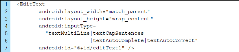
In the XML code segment below, the EditText object is configured to hold multiple lines of plain text, the first letter of a given sentence is capitalized, and text input, as shown in Figure 2-9, is flagged for autocompletion and autocorrection.
In addition to the inputType properties outlined in Table 2-1, further attributes can be applied to text input controls. These attributes are listed as follows.
|
Normal text keyboard that capitalizes the first letter for each new sentence. |
|
Uppercase keyboard that capitalizes all characters. |
|
Normal text keyboard that capitalizes the first letter of every word. Good for titles or names. |
|
Normal text keyboard that capitalizes every word. Good for titles or person names. |
|
Text editor corrects commonly misspelled words. |
|
The text editor (which means the application) is performing autocompletion of the text being entered based on its own semantics, which is presented to the user as they type. |
|
Flags the input method to prevent display of any dictionary-based candidates. |
|
Normal text keyboard with the / character. Used for entering a URI. |
|
Entering a short, possibly informal, message such as an instant message or a text message. |
|
Text field |
|
Entering text inside a web form. |
|
Text to filter contents, such as of a list. |
|
Entering text for phonetic pronunciation, such as a phonetic name field in contacts. |
By default, the cursor for text input controls is automatically displayed during input. You can hide the cursor by setting the cursorVisible property to false, as shown in Line 5 of the following EditText definition.
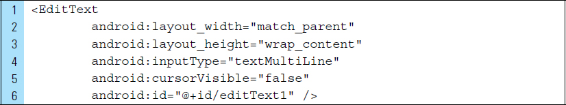
Most soft input methods provide a user action button in the bottom corner that’s appropriate for the current text field. By default, the system uses this button for either a Next or Done action unless your text field allows multiline text (such as with android:inputType="textMultiLine"), in which case the action button is a carriage return. However, you can specify additional actions that might be more appropriate for your text field, such as Send, Done, and Go.
To specify the keyboard action button, use the android:imeOptions attribute with an action value such as “actionSend” or “actionSearch.” For example, the code segment that follows produces a keyboard with a search icon, as shown in Figure 2-10.


The following Android imeOptions property can be assigned a range of values to produce keyboard icons.
actionSend
actionDone
actionGo
actionNext
actionPrevious
Furthermore, listener events can be registered to an action button, which is done by applying a setOnEditorActionListener to the EditText object. For example, in the code segment below, a listener is used to respond to the appropriate IME action EditorInfo. These actions are defined in the EditorInfo class, such as IME_ACTION_SEARCH.

■ Lab Example 2-1: Basic Input and the Shipping Calculator
The first app of this chapter examines basic layout construction and data input without the use of a button to trigger a computation. The Shipping Cost Calculator is a simple app that will be used to illustrate the input of data via a soft keyboard within an EditView object. The user will input the weight, in ounces, of an item to be shipped. As the user inputs a shipping value, the base cost, added cost, and total cost of shipping will be directly computed and then displayed in a collection of TextView objects.
Part 1: Conceptual Design
The conceptual design for this application begins with a rough sketch that outlines the user interface elements, along with their placement on the screen. The initial visual design for this app, along with the final view of the app running, is shown in Figure 2-11. The design takes into consideration the amount of screen space the soft keyboard requires. View objects are arranged so that all views are easily within view. In addition, the alignment of numeric values and labels further enhances the readability of the design. Padding around these View objects will help position them on the screen.
In a user interface, we use buttons as a practical solution to many applications. Buttons can be and have been enormously helpful with interactions; however, they may not always be the best choice for an application that needs a more intuitive interaction. When looking at efficiency and effectiveness, a button may be a wasteful form of user interaction in that it requires extra gestures that can be eliminated. The shipping cost application shown in Figure 2-11 will not use a button to trigger a computation. Instead, the application will “listen” for input and respond immediately.

Part 2: Application Structure and Setup
The settings for the application are as follows:
Application Name: |
Shipping Calculator |
Package Name: |
com.cornez.shippingcalculator |
Android Form: |
Phone and Tablet |
Minimum SDK: |
API 18: Android 4.3 (Jelly Bean) |
Target SDK: |
API 21: Android 5.0 (Lollipop) |
Compile with: |
API 21: Android 5.0 (Lollipop) |
Activity Name: |
|
Layout Name: |
|
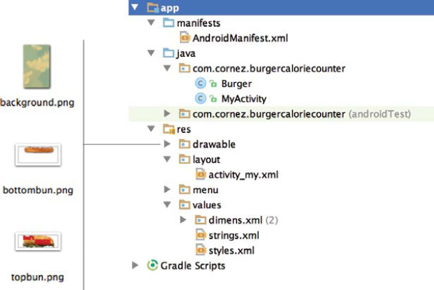
The final project structure for this application is shown in Figure 2-12. It includes two drawable elements: the background image and the launch icon. In addition, a blank activity and a layout are automatically generated with the default names MyActivity and activity_my.

The configuration options specified for this shipping calculator application can be altered within the build.gradle file, found in the src directory of the project. Keep in mind that gradle overrides the manifest values found in the AndroidManifest.xml file. For developers using Android Studio, it is preferable to update the build.gradle file rather than the manifest, which, in Eclipse, is used to contain package name, version code, version name, target SDK, and many other specifictions. If you wish to change the minimum SDK, it should be done via build.gradle.


Part 3: External Value Resources
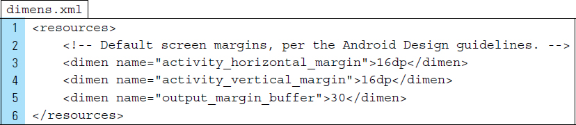
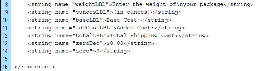
The value resources for this application revolve around dimensions and strings. Because we will consistently be using the same padding dimension in many of the display views, a dimension definition will be added to the dimens.xml file. The definition, shown on Line 5, is given the name output_margin_buffer and is set to 30.
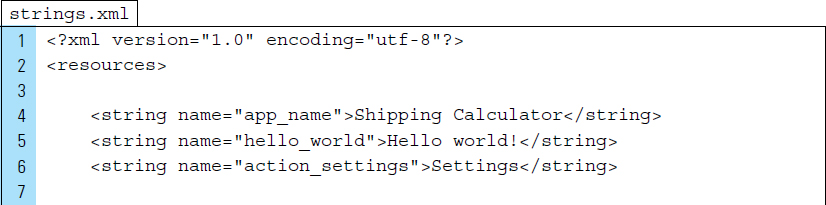
The additional string values for this application are defined on Lines 8–14 of the strings.xml file. These strings will be used primarily to label the output values the calculator produces.
Part 4: The User Interface as a Layout XML File
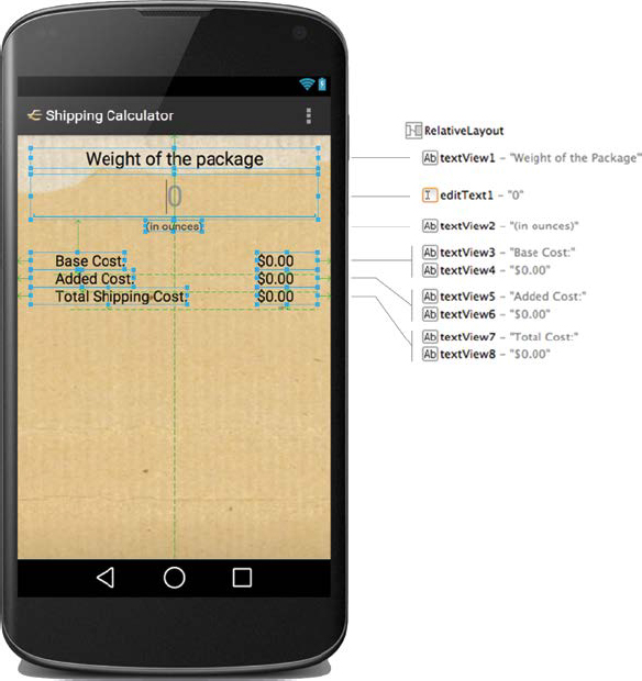
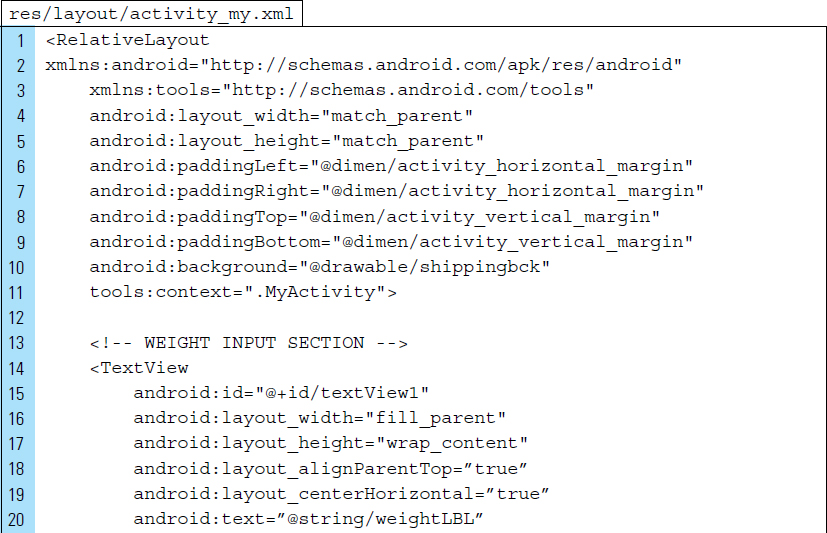
The XML code for the activity_my.xml layout file contains a RelativeLayout View as the root element. Figure 2-13 shows the arrangement of the View objects. The input control for weight entry by the user will be an EditText object. This EditText is defined on Lines 25–40.
Line 34: |
The input type for this |
Line 35: |
The |
Line 37: |
Hint text will be displayed when the |
Line 39: |
When the activity starts, the focus will go to the input |
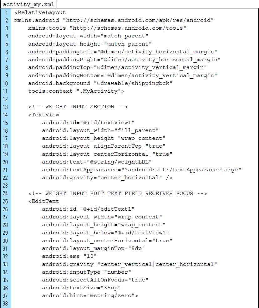
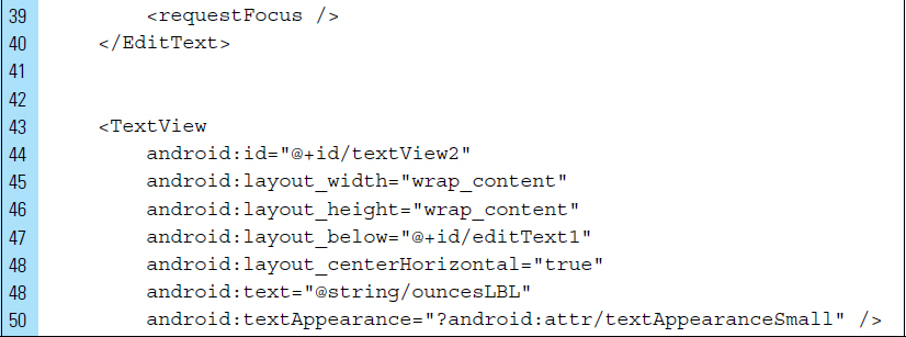
The remaining TextView objects within this layout will be used to represent the computed shipping calculations and the labels that identify them to the user. Note that all of them rely on the padding dimension defined in the dimens.xml file.


Part 5: Source Code for Application
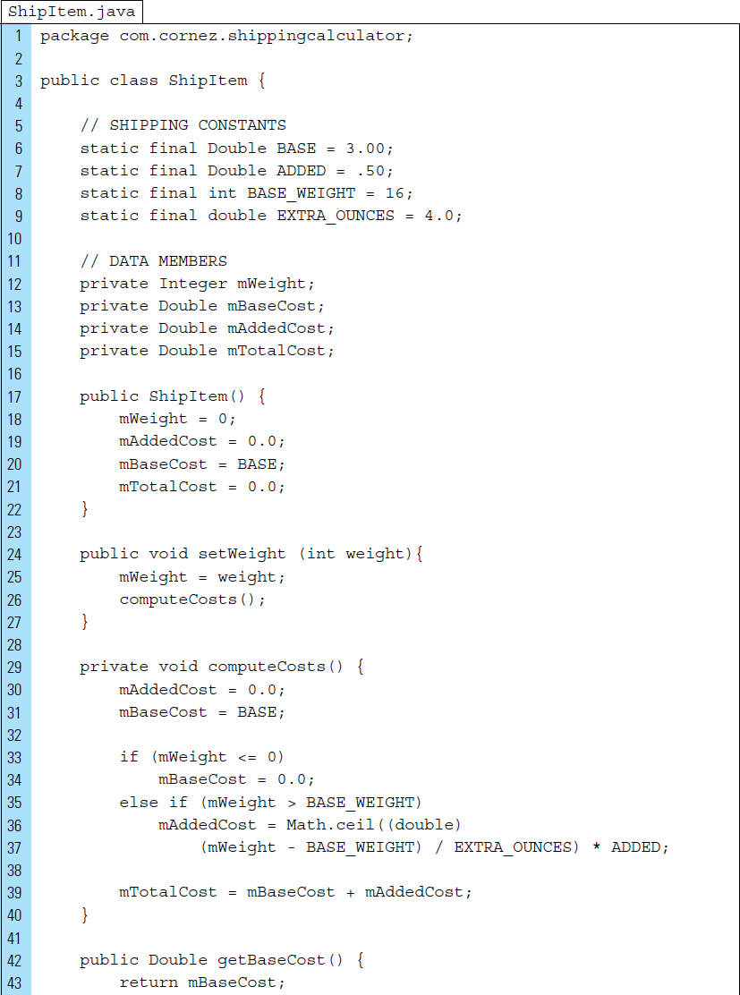
The Shipping Calculator app will rely on two Java files: ShipItem and MyActivity. The first Java file, ShipItem.java, is the class that represents an item to be shipped. All items to be shipped will have a base cost of $3.00 for the first 16 ounces. All items weighing more than 30 ounces will have a base cost of $4.00.
In addition, items weighing more than 16 ounces will have an added charge of $.50 for each additional four ounces. For example, an item weighing more than 16, but no more than 20, ounces will cost $3.50 to deliver. An item weighing more than 20, but no more than 24, ounces will cost $4.00 to deliver. Therefore, it will cost the same amount to deliver an item that weighs 24 ounces as an item that weighs more than 30 ounces. All shipped item costs are computed in the method computeCosts ().

MyActivity is the controller of the application. Whenever the user inputs a weight, this class calls the setWeight() method in the ShipItem class to tell it to change its state appropriately. The listeners specified in the Controller detect an input by the user and call the method computeCosts() in the ShipItem to compute the necessary costs. Finally, this class updates the Views to display the shipping costs to the user.
Lines 3–11: |
The first lines of code are used to import the needed libraries. It is customary for libraries to be listed in alphabetical order. |
Line 5: |
|
Line 6: |
|
Lines 10–11: |
|
Lines 33–39: |
Once the activity content from |
Line 42: |
An |


A TextWatcher requires that three methods are called once an attached TextView has been edited: onTextChanged(), afterTextChanged(), and beforeTextChanged().
Lines 49–58: |
The method |
Lines 59–61: |
The callback methods |

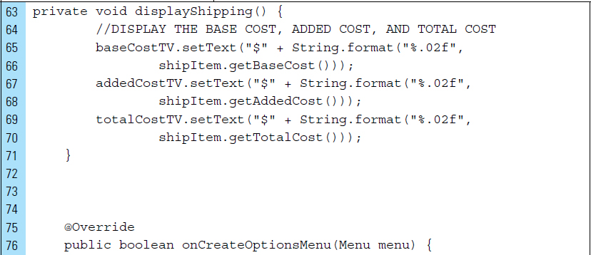
Lines 63–71: |
The method |

■ 2.6 Android’s Form Widgets for User Interfaces
Input controls, such as EditText and Button Views, are the interactive components in an application’s user interface. Android provides a wide set of input controls, also called widgets, to be used in an app’s user interface. These built-in widgets, shown in Figure 2-14, are subclasses of the View base class, which provides the functionality that is common to all widgets.
Widgets, including seek bars, checkboxes, and switches, can be added easily to XML layout, similar to Buttons, EditTexts, and TextViews. Each widget has a built-in set of properties that can be used to customize the appearance of a widget as seen by the user. For example, a TextView widget might be designated as Large Text, Medium Text, or Small Text, but it also contains a numeric textsize property that can be altered further. By editing the textsize of a TextView, the small, medium, or large designations are no longer relevant.
Each widget control supports a specific set of input events that can be listened for and handled, such as when the user slides the knob on a seek bar or toggles a switch. If an app requires a specific kind of input control, these controls can be customized or even built programmatically.
TextView, EditText, and Button widgets have already been discussed in the previous two sections of this chapter. This section will explore several other widgets from the list in Figure 2-14.
2.6.1 RadioButton and CheckBox
A radio button is a familiar UI component for programmers. It is specifically used when a single item from a collection of items must be made. If a radio button is already selected, it will be de-selected when another radio button in the collection is selected. The RadioButton in Android is specifically a single item in the collection. In Figure 2-15, a RadioGroup is used to contain three RadioButton widgets.


As with radio buttons, the CheckBox widget is also a common UI component for programmers. Specifically, it is a type of two-state button that can either be checked or unchecked.
2.6.2 ToggleButton
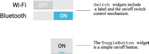
A toggle button allows the user to change a setting between two states, such as on or off. Android 4.0 (API level 14) introduced another kind of toggle button called a switch that provides a slider control, which you can add with a Switch object.
2.6.3 Switch
A Switch is a two-state toggle switch widget that can select between two options, off and on. The user can drag the “thumb” back and forth to choose the selected option; instead, the user can simply tap to toggle as if it were a checkbox. Figure 2-16 shows two Switch widgets and a ToggleButton widget. The Switch widgets incorporate a label, such as Wi-Fi and Bluetooth, and an easy-to-understand toggle control button. The ToggleButton widget is merely the button.
The following XML code segment is used to produce the Switch widgets shown in Figure 2-16.

2.6.4 ProgressBar
A ProgressBar is a visual indicator of progress in a given operation. For example, a ProgressBar control can be displayed to the user representing how far an operation has progressed; the application can change the amount of progress (modifying the length of the bar) as it moves forward, such as the buffer level during a streaming playback.
A progress bar can also be made indeterminate. In indeterminate mode, the progress bar shows a cyclic animation without an indication of progress. This mode is used by applications when the length of the task is unknown. The indeterminate progress bar can be either a spinning wheel or a horizontal bar.
2.6.5 SeekBar
A SeekBar is an extension of ProgressBar that adds a draggable thumb. The user can touch the thumb and drag left or right to set the current progress level or use the arrow keys. A Seekbar widget is used in Figure 2-17 to select an amount of chocolate.

Placing focusable widgets to the left or right of a SeekBar is discouraged. Soft keyboards on an Android device cannot decide which input widget to which to send its input events. Input events are sent to the view that has focus. Clients of the SeekBar can attach a SeekBar.OnSeekBarChangeListener to be notified of the user’s input actions.
2.6.6 RatingBar
A RatingBar is an extension of SeekBar and ProgressBar that shows a rating in stars. The user can touch/drag or use arrow keys to set the rating when using the default size RatingBar. The smaller RatingBar style (ratingBarStyleSmall) and the larger indicator-only style (ratingBarStyleIndicator) do not support user interaction and should be used only as indicators.
When using a RatingBar that supports user interaction, placing widgets to the left or right of the RatingBar is discouraged. The number of stars set (via setNumStars(int) or in an XML layout) will be shown when the layout width is set to wrap content; if another layout width is set, the results may be unpredictable.
2.6.7 Spinner
Spinners provide a quick way to select one value from a set of values. For example, in Figure 2-18 an individual contact can be selected from a set of contacts. In the default state, a spinner shows its currently selected value—or in this case, none. Touching the spinner, Contacts displays a drop-down menu containing the complete set of contacts from which to choose. The user can then select one.
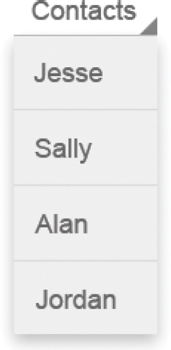
The choices you provide for the spinner can come from any source, but they most often will originate from a database. In the example, the available contact choices are predetermined, provided by a string array defined in a value string resource file. This file would be located in the res/values directory of the project.
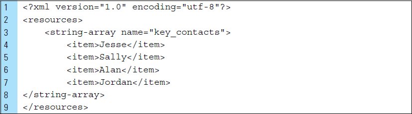
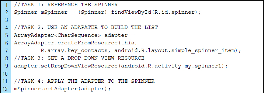
Loading the Spinner with the contact names is done with Java code, such as the segment shown in the code below. Spinners rely on Adapters, or an Array-Adapter such as the one declared in Line 5. The Adapter object acts as a bridge between a Spinner and the underlying data for that Spinner. The Adapter provides access to the contact items.
■ 2.7 Unique ID of a View Object and the R Class
Some attributes are common to all View objects, because they are inherited from the View base class. As with all Java classes, these attributes are inherited by objects that extend the class. One of the most important View attributes is the id attribute. Every View object shares this attribute.
When an app has been compiled, all of its View objects are assigned a unique integer that identifies them. The file named R.java, which is an auto-generated file when you build an Android application, categorizes these unique identifiers (normally 32-bit numbers) into groupings for drawables, strings, layout elements, and so on. The main purpose of the R.java file is rapid accessibility of resources in the project. As resources are deleted and added to an Android project, the R.java file is updated automatically. The generated R class, located in the build folder in an Android Studio project, will be constructed with final 32-bit values.
In addition to the R.java listing of unique integer identifiers, the View class provides an XML attribute for defining a unique string id for referencing the View object. String identifications are readable and easy to work with when writing code. In the following example XML instruction, a Button View object is constructed. The syntax for the button ID, inside the XML tag, is shown on Line 2.

The at-symbol (@) at the beginning of the string indicates that the XML parser should parse and expand the rest of the ID string and identify it as an ID resource. The plus-symbol (+) means that this is a new resource name that must be created and added to the resources (in the R.java file).
Once a View can be uniquely identified, it can be referenced in Java source code. For example, the Button object, defined in the XML code above, was given the string id of “go_button.” In the Java instruction below, this button is referenced using findViewById(). findViewById() locates a view that was identified by the id attribute from the XML code.
It is also possible to use other ID resources that are offered by the Android framework. When referencing an Android resource ID, you do not need the plus-symbol, but you must add the android package namespace:
android:id="@android:id/empty"
Resources include all the external resources for the application and include elements such as the layouts, layout control elements, strings, and drawables. All resource elements are defined and compiled into the file R.java, stored in the app/build/generated/ subdirectory. An example of the generated file is shown as follows:

■ 2.8 The ViewGroup
The user interface of an app is defined using a hierarchy of View and ViewGroup objects. A ViewGroup is a container of View objects. The distinction between View and ViewGroup can sometimes be confusing because all ViewGroup are also View objects.
As the term implies, a ViewGroup is a special type of View that is designed to hold groups of Views. Each ViewGroup is an invisible container that organizes child Views. The child views may be input controls or other widgets that draw some part of the UI. The ViewGroup subclass is the base class for all containers.

As shown in Figure 2-19, a ViewGroup is used as the root container for storing all View objects. One of the View objects, ViewGroup B, is a ViewGroup containing its own set of View objects. A ViewGroup hierarchy tree can be as simple or as complex as needed, with ViewGroups nested into many levels. Be judicious in how you design ViewGroups, because simplicity is best for performance.
2.8.1 RadioGroup
A RadioGroup object is a ViewGroup container. As a ViewGroup, the Radio-Group is used to group together a related set of RadioButtons, as illustrated in Figure 2-20. More specifically, a RadioGroup establishes a multiple-exclusion scope for its contained set of radio buttons.

The radio buttons elements shown in Figure 2-20 were built using the following XML code. Each of the RadioButton objects is defined within a RadioGroup. Each RadioButton is assigned a unique identification so that it may be referenced in the Java source code.


Every ViewGroup class implements a nested class that extends View-Group.LayoutParams. This subclass contains property types that define the size and position for each child view, as appropriate for the ViewGroup. The parent ViewGroup defines layout parameters for each child view. In the preceding XML code, Lines 7 and 8 set paddingRight and the gravity to a right alignment for the RadioGroup. These are automatically applied to the child views, as shown in Figure 2-20.
Each layout file must contain exactly one root element, which must be a View or ViewGroup object. Once a root element has been defined, additional layout objects or widgets can be added as child elements to gradually build a View hierarchy that defines a layout.
■ Lab Example 2-2: Burger Calorie Calculator App
The Burger Calorie Calculator App explores the use of various UI controls and widgets in a user interface. This lab looks at the construction of a calorie counter for a restaurant that serves gourmet hamburgers. A screen interface allows the user to select various burger choices. ViewGroup containing widgets, such as RadioButtons, a Checkbox, and a SeekBar, will be used to organize user input controls. Upon selecting an option from the burger menu, the user will see the number of calories of each choice. Listener events will be attached to the input controls for the immediate computation and display of calories. Figure 2-21 shows the final Burger Calorie Calculator App with its ViewGroup and View hierarchy of UI controls.

Part 1: Application Structure and Setup
The settings for the application were set as follows:
Application Name: |
Burger Calorie Counter |
Project Name: |
BurgerCalorieCounter |
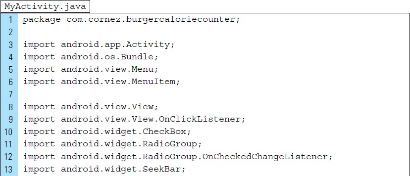
Package Name: |
com.cornez.burgercaloriecounter |
Android Form: |
Phone and Tablet |
Minimum SDK: |
API 18: Android 4.3 (Jelly Bean) |
Target SDK: |
API 21: Android 5.0 (Lollipop) |
Compile with: |
API 21: Android 5.0 (Lollipop) |
Activity Name: |
|
Layout Name: |
|
The final project structure for this app appears in Figure 2-22. The drawable folders in the res/ directory contain bitmap PNG files to make the app more interesting visually. These files can be found in the textbook resources. The launcher icon is set to the Android default ic_launcher.png file.
The activity for the application is set to the default name MyActivity, and the layout file that displays the visual elements for the activity is given the name activity_my.
Part 2: The Theme of the Application
The theme of an application describes the look and feel of the app through the user’s perspective. A theme is a set of styles, often defined in a separate XML file named styles.xml.
By default, Android comes with many themes that we can directly use. It is also possible to create our own themes, which typically remain consistent throughout the execution of the app.
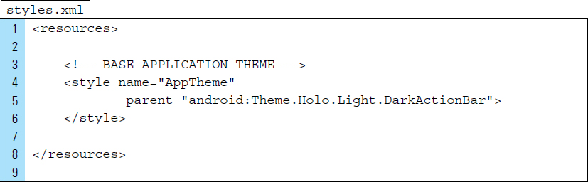
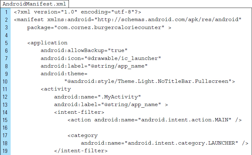
The AndroidManifest.xml file is used to apply the theme defined by the style.xml file. The styles.xml file is located in res/values/directory. The default style defined for the app is shown in the following code segment. The name of this style is AppTheme, and it consists of a Holo.LightDarkActionBar. This particular style uses a light theme for the content area and has a solid opaque action bar in an inverse color that makes it stand out against the light content.
AndroidManifest.xml file applied this defined style to your app using the instruction:
android:theme="@style/AppTheme"
It is also possible to apply a style configuration directly to the android-Manifest.xml. For demonstration purposes, we applied a new style as shown in the AndroidManifext.xml code below. By altering the theme, as seen in Lines 9–10, the Burger Calorie Counter app will use the entire screen and no title bar will appear.
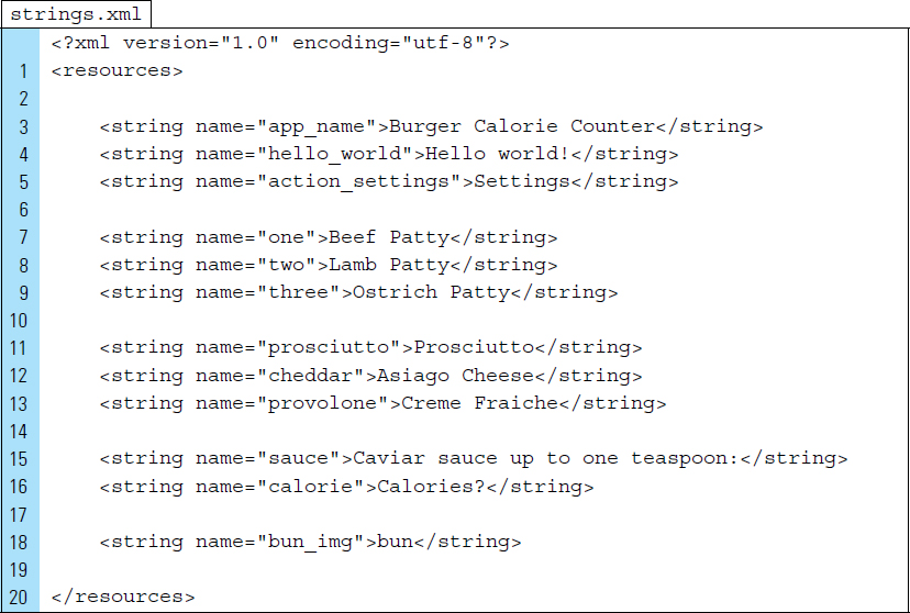
Part 3: External Value Resources
Other than the styles.xml file, strings is the only other value resource on which this app depends. The strings shown in the strings.xml code below represent the labels that will identify the user interface controls.
Part 4: The User Interface as a Layout XML File
The final design for the layout, activity_my.xml, of this application is shown in Figure 2-23. It uses a RelativeLayout as the root element. A RelativeLayout is also a ViewGroup. Within the RelativeLayout is a collection of ImageViews, TextViews, RadioGroups (containing RadioButtons), a SeekBar, and a CheckBox.
The first segment of activity_my is used to define a RelativeLayout as the root ViewGroup, set images, and define the first RadioGroup.
Line 11: |
For visual interest, the background of the |

Lines 14–21: |
The logo of the application, a top bun with the restaurant name, is placed directly on the layout. |
Lines 32–50: |
A |


The second segment of activity_my will define the CheckBox widget and the second RadioGroup.
Lines 51–58: |
The |
Lines 60–82: |
The second |

The final XML code segment of activity_my defines the SeekBar UI control for selecting the amount of caviar added to the burger. A final SeekBar and an output TextView for displaying the calories to the user are also defined.
Lines 83–103: |
The label for the caviar |
Lines 105–113: |
For visual interest, an |
Lines 115–124: |
The calorie computation will be displayed in a |
Line 126: |
The |

Part 5: Source Code for Application
The two Java class files for this application are Burger.java and MyActivity.java. The Burger class provides the data for the application. MyActivity is launched when the application loads. This class serves as the controller of the application.
Lines 4–9: |
To keep things simple, constant calories are assigned within the Burger class. |
Lines 16–21: |
The constructor sets the initial ingredients to a beef patty with asiago cheese. No condiments are added to the initial burger. |
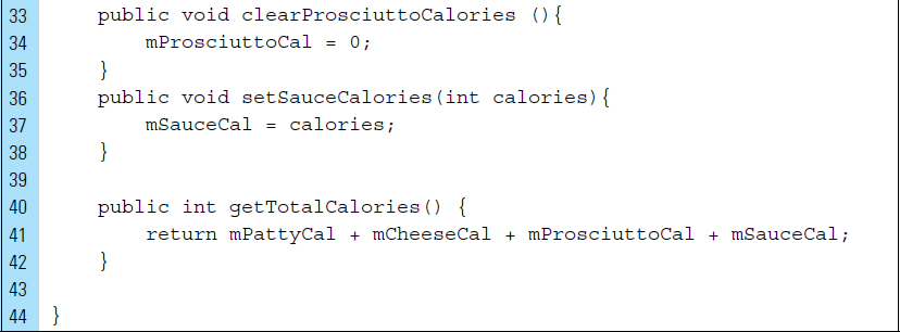
The remaining instruction for this class will set and get the values for the data members.

MyActivity.java will serve as the controller of the application.
Lines 3–15: |
The import statements enable the use of |
Lines 19–24: |
All input controls defined within a layout must be referenced in order for |
Lines 55–60: |
Change listeners are registered for all of the input controls. When a change is triggered in an input control, the listener event is called. The listener event for |

MyActivity.java will use an anonymous inner class that extends On-CheckedChangeListener to respond to the user’s selection of certain food items. foodListener() listens for changes in the RadioGroup for the patty and cheese selections the user makes.
Lines 61–63: |
|
Lines 65–79: |
For demonstration purposes, and to provide you with firsthand experience using the hex resource identifiers, this application will rely on the generated |
app/build/generated/source/r/degug/com/com.cornez.burgercaloriecounter.
|
Calories are set for the selected burger item identified by the hex value associated with the appropriate |

Line 80: |
Calories are redisplayed with a call to |

The CheckBox (the Proscuitto selection) and the SeekBar (the amount of caviar added to the burger) had listener events registered to them so that calories could be computed immediately if the user altered either of these selections. This segment of code defines the anonymous inner class that extends OnClickListener and OnSeekBarChangeListener.
Lines 85–93: |
A |
|
Lines 95–109: |
An OnSeekBarChangeListener named |
|
|
|
The |
|
|
The user has just touched the |
|
|
The user has just touched the |

The remaining instructions in MyActivity.java display the computed calories.


■ 2.9 Adaptive Design Concepts—Screens and Orientations
Android apps can be difficult to design and build because of the many variations in screen sizes available on the market at any given time. Forcing a single design for an app that is expected to fit on a wide range of screen sizes can often result in an ineffective and inefficient user interface. Adaptive Design is so important to Android because it supports flexibility when designing an app that can work on multiple devices. Another method for dealing with Android device variations, called Responsive Design, will be introduced in Chapter 4.
Adaptive Design refers to the adaptation of a layout design that fits an individual screen size and or orientation. Designing for a device’s size or orientation makes it possible to make better use of the opportunities each one offers. For example, when building an app for a Nexus phone that has a screen size of 4.7”, the layout can be constructed to comply specifically with the standards of that screen. The layout of the application might also need to have a separate design for a landscape orientation. Figure 2-25 shows six different general screen sizes for Android. Depending on the screen size, a different, yet similar, background has been applied.
Android applications need to adapt to a number of different types of devices. These devices can range from wearables to 3” phones to 10” tablets. Adaptive Design models a layout for general sizes, which means that designs are structured around approximations. For example, a screen size between 3 and 5 inches is generally suitable for showing content in a vertical manner. Larger screens, such as those found on tablets and TVs, on the other hand, generally have much more available screen space and are able to present content in less restrictive ways.
Android screen designs can be categorized using two general properties: size and density. Users are accustomed to seeing a variety of different screens and are accepting of different presentations, as long as they are well designed. Problems can arise when a user interface designed for a large layout is moved to a smaller one. Developers should expect their applications to be installed on devices with screens that range in both size and density.

Screen orientation is also considered a variation of screen size. Apps should revise layouts to optimize the user experience in each orientation: landscape or portrait.
A unique layout XML file can be created for each screen size on which the app might be launched. Four generalized sizes can be targed: small, normal, large, and xlarge. Each layout should be saved into the appropriate resources directory, named with a -<screen_size> suffix. Figure 2-26 shows four different versions of the layout named activity_my.xml, saved to the appropriate layout directory. The layout version that will be used for the large tablet is saved under res/layout-xlarge/.
As you have already experienced, Android automatically scales a layout so that it properly fits the device on which it is launched. Thus, do not worry about the absolute size of UI elements; focus instead on the layout structure that affects the user experience (such as the size or position of important views relative to sibling views). The system loads the layout file from the appropriate layout directory based on the screen size of the device on which your app is running.

Designing for screen size approximations produces better-quality user interfaces because they can be targeted more specifically. This method, however, is not without its flaws. Beware that an intended design could deviate in small measure from the targeted size. Sizes are generalized rather than exact.
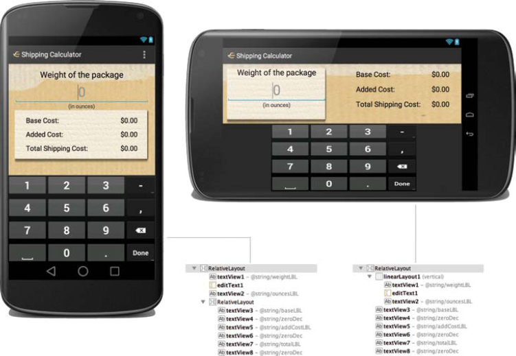
■ Lab Example 2-3: Shipping Cost Calculator II—Adaptive Design
The Shipping Cost Calculator, produced in Lab 2-1, did not adapt well to changes in screen orientation. For example, the user could clearly see the input and output elements when using a small device held in portrait orientation. If the small device were tilted to a landscape orientation, however, the output elements would be cut off. This would not impede the performance of the app because the user could always take the extra action of pressing the “Done” key. However, it is clear that this one-size-fits-all approach does not produce the best possible experience for the user. The solution to this problem is to create layouts with adaptive design methods.
In this lab, we will revise the layout used from Lab 2-1 and add an alternate version of the layout to be used for a landscape orientation. When the user is holding the device in portrait orientation, the first layout shown on the left in Figure 2-27 will appear on the screen. When the user rotates the device, the screen display will automatically change to the second layout, shown to the right in Figure 2-27.
In addition, this lab will explore the use of ViewGroups for categorizing elements on the screen. ViewGroups can be highly effective in screen design because they allow an easy grouping of related controls. For example, in the portrait layout, a RelativeLayout is used to group together all output widgets, including the labels used to identify the output values.
Part 1: Project Structure
A bitmap representing a small piece of paper is placed on both layouts for this application. This will provide the user with a visual cue. This graphic needs to be added to the drawable folder within the project.
The final project structure, shown in Figure 2-28, uses two layout directories. Both of these directories store a layout file named activity_my.xml. This file represents the user interface for MyActivity. The first version of activity_my.xml is stored in res/layout, which is the default portrait orientation. The layout stored in res/layout-land will be used for a landscape orientation.

 FIGURE 2-28 Additional layout directories can be used to store different configurations of a user interface.
Part 2: Portrait Layout—the Default
The portrait layout for this application is the default layout and retains the name activity_my.xml. As the default layout, it is stored in res/layout.
The portrait layout file has a RelativeLayout as its root element. The XML code for the weight input segment is similar to the layout from Lab 1 of this chapter.

Contained within this layout is another RelativeLayout, as shown in Figure 2-29. This nested ViewGroup allows us to group the related cost calculations the user needs to see for the item that will be shipped. The code for the nested RelativeLayout element appears in Lines 50–138. A paper graphic has been applied to the nested ViewGroup in Line 57.

FIGURE 2-29 Computed output values are organized in a separate ViewGroup container in res/layout/activity_my.xml.


Part 3: Landscape Layout
The landscape version of the layout is also named activity_my.xml. In order to differentiate between the two layouts, the landscape layout is stored in a separate folder, res/layout-land. The easiest way to create this folder is to choose Create Landscape Variation from the Configuration Icon  in the Graphical Layout Editor in the Design mode. The landscape layout uses a
 RelativeLayout as the root element. It differs from the default layout in that it incorporates a ViewGroup, the LinearLayout, to group the controls that are related to input, as shown in Figure 2-30.

FIGURE 2-30 A LinearLayout is added to res/layout-land/activity_my.xml to group elements related to weight input.
The XML code for the landscape layout resource file is shown as follows:


■ 2.10 TableLayout and TableRow
In Android, TableLayouts are often used to organize data content into tabular form. This ViewGroup is highly effective in layout designs that require a neat alignment of user interface controls arranged into rows and columns. When used correctly, TableLayouts can be a powerful layout paradigm, which apps can use to display a variety of elements.
Tables can be added to a layout file using the Graphical Layout Editor or programmatically using Java. However the layout is constructed, the build rules will be the same. The number of columns within a table automatically matches the number of columns in the row with the most columns. The width of each column is defined as the width of the widest content in the column. The TableLayout’s child rows and cells layout_width attributes are always MATCH_PARENT; although they can be put in an XML file, the actual value cannot be overridden. The TableLayout’s layout_height of a cell can be defined, but a TableRow attribute for layout_height is always WRAP_CONTENT.
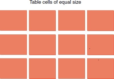
Java requires two class imports for this purpose: android.widget.Table-Layout and android.widget.TableRow. The following code segment uses Java code to generate a layout screen consisting of a table. This table contains two rows and two columns. Each cell in the table will store a TextView element.
Line 1: |
A |
Lines 3–4: |
Columns can be marked as stretchable, which means that the width can expand to the size of the parent container. Columns can also be marked as shrinkable, which means that they can be reduced in width so the whole row fits in the space provided by the parent container. You can also collapse an entire column. It should be noted that a table cell can span multiple columns, but not rows. This is done through the |
Lines 6–22: |
The first |
Line 24: |
The layout for this given application is set to the table that was just constructed. The screen for this application will look similar to the one shown in Figure 2-31. |

Although it is possible for TableLayouts to be used to design entire user interfaces, they are often combined with other layout Views. As a derivative of a LinearLayout, the TableLayout is little more than an organized set of nested LinearLayouts. Nesting layouts too deeply is generally discouraged for performance concerns.

■ Lab Example 2-4: Simple Calculator App and the TableLayout
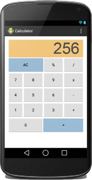
The purpose of this lab is to illustrate how a TableLayout ViewGroup can be used to design a user interface containing table cells that are customized. The Calculator app takes advantage of table structure for organizing the control elements. The final app is shown in Figure 2-32.
Part 1: Application Structure and Setup
The settings for the application are as follows:
• Application Name: |
Calculator |
• Project Name: |
Calculator |
• Package Name: |
com.cornez.calculator |
• Android Form: |
Phone and Tablet |
• Minimum SDK: |
API 18: Android 4.3 (Jelly Bean) |
• Target SDK: |
API 21: Android 5.0 (Lollipop) |
• Compile with: |
API 21: Android 5.0 (Lollipop) |
• Activity Name: |
|
• Layout Name: |
|
No bitmap elements are required for the design of this app. The launcher icon will remain as the default bitmap, ic_launcher.png. The final structure will resemble the one shown in Figure 2-33.

For more control over the visual presentation of the calculator, the orientation is fixed in portrait mode. When the user rotates the device to a landscape orientation, the application remains fixed in portrait mode. A quick and easy method for fixing orientation is to set the screenOrientation property of the activity within AndroidManifest.xml.
Line 12: Screen orientation is fixed in portrait mode.
The screenOrientation property applies solely to activities and not to an application. If an app contains multiple activities, the screenOrientation property can be set for each one individually. If an orientation is not specified for an activity, it will run in the current preferred orientation of the screen.
In addition to portrait, screenOrientation can be set to the following values: landscape, locked, reverseLandscape, and reversePortrait. This value list is not complete. Refer to Android documentation for the full list.

Part 2: External Value Resources
Two value resource files are required for the Calculator app. The first is the string.xml file, which stores the text on display within the keypad holding the numbers, operators, and accumulator key (AC).
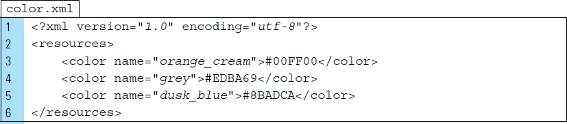
The second value resource file is the color.xml file. Color is used make the calculator easier to navigate. Colors are applied to certain keys and to the display component of the calculator. orange_cream is used for the display, grey is used for the numeric keys and operators, and dusk_blue is used for “=” and AC. Note that both dusk_blue keys on the calculator span two regular keys, two columns. The display component spans across four columns in the table structure.
The XML code for strings.xml and color.xml are listed as follows.

Part 3: The User Interface as a Layout XML File
The root element of the layout file for the main activity of this application is a Table-Layout. The TableLayout contains exactly six TableRows, named tableRow1, tableRow2, and so on. The design for this layout is shown in Figure 2-34.

The XML code for activity_my.xml appears below. The first 28 lines of this file define the configuration of the TableLayout and the display component located at the top of the calculator.
Line 9: |
The |
Lines 13–17: |
A first row is defined as |
Lines 18–28: |
The display component of the Calculator is defined as a |
Line 22: |
The Calculator will display computed values in a display component, |
Line 24: |
The |


Lines 29–63 of activity_my.xml code are used to define the second row of the TableLayout, as shown in Figure 2-36. The second row of the calculator contains three buttons.
Line 38: |
The button representing the AC control is set to span two cells. Not specifying the span of the other two buttons results in a default span of one cell/column. |


Line 63–193: |
|
Lines 72, 83, 92, 101, 116, 127, 136, 145: |
|
|
The |


Lines 194–220: |
The final row of the table, |
Lines 204, 213: |
|


Part 4: Source Code for Application
MyActivity controls all activity, while the data model for a calculator expression is SimpleExpression.
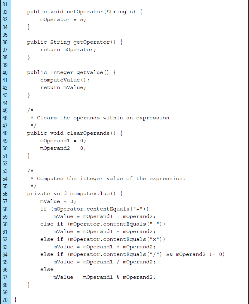
The class SimpleExpression.java models a basic expression involving integers as operators.
Lines 4–7: |
The data members for this class define the operator, two operands, and the computed value. A |


As the controller of the application, the class MyActivity.java will implement the interface listener events to reference the layout, activity_my.xml, and update will update the calculator as the user enters expressions to be computed.
Lines 13–14: |
The calculator display, |
Line 20: |
A reference to the layout |
Lines 25–38: |
The handlers for the |
Line 32: |
The operand key, activated by the user, can be identified by its |

Lines 25–38: |
The handler for the |
Lines 41–49: |
Once the user touches an operator key, the first operand of the expression is set to the integer value found in the display component of the calculator. A |
Line 44: |
Recall that the method |
Lines 55–65: |
The handler for the |

■ 2.11 Container Views
Container Views are simply ViewGroups, which are Views. Figure 2-40 shows a collection of Containers. Android categorizes this group of Views as “containers” because its sole function is to act as containers for other views. Any object that provides access to container values is referred to as a Container.

Once a container is created, it can be queried for values. The method for accessing values from a container will depend on the type of container being used. Typically containers are used with Adapters, which map data to a View.Adapters are explored in more detail in the next section of the chapter, as well as in subsequent chapters. For now, it is easiest to think of an Adapter as an object that acts as a bridge between the container and the data items with which it will be populated. The container Views that are used with Adapters are subclasses of the AdapterView class.
When the content of an application is dynamic or not predetermined, an Adapter is used to populate the layout with Views at runtime. Containers and Adapters provide the mechanism for grouping elements and presenting content in a more intuitive and device-sensitive manner.
2.11.1 ListView, GridView, and ExpandableListView
The ListView, GridView, and ExpandableListView are all AdapterViews. This means they are populated with Views that are identified by an Adapter.
A ListView object displays items in a vertically scrolling list. The list items are automatically inserted into the list using an Adapter that pulls content from a source, such as an array or database query, and converts each item result into a view that’s placed into the list.
A GridView object is similar to a ListView, except that displays contain items in a two-dimensional scrolling grid. The items in the grid are inserted using an Adapter.
A ExpandableListView is an extension of a ListView. This type of container displays items in a vertically scrolling list that supports two levels. For example, the top level contains a group of items that can be individually expanded to show its child Views.
2.11.2 ScrollView and HorizontalScrollView
The ScrollView and the HorizontalScrollView are containers specifically designed to support scrolling by the user. ScrollView supports only vertical scrolling, and HorizontalScrollView should always be used for horizontal scrolling.
Both of these containers are extensions of the FrameLayout, which means they should contain a single View. Once a View has been placed in either of these containers, the view can be made scrollable. For example, a LinearLayout that contains a large number of items can be inserted into a ScrollView that the user can scroll through when the list is larger than the physical display.
Optimization should be considered when using containers that scroll. For example, it is not advisable to use a ScrollView with a ListView, because ListView already supports scrolling. Most important, doing this defeats optimizations found in ListView when dealing with large lists.
2.11.3 SearchView
The SearchView is one of the most useful UI controls to be introduced into the Android framework. This View, which we regarded as more of a widget than a container, is typically added to the menu and provides an easy way to incorporate a standard search into the header of any activity.
It should be pointed out that by default, the Android system controls all search events. When the user submits a query, the system delivers the query to the activity that you specify to handle searches. This system default can be overridden with various callback methods and listeners.
A SearchView object can be placed anywhere in your layout and will function like a standard EditText View.
2.11.4 VideoView
A VideoView is an extension of a SurfaceView, which will be discussed in Chapter 6. More simply stated, this container is used to display a video file. It is designed as an implementation of Android’s MediaController.MediaPlayerControl class. This means that it can load images from various sources (such as resources or content providers), and it provides various display options, such as scaling and tinting.
■ 2.12 Using an Adapter
In Android, an Adapter provides a common interface to the data model behind an AdapterView, such as a ListView object. An Adapter is the control that is responsible for accessing the data to be supplied to a container widget and converting the individual elements of data into a specific View to be added to and displayed inside the AdapterView.
The Adapter behaves as a middleman between the data source and the AdapterView layout. The Adapter retrieves the data (from a source such as an array or a database query) and converts each entry into a View that can be added into the AdapterView.
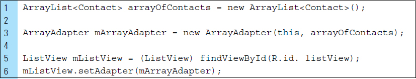
It is typical to populate an AdapterView by binding it to an Adapter. The following code segment illustrates this process. The ListView named mListView is referenced from the layout XML file. The method setAdapter() is called on mListView to bind the data.

Android provides several subclasses of Adapters that are useful for retrieving different kinds of data and building views for an AdapterView. A common Adapter is the ArrayAdapter.
ArrayAdapter is used when the data source is an array. By default, an ArrayAdapter creates a view for each array item by calling toString() on each item and placing the contents in a TextView.
For example, if an array of strings needs to be displayed in a ListView, a new ArrayAdapter can be initialized using a constructor to specify the layout for each string and the string array.
Consider the code segment below.
Line 1: |
A data source is constructed as an |
Line 3: |
An |
Lines 5–6: |
The |
■ Lab Example 2-5: Renaissance Paintings App
A common design in mobile applications is a scrollable list of items, such as text elements and images. This design pattern can be constructed using a ViewGroup populated with elements. The ViewGroup can then be made scrollable by storing it in a ScrollView. The Renaissance Paintings App, seen in Figure 2-41, uses a HorizontalScrollView to achieve a scrollable list of paintings by Renaissance artists.
Part 1: Design
The user is presented with a scrollable gallery of paintings from the Renaissance period, which can revolve horizontally with a simple swipe of a finger. Each of the paintings in the gallery is touch-sensitive. When the user touches a specific painting within the scrollable gallery, information about that painting appears for a brief moment in the form of a Toast.
A HorizontalScrollView has been chosen for this design because, not only is it a Scrollview, but it also uses a horizontal orientation. ScrollViews and HorizontalScrollViews can be used on an entire screen in which all elements can be scrolled up or down. It can also be used on smaller segments of the screen, allowing intended static screen elements to remain stable while the container elements scroll. In this design, we will use a stable title with the HorizontalScrollView positioned below it.

Part 2: Application Structure and Setup
The settings for the application are as follows:
• Application Name: |
Renaissance Paintings |
• Project Name: |
RenaissancePaintings |
• Package Name: |
com.cornez.renaissancepaintings |
• Android Form: |
Phone and Tablet |
• Minimum SDK: |
API 18: Android 4.3 (Jelly Bean) |
• Target SDK: |
API 21: Android 5.0 (Lollipop) |
• Compile with: |
API 21: Android 5.0 (Lollipop) |
• Activity Name: |
|
• Layout Name: |
|
The launcher is set to the Android default ic_launcher.png file. The drawables, in res directory, contain a sample of six Renaissance paintings. In addition to the paintings, two decorative graphics have been added to provide interest to the application: a textured background graphic and a graphic for the application title. The final project structure for the completed app appears in Figure 2-42.

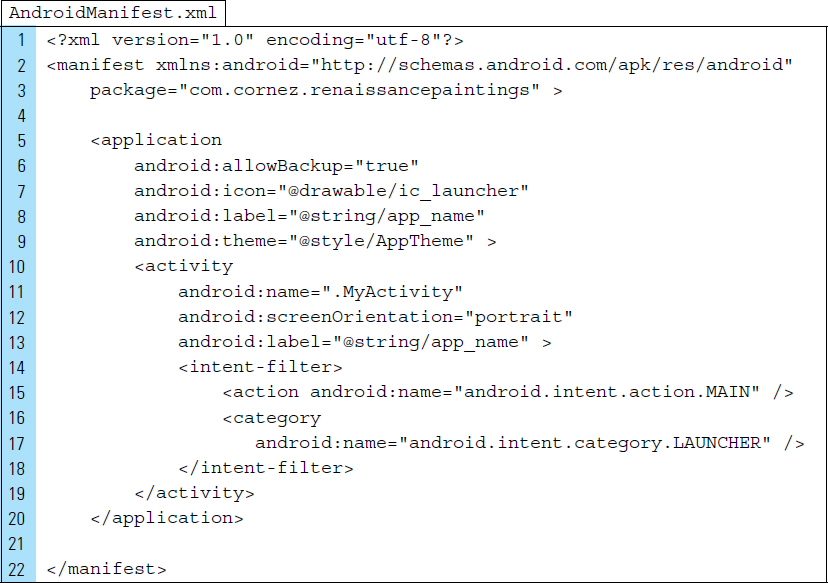
The AndroidManifest.xml file will set the screenOrientation so that it will be fixed in portrait mode, Line 12.
Part 3: External Value Resources
The style of the app is set within styles.xml. The default setting, Holo.Light.DarkActionBar, has been eliminated.
Line 6: |
The new |

Part 4: The User Interface Layout XML File
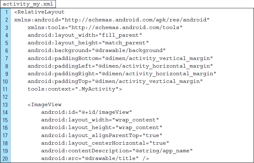
activity_my.xml is the layout file that this application uses. It will serve as the user interface file associated with MyActivity. As shown in Figure 2-43, the root element is a RelativeLayout containing two View objects: an ImageView and a HorizontalScrollView.
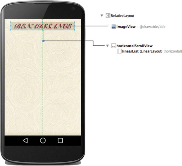
Line 6: |
The background of the root element is set to display the textured background graphic. |
Lines 7–10: |
Padding is added to provide a buffer to make the screen more readable, as well as to improve the look of the application. |
Line 13–20: |
The |
Line 19: |
Content description for the title image is provided. Note: Android Studio will display a warning to ensure that image The Nontextual widgets like |
Line 21: |
A |
Lines 29–34: |
A |
Line 33: |
The orientation of both the |

Part 5: Source Code for Application
Each of the paintings in the gallery has information that the user will see after tapping his or her finger on a specific painting. The data source for this information is the Java file RenaissanceDatabase.
Lines 5–11: |
The array named Name of the painting Artist Year |
Lines 13–20: |
The painting images, stored in the |


Each of the paintings in the gallery is a member of the Painting class. The data for this class specify the painting description and its unique drawable identification from the generated R.java file.

MyActivity.java is launched when the application launches. This java source file drives the application.
Lines 3–10: |
Notice that a |
Line 10: |
A |
Line 16: |
|
Lines 32–61: |
The |
Lines 36–41: |
Each of the paintings is constructed as an |
Line 51: |
The |
Line 59: |
The |
Line 62: |
The |

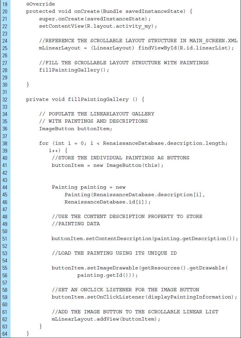
Lines 65–75: |
The anonymous inner class for a generic |
Lines 77–82: |
A |

■ EXERCISES
Name the six standard root layouts provided by Android. Briefly describe each of them.
Explain the main difference between a TableLayout and a GridLayout.
Name three alignment attributes used with RelativeLayout.
Draw the interface produced by the following layout XML code:

Explain the importance of the Android’s View class.
Describe the similarities between a TextView and an EditText. Describe the differences between the two.
Name three InputType values that can be used with an EditText.
Describe the input expectation and the soft keyboard configurations produced by the following XML code:

Name the built-in user interface widgets provided by Android. Briefly explain the use of each one.
What is the difference between a ToggleButton and a Switch?
What is the purpose of the R.java file? Briefly explain its construction.
What is the difference between a ViewGroup and a View?
Briefly explain the concept of Adaptive Design.
Explain how Adapters are used with ViewGroups.