
| 4 | Fragments, ActionBar, and Menus |
Chapter Objectives
In this chapter you will:
Explore how to build applications that use an ActionBar and Fragments.
Understand the Fragment lifecycle.
Learn to configure the ActionBar.
Implement Fragments with Responsive Design Techniques.
Explore animation in Fragment Transactions.
Experiment with Fragments, ListViews, and ArrayAdapters.
■ 4.1 Fragmentation and Android Fragments
Android devices come in many shapes and screen sizes, and they have different performance characteristics. Multiple versions of Android are concurrently being used and supported at any given time. Often, companies produce their own variants on the system’s user interface, which can change the look of default elements. It can be challenging, problematic, and time-consuming to develop an Android application that works optimally in this fragmented environment; however, fragmentation also has benefits for both users and developers. The availability of affordable Android devices makes them accessible to a large number of consumers. For developers, this translates into a wider audience and market for applications.
A well-designed app is partly characterized by its user interface, which must be as easy to navigate and use as possible. When designing and coding layouts, several factors should be considered, such as spacing, positioning, size, and the grouping of user interface controls. Layouts must be compatible to many physical screen sizes; as screen sizes vary, so do the positioning, spacing, and size of these control elements on the screen. The user interface layouts must resize correctly when run on different devices, and they must respond to changes, such as moving from portrait to landscape orientation.
The design concept behind Android’s Fragment class was conceived with the goal of promoting reuse of, and interaction between, the different elements that make up an application. Rather than simply using an Activity and a Layout to define the complete user interface of an application screen, it is often more efficient to use fragments. The user interface can be divided into logical sections, with these sections represented by fragments. A fragment can then be reused in more than one screen within the application.
A Fragment is modeled as a subdivision of an Activity. In other words, a Fragment is integrated into an Activity; therefore, it needs an Activity to run. Using Fragments in building applications helps the developer easily present a consistently well-designed user interface. Fragments are particularly helpful in adapting a user experience across a wide range of devices.
■ 4.2 The Fragment Lifecycle
Fragments are associated with an activity and can be created, added, or removed while the activity is running. For example, an application can use one fragment for receiving its own input events, thus allowing the user to input information, and use another fragment for rendering output.
Like an Activity, a Fragment has its own lifecycle, as well as its own user interface. The Fragment’s lifecycle is connected to the activity that owns it. Each fragment has its own callback methods in the standard Activity lifecycle.
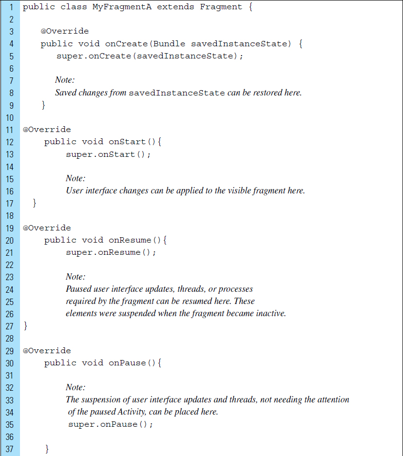
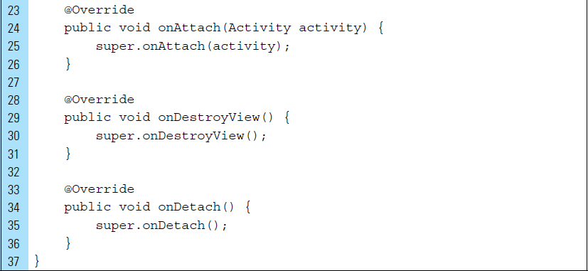
The following code listing illustrates a Fragment class that overrides several of its callback methods that are joined with an activity.
Lines 3–9: |
|
Lines 11–17: |
|
Lines 19–27: |
|
Lines 29–37: |
|
Lines 39–46: |
|
Lines 48–57: |
|
Lines 60–66: |
|
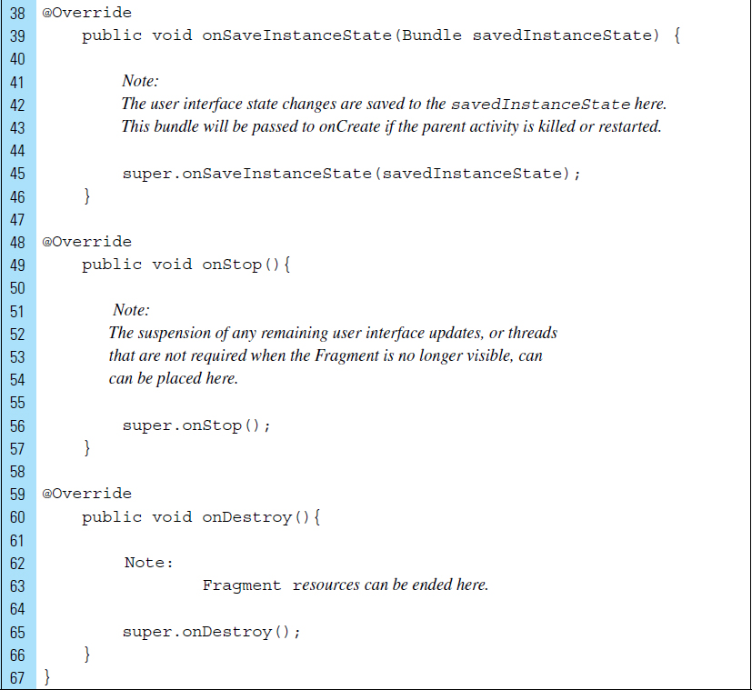
A fragment layout can be installed in an activity using setContentView(), as shown in the code segment that follows:
As previously illustrated, a Fragment has the same callback methods as an Activity; however, it also has its own set of callbacks. For example, when a fragment is no longer being used, it goes through a reverse series of callbacks, including onPause(), onStop(), and onDestroy(). Additionally, callbacks are made to onDestroyView() and onDetach() to carry out actions specific to Fragments.
The following list outlines the additional callbacks used in the lifecycle of a Fragment:
|
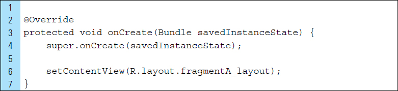
This is a core lifecycle method that is called to bring a fragment up to a resumed state, interacting with the user. This callback method creates and returns the view hierarchy associated with the fragment. |
|
Called every time the fragment is inflated. |
|
Called when the fragment’s activity has been created and this fragment’s view hierarchy is instantiated. Final initializations, such as restoring a state or retrieving a view, are often implemented here. |
|
Called after the fragment has been attached (associated) to an activity. |
|
Informs the fragment that its view is being destroyed so that it can clean up any associated resources. This is called after |
|
Called when the fragment is no longer attached to its activity, after |
The following code listing illustrates these callbacks in FragmentB:
■ 4.3 Action Bar
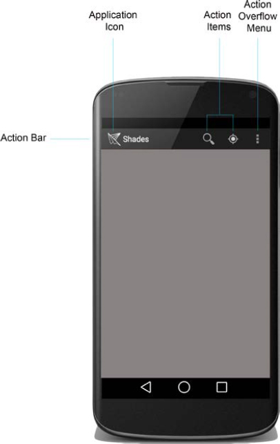
The action bar is a vital and flexible design element for an application. A rectangular window feature that appears at the top of the screen, the action bar provides information and displays control elements to the user.
In a basic configuration, the action bar displays the application icon and a title. The title often identifies the running activity. In this simple format, users have an indication of where they are and a consistent identity from which to recognize the application.
In a more complex configuration, the action bar can feature user action control elements, navigation modes, and drop-down menus. The purpose of the action bar, as in the one shown in Figure 4-1, is to improve user interaction and provide a higher quality experience. It supports easy navigation through action controls, featured as tabs and drop-down lists.
The action bar was first introduced in Android 3.0. Support for older versions can also be achieved but requires the use of the Android Support Library. The action bar is included by default in all activities for applications with a minimum SdkVersion of 11.
An action bar can be constructed with the following features:
Application Icon: |
|
|
The application icon can be used as a unique identification for an application. To the right of the icon is the View control, the title element that can specify the application name or the activity the user is currently using. |
Action Items: |
Action items are buttons for the most used action of the application. To provide quick and easy access, it is also typical to include action buttons for the important actions that require accessibility and prominence. If all of the specified action buttons cannot be displayed on the screen, those that do not fit will automatically be moved to the action overflow menu. |
Action Overflow: |
|
|
The action overflow menu is a drop-down menu list that is often used for actions performed less frequently. This is also the location of actions that do not fit on the main action bar. |
■ Lab Example 4-1: Fragments and the ActionBar: Menu Experiment
This lab features the Actionbar Experiment I application. It is a first look at the basics of fragments that also explores how an action bar is used so we can better understand its association with the user interface.
Part 1: The Design
Actionbar Experiment is an app that illustrates how fragments can use the ActionBar Android user interface component. This app combines four fragments into a single activity to build a multipane user interface. These fragments are basic, yet self-contained, components. Each fragment holds a photograph representing one meal in a given day: breakfast, snack, lunch, and dinner.
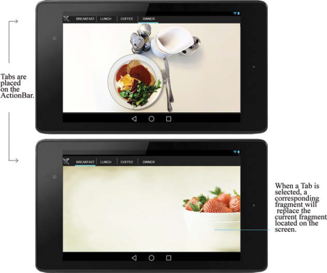
The action bar for this application displays a unique application icon. It also supports consistent navigation and view switching through the use of Tabs, as shown in Figure 4-2. The application is made up of four Tabs and four corresponding Fragments. When a Tab is selected, its corresponding Fragment replaces the fragment currently located on the screen.
Part 2: Application Structure and Setup
The settings for the application are as follows:
• Application Name: |
Actionbar Experiment |
• Project Name: |
ActionbarExperiment |
• Package Name: |
|
• Android Form: |
Phone and Tablet |
• Minimum SDK: |
API 18: Android 4.3 (Jelly Bean) |
• Target SDK: |
API 21: Android 5.0 (Lollipop) |
• Compile with: |
API 21: Android 5.0 (Lollipop) |
• Activity Name: |
|
• Layout Name: |
|
The application does not use the Android default ic_launcher.pg file. The launcher icon is the bitmap file provided in the textbook resources. This bitmap file stores the icon as a PNG and is added to the drawable folder, along with PNG files representing the meal photographs: breakfast, snack, lunch, and dinner.
The final project structure for the Actionbar Experiment application is shown in Figure 4-3. The project is driven by a single Actvity, MyActivity.java, and a set of Fragment subclass source files. The Fragment files are Breakfast Fragment.java, SnackFragment.java, LunchFragment.java, and DinnerFragment.java.
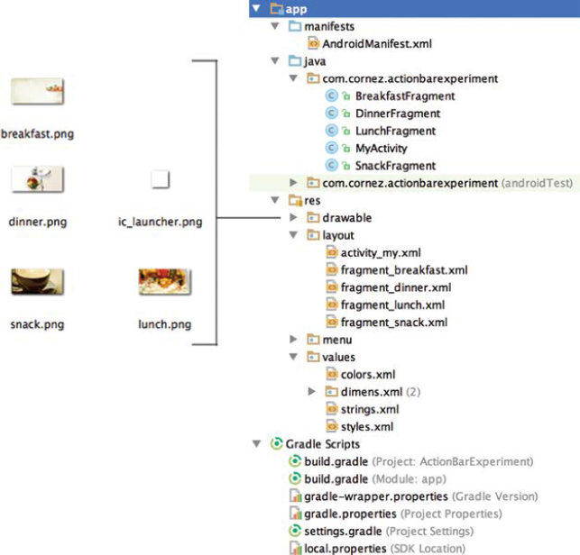
In addition to the activity layout, activity_my.xml, each of the four Fragment classes have their own associated layout files. Finally, a colors.xml file is used to store a backdrop color.
The orientation of the screen will be locked into landscape mode. It should be noted that when an application is viewed in landscape mode, the action bar might be configured differently from the normal portrait view. Android automatically rearranges visible icons located on the action bar depending on several factors, such as the amount of space available to accommodate the icon, action control icons, and so forth. In landscape mode, for example, an “add” option is often shown as an icon on the action bar rather than in the drop-down menu.
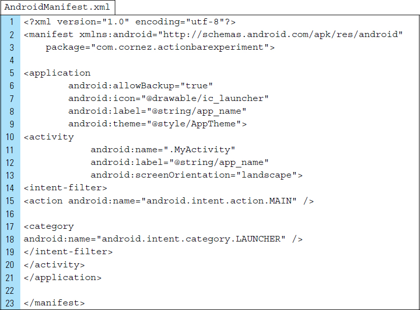
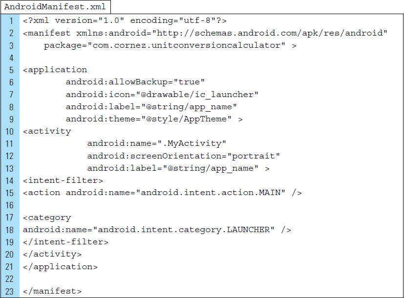
Unlike an Activity, a Fragment is never declared in the Android Manifest.xml file. The following is the code listing for AndroidManifest.xml used by the Actionbar Experiment I application:
Part 3: External Value Resources
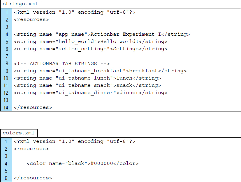
strings.xml and colors.xml are the two value resource files used by the Actionbar Experiment application. strings.xml has been edited to contain the action bar Tab strings. colors.xml is created to store the background color, black, to be used as a backdrop for the fragments as they enter and exit the screen.
The XML code listings for strings.xml and colors.xml are as follows:
Part 4: Creating the User Interface and a Fragment
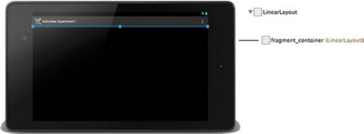
The user interface for the Actionbar Experiment application consists of five layouts. The layout associated with the running activity is always visible while the app is visible. This layout, activity_my.xml, uses a ViewGroup container, shown in Figure 4-4, to hold incoming and outgoing fragment layouts.
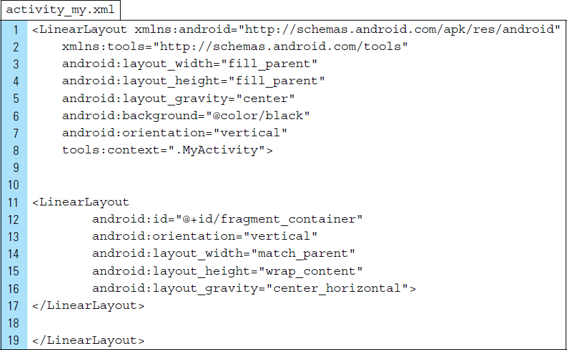
The code listing for activity_my.xml is as follows:
Line 6: |
A black backdrop is applied to the background of the root element, a |
Line 8: |
The class |
Lines 11–17: |
A |
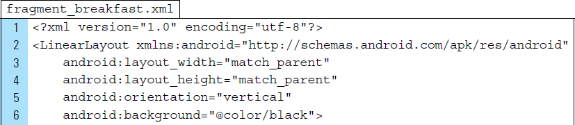
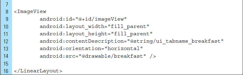
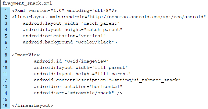
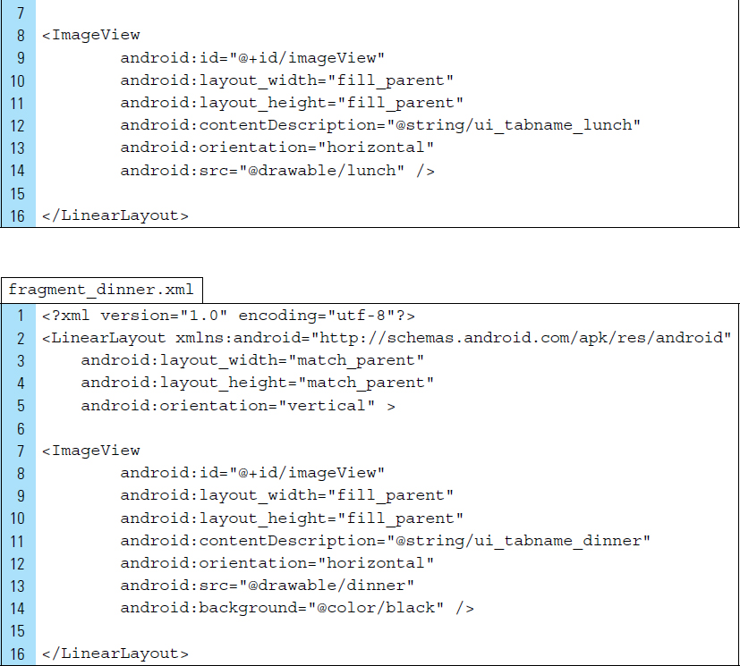
Each of the four Fragments used by the app has an associated layout that stores the photograph of a meal. The code listing for these XML files is shown below. Figure 4-5 illustrates the graphic visual design of the layout for fragment_snack.xml.
All four layouts will consistently feature the following properties:
Line 6: |
A black backdrop is applied to the background of the root element, a |
Lines 8–14: |
An ImageView is declared to store a drawable image. |

Part 5: Defining the Fragment Subclasses
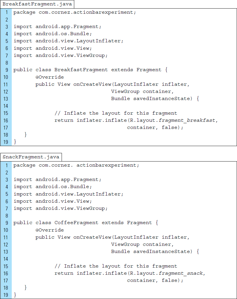
To create a fragment for use in an application, a subclass of Fragment must be created, if it does not already exist. A Fragment class uses code that looks very much like an Activity. It contains callback methods similar to an Activity, such as onCreate(). Oftentimes, you can convert an existing Android application to use Fragments by moving code from an activity’s callback methods into the respective callback methods of the Fragment.
The BreakfastFragment class is an extension of the Fragment class. It has its own lifecycle, yet it is tied to MyActivity.
Lines 11–13: |
The method |
Line 16: |
The |
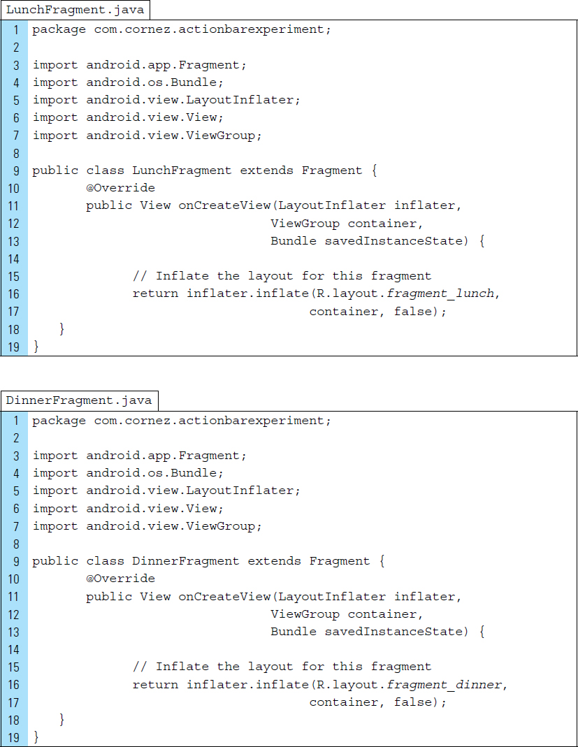
The code listing for the implementation of the four Fragment subclasses is as follows. Each is responsible for inflating its associated user interface layout.
Part 6: Source Code for the App Activity
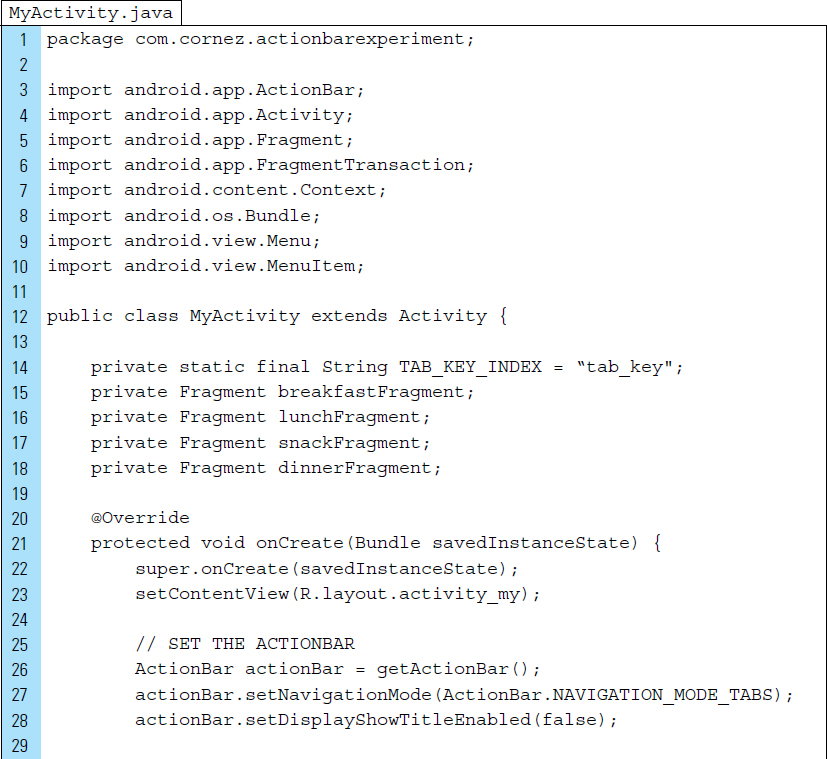
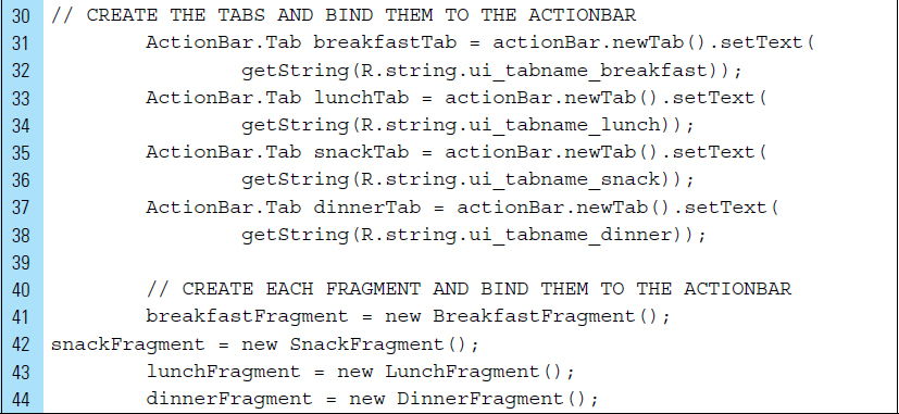
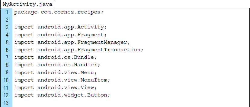
MyActivity is the sole Activity used by the Actionbar Experiment application. This Activity source file is responsible for displaying the app’s user interface that will hold Fragments as they enter and exit the screen.
Lines 3, 5–6: |
The imports for |
Lines 26–27: |
The actionBar object is instantiated. Its navigation mode is set to |
Line 28: |
The title element in the action bar can be disabled by setting the attribute |
Lines 31–38: |
Four Tabs are constructed using |
Lines 41–44: |
The Fragment objects used by the application ( |
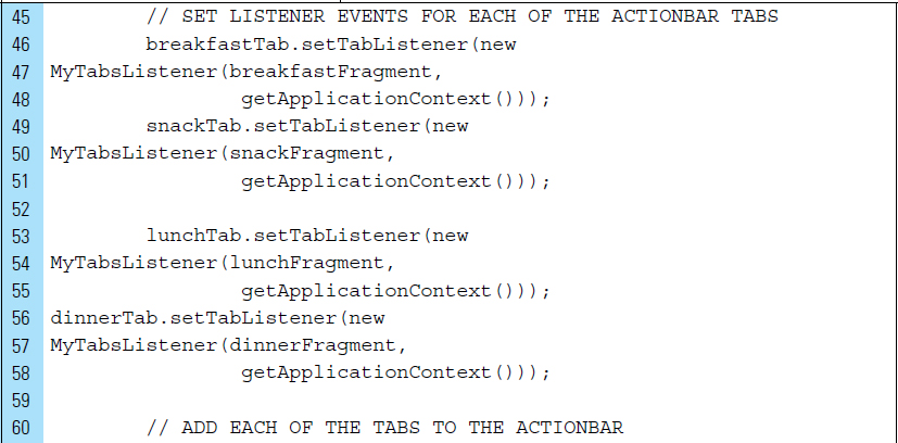
Within the ActionBar, Tabs can trigger an event only if an event listener has been applied.
Lines 46–58: |
A listener event is registered to each of the Tabs located on the ActionBar. Set the ActionBar.TabListener that will handle switching to and from a specific tab. The handler for the listener event is the anonymous class |
It should be noted that all tabs must have a TabListener set before being added to the ActionBar.
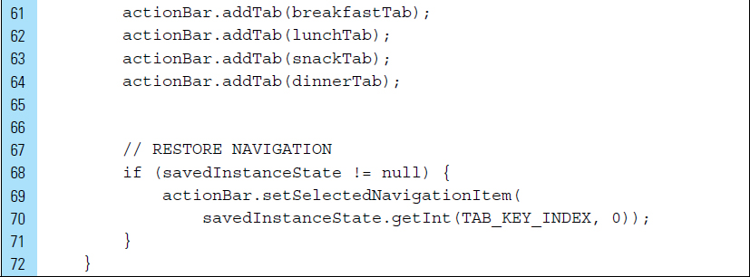
Lines 60–64: |
Tabs are added to the ActionBar. |
Lines 68–71: |
If application has not been launched for the first time, the state of the navigation is restored using a constant, TAB_KEY_INDEX. |
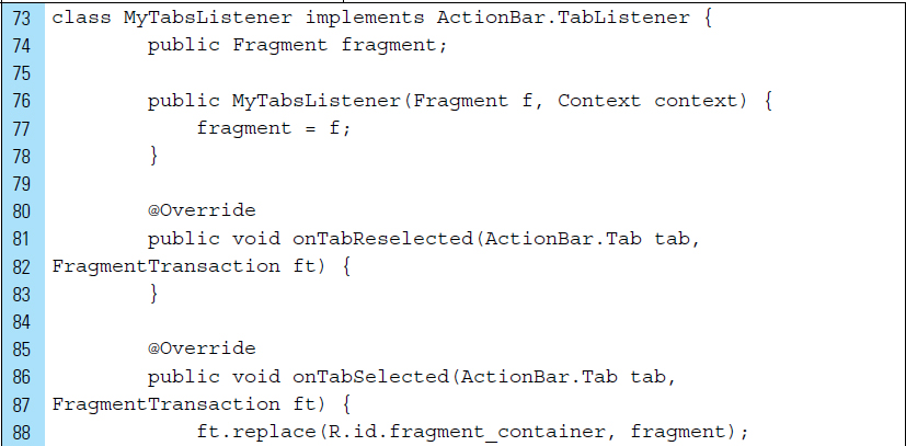
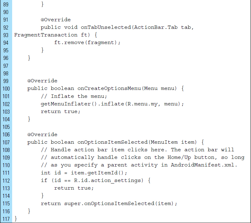
The handler for the Tab listener events is the class MyTabsListener. This class implements the ActionBar.TabListener interface. Its callbacks will be invoked when a tab is focused, unfocused, added, or removed from the ActionBar.
Lines 76–78: |
The constructor of this class assigns the Fragment whose layout will appear on the screen. |
Lines 80–83: |
Implementation for onTabReselected will not be used. |
Lines 85–89: |
When a Tab is selected from the ActionBar, its associated Fragment layout will replace the current layout located in the fragment_container within the activity layout. When a Tab is unselected, the |
■ 4.4 ActionBar Configurations
Control elements that appear directly on the action bar as an icon and/or text are known as action buttons.
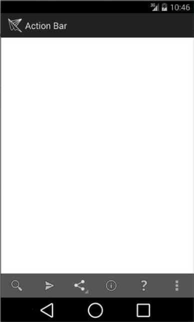
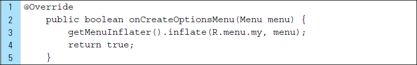
When an Activity starts, its associated layout is inflated on the screen and the action bar is populated with action buttons, such as the one shown in Figure 4-1. The activity’s onCreateOptionsMenu() method is responsible for inflating a menu hierarchy from a specified XML resource file.
In the following sample code segment, onCreateOptionsMenu() calls getMenuInflater().inflate (R.menu.my, menu) to inflate the menu and add the defined items from the menu to the action bar. The name of the resource file in this example is my.xml. By default, every Activity supports an options menu of actions or options.

The menu resource file, such as the example my.xml, is always located in the res/menu directory of the project. The action button item definitions are specified using the <item> tag. The following XML file produced the action bar shown in Figure 4-1.
Lines 1–38: |
Five button elements are defined using the <item> tag. |
Lines 5–10: |
The first action button is defined. |
Line 6: |
Each action button is given an identifier name, such as menuitem_search. |
Line 7: |
Many icon images are available through |
Line 8: |
Action buttons that cannot fit |
Line 9: |
|
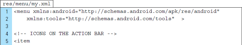
Several options are available when configuring the ActionBar. For example, if a menu item supplies both a title and an icon, as shown with the previous example, the action button always displays the icon by default. To display both the title and the icon, the withText value can be added to the showAsAction attribute.
The title of an action button should always be defined, even if it does not appear in the action bar. This provides flexibility in the application. For example, if the user performs a long-press on the button icon, a tool-tip containing the title will be revealed.
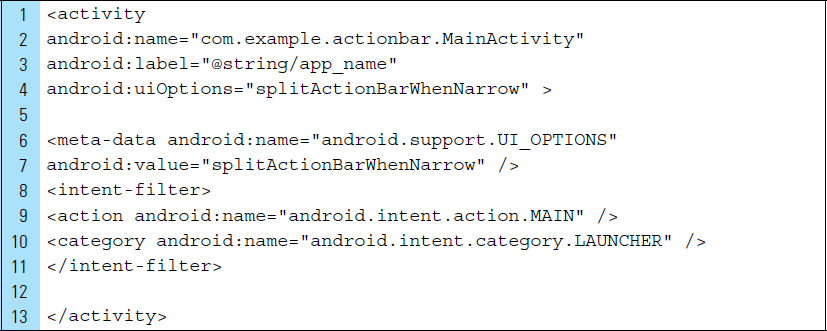
An action bar can be divided into two action bars: one on the top of the screen and the other on the bottom, as shown in Figure 4-6. This is helpful when more space is needed, such as when the action bar is found to be narrow. The top action bar contains the application icon and title. The bottom action bar has more room; thus, more of the action button will be visible to the user.
To split the action bar, the attribute android:uiOptions can be applied to the activity or the application in the AndroidManifest file. This option is supported in API level 14 and above. To add support for lower API levels, a metadata element must be applied. The following XML code segment is an example activity definition in an AndroidManifest.xml file:
Line 4: |
A |
Lines 6–7: |
UI options can be applied in a metadata element. Metadata is simply a name-value pair for an item of additional, arbitrary data that can be supplied to the parent component. A component element can contain any number of <metadata> subelements. |
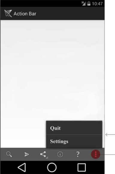
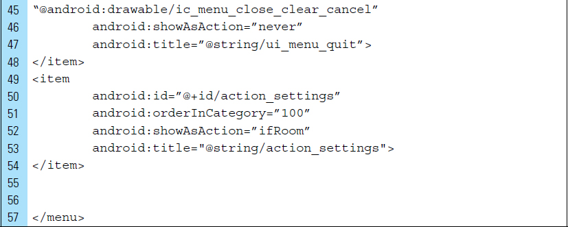
4.4.1 Overflow on the Action Bar
Narrow devices can often require the use of the overflow button. When creating layouts on devices with a narrow screen, it is best to use ifRoom to request that an item appear in the action bar. It is also a good design technique to allow the system to move elements into the overflow when there is not enough room. Figure 4-7 shows action buttons Quit and Settings placed in the overflow menu.
The code for the XML menu resource file that produced the action bars displayed in Figure 4-7 is as follows:
4.4.2 Adding an Action View
An action view is simply a widget that appears in the action bar as a substitute for an action button. An action view provides quick access to heavily used actions. By placing these actions directly on the action bar, they appear as a consistent tool the user can easily utilize across multiple activities and fragments. From a developer’s standpoint, the action bar can be designed once and used throughout the application screens.
Consider a collapsible search view widget. A search action view can be added as an embedded search view widget in the action bar.
To declare an action view, the actionLayout or actionViewClass attribute can be added to an item to specify either a layout resource or a widget class. The following segment of XML code adds a search view widget item to an action bar:
Line 3: |
|
Line 5: |
The |
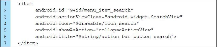
When a user executes a search request, the system starts your searchable activity and sends it to an activity action that performs the search.
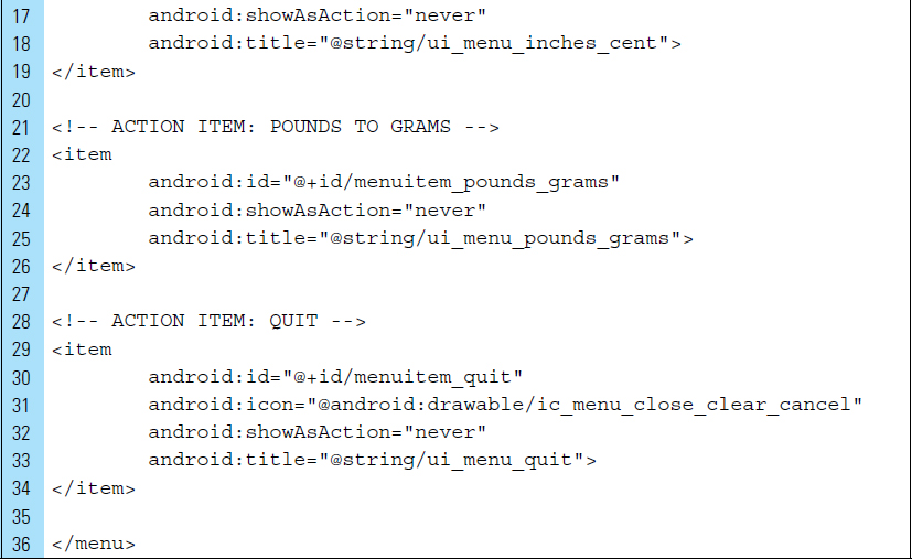
■ Lab Example 4-2: Unit Conversion Calculator App
The objective of this lab example is to illustrate the use of the overflow menu as an option for presenting action tasks to the user. Using the overflow menu as a tool for application task navigation provides the user with action items that are available at all times, regardless of which activity or fragment is active. In addition, the overflow menu is often the first place users tend to look to understand what is included on the app.
Part 1: The Design
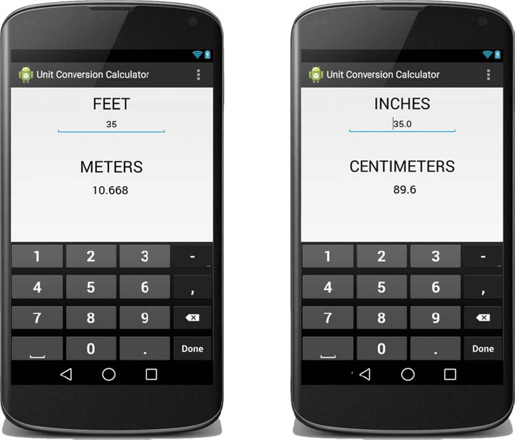
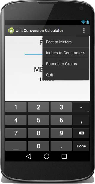
The Unit Conversion Calculator is a measurement converter, as illustrated in Figure 4-8. The user can use the conversion calculator to convert from one measure to another. To select the unit of measurement, the user chooses an option available from the overflow menu, as shown in Figure 4-9.
The application is designed to allow the user to input a unit value into a text field. The conversion to the target unit will automatically execute. Because the main purpose of the app is to explore the overflow menu, the number of conversions available is kept to a minimum. Conversions include feet to meters, inches to centimeters, and pounds to grams. The user is also provided an action item for quitting the app. The Quit action item is placed last on the overflow menu.
As an added design feature, the user can show and hide the action bar by performing a single tap on unoccupied territory on the screen. This flexibility can be helpful when the user determines more screen space is needed.
It should be mentioned that long or poorly organized menus are difficult for users to scan. Long menus, in particular, can be overwhelming and confusing to the user. When given a large set of action items, it is better to reorganize them into other menus.
Part 2: Application Structure and Setup
The settings for the Unit Conversion Calculator app are as follows:
• Application Name: |
Unit Conversion Calculator |
• Project Name: |
UnitConversionCalculator |
• Package Name: |
|
• Android Form: |
Phone and Tablet |
• Minimum SDK: |
API 18: Android 4.3 (Jelly Bean) |
• Target SDK: |
API 21: Android 5.0 (Lollipop) |
• Compile with: |
API 21: Android 5.0 (Lollipop) |
• Activity Name: |
|
• Layout Name: |
|
• |
|
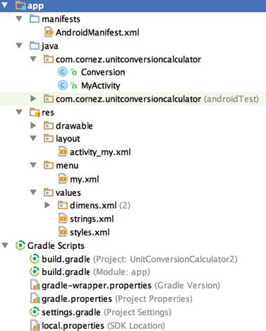
The launcher is set to the Android default ic_launcher.png file. No additional drawable files are needed for this app. The final project structure is shown in Figure 4-10. The source file conversion.java is the only new file added to the project.
The application requires a single Activity class, MyActivity.java. Fragments are not used in this app. Changes are made to the auto-generated files MyActivity. java, activity_my.xml, my.xml, strings.xml, and AndroidManifest.xml.
The orientation of the screen for the application will be locked into portrait mode, which will be set within the activity. The complete attribute settings for the Android-Manifest are shown in the XML code listing as follows:
Part 3: Strings Value Resources
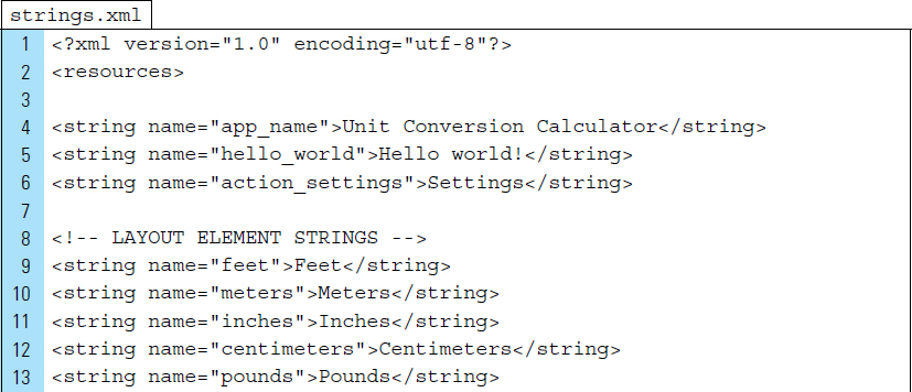
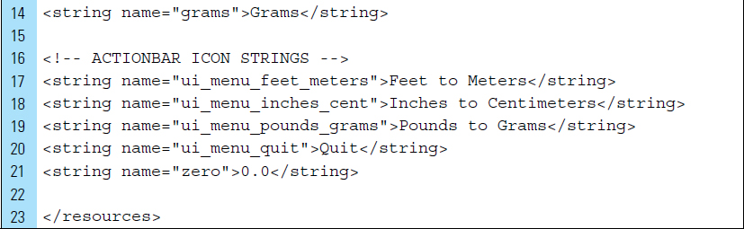
strings.xml is the only value resource, aside from the menu resource, required by the application. The new string elements are divided into two categories. The first category defines strings used by the application’s layout file. The second category of strings represents the action bar overflow menu strings.
The complete strings.xml code is listed as follows:
Part 4: The Action Bar and Menu Design
The action bar is configured to feature a limited number of elements: application icon, title, and the overflow menu. Action buttons are not used in this application. The overflow menu holds all the action elements (i.e., controls) for the application.
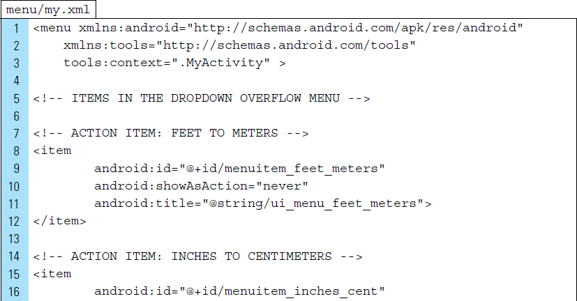
The code listing for the XML file, menu/my.xml, is shown below:
Line 3: |
The context for the menu is an |
Lines 5–34: |
Four action elements are defined as individual items using the <item> tag. |
Line 9: |
Each action item requires a resource ID. |
Line 10: |
To force an action item onto the overflow menu, the value is never applied to the |
Line 11: |
The action title, as it appears on the overflow menu, is set using the appropriate |
Part 5: The Layout User Interface
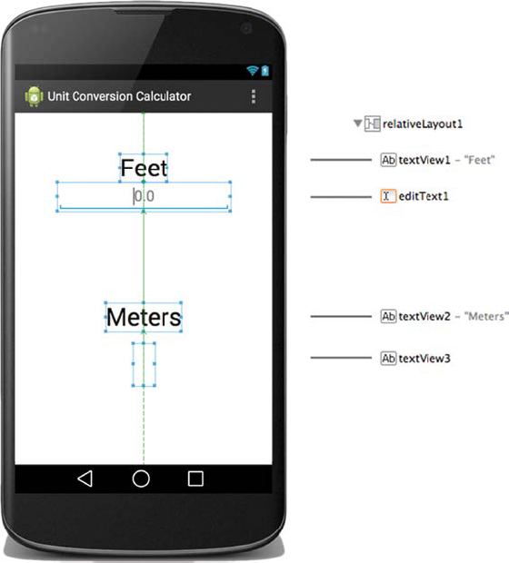
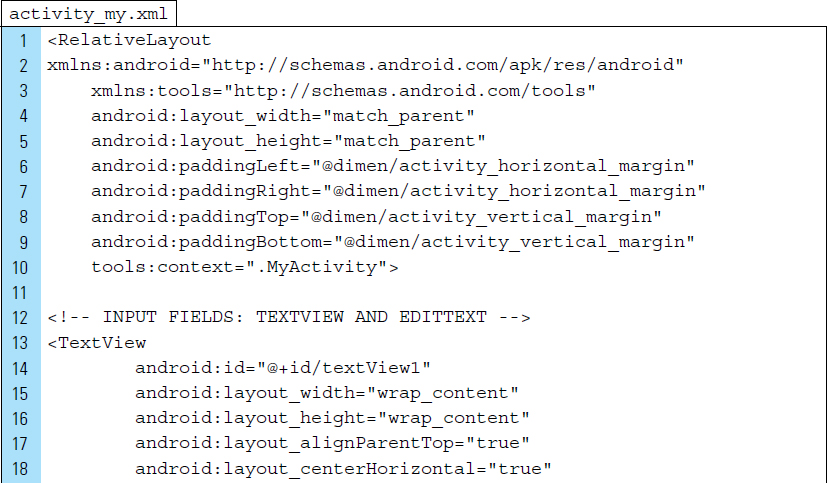
A single layout, activity_my.xml, is used to support the entire user interface for the Unit Conversion Calculator application. This layout is bound to the activity MyActivity.java. Control elements for this layout are simple and arranged in a linear manner; however, the spacing between the elements requires a relative arrangement. As shown in the graphic layout design in Figure 4-11, the root element for the layout is a RelativeLayout, with an EditText providing the numeric input.
The XML code listing for activity_my.xml is shown below:
Lines 23–35: |
The |
Line 31: |
The alignment of the user’s input into the text field will be centered along a horizontal axis. |
Line 32: |
A zero value hint text is displayed when the input text field is empty. |
Line 33: |
The type of data entered into the text field is restricted to a numeric value. |
Lines 50–57: |
The output text field, used to display the converted measurement, is given the identifier name |
Part 6: The Source Code
The two source files used by the application are MyActivity, which provides the controller mechanism, and the Conversion class, which is used to implement the data required by the conversions.
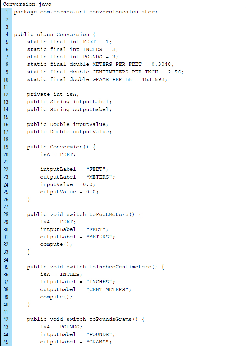
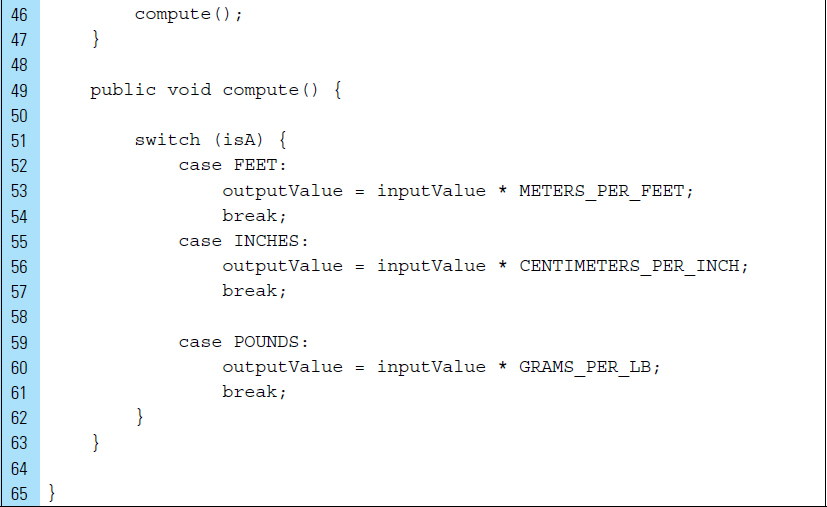
The Conversion class defines the data for a measurement object to be converted. This class also implements the logic for the computation of the conversion. The data members of the class are used to describe the units of the conversion, the value to be converted, and result of the conversion. The code listing for Conversion is as follows:
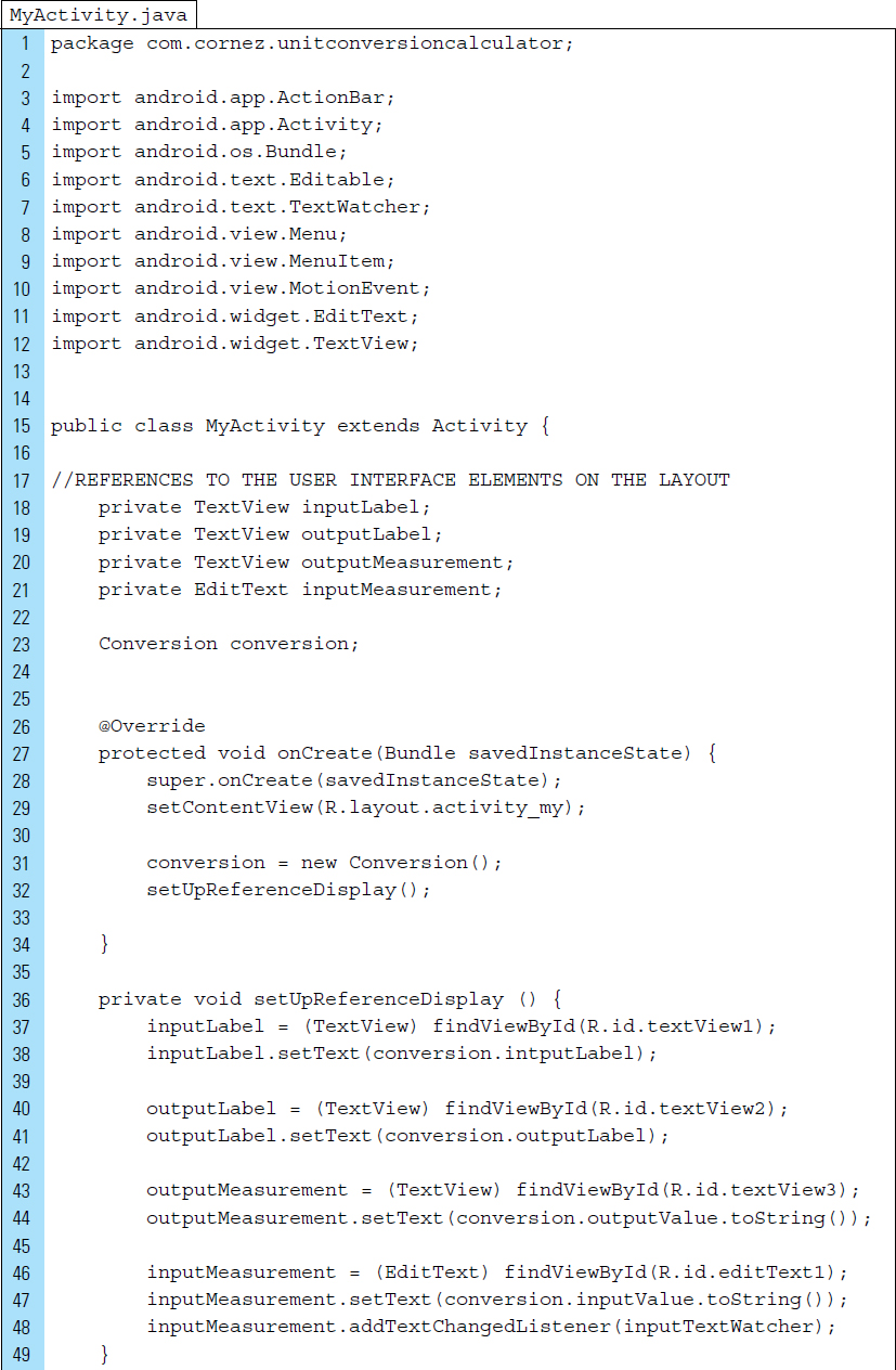
MyActivity will launch once the application has been activated. AndroidManifest specifies this activity as the main activity of the application. The Java code listing for MyActivity.java is shown below:
Lines 18–21: |
All layout control elements need to be referenced because they are dynamic and will change, depending on the type of measurement conversion the user wants to apply to the input. The variables objects on Lines 18–21 include the unit measurement labels and the input and output measurement values. |
Line 31: |
A |
Line 32: |
The call to the method |
Line 48: |
|
Lines 51–71: |
|
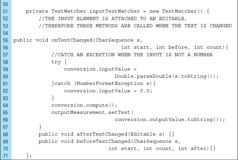
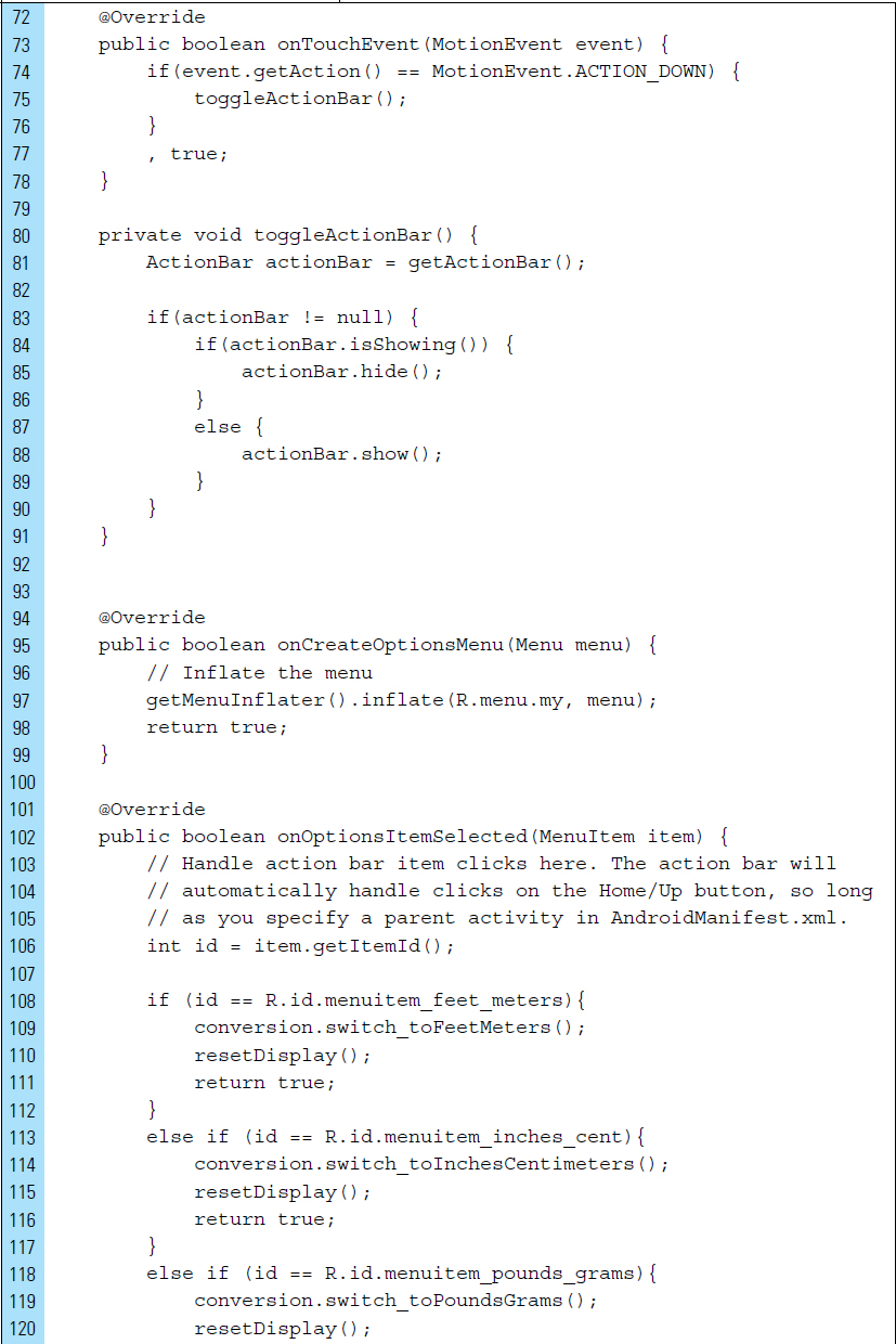
Lines 72–78: |
The |
Lines 80–91: |
The method |
Lines 95–99: |
The menu hierarchy, specified by |
Lines 101–130: |
|
Lines 132–137: |
|
■ 4.5 Responsive Design with Fragments
Responsive design techniques have been applied to web design to build websites that are able to work across different screen sizes. Responsive design techniques should also be applied to Android appplications for solving interactive design and layout problems within a responsive framework, such as the optimal arrangement of data elements in a fragmented environment.
In some ways, responsive design is similar to adaptive design, which was introduced in Chapter 2. At times, these two design techniques can overlap; however, responsive design and adaptive design have significant differences. To simplify, responsive design is used for heavy data-driven content. It uses screen grouping techniques and complex navigation to present data content in a more intuitive and device-sensitive way. Adaptive design is primarily used for the rearrangement of fixed user interface elements in an application. For example, adaptive design methods would not be ideal for solving problems related to the arrangement of data control elements for a database-driven application.
On an Android mobile device, responsive design revolves around a master/detail flow interface design pattern. In this design pattern, the user is provided with a list of items, which is referred to as the master list. Upon selecting one of the items, additional information relating to that item is then presented to the user within an area of the screen called a details panel. For example, consider an email application. One panel of the screen, the master list panel, displays a list of the inbox messages consisting of the address of the sender and the subject of the message. Upon selecting one of the email items from the list, the body of the email message appears in another panel of the screen, the detail panel.
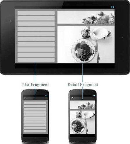
This design concept is responsive in the sense that list and detail panels of the app can change based on the width of the device. On a large tablet-sized Android device, the screen is large enough to display both panels. The master list can appear as a narrow vertical panel along the left-hand edge of the screen, while the remainder of the screen can display the detail panel. This arrangement is referred to as a two-pane mode.
Small Android devices do not have a screen size large enough to combine lists and details together effectively on a screen. A solution for smaller Android devices is to display the master list within its own individual screen. The detail panel will also be displayed on a separate screen, which will appear when a selection is made from the master list. The detail screen must feature an action icon that allows the user to return to the master list.
In Android, responsive design makes use of Fragments. A user interface can be divided into multiple panes using Fragments and reused in more than one screen of an application, as shown in Figure 4-12. Fragments can be combined or separated on a device. Although a single screen is implemented as an Activity subclass, the individual content panes are implemented as Fragment subclasses.
When building an application that follows a similar master/detail design pattern, the application often needs a set of Java and XML layout resource files. As an example, consider a general application with a list of items and the details for a selected item to be displayed when the user selects the item from the list. Figure 4-13 shows the layout structure for such an application.
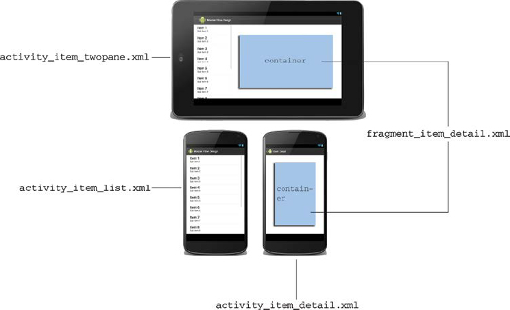
activity_item_twopane.xml is the layout that contains both the list of items and a container to display details. The container is used to hold a fragment. This layout is used when the application is running on a device large enough to support the two-pane mode.
The XML resource file named activity_item_list.xml is populated with the list of items, and is always used on devices that are too small to support the two-pane mode.
The activity_item_detail.xml layout resource file occupies its own screen, which means it is associated with another activity. This layout is inflated from the activity ItemActivityDetail.java, and it is used on small screens. The layout uses a container to place a fragment. The fragment_item_detail.xml is the user interface for the detail pane.
Two separate activities are required to represent the item list activity (ItemListActivity.java) and the item detail activity (Item_Detail Activity.java).
ItemListActivity.java has a different presentation depending on the size of the device. On a large device, the activity presents the list of items and the item details side-by-side using two panes. The activity can do this by using a fragment. The ItemListFragment class can represent the list of items, and the Item DetailFragment class can represent the item details (if present). These classes must be created. On a small device, the activity can solely present the list of items. A selected item leads to an ItemDetailActivity representing item details.
Item_DetailActivity.java is a necessary activity that serves as a “shell” that is used to present an item detail fragment; it appears only when a small device is being used.
This sample application uses two Fragment source files: an item list fragment (ItemListFragment.java) and an item detail fragment (ItemDetailFragment.java).
ItemListFragment.java will be the list fragment class that represents a list of Items. ItemDetailFragment.java will be the fragment class representing a single-item detail on the screen.
If the display is large enough to support the two-pane mode, an instance of the item_list fragment from the activity_item_twopane.xml layout is created and displayed. If the display cannot accommodate both panes, the instance contained in the activity_item_list.xml file is used.
This lab example explores using responsive design, with the use of Fragments, to create a responsive user interface that can be adapted from a two-pane to a single-pane configuration, based on a change in screen orientation.
Part 1: The Design
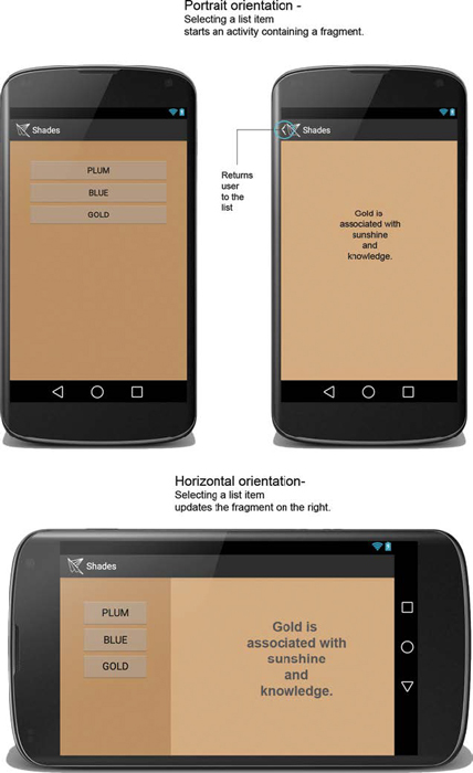
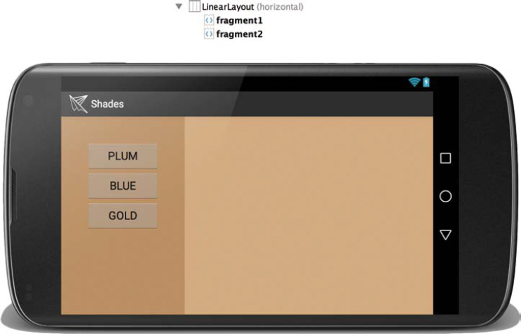
When launched, the Shades application provides the user with a fixed list of color shades: plum, blue, and gold. When a shade is selected, information about that shade is displayed. The user interface is designed to respond to changes in screen orientation. When the user is viewing the application in landscape mode, a two-pane configuration is used, displaying the list of shades in a left-hand pane and information about an individual shade in a right-hand pane. As the user rotates the device into portrait orientation, a single-pane configuration is used. One activity is used to display the list of shades. Once a shade is selected, a new activity appears on the screen with information about the shade. The two-pane and one-pane configurations for the Shades application are shown in Figure 4-14.
Fragments used with this master-detail pattern design provide the responsive framework for the application. In the default landscape mode, the main Activity contains two Fragments: a list Fragment and an information Fragment. When in portrait mode, the Activity contains only the list Fragment.
Selecting a shade from the master list either updates the information Fragment or launches a new activity, the information Fragment Activity.
Part 2: Application Structure and Setup
The settings for the application are as follows:
• Application Name: |
Shades |
• Project Name: |
Shades |
• Package Name: |
|
• Android Form: |
Phone and Tablet |
• Minimum SDK: |
API 18: Android 4.3 (Jelly Bean) |
• Target SDK: |
API 21: Android 5.0 (Lollipop) |
• Compile with: |
API 21: Android 5.0 (Lollipop) |
• Activity Name: |
|
• Layout Name: |
|
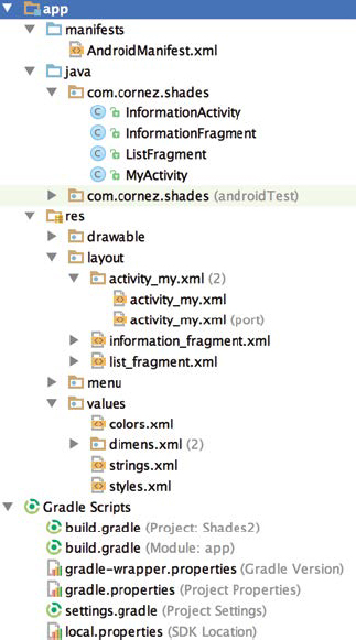
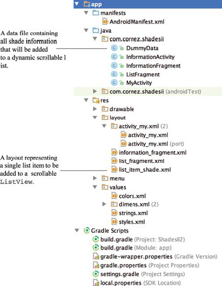
The launch icon for the application is a PNG file added to the drawable folder. This bitmap file, also named ic_launcher.png, is provided in the textbook resource material. The application’s final project structure is shown in Figure 4-1. The Java source files include two Activity classes and two Fragment classes. MyActivity is the main activity of the project. MyActivity uses activity_my.xml as its associated layout file.
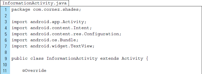
InformationActivity.java is the Activity class that will be activated when the user is in portrait mode and has selected a shade. If the user remains in landscape mode during the entire application, InformationActivity will never launch.
As shown in the res/layout directory in Figure 4-15, the Shades app relies on three XML layout files: an activity layout and two fragment layouts. The activity layout, activity_my.xml, is the screen interface for the main activity of the application. Two versions of activity_my.xml are shown. The first version, designed for a landscape orientation, is located in the default res/layout folder and uses a two-pane layout. The second version of activity_my.xml, designed for a portrait screen orientation, is located in res/layout-port and uses a one-pane layout.
The two XML fragment layout files are list_fragment_xml and infor mation_fragment.xml. Both files are used to structure the fragments of data, representing the shade list and the individual information, which will be inserted into the pane containers.
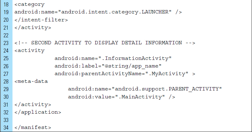
AndroidManifest.xml must declare both activities used by the Shades application, as shown below:
Lines 11–21: |
|
Line 24–31: |
The secondary activity, |

Part 3: External Value Resources
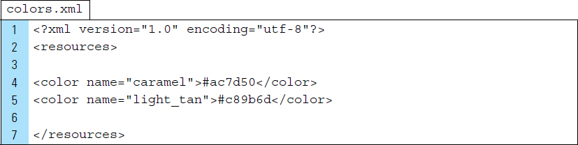
Color has been added to the Shades application to provide a visual demarcation for the two-pane configurations; this is primarily a visual cue. The pane used for the master list uses a caramel background color. The pane used for the information data uses a light-tan background color. The color definitions are placed in a newly added XML file colors.xml, which is located in res/values.
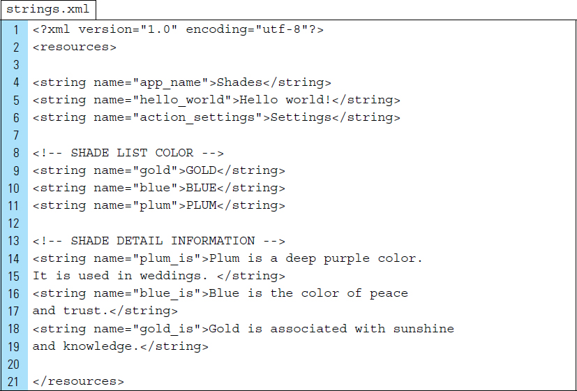
The master list elements and the information about individual shades of color will be stored in strings.xml file. It should be noted that Shades is a simple application used to simplify and demonstrate how fragments can be used with a master/detail design pattern. Outside an example such as this, it is not practical to employ strings.xml as a data repository. More practical solutions will be explored later in the chapter, as well as in subsequent chapters.
The XML code listing for strings.xml is as follows:
Part 4: Individual Fragment Layouts
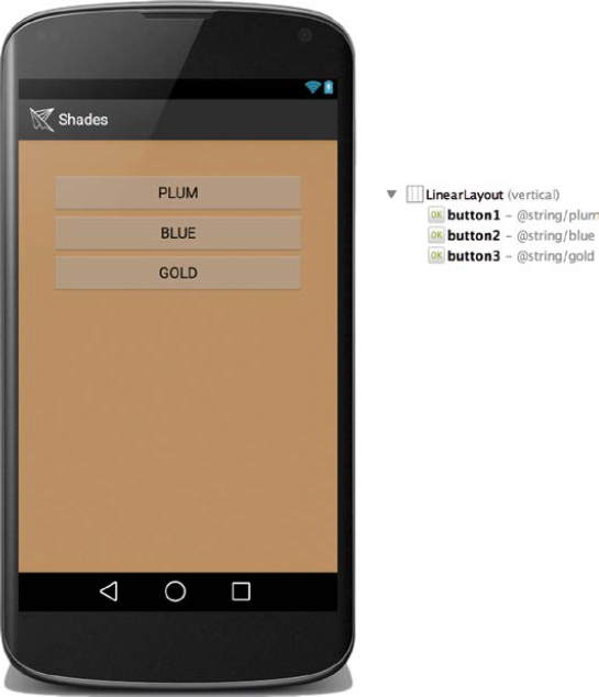
As a component of an application’s user interface, Fragments are designed with corresponding layouts. In this application, the master list fragment layout is defined by list_fragment.xml. The master list for this demonstration app is limited to three shades of color. Each shade is placed, as a button control, directly on the list_fragment.xml layout file, as shown in its visual representation in Figure 4-16. The layout’s root container is set to a LinearLayout.
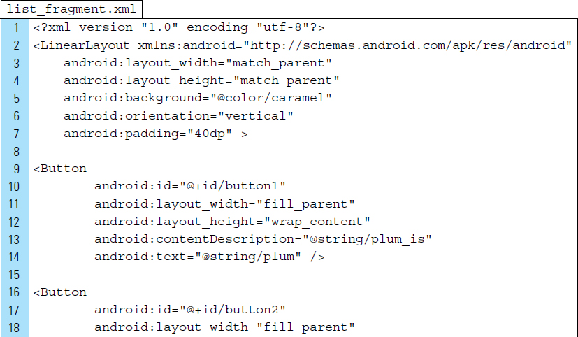
The code listing for list_fragment.xml appears below:
Line 5: |
The background color, for this master list, is set to caramel. |
Lines 11–12: |
The width of each button will be uniform. The value |
Line 13: |
The Activity uses the |
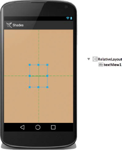
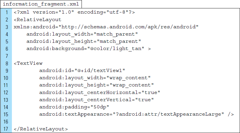
The detail, or information, fragment layout is defined by the XML file information_fragment.xml. Information about a selected shade is a text element. This text element is placed in a TextView, as shown in the visual representation of the layout in Figure 4-17.
The XML code listing for information is shown below:
Line 2: |
A RelativeLayout ViewGroup is used as the root element of the layout file. This allows the text element to be placed freely on the screen. |
Lines 12–13: |
The text element is set to appear in the center of the pane. |
Part 5: The Main User Interface to Hold the Fragments
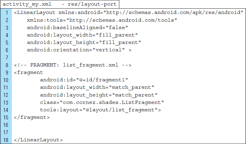
activity_my.xml provides two possible configurations. The Android operating system will choose the appropriate resources based on the current device characteristics. For this application experiment, the two layout configurations are placed in separate folders: res/layout and res/layout-port. The same name, activity_my.xml, is used in both locations.
It should be noted that using multiple layout folders works well for a simple application such as this one. For an application that is more complex, relying on a variety of folders to store versions of the same layout can be hard to maintain. For advanced applications, references can be used to refer to a specific item in Android from a particular resource folder. In addition, you can quickly calculate the suitability of a screen size, and you can apply pane configurations accordingly.
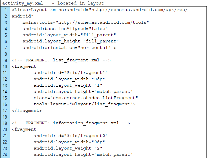
To keep the layout simple, the root element of the default main activity in a landscape orientation is a LinearLayout, as shown in Figure 4-18.
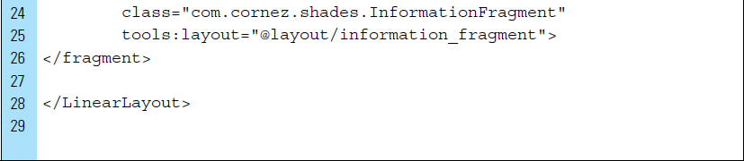
The XML code for activity_my.xml is listed below:
Line 4: |
The orientation attribute of the LinearLayout is set to horizontal, which allows the Fragment elements to be placed side by side. |
Lines 9–16: |
The master list fragment is defined. The class associated with this |
Lines 18–26: |
The information fragment is defined. The class associated with this |
A second version of activity_my.xml will be created and placed in a new resource folder named layout-port. The Android system will select this second version of the layout when the current device is in a portrait orientation. The visual design for this version of the main activity layout is shown in Figure 4-19. It contains a LinearLayout with a single element, a Fragment container, and it is given the identifier name fragment1.
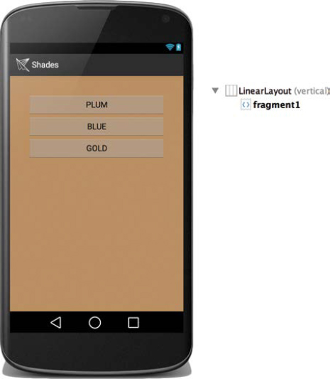
 FIGURE 4-19 The main layout designed for portrait orientation. Fragment1 is shown holding the color list.
This portrait version of activity_my.xml is used to define the single pane information Activity. This layout is a placeholder for the ListFragment class. The XML code for this file appears as follows:
Part 6: Coding the Application
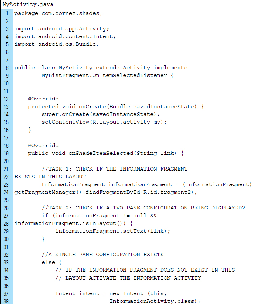
Two Activities are used by this application: MyActivity and Information Activity. MyActivity is the main activity of the application and will always remain running while the application is in landscape mode. This activity displays fragments side by side with the master list on the left and the information detail on the right. When the system determines a single pane configuration, MyActivity is responsible for launching a second activity, InformationActivity, to display the information detail when required. The Java code for MyActivity.java is listed below:
Lines 18–26: |
The information fragment is defined. The class associated with this |
Lines 19–42: |
The |
Lines 23–30: |
|
Lines 33–41: |
If a single-pane configuration is on display in the window, an |
The ListFragment is the Fragment class that provides the structure for the master list containing clickable buttons. ListFragment serves as a component to the MyActivity class.
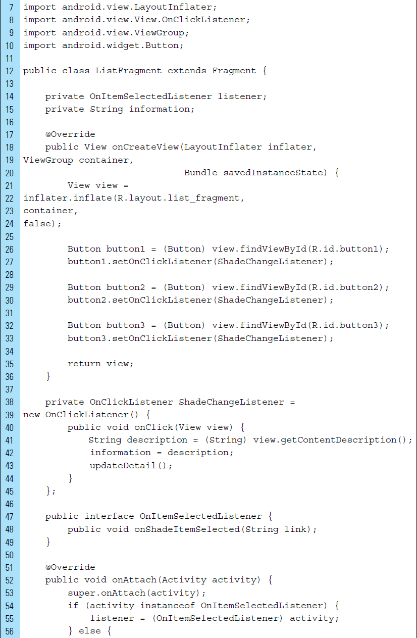
The code listing for ListFragment.java appears as follows:
Line 12: |
A listener object, used for signaling and identifying which shade on the master list has been selected, is declared. |
Line 13: |
When a shade from the master list is selected, the string |
Lines 21–24: |
|
Lines 26–33: |
Each shade item on the master list is referenced by a button view. |
Lines 38–45: |
The onClick event handler |
Lines 47–49: |
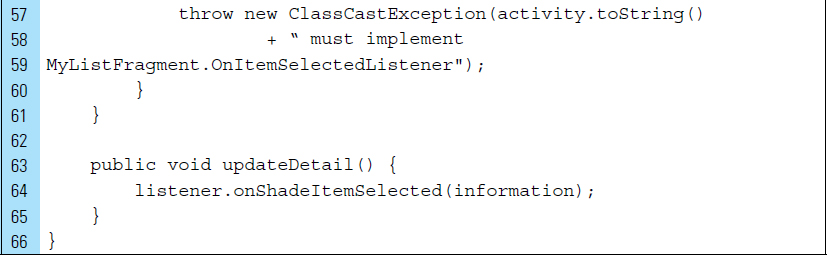
The public interface can support the passing of information to the controlling activity of a fragment. Often, communication between the fragment and its activity is managed through a public interface defined in the fragment. The public interface |
Lines 52–61: |
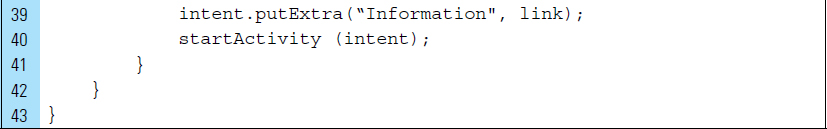
|
Lines 62–64: |
|
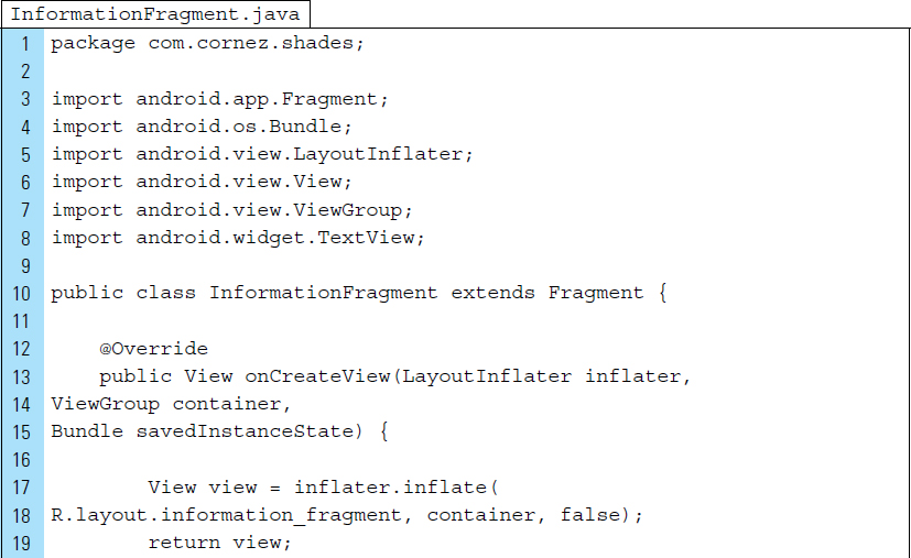
The InformationFragment class requires information about the selected shade item, which is then loaded into a TextView located on the associated layout. The Java code is listed below:
Lines 12–22: |
|
Lines 17–18: |
The layout associated with the fragment, |
Line 19: |
The view, specfically |
Lines 23–27: |
The public method |
Part 7: Defining the Single-Pane Detail Activity
InformationActivity.java is the single-pane Activity that shows the detail information about a specific shade.
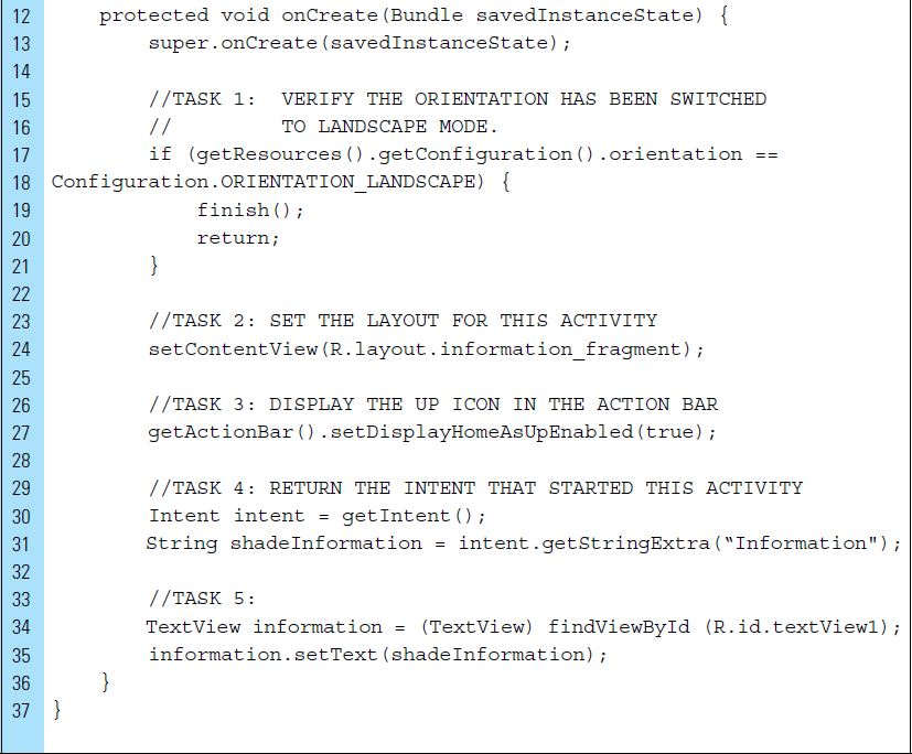
Lines 15–21: |
If the orientation of the screen has returned to landscape mode, this single-pane Activity is no longer needed because the two-pane model does not fit comfortably on the screen. |
Line 27: |
|
Line 29: |
The |
Lines 34–35: |
A reference is made to the TextView located on the Fragment layout |
■ 4.6 Animation in Fragment Transactions
Transition animations can be applied directly to fragments that are entering and exiting a transaction.
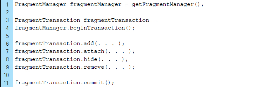
To manage fragments, the FragmentManager provides the structure that handles transactions between fragments. A transaction refers to the sequence of steps that add, replace, or remove fragments.
Operations performed by the FragmentManager occur inside a transaction. For example, the following code segment illustrates a Fragment transaction:
Line 1: |
|
Lines 3–4: |
|
Lines 6–9: |
A series of edit operations is performed on the fragment associated with the Common edit operations that can occur in a transaction are: |
Line 10: |
|
Fragment transactions support transition animations. Two versions of the setCustomAnimations() method, from the FragmentTransaction class, are used to set the animation resources to be applied to fragments that are entering and exiting a given transaction.
The method setCustomAnimations(int enter, int exit) is used to play an animation for enter and exit operations. These animations, however, will not be played when popping the back stack.
popEnter and popExit animations can be played for enter and exit operations specifically when popping the back stack. The setCustom Animations (int enter, int exit, int popEnter, int popExit) method is used for this purpose.
■ Lab Example 4-4: Recipes–Fragments with Transition Animations
The objective of this lab example is to work with fragments in an application and to apply transition animations. This lab will explore the FragmentTransaction class, basic animation effects, and the Android interpolator.
Part 1: The App Design
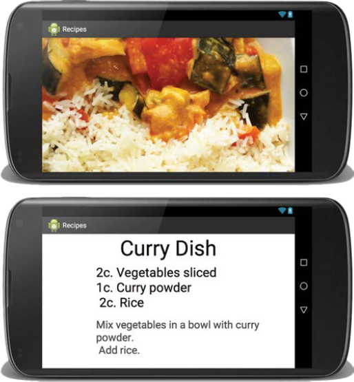
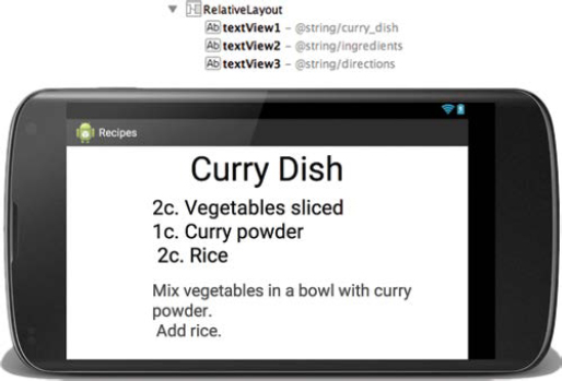
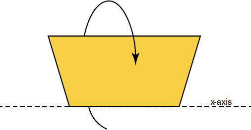
The Recipes App was constructed for the purpose of demonstrating fragment transition animations; hence, it is very simple. The behavior of this application is similar to a flip card, with a swiveling rotation animation. The application is displayed in Figure 4-20. Upon first launching Recipe App, the user is presented with a photograph of a cooked dish. In the lower left corner is a button for flipping the photograph over to view the recipe directions. The photograph and the recipe directions are both Fragments that enter and exit within a transaction.
Part 2: Application Structure and Setup
The settings for the application are as follows:
• Application Name: |
Recipes |
• Project Name: |
Recipes |
• Android Form: |
Phone and Tablet |
• Minimum SDK: |
API 18: Android 4.3 (Jelly Bean) |
• Target SDK: |
API 21: Android 5.0 (Lollipop) |
• Compile with: |
API 21: Android 5.0 (Lollipop) |
• Activity Name: |
|
• Layout Name: |
|
The application icon launcher is set to the Android default ic_launcher.png file, and a photograph of a cooked dish has been added to the drawable folder. The final application structure is shown in Figure 4-21. Two Java Fragment classes–one for the recipe photos and another for the recipe directions–,and a main Activity are the source files required by the application. The Activity and the Fragments each have an associated XML layout file.
An animation folder, res/anim, has been added to store the enter/exit animation definitions for “rotating” Fragments in and out of a transaction.
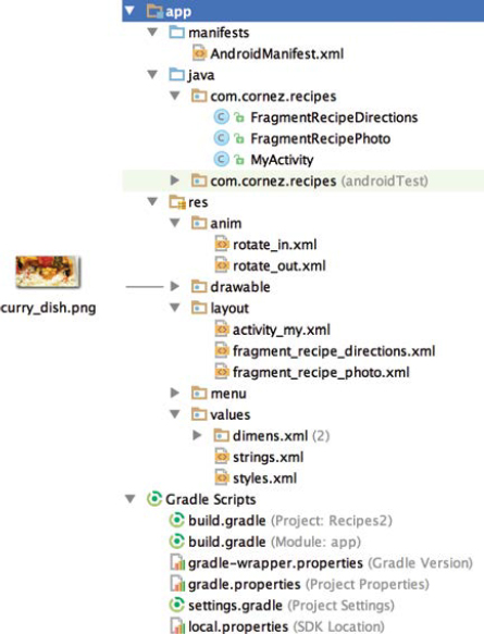
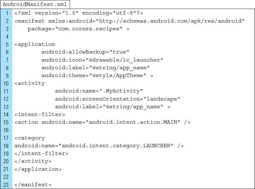
The AndroidManifest file for Recipes specifies a landscape orientation for the main activity and sets the main activity to the Java class MyActivity. The XML code for this file is listed as follows:
Part 3: Value Resources
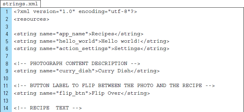
strings.xml is the only required value resource file used by the Recipes app. As a demonstration application, this project stores its recipe data in the strings.xml file. To evolve this app into a more practical application, a database would be the optimal choice for the data source. The XML code for strings.xml is listed as follows:
Part 4: Designing Individual Fragments
The two Fragments for this application represent the front and back of a recipe flip card. The front of the card displays the photo of the cooked dish, and the back contains the directions of the recipe.
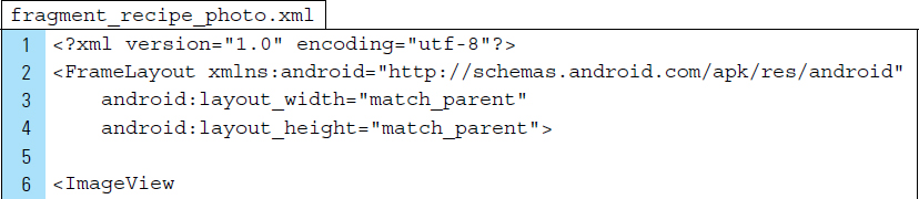
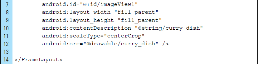
The layout for the photo fragment, fragment_recipe_photo, consists of an ImageView placed inside the root element, a FrameLayout. The visual layout structure is shown in Figure 4-22.

The XML code for fragment_recipe_photo.xml is listed as follows:
Line 11: |
The value |
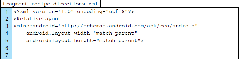
The visual design structure for fragment_recipe_directions.xml is shown in Figure 4-23.
The XML code for fragment_recipe_directions.xml is listed as follows:

Part 4: User Interface and Fragment Design
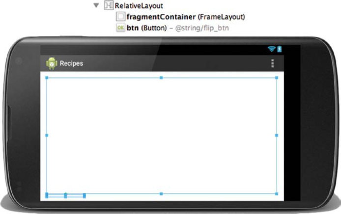
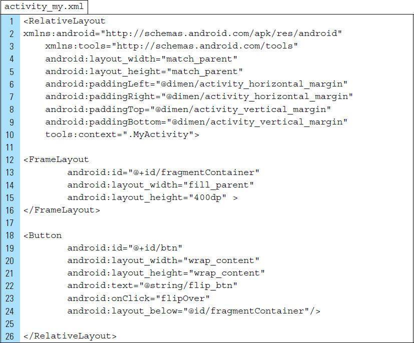
The application’s user interface is designed to hold fragments. The main layout of the application, activity_my.xml, corresponds to the application’s activity. The visual structure for this layout is shown in Figure 4-24. The layout consists of a FrameLayout placed inside the root element, a RelativeLayout. The FrameLayout serves as a Fragment container, which allows a set of fragments to be moved in and out of the user’s view on the screen. A Button control element is placed below the Fragment container and will be used to flip the recipe over.
The XML code for activity_my.xml is listed as follows:
Part 5: The Transition Animations
Fragments are transitioned into the container located on activity_my.xml with the help of the Android interpolator. An interpolator defines the rate of change of an animation. This allows the basic animation effects–such as alpha, scale, translate, and rotate–to be accelerated, decelerated, repeated, and so on.
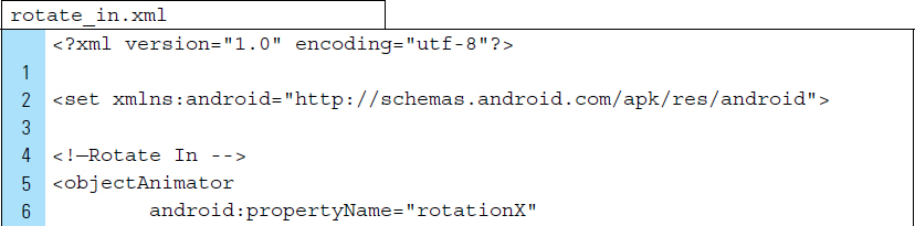
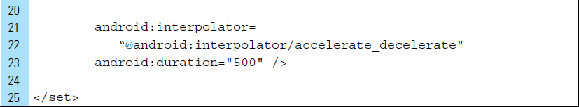
Two XML files define the animation effects used to “flip” from the recipe photo to the recipe directions. Both animation XML files are placed in the anim folder, which was added to the project structure. rotate_in.xml characterizes how a fragment will enter the screen, and rotate_out.xml characterizes how a fragment will exit the screen.
The XML code for rotate_in.xml is listed as follows:
Line 5: |
The |
Line 6: |
The animation effect |
Lines 8–9: |
Values are set to define a rotation around the x-axis from 180 to 0 degrees. |
Lines 11–13: |
The interpolator moves the element after 1,500 milliseconds has passed. |
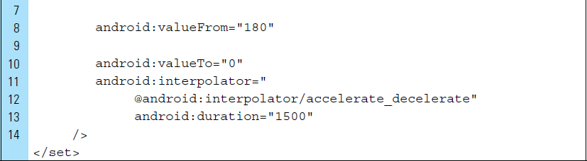
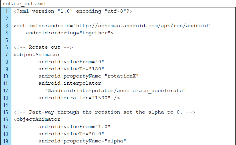
The XML code for rotate_in.xml and rotate_out.xml are listed as follows:
Lines 3–4: |
A |
Lines 7–13: |
The first animation set element is defined. ObjectAnimator is used to specify a rotation from −180 to 0 degrees. |
Lines 16–23: |
A second animation set element is defined to gradually fade the exiting Fragment so that it is no longer visible once the rotation ends. The interpolator alters the element after 500 milliseconds has passed. |
Part 6: Coding the Application
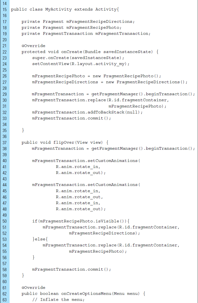
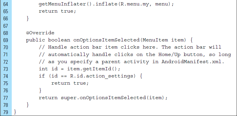
The primary activity of the application is MyActivity. This is the starting point for loading either one of the Fragments.
The Java code for MyActivity.java is listed as follows:
Lines 37–61: |
|
Line 38: |
|
Lines 40–48: |
Specific animation resources are set to run for the fragments that are entering and exiting in this transaction. In the second |
Lines 54–55: |
The |
Line 58: |
|
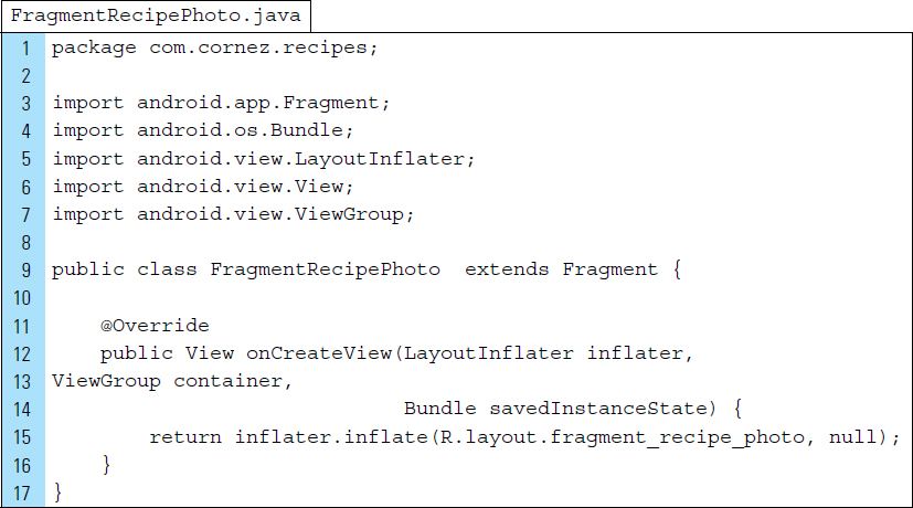
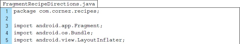
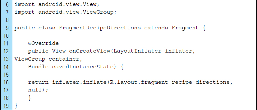
The Recipes app has two fragments, each represented by an independent Fragment class. Both Fragment classes include a callback to onCreateView() to inflate its user interface view. The code listings for FragmentRecipePhoto.java and FragmentrecipeDirections.java appear as follows:
■ 4.7 ListViews and Adapters
A ListView is similar to a ScrollView, which was introduced in Chapter 2. The ScrollView is an extension of the FrameLayout, and it is suitable for holding a single control element. As a scrollable control, it provides the user with the scroll mechanism to reveal more content than can be displayed on the screen at once. Scroll-Views are most often implemented with a LinearLayout. For example, a LinearLayout, containing multiple View items, can be placed within a ScrollView. The items are made scrollable if the screen is not large enough to display them all. Placing many View items into a LinearLayout is not always practical. When dealing with a dynamic list of many Views, the ScrollView is not efficient.
A ListView is a specialized control that is optimized for displaying long lists of items. It is specifically designed to be efficient when creating, recycling, and displaying scrollable Views. The list items are inserted into the list using an Adapter that collects the data content from a source, such as an array or database query, and converts each item result into a view that is placed into the list.
When the data content for the layout is dynamic or not predetermined, it is possible to use a layout that subclasses an AdapterView to populate the layout with views at runtime. A subclass of the AdapterView class uses an Adapter to bind data to its associated layout. In this way, the Adapter serves as the controller between the data source and the AdapterView layout. The Adapter retrieves the data, then turns it into a layout View, and then adds to the AdapterView layout.
An AdapterView can be populated with data in two ways. An AdapterView, such as a ListView, can be filled with data by binding the AdapterView instance to an Adapter, which retrieves data from an external source and creates a View that represents each data entry.
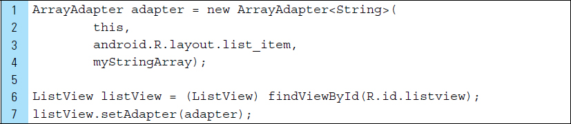
Android provides several subclasses of Adapter that are useful for retrieving different kinds of data and building views for an AdapterView. A common adapter is an ArrayAdapter. An ArrayAdapter is used when the data source is an array. By default, ArrayAdapter creates a view for each array item by calling toString() on each item and placing the contents in a TextView. For example, consider an array of strings that will be used to populate a ListView.
Lines 1–3: |
An ArrayAdapter can be initialized, using a constructor, to specify the layout for each string and the string array. The arguments for this constructor are: The app Context The layout that contains the The string array |
Lines 7–8: |
The |
To customize the appearance of items placed into a ListView, the toString() method can be overridden. To create a list item other than a TextView, such as an ImageView, the ArrayAdapter class can be extended and the getView() can be overridden to return the appropriate item type.
■ Lab Example 4-5: Redlands Music Events App–Adapters and ListViews
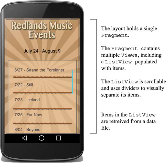
This lab explores the use of an Adapter and a ListView in a single Fragment context. A Fragment containing a ListView is arranged on the screen and filled with data from a Java data file. This is a first look at using an Adapter and a ListView; hence, the application will be kept very simple. A snapshot of the application is shown in Figure 4-26.
Part 1: Application Design
Every year, the City of Redlands puts on a music festival during the summer months. The scheduled events and the dates change from year to year, but the structure of the application itself remains much the same. An internal Java data file provides the data, containing a list of scheduled events and dates.
Part 2: Application Structure and Setup
The settings for the application are as follows:
• Application Name: |
Redlands Music Events |
• Project Name: |
RedlandsMusicEvents |
• Package Name: |
|
• Android Form: |
Phone and Tablet |
• Minimum SDK: |
API 18: Android 4.3 (Jelly Bean) |
• Target SDK: |
API 21: Android 5.0 (Lollipop) |
• Compile with: |
API 21: Android 5.0 (Lollipop) |
• Activity Name: |
|
• Layout Name: |
|
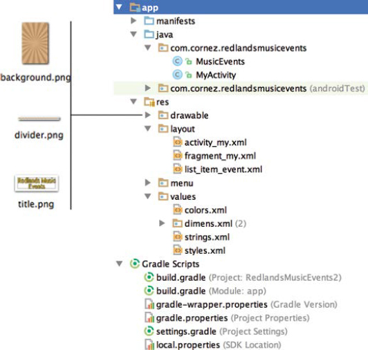
The icon used to launch the application is the Android default icon stored in the ic_launcher.png file. To enhance the application’s visual appeal, a background graphic, a Redlands music logo, and a unique graphic divider for separating the music event items have been added to the drawable default folder. The final application structure is shown in Figure 4-27.
The two Java classes represent the data source, MusicEvents.java, and the activity of the application, MyActivity.java. A Fragment class is not required for this simple application because the Fragment will be added to the main user interface and will not be removed at any time. The main activity and its fragment will each have an associated XML layout file, activity_my.xml and fragment_my.xml. A third layout file, list_item_event.xml, will provide the visual structure for items added to the music event list.
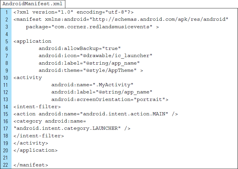
The AndroidManifest file sets the main activity of the application to MyActivity. The action attribute of the intent-filter ensures that this activity will launch when the application launches for the first time. The orientation of the activity is restricted to landscape mode. The XML code for AndroidManifest.xml is listed as follows:
Part 3: External Value Resources
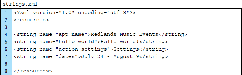
The strings.xml file will be edited to add the Redlands Music Events dates, the start and end data of the festival.
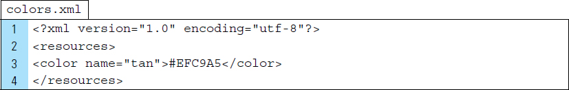
A colors.xml file will be used to declare a “tan” color that will be used as a backdrop by the ListView. The code listing for strings.xml and colors.xml are as follows:
Part 4: The Event List Item
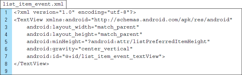
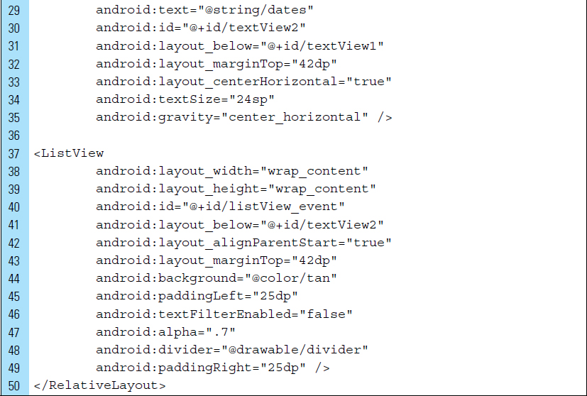
The event list item is an individual music event that will be added to the list of music events that make up the Redlands Music Festival. At its most basic, a music event item can be represented as a text element. The list_item_event.xml declares a TextView as its root element and sets the identifier to @+id/list_item_event_textView. The ArrayAdapter in the main activity references this identifier as it populates the ListView.
The XML code listing for list_item_event.xml appears as follows:
Part 5: The Activity XML File
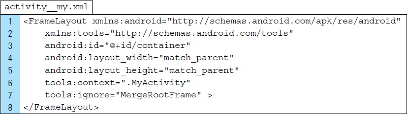
The layout file that corresponds to the main activity of the application is represented by activity_my.xml. It uses a FrameLayout as the root element. No control elements have been added to this user interface.
Part 6: The Fragment Layout File
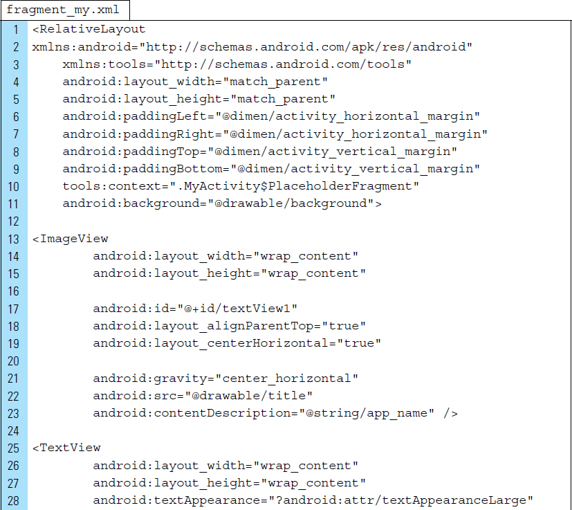
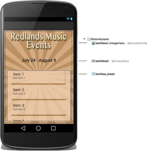
The activitiy’s fragment XML file holds all user interface elements used by the activity. The visual structure for fragment_my.xml is shown in Figure 4-28. The XML code for this fragment is listed as follows:
Line 11: |
The background graphic, from the drawables folder, is applied to the background for the fragment. |
Lines 13–23: |
The Redlands Music logo is placed at the top of the screen. |
Lines 25–35: |
The dates for the music festival are placed in the Textview. |
Lines 37–49: |
The |
Part 7: Coding the Application
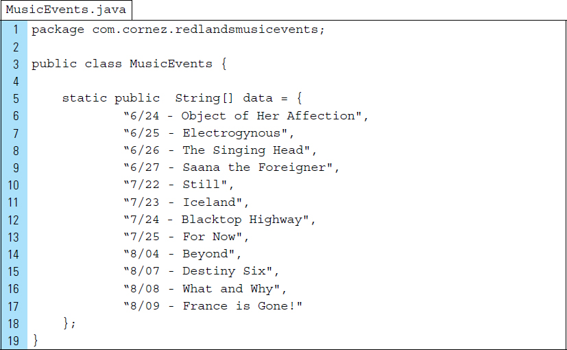
The purpose of MusicEvents.java is to provide a data source for the application. The data[] array contains a fixed set of music events. Each event includes the data of the event and the name. The code listing for MusicEvents.java is as follows:
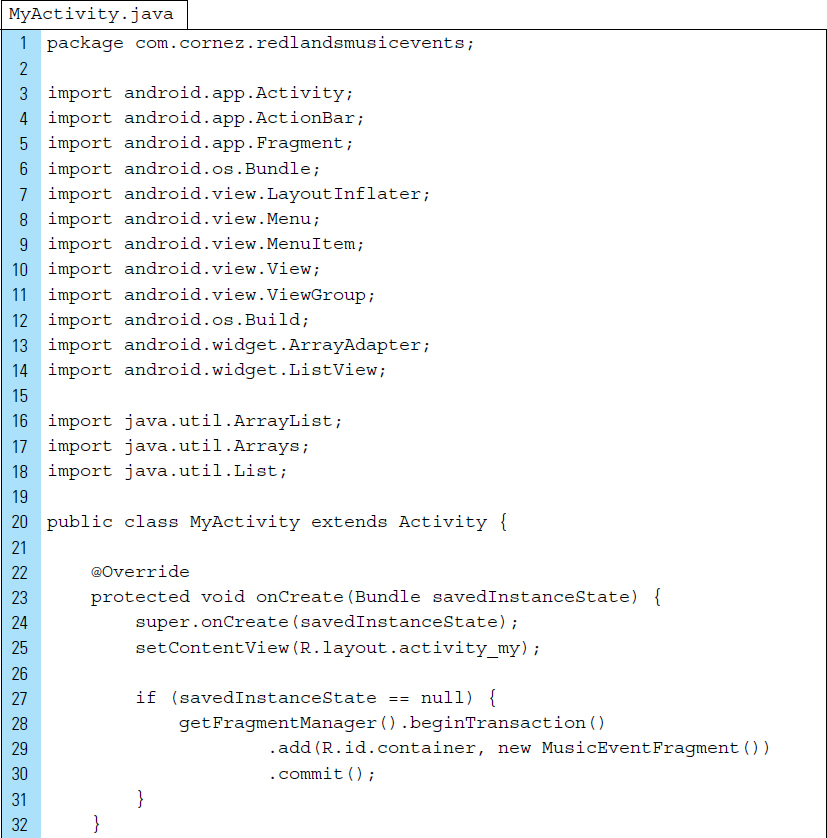
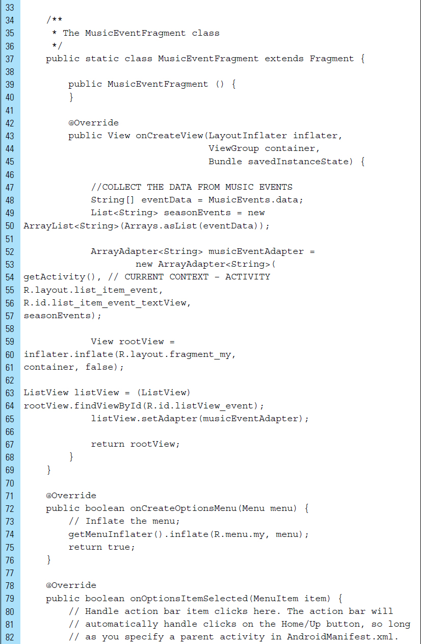
MyActivity.java, the main activity of the application, displays the fragment. Recall that a fragment requires an activity. The fragment XML file for this application holds all user interface elements used by the activity. The visual structure for fragment_my.xml is shown in Figure 4-1. The XML code for this fragment is listed as follows:
Line 25: |
The activity user interface content is set to the layout file |
Lines 27–31: |
When the activity is launched for the first time, a fragment transaction is processed to add |
Lines 37–69: |
The |
Lines 48–50: |
The music event data are collected and first stored in |
Lines 52–57: |
Now that we have some music event data, an ArrayAdapter is created. The ArrayAdapter will take the music data and use it to populate the ListView to which it is attached. |
Line 54: |
The context of the activity is supplied to the ArrayAdapter. |
Line 55: |
The name of the layout ID is R.layout.list_item_event. |
Line 56: |
|
Lines 63–65: |
The reference to the |
■ 4.8 Handling Click Events in a ListView
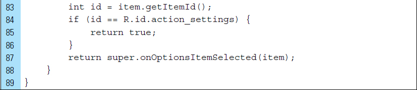
Often, a ListView is populated with items that need to respond to a click event. You can respond to click events on an item in an AdapterView by implementing the AdapterView.OnItemClickListener interface. The onItemClick () callback method will always be invoked when an item in the AdapterView has been clicked.
As shown in the following code segment, this onItemClick() callback uses four parameters:
parent: the AdapterView where the user has clicked.
view: the view within the AdapterView that was clicked. This is the view provided by the adapter.
position: the index position of the view in the adapter. To access the data associated with the selected item, the getItemAtPosition(position) method can be called.
id: the row id of the item that was clicked.
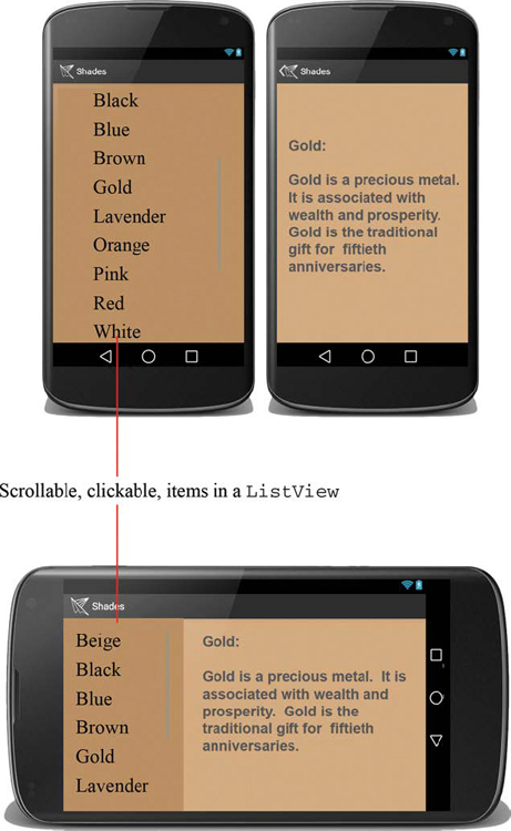
■ Lab Example 4-6: Shades (Part 2): Clickable Shades of Color in the ListView
In Lab Example 4-3, a master list fragment was populated with buttons representing various shades of color. When the user clicked one of the buttons, detailed information about a specific shade of color appeared in a separate pane on the screen. This application was meant to be a simple introduction to fragments, but it is considered impractical because the buttons were placed individually within the layout design. With only three buttons, this example served as a good demonstration for a first look at the concepts of Fragments. In most cases, however, a more feasible approach to constructing a master list of items would be the utilization of a ListView. As a container, a ListView can be populated with a large and dynamic collection of clickable items. In addition, this master list can be built with items obtained from a dynamic source, such as an online database.
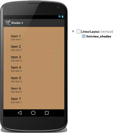
In this lab, we enhance the first version of the Shades application by employing a ListView for the display of items and an Adapter for populating the master list with items from a dummy source. Figure 4-29 shows Shades II, the new version of Shades. The master list of items will be more extensive and each item will be clickable. The fragment behavior of the application will remain the same.
Part 1: Application Structure and Setup
The final project structure for the Shades II application is shown in Figure 4-30. Two additional files from the original Shades have been added. A data source file, DummyData, will provide all the data elements. The second file added to the structure is list-item-shade.xml. This layout represents an individual list item to be added to the ListView.
It should be noted that the data file has been given the name DummyData because it is not an optimal design for a data source. Even though it is considerably more efficient than using a layout containing physical buttons, a better option is accessing data from a database file in the cloud. This topic will be discussed in Chapter 9.
Part 2: Defining the Layout Structure for
an Individual Item to Be Added to the List
The human eye can distinguish nearly 2 million color shades, or perhaps even more. We will not be adding close to this number of color shades to the ListView, however. The goal is to add a more robust list than the set of three colors provided in the first version of Shades.
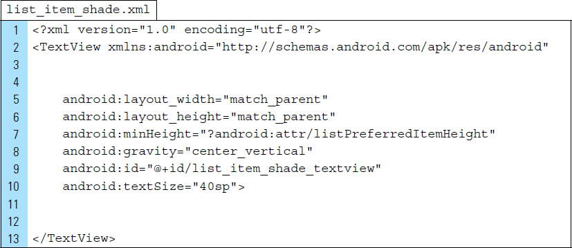
In the Shades II application, shades of color are added dynamically by creating a View object, populating it with a color, and adding it to the Listview. The blueprint of the View object can be defined as an XML file, specifically as a mini layout. The file list_item_shade.xml is the blueprint for an individual View object that stores a shade of color.
The root element of list_item_shade.xml is a TextView, which stores the text for the shade of color. The XML for this file is shown as follows:
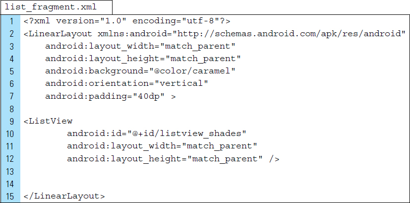
Part 3: Restructure list_fragment.xml
The layout for the master list, list_fragment.xml, will be restructured. Its container is a ListView named listview_shades, as shown in Figure 4-31.
The XML code list for list_fragment.xml is as follows:
Part 4: Defining the Data Source Application
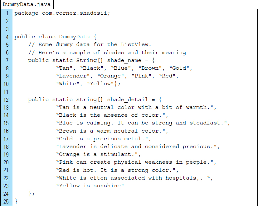
Color data is provided by items stored in the Java file DummyData.java in two arrays of data. The first array contains the names of the colors, and the second array contains detailed information about each color.
This file represents pretend data for the ListView. For applications that require real data, the application code will still be used, but the data may be retrieved elsewhere, such as the cloud. To save space, the code below is incomplete. The finished code file can be found in the accompanying resources for this text.
Part 5: Recoding MyListFragment
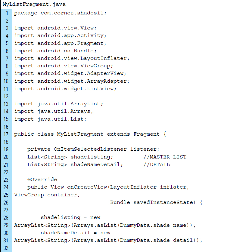
MyListFragment.java represents the master list in the master-detail flow pattern. Modifications, outlined in the Line commentary below, have been made to accommodate the ListView element in the Fragment.
Lines 28–31: |
The shade dummy data is collected. The set of shade names, from the data source, is placed in the ordered list named |
Lines 33–38: |
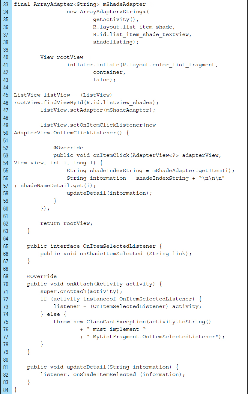
An |
Lines 45–47: |
The object |
Lines 49–60: |
An |
■ EXERCISES
Describe the Fragment lifecycle.
List the set of Fragment callback methods used by a Fragment.
Explain when onInflate() and onActivityCreated() are called.
Describe the features of a typical action bar.
Every Activity supports an options menu of actions. Describe what occurs in the code segment shown below:
Explain the purpose of an action view.
How does adaptive design differ from responsive design?
Describe the master/detail design pattern.
How are Adapters used in a master/detail design?