
SECTION 2
Planning: Designing the Presentation
Before creating any slides, you must take the time to design your presentation. It is necessary to determine the story you want to tell, the order in which you'll introduce information, the level of depth you'll cover, what you want the audience to remember, and what actions you want the audience to take. You'll also need to plan how to verbally convey all of that information.
If you learn to be disciplined about taking the time to design your presentations, you'll soon realize not only how much better and more effective your presentations are but also that the time spent in the design phase is far less than the time wasted on revisions to a presentation that wasn't properly designed up‐front. Here are some of the concepts discussed in this section:
- Identify the type of presentation that you need for each situation.
- Determine how much detail to include.
- Make use of approaches, such as animations and appendices, to streamline a presentation.
- Keep practical implications front and center.
- Focus on what the audience should do with the results more than what you did to generate the results.
Moviemakers don't simply start shooting scenes without a plan or script and then hope to chain them together after the fact into a good movie. Rather, they design the overall story and each scene in immense detail before any filming takes place. You must follow this model to create and deliver an effective data‐driven presentation.
Tip 13: Different Presentation Venues Require Different Approaches
Most of the tips in this book apply to almost any situation. However, some are more (or less) critical depending on the venue for your presentation. Here we'll consider three distinct venues for a data‐driven presentation: a business venue, a conference venue, and an academic venue. Each has nuances and adjustments that you will need to make if you want your presentation to be a success.
Business presentations are where I have seen the most mistakes made over the years. This is unfortunate because the stakes are often high in a business setting. Everything in this book applies to a business presentation. Business presentations often must cater to a wide diversity of backgrounds and technical abilities in the room. It is also quite common that the very people you most need to influence have the background least like yours. It should go without saying that it is critical to apply the tips from this book in a business setting.
Conference presentations require some adjustment. One advantage is that your audience will typically be more consistent in background based on the choice to attend a given conference. It is unlikely that non‐accountants will attend an accounting conference, for example. Although the audience may be able to handle a little more technical detail due to its familiarity with your topic, they can also be a tough audience in that they'll expect to learn some genuinely new things from you.
One challenge at a conference is that you usually cannot discuss the specific impacts or recommendations that help solidify a business presentation because you are presenting in public and must respect confidentiality. The visual appeal of your slides will be even more important in a conference setting if you want to stand out from the sea of presenters. You are also much more likely to be driven to your appendices during the question‐and‐answer period because the audience will typically desire to and be able to dive deeper into your topic.
Academic presentations can be a different animal altogether. I believe that all of the tips aimed at clarity, readability, and visual appeal apply fully in an academic setting. Unfortunately, very few academics agree based on the presentations I've seen! Most specifically, in an academic presentation you often must make what would otherwise be a technical appendix a core part of your presentation. An academic audience will often expect the gory details and will want you to go through them.
With that said, the academics I know who have been successful in developing a strong reputation do follow the principles in this book. It is part of what helps them get noticed. It also helps them appeal to audiences broader than just those deeply involved in their core discipline. Especially if you're new to the academic world and need to build your reputation and win tenure, you need to do what you can to stand out. The tips in this book are one way to do that.
To summarize, regardless of the presentation venue and audience, you'll be wise to make use of the tips in this book. Some tips are more or less important in different settings, but none can be ignored. You will always benefit from telling an engaging, entertaining, and compelling story while making use of visually appealing, clear, and straightforward slides.
Tip 14: Try Different Ways to Organize Your Story
Although starting with your key findings and recommendations (see Tip 28) and closing with a call to action (see Tip 118) are almost always the way to go, there is a lot of leeway in how to organize the arguments in between. There are occasions when the order in which to present the various supporting facts is clear‐cut. Usually, however, there will be many options which all seem reasonable. How do you decide how to organize your presentation for the biggest impact?
Order your content in a few different ways. This doesn't take long. Simply list the key points and arrange them in different ways to represent the options you find worth considering. To illustrate, see Figures 14a and 14b, which show two options for ordering points. Creating each flow was as easy as dragging the slides around. You want to start and end strong. To do so, be sure to put some of the most compelling points up‐front and in back. Particularly contentious or controversial points will need to be handled with care. Place them early or late depending on the culture and practices of your specific audience.

FIGURE 14A Story Flow 1
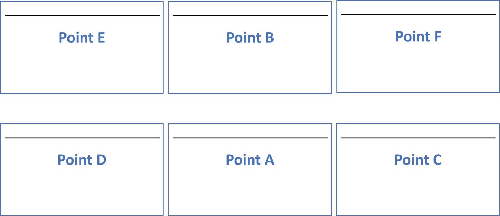
FIGURE 14B Story Flow 2
Once you've generated some options, put them aside for a while and then come back later with fresh eyes and review them again. Likely, you'll quickly note a couple orderings that flow better than the others. Once you've decided on an option or two that you like best, run them past a colleague and, ideally, one of the stakeholders you'll be presenting to (see Tip 84). Another person who isn't as deep into the process as you are will often provide feedback that enables you to be confident in the direction to go.
Tip 15: Too Many Technical Details Will Undercut Your Impact
It is appealing to think that helping an (often nontechnical) audience understand the details of our technical efforts would increase our credibility and impact. Unfortunately, it doesn't work that way. Suppose you visit two local auto mechanics to help with a broken‐down car. Which of these two mechanics would you give your trust and business to?
Mechanic 1:
“It looks like you have a transmission issue. I'll need to run multiple tests to validate that including a fluid test, an electronics test, and an internal diagnostics test. Let me explain those tests to you.” (five minutes of painful technical detail on each test)
“Depending on what the tests find, I may or may not be able to fix it quickly. One less common scenario I've seen with these symptoms requires an entire new transmission, which would cost several thousand dollars and take about two weeks. While that scenario is possible, it isn't probable.”
“We're also having issues with our primary supplier right now. I don't expect we'll have an issue with transmission parts, but I just wanted to alert you that we won't know for sure until we place the order. I can give you a firm time and cost estimate tomorrow I hope, depending on if my sick mechanic gets back to work. Should I check the car in?”
Mechanic 2:
“This is almost certainly a transmission issue. Most likely with these symptoms I can fix it in three days for about $1,500. Although I can't commit to that until we take a look, I'll be able to give a firm commitment within 48 hours. Should I check the car in?”
Although mechanic 1 provided much more detail and technical background about the tests, risks, and range of outcomes, you'd likely leave that discussion feeling uneasy and overwhelmed. He told you much more than you needed or wanted to know. Most people wouldn't choose to leave a car with him. Mechanic 2 was concise and confident. He acknowledged that there were risks, but he stated what he thought the issue was and was very clear on the path to completion. Most people would leave that discussion feeling much more comfortable than with the first even though they were provided much less detail.
People come to you as an expert to handle the technical details they don't understand. They want you to worry about the technical details; they don't want you to teach them the technical details. So, what does your audience want from you?
- A summary of your results
- An understanding of what the results imply for them
- Specific actions they can take as a result
You must be credible, and you must communicate well to deliver that wish list to your audience. But never forget that they are trusting you as the expert to handle the technical details. Helping them understand what they can do to address their problems given what you've done will lead to a successful project and further requests for support in the future.
Tip 16: Reveal Details Only to the Extent Required
Although you don't want to volunteer too much detail (see Tip 15), it is important to properly gauge exactly how much to reveal when someone does ask for details. Although executives and nontechnical audience members rarely want to know technical details, there are always exceptions where you are asked to dive deeper. That raises the question of how much detail to reveal. Follow these three rules:
- Go into technical details only if explicitly asked to do so.
- Provide the minimal level of detail required to satisfy the person asking … and no more.
- If only one person seems interested in the topic, suggest a follow‐up one‐on‐one so that you can avoid taking the room in a direction most don't want to go.
The reality is that most people asking you to tackle a technical endeavor won't care about the details and only want confidence that you can handle their problem. They have come to you, much like you'd go to a mechanic (see Tip 15), because they are assuming that you have the knowledge that they lack to address their problem. Of course, there are occasions when some detail is desired by an audience member. There are also occasions when a technical person is in the audience who may care about the details to a much greater extent than the nontechnical audience members. You must try to find a way to pacify the technical person without losing the rest of the audience, such as suggesting a follow‐up.
Think of providing technical details like filling a glass. You can always add a bit more to a glass if it isn't full enough, but once the glass overflows you have a big mess. Once the mess is made, you can't take it back. Similarly, you can always add technical details a little bit at a time to work toward what your audience desires. However, once you go too far and lose the audience, it is very hard to get them back. Your strategy should be to always add detail slowly until it is clear you've hit the level that is required and offer no more.
I came across another great analogy for this concept. Only provide a tree trunk to start. If someone wants to understand the branches, then go to that level. If they then ask to understand the leaves, then go to that level. However, if you always drill down to the tiniest details, your presentation will fail with every audience except those wanting the tiniest details. If you always start at a high level and only get more detailed as asked, then you can succeed with every audience you present to!
Years back, a client (I can't recall who) said, “Share the what, so what, and now what. Only go into the how and why if requested.” We actually serve ourselves and our sponsors best when we say the least we can to instill confidence that we have the situation handled and that we can provide valuable guidance on what to do with the results we have found. It can be very hard for technical professionals to hold back on the details that we get excited about. It takes discipline to avoid falling into the trap of saying way too much!
Tip 17: Focus on How to Use Your Results
When presenting and discussing technical information, it is necessary to interpret requests for clarification or additional detail from the view of the person asking the question. A nontechnical person without your level of understanding will often ask a question using verbiage that, if an expert asked the same thing, could mean something very different than what the nontechnical person is trying to ask.
Imagine going into a car dealership to look at a vehicle and asking how the backup camera system works. If the salesperson (who is a technology fanatic) starts talking about the high‐definition OLED screen, the onboard sensors that are scanning the area in real time, and how the trajectory lines are computed and rendered on the screen, you'll probably wish you hadn't asked. Although the salesperson is an expert who is passionate about such details, it is important for the salesperson to determine if the customer is a technology fanatic too before going into such a technical explanation. If you aren't sure what your audience wants, then ask!
When most people ask how the backup camera system works, they really want to know how to use the backup camera, not literally how the camera system works. A great response from the salesperson would be, “You'll see what's behind you and a projection of where you are going as you back up. If you hear a beep, then stop!”
Similarly, if a business executive asks, “How do these analytics work?,” the desire likely isn't to understand the math, the data issues found, or how the analytics will be deployed on the organization's systems. Rather, the executive likely wants to understand how to use the results. For example, a simple answer might be, “The analytics will provide a probability of response for each customer. You can then decide to make each customer an offer (or not) based on that probability.”
The same concept would apply in any technical discipline. If an executive or customer asks during a product presentation, “How does this new glue work?,” they probably don't want a lesson on the chemistry behind it. They most likely want to hear, “Although you apply the glue just like you would our other products, this glue will have a bond after drying that is over twice as strong as our standard product.”
Always remember when giving a data‐driven presentation that when asked, “How does it work?,” the real question is almost always, “How do I use it and how will it add value to me?” This is especially true when presenting to a nontechnical audience. Failing to recognize the distinction can lead you to confuse and frustrate the audience. Worse, they may decide you are too technical to be of practical use to them, tune you out, and ignore your findings.
Tip 18: Use Analogies to Make an Impact
I suspect this will be one of the more controversial tips in the book. I know many people do not like using analogies and think that it weakens their position. When dealing with other technical people, I can see that argument. If discussing technical issues among technical peers, maybe you should be able to explain things without resorting to an analogy (though I personally still think analogies are helpful even then). However, when dealing with a nontechnical audience, I have found that an analogy can be one of the best ways to help an audience “get” a complex concept.
Two of the most popular analogies I have ever used include one based on fleas trapped in a jar to illustrate innovative thinking and one comparing frozen yogurt shop business models to illustrate why a common analytical architecture needed changing. Both of those probably sound like they would be ridiculous for the purpose I used them, but they really helped people understand how to think differently about a common, complex issue. I typically don't set out to develop an analogy. Instead, as I see people struggling to grasp a given topic, I try different ways to explain it. I often eventually land on an analogy that works and then use it moving forward.
You may notice that in this book there are a lot of places where I illustrate a tip by using an analogy from day‐to‐day life that doesn't relate to presenting data‐driven content. After laying the groundwork with the analogy, I then tie it to presenting data‐driven content. My guess is that you probably remember my analogy for some of the tips better than you remember the more technical explanation. If so, that's exactly why you should consider using analogies yourself!
Tip 19: Make Liberal Use of Appendices
This book talks a lot about keeping slides to a minimum and not showing more detail than necessary. However, there are often additional details that you need to make available for later review by your audience. Appendices are where to place any extra information you need to provide. They enable the audience to get the main points quickly as you talk while providing them additional details to review later as desired.
My belief is that appendices are greatly underused and undervalued as a tool to enable a diverse audience to grasp a data‐driven presentation, so don't be shy about adding appendices liberally. If appendices are clearly labeled, your audience will easily find the information they want when they review your material later. While you are presenting, you shouldn't display your appendices, of course, but you should alert the audience to the fact that they are present. Figure 19a is a simple slide that lists available appendices. As you tell your story, you can remind the audience when there is an appendix that provides more information on a given topic. Even if the audience doesn't ask to see the appendix as you present, they will be comforted that it is available for later review.
If questions force you to discuss material in one of your appendices, don't default to showing an entire appendix section. Rather, as per Tip 16, show and discuss only the portion of the appendix that enables you to answer the question you were asked before returning to your main presentation. Of course, per Tip 100, never hand out your appendices until after your presentation.
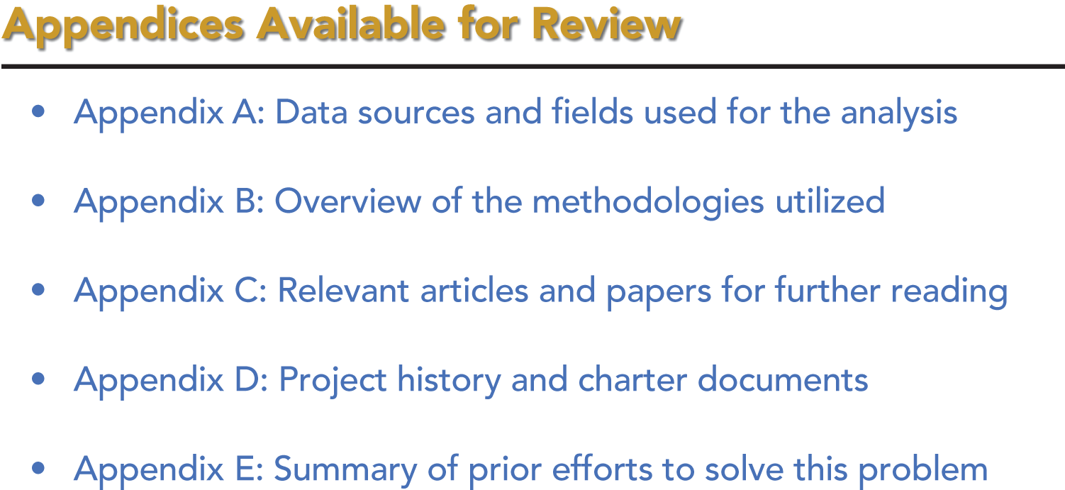
FIGURE 19A A List of Appendices for the Audience
Tip 20: Create a Distinct Leave‐Behind Document
Tip 19 focuses on using appendices to include additional information that the audience may want to see. Appendices are but one option. Appendices can be used by themselves or alongside other options, such as those discussed in this tip.
In my field, when there is a very important, high‐stakes analysis involving a lot of investment, generating a formal written report to support the live presentation slides can be a necessity. A formal written report is closer to an academic paper in that it will have extensive details on various aspects of the project. Of course, writing this type of report is time‐consuming and it only makes sense for high‐value initiatives.
A middle option between appendices and a totally separate document is to make use of the “notes” section of PowerPoint so that you can provide additional details to the audience through the printing of the “notes pages” view from the print menu. Using this approach, you can include a good bit more detail than will fit on a slide. At the same time, the format tends to keep your additional comments short so that they fit within one or at most two pages, which won't overwhelm the audience.
I personally like the notes pages approach because it lets me place additional important data and talking points underneath each slide. Then, when I am reviewing my slides before my presentation, I also review the notes. It helps me prepare as well as providing more information to the audience when I provide them the printout. Figure 20a shows an example of how a notes pages printout looks. It is clean and easy to follow. Figure 20b shows how to print the notes pages (Microsoft 365 version).
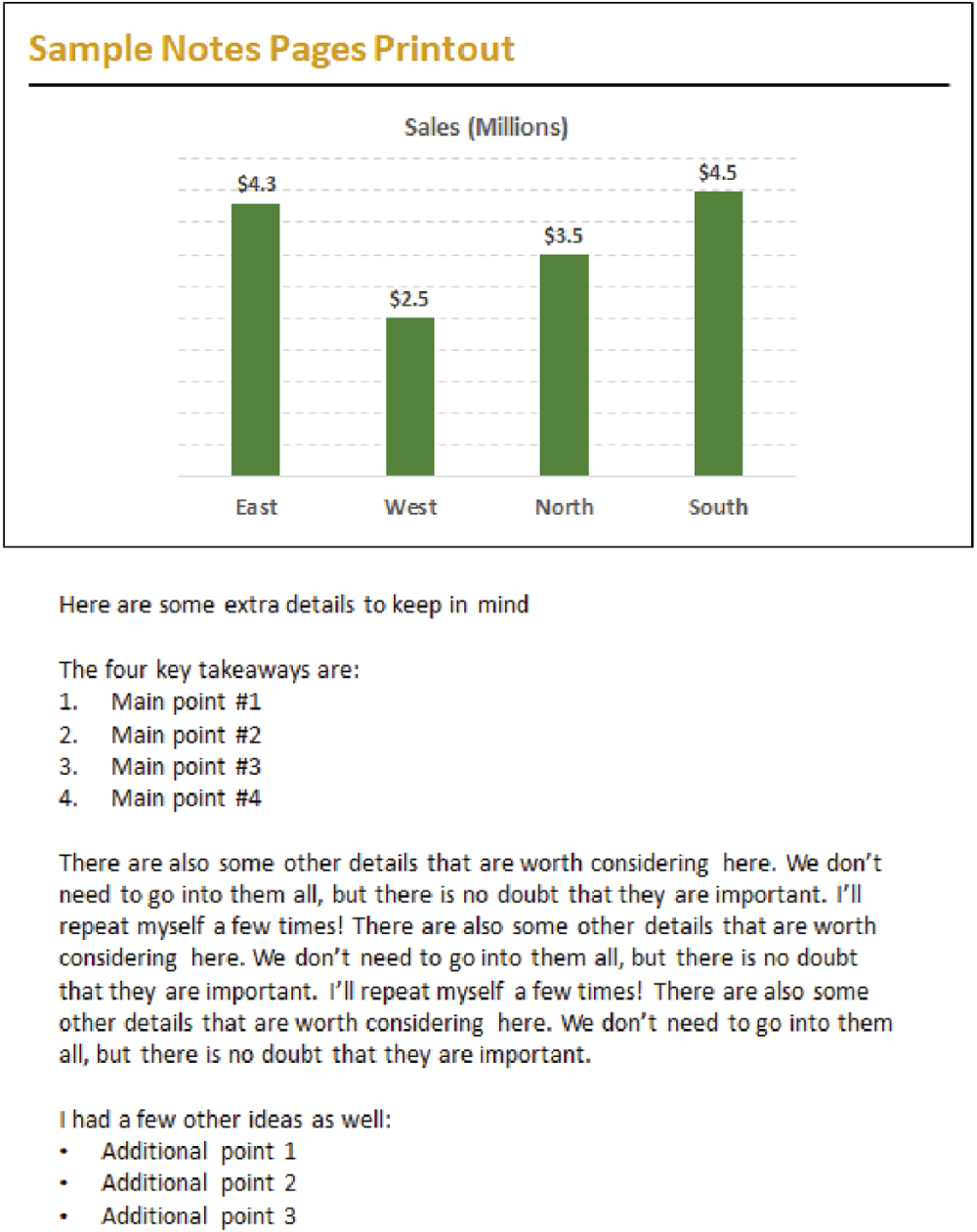
FIGURE 20A Use Notes Pages as a Leave‐Behind Document
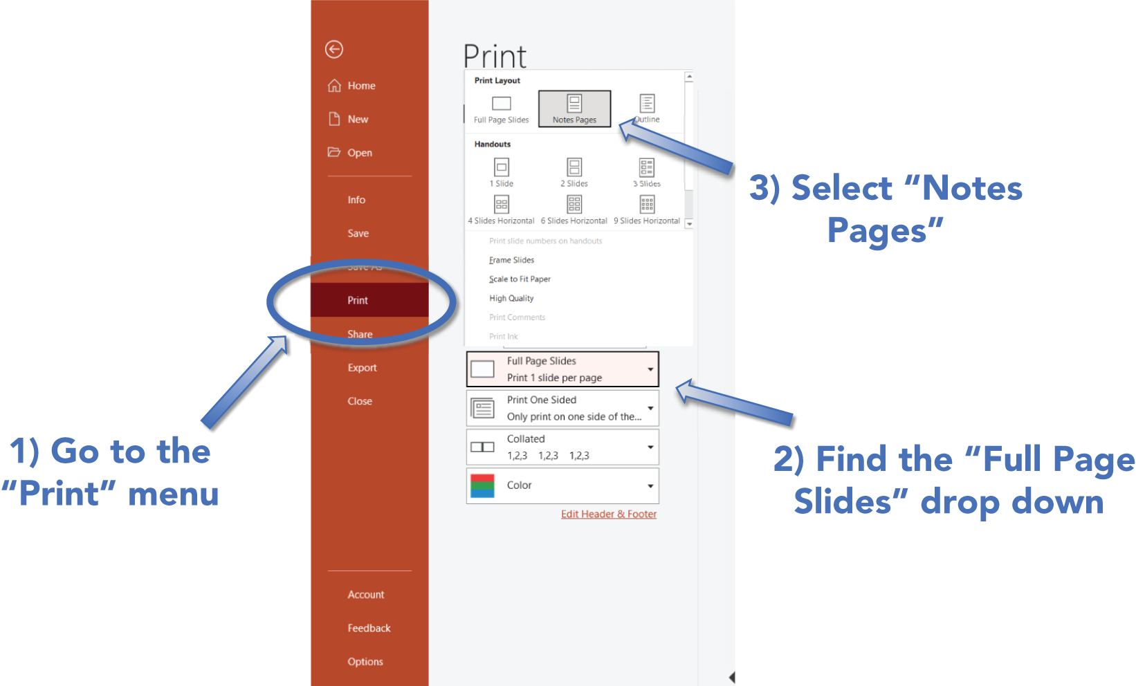
FIGURE 20B How to Print Notes Pages
Tip 21: Create “Launch” Slides
In Tip 23, we talk about using animations to control information flow. Animations are helpful when there are multiple pieces of information you would like to discuss in a set order. Sometimes, however, you will have a topic that is far‐reaching but you need flexibility in how you cover it based on audience feedback and reaction. This is where a concept that I call a “launch” slide comes into play.
A launch slide has a high‐level summary of a concept. It could be an overview of a framework or a process flow, for example. After explaining the general concept of what is on the launch slide, you might ask the audience what components are of most interest. Then, you launch into a discussion of the topic(s) of most interest. You can even use action settings (see Tip 24) to jump back and forth in an ad hoc fashion to the slides with your drill‐down points.
Another option is to leave the launch slide up and just talk to all of the points. A launch slide could stay up for a very long time, so be sure to account for that in your preparations (see Tip 87). By leaving the launch slide up while you dive deeper verbally, you achieve several things:
- You keep the audience fully focused on you and your story.
- You show mastery of the subject matter by being able to talk about any aspect on the fly without slide support. Audiences appreciate when you know your material well enough to go off script!
- Your audience retains the big picture from the launch slide in their minds, which helps keep your drill‐down points in the proper larger context.
Figure 21a shows a potential launch slide. In this case, you can discuss the overall product life cycle, each phase at a high level, and also details on each phase without ever leaving this single, illustrative slide. Figure 21b is a classic analytical project flow. You can talk in detail to any or all of the phases without leaving the slide. In both examples, your leave‐behind document or appendices can contain the detailed information you discuss.

FIGURE 21A A Framework Launch Slide

FIGURE 21B A Process Launch Slide
Tip 22: Break Content into Smaller Pieces
It is tempting to provide as much detail as possible on one slide. You can get away with that in an interactive online report or in a detailed leave‐behind document because the audience in those settings has as much time as they need to look closely at the content and interpret it. During your live presentation, as we've discussed repeatedly in this book, you want people focused on you and not on analyzing the information on the screen. As a result, you must break your content into smaller, digestible pieces.
Consider a complex dashboard that stakeholders review daily. Because they are used to seeing that dashboard, it is tempting to use the dashboard as a slide during a presentation. However, this will make the slide look overloaded and will distract the audience. During your presentation, you'll have to talk about one point at a time, so reveal the information one point at a time. Instead of a single slide with lots of information, create multiple slides with targeted, specific pieces of information. Alternatively, use animations as outlined next in Tip 23 to keep the audience focused as your discussion drills down into pieces within a complex slide.
The slide in Figure 22a is simply too busy to be easily digested by an audience (technical or not) while you are speaking. It might be terrific as a leave‐behind document, but it will not go over well live. Figure 22b shows one of the charts as a standalone slide that you can talk to. Figure 22c uses an animation method from Tip 23 so each piece is highlighted as you speak to it while the others are deemphasized.

FIGURE 22A Quarterly Dashboard
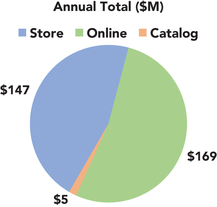
FIGURE 22B Quarterly Dashboard Highlight – Sales by Channel
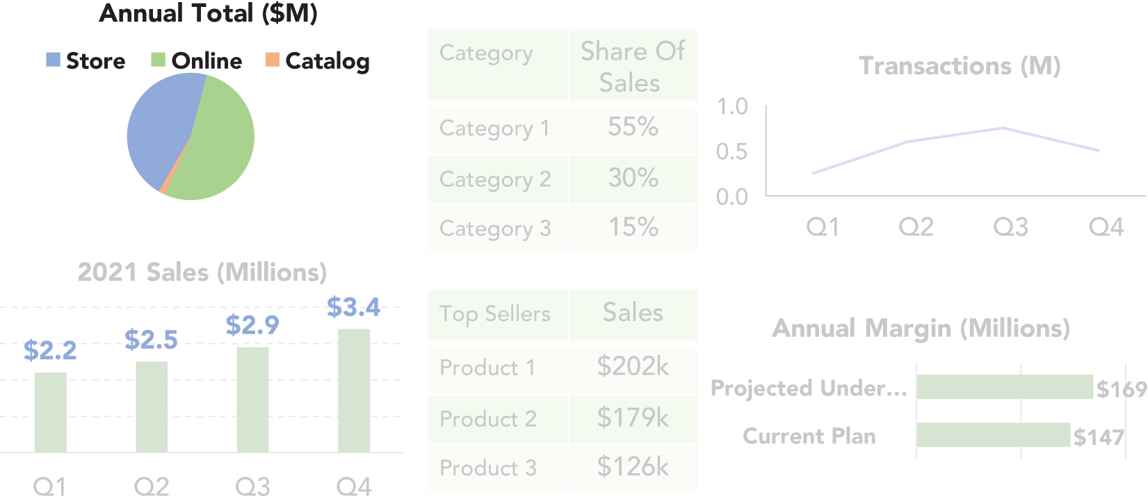
FIGURE 22C Quarterly Dashboard (with Animations)
Tip 23: Animations Are Your Friend
Slide animations are a terrific tool for controlling flow within a slide. Having important information appear one piece at a time keeps the audience focused on your story and stops them from reading ahead. If you provide your presentation as a handout, the full slide will appear. In this sense, animations are another way to differentiate your live presentation from your leave behind. The audience will watch the story slowly unfold via animations in your live talk, but when they review the material later, they'll see everything at once.
Basic animations make a lot of sense in cases like listing critical takeaways. The slide may be a few short and succinct points, but revealing them all at once distracts the audience from your story as they try to read and interpret them all as soon as they appear. Use animation in this situation to reveal each point one at a time as you're ready to discuss it. Similarly, if you have multiple charts on a slide, reveal them one at a time.
Another way to use animations is to highlight items. If compelled to show a large table, highlight what is important by using animations to circle numbers, draw an arrow to them, or enlarge their size. Each method draws the audience's attention where you want it. Figure 23a illustrates these methods (we'll discuss these methods more in Tip 95).
More advanced techniques include not just adding items but removing or changing the look of items. One trick I like to use is to make all but the current item of focus appear mostly transparent. That way, even as I add more to the slide, it is very clear where attention should be. Figure 23b illustrates what this looks like.
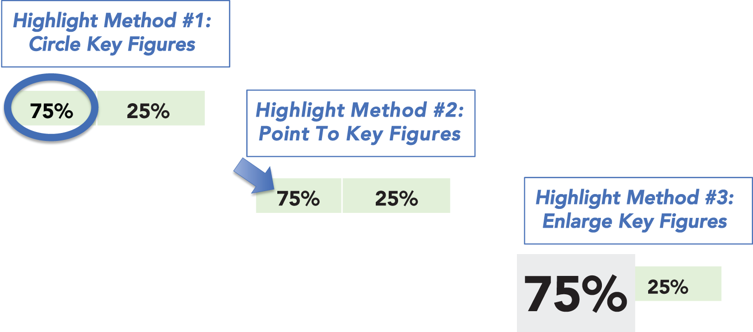
FIGURE 23A Three Animation Options for Highlighting Key Figures
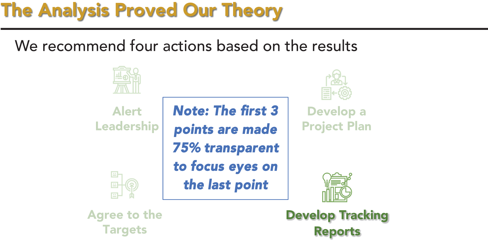
FIGURE 23B Using Transparency Animations
Tip 24: Action Settings: A Hidden Gem
The slide animations discussed in Tip 23 control flow within a slide, but don't help flow between slides. There is a feature very few people know about called “action settings” in PowerPoint that does just that.
The great thing about action settings is that they enable you to turn text or graphics into hyperlinks that will navigate to different parts of your presentation. For example, if there is a slide that you know will likely lead to a need to visit an appendix, you can create an action setting to have an object on that slide take you directly to the appendix. Similarly, in the appendix, you can have an action setting to take you back to where you came from.
This is a powerful tool because it lets you stay in “presentation mode” while being dynamic. You don't need to hit page up or page down repeatedly or exit presentation mode and scroll down to your appendix before going back into presentation mode. Action settings enable you to move between content seamlessly and easily without visibly interrupting your flow.
I have done interactive webinars where the audience votes on which topic out of a few choices they desire me to cover next. Each question on the slide has an action setting to take me to the right place if that question wins. Each topic's content then sends me back to my question slide when I am done. To the audience, the webinar is a seamless flow. Behind the scenes, I am bouncing all over the place within the presentation's slides.
It isn't always clear how many topics I will get through based on audience participation, so I also put an action setting on the logo or copyright text in the slide master and have that go to my wrap‐up section. No matter where I am in the presentation, when it is time to end, I can get directly to my wrap‐up section with a single click. If you experiment with action settings, I think you'll become a fan very quickly. It will also open the door to new types of presentations, such as the one I described in the prior paragraph.
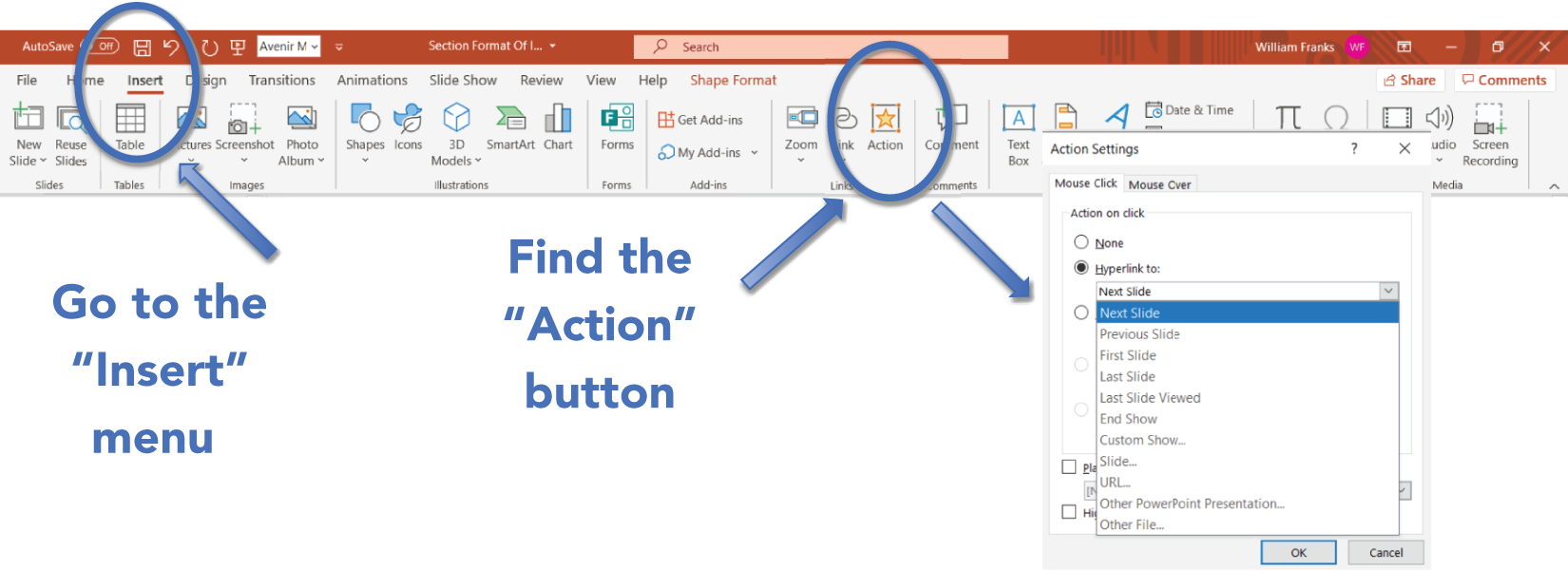
FIGURE 24A How to Apply Action Settings
Figure 24a shows where to find the Action Settings item on the Insert menu in PowerPoint (Microsoft 365 version). The icon is in the middle by default and that's why I think most people miss it. I typically just use the “Hyperlink to:” option in the menu because it usually meets the need. Notice the ability to jump to any specific slide or the slide you last came from, among other options.
Tip 25: Show the Fewest Numbers Necessary
A written leave‐behind document should have all the relevant details about your work that someone, whether technical or not, might require. A live presentation should contain only the core information required to support your story. On a screen, it is difficult for the audience to digest and interpret a large volume of information. Worse, as we've discussed frequently in this book, all the time and attention the audience gives to reading and interpreting your slides takes their attention away from your story. The more numbers that are on a page, the more likely it is that the presentation gets sidetracked by someone in the audience not understanding or believing one of the numbers.
Consider a situation in which your company has a standard view of five core products' sales by quarter. It might seem easiest and natural to display the typical five products by four quarters grid of sales that people are used to seeing. The problem with that approach is that you end up with 20 numbers on the slide (not including totals if you also need them). At any point in your presentation, however, you are likely discussing a single specific cell from that table (or just a few related cells). Instead of providing the entire table of data, design each slide to have only the specific data points you plan to discuss at that time.
This approach will keep the audience focused on the important information you're discussing without distracting them with a bunch of other noise. In an extreme case, you might talk about most of the cells in the larger table at some point in your presentation. However, by displaying and discussing just a few numbers at a time, it will make your data‐driven presentation more effective and will allow your audience to follow along. The entire 5 × 4 table can be in an appendix, and you can let the audience know that the numbers you're showing are available in the standard grid view they are used to seeing.
Figure 25a shows the full 5 × 4 table while calling out one important fact in the headline. Although it is possible to see what the headline is talking about by looking at the table, it does take effort. You also have to stop yourself from focusing on all of the other numbers. Figure 25b shows only the numbers that pertain to the headline. This helps the audience focus on what is important to the point you are discussing. In Section 6, we'll discuss more options for clarifying the information you want your audience to take away.
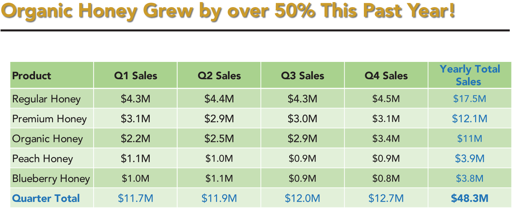
FIGURE 25A Too Much Data Makes It Hard to See the Point
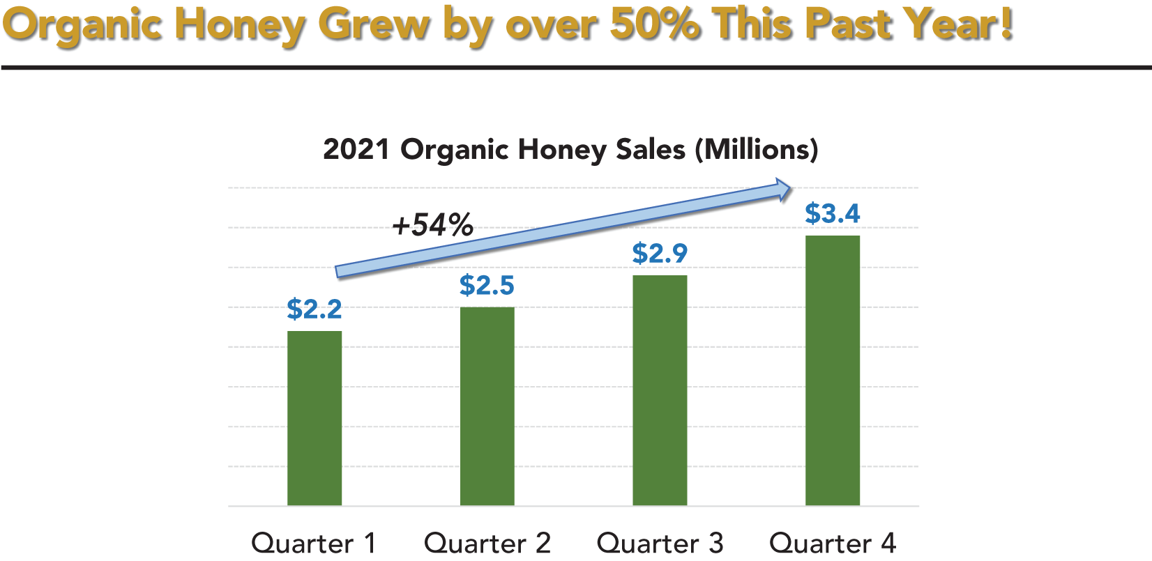
FIGURE 25B Showing Just the Data to Support the Headline
Tip 26: Distinguish Technical Significance from Business Significance
In my field, although statistical significance is commonly assessed, it isn't enough to prove an analysis is a success worthy of action. It is also necessary to determine and communicate how the results are significant from a business and practical perspective. If the audience doesn't find your results to be relevant and actionable, you are just providing noise. The same principle holds true with any other type of technical measure of importance. Who cares if a proposed building can support twice the anticipated maximum stress it will be exposed to if the building is ugly or won't fit in the lot it is targeted for?
Always place your results in a business or practical context during your data‐driven presentation. Perhaps we can be 99% confident that the lift in response from a proposed offer is at least 10%. But what if the offer tested is a bonus offer costing twice as much to fulfill? In that case, getting an extra 10% response may not cover the extra costs. The fact that the response rate is proven higher from a statistical perspective doesn't matter because it simply isn't important or actionable from a business perspective. It is a money‐losing approach that is dead on arrival with a businessperson.
Yes, statistical significance and other technical measures are important, but you must look beyond technical measures and answer additional questions such as these:
- What are the costs associated with taking (or not taking) the recommended actions?
- How much additional revenue might be generated?
- Is the new approach consistent with the overall corporate strategy?
- Are people available to make the process changes that will be required?
- Are there any regulatory or legal guidelines that need to be accounted for?
Audiences, even if nontechnical, might be comforted to know that something is statistically or technically significant. However, don't expect them to take your presentation and recommendations seriously if you don't clearly point out why the results have business and practical significance as well.
Tip 27: Give the Audience Your Headlines
As you design your data‐driven presentation, one of the first things you must do is to create an outline that lays out your narrative, the key points that you want to get across to the audience, and the actions you want them to take. You will then build your presentation from that outline. It is a good idea to clue the audience in on the direction you're heading up‐front to draw them in from the start (we'll also talk more about this in Tip 28). Let's look at a couple of examples of why this is important.
Virtually all books have some paragraphs on the back cover as well as an introduction section and a table of contents. These all serve to give a potential reader a feel for what the book is about, what it will discuss, and what the reader will get out of the book. Very few people will pick up a book and start reading without having any idea whatsoever what it is about and what type of story it will tell.
For movies or television series, trailers are a ubiquitous method of distilling down key scenes that capture the essence of the flow, style, and tone of a movie or series so that potential viewers can decide if it is for them or not. The trailers don't give away too much, but they do give away enough to get the attention of viewers.
Let's take the same concepts and apply them to your presentation. Do you typically launch into your narrative and assume that the audience will stick with you until the end? That's a mistake. Similar to a book preview or movie trailer, you should explain up‐front the general direction you intend to take your presentation. If you understand your audience well (per Tip 5), they will like your introduction and will be willing to give you their attention to hear the whole story. Perhaps some in the audience will realize that your presentation isn't for them. That's okay, too. They can always leave without guilt and they'll be happy you didn't waste their time.
Note that what I am talking about here is more than just an agenda slide. It is the selective revealing, whether verbally, on a slide, or both, of core themes and takeaways that your presentation will provide. Similar to a book cover, you are providing a short overview of your story to get the audience committed. Going through the process of developing your introduction will also force you to think through which of your points are most important and compelling. This, in turn, can lead to changes to the outline you originally designed, creating a positive feedback loop.
Tip 28: Start with Your Recommended Actions
I have seen much debate over the years about whether you should (1) give away your big ideas and recommended actions up‐front and then defend them or (2) save the ideas and recommendations for a big reveal after you've woven an exciting narrative and have the audience on the edge of their seat. In an ideal world, saving big ideas until the end would be the way to go. However, our world isn't ideal. Audience members will leave early, they'll get distracted, or you'll field so many questions that you don't have time to do anything but rush through your big ideas in the closing minutes. These real‐world realities, among others, will jeopardize the success of your data‐driven presentation.
I have come around to the view that the best design approach is to state up‐front the big ideas and recommended actions that you plan to substantiate in your presentation. In practice, this will have several benefits. First, everyone will know where you are heading, and if they have a big stake in what you've found they'll be more likely to stay focused if they are made aware that your presentation is leading to something of high relevance to them.
Second, if someone must leave early or if your presentation is derailed by questions, the audience will know what you were working toward. People will be much more likely to give you another meeting to complete your story if they know the ending is compelling. If you are cut off mid‐presentation and the audience still doesn't know anything about how it ends, they are likely to just move on. Imagine you are taking your friend to an amazing five‐star restaurant as a surprise, and you hit hideous traffic. Not knowing what you have planned, your friend will suggest stopping someplace close to avoid the mess. If you inform your friend of the ultimate five‐star destination, however, chances are that they will be willing to sit through a lot more traffic to get there. Similarly, an audience will be willing to allot more time for a follow‐up discussion if they know it will be worth their time.
Last, based on the reactions from the audience to your initial reveal, whether positive or negative, you can adjust how much time you spend on various parts of your story to increase focus on those areas that have the most interest (see Tip 102). Sometimes you'll be surprised that points you thought would be a hard sell are well received whereas points you thought would be readily accepted receive substantial resistance.
It is important to note that you will need to actively manage the audience so that they don't start litigating your recommended actions after you reveal them up‐front. Make clear that the point of your presentation is to lay out the case for the actions and that you would like the audience to hear you explain and put the ideas in context before debating their merits.
One exception to the rule of starting with your big ideas and recommended actions is if they are highly charged politically or otherwise quite sensitive. In such cases, laying out the end of the story without the buildup and full context can backfire because emotions may run high and be impossible to rein in. It is hard to imagine how starting with, “We need to lay off 40% of our staff” with no context will go over well. It is better to ease an audience into sensitive findings.
Tip 29: Don't Focus on the “What”
Technical people love to discuss details about what they did and, from a technical perspective, why they did it. The harsh reality is that a nontechnical audience doesn't care about the technical aspects of what you did. They care about what you've found, why it matters to them, and what they should do as a result.
Avoid focusing on the what aspect of your efforts in terms of what you did and what led you to choose that path technically. Instead focus on the why in terms of the practical problem you're solving, the so what for the audience, and, most important, the what now recommendations. Let's review what each of these is about.
The why aspect of your presentation has several components. First, why did you address the problem you're discussing? Second, why is the problem important to the audience? Third, why will the audience benefit from hearing about what you've found?
The so what aspect of your presentation ties to why your findings and information matter to the audience. What is the business value of your findings? How will listening to you help the nontechnical audience meet its goals? Help the audience grasp that they have a personal stake in your results.
The what now aspect of your presentation entails laying out specific recommendations and actions for the audience to enable them to take full advantage of your findings. Don't make the nontechnical audience connect the dots. Rather, connect those dots for them and give them tangible next steps (see Tip 118).
Figure 29a is mostly about the technical what. It isn't very compelling. Figure 29b addresses the why, the so what, and the what next. Doesn't it sound better?
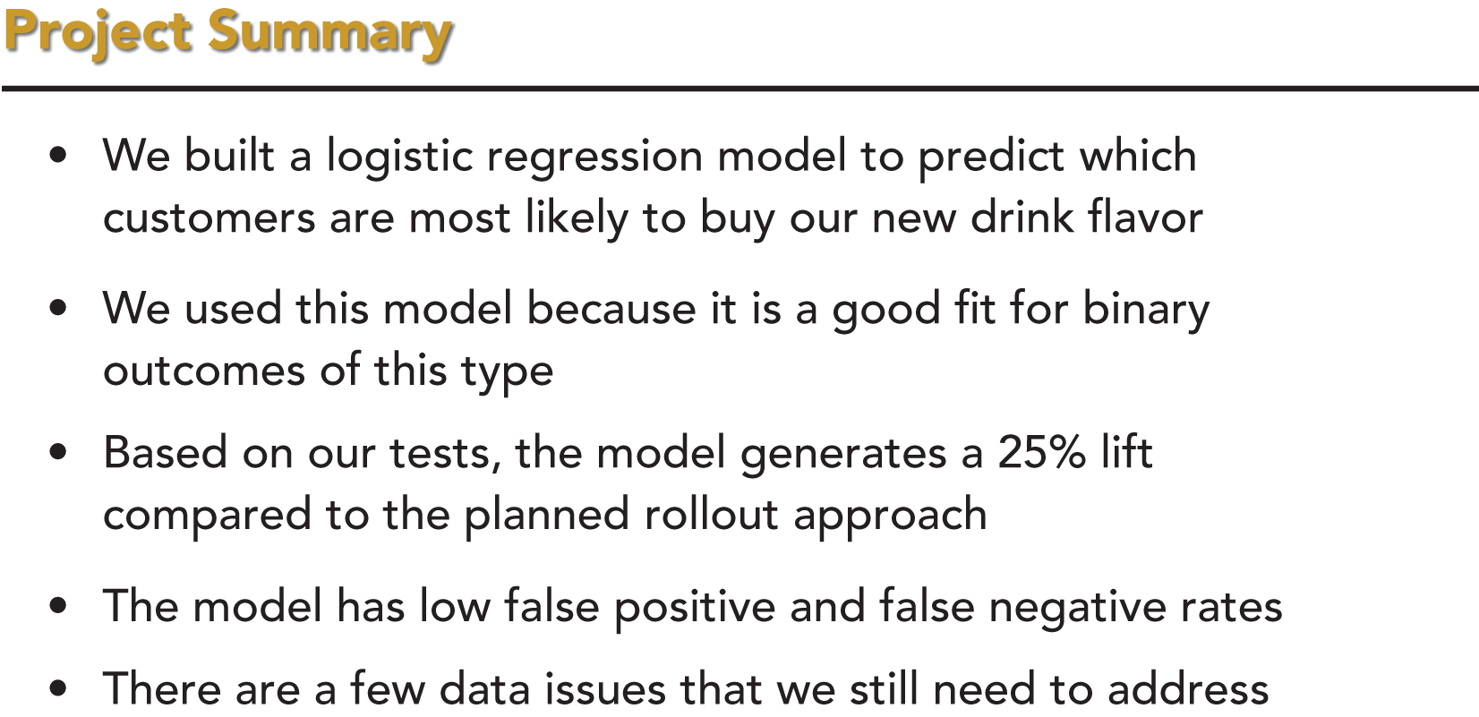
FIGURE 29A An Example of Too Much “What”
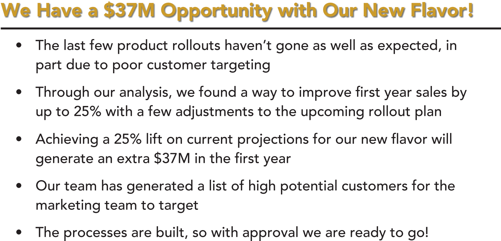
FIGURE 29B An Example of “Why,” “So What,” and “What Next”