chapter eight
practice more on your own
While Chapter 7 posed problems and offered solutions, Chapter 8 has a number of unsolved exercises: to answer them, you will need to draw on the various lessons we’ve covered over the course of SWD and this book. These can be used as assignments, individual or group projects, or incorporated into tests or exams. They will also be useful for those simply wanting additional opportunities to apply the storytelling with data lessons.
The exercises in this chapter can be worked through on your own or with a partner or small group. They grow in nuance and complexity as you move through them. For topics or data that don’t feel immediately relevant to your work, I still encourage you to complete the exercises. Continued rehearsal of lessons helps them become ingrained and enables you to refine your skills in a low-risk setting. Additionally, practicing in different contexts frees you up from the constraints of normal day-to-day work, which may bring to light more creative approaches. After completing an exercise, get feedback and consider what components of your solution you might employ in your work.
A number of exercises invite you to execute the recommendations you outline in the tool of your choice. This additional application helps you better learn your tools and further hone your data visualization and data storytelling skills.
For those assigning exercises from this chapter, feel free to take liberties. There is no end to the number of assignments you can create by mixing and matching specific discussion points or instructions across the various examples. You might use similar exercise framing with your own visuals to create custom exercises.
Let’s practice more on your own!
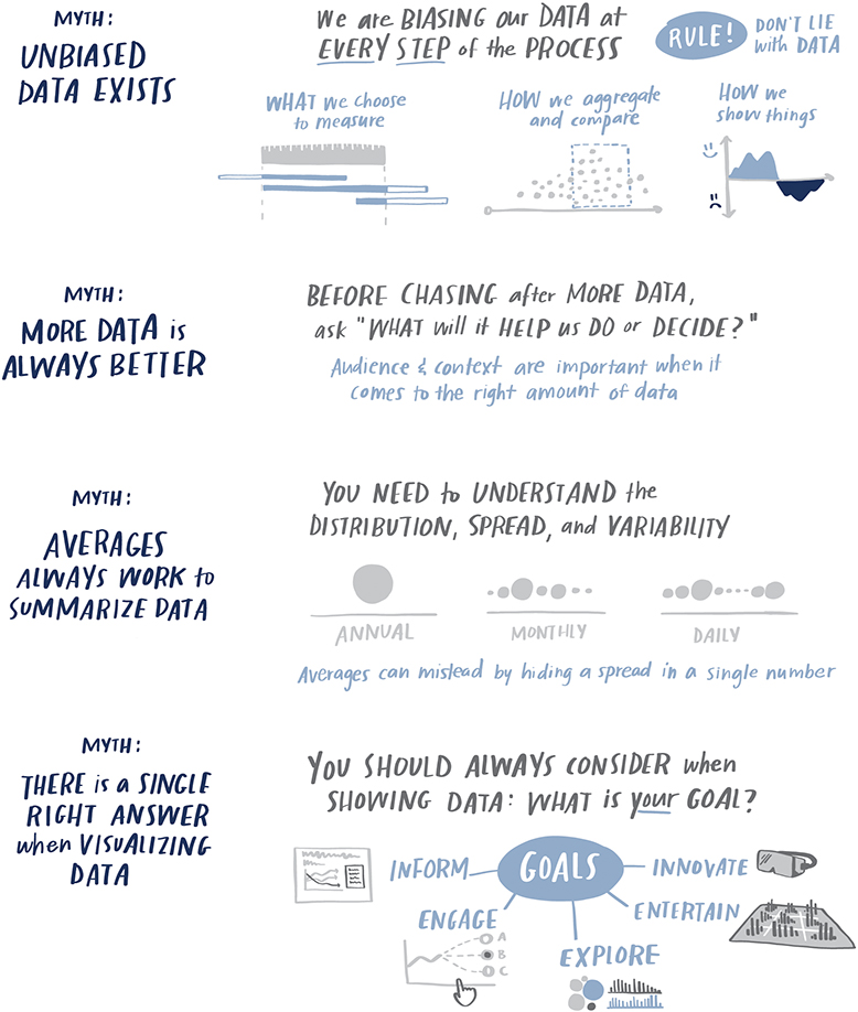
But before you dive in, let’s review some common myths in data visualization.


Exercise 8.1: diversity hiring
Your organization recently implemented a diversity hiring initiative for its “ABC Program.” You’re interested in understanding the relative success of the initiative. Familiarize yourself with Figure 8.1—a slide showing related data—then complete the following steps.

Figure 8.1 Program hiring highlights
STEP 1: Let’s start with the positives: what do you like about this slide?
STEP 2: What is not ideal about Figure 8.1? Make notes or discuss with a partner.
STEP 3: What is the primary takeaway? Is this a success story or a call for action? Articulate in a sentence or two the point(s) you would focus on if you were presenting this data.
STEP 4: Assume you need to present this data and have been told it has to be in tabular form (a table or set of tables). Are there improvements you can make to the way the data is shown given this constraint to better focus on the takeaway you formed in Step 3? Draw (or if you prefer, download the data and create in your tool) the table or tables you would use and detail where and how you would direct attention.
STEP 5: Assume you have more liberty to make changes. How might you present the data? How would you tell a data-driven story about diversity hiring in the ABC Program? Outline your planned approach, then create your ideal materials in the tool of your choice.
Exercise 8.2: sales by region
Imagine that you are the Sales Manager of the Northwest (NW) region at your company. You’ve pulled the following slide (Figure 8.2) from a monthly report and want to cover it at an upcoming offsite with your sales team. You’re preparing content together with your Chief of Staff. Let’s consider two scenarios:
SCENARIO 1: The offsite is tomorrow, and both you and your Chief of Staff have a number of other items to tackle in the meantime. You don’t have time to fully redesign the visual in Figure 8.2. Assume you can spend at most five minutes making changes. What would you do? How would you present the information?
SCENARIO 2: The offsite is a week away, and your Chief of Staff has volunteered to redesign the information shown in Figure 8.2. Before doing so, she’s asked for your feedback. What aspects do you like about the current visual that you would want to be preserved? What changes would you suggest based on the lessons we’ve covered?
Make notes or discuss with a partner.
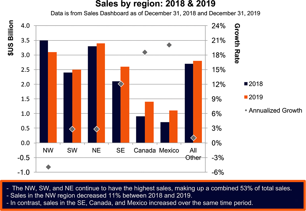
Figure 8.2 Sales by region
Exercise 8.3: revenue forecast
Study Figure 8.3, which depicts gross and net revenue over time, then complete the following steps.

Figure 8.3 Revenue forecast
STEP 1: What do you like about this visual?
STEP 2: Reflect on the use of the data table. Do you find this effective? If so, explain why. If not, how might you approach it differently?
STEP 3: What other changes would you make? Take notes or talk with a partner.
STEP 4: Let’s envision two distinct circumstances for communicating this data: (1) presenting in a live meeting and (2) emailing it to your audience. What would you do differently in these two situations? To take things a step further, download the data and create your preferred visuals in the tool of your choice, making assumptions as needed.
STEP 5: Select a data visualization tool that you have not previously used (see the Tools section of the Introduction for a partial list). Re-create your visual in this new tool. What did you learn from this experience? Write a paragraph or two outlining your insights.
Exercise 8.4: adverse events
Imagine that you work at a medical device company. A colleague approaches you with the following slide (Figure 8.4) summarizing a couple of points from a recent study and asks for your feedback. Spend a few moments examining it, then complete the following steps.

Figure 8.4 Adverse events
STEP 1: Before jumping into constructive criticism, it can be nice to point out what has been done well. What do you like about this slide?
STEP 2: What questions would you ask your colleague? Make a list.
STEP 3: What changes might you recommend based on the various lessons we’ve covered? Outline your thoughts, focusing not just on what you would recommend changing, but also why.
STEP 4: How would your recommendations change if you knew this information was going to be presented to a non-technical audience?
STEP 5: To take things a step further, download the data and create your revamped slide, incorporating the changes you’ve outlined in prior steps in the tool of your choice. Make assumptions as needed.
Exercise 8.5: reasons for leaving
Imagine that you are Chief of Staff for the Chief Marketing Officer (CMO) at a large company. Your boss, the CMO, has asked you to work with your Human Resources Business Partner (HRBP) to understand what is driving attrition—people leaving the company—across the marketing organization and present your findings. Your HRBP digs into the data, then emails you the following visual, Figure 8.5.

Figure 8.5 Reasons for leaving
Spend a few minutes processing this data, then complete the following steps.
STEP 1: What is being shown here? Write a few sentences explaining this data: how do we interpret this visual? Make assumptions as necessary for the purpose of this exercise.
STEP 2: What is confusing or not ideal about the visual in its current form? What questions would you ask or feedback might you give your HRBP? On a related note, assume your HRBP spent a lot of time creating this visual—how can you frame your feedback so they don’t take offense?
STEP 3: Let’s draw! Come up with three different ways to show this data. What are some advantages and shortcomings of each? List them. Which view do you like best and why?
STEP 4: Download the data and create your preferred visual in the tool of your choice.
STEP 5: It’s time to present this data to the CMO. Make an assumption about whether you’ll walk through it live or send it to be consumed on its own. Create your recommended communication in light of this assumption in the tool of your choice.
Exercise 8.6: accounts over time
You are an analyst in a sales organization and your team has been asked to summarize a current campaign, assessing how things are going against the goal of increasing the number of accounts. You have actual data through September 2019 and a forward-looking forecast through the end of 2020. Your colleague has pulled together the following summary (Figure 8.6) and asked for your feedback. Spend a couple of minutes examining the visual, then complete the following steps.
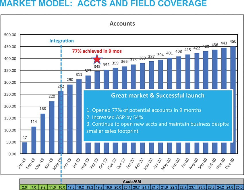
Figure 8.6 Accounts over time
STEP 1: What questions do you have about this data? Make a list.
STEP 2: Let’s declutter: make a list of the elements you would remove.
STEP 3: What is the story—is this a success or call to action? What is the tension in this scenario? What action do you want your audience to take to resolve this tension?
STEP 4: How would you recommend showing this data? Draw or download the data and iterate in the tool of your choice to create your preferred design.
STEP 5: Consider how your approach would vary if you were (1) presenting this data live in a meeting and (2) sending it to your audience to be consumed on its own. How would the way you’d tackle this differ? Write a few sentences explaining your thoughts. To take it a step further, redesign this visual for these different use cases in the tool of your choice.
Exercise 8.7: errors & complaints
In this scenario, you are an analyst working at a national bank. At the beginning of each year, your team compiles a year-end review for each portfolio. This contains data from many parts of the lending process—from originations to collections. You’ve been tasked with analyzing data and creating content on the topics of quality and satisfaction in the Home Loans portfolio. You started by pulling the slide that was used for this in the prior year’s review and updated it with the latest year’s data. The resulting graphs are shown in Figure 8.7.

Figure 8.7 Errors & complaints
Instead of having a page of graphs, you’d decided to use this opportunity to tell a data story.
Spend a few minutes studying Figure 8.7, then complete the following steps.
STEP 1: What questions would you ask about this data? Make a list. Next, answer each of these questions, making assumptions for the purpose of this exercise.
STEP 2: Write a sentence or two about each graph that describes the primary takeaway.
STEP 3: What story or stories would you focus on here? Which data would you include? Is there any data you would omit? Will it all work on a single slide, or do you believe it would be best to use more? Sketch your planned approach on blank paper.
STEP 4: How would you visualize the data in Figure 8.7 to lend insight into what we should focus on in this situation? Consider all of the lessons that we’ve covered and how you would apply them. Download the data and build your materials using the tool of your choice to tell the story with this data.
STEP 5: Imagine you draft your slide(s) and get feedback from your manager that the audience will expect a page of graphs, like they’ve seen in the past. How will you respond to this? Write out your thoughts.
Exercise 8.8: taste test data
Craveberry is the new yogurt product that your food-manufacturing employer is preparing to launch. The product team on which you work decided to do an additional round of taste testing to get a final gauge of consumer sentiment before going to market with the product. You’ve worked with your team to analyze the results. You are getting ready to meet with the Head of Product to discuss whether to potentially make changes before going to market. (If this sounds familiar, it’s because we introduced it in context of the narrative arc in Chapter 6.)
Your colleague puts together the following visual (Figure 8.8) summarizing the taste test results and asks for your feedback. Spend a moment studying it, then complete the following steps.

Figure 8.8 Taste test data
STEP 1: Let’s start with the positives: what do you like about this slide?
STEP 2: What feedback would you give based on the lessons we’ve covered? Outline your thoughts, focusing not just on what you would recommend changing, but also why.
STEP 3: Let’s step back and think about story. Reflect on the various components of the narrative arc: plot, rising action, climax, falling action, ending. List these components and what you would cover within each for this scenario. Even better: write out the points of your planned story on sticky notes and arrange them in the shape of the narrative arc. Edit as needed to outline the story you would tell with this data. What is the tension? What can your audience do to resolve it?
STEP 4: Download the data and create the data-driven story you outlined in Step 3 in the tool of your choice. Also outline the accompanying narrative of what you’ll say when you present to the Head of Product.
Exercise 8.9: encounters by type
The following situation may sound familiar; we’ve seen it once before in Exercise 6.3. Read through the scenario to refresh your memory, then examine the data and complete the following steps.
You work as a data analyst at a regional health care center. As part of ongoing initiatives to improve overall efficiency, cost, and quality of care, there has been a push in recent years for greater use of virtual communications by physicians (via email, phone, and video) when possible in place of in-person visits. You’ve been asked to pull together data for inclusion in the annual review to assess whether the desired shift towards virtual is happening and make recommendations for targets for the coming year. Your analysis indicates there has indeed been a relative increase in virtual encounters across both primary and specialty care. You’ve forecast the coming year and expect these trends to continue. You can use recent data and your forecast to inform targets. You believe seeking physician input is also necessary to avoid setting overaggressive targets that could inadvertently lead to negative impact on quality of care.
Figure 8.9 shows the data you’ll use to build your story.

Figure 8.9 Encounters over time by type
STEP 1: It’s difficult to see what’s going on with the data in tabular form, so let’s start by visualizing it. You can sketch it, or download the data in Figure 8.9 and create graphs in the tool of your choice. Do this to build a better understanding of the data and what we can learn from it. As part of this, you’ll likely want to answer the following questions:
- How have the total number of encounters changed over time?
- How do encounters break down across the various types? Is the desired shift towards virtual channels (telephone, video, and email) happening?
- Is there a difference between Primary and Specialty Care when it comes to use of virtual channels?
- What targets would you recommend for Primary and Specialty Care virtual encounters based solely on the data?
STEP 2: Consider the provided context along with what you learned in Step 1. You anticipate that you’ll have to present this data live. Create a low-tech outline of your data story. You may do this in written form, putting the various takeaways into words and creating a bulleted list. You could also make use of some of the tools we’ve discussed—sticky notes, storyboarding, and the narrative arc. Or perhaps you have other ideas. Plan your data story in the way that works best for you.
STEP 3: Create the data story you outlined in Step 2 using the tool of your choice.
STEP 4: In addition to the live progression, you’ll need a one-pager to be shared with those who missed the meeting or as a reminder of what was covered. Create this visual in the tool of your choice.
Exercise 8.10: store traffic
You are an insights analyst at a large national retailer. You have just completed an analysis of recent store traffic and purchase trends. You’ve visualized the data and believe there is a compelling story to tell.
Store traffic has decreased since last year, both overall and across all regions. Traffic decreased the most in the Northeast—this makes sense, as your company closed several stores there in the past year. Many of those stores’ customers are now shopping with your competitors. The decrease in traffic is also more marked for your most important customer group, which your organization calls “Super Shoppers.” This year-over-year gap has increased in recent months. But traffic—the number of people shopping—is only one piece of the puzzle. To understand how changes in traffic manifest in changes in sales (something management cares deeply about), you also have to take into account how much people spend while at your store. You measure this by “basket,” which is made up of unit purchases (the number of items bought) and the price per item.
The data shows that customers—and Super Shoppers in particular—are generally buying fewer items; however, the average price of those items has increased. This is likely due to targeted promotions your stores offered with luxury brands in the past year. Because of the positive impact of the promotions, you’d like to recommend to senior management to further investigate the financial implications of running additional Super Shopper promotions, both to further test this hypothesis and—more importantly—in hopes of turning around the undesirable trends you’re seeing in the data.
You were talking through the visuals you created as part of this analysis with your manager. In doing so, you realized that the graphs you used to figure out the story may not work well for getting that information across to your stakeholders. Your manager has asked you to revamp the graphs and pull together a short slide deck to communicate your findings and recommendation to senior management. You’ve decided to take a step back and use this as an opportunity to employ the various lessons we’ve covered over the course of SWD and this book.
Figure 8.10 shows your original graphs. Spend some time studying these, then complete the following steps.
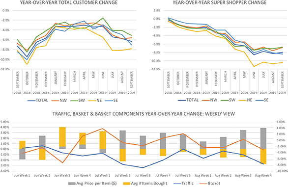
Figure 8.10 Your original graphs
STEP 1: Form your Big Idea for this scenario. Remember the Big Idea should (1) articulate your point of view, (2) convey what’s at stake, and (3) be a complete sentence. Refer to the Big Idea worksheet in Exercise 1.20 if helpful. After crafting it, discuss it with someone else and refine. Do you think it makes sense to form a pithy, repeatable phrase based on your Big Idea? If so, create one, referring to Exercise 6.12 as needed.
STEP 2: Let’s take a closer look at the data. Write a sentence or two about each graph that describes the primary takeaway.
STEP 3: Time to get sticky! Get some sticky notes. In light of the context described, the Big Idea you created in Step 1, and the takeaways you outlined in Step 2, brainstorm the pieces of content you might include in your slide deck. After you’ve spent a few minutes doing this, arrange the pieces along the narrative arc. What is the tension? What can your audience do to resolve it?
STEP 4: Next, spend some time with the data and design your graphs. Download the original graphs and underlying data (you’ll find some additional data there, too, which may be useful). You’ll likely need to iterate through a few different views of the data. Consider drawing your ideas as part of your iterating and brainstorming process. Put into practice the lessons we’ve covered on choosing appropriate visuals, decluttering, and focusing attention. Be thoughtful in your overall design.
STEP 5: Create the deck you will use to present using the tool of your choice. Also outline the accompanying narrative of what you’ll say for each slide. Even better: present this deck, walking a friend or colleague through your data-driven story.
STEP 6: Let’s take a few minutes to reflect. Compare the original graphs with what you’ve created. Do you believe your solution will be more effective? Why? How did this overall process feel? Which parts were most helpful and why? How can you envision applying components of what you’ve done in this exercise to your work in general? Write a paragraph or two outlining your thoughts.
You’ve made it: you’ve learned by example! You’ve practiced a ton. You’ve honed your data storytelling skills. Congrats! If you haven’t already started, you are definitely now ready to practice at work. Let’s move on to some final exercises designed to give you the skills and confidence you need to succeed telling stories with data in your day job.