chapter seven
practice more with cole
While prior chapters have provided a piecemeal focus on the given lesson, this chapter takes a more comprehensive view of the entire storytelling with data process. Real-world based scenarios and related data visualizations are introduced and paired with specific questions to consider and solve. These are followed by step-by- step illustrations that give full insight into my thought process and design decisions.
I encounter many examples of data communications through our workshops. Clients share their work ahead of time and we use this as the basis of discussion and practice. These cross many topics and industries and there is something to be learned from each and every one. The process of creating data visualization makeovers from select examples to highlight storytelling with data lessons has been key to honing my own and my team’s skills for critiquing, remaking, and sharing and discussing examples. In this section, you’ll get an opportunity to practice just like the storytelling with data team—then you’ll be walked through our solution as if you were a participant in one of our hands-on workshops.
Though the lessons in SWD and here could be taken as step-by-step instruction, my typical approach for moving from data to data story is more holistic, which is how you’ll see it addressed in the forthcoming examples. Rather than go through all parts of the process each time, the various examples are used to highlight different components, exposing you to varied challenges and potential solutions. We will start out with some simple graph and slide redesigns and get increasingly comprehensive as we move through the case studies presented and solved in this chapter.
Let’s practice!
Before we do, we’ll review the main lessons we’ve covered so far.


Exercise 7.1: new advertiser revenue
Imagine you are an analyst at a digital marketing company. A new feature was rolled out in 2015—let’s call it Feature Z—that allows your company’s clients to create better ads and will introduce a new revenue stream for your platform. The challenge is that Feature Z has a steep learning curve, so there’s been some difficulty getting clients to utilize it. Overall, you have seen improvement over time, both in terms of clients using Feature Z and increased revenue from it. At a recent meeting when discussing this topic, the head of client support raised a question about what Feature Z adoption looks like for new advertisers specifically—those creating an advertisement on your platform for the first time. No one has sliced the data to look at this before, so you’re working with a colleague to answer this question.
Your colleague put together the heatmap shown in Figure 7.1a. Spend a few moments studying it, then complete the following steps.

Figure 7.1a Advertisers are getting more sophisticated sooner
STEP 1: It’s easy to jump to what’s “wrong” when faced with someone else’s data viz; let’s pause first and reflect on positive points to share as feedback. What do you like about the current visual? Write a sentence or two.
STEP 2: What is not ideal in Figure 7.1a? Make a list.
STEP 3: How would you show this data? Download the data and iterate in the tool of your choice to create your preferred view.
STEP 4: What is the tension in this scenario? What action do you want your audience to take to resolve this tension?
STEP 5: You’ve been asked to provide a single slide that tells the story. Create this slide in the tool of your choice, making assumptions as necessary for the purpose of this exercise.
Solution 7.1: new advertiser revenue
STEP 1: There are a couple of things I like in this visual. Words are generally used well. The takeaway title at the top does a nice job setting up the story and starting to address the question posed. Axes are titled directly. I also like that there is annotation directly on the graph (in the grey text box on the right) that supports the takeaway title and also is connected directly to the data that is described so I don’t have to search for it. That said, I don’t love the arrows for creating this connection because they look messy and cover up some of the data. Oops, I’ve already jumped to what I’d do differently! Let’s address that next.
STEP 2: There are a number of things that could be improved in this visual. The following are three primary aspects that are not ideal from my perspective.
- The table feels like work. I find the tabular data difficult to wrap my head around. The heatmapping helps, but it still requires effort to figure out what we’re meant to see.
- We’ve employed a problematic color scheme. The red/green color scheme will be an issue for colorblind individuals in our audience. Beyond that, the red and green are competing for my attention, making it difficult to focus.
- There is lack of alignment. The various elements on the page aren’t aligned. We see a mix of left-aligned, centered, and right-aligned text and numbers, without an apparent reason why. This creates an overall disorganized feel.
STEP 3: Iterating through multiple ways of graphing the data will likely be necessary to observe how variant views allow us to more or less easily see different things. We have time in a couple of ways in this example: by quarter for the first time an ad was created and by advertiser age. This means we could graph this data in lines two totally distinct ways. I’ll start by creating a couple of quick and dirty graphs of the data (these are simply default charts; I’m not worrying at all about formatting at this step). See Figure 7.1b.

Figure 7.1b Quick and dirty views of data
Let’s consider what the visuals in Figure 7.1b allow us to see. In both cases, the y-axis represents the percent of total revenue driven by Feature Z. On the left-hand side, my x-axis is the date when the first ad was created. Each line represents advertisers of the given age group. This allows us to see that those in the first quarter (0) are less successful (the dark blue line for 0 quarters is at the bottom of the graph, where percent of revenue is lowest), though improving (the line for 0 increases as you move from left to right). Revenue goes up generally as age increases (the lines as we move upwards in age are increasingly high on the graph), with those in their 15th quarter appearing highest on the graph (we don’t see a line for 16 quarters of tenure since there’s only a single data point and you need two points to make a line). If you’re reading this and thinking, Wow, this sounds complicated—you are correct. Let’s shift our attention to the second graph.
The right-hand side plots advertiser age on the x-axis. Each line represents the quarter in which the first ad was created. Lines going upward to the right illustrate sophistication increasing with advertiser age. Lines moving upward on the graph shows sophistication increasing earlier—with more recent quarters at the top. Notice how much simpler that was to put into words compared to the left-hand side! This is going to be a good general view of the data given what we want to illustrate.
That said, this is still a lot of data to process. Do we need it all? Perhaps we could simplify by showing less. One way to do so would be to show fewer quarters of data. That said, I don’t necessarily want to narrow our time window, since I’d like to be able to compare how things looked when Feature Z was introduced in 2015 and our recent data. But that still leaves me a couple of options. Given that the most recent data point is Q1 2019, I could elect to show just Q1 line for each year. Another approach could be to roll this data into annual cohorts. Look back to the right-hand side of Figure 7.1b and imagine we have just 5 lines of data (2015, 2016, 2017, 2018, 2019). Aggregating in this way would simplify things and allow us to clearly make our point: we’re seeing more revenue sooner as advertiser sophistication gets better with both time (increasing as we move up the graph) and age (increasing rightwards). Bingo!
STEP 4: Let’s step back from the data for a moment to identify the tension and resolution. I’d characterize the tension as: while we’re generally seeing improvement in adoption of and revenue from Feature Z, we don’t know how this plays out for our newbie advertisers. Are things okay? Are there issues we need to address?
The resolution is that things look good—no immediate action is needed. I often suggest that if we can’t clearly articulate the action we want our audience to take, we should revisit the need to communicate in the first place. But here, our audience posed a question and though no action is needed, this isn’t a reason not to answer it! Still, let’s be clear on what we need our audience to do: they should be aware of this and they don’t need to do anything right now. We can take the action to continue to monitor things from this perspective and alert them if this changes.
STEP 5: Figure 7.1c shows my single-slide story. Take a moment to study it and compare to what you created. Are there similarities? Where are there differences? Note what works well in each approach.

Figure 7.1c Sophistication increasing with time & age
We’ve reviewed a number of lessons over the course of this solution. Always ask yourself: do you need all the data? Determine what you want your audience to see, then select a visual that will facilitate that, iterating as needed to identify an effective view. Design thoughtfully, aligning elements to create structure, using color sparingly to direct attention, and titling and annotating effectively with words to help the data make sense.
Exercise 7.2: sales channel update
The following slide (Figure 7.2a) shows unit channel sales over time for a given product. Familiarize yourself with the details, then complete the following steps on your own or with a partner.

Figure 7.2a Sales channel update
STEP 1: Let’s start with the positive: what do you like about this slide?
STEP 2: What questions can we answer with this graph? Where specifically do we look in the data for answers to these questions? How effectively are these questions answered? Write a couple of sentences outlining your thoughts.
STEP 3: What changes would you recommend based on the lessons we’ve covered? Write a few sentences or make a list outlining specific points of feedback and how you would resolve.
STEP 4: Consider how your approach would vary if you were (1) presenting this data live in a meeting and (2) sending it to your audience to be consumed on its own. How would the way you’d tackle this differ? Write a few sentences explaining your thoughts. To take it a step further, redesign this visual for these different use cases in the tool of your choice.
Solution 7.2: sales channel update
For me, this is a situation where we are trying to answer too many questions in a single graph. In doing so, we don’t answer any single question effectively. Rather than pack a lot into one graph, we will be better off allowing ourselves to have multiple visuals.
STEP 1: What do I like about the original slide? I like that someone outlined some specific points of interest via the bulleted text below the graph. The general design of the graph is also pretty clean; there isn’t a lot of clutter to distract from the data.
STEP 2: We can answer a couple of different primary queries with this graph: how have unit sales changed over time? How has the composition of sales across channels changed over time? We’re meant to see the former by comparing the tops of the bars and the latter by comparing the pieces within the stack. Stacked bars are challenging, though, because when you stack things that are changing on top of other things that are changing, it becomes very difficult to see what is happening. The second point outlined via bullets says there was a decision made to shift sales from retail to partners. Does the data show that happening? Is this a success story or a call for action? It’s tough to tell!
STEP 3: I have three major points of feedback that I will address in my makeover of this visual. Let’s talk through each of these.
Use multiple graphs. The biggest change I will make is to use multiple graphs. I sometimes think of the stacked bar chart like a Swiss Army knife. You can do many things with it and sometimes constraints may necessitate its use. But you can’t do any of these tasks quite as well as if you had the dedicated tool. Sure, the scissors on a Swiss Army knife work well enough to cut a loose thread, but for anything more I’d much rather have a pair of scissors. Instead of the stacked bar, I’ll use two different graphs that each directly answer the questions outlined in Step 2. I’ll walk you through the specifics in Step 4.
Tie text visually to data. In terms of additional changes, as mentioned in Step 1, I like that someone looked at this data and outlined takeaways. The challenge, though, is that when I read the text at the bottom of the slide, I have to spend time thinking and searching to figure out where to look in the data for evidence of what is being said. I’ll want to solve for this—when someone reads the text, I want them to know where to look in the data. When someone sees the data, I want them to know where to look in the text for related context or takeaways. To connect the text and data, we should think back to the Gestalt principles. We can use proximity, putting the text close to the data it describes. We can use connection and physically draw a line between the text and data. We can use similarity, making the text the same color as the data it describes. I’ll employ aspects of each of these approaches in my solution.
Clearly differentiate forecast data. If I take the time to read through all of the text, the final bullet raises something perhaps unexpected—not all of this data is real. The final point, 2020, is a forecast. But there’s nothing done to the design of the data to indicate this to us. I’ll want to change that and clearly indicate which points are actual data and which are forecast.
STEP 4: My makeover will address the points of feedback raised in Step 3. Let’s first tackle the initial question—how have total unit sales changed over time? See Figure 7.2b.

Figure 7.2b Visualize units sold over time with a line
I moved from bars to a line so the connection between points would allow us to more easily see the trend. I chose to omit the axis and instead labeled a few of the data points; why I chose the ones I did will become clear momentarily. I made a visual distinction between the actual data (solid line, filled points) and projected data (dotted line, unfilled point) and also added the descriptor text “Projected” to the x-axis tied through proximity to the 2020 label.
If I will be presenting this information in a live setting, that opens up additional opportunities. Any time we are looking at data over time, we have a natural construct for storytelling: the chronological story. In a live setting, I can build the graph piece by piece, talking through relative context as I do. See the following (Figure 7.2e - 7.2r) for an illustration of how I might do this, paired with my written voiceover.
Today, we’ll be looking at unit sales over time. I’ll start back in 2012, we’ll look at actual data through 2019 and then our latest projection for 2020. (Figure 7.2c)

Figure 7.2c In a live progression, first set up graph
Our product hit the market in 2012. Sales that first year amounted to twenty-two and a half thousand units, which we were very happy with against our initial target of 18,000 units. (Figure 7.2d)

Figure 7.2d Live progression
Sales increased slightly in 2013, to just over 23,000 units sold. (Figure 7.2e)

Figure 7.2e Live progression
But then in 2014, we encountered production issues. As a result, we weren’t able to keep up with demand. Units sold plummeted. (Figure 7.2f)

Figure 7.2f Live progression
We quickly recovered, fixing the issues and hitting nearly 24,000 in unit sales in 2015. (Figure 7.2g)

Figure 7.2g Live progression
Sales continued to increase through 2016 and 2017. (Figure 7.2h)

Figure 7.2h Live progression
In 2017, we made the decision to start shifting sales from retail to our partner channel. We saw sales in 2018 dip as a result of this. (Figure 7.2i)
Figure 7.2i Live progression
We recovered from this dip in 2019. (Figure 7.2j)

Figure 7.2j Live progression
We expect continued increasing sales in 2020. (Figure 7.2k)

Figure 7.2k Live progression
If I weren’t presenting live, I could annotate this context directly on the graph so that my audience processing it on their own would get the same sort of story I’d walk my audience through in a live setting. See Figure 7.2l.

Figure 7.2l Annotated line graph
We’ll look momentarily at how we could integrate a version of this graph into a slide. But before we get there, let’s determine how we can answer the relative composition question in a live setting: with a 100% stacked bar. The 100% stacked bar does face some of the same challenges as the typical stacked bar, in that the middle segments are harder to compare. However, we also get some benefit. With a consistent baseline both along the bottom and top of the graph, there are two data series that our audience can more easily compare over time. Depending on what we need to highlight and if we are smart about how we order the data, we can actually make this work quite well. Let’s tune back into my live presentation:
Let’s look next at the composition of sales across channels. (Figure 7.2m)

Figure 7.2m Another view: channel breakdown
The retail channel has decreased as a proportion of total over time. (Figure 7.2n)

Figure 7.2n Focus on retail
E-commerce has increased marginally since launch, but has made up a consistent proportion of total sales in recent years. (Figure 7.2o)

Figure 7.2o Focus on e-commerce
Direct mail is tiny, has always been tiny, and will stay tiny. (Figure 7.2p)

Figure 7.2p Focus on direct mail
Partner sales have increased as a percent of total. (Figure 7.2q)

Figure 7.2q Focus on partner
Most noteworthy is the change we’ve seen in composition of sales by channel over time. In particular, since the decision was made in 2017 to shift sales from retail to partner: we’ve seen that change happen. Retail is making up a decreasing proportion of total sales, while the partner channel is making up an increasing proportion of sales over time. We expect this will continue in 2020. (Figure 7.2r)

Figure 7.2r The desired shift in channels has happened: success!
This is a success story! If we need to pull that together in a way that can stand on its own to be sent around, I would opt for a single slide with takeaway titles, clear structure, and more written words to lend context. See Figure 7.2s.

Figure 7.2s Single slide for distribution
By allowing ourselves to have more than one graph, we can effectively answer multiple questions. Note also the various ways in which text is used in the preceding visual, and the numerous ways words are visually tied to the data. When my audience reads the text, they know where to look in the data for the important things and vice versa. Not only will this be a more pleasant experience for my audience to process this data, but we can also get much more information out of it!
Exercise 7.3: model performance
You work at a large national bank managing a team of statisticians. One of your employees shares the following graph (Figure 7.3a) with you during their weekly one-on-one and asks for your feedback. Spend a moment analyzing it, then complete the following steps.

Figure 7.3a Model performance by LTV
STEP 1: What questions would you ask about this data? Make a list.
STEP 2: What feedback would you give based on the lessons we’ve covered? Outline your thoughts, focusing not just on what you would recommend changing, but also why. It’s by grounding our feedback in underlying principles that we help improve not just a single graph, but also deeper understanding that can lead to better data visualization in the future.
STEP 3: How would you recommend presenting this? What is the story and how can it be brought to life? Make an assumption about whether this information will be presented live or sent around, and outline your recommended plan of attack in light of this assumption. Take things a step further by creating your recommended communication in the tool of your choice.
Solution 7.3: model performance
STEP 1: This is a difficult one! I have so many questions about the graph that it’s hard to step back and consider what the data is showing. I would ask about the language used: what do the acronyms mean and what do the axes represent? Which data is meant to be read on the secondary y-axis on the right-hand side of the graph? Why have these particular choices for line style been made? What is the big red box meant to highlight?
STEP 2: After getting answers to my questions raised in Step 1, I would offer the following feedback.
Use more approachable language. This looks to me like output from statistical programming software (SAS or similar). If you are a statistician and you are communicating to your colleagues who are also statisticians, this is totally fine. If you are communicating to anyone else on the planet, you need to turn this into accessible language. Rather than put things like “vol_prepay_rt” (y-axis title in Figure 7.3a), we should translate it into voluntary prepayment rate. This is the proportion of people who are paying off their loan before it is due. The only reason I have any idea what’s going on in this graph is because I used to work in Credit Risk Management, so I have enough banking subject matter expertise to make sense of it.
On the topic of comprehensible language, you should also spell out any acronyms. If someone in your audience doesn’t know what an acronym means, they will usually be too embarrassed to ask—or they may make an incorrect assumption. In that event, you’ve lost the ability to fully communicate to everyone. Spell out acronyms on each page at least once. This can be the first time you use it or you can have a footnote at the bottom of the page defining acronyms or specialized language. This isn’t about dumbing anything down, but rather not making things more complicated than necessary. By the way, “ltv_bin” on the x-axis represents the loan-to-value ratio. This is commonly referred to as LTV and represents the loan amount relative to the value of the property (typically expressed as a percent, but here we have it as a decimal). The higher the LTV, the riskier the loan, because the higher proportion the loan amount is relative to the value of the property. UPB is unpaid principal balance: the sum of total outstanding loans.
There is also some pretty convoluted language in the title of the graph and at the bottom of it. I guarantee you that the person who created this graph knows exactly what it all means. I can decipher enough to believe that it indicates the product in the title and what they used for their out of time sample to validate the model. Who our audience is will dictate whether and how prominently we need to present this. If we’re reporting to a senior leadership team, we probably don’t need to get into any of those details—they are going to trust that we know our stuff and have done it in a way that makes sense. If we’re communicating to people who will care about the technical details, we may need to include some of this, but it’s likely footnote material rather than things that are prominently called out as in the original.
Change up line style sparingly. Dotted lines are super attention grabbing. They also add some visual noise. If we think about a dotted line from a clutter standpoint, we’ve taken what could have been a single visual element (a line) and chopped it into many pieces. Because of this, I recommend reserving the use of dotted lines for when you have uncertainty to depict: a forecast, prediction, target or goal. In these cases, the visual sense of uncertainty we get with the dotted or dashed line more than makes up for the additional noise it adds. The blue model line in Figure 7.3a is the perfect use of a dotted line. When it comes to the green UPB line, though—I certainly hope we aren’t estimating the volume of unpaid principal balance across our portfolio—we should know exactly what that is! Use thick, solid, filled in elements to depict actual data and thin, dotted, unfilled points to represent estimated data.
Eliminate the secondary y-axis. I recommend avoiding the use of a secondary y-axis, both in this specific example and in general. The challenge with a secondary axis is—no matter how clearly things are titled and labeled—there is always some work that has to be undertaken to figure out which data to read against which axis. I don’t want my audience to have to do this work. Rather than use a secondary axis, you can hide the secondary y-axis and instead title and label the data that is meant to be read against it directly. As another alternative, you can create two graphs, using the same x-axis across each. Putting the data into separate graphs means you can title and label each of the data series on the left, so there’s no question of “Do I look left or right to get the details that I need?”
The data that is meant to be read against the secondary axis is the unpaid principal balance. This is shown in an odd way in Figure 7.3a: thousands of thousands. A thousand thousand is a million. Changing our scale to millions will both make the graph easier to process and talk about the data it depicts.
It seems like the general shape of the data is more important than the specific numeric values. Given this, I’d recommend employing the second alternative raised previously: divide the data across two graphs, as shown in Figure 7.3b.

Figure 7.3b Pull the data apart into two graphs
In Figure 7.3b, I separated the visual into two graphs. The top graph shows Model and Actual prepayment rate. The LTV axis in the middle is meant to be read across both graphs (if you find this confusing, you could simply repeat it again below the second graph). The bottom graph shows the distribution of loans by Unpaid Principal Balance in our portfolio. We’ll look at another potential option for presenting this data momentarily. First, let’s continue my points of feedback.
The big red box doesn’t highlight the right thing. Someone looked at this graph and thought, I would like you to look here and then they drew a red box around it. I appreciate the effort. However, I think this might be a red herring.
Now that we’ve hopefully answered a lot of the questions about this data, take a look back at the red box in Figure 7.3a. What are we meant to see? Can you state it in a sentence?
If I were to do so, my sentence would be: our model overpredicts prepayment at low LTVs. Is that an issue? Look back at Figure 7.3a. Do we have any loans in our portfolio at low LTVs? (Hint: look at the green dotted line to answer this question.)
No. We don’t have any loan balance in that part of the portfolio. That’s probably why our model isn’t performing well there: we didn’t have any loans to model on in this area. Beyond that, low LTVs represent our least risky loans. These are cases where the loan amount is low compared to the property value (so if someone doesn’t pay and the bank needs to take the house, they will make their money back...and then some). This probably isn’t cause for concern. That said, there is still something interesting here. We’ll get to that momentarily.
STEP 3: Let me walk you through how I would present this data in a live setting, which—as we saw in the prior exercise—gives us some interesting options for communicating this data.
I can start by setting up the graph for my audience. Today, we’ll be looking at modeled versus actual prepayment rates by LTV. Prepayment rate is shown on the vertical y-axis. Loan to value, LTV, is depicted across the x-axis. (Figure 7.3c)

Figure 7.3c First, set the stage
Actual prepayment doesn’t vary much by LTV: this line is pretty flat. (Figure 7.3d)

Figure 7.3d Actual prepayment doesn’t vary by LTV
Our model, however, behaves differently. It overpredicts at low LTVs and underpredicts at high LTVs. (Figure 7.3e)

Figure 7.3e Model overpredicts at low LTVs and underpredicts at high LTVs
Next, I’m going to do something a little different. You might ask: how big of a deal is this? Where are loans concentrated in the portfolio? I’m going to replace prepayment rate on the y-axis with the unpaid principal balance of loans across our portfolio. That looks like this. (Figure 7.3f)

Figure 7.3f Distribution of loans across the portfolio
Here is how the loans are distributed across the portfolio. Let’s pause and take note of the y-axis scale and how the data lines up against it: the biggest bar represents roughly $800 million in unpaid principal balance. That said, more important than the specific numbers is that we focus on the general shape of the data, so I’m going to get rid of this axis in my next step. At the same time, I’ll push these bars to the background and layer the modeled and actual prepayment rates back onto the graph. (Figure 7.3g)

Figure 7.3g Add prepayment back to graph
This allows us to see that the model over-predicts prepayment at low LTVs—but we don’t have any portfolio concentrated there. (Figure 7.3h)

Figure 7.3h Model over-predicts prepayment at low LTVs
The model under-predicts prepayment at high LTVs—by the way, we do have loan balances in that part of the portfolio. We should watch this going forward. (Figure 7.3i)

Figure 7.3i Model under-predicts prepayment at high LTVs
The preceding sequence would work well in a live presentation. If we need a single visual to send out to remind people what we discussed or for those who missed the meeting, I would annotate important points directly on the slide. This will make it clear to my audience what they are meant to take away and what it means. See Figure 7.3j.

Figure 7.3j Annotate important points directly on slide
Lessons put into practice: use accessible language and don’t overcomplicate. Highlight sparingly with color. Articulate your message clearly so your audience doesn’t miss it!
Exercise 7.4: back-to-school shopping
As a data analyst at a national clothing retailer, you are gearing up for this year’s back-to-school shopping season. You’ve analyzed survey data from last year’s back-to-school shopping to understand customers’ experience—what they liked and what they didn’t like. You believe the data reveals some clear opportunities and want to use it to inform the strategy for this year’s back-to-school shopping season across your company’s stores.
This example may sound familiar; we’ve seen it before in Exercises 1.2, 1.3, 1.4, 1.7, 6.3 and 6.4. Refer back to these exercises and corresponding solutions to remind yourself how we thought about our audience, Big Idea, storyboard, tension, resolution, and the narrative arc for this scenario. Review Figure 7.4a and complete the following.

Figure 7.4a Back-to-school shopping survey results
STEP 1: What is the story here? How would you visualize the data in Figure 7.4a to lend insight into what we should focus on in this situation? Reflect on all of the lessons that we’ve covered and how you would apply them. Make assumptions about the scenario as needed. Download the data and create your preferred visual(s).
STEP 2: You will be walking your audience through this data in a meeting. How would you present the information to them? Develop your materials in the tool of your choice.
STEP 3: You anticipate that your audience will want you to send them content after the meeting. This will remind those who attended what was talked about as well as let folks who weren’t able to attend know what was discussed. How would you design graphs or slides to meet this need? Create in the tool of your choice.
Solution 7.4: back-to-school shopping
STEP 1: Let’s look at a few iterations of this data to see which can help us facilitate that magical “ah ha” moment of understanding what graphs done well can do. First, I’ll try a scatterplot. See Figure 7.4b.

Figure 7.4b Scatterplot
The scatterplot seems to prompt more questions than it answers; it doesn’t work well for this data. Let’s try a line graph. See Figure 7.4c.

Figure 7.4c Line graph
Do lines work for us here? We can more easily pick out highs and lows than the prior view. But the lines are connecting categorical data in a way that doesn’t make sense. Given that we have categorical data, let’s try a bar chart. See Figure 7.4d.

Figure 7.4d Vertical bars
The most frequent reason I find myself moving from a standard vertical bar chart to a horizontal bar chart is simply to get more space to write the x-axis labels. Diagonal elements are attention-grabbing. They are also messy: they create jagged edges, which look disorganized. Worse than any of that, though—diagonal text is slower to read than horizontal text. This is an easy fix: we can rotate our graph 90 degrees to a horizontal bar chart, which gives us more space to write the category names in a legible fashion. See Figure 7.4e.

Figure 7.4e Horizontal bars
Any time we show data, we want to be thoughtful about how we order the data. Sometimes, there is a natural ordering inherent to our categories that we should honor. If we don’t have a set order to our categories, then we want to order meaningfully by the data. In doing so, we should think back to that zigzagging “z” of processing: without other visual cues, your audience will start at the top left of your page or screen and do zigzagging “z’s” with their eyes to take in the information. This means they encounter the top left of your graph first. If the small pieces are the important ones, we might put those at the top. See Figure 7.4f.

Figure 7.4f Sort ascending
However, if we step back and think about story progression, we’d be starting with where we perform the worst, which could be a bit abrupt. Perhaps we want to start with where we perform well and then move into the opportunities: we could put the large categories at the top and sort in descending fashion. See Figure 7.4g.

Figure 7.4g Sort descending
Excel moved my x-axis to the top with this reorganization in Figure 7.4g, which I like. It means my audience hits how to read the data before they get to the data.
In the spirit of applying the other lessons we’ve covered: next, let’s declutter. Before reading on, spend a moment studying Figure 7.4g. What clutter would you eliminate? What other changes would you make to ease the processing of this data?
Figure 7.4h represents my decluttered graph. I removed the chart border and gridlines. I thickend the bars. I increased the x-axis maximum to 100% and reduced the frequency of x-axis labels so they would fit horizontally. I removed the y-axis line and tick marks. I eliminated the periods from the ends of the y-axis labels and shortened the second-to-last label so it would fit on a single line. I put the legend at the top of the graph, so my audience will encounter it before they get to the data and used similarity of color to visually tie it to the data it describes.

Figure 7.4h Decluttered graph
Before proceeding, look back at Figure 7.4h: where are your eyes drawn?
If you’re like me, your response is: nowhere very clearly. This means we aren’t currently using our preattentive attributes strategically to direct attention. Let’s be more thoughtful in how we use our color and contrast. See Figure 7.4i.

Figure 7.4i Focus attention
In Figure 7.4i, I’ve pushed most elements of the graph to the background by making them grey. I drew attention to Our Store by making it dark blue. We’ll further focus attention in a few different places when we tell our story in a live progression momentarily. First, let’s add the words that need to be present to ensure the data is accessible: see Figure 7.4j.

Figure 7.4j Add words
Stories have words. At minimum, we need descriptive words on the graph to help it make sense: a graph title and axis titles. We can take this a step further and use our words to tell a story. Let’s do that next.
STEP 2: If I were presenting in a live meeting, I might go through a progression similar to the following.
I’ll be making one recommendation today: that we invest in employee training to improve the in-store customer experience. (Figure 7.4k)

Figure 7.4k My Big Idea summarized in a pithy, repeatable phrase
Let me back up and set the plot. The back-to-school shopping season makes up nearly a third of our annual revenue, so is a huge driver of our overall success. But we’ve not historically been data-driven about how we’ve approached it. We allowed a one-off compliment or criticism at the store level drive how we did things. That worked okay when we were small, but clearly it doesn’t scale. So we thought: let’s get more data-driven about how we plan for this important part of our business. Coming out of last year’s back-to-school shopping season, we conducted a survey of our customers and the customers of our competitors. The data collected lends important insight into both how we fare across different dimensions of our store experience, as well as how we stack up against the competition. (Figure 7.4l)

Figure 7.4l Back up and set the plot
Today I’ll take you through those survey results and use them to frame up a specific recommendation. I’ve already foreshadowed this: I believe we should invest in employee training to improve the in-store customer experience. (Figure 7.4m)

Figure 7.4m What we’ll cover today
Before we get to the data, let me set up for you what we’re going to be looking at. We asked people about a number of dimensions of the shopping experience—things like the store offers a nice atmosphere, items I can’t find elsewhere, and the latest styles. For each of these dimensions, we’ll be summarizing into percent favorable. This is the proportion of respondents who indicated positive sentiment on the given item. (Figure 7.4n)

Figure 7.4n Set up the graph
Let’s add the data for our stores. You’ll see there is variance in performance across the different items. (Figure 7.4o)

Figure 7.4o Focus on our business
Let’s focus first on where things are going well. We score highest in three areas: a nice atmosphere, items people can’t find elsewhere, and the latest styles. Verbatim comments echoed these points as well: people like the idea of shopping with us and they have positive brand association. (Figure 7.4p)

Figure 7.4p Focus on highest scoring items
But there is also another side of the story: items where we score lower. (Figure 7.4q)

Figure 7.4q Focus on lowest scoring items
Interestingly, when we layer on our competitor data—which I’ll do next via grey bars—we score on par with the competition in these low scoring areas. So that’s not where we recommend focusing. (Figure 7.4r)
Figure 7.4r Add competitor data
There are other items, however, where we score lower than the competition. (Figure 7.4s)

Figure 7.4s Highlight where we underscore competition
Next, I’m going to transition to a different view of the data. Rather than plot absolute percent favorable, I’m going to graph the difference between the bars. The left-hand side represents where we underperform—we score lower than—the competition. The right-hand side shows where we outperform—we score higher than—the competition. (Figure 7.4t)

Figure 7.4t Shift from focus on absolute to difference
Let’s refocus again, first on where things are going well. The three areas we outperform the competition the most—items that can’t be found elsewhere, a nice atmosphere, and the latest styles—these are the same three items we score highest on an absolute percent favorable basis. (Figure 7.4u)

Figure 7.4u Focus on items we outperform
But there are also areas where we underperform the competition. (Figure 7.4v)

Figure 7.4v Focus on items we underperform
We underperform the most in items related to promotions and sales. These are areas we’ve intentionally avoided historically because of the brand dilution we expect may result. We don’t recommend focusing here. (Figure 7.4w)

Figure 7.4w Underperform the most in promotions
Rather, look at these other areas where we underperform. Friendly and helpful employees, I can find what I’m looking for, and I can find the size I need—it is alarming that we underscore the competition so much in these areas. The good news is that these are all aspects of customer experience over which our sales associates have direct control. (Figure 7.4x)

Figure 7.4x Recommend focusing on areas we can control
Let’s invest in employee training to create a common understanding of what good service looks like to improve the in-store customer experience and make the upcoming back-to-school shopping season the best one yet! (Figure 7.4y)

Figure 7.4y Repeat my Big Idea summarized in a pithy, repeatable phrase
STEP 3: If I need something to send out after my live presentation, I would fully annotate a slide so that my audience processing it on their own would get a similar story to what I took my audience through in the live progression. See Figure 7.4z.

Figure 7.4z Final annotated version
This is a good illustration of the power of applying the many lessons that we’ve covered: building a robust understanding of the context, choosing an appropriate visual display, identifying and eliminating clutter, drawing attention where we want it, thinking like a designer, and telling a story. Don’t just show data: make data a pivotal point in an overarching story!
Exercise 7.5: diabetes rates
The following case study was created and solved by storytelling with data team member Elizabeth Hardman Ricks.
Imagine you work as an analyst for a large health care system with medical centers in several states. Your role is to use data to understand trends in the patient base and communicate your findings to help administrators make organizational decisions. Your analysis has shown a recent rise in diabetes rates across all medical centers (A-M) in a given region. If this trend continues at its current rate, the centers may be understaffed to provide an appropriate level of care. Specifically, you’ve estimated the increase will be an additional 14,000 patients per year for the next four years. You want administrators to understand the trend in diabetes rates and use that information to determine whether additional resources are needed.
You’re planning to share this analysis at an upcoming meeting. You’ve visualized the diabetes rates four different ways, as shown in Figure 7.5a. Spend a moment familiarizing yourself with the data then complete the following steps.

Figure 7.5a Diabetes rates by medical center
STEP 1: Let’s start by considering our audience. The decision maker is a senior administrator. Because this is an anonymized example, we won’t aim to pinpoint the needs of a specific person; rather, we can think generally about what motivating factors someone in this role may have. What would keep them up at night? What might motivate them? Spend a few minutes brainstorming and make a list.
STEP 2: Create the Big Idea for your communication (if helpful, refer to the Big Idea worksheet in Exercise 1.20). Feel free to liberally make assumptions as needed for the purpose of the exercise.
STEP 3: Next, let’s think about the narrative arc. What tension exists for the audience? What does your analysis suggest that resolves this tension? What pieces of content will you need to provide your audience? With this in mind, create a storyboard (if helpful, refer to Exercises 1.23 and 1.24) and arrange your pieces of content along the narrative arc (see Exercise 6.14).
STEP 4: Review the four graphs in Figure 7.5a. Analyze each and observe what it allows you to most easily see in the data. Write a one-sentence observation for each graph. Think back to the Big Idea you crafted in Step 2: which of these approaches reinforces your message best?
STEP 5: Assume you have a tight timeline to communicate your findings. A key stakeholder has asked for an update by the end of the day today. Refer to the graph you identified as working best in Step 4. Assume you don’t have time to change anything about the layout of the graph. How could you use color and words to make the main takeaway clear? Download the data and make these changes to your selected graph.
STEP 6: Your visual from Step 5 was well received (nice work!). Administrators would like to discuss the data at an upcoming meeting where your manager will present the full analysis, including your forward-looking projections that diabetes rates will continue to increase. Create the deck that your manager will use in your tool of choice to tell a story with this data. Provide the accompanying narrative as speaker notes for each slide.
Solution 7.5: diabetes rates
STEP 1: In brainstorming what my audience might care about, I set a timer and wrote down as many ideas as I could in five minutes. When I stepped back and looked at my list, I realized I could group what I’d come up with into five categories:
- Financial: controlling operating expenses, hitting revenue targets
- People: recruiting providers, managing and retaining talent to deliver quality patient care
- Accreditation and standards: remaining within certain benchmarks, navigating government regulations
- Suppliers: maintaining reimbursement levels from insurance companies, negotiating contracts, purchasing medical equipment
- Competitors: maintaining a superior level of patient care and/or cost compared to other facilities and patient options
STEP 2: As I worked through the Big Idea worksheet, the motivating factors from my list in Step 1 helped me narrow in on what’s at stake for my audience in this specific circumstance. My audience stands to lose revenue (reimbursement from payers) and fall below accreditation standards if the patient care does not meet a certain threshold. To mitigate this risk, I will ask them to think about hiring additional resources to meet the growing demand for diabetes care.
My Big Idea for my communication is:

STEP 3: While my audience has tension coming from several places (from my list in Step 1, it’s a wonder they sleep at night!), I’d consider the financial implications to be a strong source of tension. Without revenue coming in, eventually the system would shut down. This analysis shows one way to remain afloat: staff accordingly to provide the appropriate level of care.
My initial storyboard is shown in Figure 7.5b. Notice I arranged these stickies chronologically. This feels most natural to me because it mirrors the steps I followed in my analytical process.

Figure 7.5b My initial storyboard
However, I’ll want to consider my audience’s perspective. I can use the narrative arc to arrange these stickies to align to how the data resolves their tension, as shown in Figure 7.5c.

Figure 7.5c My storyboard arranged along the narrative arc
STEP 4: When I look at the four graphs in Figure 7.5a, it’s interesting how different views enable us to see certain things about the data more clearly. Here are my one-sentence observations about each graph:
- OPTION A: Center A has the lowest rate while B has the highest rate.
- OPTION B: Every line is sloping upward with varying degrees of change.
- OPTION C: Every line is sloping upward with Center A lowest (about 3%) and a marked increase in Center E between 2017-2019 (roughly 8% to 11%).
- OPTION D: Center E increased the most (from roughly 8% in 2015 to 11% in 2019); Center A remains lowest (slightly above 4% in 2019).
Which graph will help my audience understand my Big Idea the best? I selected Option C, the standard line graph, for three primary reasons (although I’ll definitely need to make some design changes—namely color and clutter—before presenting it). First, this view provides sufficient historical context, which I’ll need my audience to see to ground them in what has happened and how this affects future expectations. Second, the line graph makes sense for this data over time and will feel familiar to my audience, so there won’t be any obstacles to understanding the graph. Finally, I want to highlight the line indicating the diabetes rate across all of our medical centers in my final communication and show the projection going forward. This visual, with some modifications, will allow me to easily do that.
STEP 5: Time constraints are real. Fire drill requests happen, so I’ll need to prioritize what changes I can make for the biggest impact. Due to time constraints, I’ll skip making any modifications to the layout of the graph, but instead will make changes when it comes to color and use of words. Figure 7.5d shows what this could look like.

Figure 7.5d My visual completed for end-of-day fire drill request
I chose orange to emphasize the negatives: where diabetes rate is highest and in which center it increased the most. I utilized black to tie my title (“Diabetes rates have increased”) to the data it describes (All). The subtitle acts to both illuminate the tension and suggest how the audience can resolve it. I picked blue to accentuate the positive: it’s not all doom and gloom! I added text at the right (tied through both proximity and similarity of color to the data it describes) with some additional context and to help my audience understand why I’ve drawn attention as I have.
In a time-constrained environment, the contextual considerations we took in Steps 1 and 2 become even more valuable. Because I’d already done these thought exercises, I was able to create the visual in Figure 7.5d in under 15 minutes.
STEP 6: Figures 7.5e - 7.5p show the materials I would build and speaker notes for my manager to present this data story.
Today, I’d like you to contemplate an alarming number: 14,000. This is the number of additional diabetic patients per year we’ll have if the increasing current trend in diabetes rates across our medical centers continues. I’ll walk you through the details of how we arrived at that number momentarily, but keep in mind that our primary goal today is to discuss whether—given this anticipated increase in patient needs—we should consider hiring additional staff to remain within accreditation standards of appropriate care. (Figure 7.5e)

Figure 7.5e A question to ponder
Let me first talk you through the historical trends. We’ll be looking at diabetes rates—expressed as a percent of our total patient base—at the medical center level from 2015 through 2019. (Figure 7.5f)
Figure 7.5f Start by setting the stage
Let’s look across all of our medical centers: overall diabetes rate among our patients in 2015 was 7.2%. (Figure 7.5g)

Figure 7.5g Overall diabetes rate was 7.2% in 2015
At that point, there were eight centers with higher diabetes rates (Figure 7.5h)

Figure 7.5h There were 8 centers with rates higher than overall
...and five centers with lower diabetes rates. (Figure 7.5i)

Figure 7.5i There were 5 centers with relatively low diabetes rates
We’ve seen a steady increase in the overall diabetes rate in our patients over the past five years. Today, it is 8.6%. (Figure 7.5j)

Figure 7.5j Diabetes rate across our medical centers is 8.6% in 2019
Over this period, all eight of the higher medical centers have increased. (Figure 7.5k)

Figure 7.5k Medical centers having relatively high diabetes rates increased
Those with relatively lower diabetes rate also all increased. (Figure 7.5l)

Figure 7.5l Those centers having lower diabetes rates also increased
The overall rate has increased roughly 0.5 percentage points per year. (Figure 7.5m)

Figure 7.5m This is a consistent rise of 0.5 points per year
We forecast diabetes rates forward at the medical center level. I’m happy to talk about our methodology more specifically if there’s interest in that. But the overall takeaway is that if a similar pace of increase continues, we project the diabetes rate across our medical centers will be 10% by the year 2023. In other words, one out of every ten patients across our clinics will be diabetic. (Figure 7.5n)

Figure 7.5n We project a continued increase
That translates to an additional 14,000 diabetic patients per year for the next four years. Given these projections, what should we do to prepare for this? Our initial recommendation is to consider hiring additional staff to be able to handle these numbers without any dip in patient care. What other options should we be thinking about? Let’s discuss. (Figure 7.5o)

Figure 7.5o This implies 14,000 more patients with diabetes per year
If I needed something that would be sent around, I could have a single fully annotated slide that could stand on its own. Figure 7.5p shows what that might look like.

Figure 7.5p Annotated slide to distribute
In this scenario, we’ve pulled from practice exercises in Chapters 1, 2, 4, and 6 to craft a compelling story that should resonate with our audience and help us direct a discussion focused on action!
Exercise 7.6: net promoter score
Imagine you work as an analyst on the customer insights team in your organization, which has three primary products. There is a monthly update meeting where the product team reviews data related to one of the products (cycling through so each product is focused on once per quarter). Your team has a dedicated 15-minute spot on the agenda to present voice of customer data related to product of focus for the given month. This is done through the Customer Feedback Analysis slide deck, which always follows the same format: a slide each for title page, data and methodology, analysis, and findings.
As a bit of background on the customer insights-related data you track, customers rate your products on a 5-star scale. You categorize 1-3 stars as “detractors” (those not likely to recommend the product); 4 stars are “passives”; 5 stars are “promoters” (those likely to recommend the product to others). The primary metric of focus is Net Promoter Score (NPS), which is the percent of promoters minus the percent of detractors, expressed as a number (not a percent). You typically look at NPS over time and compared to your competitor set for a given product. Customers rating your products also have the option of leaving comments, which your team categorizes into themes.
The product you focus on—an app—is on the agenda this month. You’ve updated the data and have found something interesting: while NPS has generally increased over time, underlying feedback has become increasingly polarized, with both promoter and detractor populations increasing as a proportion of total over time. Analysis of customer comments indicates a theme of latency and speed concerns among detractors. You’d like to bring this to light and use it to frame a recommendation to prioritize latency improvements for the product. This seems like the perfect situation in which to employ the various lessons we’ve reviewed and practiced over the course of this book!
The graphs presented on the Analysis slide of your typical deck are shown in Figure 7.6a. Study it in light of the scenario described, then complete the following steps.

Figure 7.6a Typical graphs presented in monthly meeting
STEP 1: Form your Big Idea for this situation. Remember the Big Idea should (1) articulate your point of view, (2) convey what’s at stake, and (3) be a complete sentence. Write it down. If possible, discuss it with someone else and refine. Create a pithy, repeatable phrase based on your Big Idea.
STEP 2: Let’s take a closer look at the data. Write a sentence or two about each graph that describes the primary takeaway.
STEP 3: Time to get sticky! Get some sticky notes. In light of the context described, the Big Idea you created in Step 1, and the takeaways you outlined in Step 2, brainstorm the pieces of content you may include in your slide deck. After you’ve spent a few minutes doing this, arrange the pieces along the narrative arc. What is the tension? What can your audience do to resolve it?
STEP 4: It’s time to design your graphs. Download the original graphs and underlying data. You can either modify the existing visuals or create new ones. Put into practice the lessons we’ve covered on choosing appropriate visuals, decluttering, and focusing attention. Be thoughtful in your overall design.
STEP 5: Create the deck you will use to present using the tool of your choice. Also outline the accompanying narrative of what you’ll say for each slide. Even better: present this deck, walking a friend or colleague through your data-driven story.
Solution 7.6: net promoter score
STEP 1: My Big Idea could be something like, “We will continue losing users unless we improve the latency of our product: let’s prioritize this in the next feature release.”
For my pithy, repeatable phrase, I’ll want something simple that doesn’t feel overly salesy given the audience and typical meeting approach. Plus, I anticipate they will have additional context to lend as we together determine whether my recommendation is the best course of action. I can use something like, “Let’s learn from our detractors.” I could title my deck with this and weave it into my call to action.
STEP 2: Looking back at Figure 7.6a, my takeaways could be as follows.
- Top left: NPS has increased steadily recently, and as of February 2020, is at a 14-month high of 37 (NPS was 29 at this point in time last year, the lowest it’s been over the time period observed).
- Top right: We currently rank 4th in NPS across our competitive set. Our 15 competitors have NPS ranging from a high of 47 (Competitor A) to a low of 18 (Competitor O).
- Bottom left: There has been a shift in makeup across promoters, passives, and detractors over time. Our users are becoming increasingly polarized, with the proportion of passives shrinking as the proportion of promoters and the proportion of detractors increases.
- Bottom right: A high proportion of detractors leave comments, and their primary concern is latency.
STEP 3: Figure 7.6b shows a basic narrative arc for this scenario.
Figure 7.6b Narrative arc
STEPS 4 & 5: The following progression shows how I could weave everything together into a data-driven story with thoughtfully designed visuals, employing the various lessons covered in SWD and this book.
Today, I want to tell you a story. It’s the story of what we’ve learned from our analysis of recent customer feedback. Let me offer a sneak peek—as indicated by my title, detractors play an important role—and we can learn from them in ways that may influence the go-forward strategy for our product roadmap. (Figure 7.6c)

Figure 7.6c Title slide
I have two primary goals today. First, to bring you up to speed on what we’ve learned from our analysis of recent customer feedback and related data. It turns out looking at NPS alone doesn’t tell the whole story. Detractors are increasing. Second, I’d like to use the feedback from detractors to frame a conversation on how we can address their concerns. This will likely play into the product strategy and possibly impact the upcoming feature release schedule. (Figure 7.6d)

Figure 7.6d Goal today
Let’s take a look at the data. NPS has generally increased over time and has consistently increased in the past four months to 37 as of last month. (Figure 7.6e)
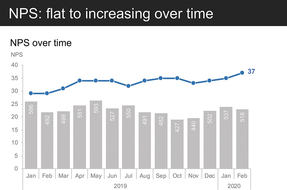
Figure 7.6e NPS: flat to increasing over time
This 37 NPS puts us in 4th place relative to the competition. We anticipate that learning from our detractors and addressing their concerns will ultimately improve our positioning among competitors. (Figure 7.6f)

Figure 7.6f We rank 4th against the competition
But as I mentioned, NPS alone doesn’t tell the full story. Let’s take a look at the components. As a reminder, we categorize customers based on their ratings of our product. Those rating us 1-3 stars are categorized as “detractors” (those not likely to recommend the product); 4 stars are “passives”; 5 stars are “promoters” (those likely to recommend the product to others). NPS is the percent of promoters minus percent of detractors. NPS provides a good aggregate measure but doesn’t give us insight into how the breakdown across its components are changing over time. So next, let’s take a look at those components.
Before I add the data, let me talk you through what we’re going to be looking at. The y-axis represents the percent the given component—detractors, passives, and promoters—make up of total. We have time on our x-axis, ranging from January 2019 on the left to our most recent point of data, February 2020, on the right. (Figure 7.6g)

Figure 7.6g Let’s look at NPS components
I’m going to do something a little different here and build this graph from the middle out. These grey bars represent the proportion of total made up by passives. You see the proportion of passives is shrinking markedly over time: the height of these grey bars is getting smaller. (Figure 7.6h)

Figure 7.6h Proportion of passives decreasing
Some of this change is good news: we’ve seen an accompanying increase in the proportion of promoters; the dark grey bars at the top are getting bigger over time. (Figure 7.6i)

Figure 7.6i Proportion of promoters increasing
But as you can probably anticipate based on the empty part of my graph and my commentary so far, the detractor population is also increasing as a percent of total. (Figure 7.6j)

Figure 7.6j Proportion of detractors increasing
And actually, let’s put a couple of numbers on the graph to help understand the magnitude of this increase. Detractors made up 10% of those giving feedback at the beginning of 2019. This increased marginally, to 13% of total, over the first half of last year. Since then, the detractor population has nearly doubled as a percent of total. As of February this year, detractors make up 25% of those leaving us feedback about our product. (Figure 7.6k)

Figure 7.6k Detractors: nearly doubled since Aug
In addition to numerical ratings, customers also have the option of leaving comments that lend further context. Overall, 15% of those rating our product leave a comment. Relatively fewer promoters leave comments and they tend to be pretty general and less actionable: things like, “It’s great!” and “I really like it!” But we get some incredibly rich detail from our detractors. Relatively many more leave comments—29% of those rating us 1-3 stars share additional detail. (Figure 7.6l)

Figure 7.6l Detractors: relatively more comments
Our detractor comments focus on one topic more than any other: speed and latency concerns.
Let me read you a sample verbatim comment: “My frustration in a single word: latency. It takes forever for the app to open. When it works, it works great. But I spend too much time waiting and wondering whether it’s ever going to load. It often hangs when opening.”
It is disheartening to read comments like this from our users. We’ve been focused on adding more features but it seems something that might help more is making sure the basics work seamlessly. (Figure 7.6m)
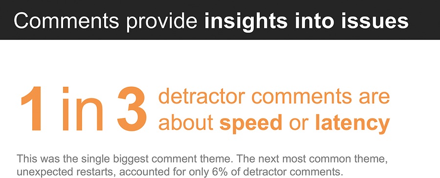
Figure 7.6m Comments provide insights into issues
Now, I fully recognize that there is other context to consider. But I want to make sure to bring this customer insight data to light so that we can take it into account in our overall product strategy. Improving the latency of our product can help us reverse the increase in detractors and simply make for happier users. How should this play into our product strategy and upcoming release schedule? Let’s discuss. (Figure 7.6n)
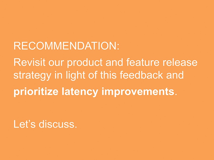
Figure 7.6n Recommendation
Consider how the path we just took our audience along differs from the typical linear approach of methodology-analysis-findings that was outlined in the onset of this scenario. We can use data storytelling to capture and maintain our audience’s attention and frame a productive data-driven discussion. Leaving the room after this meeting, you’d know the analysis you undertook will help influence decision making.
Will your audience always do what you want them to? Of course not. There are likely competing priorities or maybe speeding the app up is actually a really complicated thing. The great thing is, framing things in terms of a recommendation—thus giving the folks in the room something specific to react to—will drive conversation that will bring additional relevant context to light. Presenting a data story does not mean you know all the details or have all the answers. But it does mean thinking about the data and how we communicate it in a deeper way. When we are thoughtful about how we do this, we can influence richer debates and smarter decisions. Success!
We’ve practiced the holistic process of data storytelling together a handful of times. Next up you’ll find additional examples and case studies to work through on your own.