
Chapter 11
Drawdown Analysis
While the world of finance believes risk is measured by volatility (standard deviation), it is my belief that loss of capital is risk and not volatility. In Figure 11.1, example A ends where it begins with zero gain or loss, yet modern finance says it is risky because it is volatile. Example B shows the end price lower than the beginning price so it shows a loss. Modern finance, in this instance, would say there is no risk because there is no volatility. I think you can draw your own conclusions. Volatility can contribute to risk, but it also can contribute to price gains. Loss of capital is simple and reasonable to use as a risk measure, and in this chapter, risk is defined by drawdown.

FIGURE 11.1 Volatility versus Risk
What Is Drawdown?
Drawdown is the percentage that price has moved down from its previous all-time high price.
- Drawdown is risk.
- Drawdown is systematic risk.
- Drawdown is loss of capital.
- Drawdown can last longer than you can.
- Drawdown can ruin your retirement plans.
Drawdown Terminology
The following describes the nomenclature used in Figure 11.2.

FIGURE 11.2 Drawdown Terminology Chart
Source: Chart courtesy of MetaStock.
- Magnitude: Drawdown Magnitude is the percentage that price has moved down from its previous all-time high.
- Decline: Drawdown Decline is the amount of time the market declined from an all-time high to the trough.
- Duration: Drawdown Duration is the total amount of time that it took the price to recover to is previous all-time high.
- Recovery: Drawdown Recovery is the time it took from the trough to get back to an all-time high.
Although the terminology for drawdowns is subjective, I’ll stick with the ones that Sam Stovall (Standard & Poor’s) uses, as they are as good as any. I have often thought one more term for bear markets greater than −40 percent would be good, such as Super Bear, but I have other battles to fight. See Table 11.1.
| % Decline | |
|---|---|
| 0−5% | Noise |
| 5−10% | Pull Back |
| 10−20% | Correction |
| > 20% | Bear Market |
TABLE 11.1 Drawdown Terminology Table
The Mathematics of Drawdown and Equivalent Return
Recovering from a severe drawdown takes an extraordinary return just to get back to where you were. This is sometimes referred to as equivalent return and is represented by this formula:
Percent Drawdown/(1 – Percent Drawdown) – 1
If you don’t have a calculator or table handy, just divide the percent decline by its complement (100 – percent), and then mentally place the decimal in the appropriate place. This is best done in privacy and not on a stage in front of many people.
From Figure 11.3 you can see that if you lose 50 percent, then it takes a 100 percent gain to get back to even. When was the last time you doubled your money? A 100 percent gain is the same as doubling your money. The recent bear market that began on October 9, 2007, dropped more than 55 percent, you can see that to recover it takes a gain of more than 122 percent to get back to even. One thing the graphic clearly shows is that the larger the loss, the gain required to recover becomes even greater.

FIGURE 11.3 Mathematics of Equivalent Return
To access an online version of this figure, please visit www.wiley.com/go/morrisinvestingebook.
Source: Chart courtesy of dshort.com.
Cumulative Drawdown
Figure 11.4 is an example of cumulative drawdown. The line that moves across the tops of the price data (top plot) only moves up with the data and sideways when the data does not move up; in other words, it is constantly reflecting the price’s all-time high value. The bottom plot is the percentage decline from that all-time high line. Whenever that line is at the top it means that price in the top plot is at its all-time high. As the line in the bottom plot declines it moves in percentages of where it was last at its all-time high price. In the example shown, a new all-time high in price is reached at the vertical line labeled A. The bottom plot shows that as prices move down from that point, the drawdown also moves in conjunction with price. The horizontal line that goes through the lower part of the drawdown plot is at −10 percent. You can’t read the dates at the bottom, but it took almost six months before the prices recovered to point B and then moved above the level they had reached at point A. This is an example of drawdown that had a magnitude of −17 percent shown by the lowest point reached on the drawdown line in the bottom plot. The drawdown also lasted (duration) almost six months as shown by the time between line A and line B.

FIGURE 11.4 Cumulative Drawdown Example
Source: Chart courtesy of MetaStock.
Figure 11.5 shows the percentage of drawdown over the entire history of the Dow Industrials since 1885. The top portion is the Dow Industrials plotted using semi-log scaling and the bottom plot is the drawdown percentage. The darker horizontal line through the bottom plot is the mean or average of the drawdown over the full time period since 1885. Its value is −22.1 percent. The other horizontal lines are shown at zero (top line), −20 percent, −35 percent, −50 percent, and −65 percent, I think the thing that stands out from this chart is that the period from 1929 through 1954 suffered an enormous drawdown not only in magnitude but also in duration. The low was on June 28, 1932 at −88.67 percent. The equivalent return to get back to even from that point was a gain of more than 783 percent. That is why it took almost 25 years to accomplish.

FIGURE 11.5 Dow Industrials Cumulative Drawdown (1885−2012)
Source: Chart courtesy of MetaStock.
Because the depression-era drawdown distorts the other drawdowns, Figure 11.6 shows exactly the same data since about 1954, eliminating the scaling affect from the −88 percent depression era drawdown. The drawdown in 2008 clearly stands out as the biggest in modern times at −53.78 percent on March 9, 2009. As of this writing, that drawdown has yet to recover. It should be noted that all of the time that the drawdown line in the bottom plot is not back up to the top (0 percent), the market is in a “state of drawdown,” which is noted by the duration, not just the amount of the decline, which is the magnitude.

FIGURE 11.6 Dow Industrials Cumulative Drawdown (1954–2012)
Source: Chart courtesy of MetaStock.
Remember: Every bear market ends, but rarely when you are still trying to pick the bottom.
S&P 500 Drawdown Analysis
The following data is from the S&P 500 Index, not adjusted for dividends or inflation, over the period from December 30, 1927, through December 31, 2012. It was a period that consisted of 21,353 market days and 1,016.81 calendar months. The S&P 500 has been widely regarded as the best single gauge of the large cap U.S. equities market since the index was first published in 1957 and back filled to 1927 with the S&P 90. The index has more than US$5.58 trillion benchmarked, with index assets comprising approximately US$1.31 trillion of this total. The index includes 500 leading companies in leading industries of the U.S. economy, capturing 75 percent coverage of U.S. equities.
Drawdown Decline—S&P 500
Table 11.2 is focused only on the percentage decline of the various drawdowns. The columns in the table are defined as follows:
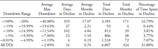
TABLE 11.2 S&P 500 Drawdown Decline Data
- Drawdown range. This is the percentage of drawdown decline, it is divided into various ranges which make up the rows in the table. The top row of data is for drawdowns with declines greater than 20 percent and the bottom row is the data for all drawdowns.
- Average max drawdown. This is the average of all the drawdowns for the percentage decline in the first column.
- Average days in decline. This is the average number of market days that the drawdowns were in the decline whose percentage decline is defined by the first column.
- Average months in drawdown. This is simply a calculation of dividing the average market days in decline by 21, which is the average number of market days per month, which yields calendar months.
- Total days in decline. This is the sum of all the days the particular decline range was in decline.
- Total months in decline. This is the total market days in decline divided by 21.
- Percentage of time spent in decline. This is the percentage of time that the declines were in a state of decline based on the total number of market days for the period of analysis.
From Table 11.2 you can see that all drawdowns greater than 20 percent, which are also called bear markets, were in a state of decline for almost 17 percent of the time, in other words bear market declines accounted for 17 percent of the total time from 1927 to 2012. The bottom row in the table above shows that all drawdowns (DD), no matter what their magnitude spent almost 32 percent of the time declining.
Drawdown Recovery—S&P 500
Drawdown recovery is the term used to define the time spent from when a drawdown bottoms (hits its absolute lowest point and greatest percentage of decline) and completely recovers (gets back up to where the drawdown began). The columns in Table 11.3 are similar to the Drawdown Decline table in Table 11.2; we are just discussing the last portion of the drawdown here instead of the first portion.

TABLE 11.3 S&P 500 Drawdown Recovery Data
Following a similar discussion as was done in the Drawdown Decline analysis, we can see that Drawdown Recoveries where the magnitude of the drawdown was greater than 20 percent took more than 50 percent of the total time to recover. Remember that recoveries from declines always take longer than the declines. This is generally defined by the fact that declines (selling) are more emotionally driven so usually are quicker and more abrupt. There is a new column in the Drawdown Recovery table and it is called Average Gain to Recovery. This is the percentage of gain (recovery) needed to get back to where the drawdown began. See the earlier part of this section that talks about equivalent return for more information. From the Table 11.3 you can see that for drawdowns greater than 20 percent, on average it takes a gain of more than 69 percent to get back to even. Remember we are dealing with averages in these tables. Elsewhere in the book are tables showing each of the drawdowns that were greater than 20 percent.
Drawdown Duration—S&P 500
Drawdown Duration is shown in Table 11.4; this is the total amount of time that a complete drawdown occurred. The previous two tables dealt with the decline and the recovery, this table is the total of those two.

TABLE 11.4 S&P 500 Drawdown Duration Data
Drawdowns of greater than 20 percent averaged 1,433 days, which is more than 68 months, or about 5.6 years. The total number of days of all drawdowns greater than 20 percent was 14,333 market days or 682 months, which is more than 56 years. Now the real eye-catcher in this table is the last row that shows all drawdowns regardless of the percentage decline. It shows that the market from 1927 to 2012 was in a state of drawdown for more than 95 percent of the time. In other words, the market was making new all-time highs less than 5 percent of the time.
The Drawdown Message—S&P 500
With all the above tables about the various stages of drawdown, the information taken from the Drawdown Duration table in Table 11.5 is the real message from this Drawdown Analysis; the percentage of time that the market, in this case the S&P 500 Index, has spent in a state of drawdown. In other words, the amount of time that the market has spent just to get back to where it had already been before is what most folks do not realize. If you even eliminated the noise, which are the drawdowns of less than 5 percent, the market has been in a state of drawdown for 82.95 percent of the time.
| Drawdown Range | Percent of Time Spent in Drawdown | |
|---|---|---|
| −100% | −20% | 67.12% |
| −15% | −19.99% | 1.11% |
| −10% | −14.99% | 5.79% |
| −5% | −9.99% | 8.93% |
| −0.01% | −4.99% | 12.29% |
| All Drawdowns | 95.24% |
TABLE 11.5 S&P 500 Time Spent in Drawdown
Alternative Method
Figure 11.7 and the analysis below shows an alternative method to validate this drawdown analysis. In this mathematical process, the amount of time spent making new all-time highs was calculated using the same S&P 500 data. The top plot is the S&P 500 price shown plotted using semi-log scaling. The jagged line that moves along the top of the data is a line representing the all-time high price. It only moves up when the S&P is making a new all-time high and moves sideways when the S&P is declining below its previous all-time high. The second plot is a calculation to identify only the days in which the all-time high line in the top plot was moving upward, in other words the days in which the S&P 500 was making a new all-time high. The third plot has two lines; one is a summation of the second plot or the running sum of all the days making a new all-time high in price. The second line in the third plot is just calculating all the days of data in the S&P 500 by using the simple concept of Close price not equal to zero and then doing the running summation. The bottom plot is the percent of the new all-time highs summation to the total of all days of data. You can see (trust me) that the percentage of time the S&P 500 was making new all-time highs is 4.63 percent. In the previous drawdown analysis it was shown that all drawdowns contained 95.24 percent of the data. 100 percent – 95.24 percent = 4.76 percent, which is only 0.13 percent difference between the two totally independent calculations.
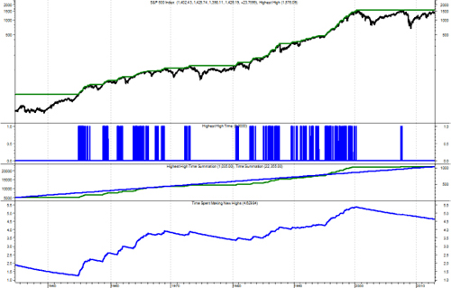
FIGURE 11.7 Alternative Drawdown Method for S&P 500
Source: Chart courtesy of MetaStock.
Average Drawdown—S&P 500
An additional calculation has been added to Table 11.4—S&P 500 Drawdown Duration Data and is shown in Table 11.6 as two new columns; the average of the average drawdown for each percentage category, and the total average of all drawdowns.

TABLE 11.6 S&P 500 Average Drawdown
To access an online version of this table, please visit www.wiley.com/go/morrisinvestingebook.
While the data in the previous tables breaks down the drawdowns over various ranges of percentage of decline, a common mistake in the world of finance is to focus on a term called maximum drawdown when comparing two issues, such as two mutual funds. One must keep in mind that maximum drawdown is a one-time isolated event and could be misleading. Here is an example: Let’s assume we are looking at two mutual funds, each with a 20-year history of net asset value (NAV). Fund A has a maximum drawdown of 45 percent and Fund B has a maximum drawdown of 30 percent. Which fund do you prefer? Most will say that Fund B is better because it has a smaller maximum drawdown. And they would be correct, but I think they need to view more information from the 20 years of data. What if Fund B had 12 additional drawdowns of 25 percent each and Fund A had additional drawdowns with the largest being only 12 percent. Now which fund do you like? While the maximum drawdown is greater on Fund A, all of the remaining drawdowns are considerably less than those for Fund B. This is why I prefer to look at Average Drawdown as shown in Table 11.6.
Distribution of Drawdowns—S&P 500
Figure 11.8 shows all drawdowns that were greater than 15 percent. You can see that for the period from 1927 to 2012, the S&P 500 had 2 drawdowns in the 15–19.99 percent range, 2 in the 20–24.99 percent range, and so on, for a total of 12 drawdowns of magnitude greater than 15 percent. Interestingly, there were no drawdowns in the 40–44.99 percent range. I would guess that once a market has declined over 40 percent that it creates so much fear it cannot stop until it moves further first.

FIGURE 11.8 S&P 500 Distribution of Drawdowns Greater than 15 Percent
Figure 11.9 shows all drawdowns no matter how small. You can see that there were 424 drawdowns, with 369 of them less than 5 percent. Five percent declines are generally considered just noise and part of the market pricing mechanism. Drawdowns between 5 percent and 10 percent are considered pullbacks; there were 35 pullbacks during this period. Corrections are drawdowns between 10 percent and 20 percent, you can see that there were 10 (total of 10–14.99 percent and 15–19.99 percent). There were 10 drawdowns of 20 percent or greater. Also notice that Figure 11.8 is reflected in Figure 11.9, just that 3 more distribution percentages were added to the left.

FIGURE 11.9 S&P 500 Distribution of All Drawdowns
Cumulative Drawdown for S&P 500
Figure 11.10 shows you a visual of all drawdowns during the analysis period. The 1929 Drawdown is clearly exceptional not only in magnitude of decline but also duration; so much so that it skews the visual affect of the remaining drawdowns.
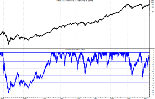
FIGURE 11.10 S&P 500 Cumulative Drawdown Chart
Source: Chart courtesy of MetaStock.
S&P 500 Index Excluding the 1929 Bear Market
Often it is good to remove some statistical outliers such as the giant drawdown/bear market that began in 1929 and lasted until 1954, 25 years total duration. The tables that follow (Table 11.7, Table 11.8, and Table 11.9) show the S&P 500 from 1927 to 2012 with exactly the same data as the previous respective tables; however, this time the great depression drawdown has been removed from the data.

TABLE 11.7 S&P 500 Drawdown Decline Data Excluding 1929 Bear Market

TABLE 11.8 S&P 500 Drawdown Recovery Data Excluding 1929 Bear Market

TABLE 11.9 S&P 500 Drawdown Duration Data Excluding 1929 Bear Market
To access an online version of this table, please visit www.wiley.com/go/morrisinvestingebook.
The Average Max Drawdown has decreased from −40.88 percent to only −35.84 percent for drawdowns more than 20 percent. You can look at the numbers for the remaining columns and see that they are all reduced, however, not by nearly as much as I would have guessed prior to doing the analysis.
Recovery data seems to have been reduced significantly more when removing the 1929 depression drawdown. This is because not only was the magnitude of that bear market over −86 percent, but it also lasted for more than 25 years.
Because the Recovery numbers were significantly reduced with the removal of the 1929 bear market, it also stands to reason that the duration numbers would also be significantly reduced. And Table 11.9 confirms that is the case.
Drawdowns Greater than 20 Percent Are Bear Markets
Although this is also shown in Chapter 7, it is appropriate to include with this section of the book on Drawdown Analysis because bear markets are merely drawdowns of 20 percent or greater. Table 11.10 shows all the drawdowns (bear markets) of 20 percent or greater in the S&P 500 Index since 12/30/1927. Here is a brief description of the statistics that are at the bottom of Table 11.10.

TABLE 11.10 Bear Markets in S&P 500 from 12/30/1927 to 12/31/2012
To access an online version of this table, please visit www.wiley.com/go/morrisinvestingebook.
- Average. The same as the mean in statistics; add all values and then divide by the number of items.
- Avg Ex 29. This is the Average with the 1929 bear market removed as it skews the data somewhat.
- Minimum. The minimum value in that column.
- Maximum. The maximum value in that column.
- Std. Dev. This is standard deviation or sigma, which is a measure of the dispersion of the values in the column. About 65 percent of the values will fall within one standard deviation of the mean, and 95 percent will fall within two standard deviations of the mean.
- Median. If the data is widely dispersed or has asymptotic outlier data, this is usually a better measure for central tendency than Average.
The number two drawdown as of 12/31/2012 is still in progress. While its magnitude of decline was −56.78 percent, the duration is still in progress and only fourth in rank as the current number 3 and 4 drawdowns, while not as steep, lasted longer.
S&P Total Return Analysis
This data is not as robust as the price data but does reflect the reality of the markets for buy and hold or index investing in which one received and reinvests the dividends earned by the individual stocks that make up the index. This data begins on March 31, 1936, so therefore will not include the great depression drawdown that began in 1929. Tables 11.11 through 11.13, Figures 11.11 and 11.12, and Table 11.14 follow the format of the preceding sections.
Drawdown Decline—S&P Total Return

TABLE 11.11 S&P 500 Total Return Drawdown Decline Data
Drawdown Recovery—S&P Total Return
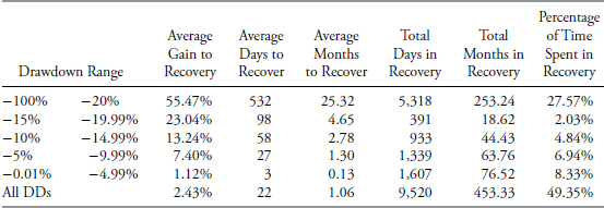
TABLE 11.12 S&P 500 Total Return Drawdown Recovery Data
Drawdown Duration—S&P Total Return
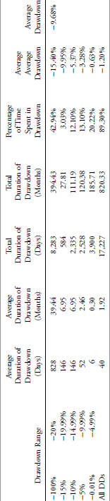
TABLE 11.13 S&P 500 Total Return Drawdown Duration Data
To access an online version of this table, please visit www.wiley.com/go/morrisinvestingebook.
Distribution of Drawdowns Greater than 15 Percent—S&P Total Return
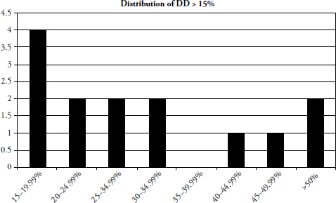
FIGURE 11.11 S&P 500 Total Return Distributions Greater than 15 Percent
Distribution of All Drawdowns—S&P Total Return

FIGURE 11.12 S&P 500 Total Return Distributions
Bear Markets—S&P Total Return

TABLE 11.14 S&P 500 Total Return Bear Markets (3/31/1936 to 12/31/2012)
To access an online version of this table, please visit www.wiley.com/go/morrisinvestingebook.
Dow Jones Industrial Average Drawdown Analysis
This section follows the same order and format of the previous section on the S&P 500 Index drawdown, however, the only difference is that the analysis is done on the Dow Jones Industrial Average. (See Tables 11.15 through 11.19, Figures 11.13 through 11.15, and additional Tables 11.20 through 11.23.) The Dow Jones Industrial Average, also referred to as The Dow, is a price-weighted measure of 30 U.S. blue-chip companies. The Dow covers all industries with the exception of transportation and utilities, which are covered by the Dow Jones Transportation Average and Dow Jones Utility Average. Although stock selection is not governed by quantitative rules, a stock typically is added to the Dow only if the company has an excellent reputation, demonstrates sustained growth and is of interest to a large number of investors. Maintaining adequate sector representation within the indexes is also a consideration in the selection process.
Drawdown Decline—Dow Jones Industrial Average

TABLE 11.15 Dow Industrials Drawdown Decline Data
Drawdown Recovery—Dow Jones Industrial Average

TABLE 11.16 Dow Industrials Drawdown Recovery Data
Drawdown Duration—Dow Jones Industrial Average
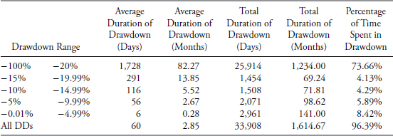
TABLE 11.17 Dow Industrials Drawdown Duration Data
The Drawdown Message—Dow Jones Industrial Average
| Drawdown Range | Percent of Time Spent in Drawdown | |
|---|---|---|
| −100% | −20% | 73.66% |
| −15% | −19.99% | 4.13% |
| −10% | −14.99% | 4.29% |
| −5% | −9.99% | 5.89% |
| −0.01% | −4.99% | 8.42% |
| All Drawdowns | 96.39% |
TABLE 11.18 Dow Industrials Time Spent in Drawdown
Average Drawdown—Dow Jones Industrial Average
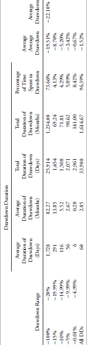
TABLE 11.19 Dow Industrials Average Drawdown
Distribution of Drawdowns—Dow Jones Industrial Average
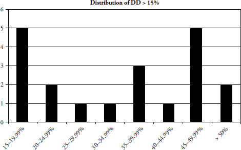
FIGURE 11.13 Dow Industrials Distribution of Drawdowns Greater than 15 Percent

FIGURE 11.14 Dow Industrials Distribution of All Drawdowns
Cumulative Drawdown for Dow Industrials

FIGURE 11.15 Dow Industrials Cumulative Drawdown
Dow Industrials Excluding the 1929 Bear Market

TABLE 11.20 Dow Industrials Drawdown Decline Excluding 1929 Bear Market
To access an online version of this table, please visit www.wiley.com/go/morrisinvestingebook.
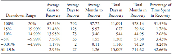
TABLE 11.21 Dow Industrials Drawdown Recovery Excluding 1929 Bear Market

TABLE 11.22 Dow Industrials Drawdown Duration Excluding 1929 Bear Market
To access an online version of this table, please visit www.wiley.com/go/morrisinvestingebook.
Drawdowns Greater than 20 Percent Are Bear Markets

TABLE 11.23 Dow Industrials Bear Markets (2/17/1885 to 12/31/2012)
To access an online version of this table, please visit www.wiley.com/go/morrisinvestingebook.
The following data is from the Dow Jones Industrial Average, not adjusted for dividends or inflation, over the period from February 17, 1885, through December 31, 2012. The drawdown analysis for the Dow Industrials consists of 35,179 market days which translates into 1,675.19 calendar months.
Dow Industrials Total Return Analysis
This data is only available beginning on March 31, 1963. (See Tables 11.24 through 11.26 and Figures 11.16 and 11.17, followed by Table 11.27.)
Drawdown Decline—Dow Industrials Total Return

TABLE 11.24 Dow Industrials Total Return Drawdown Decline Data
Drawdown Recovery—Dow Industrials Total Return
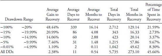
TABLE 11.25 Dow Industrials Total Return Drawdown Recovery Data
Drawdown Duration—Dow Industrials Total Return

TABLE 11.26 Dow Industrials Total Return Drawdown Duration Data
To access an online version of this table, please visit www.wiley.com/go/morrisinvestingebook.
Distribution of Drawdowns—Dow Industrials Total Return

FIGURE 11.16 Dow Industrials Total Return Distribution of Drawdowns Greater than 15%
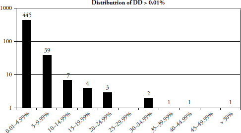
FIGURE 11.17 Dow Industrials Total Return Distribution of Drawdowns
Bear Markets for Dow Industrials Total Return
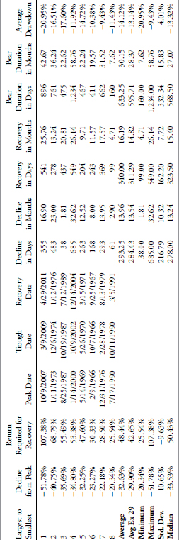
TABLE 11.27 Dow Industrials Total Return Bear Markets (3/31/1963 to 12/31/2012)
To access an online version of this table, please visit www.wiley.com/go/morrisinvestingebook.
Gold Drawdown
Drawdowns are not restricted to the stock market; they can be analyzed on any time series data. Figure 11.18 is a chart of gold. This shows the price of gold in the top plot since 1967 and its cumulative drawdown in the bottom plot. The two horizontal lines in the drawdown plot are at −20 percent and −50 percent. I think it is clear that anyone who bought gold in the Hunt Brothers 1981 silver era and also the ending of the exceptional inflationary period of the 1970s, held an investment from 1980 until 2008 before the price of gold recovered. Twenty-eight years is a really long time to hold a loser. With gold’s recent surge to new highs, the time value of money would probably continue to erode this 1980 investment, even though those folks are at least feeling better now.

FIGURE 11.18 Gold Cumulative Drawdown
Source: Chart courtesy of MetaStock.
Japan’s Nikkei 225 Drawdown
Figure 11.19 is of the Japanese stock market and its drawdown. I think at this point no commentary is needed as you can see that the Nikkei started dropping in late 1989 and is down in the −75 percent area since the end of 2008.
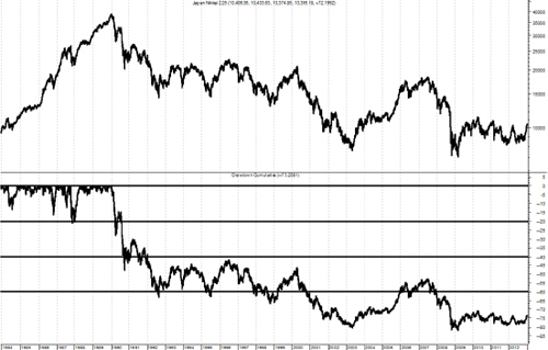
FIGURE 11.19 Nikkei Cumulative Drawdown
Source: Chart courtesy of MetaStock.
Copper Drawdown
Copper is often referred to as Doctor Copper as many think it is a measure of economic activity, especially in the construction industry. Figure 11.20 is a chart of copper since 1971 with its cumulative drawdown in the bottom plot. Clearly, copper as an investment has spent an enormous amount of time in a state of drawdown.
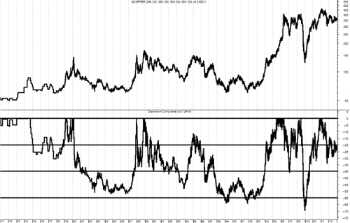
FIGURE 11.20 Copper Cumulative Drawdown
Source: Chart courtesy of MetaStock.
Drawdown Intensity Evaluator (DIE)
In an attempt to further evaluate the pain of drawdown, I have created an indicator that measures not only the magnitude of the drawdown, but also the duration. Remember it is not just how big the drop in price is, but also how long it takes to recover. Figure 11.21 helps you understand how this concept works. The top plot is a price series, the middle plot (with the circles) is the cumulative drawdown, and the bottom plot is the Drawdown Intensity Evaluator (DIE). You can see at point A on the middle plot that a drawdown began and did not end until point D, in this example (Consumer Staples) a time period from the end of 1998 until the middle of 2006. You also see that the DIE was at zero at point A and again at point D (vertical lines). From the middle plot of cumulative drawdown you can see that the point of maximum drawdown is at point B (early 2000), which also corresponded with an initial peak in DIE. The middle plot of drawdown shows point C, which occurred in early 2003 and is not as low as point B, in fact, in this example point B is −32.5 percent and point C is −27.4 percent. However, when you look at the bottom plot of DIE the highest point is at point C. This is because even though point C occurred three years after point B, the pain of holding an investment during this time increased because the drawdown was still significant even though it wasn’t at its maximum. After point C you can see that the drawdown slowing started to decrease but did not get back to its starting point (A) for more than three years (point D). DIE represents the pain of drawdown using not only magnitude but also, and equally important, the duration.
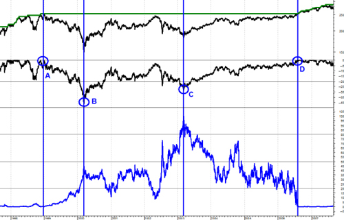
FIGURE 11.21 Drawdown Intensity Evaluator (DIE) Explanation
Source: Chart courtesy of MetaStock.
The DIE in Figure 11.21 uses the data for the entire period, to determine the pain. The next example, Figure 11.22, is an attempt to normalize the information using a four-year look-back. Normalizing data in this case resets the drawdown numbers and gives us a better picture of current conditions relative to a recent period of time and is particularly useful for long duration drawdowns. This means that it is measuring DIE over a moving four-year window. Figure 11.22 is a chart of the Dow Industrial Average in the top plot, with the cumulative drawdown in the second plot. The third plot is the Drawdown Intensity Evaluator, or DIE. The bottom plot is the DIE that has been normalized over a four-year period. The data begins in 1969. The DIE is a relatively simple process as it merely calculates the percentage of drawdown and multiplies it by the number of cumulative days it is in drawdown. An example here is in 1987 when there was a large drawdown but it did not last very long, in fact, the market completely recovered in only two years.

FIGURE 11.22 Drawdown Intensity Evaluator and Normalized Version
Source: Chart courtesy of MetaStock.
The world of finance, with its inadequate mathematics, inappropriate statistics, and faulty assumptions wants investors to believe that risk is volatility as represented by Standard Deviation (sigma). Although volatility is a contributor to drawdown it is also a contributor to price gains. Risk is loss of capital and that is best measured by drawdown. An investment strategy that attempts to tackle and limit drawdowns will be a more comfortable “Investment Ride” for most investors.
This wraps up Part II, which was heavily focused on research. Let’s now move to why we want to understand all this—building a trend-following rules-based model designed to participate as much as possible in the good times, trying to avoid the bad times, and most of all, keep the subjectivity out of the process.