
Chapter 10
Market Trend Analysis
This chapter focuses on trends in the market—an explanation as to why markets trend, reasons why it is good to know that markets trend, then finally, a large research section into how much markets trend. This analysis will initially be shown on 109 market indices that involve domestic, international, and commodity sectors. Following that the full list of all S&P GICS sectors, industry groups, and industries are shown following the same format. There is a great amount of data in this chapter. I try to slice through it with simple analysis, keeping in mind that lots of data does not equate to information.
Why Markets Trend
Trends in markets are generally caused by short-term supply and demand imbalances with a heavy overdose of human emotion. When you buy a stock, you know that someone had to sell it to you. If the market has been rising recently, then you know you will probably pay a higher price for it and the seller also knows he can get a higher price for it. The buying enthusiasm is much greater than the selling enthusiasm. I hate it when the financial media makes a comment when the market is down by saying that there are more sellers than buyers. They clearly do not understand how these markets work. Based on shares there are always the same number of buyers and sellers; it is the buying and selling enthusiasm that changes. Finally, trending is a positive feedback process. Even Isaac Newton believed in trends with his first law of motion, which stated an object at rest stays at rest and an object in motion stays in motion with the same speed and in the same direction unless acted on by an unbalanced force. Hey, an apple will continue to fall until it hits the ground. Positive feedback is the direct result of an investor’s confidence in the price trend. When prices rise, investors confidently buy into higher and higher prices.
Supply and Demand
A buyer of a stock, which is the demand, bids for a certain amount of stock at a certain price. A seller, which is the supply, offers a certain amount at a certain price. I think it is fair to say that one buys a stock with the anticipation that they can sell it later to someone at a higher price. Not an unreasonable desire, and probably what drives most investors. The buyer has no idea who will sell it to him, or why they would sell it to him. He may assume that he and the seller have a complete disagreement on the future value of that stock. And that might be correct, however, the buyer will never know. In fact, the buyer just might be the seller’s person who buys it from him at a higher price.
The reasons for buying and selling stock are complex and impossible to quantify. However when they eventually agree, what is it that they agreed on? Was it the earnings of the company? Was it the products the company produces? Was it the management team? Was it the amount of the stock’s dividend? Was it the sales revenues? It was none of those things, the transaction was settled because they agreed on the price of the stock, and that alone determines profit or loss. Changes in supply and demand are reflected immediately in price, which is an instantaneous assessment of supply and demand.
What Do You Know about This Chart?
In Figure 10.1 I have removed the price scale, the dates, and the name of this issue; now let me ask you some questions about this issue.

FIGURE 10.1 Chart without Price, Name, or Dates
Source: Chart courtesy of MetaStock.
- Is this a chart of daily prices, weekly prices, or 30-minute prices?
- Is this a chart of a stock, a commodity, or a market index?
Okay, I’ll give you this much, it is a daily price chart of a stock over a period of about six years. Now, some more questions:
- During this period of time, there were 11 earnings announcements. Can you show me where one of those announcements occurred and if you could, were the earnings report considered good or bad?
- Also during the period of time for this chart, there were seven Federal Open Market Committee (FOMC) announcements. Can you tell me where one of them occurred and was the announcement considered good or bad?
- Does this stock pay a dividend?
- Hurricane Katrina occurred during this period displayed on this chart, can you tell me where it is?
- Finally, would you want to buy this stock at the beginning of the period displayed and then sell it at the end of the period (right side of chart)?
I doubt, in fact, I know you cannot answer most of the above questions with any tool other than guessing. The point of this exercise is to point out that there is always and ever noise in stock prices. This noise comes in hundreds of different colors, sizes, shapes, and media formats. The bottom line is that it is just noise. The financial media bombards us all day long with noise. I do not think they do it maliciously; they do it because they believe they are giving you valuable information to help you make investment decisions. Nothing could be further from the truth. Of course, question number 7 is the one question that most can answer because from the chart a buy-and-hold investment during the data displayed clearly resulted in no investment growth.
However, let me tell you what I see as shown in Figure 10.2. I see two really good uptrends and if I had a trend-following methodology that could capture 65 percent to 75 percent of those uptrends I would be happy. I also see two good downtrends, and if I had a methodology that could avoid about 75 percent of them, I would also be happy. If you could do that for the amount of time shown on the chart below, then you would come out considerably better off than the buy and hold investor. I generally only participate in the long side of the market and move to cash or cash equivalents when defensive. However, a long–short strategy could possibly derive even greater profit.
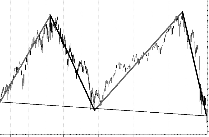
FIGURE 10.2 Chart with Only Trends
Source: Chart courtesy of MetaStock.
Trend versus Mean Reversion
I prefer to use a market analysis methodology called trend following. Sometimes it should be called trend continuation. Why? Trend analysis works on the thoroughly researched concept that once a trend is identified, it has a reasonable probability to continue. I know that is the case because most of the time markets are trending markets and I see no reason to adopt a different strategy during a period of mean reverting, such as is experienced in the market from time to time. You can think of trend following as a positive feedback mechanism. Mean reverting measures are those that oscillate between predetermined parameters; oftentimes the selection of those parameters is the problem. Mean reversion strategies are clearly superior during those volatile sideways times but the implementation of a mean reverting process requires a level of guessing that I refuse to be a part of. You can think of mean reversion as a negative feedback mechanism.
In technical analysis there are many mean reverting measures that could be used. They are the ones where you frequently hear the terms overbought and oversold. Overbought means the measurement shows that prices have moved upward to a limit that is predefined. Oversold means the opposite: prices have moved down to a predetermined level. The problem with that type of indicator or measurement is that a parameter needs to be set beforehand to know what the overbought and oversold levels are. Also, if you believe something mean reverts, you will probably have difficulty in determining the rate of reversion. For mean reversion to be relevant, there must be a meaning tied to average (mean) and since most market data does not adhere to normal distributions, the mean isn’t as meaningful (sic). Kind of like charting net worth and removing billionaires to make the data less skewed and therefore a more meaningful average.
Clearly, mean reverting measurements would work better in highly volatile markets, such as we witness from time to time. One might ask the question: Why don’t you incorporate both into your model? A fair question, but one that shows the inquiry is forgetting that hindsight is not an analysis tool that will serve you well. When do you switch from one strategy (trend following) to the other (mean reversion)? Therein lays the problem.
Another question that might be asked is why not use adaptive measures to help identify the two types of markets. Again, another fair question! I think the lag between the two types of markets and the fact that often there is no clear period of delineation is the issue. It is a natural instinct to want to change the strategy in order to respond more quickly from one to the other. Natural instincts are what we are trying to avoid, simply because they are generally wrong, and painfully wrong at the worst times.
The transition from trend following to mean reversion can be difficult to see except with 20/20 hindsight. For example, when you view a chart, which clearly has gone from trending to reversion, from that point if we had used a simple mean reverting measurement, we would have looked like geniuses. However, in reality, periods like that have existed many times in the past in overall trending markets. Then the next problem becomes when to move away from a mean reverting strategy back to a trend following one. Again, hindsight always gives the precise answer, but in reality it is extremely difficult to implement in real time.
The bottom line is that with markets that generally trend most of the time, keeping a set of rules and stop loss levels in place, will probably always win over the long term. Sharpshooting the process is the beginning of the end. Trend following is somewhat similar to a momentum strategy except for two significant differences. One, momentum strategies generally rank past performance for selection, and two, often they do not utilize stop-loss methods, instead move in and out of top performers. They both rely on the persistence of price behavior.
Trend Analysis
If one is going to be a trend follower, what is the first thing that must be done (rhetorical)? In order to be a trend follower you must first determine the minimum length trend you want to identify. You cannot follow every little up and down move in the market; you must decide what the minimum trend length is that you want to follow. Once this is done, you can then develop trend-following indicators using parameters that will help identify trends in the market based on the minimum length you have decided on.
Figure 10.3 is an example of various trend-following periods. The top plot is the Nasdaq Composite index. The second plot is a filtered wave showing the trend analysis for a fairly short-term–oriented trend system. This is for traders and those who want to try to capture every small up and down in the market; a process that is not adopted by this author. The third plot is the ideal trend system, where it is obvious that you buy at the long-term bottom and sell at the long-term top. You must realize that this trend analysis can only be done with perfect 20/20 hindsight, and is probably even more difficult than the short-term process shown in the second plot. The bottom plot is a trend analysis process that is at the heart of the concepts discussed in this book. It is a trend-following process that realizes you cannot participate in every small up and down move, but try to capture most of the up moves and avoid most of the down moves.

FIGURE 10.3 Trend Length and Frequency
Source: Chart courtesy of MetaStock.
There is a concept developed by the late Arthur Merrill called Filtered Waves. (B40) A filtered wave is the measurement of price movements in which only the movement that exceeds a predetermined percentage is counted. The price component used in this concept needs to be decided on as to whether to use just the closing prices for the filtered wave or use a combination of high and low prices. This would mean that while prices are rising the high would be used and while prices are falling the low price would be used. I personally prefer the high and low prices as they truly reflect the price movements, whereas the closing prices only would eliminate some of the data. For example, in Figure 10.4, the background plot is the S&P 500 Index with both the close C and the high low H-L filtered waves overlaid on the prices. You can see that the H-L filtered wave techniques picks up more of the data; in fact, it shows a move of 5 percent in the middle of the plot that the Close only version did not show. In this particular example the zigzag line uses a filter of 5 percent, which means that each time it changes direction, it had previously moved at least 5 percent in the opposite direction. There is one exception to this and that is the last move of the zigzag line (there is a similar discussion in an earlier chapter). It merely moves to the most recent close regardless of the percentage moved so it must be ignored.

FIGURE 10.4 Difference between Filtered Wave Using Close and High–Low
Source: Chart courtesy of MetaStock.
The bottom plot in Figure 10.5 shows the filtered wave by breaking down the up moves and down moves and then counting the number of periods that were in each move. There are three horizontal lines on that plot, the middle one is at zero, which is where the filtered wave changes direction. In this example the top and bottom lines are at +21 and – 21 periods, which mean that anytime the filtered wave exceeds those lines above or below, the trend has lasted at least 21 periods. Notice that in this example there was a period at the beginning (highlighted) where the market moved up and down in 5 percent or greater moves with high frequency but never lasted long enough to exceed the 21 boundaries. Then in the second half of the chart, there were two good moves that did exceed the 21 boundaries. This is a good example of a chart where there was a trendless market (first half) and a trending market (second half). I used the high–low filtered wave of 5 percent and 21 days for the minimum length because that is what I prefer to use for most trend analysis.

FIGURE 10.5 Trend Analysis Example
Source: Chart courtesy of MetaStock.
The following research was conducted using the high–low filtered wave using various percentages and various trend length measures. The research was conducted on a wide variety of market prices, such as most domestic indices, most foreign indices, all of the S&P sectors and industry groups; 109 issues in all. I offer commentary throughout so you can see that this was a robust process. Any indices or price series that is missing was probably because of an inadequate amount of data, as you need a few years of data to determine a series’ trendiness. The goal of this research was to determine that markets generally trend and if there are some markets that trend better than others. Following this large section, the trend analysis will be shown using the S&P GICS data on sectors, industry groups, and industries.
Table 10.1 is the complete list of indices used in this study along with the beginning date of the data.
| Index Name | Start Date |
|---|---|
| AMEX Composite | 12/27/1995 |
| AMEX Oil Index | 10/25/1984 |
| AMEX Pharmaceutical Index | 4/21/1992 |
| Argentina MerVal | 6/3/1991 |
| Australia All Ordinaries | 1/4/1982 |
| Austria ATX | 10/28/1991 |
| Belgium BEL-20 | 1/2/1992 |
| Brazil Bovespa | 11/22/1996 |
| Chile IGPA General Index | 12/4/1996 |
| Chile IPSA | 12/4/1996 |
| China Shanghai Composite | 12/19/1990 |
| CRB Index | 1/2/1980 |
| Czech Republic PX | 7/16/2004 |
| Denmark Copenhagen 20 | 2/2/2001 |
| DJ Wilshire US Small Cap | 3/14/2005 |
| Dow Industrials 1885 | 02/17/1885 |
| Dow Jones Composite | 1/3/1995 |
| Dow Jones Euro Stoxx | 2/17/1998 |
| Dow Jones Euro Stoxx 50 | 3/2/1998 |
| Dow Jones Stoxx | 2/17/1998 |
| Dow Jones Transport | 1/2/1990 |
| Dow Jones Utilities | 1/2/1990 |
| Dow Jones Wilshire 5000 Composite Index | 11/10/1980 |
| Dow Jones Wilshire REIT Index | 5/3/2004 |
| Dow Jones Wilshire REIT Total Return Index | 5/3/2004 |
| Egypt CMA | 1/27/1999 |
| EURONEXT 100 | 3/15/2002 |
| Finland HSE General Index | 3/1/1991 |
| France CAC 40 | 8/19/1988 |
| Germany DAX | 12/14/1993 |
| Global Dow | 9/12/2008 |
| Gold and Silver Mining | 12/20/1983 |
| Gold Base Price Handy & Harman | 1/30/1920 |
| Gold Bugs (AMEX) | 5/6/1996 |
| Gold Mining Stocks | 9/17/1993 |
| Greece General Share | 1/2/1991 |
| Hanoi SE Index | 4/21/2009 |
| Healthcare Index (S&P) | 4/29/2002 |
| Hong Kong Hang Seng | 1/4/1982 |
| Ibex 35 | 9/6/1991 |
| India BSE 30 | 1/1/1990 |
| Indonesia Jakarta Composite | 4/6/1990 |
| Israel TA-100 | 6/17/1996 |
| Italy FTSE MIB Index | 4/3/2003 |
| Japan Nikkei 225 | 1/4/1982 |
| Johannesburg All Shares | 4/22/2002 |
| Major Market Index | 4/15/1983 |
| Malaysia KLSE Composite | 1/4/1982 |
| Mexico IPC | 1/2/1987 |
| Morgan Stanley Consumer Index | 10/23/1992 |
| Morgan Stanley Cyclical Index | 10/23/1992 |
| MSCI EAFE | 12/31/1969 |
| MSCI EM | 12/31/1987 |
| NASDAQ 100 | 2/4/1985 |
| NASDAQ Composite | 2/5/1971 |
| Netherlands AEX General | 1/3/1983 |
| Norway Oslo All Share Composite | 2/5/2001 |
| Norway Oslo OBX Top 25 | 9/21/2004 |
| NYSE Composite | 12/31/1965 |
| Pakistan Karachi 100 | 5/25/1994 |
| Peru Lima General | 1/27/1999 |
| Philippines PSE Composite | 1/2/1987 |
| Russell 1000 | 6/29/1987 |
| Russell 1000 Growth | 8/31/1992 |
| Russell 1000 Value | 8/31/1992 |
| Russell 2000 | 12/29/1978 |
| Russell 2000 Growth | 12/29/1978 |
| Russell 2000 Value | 12/29/1978 |
| Russell 3000 | 6/29/1987 |
| S&P 100 Index | 1/2/1976 |
| S&P 1500 INDEX | 8/30/2001 |
| S&P 400 Index | 3/11/1992 |
| S&P 500 Index | 12/30/1927 |
| S&P 500 Total Return | 1/4/1988 |
| S&P 600 Index | 11/21/1994 |
| S&P CNX NIFTY (India) | 2/8/2000 |
| S&P Cons Discretionary Sector | 9/11/1989 |
| S&P Cons Staples Sector | 9/11/1989 |
| S&P Energy Sector | 9/11/1989 |
| S&P Equal Weight | 11/7/2000 |
| S&P Financials Sector | 9/11/1989 |
| S&P Healthcare Sector | 9/11/1989 |
| S&P Industrials Sector | 9/11/1989 |
| S&P Materials Sector | 9/11/1989 |
| S&P MIDCAP INDEX | 1/2/1981 |
| S&P Technology Sector | 9/11/1989 |
| S&P Telecomm Sector | 9/11/1989 |
| S&P Utilities Sector | 9/11/1989 |
| S&P/TSX 60 CAPPED (Canada) | 11/20/2000 |
| S&P/TSX 60 INDEX (Canada) | 12/31/1998 |
| S&P/TSX Composite (Canada) | 1/2/1980 |
| Silver Base Price Handy & Harman | 2/15/1996 |
| Singapore Straits Times | 8/31/1999 |
| Slovakia SAX | 1/27/1999 |
| South Korea Seoul Composite | 5/3/1983 |
| S&P 500 Tot Ret Inflation Adj | 1/4/1988 |
| Spain Madrid General | 8/1/1984 |
| Sri Lanka All Share | 6/14/1993 |
| Swedish OMX 30 | 9/30/1986 |
| Switzerland Swiss Market | 1/4/1988 |
| Taiwan Weighted | 1/5/1981 |
| Thailand SET | 1/4/1982 |
| Turkey ISE National-100 | 1/4/1988 |
| United Kingdom FTSE 100 | 1/3/1984 |
| US Dollar Index | 11/8/1985 |
| Value Line Index (Arithmetic) | 1/2/1980 |
| Value Line Index (Geometric) | 12/15/1983 |
| Venezuela IBC | 12/31/1993 |
| Viet Nam Index | 5/13/2002 |
TABLE 10.1 Indices Used in Trend Analysis
Because of space limitations in a book, I had to break up the giant spreadsheets that were used for this trend analysis. Hopefully, it will be clear with the commentary associated with each table.
I did multiple sets of data runs, but will explain the process by showing just one of them. Table 10.2 is the data run through all 109 indices for the 5 percent filtered wave and 21 days for the trend to be identified. The first column is the name of the index (they are in alphabetical order), the next four columns are the results of the data runs for the total trend percentage, the uptrend percentage, the downtrend percentage, and the ratio of uptrends to downtrends.
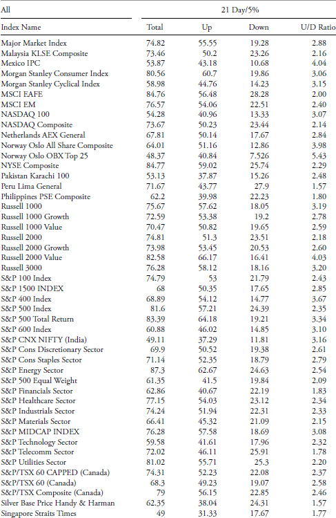

TABLE 10.2 Trends of 21 Days with 5 Percent Filter
To access an online version of this table, please visit www.wiley.com/go/morrisinvestingebook.
Total reflects the amount of time relative to the amount of all data available that the index was in a trend mode defined by the filtered wave and trend time; in the case below a trend had to last at least 21 days and a move of 5 percent or greater. The up measure is just the percentage of the uptrend relative to the amount of data. Similarly, the downtrend is the percentage of the downtrend to the amount of data. If you add the uptrend and downtrend you will get the total trend. The last column is the U/D Ratio, which is merely the uptrend percentage divided by the downtrend percentage. If you look at the first entry in Table 10.2, the AMEX Composite trends 71.18 percent of the time, with 56.16 percent of the time in an uptrend and 15.03 percent of the time in a downtrend. The U/D Ratio is 3.74, which means the AMEX Composite trends up almost 4 (3.74) times more than it trends down. You can verify the amount of data in the Indices Date table shown early to see if it was adequate enough for trend analysis. It is not shown, but the complement of the total would give you the amount of time the index was trendless.
At the bottom of each table is a grouping of statistical measures for the various columns. Here are the definitions of those statistics:
- Mean. In statistics this is the arithmetic average of the selected cells. In Excel, this is the Average function (go figure). It is a good measure as long as there are no large outliers in the data being analyzed.
- Average deviation. This is a function that returns the average of the absolute deviations of data points from their mean. It can be thought of as a measure of the variability of the data.
- Median. This function measures central tendency, which is the location of the center of a group of numbers in a statistical distribution. It is the middle number of a group of numbers; that is, half the numbers have values that are greater than the median, and half the numbers have values that are less than the median. For example, the median of 2, 3, 3, 5, 7, and 10 is 4. If there are a wide range of values that are outliers, then median is a better measure than mean or average.
- Minimum. Shows the value of the minimum value of the cells that are selected.
- Maximum. Shows the value of the maximum value of the cells that are selected.
- Sigma. Also known as standard deviation. It is a measure of how widely values are dispersed from their mean (average).
- Geometric mean. First of all, it is only good for positive numbers and can be used to measure growth rates, etc. It will always be a smaller number than the mean.
- Harmonic mean. Simply the reciprocal of the arithmetic mean, or could be stated as the arithmetic mean of the reciprocals. It is a value that is always less than the geometric mean, and like the geometric mean, can only be calculated on positive numbers and generally used for rates and ratios.
- Kurtosis. This function characterizes the relative peakedness or flatness of a distribution compared with the normal distribution (bell curve). If the distribution is “tall” then it reflects positive kurtosis, while a relatively flat or short distribution (relative to normal) reflects a negative kurtosis.
- Skewness. This characterizes the degree of symmetry of a distribution about its mean. Positive skewness reflects a distribution that has long tails of positive values, while negative skewness reflects a distribution with an asymmetric tail extending toward more negative values.
- Trimmed mean (20 percent). This is a great function. It is the same as the Mean, but you can select any number or percentage of numbers (sample size) to be eliminated at the extremes. A great way to eliminate the outliers in a data set.
Trendiness Determination Method One
This methodology for trend determination looks at the average of multiple sets of raw data. An example of just one set of the data was shown previously in Table 10.2, which looks at a filtered wave of 5 percent and a minimum trend length of 21 days. Following Table 10.3 is an explanation of the column headers for Trendiness One in the analysis tables that follow.
TABLE 10.3 Trendiness One Explanation
- Trendiness average. This is the simple average of all the total trending expressed as a percentage. The components that make up this average are the total trendiness of all the raw data tables in which the total average is the average of the uptrends and downtrends as a percentage of the total data in the series.
- Rank. This is just a numerical ranking of the trendiness average with the largest total average equal to a rank of 1.
- Avg. U/D. This is the average of all the raw data tables’ ratio of uptrends to downtrends. Note: If the value of the Avg. U/D is equal to 1, it means that the uptrends and downtrends were equal. If it is less than 1, then there were more downtrends.
- Uptrendiness WtdAvg. This is the product of column Trendiness Average and column Avg. U/D. Here the Total Trendiness (sum of up and down) is multiplied by their ratio, which gives a weighted portion to the upside when the ratio is high. If the average of the total trendiness is high and the uptrendiness is considerably larger than the downtrendiness, then this value (WtdAvg) will be high.
- Rank. This is a numerical ranking of the Up Trendiness WtdAvg with the largest value equal to a rank of 1.
Table 10.4 shows the complete results using Trendiness One methodology.
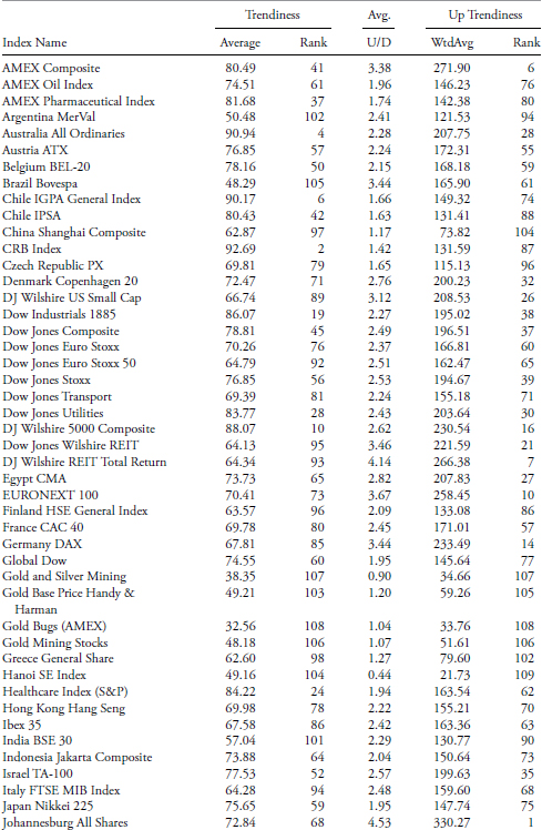

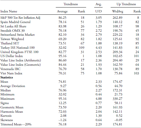
TABLE 10.4 Trendiness One Table
To access an online version of this table, please visit www.wiley.com/go/morrisinvestingebook.
Trendiness Determination Method Two
The second method of trend determination uses the raw data averages. For example, the up value is calculated by using the raw data up average compared to the raw data total average, which therefore means it only is using the amount of data that is trending and not the full data set of the series. This way the results are dealing only with the trending portion of the index, and if you think about it, when the minimum trend length is high and the filtered wave is low, there might not be that much trending. Table 10.5 shows the column headers followed by their definitions.
| While in Trend | ||
|---|---|---|
| Up | Down | Up Rank |
TABLE 10.5 Trendiness Two Explanation
- Up. This is the average of the raw data Up Trends as a percentage of the Total Trends.
- Down. This is the average of the raw data Down Trends as a percentage of the Total Trends.
- Up rank. This is the numerical ranking of the Up column, with the largest value equal to a rank of 1.
Table 10.6 shows the results using Trendiness Two methodology.
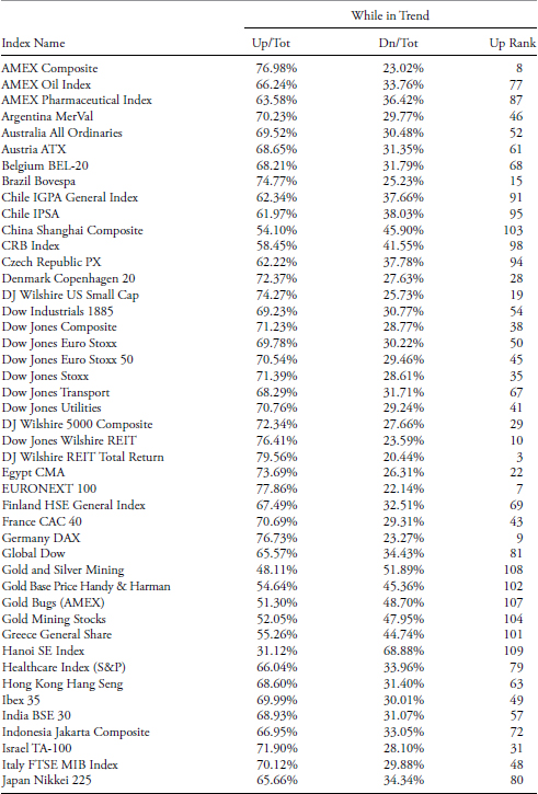
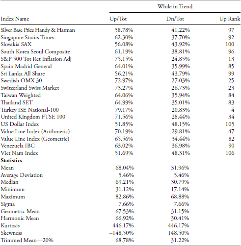
TABLE 10.6 Trendiness Two Table
To access an online version of this table, please visit www.wiley.com/go/morrisinvestingebook.
Comparison of the Two Trendiness Methods
Figure 10.6 compares the rankings using both “Trendiness” methods. Keep in mind we are only using uptrends, downtrends, and a derivative of them, which is up over down ratio. The plot below is informally called a scatter plot and deals with the relationships between two sets of paired data. The equation of the regression line is from high school geometry and follows the expression: y = mx + b, where m is the slope and b is the y-intercept (where it crosses the y axis); x is known as the independent variable or the predictor variable and y is the dependent variable or response variable. The expression that defines the regression (linear least squares) shows that the slope of the line (m) is 0.8904. The line crosses the y (vertical) axis at 6.027, which is b. R2, which is also known as the coefficient of determination, is 0.7928. From R2, we can easily see that the correlation R is 0.8904 (square root of R2). We know this is a highly positive correlation because we can visually verify it simply from the orientation of the slope. We can interpret m as the value of y when x is zero and we can interpret b as the amount that y increases when x increases by one. From all of this one can determine the amount that one variable influences the other. Sorry, I beat this to death; you can probably find simpler explanations in a high school statistics textbook.
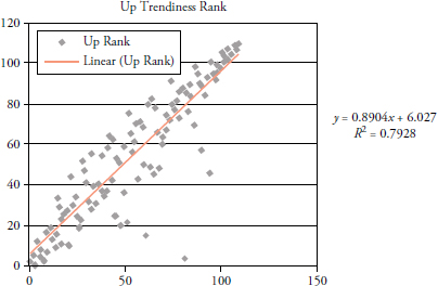
FIGURE 10.6 Scatter Plot of Trendiness One versus Trendiness Two
Trendless Analysis
This is a rather simple but complementary (intentional spelling) method that helps to validate the other two processes. This method focuses on the lack of a trend, or the amount of trendless time is in the data. The first two methods focused on trending and this one is focused on nontrending, all using the same raw data. Determining markets that do not trend will serve two purposes. One is to not use conventional trend-following techniques on them, and two, it can be good for mean reversion analysis. Table 10.7 shows the column headers; the definitions follow.

TABLE 10.7 Trendless Analysis Explanation
- Up. This is the Total Trend average from Trendiness One multiplied by the Up Total from Trendiness Two.
- Down. This is the Total Trend average from Trendiness One multiplied by the Down Total from Trendiness Two.
- Trendless. This is the complement of the sum of the Up and Down values (1 – (Up + Down)).
- Rank. This is the numerical rank of the Trendless column with the largest value equal to a rank of 1.
Table 10.8 shows the results using the Trendless methodology.
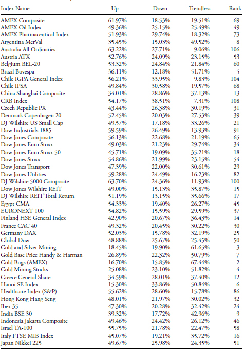

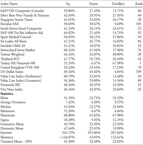
TABLE 10.8 Trendless Analysis Table
To access an online version of this table, please visit www.wiley.com/go/morrisinvestingebook.
Comparison of Trendiness One Rank and Trendless Rank
Although I think this was quite obvious, Figure 10.7 shows the analysis math is consistent and acceptable. These two series should essentially be inversely correlated, and they are with coefficient of determination equal to one.
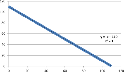
FIGURE 10.7 Trendiness One versus Trendless Scatter Plot
The following tables take the data from the full 109 indices and subdivide it into sectors, international, domestic, and time frames to ensure there is robustness across a variety of data. There are many indices that appear in many if not most of these tables, but keeping data of that sort for comparison with others that are not so widely diversified will enhance the research. These tables show all three trend method results. This first table consists of all the index data. The remaining ones contain subsets of the All table, such as Domestic, International, Commodities, Sectors, Data > 2000, Data > 1990, and Data > 1980. The reason for the data subsets is to ensure there is a robust analysis in place across various lengths of data, which means multiple bull-and-bear cyclical markets are considered, in addition to secular markets. The Data > 2000 means that the data starts sometime prior to 2000 and therefore totally contains the secular bear market that began in 2000.
All Trendiness Analysis
Table 10.9 contains data from all of the 109 indices in the analysis. The first column contains letters identifying the subcategory for each issue as follows:
- I – International
- S – Sector
- C – Commodity
- Blank – Domestic

TABLE 10.9 All Three Trend Analyses on All Indices
To access an online version of this table, please visit www.wiley.com/go/morrisinvestingebook.
Trend Table Selective Analysis
In this section, I will demonstrate more details on selected issues from Table 10.9 to show how the data can be utilized.
Using the Trendiness One Rank, you can see that the U.S. Dollar Index is number one. You can also see it is the worst for being Trendless (last column), which one would expect. However, if you look at the Trendiness One and Trendiness Two Up Ranks, you see that it did not rank well. This can only be interpreted that the U.S. Dollar Index is a good downtrending issue, but not a good uptrending one based on this relative analysis with 109 various indices. This is made clear from the long trendline drawn from the first data point to the last data point and is clearly in a downtrend. Figure 10.8 shows the U.S. Dollar Index with a 5 percent filtered wave overlaid on it. The lower plot shows the filtered wave of 5 percent measuring the number of days during each up and down move. The two horizontal lines are at +21 and – 21, which means that movements inside that band are not counted in the trendiness or trendless calculations. The only difference between what this chart shows and what the table data measures is the fact that the table is averaging a number of different filtered waves and trend lengths.
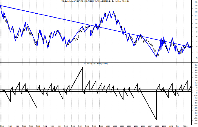
FIGURE 10.8 Trend Analysis of U.S. Dollar Index Chart
Source: Chart courtesy of MetaStock.
Let’s now look at the worst trendiness index and see what we can find out about it (Table 10.9). The Trendiness One rank and the Trendless Rank confirm that this is not a good trending index. Furthermore, the Up Trendiness in both One and Two also shows that it ranks low (109 and 81) in the Trendiness One, which is measuring the trendiness based on all the data, and that the rank in Trendiness Two is high (4). Remember that Trendiness Two only looks at the trending data, not all of the data. Therefore, you can say that this index when in a trending mode, tends to trend up well, but the problem is that it isn’t in a trending mode often (see Table 10.11).
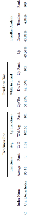
TABLE 10.10 Trend Analysis of U.S. Dollar Index
To access an online version of this table, please visit www.wiley.com/go/morrisinvestingebook.
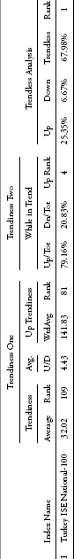
TABLE 10.11 Trend Analysis of Turkey ISE National-100
To access an online version of this table, please visit www.wiley.com/go/morrisinvestingebook.
Figure 10.9 shows the Turkey ISE National-100 index with the same format as the earlier analysis. Notice that it is generally in an uptrend based on the long-term trend line. From the bottom plot you can see that there is very little movement of trends outside of the +21 and −21 day bands. Bottom line is that this index doesn’t trend well, and is quite volatile in its price movements; if you are trend follower; don’t waste your time with this one. A question that might arise is that it is also clear from the top plot that it is in an uptrend, so if you used a larger filtered wave and/or different trend length, it might yield different results. My response to that is simply: of course it will, you can fit the analysis to get any results you want, especially with all this wonderful hindsight. Bad approach to successful trend following.

FIGURE 10.9 Trend Analysis of Turkey ISE National-100 Chart
Source: Chart courtesy of MetaStock.
Using the same data table, let’s look at an index that ranks high in the uptrend rankings (Table 10.9). From the table it ranks as middle of the road relatively based on Trendiness One and Trendless rank. However, the rank for Up Trendiness One and Trendiness Two Up rank is high (both are 5). This means that most of the trendiness is to the upside with only moderate downtrends (see Table 10.12).
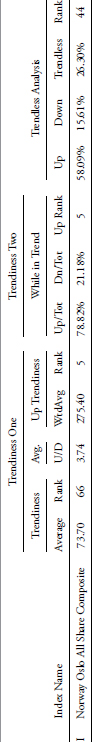
TABLE 10.12 Trend Analysis of Norway Oslo All Share Composite
To access an online version of this table, please visit www.wiley.com/go/morrisinvestingebook.
Figure 10.10 shows the Norway Oslo Index clearly in an uptrend. The bottom plot shows that most of the spikes of trend length are above the +21 band level and very few are below the – 21 band level. This confirms the data in the table.
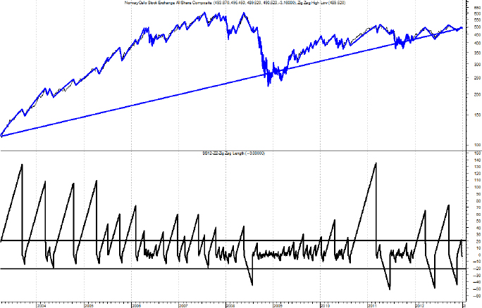
FIGURE 10.10 Trend Analysis of Norway Oslo All Share Composite Chart
Source: Chart courtesy of MetaStock.
In order to carry this analysis to fruition, let’s look at the index with the worst uptrend rank (Table 10.9). From the table the Trendiness One and Two Up ranks are dead last (109). The Trendiness One overall rank is 104, which is almost last, and the trendless rank is 6, which confirms that data (see Table 10.13).
TABLE 10.13 Trend Analysis of Hanoi SE Index
To access an online version of this table, please visit www.wiley.com/go/morrisinvestingebook.
Figure 10.11 shows that the Hanoi SE Index is clearly in a downtrend; however, the bottom plot shows that very few trends are outside the bands. And the ones that move well outside the bands are the downtrends. As before, one can change the analysis and get desired results, but that is not how it should be done. One note, however, is that this index does not have a great deal of data compared to most of the others and this should be a consideration in the overall analysis.
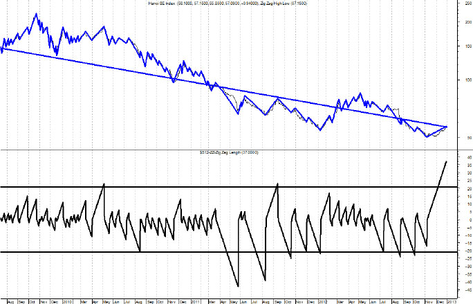
FIGURE 10.11 Trend Analysis of Hanoi SE Index Chart
Source: Chart courtesy of MetaStock.
Indices Analysis Summary
The analysis of the various rankings for the indices shows that the data in the table is robust and accurate. In summary, there are two types of overall trendiness measures; Trendiness One uses all of the data to determine trendiness, and Trendless uses only the trending data determined by the filtered wave value and the trend length. Of course, Trendiness One is the complement of Trendless analysis. They are still measuring trendiness, just in two different arenas. There are also two measures of Up Trendiness using the same concept. This could have just as easily been a ranking of down trendiness, but I think up trendiness is more prevalent in most markets.
Appendix B contains a number of tables that show the tables ordered by their ranks, which makes it easier to find the ranking you are looking for.
The following tables show various subsets of the All table just analyzed.
Domestic Trendiness
Table 10.14 contains only the domestic issues.
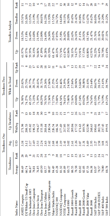
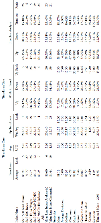
TABLE 10.14 Domestic Trendiness
To access an online version of this table, please visit www.wiley.com/go/morrisinvestingebook.
International Trendiness
Table 10.15 contains only the international issues.

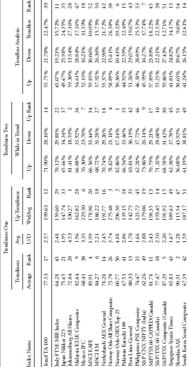
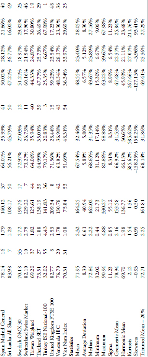
TABLE 10.15 International Trendiness
To access an online version of this table, please visit www.wiley.com/go/morrisinvestingebook.
Commodity Trendiness
Table 10.16 contains only the commodity-based issues.
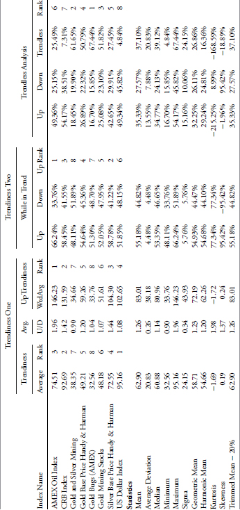
TABLE 10.16 Commodity Trendiness
To access an online version of this table, please visit www.wiley.com/go/morrisinvestingebook.
Sector Trendiness
Table 10.17 contains only the sector-related issues.
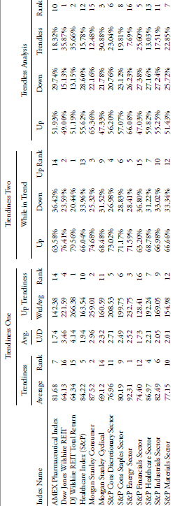
TABLE 10.17 Sector Trendiness
To access an online version of this table, please visit www.wiley.com/go/morrisinvestingebook.
Data with History Prior to 2000
Table 10.18 contains all the issues that have data that began prior to 2000. This table contains more issues than the following two tables as each of them reduces the number of issues by increasing the amount of data by using an earlier starting date.
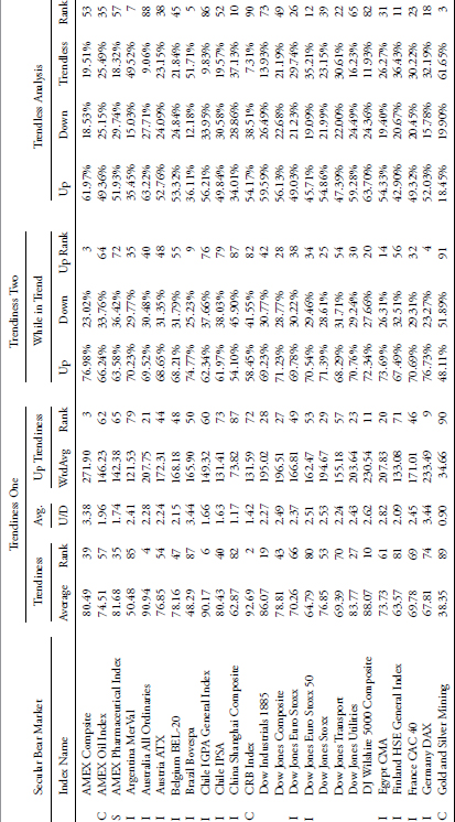
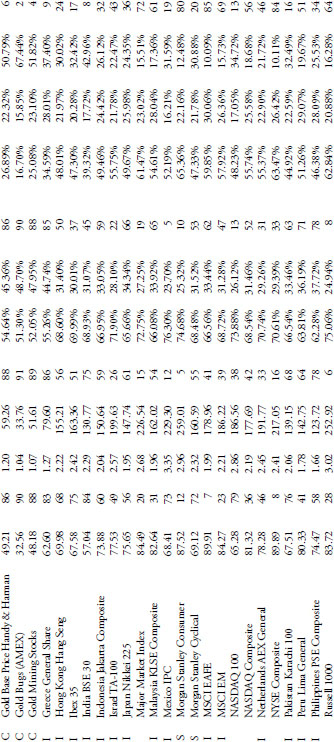
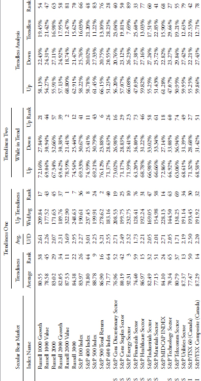
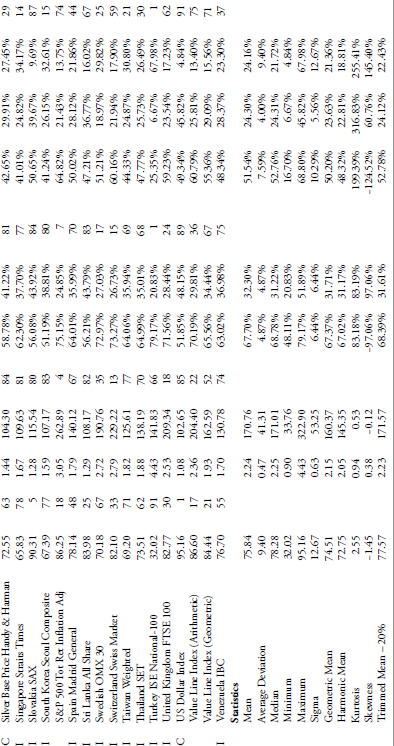
TABLE 10.18 Trend Analysis on Indices with Data History Prior to 2000
To access an online version of this table, please visit www.wiley.com/go/morrisinvestingebook.
Data with History Prior to 1990
Table 10.19 contains all the issues that have data that began prior to 1990.


TABLE 10.19 Trend Analysis on Indices with Data History Prior to 1990
To access an online version of this table, please visit www.wiley.com/go/morrisinvestingebook.
Data with History Prior to 1980
Table 10.20 contains all the issues that have data that began prior to 1980. This is the table with the longest set of data and hence, the fewest number of issues.
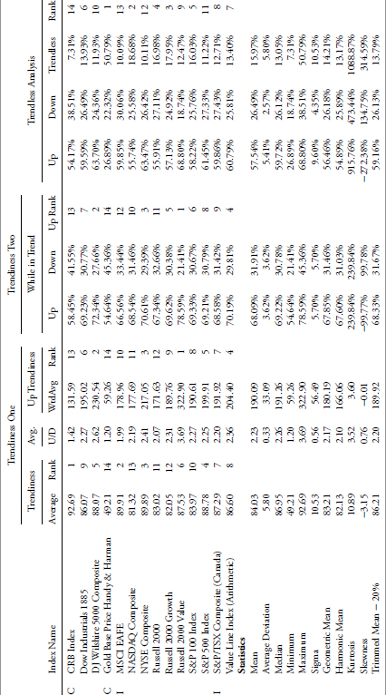
TABLE 10.20 Trend Analysis on Indices with Data History Prior to 1980
To access an online version of this table, please visit www.wiley.com/go/morrisinvestingebook.
Trend Analysis on the S&P GICS Data
Next I conduct a similar study on the 95 S&P GICS Sectors, Industry Groups, and Industries. This is a different study in that the parameters for determination of trending markets were greatly expanded. The number of days for trend determination was tabulated for days from 15 to 65. The filtered wave percentage was also expanded from 5 percent to 11 percent. All of the analysis that was included in the previous section was done on these 95 sectors and industry groups.
The Global Industry Classification Standard (GICS) is an industry taxonomy developed by MSCI and Standard & Poor’s (S&P) for use by the global financial community. The GICS structure consists of 10 sectors, 24 industry groups, 68 industries and 154 subindustries into which S&P has categorized all major public companies. The system is similar to ICB (Industry Classification Benchmark), a classification structure maintained by Dow Jones Indexes and FTSE Group.
S&P Sectors, Industry Groups, and Industries
The numerical identification is exactly the same used by Standard & Poor’s in their GICS classification methodology. Most, but not all, of the GICS database began in 1989, in fact there were only 21 series that did not begin in 1989. When viewing the analysis that follows, you can cross-reference this table if one particular sector or industry seems to trend outside the average, then check the start date as it might not have enough data for good analysis. Table 10.21 shows all the GICS data and each starting date.
| Start Date | GICS TOTAL Summary |
|---|---|
| 9/11/1989 | 10 Energy |
| 9/11/1989 | 101010 Energy Equipment & Services |
| 9/11/1989 | 101020 Oil Gas & Consumable Fuels |
| 9/11/1989 | 15 Materials |
| 9/11/1989 | 151010 Chemicals |
| 9/11/1989 | 151020 Construction Materials |
| 9/11/1989 | 151030 Containers & Packaging |
| 9/11/1989 | 151040 Metals & Mining |
| 9/11/1989 | 151050 Paper & Forest Products |
| 9/11/1989 | 20 Industrials |
| 9/11/1989 | 2010 Capital Goods |
| 9/11/1989 | 201010 Aerospace & Defense |
| 9/11/1989 | 201020 Building Products |
| 9/11/1989 | 201030 Construction & Engineering |
| 9/11/1989 | 201040 Electrical Equipment |
| 9/11/1989 | 201040 Electronic Equipment Instruments & Components |
| 9/11/1989 | 201050 Industrial Conglomerates |
| 9/11/1989 | 201060 Machinery |
| 6/30/1996 | 201070 Trading Companies & Distributors |
| 9/11/1989 | 2020 Commercial & Professional Services |
| 9/11/1989 | 202010 Commercial Services & Supplies |
| 8/29/2008 | 202020 Professional Services |
| 9/11/1989 | 2030 Transportation |
| 9/11/1989 | 203010 Air Freight & Logistics |
| 9/11/1989 | 203020 Airlines |
| 9/11/1989 | 203040 Road & Rail |
| 9/11/1989 | 25 Consumer Discretionary |
| 9/11/1989 | 2510 Automobiles & Components |
| 9/11/1989 | 251010 Auto Components |
| 9/11/1989 | 251020 Automobiles |
| 9/11/1989 | 2520 Consumer Durables & Apparel |
| 9/11/1989 | 252010 Household Durables |
| 9/11/1989 | 252020 Leisure Equipment & Products |
| 9/11/1989 | 252030 Textiles Apparel & Luxury Goods |
| 9/11/1989 | 2530 Consumer Services |
| 9/11/1989 | 253010 Hotels Restaurants & Leisure |
| 4/28/2005 | 253020 Diversified Consumer Services |
| 9/11/1989 | 2540 Media |
| 9/11/1989 | 254010 Media |
| 9/11/1989 | 2550 Retailing |
| 11/4/2002 | 255010 Distributors |
| 10/29/2002 | 255020 Internet & Catalog Retail |
| 9/11/1989 | 255030 Multiline Retail |
| 9/11/1989 | 255040 Specialty Retail |
| 9/11/1989 | 30 Consumer Staples |
| 9/11/1989 | 3010 Food & Staples Retailing |
| 9/11/1989 | 301010 Food & Staples Retailing |
| Start Date | GICS TOTAL Summary |
| 9/11/1989 | 3020 Food Beverage & Tobacco |
| 9/11/1989 | 302010 Beverages |
| 9/11/1989 | 302020 Food Products |
| 9/11/1989 | 302030 Tobacco |
| 9/11/1989 | 3030 Household & Personal Products |
| 9/11/1989 | 303010 Household Products |
| 9/11/1989 | 303020 Personal Products |
| 9/11/1989 | 35 Health Care |
| 9/11/1989 | 3510 Health Care Equipment & Services |
| 9/11/1989 | 351010 Health Care Equipment & Supplies |
| 9/11/1989 | 351020 Health Care Providers & Services |
| 4/27/2006 | 351030 Health Care Technology |
| 1/7/2000 | 3520 Pharmaceuticals Biotechnology & Life Sciences |
| 9/11/1989 | 352010 Biotechnology |
| 9/11/1989 | 352020 Pharmaceuticals |
| 4/27/2006 | 352030 Life Sciences Tools & Services |
| 9/11/1989 | 40 Financials |
| 9/11/1989 | 4010 Banks |
| 9/11/1989 | 401010 Commercial Banks |
| 5/2/2003 | 401020 Thrifts & Mortgage Finance |
| 9/11/1989 | 4020 Diversified Financials |
| 5/1/2003 | 402010 Diversified Financial Services |
| 5/6/2003 | 402020 Consumer Finance |
| 5/2/2003 | 402030 Capital Markets |
| 9/11/1989 | 4030 Insurance |
| 9/11/1989 | 403010 Insurance |
| 10/9/2001 | 4040 Real Estate |
| 10/9/2001 | 404020 Real Estate Investment Trusts (REITs) |
| 8/2/2006 | 404030 Real Estate Management & Development |
| 9/11/1989 | 45 Information Technology |
| 9/11/1989 | 4510 Software & Services |
| 1/4/1999 | 451010 Internet Software & Services |
| 9/11/1989 | 451020 IT Services |
| 9/11/1989 | 451030 Software |
| 9/11/1989 | 4520 Technology Hardware & Equipment |
| 9/11/1989 | 452010 Communications Equipment |
| 9/11/1989 | 452020 Computers & Peripherals |
| 6/28/1996 | 452040 Office Electronics |
| 5/2/2003 | 4530 Semiconductors & Semiconductor Equipment |
| 9/11/1989 | 453010 Semiconductors & Semiconductor Equipment |
| 9/11/1989 | 50 Telecommunication Services |
| 9/11/1989 | 501010 Diversified Telecommunication Services |
| 7/1/1993 | 501020 Wireless Telecommunication Services |
| 9/11/1989 | 55 Utilities |
| 9/11/1989 | 551010 Electric Utilities |
| 9/11/1989 | 551020 Gas Utilities |
| 8/31/1999 | 551030 Multi-Utilities |
| 4/28/2005 | 551050 Independent Power Producers & Energy Traders |
TABLE 10.21 GICS Sectors, Industry Groups, and Industries
GICS Total Summary
Table 10.22 shows the robustness of the analysis. It is entirely too much data to put into a table in a book, but is displayed here merely as proof (only partial data is shown). The raw data will be removed for the remainder of this analysis, only showing the average rankings and relative rankings. This is a table that shows the total trend (up and down) for all the raw data used in the analysis, with filtered waves from 5 percent to 11 percent and trend lengths from 15 to 65 days. The table is presented here just to give you an idea as to how much analysis went into this. A summary table follows that is much easier to view.


TABLE 10.22 GICS Trend Analysis of Wide Variety of Trends (Partial Data)
To access an online version of this table, please visit www.wiley.com/go/morrisinvestingebook.
The GICS Summary tables are shown below but without the vast amount of raw data, only the name of the classification, the average of all the raw calculations, and the relative rank of each. Following these tables are tables using the same analysis that was conducted previously on the 109 indices.
GICS Summary
Table 10.23 contains all of the averages of the various filtered wave and trend days analysis categorized into Total Trendiness, Uptrends, Downtrends, and the ratio of up to downtrends. You will notice that there are missing data in the U/D Ratio column. This is because of a couple of different things.

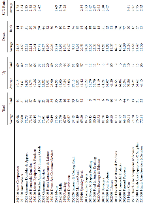
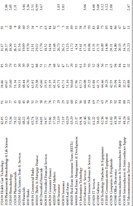
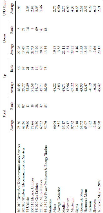
TABLE 10.23 Summary of GICS Trend Analysis
To access an online version of this table, please visit www.wiley.com/go/morrisinvestingebook.
- There were a few of the series that just did not have a long enough data history.
- When you mix a small filtered wave with a long trend expectation, you will find that some series just do not have an Uptrend, a Downtrend, or both. Division does not work well with a zero for numerator or denominator.
On first glance at the above table of all GICS issues, it could be noticed that all of the ones that have numerical codes starting with the number 3 are ranked high in the Total Trendiness. While I think this is poor analysis, let’s see if there is anything there. Oh my, yes there is, all of them are part of Consumer Staples or Healthcare. Both of these sectors are typically defensive in nature and usually with less volatility. If you refer to the table at the beginning of this section that has 109 market indices, it also contains 16 sectors or industries. Consumer Staples is ranked in that table using Trendiness One as number 3, while the Healthcare sector is ranked number 14. Remember that these are relative ranks, but the results confirm that Staples and Healthcare are good trending issues. Does this hold up for other defensive issues such as Utilities and Telecom? The Utilities sector and the Electric Utilities industry rank 14 and 13 in overall trendiness, however, the other utility industries do not rank high. Telecom sector ranks 23, with diversified telecom industry at 25 and wireless at 89. It should also be noted when doing this type of analysis that the wireless data begins 4 years later than the other, but I don’t see that as a hindrance.
Let’s now look at which GICS issues are not good at trending (Table 10.24). The top five are Internet Software and Services, Internet and Catalog Retail, Health Care Technology, Office Electronics, and Construction Materials. With this wide dispersion of industries, let’s first check the data. First note that of the 95 GICS issues, only 20 (21 percent) have data less than the majority, which all begin in 1989. Four of the poor trending issues are in this category. Only Construction Materials began in 1989. Since this analysis is measuring relative trendiness one would then need to go to each individual issue and chart it as was done in the previous section.
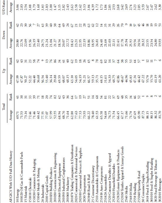
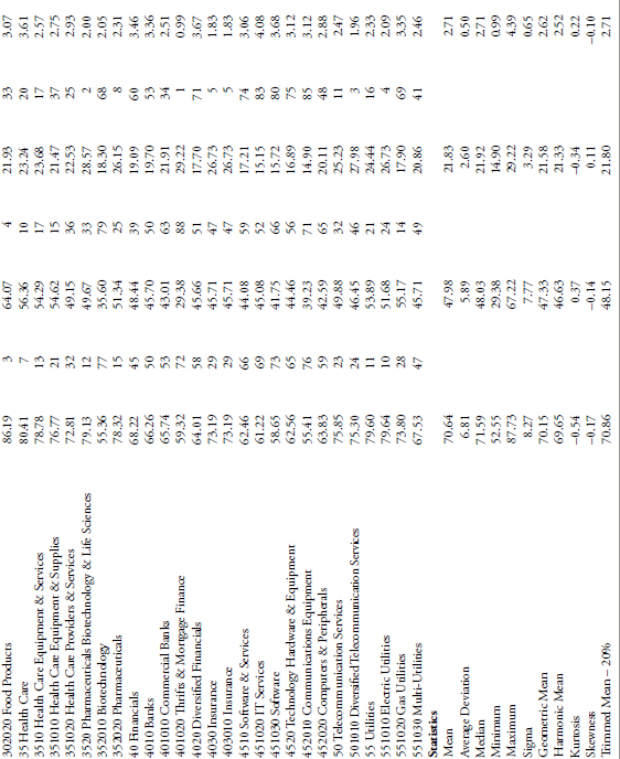
TABLE 10.24 Summary of GICS Trend Analysis with Short Data History Issues Removed
To access an online version of this table, please visit www.wiley.com/go/morrisinvestingebook.
GICS Summary Table (With Inadequate Periods of Analysis Removed)
GICS Table for All Trends Up to and Including 30 Days
Table 10.25 shows the analysis on the GICS data in the same manner as the earlier analysis on the 109 market indices. A review of the details in that section might be helpful.

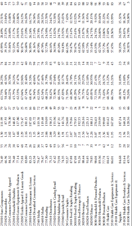

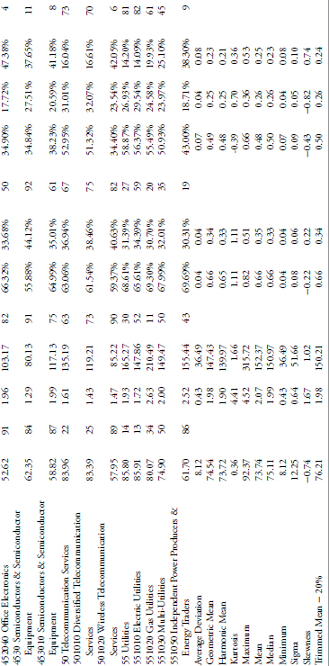
TABLE 10.25 GICS Analysis for All Trends Up to 30-Day Duration
To access an online version of this table, please visit www.wiley.com/go/morrisinvestingebook.
Trend Analysis in Secular Bear Markets
Table 10.26 shows the trend analysis for the periods when the Dow Industrials was in a secular bear market. Although these results are not as robust as the research in this chapter, and uses the 21-day trend without a move of more than 5 percent as the measure, it does show by example the message. Without studying the markets, one might assume that secular bear markets are mainly down trending markets. Hopefully this table dispels that notion and shows that during secular bear markets a strong tendency to trend still exists.
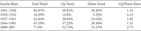
TABLE 10.26 Trend Analysis in Secular Bear Markets
If there is a single takeaway from all this analysis on market trends, it is this: markets trend. Herding causes demand, which is the opposite of economic supply and demand (A104). The stock market is a demand event. Some issues trend better when in uptrends than in downtrends, while the reverse holds true for some. From the tables in this chapter and in the appendix, you should be able to discern which indices, sectors, or industries are better for trending.