Chapter 3: Using Excel Sparklines
In This Chapter
• Understanding the Excel 2013 Sparkline feature
• Adding sparklines to a worksheet
• Working with groups of sparklines
• Modifying your sparkline graphics
Sparklines were developed by visualization guru Edward Tufte. Tufte envisioned mini word-sized charts placed in and among the data that they represent. Sparklines enable you to see trends and patterns within your data at a glance using minimal space. Following the sparkline concept, Microsoft then implemented sparklines in Excel worksheets so that you can get visual context for data that doesn’t take up a lot of real estate on your dashboard.
This chapter introduces you to sparklines and demonstrates how you can use them to add visualizations to your dashboards and reports.
 Sparklines are available only with Excel 2010 and Excel 2013. If you create a workbook that uses sparklines, and that workbook is opened using a previous version of Excel, the sparkline cells will be empty. If your organization is not fully using Excel 2010 or 2013, you may want to search for alternatives to the built-in Excel sparklines. There are many third-party add-ons that bring sparkline features to earlier versions of Excel. Some of these products support additional sparkline types, and most have many additional customization options. Search the web for sparklines excel, and you’ll find several add-ons to choose from.
Understanding Sparklines
It’s important to understand just how sparklines can enhance your reporting. As I mention in Chapter 2, much of the reporting done in Excel is table-based, where precise numbers are more important than pretty charts. However, in table-based reporting, you often lose the ability to show important aspects of the data such as trends. The number of columns needed to show adequate trend data in a table makes it impractical to do so, and often will do nothing more than render your report unreadable. Sparklines allow you to add extra analysis, such as trends, in a concise visualization within your table without inundating your customers with superfluous numbers.
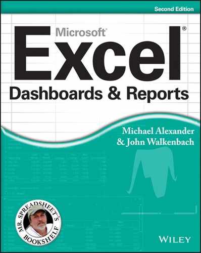
Take the example in Figure 3-1. The data represents a compact KPI summary designed to be an at-a-glance view of key metrics. Although there is some effort given to comparing various time periods (in columns D, E, and F), the ability to see a full-year trend would be helpful.
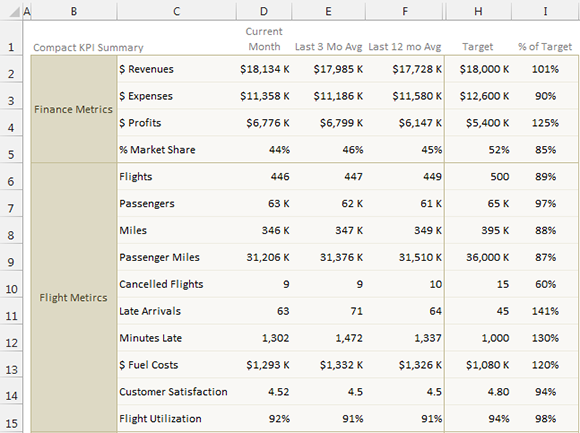
Figure 3-1: Although this KPI Summary is useful, it lacks the ability to show a full-year trend.
Figure 3-2 illustrates the same KPI Summary with Excel sparklines added to visually show the 12-month trend. With the sparklines added, you can see the broader story behind each metric. For example, if you were to look at the Passengers metric based solely on the numbers, it would look like it is merely slightly up from the average. But look at the sparkline, and you see a story of a heroic comeback from a huge hit at the beginning of the year.
It’s not about adding flash and pizzazz to your tables. It’s about building the most effective message you can in the limited you space you have. Sparklines are another tool you can use to add another dimension to your table-based reports.
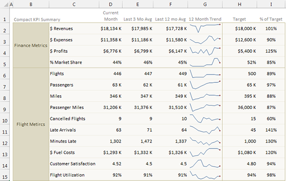
Figure 3-2: Sparklines allow you to add trending in a compact space, enabling you to see a broader picture for each metric.
Applying Sparklines
Although sparklines look like miniature charts (and can sometimes take the place of a chart), this feature is completely separate from the Excel chart feature (covered in Part II of this book). For example, charts are placed on a worksheet’s drawing layer, and a single chart can display several series of data. In contrast, a sparkline is displayed inside a worksheet cell and displays only one series of data.
Excel 2013 supports three types of sparklines: Line, Column, and Win/Loss. Figure 3-3 shows examples of each type of sparkline graphics, displayed in column H. Each sparkline depicts the six data points to the left.
→ Line: Similar to a line chart, the line can display with a marker for each data point. The first group in Figure 3-3 shows Line sparklines with markers. A quick glance reveals that with the exception of Fund Number W-91, the funds have been losing value over the six-month period.
→ Column: Similar to a column chart, the second group shows the same data with Column sparklines.
→ Win/Loss: A binary type chart that displays each data point as a high block or a low block. The third group shows Win/Loss sparklines. Notice that the data is different. Each cell displays the change from the previous month. In the sparkline, each data point is depicted as a high block (win) or a low block (loss). In this example, a positive change from the previous month is a win, and a negative change from the previous month is a loss.
Figure 3-3: Three types of sparklines.
Creating Sparklines
Figure 3-4 shows some weather data that you can summarize with sparklines. To create sparkline graphics for the values in these nine rows, follow these steps:
1. Select the data range that you want to summarize. In this example, select B4:M12.
If you’re creating multiple sparklines, select all the data.
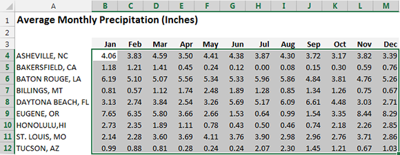
Figure 3-4: Data that you want to summarize with sparkline graphics.
2. With the data selected, click the Insert tab on the Ribbon and find the Sparklines group. There you can select any one of the three sparkline types: Line, Column, or Win/Loss. In this case, select the Column option.
Excel displays the Create Sparklines dialog box, as shown in Figure 3-5.
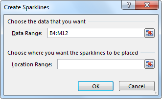
Figure 3-5: Use the Create Sparklines dialog box to specify the data range and the location for the sparkline graphics.
3. Specify the data range and the location for the sparklines. For this example, specify N4:N12 as the Location Range.
Typically, you put the sparklines next to the data, but that’s not required. Most of the time, you’ll use an empty range to hold the sparklines. However, Excel doesn’t prevent you from inserting sparklines into nonempty cells. The sparkline location that you specify must match the source data in terms of number of rows or number of columns.
4. Click OK.
Excel creates the sparklines graphics of the type you specified (see Figure 3-6).
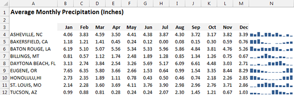
Figure 3-6: Column sparklines summarize the precipitation data for nine cities.
The sparklines are linked to the data, so if you change any of the values in the data range, the sparkline graphic updates.
 Generally, you’ll create sparklines on the same sheet that contains the data. If you want to create sparklines on a different sheet, start by activating the sheet where the sparklines will be displayed. Then, in the Create Sparklines dialog box, specify the source data either by pointing or by typing the complete sheet reference (for example, type Sheet1A1:C12). The Create Sparklines dialog box lets you specify a different sheet for the Data Range, but not for the Location Range.
Customizing Sparklines
When you activate a cell that contains a sparkline, Excel displays an outline around all the sparklines in its group. You can then use the commands on the Design tab (select Sparkline Tools→Design tab) to customize the group of sparklines.
Sizing and merging sparkline cells
When you change the width or height of a cell that contains a sparkline, the sparkline adjusts to fill the new cell size. In addition, you can put a sparkline into merged cells. To merge cells, select at least two cells and choose Home→Alignment→Merge & Center.
Figure 3-7 shows the same sparkline, displayed at four sizes resulting from column width, row height, and merged cells.
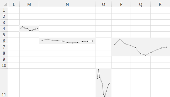
Figure 3-7: A sparkline at various sizes.
Generally, the most appropriate aspect ratio for a chart is 2:1, where the chart is about twice as wide as it is tall. Other aspect ratios can distort your visualizations, exaggerating the trend in sparklines that are too tall, and flattening the trend in sparklines that are too wide.
If you merge cells, and the merged cells occupy more than one row or one column, Excel won’t let you insert a group of sparklines into those merged cells. Rather, you need to insert the sparklines into a normal range (with no merged cells) and then merge the cells.
You can also put a sparkline in nonempty cells, including merged cells. Figure 3-8 shows two sparklines merged with cells containing some text. This gives the appearance of two single cells with both text and graphics.

Figure 3-8: Sparklines in merged cells (E2:I7 and E9:I14).
Handling hidden or missing data
In some cases, you just want to present the sparkline visualization, without the numbers. One way to do so is to hide the rows or columns that contain the data. Figure 3-9 shows a table with the values displayed, and the same table with the values hidden (by hiding the columns).
By default, if you hide rows or columns that contain data used in a sparkline graphic, the hidden data doesn’t appear in the sparkline. In addition, blank cells are displayed as a gap in the graphic.
To change these default settings, go to the Sparkline Tools tab on the Ribbon and select Design→Sparkline→Edit Data→Hidden & Empty Cells. In the Hidden and Empty Cell Settings dialog box, specify how to handle hidden data and empty cells.
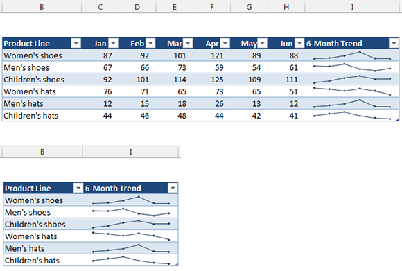
Figure 3-9: Sparklines can use data in hidden rows or columns.
Changing the sparkline type
As mentioned earlier in this chapter, Excel supports three sparkline types: Line, Column, and Win/Loss. After you create a sparkline or group of sparklines, you can easily change the type by clicking the sparkline and selecting one of the three icons located under Sparkline Tools→Design→Type. If the selected sparkline is part of a group, all sparklines in the group are changed to the new type.
If you’ve customized the appearance, when you switch among different sparkline types, Excel remembers your customization settings for each sparkline type.
Changing sparkline colors and line width
After you create a sparkline, changing the color is easy. Simply click the sparkline, go up to the Sparkline Tools tab in the Ribbon, and select Design→Style. There you will find various options to change the color and style of your sparkline.
For Line sparklines, you can also specify the line width. Choose Sparkline Tools→Design→Style→Sparkline Color→Weight.
Colors used in sparkline graphics are tied to the document theme. If you change the theme (by choosing Page Layout→Themes→Themes), the sparkline colors then change to the new theme colors. Be aware that any manual changes you make to color are lost if you change the theme.
Using color to emphasize key data points
Use the commands under Sparkline Tools→Design→Show to customize the sparklines to emphasize key aspects of the data. The options in the Show group are as follows:
→ High Point: Apply a different color to the highest data point in the sparkline.
→ Low Point: Apply a different color to the lowest data point in the sparkline.
→ Negative Points: Apply a different color to negative values in the sparkline.
→ First Point: Apply a different color to the first data point in the sparkline.
→ Last Point: Apply a different color to the last data point in the sparkline.
→ Markers: Show data markers in the sparkline. This option is available only for Line sparklines.
You can control the color of the sparkline by using the Marker Color control in the Sparkline Tools→Design→Style group. Unfortunately, you cannot change the size of the markers in Line sparklines.
Figure 3-10 shows some Line sparklines with various types of colors added.
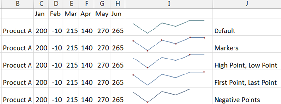
Figure 3-10: Using color to emphasize key data points for Line sparklines.
Adjusting sparkline axis scaling
When you create one or more sparklines, they all use (by default) automatic axis scaling. In other words, Excel determines the minimum and maximum vertical axis values for each sparkline in the group, based on the numeric range of the sparkline data.
The Sparkline Tools→Design→Group→Axis command lets you override this automatic behavior and control the minimum and maximum value for each sparkline, or for a group of sparklines. For even more control, you can use the Custom Value option and specify the minimum and maximum for the sparkline group.
Axis scaling can make a huge difference in the sparklines. Figure 3-11 shows two groups of sparklines. The group at the top uses the default axis settings (Automatic for Each Sparkline). Each sparkline in this group shows the six-month trend for the product, but there is no indication of the magnitude of the values.
The sparkline group at the bottom (which uses the same data), uses the Same for All Sparklines setting for the minimum and maximum axis values. With these settings in effect, the magnitude of the values across the products is apparent — but the trend across the months within a product is not apparent.
The axis scaling option you choose depends on what aspect of the data you want to emphasize.
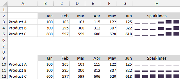
Figure 3-11: The bottom group of sparklines shows the effect of using the same axis minimum and maximum values for all sparklines in a group.
Faking a reference line
One useful feature that’s missing in the Excel 2013 implementation of sparklines is a reference line. For example, it might be useful to show performance relative to a goal. If the goal is displayed as a reference line in a sparkline, the viewer can quickly see whether the performance for a period exceeded the goal.
One approach is to write formulas that transform the data and then use a sparkline axis as a fake reference line. Figure 3-12 shows an example. Students have a monthly reading goal of 500 pages. The range of data shows the actual pages read, with sparklines in column H. The sparklines show the six-month page data, but it’s impossible to tell who exceeded the goal and when they did it.
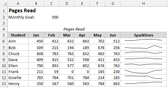
Figure 3-12: Sparklines display the number of pages read per month.
The lower set of sparklines in Figure 3-13 shows another approach: Transforming the data so that meeting the goal is expressed as a 1 and failing to meet the goal is expressed as a –1. The following formula (in cell B18) transforms the original data:
=IF(B6>$C$2,1,-1)
This formula was copied to the other cells in the B18:G25 range.
Using the transformed data, Win/Loss sparklines are used to visualize the results. This approach is better than the original, but it doesn’t convey any magnitude differences. For example, you cannot tell whether the student missed the goal by 1 page or by 500 pages.
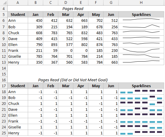
Figure 3-13: Using Win/Loss sparklines to display goal status.
Figure 3-14 shows a better approach. Here the original data is transformed by subtracting the goal from the pages read. The formula in cell B31 is
=B6-C$2
This formula was copied to the other cells in the B31:G38 range, and a group of Line sparklines display the resulting values. This group has the Show Axis setting enabled and also uses Negative Point markers so the negative values (failure to meet the goal) clearly stand out.
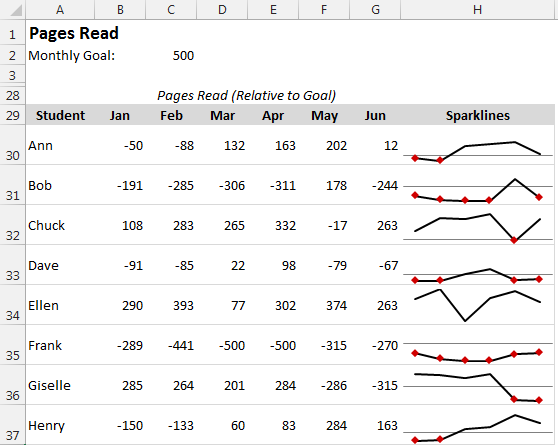
Figure 3-14: The axis in the sparklines represents the goal.
Specifying a date axis
By default, data displayed in a sparkline is assumed to be at equal intervals. For example, a sparkline may display a daily account balance, sales by month, or profits by year. But what if the data isn’t at equal intervals?
Figure 3-15 shows data, by date, along with a sparklines graphic created from column B. Notice that some dates are missing, but the sparkline shows the columns as though the values were spaced at equal intervals.

Figure 3-15: The sparkline displays the values as though they’re at equal time intervals.
To better depict this type of time-based data, the solution is to specify a date axis. Select the sparkline and choose Sparkline Tools→Design→Group→Axis→Date Axis Type.
Excel displays a dialog box, asking for the range that contains the corresponding dates. In this example, specify range A2:A11.
Click OK, and the sparkline displays gaps for the missing dates (see Figure 3-16).
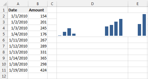
Figure 3-16: After specifying a date axis, the sparkline shows the values accurately.
Auto-updating sparkline ranges
If a sparkline uses data in a normal range of cells, adding new data to the beginning or end of the range does not force the sparkline to use the new data. You need to use the Edit Sparklines dialog box to update the data range (choose Sparkline Tools→Design→Sparkline→Edit Data).
But if the sparkline data is in a column within a Table object (created using Insert→Tables→Table as described in Chapter 11), the sparkline uses new data that’s added to the end of the table.
Figure 3-17 shows an example. The sparkline was created using the data in the Rate column of the table. When you add the new rate for September, the sparkline will automatically update its Data Range.
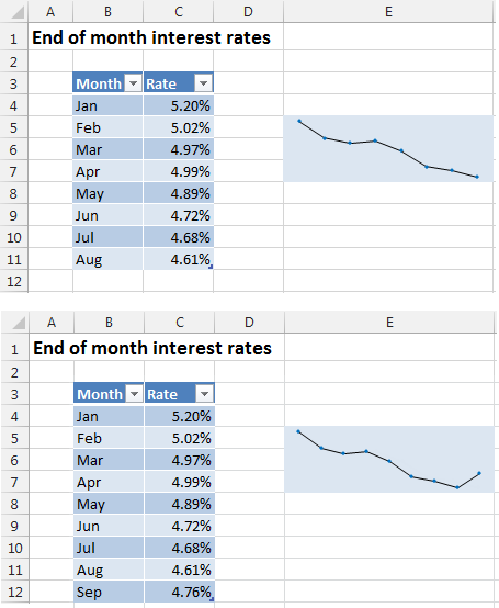
Figure 3-17: Creating a sparkline from data in a table.