
Chapter 2: Table Design Best Practices
In This Chapter
• Table design principles
• Custom number formatting
• Applying custom format colors
• Applying custom format conditions
The Excel table is the number one way information is consolidated and relayed. Look in any Excel report, and you’ll find a table of data. Yet the concept of making tables easier to read and more visually appealing escapes most of us.
Even on many highly graphical dashboards, you find key pieces of information (like the top ten sales reps) presented in a table format. But while the visual components of dashboards are treated with overwhelming care and attention, table design rarely goes beyond matching the color scheme of the other visual components of the dashboard.
Maybe the nicely structured rows and columns of a table lull people into believing that the data is presented in the best way possible. Maybe the options of adding color and borders make the table seem nicely packaged. In any case, you can use several design principles to make your Excel table a more effective platform for conveying data points.
In this chapter, you explore how easy it is to apply a handful of table-design best practices. The tips found here will ultimately help you create visually appealing tables that make the data within them easier to consume and comprehend.
 All workbook examples in this book are available on the companion website for this book at www.wiley.com/go/exceldr.
Table Design Principles
Table design is one of the most underestimated endeavors in Excel reporting. How a table is designed has a direct effect on how well an audience absorbs and interprets the data in that table. Unfortunately, the act of putting a table of data together for consumption is treated trivially by most.
Take, for example, the table illustrated in Figure 2-1. This table is similar to many found in Excel reports. The thick borders, the different colors, and the poorly formatted numbers are all unfortunate trademarks of most tables that come from the average Excel analyst.

Figure 2-1: A poorly designed table.
Throughout this chapter, you’ll improve upon this table, applying these four basic design principles.
→ Use colors sparingly, reserving them only for information about key data points.
→ De-emphasize borders by using the natural white space between your components to partition your dashboard.
→ Use effective number formatting to avoid inundating your table with too much ink.
→ Subdue your labels and headers.
Use colors sparingly
Color is most often used to separate the various sections of a table. The basic idea is that the colors applied to a table suggest the relationships among the rows and columns. The problem is that colors often distract and draw attention away from the important data. In addition, printed tables with dark-colored cells are notoriously difficult to read (especially when printed on black and white printers). They’re also hard on the toner budget, if that holds any importance to you.
In general, you should use colors sparingly; reserve them for providing information about key data points. The headers, labels, and natural structure of your table are more than enough to guide your audience. There’s no real need to add a layer of color to demark rows and columns.
Figure 2-2 shows a table with the colors removed. As you can see, it’s already easier to read.

Figure 2-2: Remove unnecessary cell coloring.
To remove color from cells in a table, first highlight the cells, and then go to the Ribbon and select Home➜Theme Colors. From the Theme Colors drop-down menu, select No Fill (see Figure 2-3).
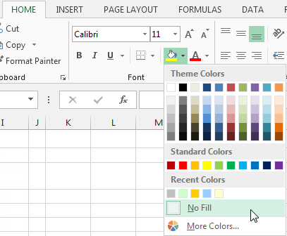
Figure 2-3: Use the No Fill option to clear cell colors.
De-emphasize borders
Believe it or not, borders get in the way of quickly reading the data in a table. This is counterintuitive to the thought that borders help separate data into nicely partitioned sections. The reality is that the borders of a table are the first thing your eyes see when looking at a table. Don’t believe it? Try standing back a bit from an Excel table and squint. The borders will pop out at you.
De-emphasize borders and gridlines wherever you can:
→ Try to use the natural white space between the columns to partition sections.
→ If borders are necessary, format them to lighter hues than your data.
→ Light grays are typically ideal for borders. The idea is to indicate sections without distracting from the information displayed.
Figure 2-4 demonstrates these concepts. Notice how the numbers are no longer caged in gridlines. Also, headings now jump out at you with the addition of Single Accounting underlines.

Figure 2-4: Minimize the use of borders and use the Single Accounting underlines to accent the column headers.
 Single Accounting underlines are different from the standard underlines you typically apply by pressing Ctrl+U on the keyboard. Standard underlining draws a line only as far as the text goes. That is to say, if you underline the word YES, you get a line under the three letters. Single Accounting, on the other hand, draws a line across the entire column, regardless of how big or small the word is. This makes for a minimal but apparent visual demarcation that calls out your column headers nicely.
To format your borders, follow these steps:
1. Highlight the cells you’re working with, right-click, and select Format Cells.
The Format Cells dialog box appears.
2. Click the Border tab, shown in Figure 2-5.
3. Select an appropriate line thickness.
You typically want to select the line with the lightest weight.
4. Select an appropriate color.
Again, lighter hues are the best option.
5. Use the border buttons to control where your borders are placed.
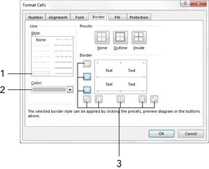
Figure 2-5: Use the Border tab of the Format Cells dialog box to customize your borders.
To apply the Single Accounting underline, follow these steps:
1. Right-click your column headings and select Format Cells.
The Format Cells dialog box appears.
2. Click the Font tab.
3. Choose the Single Accounting underline, as shown in Figure 2-6.

Figure 2-6: Single Accounting underlines effectively call out your column headers.
Use effective number formatting
Every piece of information in your table should have a reason for being there. To clarify, tables often inundate the audience with superfluous ink that doesn’t add value to the information. For example, you’ll often see tables that show a number like $145.57 when a simple 145 would be relay the data just fine. Why include the extra decimal places that serve only to add to the mass of numbers that your audience will need to plow through?
Here are some guidelines to keep in mind when applying formats to the numbers in your table.
→ Only use decimal places if that level of precision is required.
→ In percentages, use only the minimum number of decimals required to represent the data effectively.
→ Instead of using currency symbols (like $ or £), let your labels clarify that you’re referring to monetary values.
→ Format very large numbers to thousands or millions place.
→ Right-align numbers so that they’re easier to read and compare.
Figure 2-7 shows the table with appropriate number formatting applied. Note the following:
→ The large revenue and margin dollar amounts are converted to thousands place.
→ The labels above the numbers now clearly indicate that the numbers are represented in thousands place.
→ The percentages are truncated to show no decimal places.
→ The key metric, the Margin % column, is emphasized by color coding.
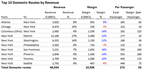
Figure 2-7: Use number formatting to eliminate clutter in your table and draw attention to key metrics.
Amazingly, all of these improvements were made with simple number formatting. That’s right; no formulas were used to convert large numbers to thousands place, no conditional formatting was used to color code the Margin % field, no other peripheral tricks of any kind were used.
Later in this chapter, in the section “Enhancing Reporting with Custom Number Formatting,” you explore how to leverage the number-formatting feature to accomplish these improvements.
Subdue your labels and headers
No one will argue that the labels and headers of a table aren’t important. On the contrary, they provide your audience with the guidance and structure needed to make sense of the data in a table. However, labels and headers sometimes are overemphasized to the point that they overshadow the data. How many times have you seen bold or oversized font applied to headers? The reality is that your audience will benefit more with the use of subdued labels.
De-emphasizing labels by using lighter hues will actually make a table easier to read and will draw more attention to the data in the table. Lightly colored labels give users the information they need without distracting them from the information being presented.
Ideal colors for labels are soft grays, light browns, soft blues, and greens.
Font size and alignment also factor into the effective display of tables. Aligning column headers to the same alignment as the numbers beneath them helps reinforce the column structures in your table. Keeping the font size of your labels close to that of the data within the table will help keep eyes focused on the data — not the labels.
Figure 2-8 illustrates how the table looks with subdued headers and labels. Note how the data now becomes the focus of attention, whereas the muted labels work in the background.
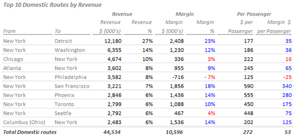
Figure 2-8: Send your labels and headers to the background by subduing their colors and keeping their font sizes in line with the data.
Sorting is another key factor in the readability of data. Many tables sort based on labels (alphabetical by route, for example). Sorting the table based on a key data point within the data establishes a pattern that your audience can use to quickly analyze the top and bottom values. In Figure 2-8, note that the data is sorted by the Revenue dollars. This again adds a layer of analysis and provides a quick look at the top and bottom generating routes.
Figure 2-9 shows the table before and after all the improvements are made. It’s easy to see how a few design principles can greatly enhance your ability to present table-driven data.

Figure 2-9: Before and after applying table design principles.
Although it may seem like a mere matter of taste, font type has a subtle but tangible impact on your tables. Outdated or inappropriate fonts will cause your audience to focus on the fonts rather than the data in your table. Using fonts like Comic Sans may seem cute, but they’re rarely appropriate for a report. Older fonts like Times New Roman or Arial can make your reports look old. It may seem strange, but fonts with straight edges and fancy strokes now look old compared to the rounded edges of the more popular fonts being used. This change in font perception is primarily driven by popular online sites, which often use fonts with rounded edges. If possible, consider using modern-looking fonts like Calibri and Segoe UI in your reports and dashboard.
Enhancing Reporting with Custom Number Formatting
You can apply number formatting to cells several ways. Most people utilize the convenient Number commands found on the Home tab. Using these commands, you can quickly apply some default formatting (such as number, percent, and currency) and just be done with it. But a better way is to utilize the Format Cells dialog box, where you can create your own custom number formatting.
Number formatting basics
To apply a custom number format, follow these steps:
1. Right-click on a range of cells and select Format Cells.
The Format Cells dialog box opens.
2. Go to the Number tab and apply some basic formatting.
To start, choose a format that makes the most sense for your purposes. In Figure 2-10, the Number format is chosen, with comma separator, no decimal places, and negative numbers wrapped in parentheses.

Figure 2-10: Choose a basic format.
3. Click the Custom option, as shown in Figure 2-11.
Excel takes you to a screen that shows the syntax that makes up the format you selected. The syntax is shown in the Type input box. Here you can edit the syntax to customize the number format.

Figure 2-11: The Type input box allows you to customize the syntax for the number format.
In this case, you see
#,##0_);(#,##0)
The number formatting syntax tells Excel how a number will look in various scenarios. Number formatting syntax consists of different individual number formats separated by semicolons. In this example, you see two different formats:
• The format to the left of the semicolon. By default, any formatting to the left of the first semicolon is applied to positive numbers.
• The format to the right of the semicolon. Any formatting to the right of the first semicolon is applied to negative numbers.
So in this scenario, negative numbers are formatted with parentheses, whereas positive numbers are formatted as a simple number.
(1,890)
1,982
 Notice that the syntax for the positive formatting in the previous example ends with _). This tells Excel to leave a space the width of a parenthesis character at the end of positive numbers. This syntax ensures that positive and negative numbers align nicely when negative numbers are wrapped within parentheses.
You can edit the syntax in the Type input box so that the numbers are formatted differently. For example, try changing the syntax to:
+#,##0;-#,##0
When applied, positive numbers will start with the + symbol, and negative numbers will start with a – symbol, like so:
+1,200
-15,000
This comes in quite handy when formatting percentages. For instance, you can apply a custom percent format by entering the following syntax into the Type input box:
+0%;-0%
This syntax gives you percentages that look like this:
+43%
-54%
You can get fancy and wrap your negative percentages with parentheses with this syntax:
0%_);(0%)
This syntax gives you percentages that look like this:
43%
(54%)
If you include only one format syntax, meaning you don’t add a second formatting option with the use of a semicolon separator, that one format will be applied to all numbers—negative or positive.
Formatting numbers in thousands and millions
Earlier in this chapter, you formatted your revenue numbers to show in thousands. This allowed you to present cleaner numbers and avoid inundating your audience with too much ink. To show your numbers in thousands, follow these steps:
1. Highlight the cells containing your numbers, right-click, and select Format Cells.
The Format Cells dialog box appears.
2. Click the Custom option.
The screen shown in Figure 2-12 appears.
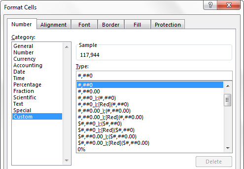
Figure 2-12: Go to the Custom screen of the Format Cells dialog box.
3. In the Type input box, add a comma after the format syntax.
This syntax cosmetically changes your number to thousands place:
#,##0,
After confirming your changes, your numbers will automatically show in thousands place.
Here’s the beauty of this technique: It doesn’t change or truncate your numbers in any way. Excel is simply applying a cosmetic effect to the number. To see what this means, take a look at Figure 2-13.
The selected cell is formatted to show in thousands: You see 118. But when you look in the formula bar, you see the real unformatted number (117943). The 118 you see in the cell is a cosmetically formatted version of the real number shown in the formula bar.
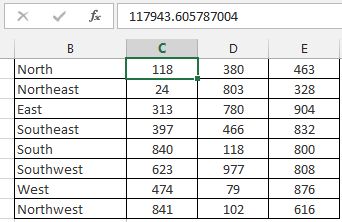
Figure 2-13: Formatting numbers applies only a cosmetic look. Look in the formula bar to see the real unformatted number.
Custom number formatting has obvious advantages over using other techniques to format numbers to thousands. For instance, many beginning analysts convert numbers to thousands by dividing them by 1,000 in a formula. But that changes the integrity of the number dramatically, and it forces you to keep track of and maintain formulas that could cause calculation errors later. Using custom number formatting avoids that by changing only how the number looks, keeping the actual number intact.
If needed, you can even indicate that the number is in thousands by adding a “k” to the number syntax.
#,##0,”k”
This syntax shows your numbers like this:
118k
318k
You can use this technique on both positive and negative numbers.
#,##0,”k”; (#,##0,”k”)
After you apply this syntax, your negative numbers will also show in thousands.
118k
(318k)
Need to show numbers in millions? Easy. Simply edit the Type input box to add two commas to your number format syntax.
#,##0.00,, “m”
Note the extra decimal places (.00). When converting numbers to millions, it’s often useful to show additional precision points, as in:
24.65 m
Hiding and suppressing zeros
In addition to positive and negative numbers, Excel allows you to provide a format for zeros. You do so by adding another semicolon to your custom number syntax. By default, any format syntax placed after the second semicolon is applied to any number that evaluates to zero.
For example, the following syntax applies a format that shows “n/a” for cells that contain zeros.
#,##0_);(#,##0);”n/a”
You can also use this syntax to suppress zeros entirely. If you add the second semicolon but don’t follow it with any syntax, cells containing zeros will show blank.
#,##0_);(#,##0);
Again, custom number formatting affects only the cosmetics of the cell. The actual data in the cell is not affected, as demonstrated in Figure 2-14. The selected cell is formatted so that zeros show as n/a, but if you look at the formula bar, you can see the actual unformatted cell contents.

Figure 2-14: Custom number formatting that shows zeros as n/a.
Applying custom format colors
Have you ever set the formatting on a cell so that negative numbers show up red? If so, you essentially applied a custom format color. In addition to controlling the look of your numbers with custom number formatting, you can control their color.
In this example, you format the percentages so that positive percentages show blue with a + symbol, whereas negative percentages show red with a – symbol. Again, you enter this syntax in the Type input box shown earlier in Figure 2-12.
[Blue]+0%;[Red]-0%
To apply a color, just enter the color name wrapped in square brackets [ ].
Now, there are only certain colors you can call out by name. You can call out the eight VB colors by name. These colors make up the first eight colors of the default Excel color palette.
[Black]
[Blue]
[Cyan]
[Green]
[Magenta]
[Red]
[White]
[Yellow]
 Blue and Red are the only colors from the 8 VB colors that are viable in a report or dashboard. The rest of the colors listed are virtually unusable, as they are very unattractive.
Fortunately, the Excel palette comes with 56 colors that you can call up using a color code. Every color has a code: The color code for black is 1, the color code for white is 2, and so on.
You can use color codes in your custom number syntax by replacing the named color with the word COLOR followed by the code.
For example, this syntax formats the percentages so that positive percentages show green with a + symbol, whereas negative percentages show red with a – symbol.
[COLOR10]+0%;[COLOR3]-0%
So how do you know which color code to use? Well, in the Chapter 2 sample file, you will find a tab called Get Color Codes (see Figure 2-15). The button found on that tab runs a small bit of VBA that extracts the color and color code for you. Simply find the color you deem most appropriate and use the associated code.
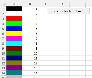
Figure 2-15: Use the Get Color Codes tab in the Chapter 2 Sample file to extract the Excel palette colors and their associated codes.
You may be wondering how using custom number coloring is different from Excel’s built-in conditional-formatting feature. In many ways, they’re the same. However, you do get a couple of benefits from using custom number coloring rather than conditional formatting.
→ You don’t have to manage separate conditional formatting rules. All the formatting needed is built into the cell.
→ Every object that uses your custom formatted cell adopts the format automatically. This means your custom formatting can be applied where conditional formatting can’t. For example, the chart in Figure 2-16 plots cells that have custom number formatting. Notice how the y axis of the chart faithfully displays the custom number formatting. You couldn’t do this with conditional formatting.

Figure 2-16: Custom number formatting is automatically adopted in charts.
Formatting dates and times
Custom number formatting isn’t just for numbers. You can also format dates and times. As you can see in Figure 2-17, you use the same dialog box to apply date and time formats using the Type input.

Figure 2-17: You can also format dates and times using the Format Cells dialog box.
Figure 2-17 demonstrates that date and time formatting involves little more than stringing date-specific or time-specific syntax together. The syntax used is fairly intuitive. For example, DDD is the syntax for the three-letter day, mmm is the syntax for the three-letter Month, and yyyy is the syntax for the four-digit year.
There are several variations on the format for days, months, years, hours, and minutes. Take some time and experiment with different combinations of syntax strings.
Table 2-1 lists some common date and time format codes you can use as starter syntax for your reports and dashboards.
Table 2-1: Common Date and Time Format Codes
|
Format Code |
1/31/2013 7:42:53 PM Displays As |
|
m |
1 |
|
mm |
01 |
|
mmm |
Jan |
|
mmmmm |
January |
|
mmmmm |
J |
|
dd |
31 |
|
ddd |
Thu |
|
dddd |
Thursday |
|
yy |
13 |
|
yyyy |
2013 |
|
mmm-yy |
Jan-13 |
|
dd/mm/yyyy |
31/01/2013 |
|
dddd mmm yyyy |
Thursday Jan 2013 |
|
mm-dd-yyyy h:mm AM/PM |
01-31-2013 7:42 PM |
|
h AM/PM |
7 PM |
|
h:mm AM/PM |
7:42 PM |
|
h:mm:ss AM/PM |
7:42:53 PM |
Adding conditions to customer number formatting
At this point, you know that Excel’s number formatting syntax consists of different individual number formats separated by semicolons. By default, the syntax to the left of the first semicolon is applied to positive numbers, the syntax to the right of the first semicolon is applied to negative numbers, and the syntax to the right of the second semicolon is applied to zeros.
Positive Number Format; Negative Number Format; Format for Zeros
Interestingly, Excel allows you override this default behavior and repurpose the syntax sections using your own conditions. Conditions are entered in square brackets.
In this syntax example, you apply a blue color to cells containing a number over 500, a red color to cells containing a number less than 500, and n/a to cells containing a number equal to 500.
[Blue][>500]#,##0;[Red][<500]#,##0;”n/a”
One of the more useful ways to use conditions is to convert numbers to thousands or millions, depending on how big the number is. In this example, numbers equal to or greater than 1,000,000 are formatted as millions, whereas numbers equal to or greater than 1,000 are formatted as thousands.
[>=1000000]#,##0.00,,”m”;[>=1000]#,##0,”k”
Again, the conditions you use must be relatively basic. Even so, conditions give you another avenue to gaining control over the display of the numbers in your dashboards and reports.