
Chapter 17: Using the Internal Data Model and Power View
In This Chapter
• Understanding the internal Data Model
• Starting a Power View dashboard
• Creating and working with Power View charts
• Visualizing data on a Power View map
Excel 2013 introduces a new feature called Power View. Power View is essentially an interactive canvas that allows you to display charts, tables, maps, and slicers in one dashboard window. The components in the Power View window are inherently linked so that they all work together and respond to any filtering or slicing you apply while using the dashboard. Select a region in one chart, and the other components in the Power View dashboard automatically respond to show you data for only that region.
This powerful feature runs on the new internal Data Model found in Excel 2013. The internal Data Model is an in-memory analytics engine that allows you to store disparate data sources in a kind of OLAP cube within Excel. OLAP is a category of data warehousing that allows you to mine and analyze vast amounts of data with ease and efficiency.
This chapter shows you how to combine the internal Data Model and Power View to create powerful interactive dashboards.
 Sadly, Microsoft has made Power View available only with Office 2013 Professional Plus or the Office 365 Small Business Premium subscription service. You won’t even see the options for Power View if you don’t have one of these versions of Office 2013. However, the internal Data Model discussed in this chapter is happily available in all versions of Excel 2013. This feature is powerful enough on its own as you will see in the following section.
Understanding the Internal Data Model
Excel 2013 introduces a new in-memory analytics engine called the internal Data Model. Every workbook has one internal Data Model that allows you to work with analyze disparate data sources like never before.
The idea behind the Data Model is simple. Let’s say you have two tables — a Customers table and an Orders table. The Orders table has basic information about invoices (Customer Number, Invoice Date, and Revenue). The Customers table has basic information like Customer Number, Customer Name, and State.
If you want to analyze revenue by state, you must join the two tables and aggregate the Revenue field in the Orders table by the State field in the Customers table.
In the past, you would have to go through a series of gyrations involving VLOOKUPs, SUMIFs, or other formulas. With the new Excel 2103 data model, however, you can simply tell Excel how the two tables are related (in this case, they both have a customer number) and then pull them into the internal Data Model. The Excel Data Model will then build an internal analytical database based on that customer number relationship and expose the data through a pivot table. With the pivot table, you can create the aggregation by state with a few clicks of the mouse.
Building out your first data model
Imagine that you have the Transactions table you see in Figure 17-1. On another worksheet, you have a Generators table (see Figure 17-2) that contains location information about each generator.
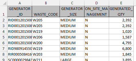
Figure 17-1: This table shows transactions by generator number.
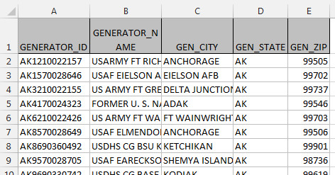
Figure 17-2: This table provides location information on each generator.
 You can find the example file for this chapter on this book’s companion website at www.wiley.com/go/exceldr in the workbook named Chapter 17 Samples.xlsx.
The first step in building your data model is to convert your separate data ranges to named Excel Tables. Converting a range to a table ensures that the internal Data Model will recognize it as an actual data source.
Convert your data ranges to Tables
For each data range you want to import into the internal Data Model, follow these steps:
1. Click anywhere in the Transactions data table and press Ctrl+T on your keyboard.
The Create Table dialog box opens, as shown in Figure 17-3.
2. Ensure that the range for the table is correct and click OK.

Figure 17-3: Convert your first data range into an Excel Table.
Click inside your Excel Table, and you will see a Table Tools Design tab on the Ribbon. Note that if you create multiple tables in a worksheet, the Table Tools Design tab will apply to the Excel Table you have selected.
3. Click the Table Tools Design tab and enter a friendly name for your table in the Table Name box (see Figure 17-4).
This step ensures that you will be able to recognize the table when adding it to the internal Data Model.

Figure 17-4: Give your newly created Excel Table a friendly name.
In this scenario, you use the same steps to convert your Generators range to an Excel Table.
Add your Tables to the internal Data Model
Each 2013 workbook has an internal Data Model that (by default) is exposed as a connection called ThisWorkbookDataModel when you add data sources to it. You can add your newly created Tables to the internal Data Model using the Workbook Connections dialog box. Follow these steps:
1. Go to the Ribbon, click the Data tab, and select Connections.
2. In the Workbook Connections dialog box, click the drop-down arrow beside the Add button and select Add to the Data Model (see Figure 17-5).

Figure 17-5: Open the Workbook Connections dialog box and select Add to the Data Model.
The Existing Connections dialog box opens, as shown in Figure 17-6.
3. Click the Tables tab, choose the table you want to add, and click OK.

Figure 17-6: Choose a table to add and click OK.
4. Repeat Steps 2 and 3 for each Table you want to add to the internal Data Model.
After adding all your tables, the Workbook Connections dialog box shows a connection called ThisWorkbookDataModel, listing all the data sources associated with it.
As you can see in Figure 17-7, you now have your two tables in the internal Data Model.

Figure 17-7: The internal Data Model now contains the Transactions and Generators tables.
Any changes made to your tables (such as adding records, deleting records, and adding columns) are automatically captured in the internal Data Model. No need to perform a refresh action.
Build relationships for the Tables in the internal Data Model
Although your data now exists in the internal Data Model, Excel doesn’t inherently know how your tables relate to one another. For example, your two tables have a column called Generator_ID (refer to Figures 17-1 and 17-2). This column is the key that connects the two tables, allowing you to match transactions with customer location.
You need to explicitly define this relationship before Excel recognizes how to handle the data in the Data Model. Follow these steps:
1. Go to the Ribbon, click the Data tab, and select Relationships.
The Manage Relationships dialog box opens.
2. Click the New button.
The Create Relationship dialog box opens, as shown in Figure 17-8.
3. Select the tables and fields that define the relationship.
In Figure 17-8, note that the Transactions table has a Generator_ID field; it’s related to the Generators table via the Generator_ID field.
4. Click OK to confirm the relationship.
You are returned to the Manage Relationships dialog box (see Figure 17-9). Here you can add any additional relationships you may need. Notice that you can also delete and edit relationships in this dialog box.

Figure 17-8: Create the relationships between your tables, defining each table and the associated fields.
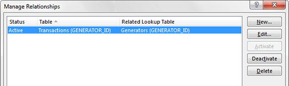
Figure 17-9: Use the Manage Relationships dialog box to add, delete, and edit relationships.
In Figure 17-8, at the lower right, notice the Related Column (Primary) drop-down field. The term Primary means that the internal Data Model will use this field from the associated table as the primary key. Every relationship must have a field you designate as the primary key. Primary key fields are necessary in the Data Model to prevent aggregation errors and duplications. Thus the Excel Data model must impose some strict rules around the primary key. You cannot have duplicates or null values in a field being used as the primary key. So the Generators table (shown in Figure 17-8) must have all unique values in its Generator_ID field, with no blanks or null values. This is the only way Excel can ensure data integrity when joining multiple tables.
Using your Data Model in a pivot table
After you fill your internal Data Model, you can start using it. Later, in the “Creating a Power View Dashboard” section, you find out how to leverage it with Power View. First, explore how to leverage the Data Model in pivot tables to analyze the data within. To create a pivot table from the internal Data Model, follow these steps:
1. Click the Insert tab and select PivotTable to start a pivot table.
2. In the Create PivotTable dialog box, select Use an External Data Source and click the Choose Connection button (see Figure 17-10).
The Existing Connections dialog box opens, as shown in Figure 17-11.
3. Click the Tables tab and choose Tables in Workbook Data Model. Click Open to confirm.
You return to the Create PivotTable dialog box.
4. Click OK to finalize the pivot table.

Figure 17-10: Start a pivot table and opt to choose an external connection.

Figure 17-11: Select the Tables in Workbook Data Model option to use the internal Data Model as the source for your pivot table.
After you create the pivot table, you’ll see that the Pivot Field list shows each table in the internal Data Model (similar to Figure 17-12).

Figure 17-12: Pivot tables that use the internal Data Model as the source will show all the tables within the Data Model in the pivot field list.
With a Data Model–driven pivot table, you can merge disparate data sources into one analytical engine. Figure 17-13 demonstrates how you can build a view using data fields from the different tables in the Data Model.

Figure 17-13: With a Data Model–driven pivot table, you can analyze data using the fields for each table in the Data Model.
Using external data sources in your internal Data Model
The internal Data Model isn’t limited to using only data that already exists in your Excel workbooks. You can fill your Data Model with all kinds of external data sources. In Chapter 18, you dive into using external data sources in your dashboarding models. Now, though, take a look at how to bring external data sources into the Data Model.
Say that you have an Access database that contains a normalized set of tables. You want to analyze the data in that database in Excel. You decide to use the new internal Data Model to present the data you need through a pivot table.
You can find the Facility Services Access database on this book’s companion website at www.wiley.com/go/exceldr.
To use external tables in your Data Model, follow these steps.
1. On the Data tab of the Ribbon, select the From Access icon, as shown in Figure 17-14.
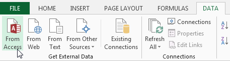
Figure 17-14: Click the From Access button to get data from your Access database.
2. Browse to your target Access database and open it.
The Select Data dialog box opens.
3. In the Select Data dialog box, place a check next to Enable Selection of Multiple Tables (see Figure 17-15).
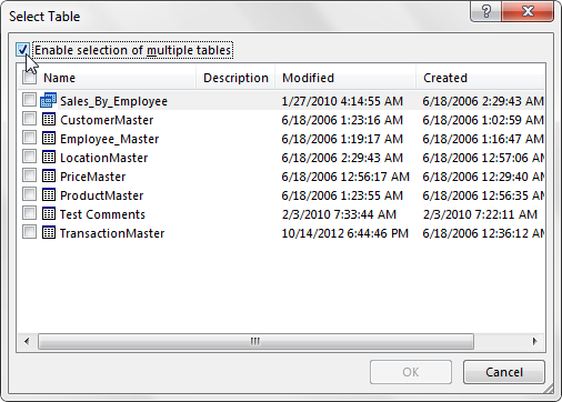
Figure 17-15: Enable the selection of multiple tables.
4. Place a check next to each table you want to bring into the internal Data Model, as demonstrated in Figure 17-16.
5. Click OK.
The Import Data dialog box opens, as shown in Figure 17-17.

Figure 17-16: Place a check next to each table you want to import to the internal Data Model; then click OK.
6. In the Import Data dialog box, click the Properties drop-down arrow and remove the check next to Import Relationships Between Tables.
This ensures that Excel doesn’t error out because of misinterpretations about how the tables are related. In other words, you want to create relationships yourself.

Figure 17-17: Remove the check next to Import Relationships Between Tables.
7. In the Import Data dialog box, choose PivotTable Report and click OK to create the base pivot.
8. Go to the Ribbon, click the Data tab, and choose Relationships.
The Manage Relationships dialog box opens, as shown in Figure 17-18.
9. Create the needed relationships and then click the Close button.
As mentioned earlier in this chapter (in the section called “Build Relationships for the Tables in the Internal Data Model”), when creating the relationships for your Data Model, you will need to remain aware of which table you designate in the Related Column (Primary) drop-down field on the Manage Relationships dialog box. The table you use in this field cannot have duplicates or null values in a field being used as the primary key. So in this scenario, you will not be able to designate the TransactionMaster table in this field, as it contains transactional line items that may contain duplicates.

Figure 17-18: Create the needed relationships for the tables you just imported.
If all went well, you should end with a pivot table similar to the one illustrated in Figure 17-19. In just a few clicks, you created a powerful platform to build and maintain pivot table analysis based on data in an Access database!
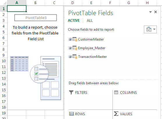
Figure 17-19: You’re ready to build your pivot table analysis based on multiple external data tables.
Creating a Power View Dashboard
After you have data in your internal Data Model, you can create a Power View dashboard from that Data Model. Just go to the Ribbon, click the Insert tab, and click Power View. Excel takes a moment to create a new worksheet called Power ViewX, where X represents a number that will make the sheet name unique (for example, Power View1).
This new worksheet has the three main sections shown in Figure 17-20: Canvas, Filter Pane, and Field List.
The canvas contains the charts, tables, and maps you add to your dashboard. The filter pane contains the data filters you define. You use the field list to add and configure the data for your dashboard.

Figure 17-20: The three main sections of a Power View worksheet.
You build up your Power View dashboard by dragging the fields from the field list to the respective sections. For example, dragging the Generator_Size field to the filter pane creates a list of filterable items (see Figure 17-21) that can be checked and unchecked. The filter pane has a few icons that help you work with the filters. These icons enable you to expand or collapse the entire filter pane, clear applied filters, call up advanced filter options, or delete the filter.

Figure 17-21: The filter pane has a few icons that help you work with the filters.
To add data to the canvas, use the field list to drag the needed data fields to the FIELDS drop zone. In Figure 17-22, you can see that the Waste_Code field and the Generated_Qty field have been moved to the FIELDS drop zone. This results in a new table of data on the canvas.

Figure 17-22: Use the field list to drag data fields to the FIELDS drop zone, resulting in a table on the canvas.
Creating and working with Power View charts
All data in Power View starts off as a table, as shown in Figure 17-22. Again, dragging fields to the FIELDS drop zone creates these tables. After you have a data table on the canvas, you can transform it into a chart by clicking it, selecting the Design tab, and choosing a chart type. Figure 17-23 demonstrates the selection of a Clustered Bar chart.

Figure 17-23: Transform data tables in the canvas by selecting the table and choosing a chart type on the Design tab.
In Figure 17-24, note that after the data is converted to a chart, new drop zones appear in the field list. These new drop zones are used to configure to the look and utility of the chart.

Figure 17-24: When your table is transformed into a chart, new drop zones appear in the field list.
When you click a Power View chart, a context menu appears above the chart. With this menu, you can sort the chart series, filter the chart, and expand/collapse the chart to full screen (see Figure 17-25).

Figure 17-25: Clicking a Power View chart activates a context menu for that chart.
When you select a chart in the Power View canvas, the filter pane provides a CHART option. Clicking that link allows you to see and apply custom filters to the selected chart. Figure 17-26 demonstrates filtering by the Generated_Qty field using a nifty slider.
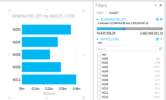
Figure 17-26: You can use the filter pane to apply chart-specific custom filters.
You can slice your chart series by dragging a new data field into the LEGEND drop zone. In the example shown in Figure 17-27, the On_Site_Management field is placed in the LEGEND drop zone; as a result, the original chart is sliced by the data items in the newly placed field.
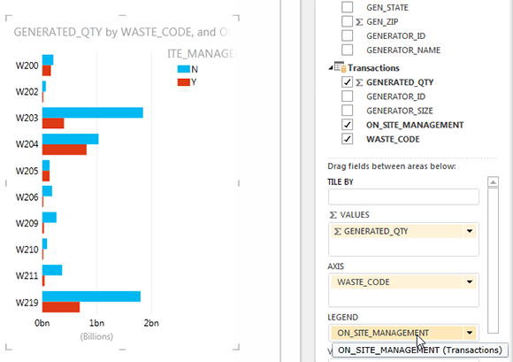
Figure 17-27: Use the LEGEND drop zone to slice your chart series.
Alternatively, you can use the VERTICAL MULTIPLES or the HORIZONTAL MULTIPLES drop zone to turn your original chart into a panel of charts. Figure 17-28 illustrates how your original chart has been replicated to show a separate chart for each data item in the On_Site_Management field.

Figure 17-28: Dragging the On_Site_Management field to the VERTICAL MULTIPLES drop zone creates a panel of charts.
Another neat trick is to add drill-down capabilities to a chart, which you do by dragging a new data field to the AXIS drop zone. Figure 17-29 shows the Gen_State field dragged to the AXIS drop zone. Initially, it will seem as though nothing happened. But in the background, Power View has layered in the newly selected field as a new category axis.
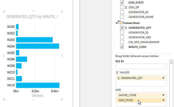
Figure 17-29: Dragging a new field to the AXIS drop zone creates a drill-down effect.
After you add your new field to the AXIS drop zone, double-click any data point in the chart. The chart automatically drills into the next level. In this case, because you added Gen_State (generator state) to the AXIS drop zone, the chart drills down to show the breakdown by state for the data point that you double-clicked (see Figure 17-30). Note the arrow icon that allows you to drill back up.
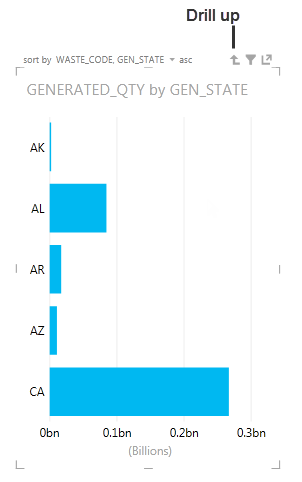
Figure 17-30: With multiple data fields in the AXIS drop zone, you can drill into the next layer of data and then drill back up using the arrow icon.
You can create as many charts as you want to your Power View canvas. And as mentioned at the beginning of this chapter, all components in the Power View window are automatically linked so that they respond to one another. For instance, Figure 17-31 shows two charts on the same Power View canvas. Clicking the pie slice for Arkansas (AR) dynamically recolors the bar chart so that it highlights the portion of the bar that’s made up by the Arkansas data — all without any extra work from you!

Figure 17-31: Charts in a Power View dashboard automatically respond to one another.
Visualizing data in a Power View map
The latest buzz in the dashboarding world is location intelligence: visualizing data on a map to quickly compare performance by location. Since Excel 2003, we haven’t had a good way of building map-based visualizations without convoluted workarounds. Excel 2013 changes all that with the introduction of Power View maps.
To add a map to your Power View dashboard, follow these steps:
1. Start with some location data in the Power View canvas.
Figure 17-32 illustrates some Zip Code data from your Data Model.

Figure 17-32: Add location data to your Power View canvas.
2. With your location data selected, click the Design tab.
3. Choose Map from the Switch Visualization group (see Figure 17-33).

Figure 17-33: Choose to show the data as a Map.
After a moment of gyrating, Excel generates a Bing map.
As you can see in Figure 17-34, the initial map will often be fairly useless. How Excel decides to initially handle your data is a bit of a black box and varies from data set to data set. You typically need to make some adjustments to get the view you need.

Figure 17-34: Excel generates an initial Bing map.
After you create your map, try moving your location field to the different drop zones in the field list. The drop zone you end up on will vary according to how you want to see your data. In this example (see Figure 17-35), moving the Gen_Zip field to the LOCATIONS drop zone fixes your map and creates a nice view of your data by Zip Code.

Figure 17-35: Moving the Gen_Zip field to the LOCATIONS drop zone creates a nice view by Zip Code.
You have limited control over how your map looks. With your map selected, you can go to the Layout tab and customize the map title, legend, data labels, and map background (see Figure 17-36).

Figure 17-36: The Layout tab provides a limited set of options for customizing your Power View map.
The map is fully interactive, allowing you to zoom and move around using the buttons at the top-right corner of the map, as illustrated in Figure 17-37.

Figure 17-37: You can interactively zoom and move around on the map.
You can use the COLOR drop zone to add an extra layer of analysis to your map. For instance, Figure 17-38 demonstrates how adding the Waste_Code field to the COLOR drop zone differentiates each plotted location based on waste code.

Figure 17-38: Add data fields to the COLOR drop zone to add an extra layer of analysis to your map.
Changing the look of your Power View dashboard
Excel grants you limited control over how your Power View dashboard looks. On the Power View tab (see Figure 17-39), you see a Themes group. Here you can set the overall font, background, and theme for your Power View dashboard.

Figure 17-39: Changing the theme of your Power View dashboard.
The theme you choose changes the colors for your charts, backgrounds, filters, tables, and plotted map points. The Bing map will not change to match your theme. Figure 17-40 illustrates a full Power View dashboard with an applied theme.
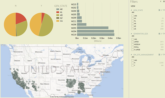
Figure 17-40: A completed Power View dashboard with an applied theme.