Chapter 16: Adding Interactivity with Slicers
In This Chapter
• Understanding slicers
• Creating and formatting standard slicers
• Using Timeline slicers
• Using slicers as command buttons
Slicers allow you to filter your pivot table, similar to the way Filter fields filter a pivot table. The difference is that slicers offer a user-friendly interface, enabling you to better manage the filter state of your pivot table reports. Happily, Microsoft has added another dimension to slicers with the introduction of Timeline slicers. Timeline slicers are designed to work specifically with date-based filtering.
In this chapter, you explore slicers and their potential to add an attractive as well as interactive user interface to your dashboards and reports.
Understanding Slicers
If you’ve worked your way through Chapter 14, you know that pivot tables allow for interactive filtering using Filter fields. Filter fields are the drop-down lists you can include at the top of your pivot table, allowing users to interactively filter for specific data items. As useful as Filter fields are, they’ve always had a couple of drawbacks:
→ Filter fields are not cascading filters. They don’t work together to limit selections when needed.
For example, look at Figure 16-1. You can see that the Region filter is set to the North region. However, the Market filter still allows you to select markets that are clearly not in the North region (California, for example). Because the Market filter is not in any way limited based on the Region Filter field, you have the annoying possibility of selecting a market that could yield no data because it isn’t in the North region.

Figure 16-1: Default pivot table Filter fields don’t work together to limit filter selections.
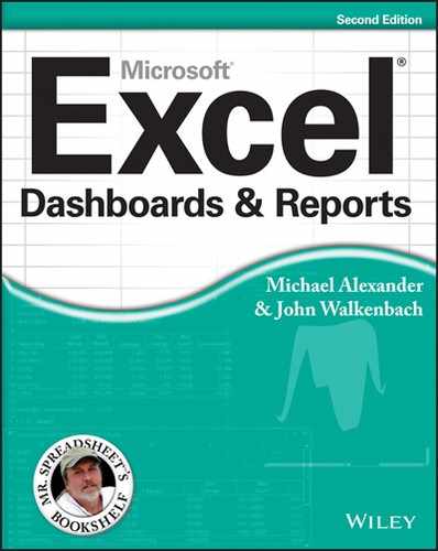
→ Filter fields don’t provide an easy way to tell what exactly is being filtered when you select multiple items.
Figure 16-2 shows an example of this. As you can see, the Region filter has been limited to three regions: Midwest, North, and Northeast. However, notice that the Region filter value shows (Multiple Items). By default, Filter fields will show (Multiple Items) when you select more than one item. The only way to tell what has been selected is to click the drop-down. You can imagine the confusion on a printed version of this report, when there is no way to click down to see which data items make up the numbers on the page.
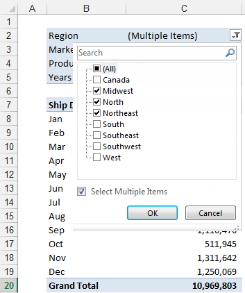
Figure 16-2: Filter fields show “(Multiple Items)” when multiple selections are made.
By contrast, slicers don’t have these issues. Slicers respond to one another. As illustrated in Figure 16-3, the Market slicer visibly highlights the relevant markets when the North region is selected. The rest of the markets are muted, signaling that they’re not part of the North region.

Figure 16-3: Slicers work together to show you relevant data items based on your selection.
When selecting multiple items in a slicer, you can easily see that multiple items have been chosen. In Figure 16-4, the pivot table is filtered by the Midwest, North, and Northeast regions. No more (Multiple Items).

Figure 16-4: Slicers do a better job at displaying multiple item selections.
Creating a Standard Slicer
It’s time to create your first slicer. Follow these steps:
1. Place your cursor anywhere inside your pivot table; then go to the Ribbon and select the Analyze tab.
2. Click the Insert Slicer icon (see Figure 16-5).

Figure 16-5: Inserting a slicer.
The Insert Slicers dialog box appears.
3. Click the filter values to filter your pivot table (see Figure 16-6).
The idea is to select the dimensions you want to filter. In this example, the Region and Market slicers will be created.

Figure 16-6: Select the dimensions for which you want slicers created.
As you can see in Figure 16-7, clicking Midwest in the Region slicer not only filters your pivot table, but also the Market slicer responds by highlighting the markets that belong to the Midwest region.

Figure 16-7: Select the dimensions you want filtered using slicers.
You can also select multiple values by holding the Ctrl key while selecting the needed filters. As illustrated in Figure 16-8, you press Ctrl while selecting Baltimore, California, Charlotte, and Chicago, which highlights the selected markets in the Market slicer and their associated regions in the Region slicer.
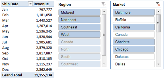
Figure 16-8: The fact that you can visually see the current filter state gives slicers a unique advantage over the Filter field.
To clear the filtering on a slicer, simply click the Clear Filter icon on the target slicer (shown in Figure 16-9).

Figure 16-9: Clearing the filters on a slicer.
Formatting slicers
When using slicers in a dashboard environment, you must do a bit of formatting to make your slicers match the theme and layout of your dashboard. The following subsections describe a few common formatting adjustments you can make to slicers.
Size and placement
A slicer behaves like a standard Excel shape object in that you can move it around and adjust its size by clicking on it and dragging its position points (see Figure 16-10).

Figure 16-10: Adjust the slicer size and placement by dragging its position points.
You can also right-click the slicer and select Size and Properties, which accesses the Format Slicer pane illustrated in Figure 16-11. Here you can adjust the size of the slicer, how the slicer behaves when cells are shifted, and whether the slicer will be shown when the worksheet is printed.

Figure 16-11: The Format Slicer pane offers more control over how the slicer behaves in relation to the worksheet it’s on.
Data item columns
By default, all slicers are created with one column of data items. You change this by right-clicking the slicer and selecting Size and Properties. This accesses the Format Slicer pane. Under the Position and Layout section, you specify the number of columns. Adjusting the number to 2 (as demonstrated in Figure 16-12) forces the data times to be displayed in two columns. Adjusting the number to 3 forces the data items to display in three columns, and so on.
Figure 16-12: Adjust the Number of Columns property to display the slicer data items in more than one column.
Color and style
You can quickly change the color and style of your slicer. Click it; then select a style from the Slicer Style gallery on the Slicer Tools’ Options tab (see Figure 16-13). The default styles available will suit the majority of your dashboards.
If you want more control over the color and style of your slicer, click the New Slicer Style button at the lower-left corner of the Slicer Style gallery shown in Figure 16-13. A dialog box appears where you can apply detailed formatting for each component part of the slicer.

Figure 16-13: Use the Slicer Style gallery to apply a default style or create your own.
Other slicer settings
Right-clicking your slicer and selecting Slicer Settings activates the Slicer Settings dialog box shown in Figure 16-14. With this dialog box, you can control the look of your slicer’s header, how your slicer is sorted, and how filtered items are handled.
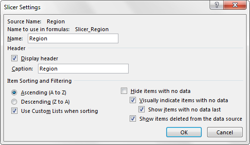
Figure 16-14: The Slicer Settings dialog box.
With minimal effort, you can integrate your slicers nicely into your dashboard layout. Figure 16-15, illustrates two slicers and a pivot chart working together as a cohesive dashboard component.
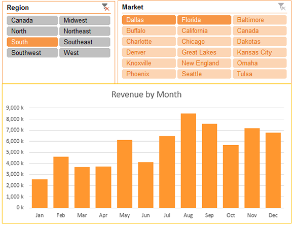
Figure 16-15: With a little formatting, slicers can be made to adopt the look and feel of your overall dashboard.
Controlling multiple pivot tables
Another advantage you gain with slicers is that each slicer can be tied to more than one pivot table. That is to say, any filter you apply to your slicer can be applied to multiple pivot tables.
To connect your slicer to more than one pivot table, simply right-click the slicer and select Report Connections. This activates the Report Connections dialog box shown in Figure 16-16. Place a check next to any pivot table that you want to filter using the current slicer.

Figure 16-16: Choose the pivot tables that will be filtered by this slicer.
At this point, any filter you apply to the slicer will be applied to all the connected pivot tables. Controlling the filter state of multiple pivot tables is a powerful feature, especially in dashboards that run on multiple pivot tables.
Creating a Timeline Slicer
The Timeline slicer is new in Excel 2013. The Timeline slicer is similar to a standard slicer: You filter a pivot table using a visual selection mechanism instead of the old Filter fields. The difference is that the Timeline slicer is designed to work exclusively with date fields, providing an excellent visual method to filter and group the dates in your pivot table.
To create a Timeline slicer, your pivot table must contain a field where all the data is formatted as a date. It’s not enough to have a column of data that contains a few dates. All the values in your date field must be a valid date and be formatted as such.
To create a Timeline slicer, follow these steps:
1. Place your cursor anywhere inside your pivot table; then go up to the Ribbon and select the Analyze tab.
2. Click the Timeline Slicer icon (see Figure 16-17).

Figure 16-17: Inserting a Timeline slicer.
The Insert Timelines dialog box, shown in Figure 16-18, activates, showing you all the available date fields in the chosen pivot table.
3. Select the date fields for which you want to create the timeline.

Figure 16-18: Select the date fields for which you want slicers created.
After your Timeline slicer is created, you can filter the data in your pivot table and pivot chart, using this dynamic data selection mechanism. Figure 16-19 demonstrates how selecting Mar, Apr, and May in the Timeline slicer automatically filters the pivot chart.
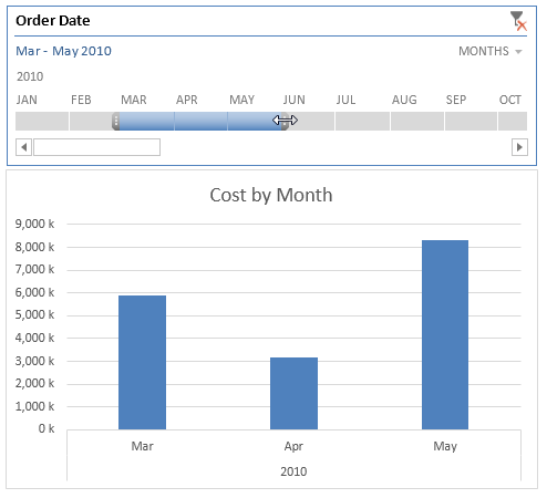
Figure 16-19: Click a date selection to filter your pivot table or pivot chart.
Figure 16-20 illustrates how you can expand the slicer range with the mouse to include a wider range of dates in your filtered numbers.

Figure 16-20: You can expand the range on the Timeline slicer to include more data in the filtered numbers.
Want to quickly filter your pivot table by quarters? Well, that’s easy with a Timeline slicer. Simply click the time period drop-down menu and select Quarters. As you can see in Figure 16-21, you also have the option of switching to Years or Days, if needed.

Figure 16-21: Quickly switch between Quarters, Years, Months, and Days.
 Timeline slicers apply filters based on standard calendar years. In other words, Q1 means Jan, Feb, and Mar. However, if your fiscal year starts in October, your Q1 is made up of Oct, Nov, and Dec. So the quarter slicers may not be as useful for your organization. Currently you can’t force a slicer to adjust to your own custom fiscal year.
Timeline slicers are not backward-compatible, meaning they are usable only in Excel 2013. If you open a workbook with Timeline slicers in Excel 2010 or previous versions, the Timeline slicers will be disabled.
Using Slicers as Form Controls
In Chapter 12, you discovered how to add interactivity to a dashboard using data modeling techniques and Form controls. Although the techniques in that chapter are powerful, the one drawback is that Excel Form controls are starting to look a bit dated, especially when paired with the modern-looking charts that come with Excel 2013.
One clever way to alleviate this problem is to highjack the slicer feature for use as a proxy Form control of sorts. Figure 16-22 demonstrates this option with a chart that responds to the slicer on the left. When you click Income, the chart fills with income data. When you click Expense, the chart fills with expense data. Keep in mind that the chart is no way connected to a pivot table.

Figure 16-22: You can highjack pivot slicers and use them as more attractive Form controls for models not built on pivot tables.
 If you skipped Chapter 12, you may want to visit it now in order to better understand the data modeling and setup demonstrated in this example.
To build this basic model, follow these steps:
1. Create a simple table that holds the names you want for your controls, along with some index numbering. In this case, the table contains three rows under a field called Metric.
Each row contains a metric name and index number for each metric (Income, Expense, and Net).
2. Using this simple table, create a pivot table (see Figure 16-23).
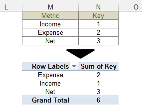
Figure 16-23: Create a simple table that holds the names for your controls along with some index numbering; then using that table, create a pivot table.
3. Place your cursor anywhere inside the newly created pivot table, select the Analyze tab, and then click the Insert Slicer icon. In the Insert Slicer dialog box, create a slicer for the Metric field.
At this point, you have a slicer with the three metric names.
4. Right-click the slicer and choose Slicer Settings to activate the Slicer Settings dialog box.
5. In the Slicer Settings dialog box, uncheck the Display Header option (see Figure 16-24).

Figure 16-24: Create a slicer for the Metric field and remove the header.
Each time the Metric slicer is clicked, the associated pivot table is filtered to show only the selected metric.
Figure 16-25 demonstrates that this action also filters the index number for that metric. The filtered index number always shows up in the same cell (N8 in this case). So this cell can now be used as a trigger cell for VLOOKUP formulas, INDEX formulas, and If statements.

Figure 16-25: Clicking an item in the slicer filters out the correct index number for the selected metric.
6. Use the slicer-fed trigger cell (N8) to drive the formulas in your staging area, as demonstrated in Figure 16-26.
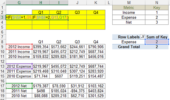
Figure 16-26: Use the filtered trigger cell to drive the formulas in your staging area.
This formula tells Excel to check the value of cell N8:
• If the value of cell N8 is 1, which represents the value of the Income option, the formula returns the value in the Income dataset (cell G9).
• If the value of cell N8 is 2, which represents the value of the Expense option, the formula returns the value in the Expense dataset (cell G13).
• If the value of cell N8 is neither 1 nor 2, the value in the Net dataset (cell G17) is returned.
7. Copy the formula down and across to build out the full staging table (see Figure 16-27).
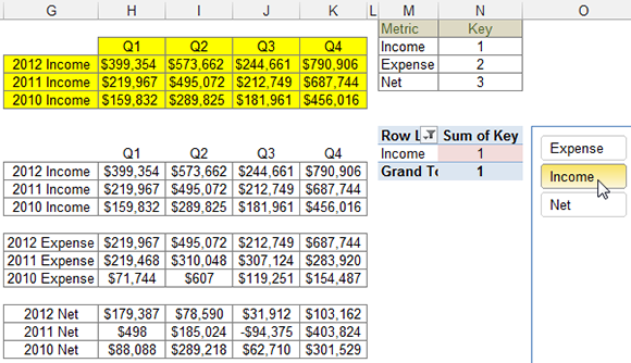
Figure 16-27: The final staging table fed via the slicer.
8. Create a chart using the staging table as the source.
With this simple technique, you can provide your customers with an attractive interactive menu that more effectively adheres to the look and feel of their dashboards.