Chapter 15: Using Pivot Charts
In This Chapter
• Creating your first pivot chart
• Understanding the link between pivot charts and pivot tables
• Using conditional formatting with pivot tables
• Examining alternatives to using pivot charts
A pivot chart is a graphical representation of a data summary displayed in a pivot table. A pivot chart is always based on a pivot table. Excel lets you create a pivot table and a pivot chart at the same time, but you can’t create a pivot chart without a pivot table.
If you’re familiar with creating charts in Excel, you’ll have no problem creating and customizing pivot charts. Most of Excel’s charting features are available in a pivot chart. But as you’ll see, pivot charts are actually a completely different animal.
 The discussion here assumes that you’re familiar with the inner workings of pivot tables, which is covered in Chapter 14. Feel free to refer to Chapter 14 if you need a refresher on pivot tables.
Getting Started with Pivot Charts
When you create a standard chart from data that isn’t in a pivot table, you feed the chart a range made up of individual cells holding individual pieces of data. Each cell is an individual object with its own piece of data, so your chart treats each cell as an individual data point, charting each one separately.
However, the data in your pivot table is part of a larger object. The pieces of data you see inside your pivot table aren’t individual pieces of data that occupy individual cells. Rather, they are items inside a larger pivot table object that is occupying space on your worksheet.
When you create a chart from your pivot table, you’re not feeding it individual pieces of data inside individual cells; you’re feeding it the entire pivot table layout. Thus your pivot chart can interactively add, remove, filter, and refresh data fields inside the chart just like your pivot table. The result of all this action is a graphical representation of the data you see in your pivot table.
If you’re new to Excel charts, we highly recommend you first read through Part II of this book.
Creating a pivot chart
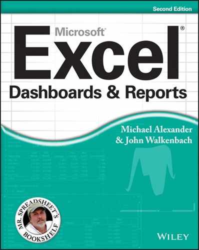
To see how to create a pivot chart, look at the pivot table in Figure 15-1. This pivot table provides a simple view of revenue by market. In the Business Segment field in the report filter area, you can parse out revenue by line of business.

Figure 15-1: This basic pivot table shows revenue by market and allows for filtering by line of business.
To start the process, place your cursor anywhere in the pivot table, go to the Ribbon, and click the Insert tab. Find the Charts group, where you can choose the chart type you want to use for your pivot chart. For this example, click the Column Chart icon and select the first 2-D column chart, as demonstrated in Figure 15-2. A chart appears, as shown in Figure 15-3.
Notice that pivot charts are now, by default, placed on the same sheet as the source pivot table. If you long for the days when pivot charts were located on their own chart sheet, you are in luck. All you have to do is place your cursor in your pivot table and then press F11 on your keyboard, and a pivot chart is created on its own sheet.

Figure 15-2: Select the chart type you want to use.
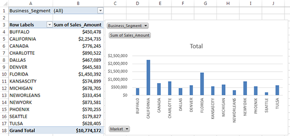
Figure 15-3: Excel creates your pivot chart on the same sheet as your pivot table.
You can easily change the location of your pivot charts by simply right-clicking on the chart (outside the plot area) and selecting Move Chart. This activates the Move Chart dialog box, where you can specify the new location.
 In Figure 15-3, notice the pivot field buttons on the pivot chart — the gray buttons with drop-down arrows. Using these pivot field buttons, you can rearrange the chart and apply filters to the underlying pivot table.
If you aren’t too keen on showing the pivot field buttons directly on your pivot charts, you can remove them by clicking on the chart and selecting the Analyze tab. On the Analyze tab, you can use the Field Buttons drop-down button to hide some or all of the pivot field buttons.
You now have a chart that is a visual representation of your pivot table. Moreover, because the pivot chart is tied to the underlying pivot table, changing the pivot table in any way changes the chart. For example, as Figure 15-4 illustrates, adding the Region field to the pivot table adds a region dimension to your chart.

Figure 15-4: Your pivot chart displays the same fields your underlying pivot table displays.
In addition, selecting a Business Segment from the Page field filter filters both the pivot table and the pivot chart. All this behavior occurs because pivot charts use the same pivot cache and pivot layout as their corresponding pivot tables. Thus, if you add or remove data from your data source and refresh your pivot table, your pivot chart updates to reflect the changes.
Take a moment to think about the possibilities. You can essentially create a fairly robust interactive reporting tool on the power of one pivot table and one pivot chart; no programming is necessary.
Understanding the link between pivot charts and pivot tables
The primary rule to remember is that your pivot chart is merely an extension of your pivot table. If you refresh, move a field, add a field, remove a field, hide a data item, show a data item, or apply a filter, your pivot chart reflects your changes.
One common mistake people make when using pivot charts is assuming that Excel will place the values in the column area of the pivot table in the x-axis of the pivot chart.
For instance, the pivot table in Figure 15-5 is in a format that’s easy to read and comprehend. The structure chosen shows Sales Periods in the column area and the Region in the row area. This structure works fine in the pivot table view.
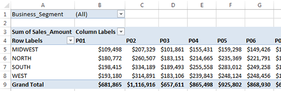
Figure 15-5: The placement of your data fields may work for a pivot table, but not for a pivot chart.
Suppose you decide to create a pivot chart from this pivot table. You would instinctively expect to see fiscal periods across the x-axis and lines of business along the y-axis. However, as you can see in Figure 15-6, your pivot chart comes out with Region in the x-axis and Sales Period in the y-axis.
Figure 15-6: Creating a pivot chart from your nicely structured pivot table doesn’t yield the results you expected.
So why doesn’t the structure in your pivot table translate to a clean pivot chart? The answer has to do with the way pivot charts handle the different areas of your pivot table.
In a pivot chart, both the x-axis and the y-axis correspond to a specific area in your pivot table.
→ The y-axis of your pivot chart corresponds to the column area in your pivot table.
→ The x-axis of your pivot chart corresponds to the row area in your pivot.
Given this new information, look at the pivot table in Figure 15-5 again. This structure says that the Sales_Period field will be treated as the y-axis because it is in the column area. Meanwhile, the Region field will be treated as the x-axis because it is in the row area.
Now suppose you rearrange the pivot table to show fiscal periods in the row area and lines of business in the column area, as shown in Figure 15-7. This format makes reading more difficult in a pivot table view, but it gives your pivot chart the effect you want (see Figure 15-8).

Figure 15-7: Moving fiscal periods to the row area allows your pivot chart to accurately plot the data.

Figure 15-8: With the new arrangement in your pivot table, you get a pivot chart that makes sense.
Limitations of pivot charts
Overall, the look and feel of pivot charts in Excel 2013 is similar to the look and feel of standard charts, making them much more of a viable reporting option. However, a few limitations persist in this version of Excel.
→ You cannot use XY (scatter) charts, bubble charts, or stock charts when creating a pivot chart.
→ Applied trend lines are often lost when adding or removing fields in the underlying pivot table.
→ The chart titles in the pivot chart cannot be resized.
Although you cannot resize the chart titles in a pivot chart, making the font bigger or smaller indirectly resizes the chart title.
Using conditional formatting with pivot tables
In Excel 2007, Microsoft introduced a robust set of conditional formatting visualizations, including data bars, color scales, and icon sets. These new visualizations allow users to build dashboard-style reporting that goes far beyond the traditional red, yellow, and green designations. What’s more, conditional formatting was extended to integrate with pivot tables, which means that conditional formatting is now applied to a pivot table’s structure, not just the cells it occupies.
In this section, you find out how to leverage the magic combination of pivot tables and conditional formatting to create interactive visualizations that serve as an alternative to pivot charts.
To start the first example, create the pivot table shown in Figure 15-9.

Figure 15-9: Create this pivot table.
Suppose you want to create a report that allows your managers to see the performance of each sales period graphically. You could build a pivot chart, but you decide to use conditional formatting. In this example, go the easy route and quickly apply some data bars:
1. Select all the Sum of Sales_Amount2 values in the values area.
2. Click the Home tab and select Conditional Formatting→Data Bars as shown in Figure 15-10.

Figure 15-10: Apply data bars to the values in your pivot table.
You immediately see data bars in your pivot table under the values in the Sum of Sales_Amount2 field. Notice that the Data Bars coexist with the data values. To get a clean visualization, you want to show only the Data Bars by following these steps:
1. Go to the Home tab, click the Conditional Formatting button, and select Manage Rules.
The Rules Manager dialog box appears.
2. Select the Data Bar rule you just created and then select Edit Rule.
The Edit Formatting Rule dialog box appears.
3. Click the Show Bar Only option (see Figure 15-11).

Figure 15-11: Click the Show Bar Only option to get a clean view of just the data bars.
As you can see in Figure 15-12, you now have a set of bars that correspond to the values in your pivot table. This visualization looks like a sideway chart, doesn’t it? What’s more impressive is that as you filter the markets in the report filter area, the data bars dynamically update to correspond with the data for the selected market.

Figure 15-12: You have applied conditional data bars with just three easy clicks!
Excel 2013 has a handful of preprogrammed scenarios that can be leveraged when you want to spend less time configuring your conditional formatting and more time analyzing your data. For example, to create the data bars you’ve just employed, Excel uses a predefined algorithm that takes the largest and smallest values in the selected range and calculates the condition levels for each bar.
Other examples of preprogrammed scenarios include
Top Nth Items
Top Nth %
Bottom Nth Items
Bottom Nth %
Above Average
Below Average
To remove the applied conditional formatting, place your cursor in the pivot table and then select Home→Conditional Formatting→Clear Rules→Clear Rules from This PivotTable.
Customizing conditional formatting
You are by no means limited to preprogrammed scenarios. You can create your own custom conditions. To see what we mean, create the pivot table shown in Figure 15-13.

Figure 15-13: This pivot shows Sales_Amount, Contracted_Hours, and a calculated field that calculates Dollars per Hour.
Here you want to evaluate the relationship between total revenue and dollars per hour. The idea is that some strategically applied conditional formatting helps identify opportunities for improvement. Follow these steps:
1. Place your cursor in the Sales_Amount column.
2. Click the Home tab and select Conditional Formatting.
3. Select New Rule.
The New Formatting Rule dialog box appears, as shown in Figure 15-14.

Figure 15-14: The New Formatting Rule dialog box.
The objective in this dialog box is to identify the cells where the conditional formatting will be applied, specify the rule type to use, and define the details of the conditional formatting.
1. Identify the cells where your conditional formatting will be applied.
You have three choices:
• Selected Cells: This selection applies conditional formatting to only the selected cells.
• All cells showing Sales_Amount values: This selection applies conditional formatting to all values in the Sales_Amount column, including all subtotals and grand totals. This selection is ideal for use in analyses in which you’re using averages, percentages, or other calculations where a single conditional formatting rule makes sense for all levels of analysis.
• All cells showing Sales_Amount values for Market: This selection applies conditional formatting to all values in the Sales_Amount column at the Market level only (excludes subtotals and grand totals). This selection is ideal for use in analyses where you’re using calculations that make sense only within the context of the level being measured.
 The words Sales_Amount and Market are not permanent fixtures of the New Formatting Rule dialog box. These words change to reflect the fields in your pivot table. Sales_Amount is used because your cursor is in that column. Market is used because the active data items in the pivot table are in the Market field.
In this example, the third selection (All cells showing Sales_Amount values for Market) makes the most sense, so click that radio button, as demonstrated in Figure 15-15.
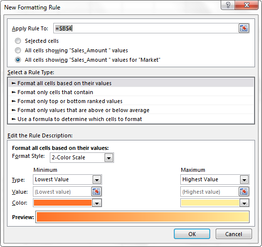
Figure 15-15: Click the radio button next to All cells showing “Sales_Amount” values for “Market”.
2. In the Select a Rule Type section, you need to specify the rule type you want to use for the conditional format.
You can select one of five rule types:
• Format All Cells Based on Their Values: This selection allows you to apply conditional formatting based on some comparison of the actual values of the selected range. That is, the values in the selected range are measured against each other. This selection is ideal when you want to identify general anomalies in your dataset.
• Format Only Cells That Contain: This selection allows you to apply conditional formatting to those cells that meet specific criteria you define. Keep in mind that the values in your range aren’t measured against each other when you use this rule type. This selection is useful when you’re comparing your values against a predefined benchmark.
• Format Only Top or Bottom Ranked Values: This selection allows you to apply conditional formatting to those cells that are ranked in the top or bottom nth number or percent of all the values in the range.
• Format Only Values That Are Above or Below the Average: This selection allows you to apply conditional formatting to those values that are mathematically above or below the average of all values in the selected range.
• Use a Formula to Determine Which Cells to Format: This selection allows you to specify your own formula and evaluate each value in the selected range against that formula. If the values evaluate as true, the conditional formatting is applied. This selection comes in handy when you’re applying conditions based on the results of an advanced formula or mathematical operation.
Data bars, color scales, and icon sets can be used only when the selected cells are formatted based on their values. This means that if you want to use data bars, color scales, and icon sets, you must select the Format All Cells Based on Their Values rule type.
In this scenario, you want to identify problem areas using icon sets; therefore, you want to format the cells based on their values.
3. Define the details of the conditional formatting in the Edit the Rule Description section.
Again, you want to identify problem areas using the slick new icon sets offered by Excel 2013. Select Icon Sets from the Format Style drop-down menu.
4. Select a style appropriate to your analysis.
The style selected in Figure 15-16 is ideal for situations in which your pivot tables cannot always be viewed in color.
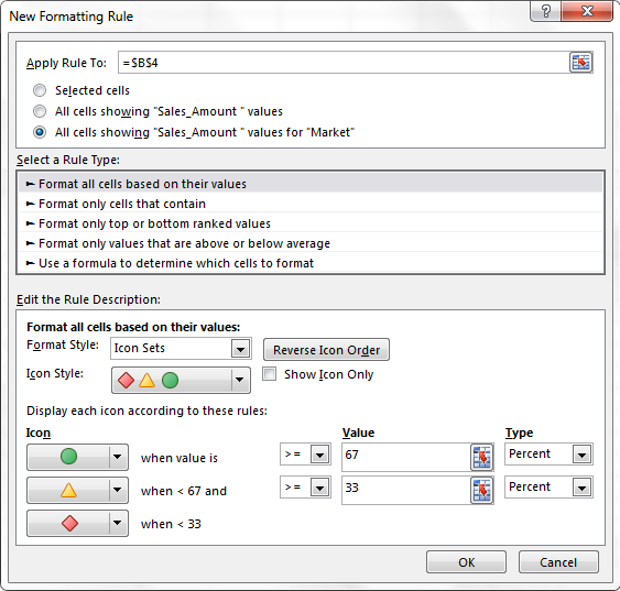
Figure 15-16: Select Icon Sets from the Format Style drop-down menu.
With this configuration, Excel applies the sign icons based on the percentile bands >=67, >=33, and <33. Keep in mind that the actual percentile bands can be changed based on your needs. In this scenario, the default percentile bands are sufficient.
5. Click OK to apply the conditional formatting.
As you can see in Figure 15-17, you now have icons that allow you to quickly determine where each market falls in relation to other markets as it pertains to revenue.

Figure 15-17: You have applied your first custom conditional formatting!
6. Apply the same conditional formatting to the Dollars per Hour field.
When you are done, your pivot table should look similar to the one shown in Figure 15-18.

Figure 15-18: You have successfully created an interactive visualization.
Take a moment to analyze what you have here. With this view, a manager can analyze the relationship between total revenue and dollars per hour. For example, the Dallas market manager can see that he is in the bottom percentile for revenue but in the top percentile for dollars per hour. With this information, he immediately sees that his dollars per hour rates may be too high for his market. Conversely, the New York market manager can see that she is in the top percentile for revenue but in the bottom percentile for dollars per hour. This tells her that her dollars-per-hour rates may be too low for her market.
And all this is driven by a pivot table and some conditional formatting!
Alternatives to Pivot Charts
There are generally two reasons why you need an alternative to using pivot charts: You don’t want the overhead that comes with a pivot chart, and you want to avoid some of the formatting limitations of pivot charts.
In fact, sometimes you may create a pivot table simply to summarize and shape your data in preparation for charting. In these situations, you don’t plan on keeping your source data, and you definitely don’t want a pivot cache taking up memory and file space.
In the example in Figure 15-19, you can see a pivot table that summarizes revenue by quarter for each product.

Figure 15-19: This pivot table was created to summarize and chart revenue by quarter for each product.
The idea here is that you create this pivot table only to summarize and shape your data for charting. You don’t want to keep the source data, nor do you want to keep the pivot table with all its overhead. The problem is that if you try to create a chart using the data in the pivot table, you inevitably create a pivot chart, which means you have all the overhead of the pivot table looming in the background. Of course, this could be problematic if you don’t want to share your source data with end users or you don’t want to inundate them unnecessarily with large files.
The good news is that with a few simple techniques, you can create a chart from a pivot table, but not end up with a pivot chart.
Disconnecting charts from pivot tables
Sometimes you want to chart the data in your pivot table, but don’t need the chart to remain connected to the pivot table. Maybe you want to e-mail just the chart to someone without the pivot table. Maybe you need a quick one-time chart and don’t need to keep the connection to the pivot table. Whatever the case, you can use any of these three alternative techniques for creating charts that are disconnected from pivot tables.
Create a standard chart from current pivot table values
After you’ve created and structured your pivot table appropriately, select the entire pivot table and copy it. Then under the Insert tab, select Paste Values, as shown in Figure 15-20.

Figure 15-20: The Paste Values functionality is useful when you want to create hard-coded values from pivot tables.
This action essentially deletes your pivot table, leaving you with the last values that were displayed in the pivot table. These values can subsequently be used to create a standard chart.
This technique disables the dynamic functionality of your pivot chart. That is, your pivot chart becomes a standard chart that cannot be interactively filtered or refreshed.
Delete the underlying pivot table
If you’ve already created your pivot chart, you can turn it into a standard chart by simply deleting the underlying pivot table. To do so, select the entire pivot table and press Delete on the keyboard.
With this method, you are left with none of the values that made up the source data for the chart. In other words, if anyone asks for the data that feeds the chart, you will not have it.
If you ever find that you have a chart but the data source isn’t available, activate the chart’s data table. The data table lets you see the data values that feed each series in the chart. See Chapter 7 to learn how to add the data table to a chart.
Create a picture of the pivot chart
A picture of your pivot chart freezes all of the text and numbers without any other information. In addition to very small file sizes, you get the added benefit of controlling what your clients get to see.
To use this method, follow these steps:
1. Copy the pivot chart by right-clicking on the chart (outside the plot area) and selecting Copy.
2. Open a new workbook.
3. Right-click anywhere in the new workbook and select Paste Special; then select the picture format you prefer.
A picture of your pivot chart is then placed in the new workbook.
 If you have pivot field buttons on your chart, they will also show up in the copied picture, which may confuse your audience about why the buttons don’t work. Be sure to hide all pivot field buttons before copying a pivot chart as a picture. You can remove them by clicking your chart and then selecting the Analyze tab. On the Analyze tab, use the Field Buttons drop-down button to hide all of the pivot field buttons.
Create standalone charts that are connected to your pivot table
To retain key functionality in your pivot table, such as report filters and top ten ranking, you can link a standard chart to your pivot table without creating a pivot chart.
In the example in Figure 15-21, a pivot table shows the top ten markets by contracted hours along with their total revenue. Notice that the report filter area allows you to filter by business segment so you can see the top ten markets segment.

Figure 15-21: This pivot table allows you to filter by business segment to see the top ten markets by total contracted hours and revenue.
Suppose you want to turn this view into an XY scatter chart to be able to point out the relationship between the contracted hours and revenues. You need to keep the capability to filter out ten records by model number; however, you also want the ability to create XY.
A pivot chart is definitely out because you can’t build pivot charts with certain chart types (such as XY scatter charts). The preceding techniques are also out because those methods disable the interactivity you need. So what’s the solution? Use the cells around the pivot table to link back to the data you need and then chart those cells. That is, you can build a mini dataset that feeds your standard chart.
This dataset links back to the data items in your pivot table, so when your pivot table changes, your dataset changes. Follow these steps to create a standalone chart that is connected to your pivot table:
1. Click in a cell next to your pivot table (see Figure 15-22) and reference the first data item you want plotted on your chart.
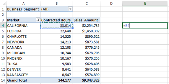
Figure 15-22: Start your linked dataset by referencing the first data item you need to capture.
2. Copy the formula you just entered and paste it down and across to create your complete dataset.
At this point, you have a dataset that looks similar to the one in Figure 15-23.

Figure 15-23: Copy the formula and paste it down and across to create your complete dataset.
3. After your linked dataset is complete, use it to create a standard chart.
In this example, you create an XY scatter chart with this data, which you can’t do with a pivot chart.
Figure 15-24 demonstrates how this solution offers the best of both worlds:
→ You kept the ability to filter out a particular business segment using the Page field.
→ You have all the formatting freedom of a standard chart without any of the issues related to using a pivot chart.

Figure 15-24: This solution provides the functionality of your pivot table without the formatting limitations of a pivot chart.