Chapter 12: Adding Interactive Controls to Your Dashboard
In This Chapter
• Introducing Form controls
• Using a button control
• Using a check box control to toggle a chart series
• Using an option button to filter your views
• Using a combo box to control multiple pivot tables
• Using a list box to control multiple charts
Today, business professionals increasingly want to be empowered to switch from one view of data to another with a simple list of choices. For those who build dashboards and reports, this empowerment comes with a whole new set of issues. The overarching question is — how do you handle a user who wants to see multiple views for multiple regions or markets?
Fortunately, Excel offers a handful of tools that enable you to add interactivity into your presentations. With these tools and a bit of creative data modeling, you can accomplish these goals with relative ease. In this chapter, we discuss how to incorporate various controls (such as buttons, check boxes, and scroll bars) into your dashboards and reports, and present you with several solutions that you can implement.
Getting Started with Form Controls
Excel offers a set of controls called Form controls, designed specifically for adding UI elements directly onto a worksheet. After you place a Form control on a worksheet, you can then configure it to perform a specific task. Later in the chapter, we demonstrate how to apply the most useful controls to a presentation.
Finding Form controls
You can find Excel’s Form controls on the Developer tab, which is initially hidden in Excel 2010. To enable the Developer tab, follow these steps:
1. Go to the Ribbon and select the File tab.
2. To open the Excel Options dialog box, click the Options button.
3. Click the Customize Ribbon button.
In the list box on the right, you’ll see all the available tabs.
4. Select the check box next to the Developer tab (see Figure 12-1).
5. Click OK.

Figure 12-1: Enabling the Developer tab.
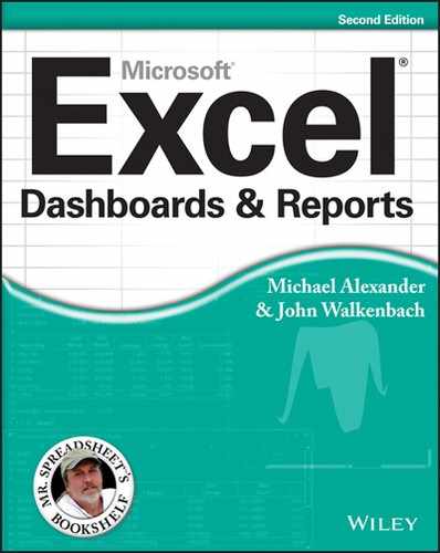
Now, select the Developer tab and choose the Insert command, as shown in Figure 12-2. Here you find two sets of controls: Form controls and ActiveX controls. Form controls are designed specifically for use on a spreadsheet, whereas ActiveX Controls are typically used on Excel UserForms. Because Form controls need less overhead and can be configured far easier than their ActiveX counterparts, you generally want to use Form controls.
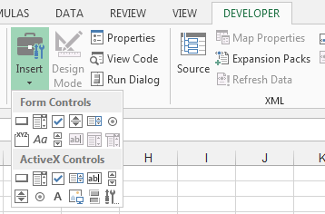
Figure 12-2: Form controls and ActiveX controls.
Here are the nine Form controls that you can add directly to a worksheet (see Figure 12-3). They are as follows:
→ Button: Executes an assigned macro when a user clicks the button.
→ Combo Box: Gives a user an expandable list of options from which to choose.
→ Check Box: Provides a mechanism for a select/deselect scenario. When selected, it returns a value of True. Otherwise, it returns False.
→ Spin Button: Enables a user to easily increment or decrement a value by clicking the up and down arrows.
→ List Box: Gives a user a list of options from which to choose.
→ Option Button: Enables a user to toggle through two or more options one at a time. Selecting one option automatically deselects the others.
→ Scroll Bar: Enables a user to scroll to a value or position using a sliding scale that can be moved by clicking and dragging the mouse.
→ Label: Allows you to add text labels to your worksheet. You can also assign a macro to the label, effectively using it as a button of sorts.
→ Group Box: Typically used for cosmetic purposes, this control serves as a container for groups of other controls.
Figure 12-3: Nine Form controls labeled so that you can add to your worksheet.
Adding a control to a worksheet
To add a control to a worksheet, simply click the control that you require and click the approximate location that you want to place the control. You can easily move and resize the control later just as you would a chart or shape.
After you add a control, you want to configure it to define its look, behavior, and utility. Each control has its own set of configuration options that allows you to customize it for your purposes. To get to these options, right-click the control and select Format Control. This opens the Format Control dialog box (illustrated in Figure 12-4) with all the configuration options for that control.

Figure 12-4: Right-click and select Format Control to open a dialog box with the configuration options.
Each control has its own set of tabs that allows you to customize everything from formatting, to security, to configuration arguments. You’ll see different tabs based on which control you’re using, but most Form controls have the Control tab. The Control tab is where the meat of the configuration lies. Here, you find the variables and settings that need to be defined in order for the control to function.
 The button and label controls don’t have the Control tab. They have no need for one. The button simply fires whichever macro you assign it. As for the Label, it’s not designed to run macro events.
Throughout the rest of the chapter, you walk through a few exercises that demonstrate how to use the most useful controls in a reporting environment. At the end of this chapter, you’ll have a solid understanding of Form controls and how they can enhance your dashboards and reports.
Using the Button Control
The button control gives your audience a clear and easy way to execute the macros you’ve recorded. To insert and configure a button control, follow these steps:
1. Select Insert drop-down list under the Developer tab.
2. Select the button Form control.
3. Click the location in your spreadsheet where you want to place your button.
The Assign Macro dialog box appears and asks you to assign a macro to this button (see Figure 12-5).
4. Edit the text shown on the button by right-clicking the button, highlighting the existing text, and then overwriting it with your own.
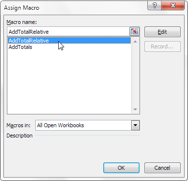
Figure 12-5: Assign a macro to the newly added button.
 To assign a different macro to the button, simply right-click and select Assign Macro to reactivate the Assign Macro dialog box, as shown in Figure 12-5.
Using the Check Box Control
The check box control provides a mechanism for selecting/deselecting options. When a check box is selected, it returns a value of True. When it isn’t selected, False is returned. To add and configure a check box control, follow these steps:
1. Select the Insert drop-down list under the Developer tab.
2. Select the check box Form control.
3. Click the location in your spreadsheet where you want to place your check box.
4. After you drop the check box control onto your spreadsheet, right-click the control and select Format Control.
5. Click the Control tab to see the configuration options, as shown in Figure 12-6.
6. Select the state in which the check box should open.
The default selection (Unchecked) typically works for most scenarios, so you rarely have to update this selection.
7. In the Cell Link box, enter the cell to which you want the check box to output its value.
By default, a check box control outputs either True or False, depending on whether it’s checked. Notice in Figure 12-6 that this particular check box outputs to cell A5.
8. (Optional) You can check the 3-D property if you want the control to have a 3-D appearance.
9. Click OK to apply your changes.

Figure 12-6: Formatting the check box control.
To rename the check box control, right-click the control, select Edit Text, and then overwrite the existing text with your own.
As Figure 12-7 illustrates, the check box outputs its value to the specified cell. If the check box is selected, a value of True is output. If the check box isn’t selected, a value of False is output.
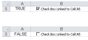
Figure 12-7: The two states of the check box.
If you’re having a hard time figuring out how this could be useful, take a stab at this next exercise, which illustrates how you can use a check box to toggle a chart series on and off.
Check box example: Toggling a chart series on and off
Figure 12-8 shows the same chart twice. Notice that the top chart contains only one series, with a check box offering to Show 2011 Trend data. The bottom chart shows the same chart with the check box selected. The on/off nature of the check box control is ideal for interactivity that calls for a visible/not visible state.

Figure 12-8: A check box can help create the disappearing data series effect.
 To download the Chapter 12 Samples.xlsx file, go to the book’s companion website at www.wiley.com/go/exceldr.
You start with the raw data (in Chapter 12 Sample File.xlsx) that contains both 2011 and 2012 data (see Figure 12-9). In the first column is a cell where the check box control will output its value (cell A12, in this example). This cell will contain either True or False.

Figure 12-9: Start with raw data and a cell where a check box control can output its value.
Next, you create the analysis layer (staging table) that consists of all formulas, as shown in Figure 12-10. The idea is that the chart actually reads from this data, not the raw data. This way, you can control what the chart sees.

Figure 12-10: Create a staging table that will feed the chart. The values of this data are all formulas.
As you can see in Figure 12-10, the formulas for the 2012 row simply reference the cells in the raw data for each respective month. You do that because you want the 2012 data to show at all times.
For the 2011 row, you test the value of cell A12 (the cell that contains the output from the check box). If A12 reads True, you reference the respective 2011 cell in the raw data. If A12 doesn’t read True, the formula uses Excel’s NA() function to return an #N/A error. Excel charts can’t read a cell with the #N/A error. Therefore, they simply don’t show the data series for any cell that contains #N/A. This is ideal when you don’t want a data series to be shown at all.
Notice that the formula shown in Figure 12-10 uses an absolute reference with cell A12. That is, the reference to cell A12 in the formula is prefixed with a $ sign ($A12). This ensures that the column references in the formulas don’t shift when they’re copied across.
Figure 12-11 illustrates the two scenarios in action in the staging tables. In the scenario shown at the bottom of Figure 12-11, cell A12 is True, so the staging table actually brings in 2011 data. In the scenario shown at the top of Figure 12-11, cell A12 is False, so the staging table returns #N/A for 2011.
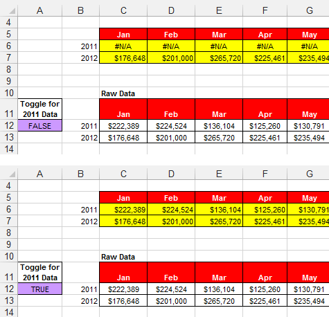
Figure 12-11: When cell A12 reads True, 2011 data is displayed; when it reads False, the 2011 row shows only #N/A errors.
Finally, you create the chart that you saw earlier in this section (refer to Figure 12-8) using the staging table. Keep in mind that you can scale this to as many series as you like.
Figure 12-12 illustrates a chart that has multiple series whose visibility is controlled by check box controls. This allows you to make all but two series invisible so you can compare those two series unhindered. Then you can make another two visible, comparing those.

Figure 12-12: You can use check boxes to control how much data is shown in your chart at one time.
Using the Option Button Control
Option buttons allow users to toggle through several options one at a time. The idea is to have two or more option buttons in a group. Then selecting one option button automatically deselects the others. To add option buttons to your worksheet, follow these steps:
1. Click the Insert drop-down list under the Developer tab.
2. Select the option button Form control.
3. Click the location in your spreadsheet where you want to place your option button.
4. After you drop the control onto your spreadsheet, right-click the control and select Format Control.
5. Click the Control tab to see the configuration options, as shown in Figure 12-13.
6. First, select the state in which the option button should open.
The default selection (Unchecked) typically works for most scenarios, so you rarely have to update this selection.
7. In the Cell Link box, enter the cell to which you want the option button to output its value. By default, an option button control outputs a number that corresponds to the order it was put onto the worksheet. For instance, the first option button you place on your worksheet outputs a number 1, the second outputs a number 2, the third outputs a number 3, and so on. Notice in Figure 12-13 that this particular control outputs to cell A1.
8. (Optional) You can check the 3-D property if you want the control to have a three-dimensional appearance.
9. Click OK to apply your changes.
10. To add another option button, simply copy the button you created and paste as many option buttons as you need. The nice thing about copying and pasting is that all the configurations you made to the original persist in all the copies.

Figure 12-13: Formatting the option button control.
To give your option button a meaningful label, right-click the control, select Edit Text, and then overwrite the existing text with your own.
Option button example: Showing many views through one chart
One of the ways you can use option buttons is to feed a single chart with different data, based on the option selected. Figure 12-14 illustrates an example of this. When each category is selected, the single chart is updated to show the data for that selection.
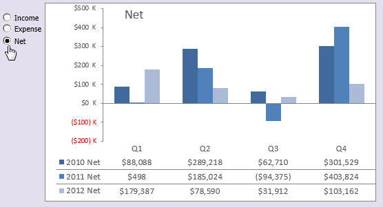
Figure 12-14: This chart is dynamically fed different data based on the selected option button.
Now, you could create three separate charts and show them all on your dashboard at the same time. However, using this technique as an alternative saves on valuable real estate by not having to show three separate charts. Plus, it’s much easier to troubleshoot, format, and maintain one chart than three.
To create this example, you start with three raw datasets (as shown in Figure 12-15) that contain three categories of data; Income, Expense, and Net. Near the raw data, you reserve a cell where the option buttons output their values (Cell A8, in this example). This cell contains the ID of the option selected: 1, 2, or 3.
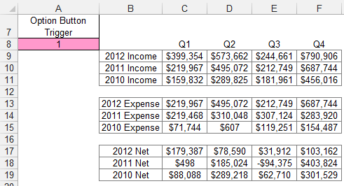
Figure 12-15: Start with the raw datasets and a cell where the option buttons can output their values.
You then create the analysis layer (the staging table) that consists of all formulas, as shown in Figure 12-16. The idea is that the chart reads from this staging table, allowing you to control what the chart sees. The first cell of the staging table contains the following formula:
=IF($A$8=1,B9,IF($A$8=2,B13,B17))
This formula tells Excel to check the value of cell A8 (the cell where the option buttons output their values). If the value of cell A8 is 1, which represents the value of the Income option, the formula returns the value in the Income dataset (cell B9). If the value of cell A8 is 2, which represents the value of the Expense option, the formula returns the value in the Expense dataset (cell B13). If the value of cell B1 is not 1 or 2, the value in cell B17 is returned.

Figure 12-16: Create a staging table and enter this formula in the first cell.
Notice that the formula shown in Figure 12-16 uses absolute references with cell A8. That is, the reference to cell A8 in the formula is prefixed with $ signs ($A$8). This ensures that the cell references in the formulas don’t shift when they’re copied down and across.
To test that the formula is working fine, you could change the value of cell A8 manually, from 1 to 3. When the formula works, you simply copy the formula across and down to fill the rest of the staging table.
When the setup is created, all that’s left to do is create the chart using the staging table. Again, the major benefits you get from this type of setup are that any formatting changes can be made to one chart and it’s easy to add another dataset by adding another option button and editing your formulas.
Using the Combo Box Control
The combo box control allows users to select from a list of predefined options from a drop-down list. The idea is that when an item from the combo box control is selected, some action is taken with that selection. To add a combo box to your worksheet, follow these steps:
1. Click the Insert drop-down list under the Developer tab.
2. Select the combo box Form control.
3. Click the location in your spreadsheet where you want to place your combo box.
4. After you drop the control onto your spreadsheet, right-click the control and select Format Control.
5. Click the Control tab to see the configuration options, as shown in Figure 12-17.
6. In the Input Range setting, identify the range that holds the predefined items you want to present as choices in the combo box.
7. In the Cell Link box, enter the cell to which you want the combo box to output its value.
A combo box control outputs the index number of the selected item. This means that if the second item on the list is selected, the number 2 will be output. If the fifth item on the list is selected, the number 5 will be output. Notice in Figure 12-17 that this particular control outputs to cell E15.
8. In the Drop Down Lines box, enter the number of items you want shown at one time. You see in Figure 12-17 that this control is formatted to show 12 items at one time. This means when the combo box is expanded, the user sees 12 items.
9. (Optional) You can check the 3-D property if you want the control to have a three-dimensional appearance.
10. Click OK to apply your changes.
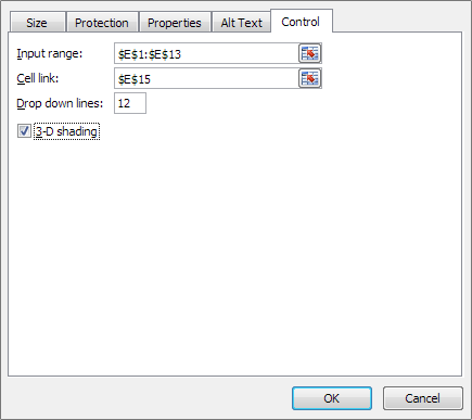
Figure 12-17: Formatting the combo box control.
Combo box example: Changing chart data with a drop-down selector
You can use combo box controls to give your users an intuitive way to select data via a drop-down selector. Figure 12-18 shows a thermometer chart controlled by the combo box above it. When a user selects the Southwest region, the chart responds by plotting the data for the selected region.
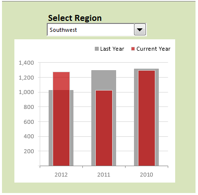
Figure 12-18: Use combo boxes to give your users an intuitive drop-down selector.
To create this example, you start with the raw dataset shown in Figure 12-19. This dataset contains the data for each region. Near the raw data, you reserve a cell where the combo box will output its value (Cell M7, in this example). This cell will catch the index number of the combo box entry selected.

Figure 12-19: Start with the raw dataset and a cell where the option buttons can output their values.
You then create the analysis layer (the staging table) that consists of all formulas, as shown in Figure 12-20. The idea is that the chart reads from this staging table, allowing you to control what the chart sees. The first cell of the staging table contains the following INDEX formula:
=INDEX(P7:P14,$M$7)

Figure 12-20: Create a staging table that uses the INDEX function to extract the appropriate data from the raw dataset.
The INDEX function converts an index number to a value that can be recognized. An INDEX function requires two arguments in order to work properly. The first argument is the range of the list you’re working with. The second argument is the index number.
In this example, you’re using the index number from the combo box (in cell M7) and extracting the value from the appropriate range (2012 data in P7:P14). Again, notice the use of the absolute $ signs. This ensures that the cell references in the formulas don’t shift when they’re copied down and across.
Take another look at Figure 12-20 to see what’s happening. The INDEX formula in cell P2 points to the range that contains the 2012 data. It then captures the index number in cell M7 (which traps the output value of the combo box). The index number happens to be 7. So the formula in cell P2 will extract the 7th value from the 2012 data range.
When you copy the formula across, Excel adjusts the formula to extract the seventh value from each year’s data range.
After your INDEX formulas are in place, you have a clean staging table that you can use to create your chart (see Figure 12-21).

Figure 12-21: A clean staging table to use to create your chart.
Using the List Box Control
The list box control allows users to select from a list of predefined choices. The idea is that when an item from the list box control is selected, some action is taken with that selection. To add a list box to your worksheet, follow these steps:
1. Select the Insert drop-down list under the Developer tab.
2. Select the list box Form control.
3. Click the location in your spreadsheet where you want to place your list box.
4. After you drop the control onto your worksheet, right-click the control and select Format Control.
5. Click the Control tab to see the configuration options, as shown in Figure 12-22.
6. In the Input Range setting, identify the range that holds the predefined items you want to present as choices in the combo box.
As you can see in Figure 12-22, this list box is filled with region selections.
7. In the Cell Link box, enter the cell where you want the list box to output its value.
By default, a list box control outputs the index number of the selected item. This means that if the second item on the list is selected, the number 2 will be output. If the fifth item on the list is selected, the number 5 will be output. Notice in Figure 12-22 that this particular control outputs to cell P2. The Selection Type setting allows users to choose more than one selection in the list box. The choices here are Single, Multi, and Extend. Always leave this setting on Single, as Multi and Extend work only in the VBA environment.
8. (Optional) You can check the 3-D property if you want the control to have a 3-D appearance.
9. Click OK to apply your changes.

Figure 12-22: Formatting the list box control.
List box example: Controlling multiple charts with one selector
One of the more useful ways to use a list box is to control multiple charts with one selector. Figure 12-23 illustrates an example of this. As a region selection is made in the list box, all three charts are fed the data for that region, adjusting the charts to correspond with the selection made. Happily, all this is done without VBA code, just a handful of formulas and a list box.

Figure 12-23: This list box feeds the region selection to multiple charts, changing each chart to correspond with the selection made.
To create this example, you start with three raw datasets (as shown in Figure 12-24) that contain three categories of data: Revenues, Net Income %, and Gross Margin. Each dataset contains a separate line for each region (including one for All Regions).
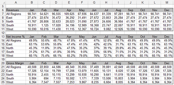
Figure 12-24: Start with the raw datasets that contain one line per region.
You then add a list box that outputs the index number of the selected item to cell P2 (see Figure 12-25).
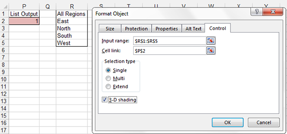
Figure 12-25: Add a list box and note the cell where the output value will be placed.
Next, you create a staging table that will consist of all formulas. In this staging table, you use the Excel’s CHOOSE function to select the correct value from the raw data tables based on the selected region.
In Excel, the Choose function returns a value from a specified list of values based on a specified position number. For instance, the formula CHOOSE(3,”Red”, “Yellow”, “Green”, “Blue”) returns Green because Green is the third item in the list of values. The formula CHOOSE(1, “Red”, “Yellow”, “Green”, “Blue”) returns Red. See Chapter 11 to get a detailed look at the CHOOSE function.
As you can see in Figure 12-26, the CHOOSE formula retrieves the target position number from Cell P2 (the cell where the list box outputs the index number of the selected item) and then matches that position number to the list of cell references given. The cell references come directly from the raw data table.
In the example shown in Figure 12-26, the data that will be returned with this CHOOSE formula is 41767. Why? Because cell P2 contains the number 3, and the third cell reference within the CHOOSE formula is cell B9.

Figure 12-26: Use the CHOOSE function to capture the correct data corresponding to the selected region.
You entered the same type of CHOOSE formula into the Jan column and then copied it across (see Figure 12-27).
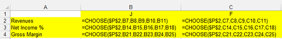
Figure 12-27: Create similar CHOOSE formulas for each row/category of data and then copy the choose formulas across months.
To test that your formulas are working, change the value of cell P2 manually, entering 1, 2, 3, 4, or 5. When the formulas work, all that’s left to do is create the charts using the staging table.
If Excel functions like CHOOSE or INDEX are a bit intimidating for you, don’t worry. There are literally hundreds of ways to use various combinations of form controls and Excel functions to achieve interactive reporting. The examples given in this chapter are designed to give you a sense of how you can incorporate form controls into your dashboards and reports. There are no set rules on which form controls or Excel functions you need to use in your model.
Start with basic improvements to your dashboard, using controls and formulas you’re comfortable with. Then gradually try to introduce some of the more complex controls and functions. With a little imagination and creativity, you can take the basics found in this chapter and customize your own dynamic dashboards.