
Chapter 11: Developing Your Data Model
In This Chapter
• Setting up the data, analysis, and presentation layers
• Applying data model best practices
• Leveraging Excel functions to deliver data
• Using Excel tables that expand with data
A data model provides the foundation upon which your dashboard or report is built. When you collect and analyze data, you’re essentially building a data model that feeds your presentation. In this chapter, we discuss how to build and manage an efficient data model. Although you’ll discover how to build cool dashboard components in later chapters, they won’t do you any good if you can’t construct an effective data model. On that note, let’s get started.
Building a Data Model
Building an effective data model isn’t as complicated as you may think. The problem is that most people spend little time thinking about the data model that supports a final presentation. If they think about it at all, they usually start by imagining a mock-up of the finished dashboard and work backward from there.
So try thinking a bit about the end-to-end process. Where does the source data reside? How should that data be organized? What calculations do you need to perform? How will those results be fed to the dashboard? How will the dashboard be updated?
Obviously, the answers to these questions are situation-specific. But here is a good place to start.
Separating the data, analysis, and presentation layers
One of the key concepts of a data model is the organization of data into three layers: data, analysis, and presentation. The basic idea is that you don’t want your data to become too tied into any one particular way of presenting that data.
For example, think about a business invoice. The financial data on that invoice is not the true source of that data. It’s merely a presentation of the actual data that’s stored in some database. That data can then be organized and presented to you in many ways: in charts, in tables, on dashboards, or even on websites. This sounds obvious, but Excel users often fuse the data, analysis, and presentation layers together into one final project.
The best approach is to create three layers in your data model. You can think of these layers as three different worksheets in an Excel workbook. Sometimes this also is a good way to organize your data model. One sheet holds the raw data that feeds your report, one sheet serves as a staging area where the calculations are performed, and one serves as the final presentation. Figure 11-1 illustrates the three layers of an effective data model.
 You don’t necessarily have to place your data, analysis, and presentation layers on different worksheets. In small data models, you may find it easier to place your data in one area of a worksheet while building your staging tables in another area of the same worksheet.
Why even bother with the three-tiered data model? Imagine that you have only the table in Figure 11-2. Hard-coded tables, such as this one, are common. This table is a combination of data, calculations, and presentation. Not only does this table tie you to a specific analysis but also there’s little to no transparency into the content of the analysis. Also, what happens when you need to report by quarters or when another dimension of analysis is needed? Do you import a table that consists of more columns and rows? How does that affect your data model?
Taking the easy route and avoiding the extra work of separating the data, analysis, and presentation layers can lead to more problems later. Take a moment to review each layer and the role it plays in building out your dashboard model.
The data layer
As you can see in Figure 11-1, the data layer consists of the raw data that feeds your dashboard. The data in the data layer is typically used “as is” from whatever source you derived it from. That is to say, you perform no analysis in the data layer.

Figure 11-1: An effective data model separates data, analysis, and presentation layers.

Figure 11-2: Avoid using hard-coded tables that fuse data, analysis, and presentation.
However, you’ll find that not all data makes for effective data modeling. For example, the data shown in Figure 11-3 would make it impractical to apply any analysis outside what’s already there. For instance, how would you calculate and present the average of all bike sales? How would you calculate a list of the top ten best performing markets?

Figure 11-3: Not all data can be a good source for your data layer.
With this setup, you’re forced into very manual processes that are difficult to maintain month after month. Any analysis outside the high-level ones already in the report is basic at best — even with fancy formulas. Furthermore, what happens when you’re required to show bike sales by month? When your data model requires analysis with data that isn’t in the worksheet report, you’re forced to search for other data.
Ideally, you want your data layer to come in one of two forms:
→ Flat data tables: Data repositories are organized by row and column. Each row corresponds to a set of data elements, or a record. Each column is a field. A field corresponds to a unique data element in a record. Figure 11-4 contains the same data as the data shown in Figure 11-3, but is in flat data table format. Flat tables lend themselves nicely to data modeling in Excel because they can be detailed enough to hold the data that you need and still be conducive to a wide array of simple formulas and calculations in your analysis layer — SUM, AVERAGE, VLOOKUP, and SUMIF, just to name a few. Later in this chapter, we discuss functions that come in handy in a data model.

Figure 11-4: A flat data table.
→ Tabular data set: Ideal for pivot-table-driven data models. Figure 11-5 illustrates a tabular data set. Note that the primary difference between a tabular data set, as shown in Figure 11-5, and a flat data file is that the column labels don’t double as actual data. For instance, in Figure 11-4, the month identifiers are integrated into the column labels. In Figure 11-5, the Sales Period column contains the month identifier. This subtle difference in structure is what makes tabular data sets optimal data sources for pivot tables. This structure ensures that key pivot table functions, such as sorting and grouping, work the way they should.

Figure 11-5: A tabular data set.
The analysis layer
The analysis layer consists primarily of formulas that analyze and pull data from the data layer into formatted tables (commonly referred to as staging tables). These staging tables ultimately feed the reporting components in your presentation layer. In short, the sheet that contains the analysis layer becomes the staging area where data is summarized and shaped to feed the reporting components.
This setup offers a couple of benefits:
→ You can easily update the entire data model simply by replacing the raw data with updated data. The formulas in the analysis tab then continue to work with the latest data.
→ You can create any added analyses easily by using different combinations of formulas on the analysis tab. If you need data that doesn’t exist in the data layer, you can add a column to the end of the raw data without disturbing the analysis or presentation layers.
The presentation layer
The presentation layer is your storefront. It contains all the charts, visualizations, and dashboard components that you want your audience to see. The presentation layer is the most flexible because you can choose a plethora of tools, graphics, and charts to create the theme and style of your dashboard. Also, because the presentation layer feeds from the analysis layer, the data needed for each component is always consistent in content and format.
Data Model Best Practices
One of Excel’s most attractive features is its flexibility. You can construct an intricate system of calculations, linked cells, and formatted summaries that work together to create your final presentation. But creating a successful dashboard requires more than just slapping data onto a worksheet. A poorly designed data model can lead to hours of excess work maintaining and updating your presentation. On the other hand, an effective data model enables you to easily repeat monthly update processes without damaging your dashboards or your sanity.
In this section, we discuss some data modeling best practices that help you start on the right foot with your dashboard projects.
Avoid storing excess data
In Chapter 1, you may have read that measures used on a dashboard should absolutely support the initial purpose of that dashboard. The same concept applies to the back-end data model. You should import only data that’s necessary to fulfill the purpose of your dashboard or report.
In an effort to have as much data as possible at their fingertips, many Excel users bring into their worksheets every piece of data they can get their hands on. You can spot these people by the 40MB files they send through e-mail. You’ve seen these worksheets — two tabs that contain presentation and then six hidden tabs that contain thousands of lines of data (most of which isn’t used). They essentially build a database in their worksheet.
What’s wrong with utilizing as much data as possible? Well, here are a few issues:
→ Excess data increases the number of formulas. If you’re bringing in all raw data, you have to aggregate that data in Excel. This inevitably causes you to exponentially increase the number of formulas you have to employ and maintain. Remember your data model is a vehicle for presenting analyses, not processing raw data. The data that works best in the presentation layer is what’s already been aggregated and summarized into useful views that can be navigated and fed to dashboard components. Importing data that’s already been aggregated as much as possible is far better. For example, if you need to report on Revenue by Region and Month, there’s no need to import sales transactions into your data model. Instead, use an aggregated table consisting of Region, Month, and Sum of Revenue.
→ Excess data degrades the performance of your presentation layer. In other words, because your dashboard is fed by your data model, you need to maintain the model behind the scenes (likely in hidden tabs) when distributing the dashboard. Besides the fact that it causes the file size to be unwieldy, including too much data in your data model can actually degrade the performance of your dashboard. Why? When you open an Excel file, the entire file is loaded into memory (or RAM) to ensure quick data processing and access. The drawback to this behavior is that Excel requires a great deal of RAM to process even the smallest change in your worksheet. You may have noticed that when you try to perform an action on a large formula-intensive data, Excel is slow to respond, giving you a Calculating indicator in the status bar. The larger your data is, the less efficient the data crunching in Excel is.
→ Excess data limits the scalability of your data model. Imagine that you’re working in a small company and you’re using monthly transactions in your data model. Each month holds 80,000 lines of data. As time goes on, you build a robust process complete with all the formulas, pivot tables, and macros you need to analyze the data that’s stored in your neatly maintained tab. Now what happens after one year? Do you start a new tab? How do you analyze two data on two different tabs as one entity? Are your formulas still good? Do you have to write new macros?
You can avoid such issues by importing only aggregated and summarized data that’s useful to the core purpose of your dashboard.
Use tabs to document and organize your data model
Wanting to keep your data model limited to one worksheet tab is natural. In our opinion, keeping track of one tab is much simpler than using different tabs. However, limiting your data model to one tab has its drawbacks, including the following:
→ Limits the quality of your analysis. Because only so much text can fit on a tab, using one tab imposes real-estate restrictions that can limit your analyses. Consider adding tabs to your data model to provide additional data and analysis that may not fit on just one tab.
→ Makes for a confusing data model. When working with a large quantity of data, you need plenty of staging tables to aggregate and shape the raw data so that it can be fed to your dashboard components. If you use only one tab, you’re forced to position these staging tables below or to the right of your data. Although this may provide all the elements needed to feed your presentation layer, a good deal of scrolling is necessary to view all the elements positioned in a wide range of areas. This makes the data model difficult to understand and maintain. Use separate tabs to hold your staging tables, particularly in data models that contain large quantities of data that take a lot of real estate.
→ Limits the amount of documentation you can include. You’ll find that your data models easily become a complex system of intertwining links among components, input ranges, output ranges, and formulas. Sure, it all makes sense while you’re building your data model, but try coming back to it after a few months. You’ll find that you’ve forgotten what each data range does and how each range interacts with the final presentation layer. To avoid this problem, consider adding a data model map tab to your data model. The map tab essentially summarizes the key ranges in the data model and allows you to document how each range interacts with the dashboard components in the final presentation layer. As you can see in Figure 11-6, the data model map is nothing fancy; just a table that lists some key information about each range in the model.
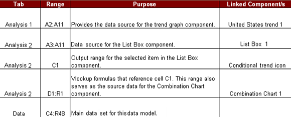
Figure 11-6: A data model map provides documentation that outlines how your data model works.
You can include any information you think appropriate in your data model map. The idea is to give yourself a handy reference that guides you through the elements in your data model.
Test your data model before building presentation components
This best practice is simple. Make sure that your data model does what it’s supposed to do before building dashboard components on top of it. In that vein, here are a few things to watch for:
→ Test your formulas to be sure that they’re working properly. Make sure your formulas don’t produce errors and that each formula outputs expected results.
→ Double-check your main data to be sure that it’s complete. Check that your data table has not truncated when transferring to Excel. Also, be sure that each column of data you need is present with appropriate data labels.
→ Make sure all numeric formatting is appropriate. Be sure that the formatting of your data is appropriate for the field. For example, check to see that dates are formatted as dates, currency values are formatted properly, and that the correct number of decimal places is displayed where needed.
The obvious goal here is to eliminate easily avoidable errors that may cause complications later.
Excel Functions for Your Data Model
As we discussed, the optimal data model for any dashboard separates data, analysis, and presentation into three distinct layers. Although all three layers are important, the analysis layer is where the real art comes into play. The fundamental task of the analysis layer is to extract information from the data layer for use in the staging tables that feed your charts, tables, and other dashboard components. To do this effectively, you need to use formulas that serve as data delivery mechanisms — formulas that deliver data to a destination range.
You see, the information you need lives in your data layer (typically, a table containing aggregated data). Data delivery formulas are designed to get that data and deliver it to the analysis layer so it can be analyzed and shaped. The cool thing is that after you’ve set up your data delivery formulas, your analysis layer automatically updates each time your data layer is refreshed.
Now, take a look at a few Excel functions that work particularly well in data delivery formulas. As you go through the examples here, you’ll start to see how these concepts come together.
Understanding lookup tables
In the following sections, you’ll see frequent use of the term lookup table. A lookup table is essentially a range of data that holds information in a structure that can be used to extract the needed data points. In the context of these examples, you can assume the lookup table will be the data layer.
A lookup table can come in several forms:
→ One column or row: You may have a list of manager names in a single column. That list can be used as a lookup table to find a manager based on his name or his position number within the column.
→ Range with multiple data columns: You may have a table with product numbers and prices. You can use a list table as a lookup to find a specific price based on its corresponding product number. In this scenario, you need a formula that performs lookup on the product number to get the appropriate price.
→ A position array: In some cases, you need to look up a value solely based on a particular position within an array of values. For instance, you may need to find the revenue amount for the 14th week in a year. If you have every value for each week in the year listed in order, you can extract the revenue amount for the 14th value in the list.
The VLOOKUP function
The VLOOKUP function finds a specific value in the first column of a lookup table and returns the corresponding value in a specified table column. The lookup table is arranged vertically. In Figure 11-7, the table on the top shows sales by month and product number. The table on the bottom translates those product numbers to actual product names. The VLOOKUP function connects the appropriate product name to each respective product number.

Figure 11-7: The VLOOKUP function finds the appropriate product name for each product number.
VLOOKUP basics
To see how the VLOOKUP function works, take a moment to review the basic syntax. A VLOOKUP function requires four arguments:
VLOOKUP(lookup_value,table_array,col_index_num,range_lookup)
→ lookup_value: The value that you want to look up in the first column of the lookup table. In Figure 11-7, the lookup_value is the product number. Therefore, the first argument for all the formulas shown in Figure 11-7 references column C.
→ table_array: The range that contains the lookup table. In Figure 11-7, that range is D16:E22. Please note that for the VLOOKUP function to work, the leftmost column of the table must be the matching value. For example, if you’re matching product numbers, product numbers must be in the first column of the lookup table. Also, the reference that you use for this argument is an absolute reference. This means that the column and row references are prefixed with dollar ($) signs — as in $G$2:$H$8. This ensures that the references don’t shift while you copy the formulas down or across.
→ col_index_num: The column number from within the lookup table that contains the matching value. In Figure 11-7, the second (column E) contains the product name, so the formula uses the number 2. If the product name column were the fourth column in the lookup table, the number 4 would be used.
→ range_lookup: Optional. You can specify whether you’re looking for an exact match for your value or an approximate match. If an exact match is needed, type FALSE for this argument. If the closest match will do, type TRUE or leave the argument blank.
Adding VLOOKUP formulas to a data model
Using a few VLOOKUP formulas and a simple drop-down list, you can create a data model that not only delivers data to the appropriate staging table but also allows you to dynamically change data views based on a selection you make. Figure 11-8 illustrates the setup.
 To see this effect in action, go to www.wiley.com/go/exceldr to get the Chapter 11 Samples.xlsx workbook. Open that workbook to see the VLOOKUP1 tab.

Figure 11-8: Using the VLOOKUP function to extract data and change data views.
The data layer in Figure 11-8 resides in the range A9:F209. The analysis layer displays in range E2:F6. The data layer consists of all the formulas that extract the appropriate data. As you can see, if you select Chevron in cell C3, the VLOOKUP formula extracts the data for Chevron from the data layer.
 You may notice that the VLOOKUP formulas in Figure 11-8 specify a table_array argument of $C$9:$F$5000. So the lookup table that the formulas point to stretches from C9 to F5000. That may seem strange because the table ends at F209. Why would you force your VLOOKUP formulas to look at a range far past the end of the data table?
Remember that the idea behind separating the data layer and the analysis layer is that your analysis layer can automatically update when you update your data. So when you get new data next month, you can simply replace the data layer in the model without having to rework your analysis layer. Allowing for more rows than necessary in your VLOOKUP formulas ensures that if your data layer grows, records won’t fall outside the lookup range of the formulas.
Later in this chapter (in the “Working with Excel Tables” section), we show you how to automatically keep up with growing data tables by using the Excel table feature.
Using drop-down lists
In the example illustrated in Figure 11-8, the data model allows you to select customer names (that is, the AccountName field) from a drop-down list when you click cell C3. The customer name serves as the lookup value for the VLOOKUP formulas. Changing the customer name extracts a new set of data from the data layer. This allows you to quickly switch from one customer to another without having to remember and type the customer name.
Now, as cool as this seems, the reasons for this setup aren’t all cosmetic. There are practical reasons for adding drop-down lists to your data models.
Many of your models consist of multiple analysis layers. Although each analysis layer is different, the layers often need to revolve around a shared dimension, such as the same customer name, the market, or the region. For instance, when you have a data model that reports on Financials, Labor Statistics, and Operational Volumes, you want to ensure that when the model is reporting Financials for the South region, the Labor Statistics are for the South region as well.
An effective way to ensure that this happens is to force your formulas to use the same dimension references. If cell C3 is where you switch customers, every analysis that is customer-dependent should reference cell C3. Drop-down lists allow you to have a predefined list of valid variables located in a single cell. With a drop-down list, you can easily switch dimensions while building and testing multiple analysis layers.
Adding a drop-down list is a relatively easy thing to do with Excel’s Data Validation functionality. To add a drop-down list:
1. Click the Data tab on the Ribbon.
2. Click the Data Validation button.
3. In the Data Validation dialog box, click the Settings tab (see Figure 11-9).
4. In the Allow drop-down list, select List.
5. In the Source box, specify the range of cells that contain your predefined selection list.
6. Click OK.

Figure 11-9: You can use data validation to create a predefined list of valid variables for your data model.
The HLookup function
The HLOOKUP function is the less popular cousin of the VLOOKUP function. The H in HLOOKUP stands for horizontal. Because Excel data is typically vertically oriented, most situations require a vertical lookup (or VLOOKUP). However, some data structures are horizontally oriented, requiring a horizontal lookup; thus the HLOOKUP function comes in handy. The HLOOKUP searches a lookup table to find a single value from a row of data where the column label matches a given criterion.
HLOOKUP basics
Figure 11-10 demonstrates a typical scenario where HLOOKUP formulas are used. The table in C3 requires quarter-end numbers (March and June) for 2012. The HLOOKUP formulas use the column labels to find the correct month columns and then locate the 2012 data by moving down the appropriate number of rows. In this case, 2012 data is in row 4, so the number 4 is used in the formulas.

Figure 11-10: HLOOKUP formulas help find March and June numbers from the lookup table.
To get your mind around how this works, take a look at the basic syntax of the HLOOKUP function.
HLOOKUP(lookup_value,table_array,row_index_num,range_lookup)
→ lookup_value: The value that you want to look up. In most cases, these values are column names. In the example in Figure 11-10, the column labels are being referenced for the lookup_value. This points the HLOOKUP function to the appropriate column in the lookup table.
→ table_array: The range that contains the lookup table. In Figure 11-10, that range is B9:H12. Like the VLOOKUP examples earlier in this chapter, the references used for this argument are absolute, which means the column and row references are prefixed with dollar ($) signs — as in $B$7:$H$10. This ensures that the reference doesn’t shift while you copy the formula down or across.
→ row_index_num: The row number that contains the value that you’re looking for. In the example in Figure 11-10, the 2012 data is located in row 4 of the lookup table. Therefore, the formulas use the number 4.
→ range_lookup: You can specify whether you’re looking for an exact match or an approximate match. If an exact match is needed, enter FALSE for this argument. If the closest match will do, enter TRUE or leave the argument blank.
Applying HLOOKUP formulas to a data model
HLOOKUPs are especially handy for shaping data into structures appropriate for charting or other types of reporting. A simple example is demonstrated in Figure 11-11. With HLOOKUPs, the data shown in the raw data table at the bottom of the figure is reoriented in a staging table at the top. When the raw data is changed or refreshed, the staging table captures the changes.

Figure 11-11: In this example, HLOOKUP formulas pull and reshape data without disturbing the raw data table.
The SUMPRODUCT function
The SUMPRODUCT function is actually listed under the math and trigonometry category of Excel functions. Because the primary purpose of SUMPRODUCT is to calculate the sum product, most people don’t know you can actually use it to look up values. In fact, you can use this versatile function quite effectively in most data models.
SUMPRODUCT basics
The SUMPRODUCT function is designed to multiply values from two or more ranges of data and then add the results together to return the sum of the products. Take a look at Figure 11-12 to see a typical scenario where the SUMPRODUCT is useful.
In Figure 11-12, you see a common analysis where you need the total sales for the years 2012 and 2011. As you can see, to get the total sales for each year, you first have to multiply Price by the number of Units to get the total for each Region. Then you have to sum those results to get the total sales for each year.
With the SUMPRODUCT function, you can perform the two-step analysis with just one formula. Figure 11-13 shows the same analysis with SUMPRODUCT formulas. Instead of using 11 formulas, you can accomplish the same analysis with just three!

Figure 11-12: Without the SUMPRODUCT, getting the total sales for each year involves a two-step process: First multiply price and units and then sum the results.
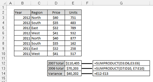
Figure 11-13: The SUMPRODUCT function allows you to perform the same analysis with just three formulas instead of 11.
The syntax of the SUMPRODUCT function is fairly simple:
SUMPRODUCT(array1,array2, ...)
The array argument represents a range of data. You can use anywhere from two to 255 arrays in a SUMPRODUCT formula. The arrays are multiplied together and then added. The only hard-and-fast rule you have to remember is that all the arrays must have the same number of values. That is to say, you can’t use the SUMPRODUCT if range X has 10 values and Range Y has 11 values. Otherwise, you get the #VALUE! error.
A twist on the SUMPRODUCT function
The interesting thing about the SUMPRODUCT function is that you can use it to filter out values. Take a look at Figure 11-14 to see what I mean.
The formula in cell E12 is pulling the sum of total units for just the North region. Meanwhile, cell E13 is pulling the units logged for the North region in the year 2011.

Figure 11-14: You can use the SUMPRODUCT function to filter data based on criteria.
To understand how this works, take a look at the formula in cell E12 shown in Figure 11-14. That formula reads SUMPRODUCT((C3:C10=”North”)*(E3:E10)).
In Excel, TRUE evaluates to 1 and FALSE evaluates to 0. Every value in Column C that equals “North” evaluates to TRUE or 1. Where the value is not “North”, it evaluates to FALSE or 0. The part of the formula that reads (C3:C10=”North”) enumerates through each value in the range C3:C10, assigning a 1 or 0 to each value. Then internally, the SUMPRODUCT formula translates to
(1*E3)+(0*E4)+(0*E5)+(0*E6)+(1*E7)+(0*E8)+(0*E9)+(0*E10).
This gives you the answer of 1628 because this next formula equals 1628.
(1*751)+(0*483)+(0*789)+(0*932)+(1*877)+(0*162)+(0*258)+(0*517)
Applying SUMPRODUCT formulas to a data model
As always in Excel, you don’t have to hard-code the criteria in your formulas. Instead of explicitly using “North” in the SUMPRODUCT formula, you can reference a cell that contains the filter value. You can imagine that cell A3 contains the word “North”, in which case, you can use (C3:C10=A3) instead of (C3:C10=”North”). This way, you can dynamically change your filter criteria, and your formula keeps up.
Figure 11-15 demonstrates how you can use this concept to pull data into a staging table based on multiple criteria. Note that each of the SUMPRODUCT formulas shown here references cells B3 and C3 to filter on Account and Product Line. Again, you can add data validation drop-down lists to cells B3 and C3, allowing you to easily change criteria.

Figure 11-15: You can use the SUMPRODUCT function to pull summarized numbers from the data layer into staging tables.
The Choose function
The CHOOSE function returns a value from a specified list of values based on a specified position number. For instance, if you enter the formulas CHOOSE(3,”Red”, “Yellow”, “Green”, “Blue”) into a cell, Excel returns Green because Green is the third item in the list of values. The formula CHOOSE(1,”Red”, “Yellow”, “Green”, “Blue”) returns Red. Although this may not look useful on the surface, the CHOOSE function can enhance your data models dramatically.
CHOOSE basics
Figure 11-16 illustrates how CHOOSE formulas can help pinpoint and extract numbers from a range of cells. Note that instead of using hard-coded values, like Red, Green, and so on, you can use cell references to list the choices.

Figure 11-16: The CHOOSE function allows you to find values from a defined set of choices.
Take a moment to review the basic syntax of the CHOOSE function:
CHOOSE(index_num,value1,value2,...)
→ index_num: Allows you to specify the position number of the chosen value in the list of values. If the third value in the list is needed, the Index_num is 3. The Index_num argument must be an integer between one and the maximum number of values in the defined list of values. That is to say, if there are ten choices defined in the CHOOSE formula, the Index_num argument can’t be more than ten.
→ value: Represents a choice in the defined list of choices for that CHOOSE formula. The value arguments can be hard-coded values, cell references, defined names, formulas, or functions. Starting in Excel 2007, you can have up to 255 choices listed in your CHOOSE functions. In Excel 2003, you were limited to 29 value arguments.
Applying CHOOSE formulas to a data model
The CHOOSE function is especially valuable in data models where there are multiple layers of data that need to be brought together. Figure 11-17 illustrates an example where CHOOSE formulas help pull data together.
In this example, you have two data tables: one for Revenues and one for Net Income. Each contains numbers for separate regions. The idea is to create a staging table that pulls data from both tables so that the data corresponds to a selected region.
To understand what’s going on, focus on the formula in cell F3 shown in Figure 11-17. The formula is CHOOSE($C$2,F7,F8,F9,F10). The index_num argument is actually a cell reference that looks at the value in cell C2, which happens to be the number 2. As you can see, cell C2 is actually a VLOOKUP formula that pulls the appropriate index number for the selected region. The list of defined choices in the CHOOSE formula is essentially the cell references that make up the revenue values for each region: F7, F8, F9, and F10. So the formula in cell F3 translates to CHOOSE(2, 27474, 41767, 18911, 10590). The answer is 41,767.

Figure 11-17: The CHOOSE formulas ensure that the appropriate data is synchronously pulled from multiple data feeds.
Working with Excel Tables
One of the challenges you can encounter when building a data model is a data table that expands over time. That is to say, as you add new data, the number of records increases. Take a look at Figure 11-18. In this figure, you see a simple table that serves as the source for the bar chart. Notice that the table lists data for January through June.
Imagine that next month, this table expands to include July data. You’ll have to manually update your chart to include July data. Now imagine that you have this same issue across your data model, with multiple data tables that link to multiple staging tables and dashboard components. You can see that keeping up with changes each month would be an extremely painful task.

Figure 11-18: This table has the potential to grow every month.
To solve this issue, you can use Excel’s table feature (you can tell they spent all night coming up with that name). The table feature allows you to convert a range of data into a defined table that’s treated independently of other rows and columns on the worksheet. After a range is converted to a table, Excel views the individual cells in the table as a single object that has the functionality a normal data range doesn’t have.
For instance, Excel tables offer the following features:
→ Drop-down lists in the Header row that allow you to filter and sort data in each column easily
→ A Total row feature with various aggregate functions
→ Ability to apply distinct formatting to the table independent of the rest of the worksheet
→ Ability to automatically expand in dimensions to accommodate new data (key for data modeling purposes)
The table feature did exist in Excel 2003 under a different name. In Excel 2003, this feature was the List feature (found in Excel’s Data menu). The benefit of this fact is that Excel tables are fully compatible with Excel 2003!
Converting a range to an Excel table
To convert a range of data to an Excel table, follow these steps:
1. Highlight the range of cells that contain the data you want to include in your Excel table.
2. On the Insert tab of the Ribbon, click the Table button.
The Create Table dialog box opens, as shown in Figure 11-19.
3. In the Create Table dialog box, verify the range for the table and specify whether the first row of the selected range is a Header row.
4. Click OK.
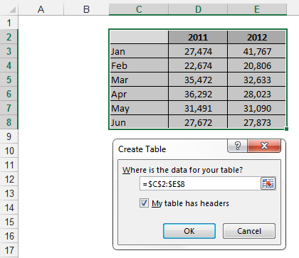
Figure 11-19: Converting a range of data to an Excel table.
After the conversion takes place, notice a few small changes. Excel put drop-down lists in each Header row, the rows in your table now have alternate shading, and any header that didn’t have a value has been named by Excel.
You can use Excel tables as the source for charts, pivot tables, list boxes, or anything else for which you normally use a data range. In Figure 11-20, a bar chart has been linked to the Excel table.

Figure 11-20: Excel tables can be used as source data for charts, pivot tables, named ranges, and so on.
Here’s the impressive bit. When data is added to the table, Excel automatically expands the range of the table and incorporates the new range into any linked object. That’s just a fancy way of saying that any chart or pivot table tied to an Excel table automatically captures new data without manual intervention.
For example, if I add July and August data to the end of the Excel table, the chart automatically updates to capture the new data. In Figure 11-21, I added July with no data and August with data to show you that the chart captures any new records and automatically plots the data given.
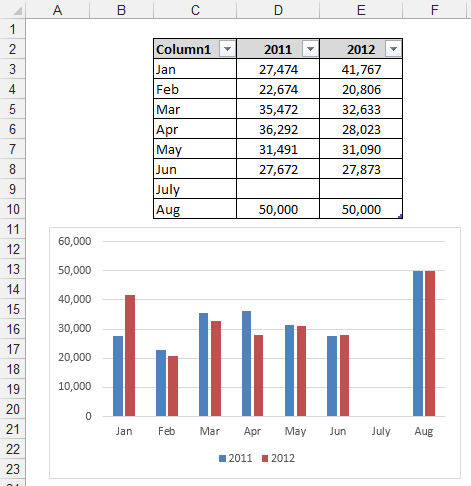
Figure 11-21: An Excel table automatically expands when new data is added.
Take a moment to think about what Excel tables mean to a data model. Pivot tables never have to be reconfigured, charts automatically capture new data, and ranges automatically keep up with changes.
Converting an Excel table back to a range
If you want to convert an Excel table back to a normal range, you can follow these steps:
1. Place your cursor in any cell inside the Excel table and select the Table Tools Design tab in the Ribbon.
2. Choose the Convert to Range command, as shown in Figure 11-22.
3. When asked if you’re sure (via a message box), click Yes.

Figure 11-22: To remove Excel table functionality, convert the table back to a range.
Any object you have connected to the range (pivot tables, charts, and so on) will continue to work. However, they will no longer dynamically update as you add or remove data from the range.