
Forms have been a mainstay of web pages, providing the means to communicate with the server and receive a response, for almost as long as there has been a World Wide Web. However, not much has changed between those original form elements and the XHTML form elements of today. Sure, there are differences, especially when forms were made to conform to XML conscripts. But how the form elements work and interact with the user is still the same.
What has changed, thanks in large part to Ajax technologies, is how the form is used for communication with the server. With Ajax, the client no longer has to refresh the entire page with each form submission. Instead, communication with the server can occur without a refresh, and only the parts of the page requiring an update or refresh get one. As you will see, this only touches on the overall effect Ajax has had on forms. As I go into more detail, you will see the true power of forms in modern web applications.
As I said in the introduction to the chapter, forms did not change much as they moved to XHTML and the world of XML. However, it is important to know the changes and idiosyncrasies of XHTML forms in order to build an accessible and standards-compliant form in an Ajax application.
The available elements that you can use in XHTML forms, according to the XHTML Forms Module (http://www.w3.org/TR/xhtml-modularization/abstract_modules.html#s_extformsmodule), are:
<button> <fieldset>
            <form> <input> <label> <legend>
            <optgroup> <option> <select>
<textarea> |
It’s important to remember when designing a form in XHTML that
a <form> element cannot
contain any of the other XHTML Forms Module elements except for the
<fieldset> element. So, the
following is not XHTML 1.1-compliant:
<form id="myForm" action="self" method="post">
    <label for="user">Username: </label> <input id="user" type="text" value=""
        size="10" />
    <br />
    <label for="pass">Password: </label> <input id="pass" type="password" value=""
        size="10" />
    <br />
    <input type="submit" value="Log In" />
</form>
You would need to change the preceding code to include a block-level element containing the other form elements, like this:
<form id="myForm" action="self" method="post">
    <div id="myFormContainer">
        <label for="user">Username: </label> <input id="user" type="text" value=""
            size="10" />
        <br />
        <label for="pass">Password: </label> <input id="pass" type="password"
            value="" size="10" />
        <br />
        <input type="submit" value="Log In" />
    </div>
</form>
It is also important to note the differences between XHTML and the older HTML versions of the common elements. One important difference is that you cannot minimize attributes, as you could in HTML. For example:
<input id="myCheck1" type="checkbox" value="true" checked />
<label for="myCheck1">Check 1</label>
<input id="myCheck2" type="checkbox" value="true" />
<label for="myCheck2">Check 2</label>

<select id="mySelect" multiple>
    <option value="1" selected>Option 1</option>
    <option value="2">Option 2</option>
</select>

<input id="myReadOnlyText" type="text" value="Read Only text" readonly />
All of these examples are incorrect, and you must change them to:
<input id="myCheck1" type="checkbox" value="true" checked="checked" />
<label for="myCheck1">Check 1</label>
<input id="myCheck2" type="checkbox" value="true" />
<label for="myCheck2">Check 2</label>

<select id="mySelect" multiple="multiple">
    <option value="1" selected="selected">Option 1</option>
    <option value="2">Option 2</option>
</select>

<input id="myReadOnlyText" type="text" value="Read Only text" readonly="readonly" />
Tip
A good source for information on HTML and XHTML is HTML & XHTML: The Definitive Guide, Sixth Edition, by Chuck Musciano and Bill Kennedy (O’Reilly).
You likely know the form elements and are familiar with how they work. However, there is a difference between knowing how to build a form correctly and knowing how to build it accessibly. Using Ajax along with form control is already going to break the normal conventions of how forms should work. By building the form with accessibility in mind, you ensure that when Ajax fails, the form will at least still function correctly for everyone else who is unable to utilize the Ajax built into it.
Accessibility goes beyond what is set in the Web Accessibility Initiative-Web Content Accessibility Guidelines (WAI-WCAG) for forms; you also need to consider the form’s usability. Ajax developers in particular should note the following:
Labeling form elements with proper placement
Creating a proper tab order
Grouping areas of a form together
First things first, though; let’s discuss accessibility in forms.
Your first concern when building a form on a page is where
to place the labels for the <input> and <select> elements. This goes hand
in hand with the usability issue of proper placement of form
labels. Consider Figure 14-1, and where
the labels are placed in this form.
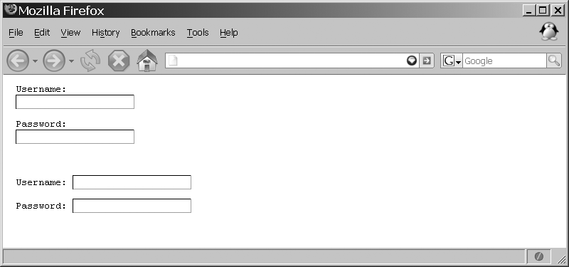
The form elements in Figure 14-1 show two
alternatives for proper placement of the <label> element within the form.
Notice that the label for the text boxes always comes before the
text boxes themselves. This is important, as it helps to indicate
the text boxes’ meaning. It might seem trivial for a page, but
consider the user accessing the application with a screen reader.
Placing the label before the text box clarifies what goes with
what.
This is the XHTML for the second alternative in Figure 14-1:
<p>
    <label for="username">Username: </label>
    <input id="username" type="text" value="" size="20" />
</p>
<p>
    <label for="password">Password: </label>
    <input id="password" type="password" value="" size="20" />
</p>
This differs only slightly from the first alternative. But
notice the use of the <label> element in the snippet.
The <label> element
clearly defines the label for using the for attribute. You can use the <label> element in two ways to
clearly show what it is labeling. I showed the first method in the
preceding code snippet. Here’s the second way:
<p>
    <label for="username">Username:
        <input id="username" type="text" value="" size="20" />
    </label>
</p>
<p>
    <label for="password">Password:
        <input id="password" type="password" value="" size="20" />
    </label>
</p>
In this example, the <label> element surrounds the
<input> element it is
labeling. Both methods are acceptable XHTML code. I prefer the
former method, simply because it’s more flexible in terms of
styling with CSS rules, and it more explicitly defines what it is
labeling.
Tip
Making sure <label> elements are properly
placed with their corresponding <input> elements, and that the
labels explicitly define what they are labeling, satisfies the
following WAI-WCAG 1.0 guidelines:
The position of the <label> element for <input> elements that are checkbox or radio buttons is opposite from what we
just discussed, as shown in Figure 14-2. Here, the
<input> element comes
first, followed by the <label> element that defines
it.
This position more clearly defines what button or checkbox
goes with what label, especially with screen readers. Screen
readers expect the <input> element to appear before
its corresponding <label>
element. With these <input> elements, I also recommend
having the <label>
element surround the <input> element for easier
association with this type of element.
Laying out the form elements in this manner goes a long way
toward form accessibility on the page. But you should take one
more accessibility step for form controls such as <textarea> elements and <input> elements of type image. Some legacy assistive
technologies still need form controls to have some initial text
for them to function properly. Assistive technologies also should
have text equivalents for images used as buttons. For
example:
<p>
    <textarea id="comments" rows="20" cols="80">
    Please enter additional comments here.
    </textarea>
    <input type="submit" value="Send"> <input type="reset">
</p>
This code adds some initial text to the <textarea> so that legacy clients
properly function when they meet this control.
Adding alternative text to an image <input> element works just like
adding alternative text to <img> elements:
<p>
    <input type="image" id="submit" src="button.png" alt="Submit" title="Submit" />
</p>
Tip
Adding place-holding text and alternative text in form controls satisfies the following WAI-WCAG 1.0 guideline:
Priority 3 checkpoint 10.4: Until user agents handle empty controls correctly, include default, place-holding characters in edit boxes and text areas.
You can take even more steps to ensure that the form is as usable as possible. These are minor details in terms of the overall form and the Ajax functionality that will be provided, but details can many times make or break an application.
We’ve already touched on the first point of usability—labeling form elements with a proper placement—as that is the main point of accessibility in forms. You can take some additional measures to ensure that the form is more usable for alternative clients that may visit your application. Better still, these measures will make navigation within your forms easier for all users.
A simple addition to the <input> elements in your forms is
the tabindex attribute, which
defines the order in which tabbing occurs within the page. This
can come in handy when CSS defines where on the screen all of the
form elements are placed and you want to control where tabbing
takes the user between the elements. For example:
<p>
    <label for="street1">Street: </label><input id="street1" type="text"
        value="" size="80" tabindex="1" />
</p>
<p>
    <label for="street2">Street 2: </label><input id="street2" type="text"
         value="" size="80" tabindex="2" />
</p>
<p>
    <label for="city">City: </label><input id="city" type="text" value=""
        size="30" tabindex="3" />
</p>
<p>
    <label for="state">State: </label><input id="state" type="text" value=""
        size="2" tabindex="4" />
</p>
<p>
    <label for="zip">Zip Code: </label><input id="zip" type="text" value=""
        size="9" tabindex="5" />
</p>
<p>
    <label for="country">Country: </label><input id="country" type="text"
        value="" size="20" tabindex="6" />
</p>
Another simple addition is to group common form elements
together not only to create a more logical order, but also to make
it visually obvious which input fields go together in a common
subject. You use the <fieldset> element to group
elements together and the <legend> element to label the
grouping visually for the user. As I mentioned, the <fieldset> element can be a direct
child element of a <form>
element, and is the only form element that can do so. Here is an
example of using a <fieldset> element in a
form:
<fieldset>
    <legend>Address</legend>
    <p>
        <label for="street1">Street: </label><input id="street1" type="text"
            value="" size="80" tabindex="1" />
    </p>
    <p>
        <label for="street2">Street 2: </label><input id="street2" type="text"
            value="" size="80" tabindex="2" />
    </p>
    <p>
        <label for="city">City: </label><input id="city" type="text" value=""
            size="30" tabindex="3" />
    </p>
    <p>
        <label for="state">State: </label><input id="state" type="text" value=""
            size="2" tabindex="4" />
    </p>
    <p>
        <label for="zip">Zip Code: </label><input id="zip" type="text" value=""
            size="9" tabindex="5" />
    </p>
    <p>
        <label for="country">Country: </label><input id="country" type="text"
            value="" size="20" tabindex="6" />
    </p>
</fieldset>
You can see the results of this markup in Figure 14-3. With a
little bit of CSS attached, a form grouped with several <fieldset> elements can look very
impressive, and it can represent a nice change from the same old
forms over and over again.

These two simple additions to a form have the potential to make a very big impact on the overall usability of an Ajax application.
To implement Ajax for use with your XHTML forms, you must rely
on JavaScript to not only find the values of form elements, but also
to build the string of data that will be sent to the server as the
XMLHttpRequest. For this reason, it
is important that you understand the fundamentals of getting and
setting input values from within JavaScript. It is also important to
be able to enhance the default form elements to make them more
functional or more visually appealing.
To enable easier access to the form elements from within the
Document Object Model (DOM), you can use the Form object. This object enables
developers to parse any <form> element by calling its
name attribute value to access
the value associated with the name. Following the form in Example 14-1 are some examples
of how to access elements.
Example 14-1. Sample form to illustrate JavaScript manipulation
<!DOCTYPE html PUBLIC "-//W3C//DTD HTML 4.01//EN"
    "http://www.w3.org/TR/html4/strict.dtd">
<html>
    <head>
        <title>
            Example 14-1. Sample form to illustrate JavaScript manipulation.
        </title>
        <meta http-equiv="content-type" content="text/xml; charset=utf-8" />
    </head>
    <body>
        <form id="myForm" name="myForm" action="self" method="post">
            <div>
                <label for="birthMonth">Month: </label>
                <select id="birthMonth" name="birthMonth">
                    <option value="1">January</option>
                    <option value="2">February</option>
                    <option value="3">March</option>
                    <option value="4">April</option>
                    <option value="5">May</option>
                    <option value="6">June</option>
                    <option value="7">July</option>
                    <option value="8">August</option>
                    <option value="9">September</option>
                    <option value="10">October</option>
                    <option value="11">November</option>
                    <option value="12">December</option>
                </select>
                <label for="birthDay">Day: </label>
                <select id="birthDay" name="birthDay">
                    <option value="1">1</option><option value="2">2</option>
                    <option value="3">3</option><option value="4">4</option>
                    <option value="5">5</option><option value="6">6</option>
                    <option value="7">7</option><option value="8">8</option>
                    <option value="9">9</option><option value="10">10</option>
                    <option value="11">11</option><option value="12">12</option>
                    <option value="13">13</option><option value="14">14</option>
                    <option value="15">15</option><option value="16">16</option>
                    <option value="17">17</option><option value="18">18</option>
                    <option value="19">19</option><option value="20">20</option>
                    <option value="21">21</option><option value="22">22</option>
                    <option value="23">23</option><option value="24">24</option>
                    <option value="25">25</option><option value="26">26</option>
                    <option value="27">27</option><option value="28">28</option>
                    <option value="29">29</option><option value="30">30</option>
                    <option value="31">31</option>
                </select>
                <label for="birthYear">Year: </label> <input id="birthYear"
                    name="birthYear" type="text" value="" size="4" />
            </div>
            <div>
                <div>Choose all that apply:</div>
                <label for="chkHighSchool"><input id="chkHighSchool"
                        name="chkHighSchool" type="checkbox" value="1" />
                    High School/GED
                </label><br />
                <label for="chkSomeCollege"><input id="chkSomeCollege"
                        name="chkSomeCollege" type="checkbox" value="2" />
                    Some College
                </label><br />
                <label for="chkCollegeDegree"><input id="chkCollegeDegree"
                        name="chkCollegeDegree" type="checkbox" value="4" />
                    College Degree
                </label><br />
                <label for="chkGradSchool"><input id="chkGradSchool"
                        name="chkGradSchool" type="checkbox" value="8" />
                    Graduate School
                </label><br />
                <label for="chkPhD"><input id="chkPhD" name="chkPhD"
                        type="checkbox" value="16" />
                    PhD
                </label><br />
                <label for="chkJD"><input id="chkJD" name="chkJD" type="checkbox"
                        value="32" />
                    JD
                </label><br />
                <label for="chkMD"><input id="chkMD" name="chkMD" type="checkbox"
                        value="64" />
                    MD
                </label>
            </div>
            <div>
                <div>Marital Status:</div>
                <label for="radSingle"><input id="radSingle"
                        name="maritalStatus" type="radio" value="1" />
                    Single
                </label><br />
                <label for="radMarried"><input id="radMarried"
                        name="maritalStatus" type="radio" value="2" />
                    Married
                </label><br />
                <label for="radWidowed"><input id="radWidowed"
                        name="maritalStatus" type="radio" value="3" />
                    Widowed
                </label><br />
                <label for="radDivorced"><input id="radDivorced"
                        name="maritalStatus" type="radio" value="4" />
                    Divorced
                </label><br />
                <label for="radOther"><input id="radOther"
                        name="maritalStatus" type="radio" value="5" />
                    Other
                </label>
            </div>
            <div>
                <input type="submit" value="Submit Information" />
                <input type="reset" value="Reset Form" />
            </div>
        </form>
    </body>
</html>
The form is not very clear in its purpose, but the point is to demonstrate the different form element types, which it does—there are drop downs, text boxes, checkboxes, radio buttons, and form buttons. Here are the examples of using JavaScript to access the values of certain elements and to programmatically set their values:
/* This gets the value for the month drop down */
document.myForm.birthMonth.value

/* This gets whether the grad school checkbox is checked */
document.myForm.chkGradSchool.checked

/* This gets the year value for the text box */
document.forms[0].birthYear.value

/* This also gets the year value for the text box */
document.forms[0].elements[2].value

/* This submits the form to the appropriate place */
document.myForm.submit( )

/* This checks the value of the college degree checkbox */
document.myForm.chkCollegeDegree.checked == true

/* This toggles the marital status to the Married button */
document.forms[0].maritalStatus[1].checked = true
Tip
You may have noticed that the form elements (with the
exception of the <form>
element itself) have both an id
attribute and a name attribute
that are, except for the radio buttons, the same value. If you do
not know why, this will become apparent once we discuss Ajax more
fully within the form.
Table 14-1 shows the
properties that are exposed with the Form object. Besides these properties, the
Form object also has two methods:
submit( ) and reset( ). The <input> elements of type text and the <textarea> elements have the extra
methods that the other form elements do not: focus( ), blur( ), and select( ).
Table 14-1. The properties of the Form object
Property | Description |
|---|---|
| This is the |
| This is the |
| This is the number of elements that are in the form (read-only). |
| This is the |
| This is the |
It’s all very simple, right? Well, the only problem is that
XHTML began to deprecate the name
attribute for certain elements: <a>,
<applet>, <form>, <frame>, <iframe>,
<img>, and <map>. You can find more information
on the reasoning behind this move on the W3C web site, at http://www.w3.org/TR/xhtml1/#h-4.10. When XHTML 1.1
was introduced, the name
attribute was completely removed in these elements. Now, without the
name attribute associated with
the <form> element, the
Form object is rendered pretty
much useless unless you know the index of the form in your
application.
Warning
It is still completely legitimate to access a form by using
the index for the form, as in document.forms[1]. The downside of this
is that the developer must keep track of the position of a form in
the DOM document to do this. The more complicated a page with
multiple forms, the easier it is to make a mistake on the
index.
The more common approach, at least with XHTML developers, is
to access the form elements directly using their id attribute, or to loop through the
childNodes of the form by using
its id attribute to seek the
desired child element. Directly accessing elements is faster,
simpler, and cleaner. Besides, with the introduction of document.getElementById( ), it is the XML
DOM way. The following code gets the same values as we got
before:
/* This gets the value for the month drop down */
document.getElementById('birthMonth').value

/* This gets whether the grad school checkbox is checked */
document.getElementById('chkGradSchool').checked

/* This still works even with the /name/ attribute gone */
document.forms[0].birthYear.value

/* This also still works even with the /name/ attribute gone */
document.forms[0].elements[2].value

/* This submits the form to the appropriate place */
document.getElementById('myForm').submit( )

/*
 * This uses Prototype's /$( )/ function to check the value of the college
 * degree checkbox
 */
$('chkCollegeDegree').checked = true

/* This also still works even with the /name/ attribute gone */
document.forms[0].maritalStatus[1].checked = true
Admittedly, it can be a pain to set a unique id attribute on every element within the
form instead of using the name
attribute on these elements as HTML designed them. It does, however,
allow for greater flexibility in how to use the values that are
obtained. This is especially true of the values of <input> elements of type checkbox and radio, as well as drop downs (both single
and multiselect). Example 14-2 shows how you can
use a simple bit of parsing by the client to create a
comma-delimited string of values based on the user’s input.
Example 14-2. Utilizing the flexibility of the id attribute in form elements
<script type="text/javascript">
    //<![CDATA[
    /**
     * This function, checkboxesToString, takes the passed /p_formId/ and gets
     * all <input> elements within the form as an /Array/.  It then finds the
     * /checkbox/ types with a /p_className/ value and adds any checked element
     * to the string to be returned.
     *
     * @param {String} p_formId The string id of the form with the checkboxes.
     * @param {String} p_className The name of the class the checkboxes belong to.
     * @return A comma-delimited string of the checked checkboxes.
     * @type String
     * @see Element#hasClassName
     */
    function checkboxesToString(p_formId, p_className) {
        var retval = '';
        /* Use the id of the form to get a list of <input> elements it contains */
        var inputs = $(p_formId).getElementsByTagName('input'),

        /* Loop through the list of <input> elements */
        for (var i = 0, il = inputs.length; i < il; i++)
            /* Does this element contain the desired className? */
            if (Element.hasClassName(inputs[i], p_className))
                /* Is this checkbox checked? */
                if (inputs[i].checked)
                    /* Should a comma be added? */
                    if (retval.length > 1) {
                        retval += ',';
                    retval += inputs[i].value;
                }
        return (retval);
    }
    //]]]>
</script>
Example 14-2 showed a simple way to collect the values associated with the checked boxes. Example 14-3 takes a similar approach to parsing a multiselect drop down.
Example 14-3. Preparing a drop down for the addition of Ajax
<script type="text/javascript">
    //<![CDATA[
    /**
     * This function, saveDropDownValues, takes the passed /p_dropDownId/ and
     * gets all <option> elements within the drop down as an /Array/.  It then
     * adds any selected element to the string to be set in the passed
     * /p_hiddenInputId/.
     *
     * @param {String} p_dropDownId The string id of the drop down.
     * @param {String} p_hiddenInputId The string id of the hidden input that will
     *     get the value.
     * @return Returns false so that no other event is fired after this.
     * @type Boolean
     */
    function saveDropDownValues(p_dropDownId, p_hiddenInputId) {
        var value = '';
        /*
         * Use the id of the drop down to get a list of <option> elements it
         * contains
         */
        var options = $(p_dropDownId).getElementsByTagName('option'),

        /* Loop through the list of <option> elements */
        for (var i = 0, il = options.length; i < il; i++)
            /* Is this option selected? */
            if (outputs[i].selected)
                /* Should a comma be added? */
                if (value.length > 1) {
                    value += ',';
                value += outputs[i].value;
                }
        $(p_hiddenInputId).value = value;
        return (false);
    }
    //]]]>
</script>
This simply loops through the list of <option> elements contained within
the <select> element every
time the user clicks to keep a hidden <input> element up-to-date with the
value of the drop down.
Parsing forms is not exactly hard work—the tools were given
to us in the DOM itself. To make parsing forms even less of a
burden on the developer, Prototype includes the $F( ) function to access the value of
any form element on a page by simply providing the element’s
id value or the element itself.
For example:
/* This gets the value for the month drop down */
$F('birthMonth')

/* This still works even with the /name/ attribute gone */
$F('birthYear')
It is important to remember that this function is read-only, and you can use it only to get values. To set the value of a form element, you must still use the preferred DOM method:
$('chkCollegeDegree').checked = trueThis can simplify the code from Example 14-3 even more.
Example 14-4 shows the
changes needed for using the $F(
) function on this example.
Example 14-4. Using the $F( ) function on Example 14-3
<script type="text/javascript">
//<![CDATA[
/**
* This function, saveDropDownValues, takes the passed /p_dropDownId/ and
* gets all <option> elements within the drop down as an /Array/. It then
* adds any selected element to the string to be set in the passed
* /p_hiddenInputId/.
*
* @param {String} p_dropDownId The string id of the drop down.
* @param {String} p_hiddenInputId The string id of the hidden input that will
* get the value.
* @return Returns false so that no other event is fired after this.
* @type Boolean
*/
function saveDropDownValues(p_dropDownId, p_hiddenInputId) {
var value = '';
/*
* Use the id of the drop down to get a list of <option> elements it
* contains
*/
var options = $(p_dropDownId).getElementsByTagName('option'),
/* Loop through the list of <option> elements */
for (var i = 0, il = options.length; i < il; i++)
/* Is this option selected? */
if (outputs[i].selected)
/* Should a comma be added? */
if (value.length > 1) {
value += ',';
value += $F(outputs[i]);
}
$(p_hiddenInputId).value = value;
return (false);
}
//]]]>
</script>Throughout the rest of this book, I will use the Prototype
$F(
            )
function whenever
possible to deal with form values—it saves on typing and
space!
Forms are meant to be a functional means of communication between the client and the server, but that does not mean they always have to have the default appearance. You can access and manipulate some form elements through CSS rules. Others you must completely fake to change their appearance. Sometimes these fancy forms are meant to give the user new or different functionality, and in these cases, “faking” the form is the only option.
Looking back at Figure 14-3, you can see that you can manipulate a form to improve its appearance, or at least to make it look different. The CSS that created this figure follows:
input {
    border: 1px inset #669;
    font: 1em 'Garamond';
}

fieldset {
    background-color: #039;
    border: 1px inset #fff;
    color: #fff;
}

fieldset label {
    float: left;
    padding-right: 5px;
    text-align: right;
    width: 100px;
}

fieldset label[for='street2'] {
    visibility: hidden;
}

fieldset legend {
    margin-left: 1em;
    font-size: 1.4em;
    font-weight: bold;
}

fieldset p {
    margin: 4px 0;
}
You can use the techniques in Chapter 7 for making fancy buttons to also create better-looking forms. Sometimes, however, CSS will not be enough to blend the form controls naturally with the theme of the rest of the application. When these cases arise, the developer is forced to create a custom control to do the job.
Radio buttons and checkboxes are form controls that are notorious for not allowing the developer to alter their look with CSS rules. For this reason, it is sometimes necessary to replace these default controls with custom ones. The first thing the developer should do is create the image that is to replace the control.
Figure 14-4 shows an example of the image that we will use for a custom checkbox. The image needs to have a separate frame for each state that the control will take. Radio buttons and checkboxes have the following states:
Unchecked
Checked
Unchecked and disabled
Checked and disabled

The custom control will be an object that will need several things sent to it when it is first created. First it needs to know whether the control will be a radio button or a checkbox. It will also need to know the source of the image that will represent the control. Following that should be the optional parameters that the control can take in the form of an object. Table 14-2 lists these parameters.
Table 14-2. The properties for our custom radio button and checkbox control
Description | Default value | |
|---|---|---|
| This property tells
the control what the default value should be. It is used
to initialize the control and to reset the control’s
value. Possible values are |
|
| This property defines the height of the image that acts as the radio button or checkbox for the control. |
|
| This property tells
the control what its unique | None |
| This property sets a label to be used to identify the control to the user. | None |
| This property is a
callback function to be fired when the value of the
control changes. The control is passed as the parameter
| None |
| This property is a
callback function to be fired when the user clicks the
control. The control is passed as the parameter | None |
| This property tells
the control what state it is in. Possible values are
|
|
| This property defines the width of a frame of the image that acts as the radio button or checkbox for the control. |
|
This should adequately define the control that needs to be
created, and that is all our control should do when it is
instantiated: create all of the internal pieces. A display( ) method will actually place
the control in the page document. Example 14-5 shows what
the custom form control will look like.
Example 14-5. A custom radio button and checkbox form control
/*
 * Example 14-5. A custom radio button and checkbox form control.
 */

/* Create custom globals to define the types of control */
var CUSTOM_RADIO = 0;
var CUSTOM_CHECKBOX = 1;

/**
 * This object, customRadioCheckControl, gives the developer a custom control for
 * building radio buttons and checkboxes that give all of the functionality of
 * these form controls without being bound to the default controls' constraints.
 */
var customRadioCheckControl = Class.create( );
customRadioCheckControl.prototype = {
    /**
     * This member, _type, defines the type of custom control this control is.
     * @member customRadioCheckControl
     * @type Integer
     */
    _type: CUSTOM_RADIO,
    /**
     * This member, _image, holds the preloaded image for the control.
     * @member customRadioCheckControl
     * @type Object
     */
    _image: null,
    /**
     * This member, checked, allows the developer to know whether the control has
     * been checked or not.
     * @member customRadioCheckControl
     * @type Boolean
     */
    checked: false,
    /**
     * This member, _options, is the set of properties that further defines the
     * custom control.
     * @member customRadioCheckControl
     * @type Object
     */
    _options: null,
    /**
     * This member, _displayed, defines whether or not that control has been
     * displayed to the user.
     * @member customRadioCheckControl
     * @type Boolean
     */
    _displayed: false,
    /**
     * This method, initialize, is the constructor for the object and initializes
     * it so that it is ready to be displayed to the user when called upon by the
     * developer.
     *
     * @member customRadioCheckControl
     * @param {Integer} p_type The type of control that is to be created.
     * @param {String} p_src The src of the image to be used by the control to
     *     display the radio button or checkbox.
     * @param {Object} p_options An object of options to further define the custom
     *     control.
     * @see #_setOptions
     */
    initialize: function(p_type, p_src, p_options) {
        this._type = p_type;
        this._setOptions(p_options);

        /* Preload the image for faster load times */
        this._image = new Image(this._options.width, this._options.height);
        this._image.src = p_src;
        this.checked = ((this._options.defaultValue == 'checked') ? true : false);
    },
    /**
     * This method, _setOptions, takes the passed /p_options/ object and sets these
     * values to the control's _options member.
     *
     * @param {Object} p_options An object of options to further define the custom
     *     control.
     * @see #initialize
     * @see Object#extend
     */
    _setOptions: function(p_options) {
        this._options = {
            id: 'customRadioCheck',
            label: '',
            defaultValue: 'unchecked',
            state: 'enabled',
            width: 20,
            height: 20,
            onClick: null,
            onChange: null
        };
        Object.extend(this._options, p_options || {});
    },
    /**
     * This method, _positionImage, moves the custom control's image by the amount
     * needed to display the correct state of the control.
     *
     * @member customRadioCheckControl
     * @see #initialize
     * @see #_toggleValue
     */
    _positionImage: function( ) {
        /* Is the state of the control /enabled/? */
        if (this._options.state == 'enabled') {
            $(this._options.id + '_img').style.backgroundPosition =
                ((this.checked) ? (-1 * this._options.width) : 0) + 'px 0';
        } else
            $(this._options.id + '_img').style.backgroundPosition = (-1 * ((2 *
                this._options.width) + ((this.checked)) ?
                this._options.width : 0)) + 'px 0';
    },
    /**
     * This method, _toggleValue,
     *
     * @member customRadioCheckControl
     * @param {Boolean} p_value The optional value to set the control to.
     * @see #_positionImage
     * @see #onChange
     */
    _toggleValue: function(p_value) {
        /* Was a /p_value/ passed to the method? */
        if (p_value)
            this.checked = p_value;
        else
            this.checked = !this.checked;
        this._positionImage( );
        this.onChange( );
    },
    /**
     * This method, _createEvents, sets an /onclick/ event on the custom control.
     *
     * @member customRadioCheckControl
     * @see Event#observe
     */
    _createEvents: function( ) {
        /* Was an id passed? */
        if (this._options.id)
            Event.observe($(this._options.id), 'click', this.onClick.bind(this),
                false);
    },
    /**
     * This method, onClick, is the event handler for the /onclick/ event on the
     * control.  It toggles the value of the control and calls the developer-
     * defined callback, if one exists, passing it the object.
     *
     * @member customRadioCheckControl
     * @see #_toggleValue
     * @see Prototype#emptyFunction
     */
    onClick: function( ) {
        this._toggleValue( );
        try {
            (this._options['onClick'] || Prototype.emptyFunction)(this);
        } catch (ex) {
            /* An exception handler could be called here */
        }
    },
    /**
     * This method, onChange, is the event handler for the /onchange/ event on the
     * control.  It is fired when the object has been toggled, and calls the
     * developer-defined callback, if one exists, passing it the object.
     *
     * @member customRadioCheckControl
     * @see #_toggleValue
     * @see Prototype#emptyFunction
     */
    onChange: function( ) {
        try {
            (this._options['onChange'] || Prototype.emptyFunction)(this);
        } catch (ex) {
            /* An exception handler could be called here */
        }
    },
    /**
     * This method, reset, allows the developer to reset the control to its
     * original state.
     *
     * @member customRadioCheckControl
     * @see #_toggleValue
     */
    reset: function( ) {
        this.checked = ((this._options.defaultValue == 'checked') ? true : false);
        this._toggleValue(this.checked);
    },
    /**
     * This method, display, is the method called by the developer when and where
     * it is to be placed into the page document.  Once displayed, it cannot be
     * displayed again, but only reset.
     *
     * @member customRadioCheckControl
     * @see #createEvents
     */
    display: function( ) {
        /* Has the control been displayed already? */
        if (!this._displayed) {
            /*
             * This will be the variable that will hold the display for the
             * control
             */
            var control = '';

            control += '<div id="' + this._options.id +
                '" class="customRadioCheck">';
            control += '<div id="' + (this._options.id + '_img') + '"></div>';
            /* Is there a label? */
            if (this._options.label)
                control += '<div class="label">' + this._options.label + '</div>';
            control += '</div>';
            /* Place the control in the document */
            document.write(control);
            /* Configure the check box or radio button */
            $(this._options.id + '_img').style.overflow = 'hidden';
            $(this._options.id + '_img').style.width = this._options.width + 'px';
            $(this._options.id + '_img').style.height =
                this._options.height + 'px';
            $(this._options.id + '_img').style.background = 'url('' +
                this._image.src + '') no-repeat';
            /* Position the image where it needs to be */
            this._positionImage( );
            /* Is there a label? */
            if (this._options.label) {
                /* Position the label next to the checkbox or radio button */
                $(this._options.id).childNodes[1].style.paddingLeft =
                    (this._options.width + 5) + 'px';
                $(this._options.id).childNodes[1].style.marginTop = (-1 *
                    (this._options.height - 2)) + 'px';
            }
            $(this._options.id).style.display = 'inline';
            this._createEvents( );
            this._displayed = true;
        }
    }
};
To add our control to a page, first we should create the object with the appropriate parameters:
<script type="text/javascript">
    //<![CDATA[
    var checkBox1 = new customRadioCheckControl(CUSTOM_CHECKBOX, '', {
        id: 'checkBox1',
        label: 'Checkbox Option 1',
        onClick: function(p_control) {
            alert(p_control.checked);
        }
    });
    //]]>
</script>
Then, within the page, add the control where it needs to be placed:
<script type="text/javascript">
    //<![CDATA[
    checkBox1.display( );
    //]]>
</script>
Figure 14-5 shows what this might look like within a web application.

In much the same way that radio buttons and checkboxes lack CSS support, drop-down controls have similar problems, albeit not as bad. The biggest drawback to the default drop-down object is that it gets rendered badly in Internet Explorer 6 and earlier. Do you remember Figure 10-5 in Chapter 10? This is the problem we want to fix.
Creating a fake drop down is not so much about creating images (though one is required); rather, it is more about control of the element involved, that is, having CSS control over the items in the drop down, the look of the “down” button, and so on. First, as with the creation of the radio button and checkbox control, we need to create an image to handle the button that controls the drop down. Figure 14-6 shows what this image would look like.

Next, we need to build the object. The parameters that we should pass to it are the source of the button image, and then an object of optional parameters. Table 14-3 lists what these options could be.
Table 14-3. The list of properties for our custom drop-down control
Property | Description | Default value |
|---|---|---|
| This property defines the background color for the drop-down control. |
|
| This property defines the border color for the drop-down control. |
|
| This property defines the color for the font in the drop-down control. |
|
| This property defines the height of the image that acts as the drop-down button for the control. |
|
| This property defines the highlight color for the drop-down control. |
|
| This property tells
the control what its unique |
|
| This property sets a label to be used to identify the control to the user. | None |
| This property is a
callback function to be fired when the value of the
control changes. The control is passed as the parameter
| None |
| This property is a
callback function to be fired when the user clicks the
control. The control is passed as the parameter | None |
| This property tells
the control what state it is in. Possible values are
|
|
| This property defines the width of a frame of the image that acts as the drop-down button for the control. |
|
This is all we need to pass to the control. The object must also be able to accept adding new options to the control, and it needs a method to display the control to the user on the page. Example 14-6 shows our new object.
Example 14-6. A custom drop-down object
/*
 * Example 14-6. A custom drop-down object.
 */

/**
 * This object, customDropDownControl, gives the developer a custom control for
 * building drop-down controls that give all of the functionality of this form
 * control without being bound to the default control's constraints.
 *
 * This control requires the Prototype Framework Version 1.5.0.
 */
var customDropDownControl = Class.create( );
customDropDownControl.prototype = {
    /**
     * This member, _options, is the set of properties that further define the
     * custom control.
     * @member customDropDownControl
     * @type Object
     */
    _options: null,
    /**
     * This member, _selected, holds the text value of the selected option.
     * @member customDropDownControl
     * @type String
     */
    _selected: '',
    /**
     * This member, _src, holds the string for the image controlling the custom
     * control.
     * @member customDropDownControl
     * @type String
     */
    _src: '',
    /**
     * This member, _value, holds the current value of the custom control.
     * @member customDropDownControl
     * @type Mixed
     */
    _value: '',
    /**
     * This method, initialize, is the constructor for the object and initializes
     * it so that it is ready to be displayed to the user when called upon by the
     * developer.
     *
     * @member customDropDownControl
     * @constructor
     * @param {String} p_src The name of the image file source for the control.
     * @param {Object} p_options  An object of options to further define the
     *     custom control.
     * @see #setOptions
     */
    initialize: function(p_src, p_options) {
        this._setOptions(p_options);
        this._src = p_src;
    },
    /**
     * This member, _setOptions, takes the passed /p_options/ object and sets these
     * values to the control's _options member.
     *
     * @member customDropDownControl
     * @param {Object} p_options An object of options to further define the custom
     *     control.
     * @see #initialize
     * @see Object#extend
     */
    _setOptions: function(p_options) {
        this._options = {
            background: '#fff',
            border: '#000',
            color: '#000',
            height: 20,
            highlight: '#ccc',
            id: 'customDropDown',
            label: '',
            onClick: null,
            onChange: null,
            state: 'up',
            width: 20
        };
        Object.extend(this._options, p_options || {});
    },
    /**
     * This method, _positionImage, moves the custom control's image by the amount
     * needed to display the correct state of the control.
     *
     * @member customDropDownControl
     * @see #initialize
     * @see #changeValue
     * @see #onActivate
     * @see #display
     * @see Element#setStyle
     */
    _positionImage: function( ) {
        $(this._options.id + '_img').setStyle({
            backgroundPosition: ((this._options.state == 'down') ? (-1 *
                this._options.width) : 0) + 'px 0'
        });
    },
    /**
     * This member, _changeValue, changes the value of the control to the clicked
     * value in the control, then closes the options available.
     *
     * @member customDropDownControl
     * @param {Object} e The event object that triggered this event.
     * @see #onClick
     * @see Element#setStyle
     */
    _changeValue: function(e) {
        e = ((e) ? e : window.event);
        var src = ((e.target) ? e.target: e.srcElement);

        /* Is the state of the control 'down'? */
        if (this._options.state == 'down') {
            var className = src.className;
            var change = false;

            this._selected = src.innerHTML;
            if (this._value == className.substring(className.indexOf('v') + 1))
                change = true;
            this._value = className.substring(className.indexOf('v') + 1);
            $((this._options.id + '_selected')).innerHTML = this._selected;
            this._options.state = 'up';
            $((this._options.id + '_options')).setStyle({ display: 'none' });
            this._positionImage( );
            $((this._options.id + '_ctrl')).setStyle({
                backgroundColor: this._options.background
            });
            if (change)
                this.onChange( );
        }
    },
    /**
     * This method, _createEvents, sets an onclick event for the control's image
     * 'button'.
     *
     * @member customDropDownControl
     * @see #display
     * @see Event#observe
     * @see #onActivate
     */
    _createEvents: function( ) {
        /* Was an id passed? */
        if (this._options.id) {
            Event.observe($((this._options.id + '_img')), 'click',
                this.onActivate.bind(this), false);
        }
    },
    /**
     * This method, _createCSS, sets all of the CSS rules for the control for the
     * look and feel of the custom control.
     *
     * @member customDropDownControl
     * @see #display
     * @see Position#positionedOffset
     * @see Element#getDimensions
     * @see Element#setStyle
     */
    _createCSS: function( ) {
        /* Set the CSS rules for the control's label */
        $((this._options.id + '_label')).setStyle({
            float: 'left',
            paddingRight: '5px',
            display: 'inline'
        });

        /* Get the position for where the control needs to go */
        var pos = Position.positionedOffset($((this._options.id + '_label')));
        var dims = $((this._options.id + '_label')).getDimensions( );

        /* Set the CSS rules for the control itself */
        $((this._options.id + '_ctrl')).setStyle({
            backgroundColor: this._options.background,
            border: '2px inset ' + this._options.border,
            float: 'left',
            height: '1.15em',
            left: pos[0] + dims.width + 'px',
            padding: '2px 1px 2px 5px',
            position: 'absolute',
            top: (pos[1] - 4) + 'px',
            verticalAlign: 'middle',
            width: this._options.width + 'px'
        });
        /* Set the CSS rules for the control's image button */
        $((this._options.id + '_img')).setStyle({
            background: 'transparent url('' + this._src+ '') no-repeat',
            float: 'left',
            height: this._options.height + 'px',
            margin: '-2px 1px 0',
            overflow: 'hidden',
            width: this._options.width + 'px'
        });
        /* Set the CSS rules for the control's selected option */
        $((this._options.id + '_selected')).setStyle({
            fontWeight: 'bold',
            margin: '0 0 0 -1.75em',
            position: 'relative'
        });

        var dims2 = $((this._options.id + '_ctrl')).getDimensions( );

        /* Set the CSS rules for the control's options */
        $((this._options.id + '_options')).setStyle({
            backgroundColor: this._options.background,
            border: '1px solid ' + this._options.border,
            display: 'none',
            height: '1.15em',
            left: pos[0] + dims.width + 'px',
            overflow: 'auto',
            position: 'absolute',
            top: (pos[1] + dims2.height − 4) + 'px',
            width: (this._options.width + 8) + 'px',
            zIndex: '9000'
        });
    },
    /**
     * This method, onActivate, opens and closes the options of the control based
     * on their current state, also highlighting or removing the highlight on the
     * background.
     *
     * @member customDropDownControl
     * @see Element#setStyle
     * @see Element#getElementsByClassName
     * @see #_positionImage
     */
    onActivate: function( ) {
        /* Is the current state /down/? */
        if (this._options.state == 'down') {
            this._options.state = 'up';
            $((this._options.id + '_options')).setStyle({ display: 'none' });
            $((this._options.id + '_selected')).innerHTML = this._selected;
            $((this._options.id + '_ctrl')).setStyle({
                backgroundColor: this._options.background
            });
        } else {
            this._options.state = 'down';
            $((this._options.id + '_options')).setStyle({ display: 'block' });
            $((this._options.id + '_ctrl')).setStyle({
                backgroundColor: this._options.highlight
            });

            /* Loop through the options and blank the background */
            for (var i = 0, il =
                    $((this._options.id + '_options')).childNodes.length; i < il;
                    i++)
                $((this._options.id + '_options')).setStyle({
                    backgroundColor: this._options.background
                });

            var divElements = $((this._options.id + '_options')).childNodes[0];

            /* Does the options part of the control have options? */
            if (divElements && this._value) {
                var value = Element.getElementsByClassName($((this._options.id +
                    '_options')), 'v' + this._value)[0];

                value.setStyle({ backgroundColor: this._options.highlight });
            }
        }
        this._positionImage( );
    },
    /**
     * This method, onClick, is called whenever one of the options is clicked on by
     * the user, changing the value of the control and calling any user-defined
     * function on the callback.
     *
     * @member customDropDownControl
     * @param {Object} e This is the event that is calling the method.
     * @see #_changeValue
     * @see #addOption
     * @see Prototype#emptyFunction
     */
    onClick: function(e) {
        this._changeValue(e);
        try {
            (this._options['onClick'] || Prototype.emptyFunction)(this);
        } catch (ex) {
            /* An exception handler could be called here */
        }
    },
    /**
     * This method, onChange, is called whenever the value of the control changes,
     * calling any user-defined function on the callback.
     *
     * @member customDropDownControl
     * @see #_changeValue
     * @see Prototype#emptyFunction
     */
    onChange: function( ) {
        try {
            (this._options['onChange'] || Prototype.emptyFunction)(this);
        } catch (ex) {
            /* An exception handler could be called here */
        }
    },
    /**
     * This method, getValue, is used to get the value of the control whenever
     * needed.
     *
     * @member customDropDownControl
     */
    getValue: function( ) {
        return this._value;
    },
    /**
     * This method, addOption, is used to add a new option to the control to be
     * viewed by the user. Once the new option is added, the option and control is
     * resized to accommodate the new option, if needed.
     *
     * @member customDropDownControl
     * @param {String} p_option The text for the new option.
     * @param {String} p_value The value for the new option.
     * @see Element#setStyle
     * @see Element#getDimensions
     */
    addOption: function(p_option, p_value) {
        var newElement = document.createElement('div'),
        var textOption = document.createTextNode(p_option);

        newElement.appendChild(textOption);
        newElement.setAttribute('onclick', this._options.id + '.onClick(event);'),
        newElement.setAttribute('onmouseover', 'this.style.backgroundColor = '' +
            this._options.highlight + '''),
        newElement.setAttribute('onmouseout', 'this.style.backgroundColor = '' +
            this._options.background + '''),
        newElement.setAttribute('class', 'v' + p_value);
        $((this._options.id + '_options')).appendChild(newElement);

        var width = this._options.width;
        /* Create a temporary <div> element to get the dimensions, then remove it */
        var tempElement = document.createElement('div'),
        var tempTextOption = document.createTextNode(p_option);

        tempElement.appendChild(tempTextOption);
        $('holding').appendChild(tempElement);
        tempElement.setStyle({ display: 'inline' });

        var dims = tempElement.getDimensions( );

        $('holding').removeChild(tempElement);
        /* Should the width be changed? */
        if (dims.width > width)
            width = dims.width

        /* Calculate the height based on the number of options */
        var height = (1.25 * $((this._options.id + '_options')).childNodes.length);

        height = ((height <= 10) ? height : 10);
        $((this._options.id + '_options')).setStyle({
            height: height + 'em',
            width: (width + 35) + 'px'
        });
        $((this._options.id + '_ctrl')).setStyle({
            width: (width + 27) + 'px'
        });
        $((this._options.id + '_img')).setStyle({
            position: 'relative',
            left: (width + this._options.width − 14) + 'px'
        });
    },
    /**
     * This method, display, is used to initially display the control to the user;
     * it is empty until options are added to it.
     *
     * @member customDropDownControl
     * @see #_createCSS
     * @see #_positionImage
     * @see #_createEvents
     */
    display: function( ) {
        /* Has the control been displayed already? */
        if (!this._displayed) {
            /*
             * This will be the variable that will hold the display for the
             * control
             */
            var control = '';

            control += '<div id="' + this._options.id + '" class="customDropDown">';
            /* Is there a label? */
            if (this._options.label)
                control += '<div id="' + (this._options.id + '_label') +
                    '" class="label">' + this._options.label + '</div>';
            control += '<div id="' + (this._options.id + '_ctrl') + '">';
            control += '<div id="' + (this._options.id + '_img') + '"></div>';
            control += '<span id="' + (this._options.id + '_selected') + '">' +
                this._selected + '</span>';
            control += '</div>';
            control += '<div id="' + (this._options.id + '_options') + '">';
            control += '</div>';
            control += '</div>';
            /* Place the control in the document */
            document.write(control);
            this._createCSS( );
            this._positionImage( );
            this._createEvents( );
            this._displayed = true;
        }
    }
};
Just as with our first custom control, we need to instantiate the new drop-down control before we can use it:
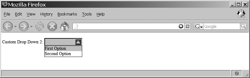
<script type="text/javascript">
    //<![CDATA[
    var myDrop = new customDropDownControl('dropdown.png', {
        id: 'myDrop',
        label: 'Custom Drop Down: ',
        width: 20,
        height: 20,
        onClick: function(p_control) {
            /* Do anything you want here */
        }
    });
    //]]>
</script>
Then we should add options, and the new object should be displayed to the user:
<script type="text/javascript">
    //<![CDATA[
    myDrop.display( );
    myDrop.addOption('First Option', 1);
    myDrop.addOption('Second Option', 2);
    //]]>
</script>
Figure 14-7 shows what this looks like in a web browser.
Creating your own custom controls is all well and good, but custom form objects are available within a couple of the libraries and toolkits I discussed earlier in this book—namely, Dojo and Zapatec. Both of these provide their own ways of creating form elements that make it so that the developer has less to think about when creating a form in an Ajax application.
The Dojo Toolkit has its own widgets for building form
elements (and the form itself), contained in the dojo.widget.HtmlWidget object. These
widgets, listed in Table 14-4, allow you to
create customized form elements that are better than the default
elements available to the browser.
Table 14-4. Widgets available to the dojo.widget.HtmlWidget object
Description | |
|---|---|
| This widget is
built to be displayed in high-contrast mode (a mode that
does not display CSS background images). It contains a
variation of the |
| This widget is a
normal XHTML button, though it has specialized styling. It
contains the |
| This widget is a normal XHTML checkbox, though it has specialized styling. |
| This widget
produces an auto-completing text box, and a base class for
the |
| This widget
produces an input box and a button for a drop down. It
contains the |
| This widget is a normal XHTML form, though it allows for callbacks. |
| This widget allows for a given node to produce an inline box to allow for editing. |
| This widget provides functionality for XHTML lists to act somewhat like radio buttons. |
| This widget allows
for a |
| This widget is a
generic text box field. It contains the |
The ValidationTextbox
contains more specialized widgets, as shown in Table 14-5. These widgets provide the
basis for Dojo’s validation functionality.
Table 14-5. Widgets available to the ValidationTextbox object
Description | |
|---|---|
| This widget is a
subclass of the |
| This widget is a
subclass of the |
| This widget is a
subclass of the |
| This widget is a
subclass of the |
| This widget is a
subclass of the |
| This widget is a
subclass of the |
| This widget is a
subclass of the |
| This widget is a
subclass of the |
| This widget is a
subclass of the |
All of the Dojo widgets are built from valid XHTML elements, as this example shows:
<form id="myForm" method="post" action="self">
<div>
<label for="name">Name *</label>
<input id="name" name="name" type="text" class="medium"
dojoType="ValidationTextBox"
required="true"
ucfirst="true" />
<br />
<label for="address">Address</label>
<input id="address" name="address" type="text" class="medium"
dojoType="ValidationTextBox"
trim="true"
ucfirst="true" />
<br />
<label for="city">City*</label>
<input id="city" name="city" type="text" class="medium"
dojoType="ValidationTextBox"
trim="true"
required="true"
ucfirst="true" />
<br />
<label for="state">State</label>
<input id="state" name="state" style="width: 300px;"
dojoType="combobox"
dataUrl="widget/comboBoxData.js" />
<br />
<label for="zip">Zip*</label>
<input id="zip" name="zip" type="text" class="medium"
dojoType="UsZipTextbox"
trim="true"
required="true"
invalidMessage="Invalid US Zip Code." />
<br />
<button dojoType="Button"><img src="cancel.png" alt="Cancel"
title="Cancel" />Cancel</button>
<button dojoType="Button"><img src="ok.png" alt="OK" title="OK" />OK</button>
</div>
</form>The Dojo widgets enable developers to make more usable forms without the effort required when making them manually. This is the whole point of using frameworks, I know, but I wanted to point out how easy it is to use these types of components versus always writing custom ones.
The Zapatec Suite also enables you to create more functional
form elements than the default XHTML elements available, and the
process is simple and straightforward. With Zapatec, a class is
added to the standard <input> element, and the Zapatec
Suite takes care of the rest. Table 14-6 lists these classes, which are
considered to be the data types that Zapatec supports.
Table 14-6. Zapatec form classes
Description | Error message | |
|---|---|---|
| This data type defines a required field. |
|
| This data type defines a URL (web address). |
|
| This data type defines an email address. |
|
| This data type defines a U.S. phone number. |
|
| This data type defines an international phone number. |
|
| This data type defines a U.S. zip code. |
|
| This data type defines a date. |
|
| This data type defines an integer. |
|
| This data type defines a floating-point number. |
|
| This data type defines a credit card number. |
|
| This data type defines a mask. |
|
| This data type defines a predefined option. |
|
Here is an example of using the Zapatec form classes:
<form id="myForm" method="post" action="self">
<div class="zpFormContent">
<label for="name" class="zpFormLabel">Name*</label>
<input id="name" name="name" type="text" class="zpFormRequired" value="" />
<br />
<label for="address" class="zpFormLabel">Address</label>
<input id="address" name="address" type="text" value="" />
<br />
<label for="city" class="zpFormLabel">City*</label>
<input id="city" name="city" type="text" class="zpFormRequired" value="" />
<br />
<label for="state" class="zpFormLabel">State</label>
<input id="state" name="state" type="text" class="zpFormMask='LL'"
value="" />
<br />
<label for="zip" class="zpFormLabel">Zip*</label>
<input id="zip" name="zip" type="text" class="zpFormRequired zpFormUSZip"
value="" />
<br />
<input name="Cancel" type="reset" class="button" value="Cancel" />
<input name="OK" type="submit" class="button" value="OK" />
</div>
</form>Zapatec also enables developers to create their own form classes as well as define the following information:
- Class name
The name of the class defining the data type (e.g.,
zpFormCurr)- Name
The name given to the data type (e.g.,
A Currency)- Regex
The regular expression to use to validate the data type (e.g.,
/[0-9]+.[0-9][0-9]$/)- Error message
The error message to show when the data did not validate (e.g.,
Invalid Currency)- Help message
The help message to display to inform the user what the data type should contain (e.g.,
Valid currency is Dollars followed by Cents,
                  ##.##
)
This makes for very flexible form controls that the developer can create. The following shows how to create a custom data type:
<script type="text/javascript">
    //<![CDATA[
    /* Create a custom data type */
    Zapatec.Form.addDataType(
        'zpFormCurr',
        'A Currency',
        /^.[0-9]+.[0-9][0-9]$/,
        "Invalid Currency",
        "Valid currency is Dollars followed by Cents, ##.##",
        null);
    /* Run this to auto-activate all "zpForm" class forms in the document. */
    Zapatec.Form.setupAll( );
    var dt = Zapatec.Form.dataTypes;
    //]]>
</script>
The whole idea of submitting a form without refreshing the page presents many opportunities to a developer. When the form is submitted in the background, the user may be able to go on to something else within the application. However, using Ajax requires that the form not really function as it is intended to function.
The Submit button may still be used to fire off events as it normally would, leaving everything the same from the user’s perspective. The developer, on the other hand, must trap this event and prevent it from completing as it normally would.
From the beginning, the form should be built as it would in a
web site that does not rely on Ajax. The exception is that the
action attribute should have a
value that will not allow the form to actually work if the user has
JavaScript disabled. I use the value self, but you may use anything that will
keep the script from completing a submission.
Tip
It is considered acceptable to have the form not work if the user is not using JavaScript. JavaScript is used to validate the contents of the form before they’re submitted—a valid use of JavaScript—and the user should be required to have it enabled so that it can function as the developer intends.
The starting tag for the <form> element should look something
like this:
<form id="myForm" action="self" method="post">
The rest of the form should be the same except for the buttons
that function on the form itself—Cancel, Reset, Submit, and so
forth. Semantics aside, technically you do not need to use the
<input> element with
type="submit" with an Ajax form,
as the onclick event attached to
it will control the action. But—and this is an important but—if you
are concerned about accessibility, disregard everything I have said
in this chapter thus far.
Accessibility concerns
means that the form should point to a server-side script that can
handle the form being passed without an Ajax call, and it means that
an <input> element of
type="submit" must be used as the
fallback when JavaScript is disabled. I’ll focus on the JavaScript
and Ajax of the form, and leave it to you to make the additions
needed for accessibility purposes. These additions will fall
entirely on the server script, which must recognize that the submit
came from the form and not from an Ajax call, and deal with sending
the user to another page once the data has been processed.
The Submit button for the form should have an onclick event attached to it that will
always return false to stop the
form from actually submitting. The function called from the onclick event will handle collecting the
form’s data and parameterizing it as needed for the Ajax request to
the server:
<input id="submitButton" type="button" value="Submit Form" onclick="return
submitButton_onclick( );" />
The biggest downside to submitting a form using Ajax is that there is no way for Ajax to intuitively know which elements need to have their values sent with the form. The biggest advantage to submitting a form using Ajax is that more selective data submissions may be sent to the server. This will come into play in Chapter 15 when we look at validation with Ajax.
Because Ajax does not just know which elements need to be included with the submit, the developer has two choices: hardcode the parameters by hand or loop through every element in the form and grab every one that has a value. The hardcoded method leaves much to be desired in terms of flexibility and expandability within the form, but it is by far the quicker method. Looping through every element requires more work upfront to build a function robust enough to address all of the different scenarios, but once it is built, it can handle any changes without any modifications. Here is an example of such a function:
/**
 * This function, get_params, takes the id of a form in a page and parses out
 * all form elements, creating a parameter string to be used in an Ajax call.
 *
 * @param {String} p_formId The id of the form to parse elements from.
 * @return Returns the parameter string containing all of the form elements and
 *     their values.
 * @type String
 */
function get_params(p_formId) {
    var params = '';
    var selects = $(p_formId).getElementsByTagName('select'),

    /* Loop through any <select> elements in the form and get their values */
    for (var i = 0, il = selects.length; i < il; i++)
        params += ((params.length > 0) ? '&' : '') + selects[i].id + '=' +
            selects[i].value;

    var inputs = $(p_formId).getElementsByTagName('input'),

    /* Loop through any <input> elements in the form and get their values */
    for (var i = 0, il = inputs.length; i < il; i++) {
        var type = inputs[i].getAttribute('type'),

        /* Is this <input> element of type text, password, hidden, or checkbox? */
        if (type == 'text' || type == 'password' || type == 'hidden' ||
                (type == 'checkbox' && inputs[i].checked))
            params += ((params.length > 0) ? '&' : '') + inputs[i].id + '=' +
                inputs[i].value;
        /* Is this <input> element of type radio? */
        if ((type == 'radio' && inputs[i].checked))
            params += ((params.length > 0) ? '&' : '') + inputs[i].name + '=' +
                inputs[i].value;
    }

    var textareas = $(p_formId).getElementsByTagName('textarea'),

    /* Loop through any <textarea> elements in the form and get their values */
    for (var i = 0, il = textareas.length; i < il; i++)
        params += ((params.length > 0) ? '&' : '') + textareas[i].id +
'=' + textareas[i].innerHTML;
    return (params);
}
Example 14-7 shows
the code for submitting the form using Ajax. This example uses
Prototype’s Ajax.Request( )
method for the XMLHttpRequest to
the server and the preceding function to parse the form on the page.
It then makes the form disappear and replaces it with the XHTML
passed back to the client from the server.
Example 14-7. Code for submitting a form using Ajax
<!DOCTYPE html PUBLIC "-//W3C//DTD XHTML 1.1//EN"
"http://www.w3.org/TR/xhtml11/DTD/xhtml11.dtd">
<html xmlns="http://www.w3.org/1999/xhtml" xml:lang="en" >
<head>
<title>Example 14-7. Code for submitting a form using Ajax</title>
<meta http-equiv="content-type" content="text/xml; charset=utf-8" />
<script type="text/javascript" src="../js/prototype.js"> </script>
<script type="text/javascript">
//<![CDATA[
/**
* This function, get_params, takes the id of a form in a page and
* parses out all form elements, creating a parameter string to be
* used in an Ajax call.
*
* @param {String} p_formId The id of the form to parse elements from.
* @return Returns the parameter string containing all of the form
* elements and their values.
* @type String
*/
function get_params(p_formId) {
var params = '';
var selects = $(p_formId).getElementsByTagName('select'),
/*
* Loop through any <select> elements in the form and get their
* values
*/
for (var i = 0, il = selects.length; i < il; i++)
params += ((params.length > 0) ? '&' : '') +
selects[i].id + '=' + selects[i].value;
var inputs = $(p_formId).getElementsByTagName('input'),
/*
* Loop through any <input> elements in the form and get their
* values
*/
for (var i = 0, il = inputs.length; i < il; i++) {
var type = inputs[i].getAttribute('type'),
/*
* Is this <input> element of type text, password, hidden,
* or checkbox?
*/
if (type == 'text' || type == 'password' ||
type == 'hidden' || (type == 'checkbox' &&
inputs[i].checked))
params += ((params.length > 0) ? '&' : '') +
inputs[i].id + '=' + inputs[i].value;
/* Is this <input> element of type radio? */
if ((type == 'radio' && inputs[i].checked))
params += ((params.length > 0) ? '&' : '') +
inputs[i].name + '=' + inputs[i].value;
}
var textareas = $(p_formId).getElementsByTagName('textarea'),
/*
* Loop through any <textarea> elements in the form and get their
* values
*/
for (var i = 0, il = textareas.length; i < il; i++)
params += ((params.length > 0) ? '&' : '') +
textareas[i].id + '=' + textareas[i].innerHTML;
return (params);
}
/**
* This function, myForm_onclick, makes an Ajax request to the server
* and changes the /pageContentContainer/ <div> element to the
* /responseText/ sent by the server.
*
* @return Returns false so that the form will not submit in the
* normal XHTML fashion.
* @type Boolean
* @see Ajax#Request
*/
function myForm_onclick( ) {
new Ajax.Request('example_14-7.php', {
method: 'post',
parameters: 'xhr=1&' + get_params('myForm'),
onSuccess: function(xhrResponse) {
$('pageContentContainer').innerHTML =
xhrResponse.responseText;
},
onFailure: function(xhrResponse) {
$('pageContentContainer').innerHTML =
xhrResponse.responseText;
}
});
return (false);
}
//]]>
</script>
</head>
<body>
<div id="pageContentContainer">
<form id="myForm" name="myForm" action="example_14-7.php">
<div>
<label for="myText">Text: </label><input type="text"
id="myText" value="" /><br />
<input type="hidden" id="myHidden" value="" />
<label for="myPassword">Password: </label><input
type="password" id="myPassword" value="" /><br />
<input type="checkbox" id="myCheck1" value="chk1" />
<label for="myCheck1">Check 1</label><br />
<input type="checkbox" id="myCheck2" value="chk2" />
<label for="myCheck2">Check 2</label><br />
<input type="checkbox" id="myCheck3" value="chk3" />
<label for="myCheck3">Check 3</label><br />
<input type="radio" id="myRadio1" name="myRadio"
value="rdo1" checked="checked" />
<label for="myRadio1">Radio 1</label><br />
<input type="radio" id="myRadio2" name="myRadio"
value="rdo2" />
<label for="myRadio2">Radio 2</label><br />
<input type="radio" id="myRadio3" name="myRadio"
value="rdo3" />
<label for="myRadio3">Radio 3</label><br />
<label for="mySelect">Select options: </label>
<select id="mySelect">
<option value="opt1">Opt1</option>
<option value="opt2">Opt2</option>
<option value="opt3">Opt3</option>
</select><br />
<label for="myTextarea">Textarea: </label>
<textarea id="myTextarea" cols="50" rows="10"></textarea>
</div>
<div>
<input type="reset" value="Reset" />
<input type="submit" value="Submit"
onclick="return myForm_onclick( );" />
</div>
</form>
</div>
</body>
</html>Sending all of your form data to the server via an Ajax request does absolutely no good unless the server is ready to handle such requests. For an Ajax request, the server is expected to take everything it is sent and handle it quickly (in most cases) so that the user does not know what took place. Of course, most times the server must also indicate that it has done its job, or that there was a problem.
It is simple enough to break the server’s tasks into the following:
Grab all of the data sent by the client regardless of format.
Process the data that is sent.
Indicate the process results to the client.
The client will most likely send information to the server in
one of three ways: GET, POST, or
RAW POST. Most developers are
probably familiar with the GET
and POST methods. These methods
are used whenever the data being sent is in a key/value pair. A
typical GET or POST request will look like
this:
data1=value1&data2=value2&data3=value3&...datan=valuen
The only difference, really, is where this information is
placed within the request to the server. The information is in the
header sent to the server for all GET requests, whereas the information is
in the body of the request when the method is a POST.
A RAW POST happens when the
data is sent using the POST
method, but that data is not in a key/value pair. Typically, this
occurs when the client is sending the information as XML or
JavaScript Object Notation (JSON) to the server as its data set. In
these cases, the server cannot use normal means to extract the data,
because it looks something like this:
<parameters>
    <data id="d1">value1</data>
    <data id="d2">value2</data>
    <data id="d3">value3</data>
    .
    .
    .
    <data id="dn">valuen</data>
</parameters>
In PHP, it is very simple to handle the GET and POST methods through the use of the PHP
$_REQUEST global array variable.
A typical PHP script to handle these methods would look like Example 14-8.
Example 14-8. A typical PHP script to handle an incoming GET or POST from the client
<?php
/**
 * Example 14-8.  A typical PHP script to handle an incoming GET or POST
 * from the client.
 */

/* Variables for the <form> elements */
$data1 = '';
$data2 = '';
$data3 = '';
/* Are the passed variables set? */
if (!empty($_REQUEST['data1']) && !empty($_REQUEST['data2']) &&
        !empty($_REQUEST['data3'])) {
    $data1 = mysql_real_escape_string($_REQUEST['data1']);
    $data2 = mysql_real_escape_string($_REQUEST['data2']);
    $data3 = mysql_real_escape_string($_REQUEST['data3']);
}
?>
For a RAW POST, the server
must be ready to handle the format that it is being sent. Example 14-9 shows how the
server would handle a RAW POST
sent as XML.
Example 14-9. The PHP to handle a RAW POST as XML
<?php
/**
 * Example 14-9. The PHP to handle a RAW POST as XML.
 */

/* Get the parameter values from the post the client sent */
$data = file_get_contents('php://input'),
/* Create an XML object using PHP's Simple XML */
$xml = new SimpleXMLElement($data);

$data1 = mysql_real_escape_string(((!empty($xml->data['d1'])) ?
    $xml->data['d1'] : ''));
$data2 = mysql_real_escape_string(((!empty($xml->data['d2'])) ?
    $xml->data['d2'] : ''));
$data3 = mysql_real_escape_string(((!empty($xml->data['d3'])) ?
    $xml->data['d3'] : ''));
?>
Similarly, Example 14-10 shows the same script adapted to handle JSON instead.
Example 14-10. The PHP to handle a RAW POST as JSON
<?php
/**
 * Example 14-10, The PHP to handle a RAW POST as JSON
 */

/* Get the parameter values from the post the client sent */
$raw_json = file_get_contents("php://input");
/* Create a JSON object using PHP's built-in JSON extension built
in as of PHP 5.2.0 */
$data = json_decode($raw_json, true);

$data1 = mysql_real_escape_string((!empty($data['d1']) ? $data['d1'] : ''));
$data2 = mysql_real_escape_string((!empty($data['d2']) ? $data['d2'] : ''));
$data3 = mysql_real_escape_string((!empty($data['d3']) ? $data['d3'] : ''));
?>
Now that all the data is ready to be processed, we can concentrate on a couple of different methods we can employ to handle that data.
One method you may want to use to handle data sent from the client is to email it to an individual, group, or both. Though you would usually do this when an error has occurred within the Ajax application, it can also be useful when a new user signs up for a mailing list, forum, or the like. These instances might require more immediate attention from a site administrator, and having a way to get the information to that person quickly via email becomes very important. Example 14-11 shows a server script that handles such a case.
Example 14-11. Emailing form data sent from the client
<?php
/**
 * Example 14-11.  Emailing form data sent from the client.
 */

/* Get the parameter values from the post the client sent */
$data = file_get_contents('php://input'),
/* Create an XML object using PHP's Simple XML */
$xml = new SimpleXMLElement($data);

$data1 = mysql_real_escape_string(((!empty($xml->data['d1'])) ?
    $xml->data['d1'] : ''));
$data2 = mysql_real_escape_string(((!empty($xml->data['d2'])) ?
    $xml->data['d2'] : ''));
$data3 = mysql_real_escape_string(((!empty($xml->data['d3'])) ?
    $xml->data['d3'] : ''));

/* Set who the email is coming from */
$to = '[email protected]';
$to .= ', [email protected]';
/* Set the subject for the email */
$subject = 'PHP Sent E-mail';
/* Set the headers for the email */
$headers =  'From: [email protected]'.'
'.
            'Reply-To: [email protected]'.'
'.
            'X-Mailer: PHP/'.phpversion( ).
            'MIME-Version: 1.0'.'
'.
            'Content-type: text/html; charset=iso-8859-1';

/* Create the message body of the email */
$message = "
<html>
    <head>
        <title>PHP Sent E-mail</title>
    </head>
    <body>
        <div>
            Data 1: $data1
            Data 2: $data2
            Data 3: $data3
        </div>
    </body>
</html>
";

$message = wordwrap($message, 78);

/* Mail the contents */
mail($to, $subject, $message, $headers);
?>Usually form data is sent to the server from the client; this
is what occurs in most web applications you will visit that provide
a form to fill out. And usually the server stores the form data in a
database. When this happens, typically a series of INSERT statements is sent to the database
server (and sometimes UPDATE or
DELETE statements as well). Example 14-12 shows form
data sent from the client being saved in the database.
Example 14-12. Saving form data sent from the client in a database
<?php
/**
 * Example 14-12.  Saving form data sent from the client in a database.
 */

/**
 * The Zend Framework Db.php library is required for this example.
 */
require_once('Zend/Db.php'),
/**
 * The generic db.inc library, containing database connection information such as
 * username, password, server, etc., is required for this example.
 */
require('db.inc'),

/* Get the parameter values from the post the client sent */
$data = file_get_contents('php://input'),
/* Create an XML object using PHP's Simple XML */
$xml = new SimpleXMLElement($data);

$data1 = ((!empty($xml->data['d1'])) ? $xml->data['d1'] : ''),
$data2 = ((!empty($xml->data['d2'])) ? $xml->data['d2'] : ''),
$data3 = ((!empty($xml->data['d3'])) ? $xml->data['d3'] : ''),

/* Set up the parameters to connect to the database */
$params = array ('host' => $host,
                 'username' => $username,
                 'password' => $password,
                 'dbname' => $db);
try {
    /* Connect to the database */
    $db = Zend_Db::factory('PDO_MYSQL', $params);
    /* The data to insert */
    $row = array(
        'data1' => $db->quote($data1),
        'data2' => $db->quote($data2),
        'data3' => $db->quote($data3)
    );
    /* Select the table into which the row should be inserted */
    $table = 'form_data';
    /* Insert the new row of data */
    $db->insert($table, $row);
} catch (Exception $ex) { }A very useful feature of forms is the ability to upload a file
from the user’s computer to the server. Internet applications such
as Google’s Gmail can upload a file without the need for a page
refresh. Unfortunately, Google is only faking an Ajax call, and in
reality is using a hidden <iframe> to do the asynchronous file
transfer.
The problem is that the XMLHttpRequest object does not contain the
functionality to handle asynchronously transferring files. The
reason is quite simple: security. For JavaScript to remain in its
sandbox, it cannot have methods for taking a file from the client
and passing it to the server in a programmatic way. I’m sure it is
obvious why this is the case. A hacker being able to fake a user
upload request to push files to the server from the client would
constitute a large security hole. Nothing would stop JavaScript from
taking any important information from the client computer and
sending it to a server for malicious purposes.
Developers can only hope that a future version of the XMLHttpRequest object will contain
asynchronous file upload capabilities in some way, shape, or form.
Otherwise, we are left with faking the Ajax by using an <iframe>, much like Google (there is
nothing wrong with being like Google, right?).
Tip
Tomas Larsson has a very good blog post that demonstrates a technique for creating an asynchronous file upload with an Ajax progress bar using PHP. You can find it at http://tomas.epineer.se/archives/3.
All of the previous examples take some action with the client data sent to them via a form on the client, and save it in some form or other on the server. At this point, these examples should tell the client how the transaction went. Did it go well? Or did everything go up in flames? The server should give some indication so that the client is not left guessing about any call that it makes to a server. It is a simple thing for the server to do, and the client should be looking for some expected code (the smaller in size, the better):
if ($worked)
    print(1);
else
    print(0);
Other times the server must send more complicated information, such as another form based on the form data sent in by the client, data to produce a pop-up window of some kind, or merely the data that will create another page. We explored the pop-up solution in Chapter 10. The other two examples are pretty much the same, in that they both need to send some sort of valid XHTML back to the client to display to the user. Example 14-13 is a refresher on sending data back to the client.
Example 14-13. A simple example of sending data back to the client
<?php
/**
 * Example 14-13.  A simple example of sending data back to the client.
 */

/**
 * The Zend Framework Db.php library is required for this example.
 */
require_once('Zend/Db.php'),
/**
 * The generic db.inc library, containing database connection information such as
 * username, password, server, etc., is required for this example.
 */
require('db.inc'),

/* Get the parameter values from the post the client sent */
$data = file_get_contents('php://input'),
/* Create an XML object using PHP's Simple XML */
$xml = new SimpleXMLElement($data);

$data1 = ((!empty($xml->data['d1'])) ? $xml->data['d1'] : ''),
$data2 = ((!empty($xml->data['d2'])) ? $xml->data['d2'] : ''),
$data3 = ((!empty($xml->data['d3'])) ? $xml->data['d3'] : ''),

/* Set up the parameters to connect to the database */
$params = array ('host' => $host,
                 'username' => $username,
                 'password' => $password,
                 'dbname' => $db);

try {
    /* Connect to the database */
    $db = Zend_Db::factory('PDO_MYSQL', $params);
    /* The data to insert */
    $row = array(
        'data1' => $db->quote($data1),
        'data2' => $db->quote($data2),
        'data3' => $db->quote($data3)
    );
    /* Select the table into which the row should be inserted */
    $table = 'form_data';
    /* Insert the new row of data */
    $db->insert($table, $row);

    /* Let the client know what happened */
    print('The data was inserted correctly into the database.'),
} catch (Exception $ex) {
    /* Let the client know there was a problem */
    print(0);
}
?>As we just saw, it is important for the server to send some kind of a response to the client when it has finished doing what it needed to do. This way, the client can keep the user informed about the status of the request, or it can send the next component that the client is to display to the user. Based on this idea, server responses can be broken down into two categories:
Success/failure
Instruction/component
The easiest type of response for the client to handle from the
server is what I call the success/failure response. In these
instances, the client is expecting nothing more than a true or false in one form or another so that it
may communicate to the user accordingly. Typically you would handle
that like this:
onSuccess: function(xhrResponse) {
    /* Did the server complete its task? */
    if (xhrResponse.responseText != '0') {
        // Do what needs to be done
    } else {
        // Let the user know something went wrong
    }
}
I should point out that the success/failure response has the potential of safely being ignored by the client if no response is necessary. Even in these cases, it is best for the server to still send its response even if it is going to be ignored. In this way, the server script becomes a more reusable component than it would be if it never sent a status back to the client.
The other type of server response is not necessarily more challenging or difficult, but may require more thought so that all the pieces fit together seamlessly in the application. In this type of response, some formatted XHTML is sent to the client and must be imported into the page document for it to be used. Even more challenging is data that is sent back as JSON, which the client must evaluate and then parse to be used. Example 14-14 shows how the client may handle a server response that is a chunk of XHTML. This example actually shows how the client can handle XML sent back from the server that has XHTML embedded in it.
Example 14-14. An example of the client handling a complex server response
/*
 * Example 14-14. An example of the client handling a complex server response.
 */

/**
 * This method, handleXMLResponse, takes the /xhrResponse/'s responseXML and
 * parses it, placing the necessary elements in the correct place within the
 * DOM document.  This function handles any JavaScript needed on the page as
 * well, eval'ing it after the page content has loaded.
 *
 * @param {Object} xhrResponse The XMLHttpRequest response from the server.
 * @return Returns true so that nothing ever stops processing because of this.
 * @type Boolean
 */
function handleXMLResponse(xhrResponse) {
    try {
        /* Get a list of any errors returned from the server */
        var errors = xhrResponse.responseXML.getElementsByTagName('error'),

        /* Were any errors returned? */
        if (errors.length > 0) {
            /*
             * This variable, errorMessages, will contain the error messages to
             * be shown to the user
             */
            var errorMessages = '';

            /* Loop through all of the errors */
            for (var i = 0, il = errors.length; i < il; i++)
                errorMessages += 'ERROR: ' + errors[i].firstChild.nodeValue + '
';
            alert(errorMessages);
            return (true);
        }
    } catch (ex) { /* This is just in case something odd happened */ }
    try {
        /* Get the separate elements from the server response */
        var pageTitle = xhrResponse.responseXML.getElementsByTagName('title')[0];
        var pageBody = xhrResponse.responseXML.getElementsByTagName('body')[0];
        var pageScripting =
            xhrResponse.responseXML.getElementsByTagName('scripts')[0];
        /* Was a page title returned? */
        if (pageTitle)
            $('pageTitle').innerHTML = pageTitle;
        /* Was new page content returned? */
        if (pageBody)
            $('pageContent').innerHTML = pageBody;
        /* Were any JavaScripts returned that need eval'ing? */
        if (pageScripting)
            /*
             * This is potentially dangerous, and uses something like the
             * parseJSON( ) method found at http://www.json.org/json.js.
             */
            eval(pageScripting);
        return (true);
    } catch (ex) {
        alert('There was a problem on the server processing your request.'),
        return (true);
    }
}
By now, I hope you see the ways in which Ajax can enhance how forms are used on a web page, and how it has made forms much more powerful. Now you can allow Ajax to aid in simple form tasks such as logging in to a site, answering a poll, verifying data, and so on. All of these tasks can be performed without the page refreshing. This has a huge impact on the use of a page, as it does not compromise the important functionality of the page around it. Ajax enables you to have more things interacting with the user at the same time without any freezes, stops, or hang-ups.