Composition basics
Understanding symmetry
Composing with color
Controlling focus and depth of field
Additional composition techniques
Although the technical aspects of an image are important, image content and composition carry equal or greater weight. After all, a technically questionable image with a compelling subject and composition always aces a technically perfect image with a mundane subject and uninteresting composition. In this section of the book, you can brush up on composition guidelines and principles.

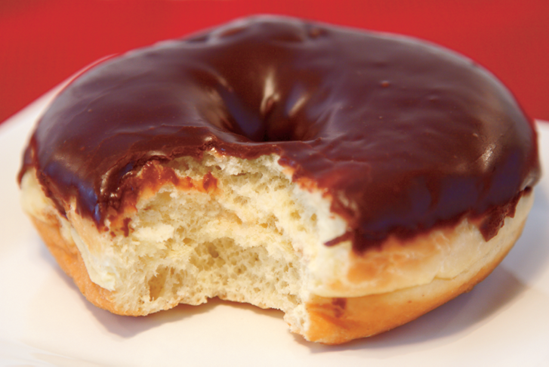
Figure 5.1. Composition is a skill that intrigues and challenges even the most experienced photographers. Taken at ISO 100, f/22, 1/125 sec. using a Canon EF 180mm, f/3.5L Macro USM lens.
Composition is the aspect of photography that many photographers strive to master. Mastering composition, however, remains a challenge for many photographers. Composition principles can help you design an image, but in the end, your personal aesthetic is the final judge. After all, for every rule of composition, there are galleries filled with pictures that break the rules, and they succeed famously.
Composition can range from strikingly simple to complex, filled with layers of content and meaning. Most photographers would agree that simple compositions are best. Simple compositions offer the advantage of being easy for the viewer to "read," a characteristic that often makes images stronger than more complex compositions.
As a photographer, your eyes, your thoughts, and your sensibilities reveal and interpret each scene for the viewer. It's your job to combine your visual and emotional perceptions of a scene with the objective viewpoint of the camera. For practice, begin by standing back and evaluating all elements in the scene. Gradually narrow your view to see as the camera sees. With this exercise, you'll see isolated vignettes within the scene. Then continue this exercise by looking closely within the vignette to identify dominant elements, colors, patterns, and textures and think about how you can use them organize the visual information in the picture.
And before you begin shooting, ask and answer for yourself these questions:
Why am I taking this picture?
What do I want to tell the viewer with this picture, or what's the story?
If you don't ask and answer these questions, you run the risk of taking a picture that is visually difficult to read, and that has no message or content. Distilling the image to the message that you want to convey is the first and most important step in creating a well-composed image.
When you know the message or story of the image, some of the traditional composition guidelines detailed in this chapter can help you complete the picture.
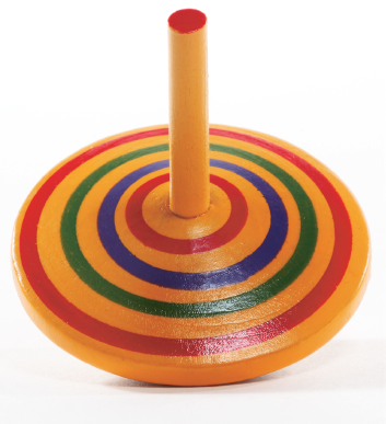
Perfectly symmetrical compositions, images that are the balanced side to side or top to bottom, create a sense of balance and stability, but they also are often viewed as boring compositions. The human eye seeks symmetry and balance, and when it finds that symmetry, the interest in the composition diminishes. Further, symmetrical compositions usually offer less visual impact and intrigue than asymmetrical photos. There are several ways to achieve good symmetry in your photography.
Figure 5.3. The symmetry of this image, while intriguing, becomes too predictable to hold the viewer's interest.
Balance is a sense of "rightness" in a photo. A balanced photo doesn't appear to be too heavy (lopsided) nor too off center. To create balance, you should evaluate the visual weight of colors and tones (dark is heavier than light), and placement (objects placed toward an edge appear heavier than objects placed at the center of the frame) in the scene. Then arrange the elements to create a visual balance — or a harmony when objects have equal visual strength.
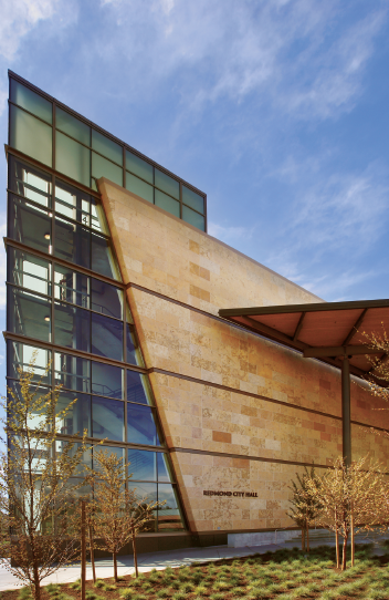
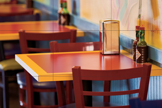
Figure 5.4. The design of this city hall building provides strong lines and contrasting planes that give the image visual interest. Taken at ISO 100, f/11, 1/80 sec. using a Canon EF 16–35mm, f/2.8L, USM lens set to 17mm.
Contrasting balance is tension, or a state of imbalance or visual contrasts. Tension is created by having dissimilar objects of different sizes in the image. For example, having two people on one side of the frame and a tree on the other side creates visual contrast by its dissimilarity in size and shape. The tension can be resolved through the use of color and brightness in subjects and objects so that because of a bright or dark color one element gains attention.
Because lines have symbolic significance, you can use them to bolster communication, to direct focus, and to organize visual elements. For example, you can place a subject's arms in a way that directs attention to the face. You can use a gently winding river to guide the viewer's eye through a landscape photo. You can use a strong diagonal beam in an architecture shot to increase the sense of the building's strength.
Lines traditionally covey these meanings:
Horizontal. Imply stability and peacefulness.
Diagonal. Create strength and dynamic tension.
Vertical. Imply motion and strength.
Curved. Symbolize grace and movement.
Zigzag. Convey a sense of action.
Wavy. Imply peaceful movement.
Jagged. Create tension.
Just as an artist would not leave part of a canvas blank or filled with extraneous details, you should try to fill the full image frame with elements that support the message. If you ask the questions suggested earlier, the answers will help you decide how much of the scene you want to include in the frame. Every element you include should support and reveal more about the subject.
Try to eliminate surrounding elements that would distract the viewer's attention. Depending on the assignment or goal of the shoot, environmental elements also may need to be included for a lifestyle image or environmental portrait.
In any picture, the elements behind and around the subject become as much a part of the photograph as the subject, and occasionally more so because the lens tends to compress visual elements. As you compose the picture, check all areas in the viewfinder or LCD for background and surrounding objects that, in the final image, seem to merge with the subject, or that compete with or distract from the subject.
The classic example of failing to use this technique is the picture of a person who appears to have a telephone pole or tree growing out of the back of his head. To avoid this type of background distraction, move the subject or change your position.
A standard composition technique in photography is the rule of thirds. Imagine that a tic-tac-toe grid is superimposed on the viewfinder. The grid divides the scene into thirds vertically and horizontally. Often, the most interesting compositions are those that place the subject at one of the points of intersection or along one of the lines on the grid.
If you're taking a portrait, you might place a subject's eyes at the upper-left intersection point. In an outdoor photo, you can place the horizon along the top line to emphasize the foreground detail, or along the bottom line to emphasize a dramatic cloud formation. Using this type of grid also helps create a sense of dynamic imbalance and visual interest in the picture.
In practice, you can use the following suggestions when composing different image types:
If your main point of interest is a static spot, try placing the main point of interest at any one of the intersecting dividing lines.
If the main point of interest is horizontal, or it is a horizon, try placing it along one of the horizontal dividing lines.
If the main point of interest is vertical, try placing it along one of the vertical dividing lines.
A similar approach is the Greek golden mean. Begin by drawing a line diagonally from the top-left corner of the frame to the bottom-right corner. Then draw a perpendicular line from the bottom-left corner to where it intersects with the diagonal line. Then draw a perpendicular line from the top-right corner of the frame to where it intersects with the diagonal line. These two points of intersection show where the center of interest should lie, particularly in portraits.
Depending on how colors are used in a photo, they can create a sense of harmony and balance, or they can make bold, stimulating visual statements. To use colors in composition, remember that complementary colors are colors opposite each other on a color wheel, such as green and red or blue and yellow. Harmonizing colors are adjacent to each other on the color wheel, such as green and yellow or yellow and orange.
If you want a picture with strong visual punch, use complementary colors of approximately equal intensity in the composition. If you want a picture that conveys peace and tranquility, use harmonizing colors.
The more that the color of an object contrasts with its surroundings, the more likely it is that the object will become the main point of interest. Conversely, the more uniform the overall color of the image, the more likely it is that the color will dictate the overall mood of the image.
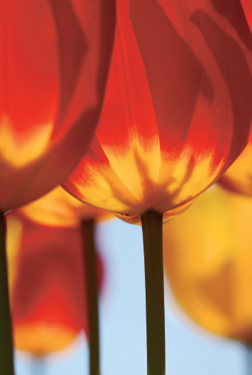
Figure 5.7. Bold colors create the visual interest and strength of this image. Taken at ISO 100, f/5.6, 1/800 sec. using a Canon EF 100mm, f/2.8 USM lens.
The type and intensity of light both affect the intensity of colors and, consequently, the composition. Overcast weather conditions, haze, mist, and fog reduce the vibrancy of colors. These conditions are ideal for creating pictures with harmonizing, subtle colors. Vice versa, on a bright, sunny day, color is intensified and is ideal for composing pictures with bold color contrasts.
Photographers often borrow a technique from painters — putting a subject within a naturally occurring frame, such as a tree framed by a barn door or a distant building framed by an archway in the foreground. The frame may or may not be in focus, but to be most effective, it should add context or visual interest to the image.
Because the human eye is drawn first to the sharpest part of the photo, be sure that the sharpest point of focus is on the subject, or part of the subject you want to emphasize, for example, a person's eyes. This focus establishes the relative importance of the elements within the image.
Differential focusing controls the depth of field or the zone (or area) of the image that is acceptably sharp. In a nutshell, differential focusing works like this: The longer the focal length is (in other words, a telephoto lens or zoom setting) and the wider the aperture (the smaller the f-stop number), the less the depth of field (or the softer the background). Conversely, the wider the focal length and the narrower the aperture are, the greater the depth of field.
You can use this principle to control what the viewer focuses on in a picture. For example, in a picture with a shallow depth of field, the subject stands in sharp focus against a blurred background. The viewer's eyes take in the blurred background, but they return quickly to the much sharper area of the subject. You can virtually eliminate distractions behind the subject by using a very shallow depth of field.
To control depth of field, you can use the techniques listed in Table 5.1 separately or in combination with each other.

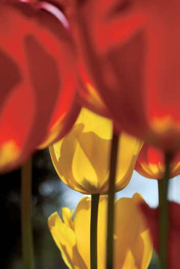
Figure 5.9. Changing your point of view can mean getting a new perspective by moving above the subject, shifting to a very low position, or moving to a side angle position. Taken at ISO 100, f/25, 1/125 using a Canon EF 100mm, f/2.8, Macro, USM lens.
Table 5.1. Depth of Field
To decrease depth of field (blur the background) | To increase the depth of field (sharpen the appearance of the background) |
|---|---|
Choose a telephoto lens or zoom setting. | Choose a wide-angle lens or zoom setting. |
Choose a wide aperture, for example, f/1.4 to f/4. | Choose a narrow aperture, for example, f/11 to f/22. |
Move closer to the subject. | Move farther away from the subject. |
In addition to the traditional guidelines, you can compose images using strong textures, repeated patterns and geometric shapes, and color repetition or contrasts to compose images. These elements can create a picture themselves, or you can use them to create visual motion that directs the eye or supports the subject.
Other techniques to keep in mind include:
Change your point of view. Instead of routinely photographing subjects at eye level, try changing the viewpoint. For example, if you photograph a subject from a position lower than eye level, the subject seems powerful, while a position higher than eye level creates the opposite effect.
Use tone and contrast. You can use contrast — the difference in light and dark tones in a -photograph — to set off your subject. A small, white flower appears more distinct against a large, dark wall than it does against a bright, light-colored wall.
Define space and perspective. You can control the perception of space in pictures by changing the distance from the camera to the subject, selecting a telephoto or wide-angle lens or zoom setting, changing the position of the light, and changing the camera position. For example, camera-to-subject distance creates a sense of perspective and dimension so that when the camera is close to a foreground object, background elements in the image appear smaller and farther apart. A wide-angle lens also makes near objects seem proportionally larger than midground and background objects.
Use leading lines. Naturally occurring lines in an image can be used to lead the viewer's eyes from the foreground to the background. This technique is often used in landscape photos where the lines of a railroad track converge on a distant horizon, or a gracefully curving river meanders into the distance. But the technique is equally useful in portraits and other types of photography. For example, in a portrait, you can position the subject's arms and hands so that they lead the viewer's eyes to the subject's face.

Knowing the rules provides a good grounding for well-composed pictures, but Henri Cartier-Bresson summed it up best when he said, "Composition must be one of our constant preoccupations, but at the moment of shooting it can stem only from our intuition, for we are out to capture the fugitive moment, and all the interrelationships involved are on the move. In applying the Golden Rule, the only pair of compasses at the photographer's disposal is his own pair of eyes" (from The Mind's Eye by Henri Cartier-Bresson).