
Chapter 6. Adding Actions
In Eclipse, the term action is used to describe a visible element in an application that allows users to initiate a unit of work. You may notice several terms in Eclipse documentation that are used to describe units of work: operations, actions, action delegates, commands, and jobs. However, actions figure most prominently in RCP applications. The key concept is that when you click a menu or toolbar, or invoke a key sequence, an action is run. It’s that simple.
As you can imagine, actions are essential for most applications. Hyperbola doesn’t have any actions yet, so it’s difficult to see how the real product will look and feel (see Figure 6-1). In this chapter we show you how to
• Add a top-level menu and toolbar
• Add the standard File > Exit and Help > About actions
• Create an action to add a contact and show it in the toolbar and menu
• Add the Hyperbola icon to the task tray
• Allow Hyperbola to minimize to the task tray
• Add connection and presence status to the status line
Figure 6-1 Hyperbola with actions and a status line

6.1 Adding to the Menus and Toolbar
Actions are everywhere: in toolbars, top-level menus, context menus, status lines, and so on. In most applications the menu and toolbar play a supporting role for the main content area. When running an application for the first time, most users browse the top-level menu structure to find out what the application can do. This makes the top-level menu structure of your application very important.
Take a look at Hyperbola as it is now. Notice that it does not have a top-level menu. Let’s fix that. The general pattern for making the toolbar, status line, or menu bar available is to configure the window before it is opened. This is done in ApplicationWorkbenchWindowAdvisor.preWindowOpen() by adding a call to methods such as setShowMenuBar(boolean), as shown here:

You should be familiar with this method—it’s what you used to change the size of the window in a previous chapter. The preWindowOpen() method is called before the window’s controls have been created, and it’s the primary place for you to control which WorkbenchWindow parts are visible.
Note
For more advanced window customizations, refer to Chapter 19, “Customizing Workbench Windows,” which explains how to customize the layout of WorkbenchWindows and how to let the user toggle the toolbar and status line.
The preceding code enables the menu bar but does not force it to be shown. It is shown only if it contains menu items. If you run Hyperbola now, the menu bar does not appear because it’s empty.
6.1.1 Create a Top-Level Menu
Now that the top-level menu has been enabled, the next step is to create actions and add them to the menu. RCP applications have a dedicated advisor, called the ActionBarAdvisor, whose job is to create the actions for a window and populate the menu, toolbar, and status line. The ActionBarAdvisor is separate from the WorkbenchWindowAdvisor since an application often has hundreds of actions—this more clearly separates the concerns.
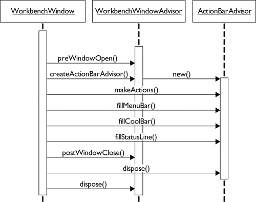
Figure 6-2 shows the call sequence between the WorkbenchWindow, the WorkbenchWindowAdvisor, and the ActionBarAdvisor. Notice that ActionBarAdvisor.makeActions() is called before the WorkbenchWindow's controls are created in createWindowContents(). This means that you cannot access any of the window’s widgets when creating the actions—you cannot link the actions to any menus or other window parts.
Figure 6-2 ActionBarAdvisor method sequencing
In Hyperbola we need two top-level menus: Hyperbola and Help. The Hyperbola menu should have general application actions and the Help menu some higher-level information related to Hyperbola itself (e.g., Help, About information, etc.). For now, let’s just add Exit and About items to these menus.
Figure 6-2 shows that the steps for creating actions, makeActions(), and placing actions, fill*(), are separated. This allows you to create the actions just once and then place the same action objects in several locations, for example, in both the toolbar and a menu. This very useful coding pattern is shown in this code snippet:
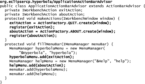
When you created the skeleton RCP application, it included an ActionBarAdvisor implementation with empty makeActions() and fillMenuBar() methods. Now, modify the generated code as just shown to get top-level Hyperbola and Help menus with associated Exit and About actions.
Notice that makeActions() creates each action and saves it in a field. Each action is also registered. Registering actions ensures that they are deleted when the related Workbench window is closed—a very important characteristic. Registering actions also enables key bindings, as discussed in Chapter 12, “Adding Key Bindings.”
Creating the Exit and About actions was easy because they already existed. The Workbench defines a set of common actions that are reusable in all RCP applications. Each of these actions is defined as an inner class of org.eclipse.ui.actions.ActionFactory. You instantiate them and use them as regular actions. They are preconfigured with a standard name, icon, and ID. The code snippet just shown demonstrates how this is done.
Run Hyperbola now and you should see the top-level menus and the new Exit and About actions, as shown in Figure 6-4 If you run the Help > About action, it displays an empty dialog, as shown in Figure 6-3. The Installation Details button shows the list of installed plug-ins. The Configuration tab within the Installation Details dialog shows information about your environment (e.g., the command-line arguments used to start Hyperbola, system properties, and user preferences). Chapter 8, “Branding Hyperbola,” shows you how to brand this dialog with an About image and some descriptive text.

Note
The Installation Details list is very handy for confirming which plug-ins are running as part of your application.
6.1.2 Menu Managers
Earlier, the Exit and About actions were added to a menu manager. A menu manager is responsible for keeping track of actions and submenus and allowing you to create logical structures of actions by grouping. It allows you to organize the actions you want to show without concerning yourself with how the menu is created. For example, the following modified version of the earlier code adds placeholders for actions. The real actions can then be added after the menu manager is created. This flexibility is quite powerful. For example, it lets you create menus that are filled in by other plug-ins.

Menu managers can also be nested. This allows you to create multidimensional action structures such as cascading menus. Let’s experiment with menu managers a bit. Change the ActionBarAdvisor with the following code snippet to add a Help cascading menu below the top-level Hyperbola menu, as shown in Figure 6-4:

Figure 6-4 Cascading menu example

6.1.3 The Add Contact Action
The Exit and About actions are generic, so we used predefined actions. Of course, Hyperbola also needs some actions specific to instant messaging. Here we talk about how to
• Implement an action that adds a contact to the contacts list
• Ensure that the action is enabled only if a contact group is selected in the Contacts view
• Add the action to the top-level Hyperbola toolbar
Some actions should be available at all times and are independent of the current state of the application. Exit is a good example of this. Other actions should be available only when Hyperbola is in a certain state. For example, the Add Contact action you are about to add requires that a contact group be selected. Actions that do not make sense in the current state of Hyperbola should be disabled to indicate that they are not applicable.
First, create the Add Contact action as shown below. Don’t worry about the compile errors; the missing run() and selectionChanged() methods are about to be added.

The constructor for this action is pretty standard; the action is given a name, an icon, a tool tip, and an ID. The ID is used to uniquely identify the action and is used by ActionBarAdvisor.register(IAction) to manage the action. The IImageKeys.ADD_CONTACT is a new image key that you must define. Alternatively, you can use an existing key just for now or import icons from the final code sample.
Tip
To make the examples clearer, we do not worry about translating the action labels. However, the Eclipse Java IDE comes with a handy wizard that helps internationalize, or externalize, the strings in your Java code. The tool can be run from Source > Find Strings to Externalize....
The interesting part of the action is around the selection listener. In the constructor, the action is registered as a selection listener. Notice that the action implements ISelectionListener. This combination means that when the selection changes in the window, the action is notified via its selectionChanged(IWorkbenchPart, ISelection) method. An implementation of selectionChanged() is shown in the following snippet:
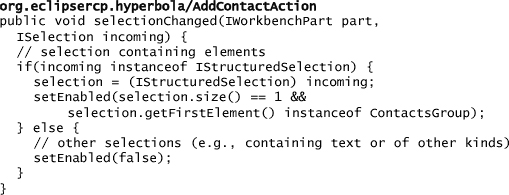
The code first checks that the incoming selection is structured. If it is not—for example, if it’s a text selection from an editor or something else—the selection cannot affect the action’s enablement state. If more than one item is selected, it does not make sense for the user to add a contact, so the action is disabled. If the incoming selection is structured and contains only one element and that element is a ContactsGroup, the Add Contact action is enabled.
Notice that the new selection is remembered by the action so that if it is run, it knows the group in which to add the new contact. Notice also that it only makes sense to hang on to the selection if it caused the action to be enabled. All other cases should make the selection field null.
We have not said where these selection events come from. You could bind the listener to just the Contacts view, but what if there is another view or window that shows contact groups? When its listener is added to the window’s selection service, the action hears about all selection changes made in that window. You can access a window’s selection service by calling IWorkbenchWindow.getSelectionService().
The selection service doesn’t generate selections on its own. For that purpose, views and editors can register as selection providers and essentially publish their selections to selection listeners. In the current Hyperbola, we expect most contact group selection events to come from the Contacts view, so the Contacts view needs to publish its selection events to the window! This needs to be done when the contents of the Contacts view are created. Take a look at ContactsView.createContents(Composite) and look for the line
getSite().setSelectionProvider(treeViewer);
This registers the TreeViewer (i.e., the contents of the Contacts view) as a selection provider.
The summary is that listening to the window instead of directly to a particular event source (e.g., a view) decouples actions from views and allows them to be used in other scenarios.
Tip
Notice that the action also implements ActionFactory.IWorkbenchAction and thus the dispose() method. When the action is disposed, it is essential that its selection listener be removed from the selection service. Failure to do this is a common cause of memory leaks—double-check to ensure that you always remove any listeners you register.
The action is configured and structured, so now add the run() method that does the real work. The code for this is shown below. Note that you can get the code for the dialog in the Samples Manager tool as described in Section 3.4, “Sample Code,” or you can use a simple InputDialog to prompt for the contact information.
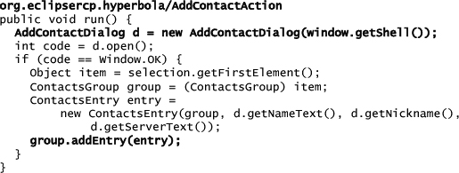
The action needs the contact’s name, nickname, and host server so it opens a dialog with three entry fields. The entered information is then used to create a ContactsEntry and add it to the previously selected group.
6.1.4 Adding the Add Contact Action
Now that you have created the Add Contact action, you need to add it to the top-level menu and toolbar. This part is easy since you did the same with the Exit and About actions. First, ensure that the action is created and registered in ApplicationActionBarAdvisor.makeActions(IWorkbenchWindow). Remember to register the action to ensure that it is deleted when the window is closed. Minimizing a window does not close it; instead, a window is closed when its Shell.close() method is called.
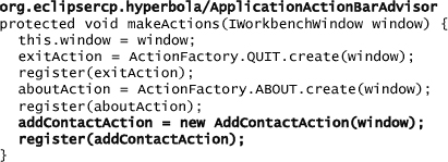
Update fillMenuBar(IMenuManager) and fillCoolBar(ICoolBarManager) to add the action to both the menu and toolbar as shown in the ApplicationActionBarAdvisor snippet below. Note that managing toolbars and menus is very similar.
Note
It’s common jargon to refer to the top-level toolbar simply as the toolbar. But the methods in the IWorkbenchWindowConfigurer refer to it as the coolbar. This is an implementation detail that has leaked into the APIs. The toolbar is implemented using an SWT CoolBar to support dynamic positioning of its controls. In this chapter we refer to this area as the top-level toolbar.

Run the application and you should see an icon in the toolbar and an entry for Add Contact in the Hyperbola top-level menu. If you click the icon, you are prompted for the contact information, and after you click OK, the contact is created and appears in the contacts list. Notice that as you click around in the Contacts view, the action changes from enabled to disabled depending on the selection.
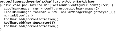
6.1.5 Customizable Toolbars
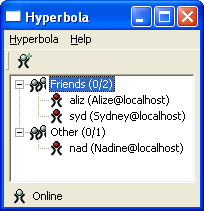
It is quite common for applications to allow customization of the toolbar. The Hyperbola toolbar is implemented in terms of the SWT CoolBar. Each ToolBarManager that is added to the ICoolBarManager is shown in a separate CoolItem group. As such, it can be separately positioned by the user. For example, toolbar managers can be moved onto separate rows or reordered within Hyperbola’s toolbar. The Hyperbola in Figure 6-5 has two toolbar managers instead of one. Both managers have the Add Contact action. Since they are in separate managers, the actions can be moved independently within the toolbar. Experiment with this by adding the Add Contact action to multiple ToolBarManagers.
Figure 6-5 Top-level toolbar showing two cool items with the move handle

If you want your actions in the same toolbar group but separated, you can use JFace Separator instances to divide the actions into groups. An update that uses the Separator is shown here:
6.2 Adding to the Status Line
The status line at the bottom of the Hyberbola window is a great place to show information that is either global to the application or pertinent to the user’s current task. Most instant messaging applications place an indicator in the status line to show the user’s online status and presence. Since it’s somewhat of a standard, Hyperbola should have it, too.
Figure 6-6 shows Hyperbola with an image that indicates whether or not the user is connected to a chat server and some text that indicates the current presence (e.g., available to chat, do not disturb). Eventually we want the icon and text to update automatically as the user’s status changes, but for now, let’s keep it simple.
Figure 6-6 Hyperbola with a status line
Remember earlier when you enabled the toolbar and menu in ApplicationWorkbenchWindowAdvisor.preWindowOpen()? Go back there to enable the status line. From within the preWindowOpen() method, type configurer.set and then press Ctrl+Space to see all the setters. Then find the setShowStatusLine() method. This is a great use of Eclipse Java IDE’s content assist—there are fewer mistakes, there is less to remember, and it’s better than cut-and-paste.

Double-check that this worked by running Hyperbola. The status line should be empty but nonetheless visible. Now you can add the icon and text using the following snippet for ApplicationWorkbenchWindowAdvisor. The statusImage is a field on the window advisor.

Like the menu bar and toolbar, the status line is controlled by the ActionBarAdvisor. You may have noticed the fillStatusLine(IStatusLineManager) method in ActionBarAdvisor. IStatusLineManagers are regular contribution managers similar to IMenuManagers and IToolbarManagers. They include a handful of methods specific to status lines such as getProgressMonitor(), setMessage(Image, String), and setErrorMessage(Image, String).
There is one caveat about these additional methods: They can be called only after the status line’s controls have been created. Since ActionBarAdvisor.fillStatusLine() is called before the status line has been created, you can’t call these methods in the ActionBarAdvisor. Instead, a good place to set the message, for example, is in the WorkbenchWindowAdvisor.postWindowOpen() method, as shown in the previous snippet.
6.2.1 Status Line—A Shared Resource
As you have seen, it’s very easy to add images and messages to the status line. Unfortunately, the status line is a shared resource and can be written to by any plug-in. If your application is small, like Hyperbola, you can simply centralize the use of the status line and avoid conflicts. This is not always feasible.
The status line is also special because it is configured with a predefined layout—the bar contains several reserved areas for standard controls, as shown in Figure 6-7.
Figure 6-7 Status line area breakdown

Fast views—The Fast Views area shows views that are removed from the window but can be accessed quickly from an icon docked in the fast view bar. For more information on fast views, consult the online Help.
Icon/message—You just used the Icon/Message area to show the user’s connection and presence in Hyperbola. Consider this the status line contribution that any part is allowed to make when it has focus.
Progress—The first Progress area is used for showing modal progress. It is normally invisible until an IWorkbenchWindow.run() operation is invoked. When the operation is running, a progress indicator and Cancel button are made visible.
Contributions—The Contributions area is reserved for the Workbench advisor and active part contributions.
Jobs progress—The Jobs Progress area is hidden by default but can be enabled by calling IWorkbenchWindowConfigurator.setShowProgressIndicator(boolean). See Sections 14.5, “Updating Hyperbola,” and 17.8, “Reporting Progress,” for more details.
Since the layout is somewhat fixed, it is not possible to left-align additional contributions to the status line—the reserved areas for the other items get in the way. However, when the Jobs Progress area is not shown, user contributions are right-aligned. You can make additions to the status line using IStatusLineManager.add(IContributionItem).
In any event, there are many uses of the status line, and directly setting the Icon/Message area is very effective. For more advanced status line uses, see Section 17.7, “Adding Contributions to the Status Line.”
6.3 System Tray Integration
Another common feature of instant messaging applications is integration into the system tray. Using this idea, we want Hyperbola to appear in the system tray as an icon representing the user’s presence. This also allows Hyperbola to minimize to the system tray rather than continuing to be displayed in the task bar even though it is minimized. The tray items are also a popular location for adding actions related to your application. Figure 6-8 shows how this looks for Hyperbola.
Figure 6-8 Context menu on the Hyperbola task tray item

Tip
If you are going to use the system tray, it is good practice to make its use optional—if every application put itself in the system tray, it would get cluttered. When it is enabled, it should be used to display important status information to the user and provide a quick access point for running frequent actions.
Also, the system tray is not available on all platforms, so do not make it the focal point of your application’s workflow. It should be used as an optional integration feature.
In this section we show you how to
• Add the Hyperbola icon to the task tray
• Allow Hyperbola to minimize to the task tray
• Add the About and Exit actions to the context menu of the task tray item
6.3.1 Obtaining a Display
To get the system tray, you need a Display. A Display is an SWT object that represents the underlying graphics system. Typically, the Display is created before the Workbench is created via a call to PlatformUI.createDisplay(). Figure 6-9 shows the WorkbenchWindow lifecycle and highlights where the Display is available. So, the first time a window is opened, the WorkbenchWindowAdvisor can get the Display via the window’s shell and set up the system tray for Hyperbola. At this point the tray item is created and configured so that when its menu is shown, the ActionBarAdvisor populates the menu.
Figure 6-9 How the ActionBarAdvisor contributes actions to the task item

Tip
In any of the advisors, you can use IWorkbench.getDisplay() to get a valid display even before the windows are created.
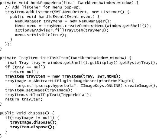
6.3.2 Creating the Tray Item
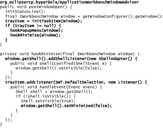
The code snippet below from ApplicationWorkbenchWindowAdvisor shows how the system tray item is created and how it operates. First, the item is created and configured, and then listeners are added to support showing the menu and minimizing into the tray item. After the tray item is set up, a menu listener is added to it. That way, when the tray item is right-clicked, a context menu appears and is populated by the ActionBarAdvisor. Some platforms do not have system trays and initTaskItem() may return null. In that case the tray item is not created.
Note
The image and tray item area are saved as fields on the WorkbenchWindowAdvisor so that they can be deleted when the window is closed.
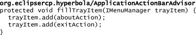
Since the ActionBarAdvisor already manages all of Hyperbola’s actions, it is a good place to put the method that fills the system tray item’s menu. This also allows the tray item menu to reuse actions created in the ActionBarAdvisor. Add the following snippet to ApplicationActionBarAdvisor:
A shell listener is added in the hookMinimize() method to the window so that the window is marked as hidden when minimized. This simulates minimizing the window into the task bar. When the window is invisible, the only indication that Hyperbola is running is the system tray icon.
Another listener, also added in the hookMinimize() method, listens to the tray item to detect when it is selected. Selecting the task item is the cue that Hyperbola’s window should be made visible if it had previously been minimized.
After setting this up, run Hyperbola and look for the system tray icon. Right-click it and the context menu appears. Minimize Hyperbola and notice that Hyperbola is completely gone except for the task tray icon. Click the tray icon and Hyperbola reappears.
6.4 Summary
There you have it—Hyperbola now has a minimal set of actions and some more advanced desktop integration. As we mentioned at the outset, actions are one of the key elements of building RCP applications. There are many ways actions can be used and placed in the Workbench. With the information in this chapter you are well on your way to mastering action definition and placement.
6.5 Pointers
This book contains many other action-related sections; if you are eager to learn more, you can skip ahead to any of these sections:
• To understand the differences between actions and commands, see Chapter 18.
• Adding key bindings to actions is discussed in Chapter 12.
• Mastering programmatic and declarative actions is covered in Section 17.2.
• For how to show progress for long-running actions, see Section 17.8.