
3. Welcome App
Objectives
In this chapter you’ll:
• Learn the basics of the Eclipse IDE for writing, running and debugging your Android apps.
• Create an Eclipse project to develop a new app.
• Design a GUI visually (without programming) using the ADT (Android Development Tools) visual layout editor.
• Edit the properties of GUI components.
• Build a simple Android app and execute it on an Android Virtual Device (AVD).
3.5 Building the Welcome App’s GUI with the ADT’s Visual Layout Editor
3.6 Examining the main.xml File
Self-Review Exercises | Answers to Self-Review Exercises | Exercises
3.1. Introduction
In this chapter, you’ll build the Welcome app—a simple app that displays a welcome message and two images—without writing any code. You’ll use the Eclipse IDE with the ADT (Android Development Tools) Plugin—the most popular tools for creating and testing Android apps. We’ll overview Eclipse and show you how to create a simple Android app (Fig. 3.1) using the ADT’s Visual Layout Editor, which allows you to build GUIs using drag-and-drop techniques. Finally, you’ll execute your app on an Android Virtual Device (AVD).

Fig. 3.1. Welcome app.
3.2. Technologies Overview
This chapter introduces the Eclipse IDE and ADT Plugin. You’ll learn how to navigate Eclipse and create a new project. With the ADT Visual Layout Editor, you’ll display pictures in ImageViews and display text in a TextView. You’ll see how to edit GUI component properties (e.g., the Text property of a TextView and the Src property of an ImageView) in Eclipse’s Properties tab and you’ll run your app on an Android Virtual Device (AVD).
3.3. Eclipse IDE
This book’s examples were developed using the versions of the Android SDK that were most current at the time of this writing (versions 2.3.3 and 3.0), and the Eclipse IDE with the ADT (Android Development Tools) Plugin. In this chapter, we assume that you’ve already set up the Java SE Development Kit (JDK), the Android SDK and the Eclipse IDE, as discussed in the Before You Begin section that follows the Preface.
Introduction to Eclipse
Eclipse enables you to manage, edit, compile, run and debug applications. The ADT Plugin for Eclipse gives you the additional tools you’ll need to develop Android apps. You can also use the ADT Plugin to manage multiple Android platform versions, which is important if you’re developing apps for many devices with different Android versions installed. When you start Eclipse for the first time, the Welcome tab (Fig. 3.2) is displayed. This contains several icon links, which are described in Fig. 3.3. Click the Workbench button to display the Java development perspective, in which you can begin developing Android apps. Eclipse supports development in many programming languages. Each set of Eclipse tools you install is represented by a separate development perspective. Changing perspectives reconfigures the IDE to use the tools for the corresponding language.

Fig. 3.2. Welcome to the Eclipse IDE for Java Developers tab in the Eclipse window.

Fig. 3.3. Links on the Eclipse IDE’s Welcome tab.
3.4. Creating a New Project
To begin programming with Android in Eclipse, select File > New > Project... to display the New Project dialog. Expand the Android node, select Android Project and click Next > to display the New Android Project dialog (Fig. 3.4). You can also do this with the New ( ) toolbar buttons’s drop-down list. After you create your first project, the Android Project option will appear in the File > New menu and in the New () button’s drop-down list.

Fig. 3.4. New Android Project dialog.
A project is a group of related files, such as the code files and any images that make up an app. Using the New Android Project dialog, you can create a project from scratch or you can use existing source code—such as the code examples from this book.
In this dialog, specify the following information:
1. In the Project name: field, enter Welcome. This will be the name of the project’s root node in Eclipse’s Package Explorer tab.
2. In the Contents section, ensure that Create new project in workspace is selected to create a new project from scratch. The Create project from existing source option allows you to create a new project and incorporate existing Java source-code files.
3. In the Build Target section, select the Android version you wish to use. For most of this book’s examples, we use version 2.3.3; however, it’s recommended that you select the minimum version that your app requires so that it can run on the widest variety of devices.
In the Properties section of the dialog, specify the following information:
1. In the Application name: field, enter Welcome. We typically give our applications the same name as their projects, but this is not required. This name appears in a bar at the top of the app, if that bar is not explicitly hidden by the app.
2. Android uses conventional Java package-naming conventions and requires a minimum of two parts in the package name (e.g., com.deitel). In the Package name: field, enter com.deitel.welcome. We use our domain deitel.com in reverse followed by the app’s name. All the classes and interfaces that are created as part of your app will be placed in this Java package. Android and the Android Market use the package name as the app’s unique identifier.
3. In the Create Activity: field, enter Welcome. This will become the name of a class that controls the app’s execution. Starting in the next chapter, we’ll modify this class to implement an app’s functionality.
4. In the Min SDK Version: field, enter the minimum API level that’s required to run your app. This allows your app to execute on devices at that API level and higher. In this book, we typically use the API level 10, which corresponds to Android 2.3.3, or API level 11, which corresponds to Android 3.0. To run your app on Android 2.2 and higher, select API level 8. In this case, you must ensure that your app does not use features that are specific to more recent versions of Android. Figure 3.5 shows the Android SDK versions and API levels. Other versions of the SDK are now deprecated and should not be used. The following webpage shows the current percentage of Android devices running each platform version:
developer.android.com/resources/dashboard/platform-versions.html

Fig. 3.5. Android SDK versions and API levels. (developer.android.com/sdk/index.html)
5. Click Finish to create the project. [Note: You might see project errors while Eclipse loads the Android SDK.]
Package Explorer Window
Once you create (or open) a project, the Package Explorer window at the left of the IDE provides access to all of the project’s files. Figure 3.6 shows the project contents for the Welcome app. The Welcome node represents the project. You can have many projects open in the IDE at once—each will have its own top-level node.
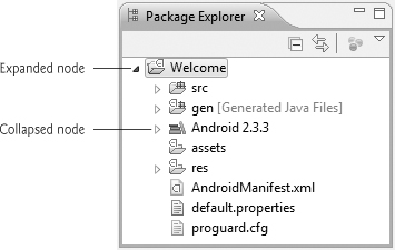
Fig. 3.6. Package Explorer window.
Within a project’s node the project’s contents are organized into various files and folders, including:
• src—A folder containing the project’s Java source files.
• gen—A folder containing the Java files generated by the IDE.
• Android 2.3.3—A folder containing the Android framework version you selected when you created the app.
• res—A folder containing the resource files associated with your app, such as GUI layouts and images used in your app.
We discuss the other files and folders as necessary throughout the book.
3.5. Building the Welcome App’s GUI with the ADT’s Visual Layout Editor
Next, you’ll create the GUI for the Welcome app. The ADT’s Visual Layout Editor allows you to build your GUI by dragging and dropping GUI components, such as Buttons, TextViews, ImageViews and more, onto an app. For an Android app that you create with Eclipse, the GUI layout is stored in an XML file called main.xml, by default. Defining the GUI in XML allows you to easily separate your app’s logic from its presentation. Layout files are considered app resources and are stored in the project’s res folder. GUI layouts are placed within that folder’s layout subfolder. When you double click the main.xml file in your app’s /res/layout folder, the Visual Layout Editor view is displayed by default (Fig. 3.7). To view the XML contents of the file (Fig. 3.8), click the tab with the name of the layout file (main.xml in this case). You can switch back to the Visual Layout Editor by clicking the Graphical Layout tab. We’ll present the layout’s XML in Section 3.6.
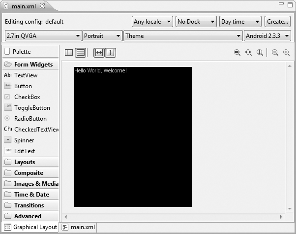
Fig. 3.7. Visual Layout Editor view of the app’s default GUI.
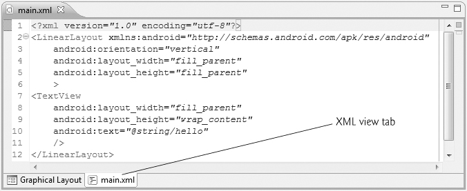
Fig. 3.8. XML view of the app’s default GUI.
The Default GUI
The default GUI for a new Android app consists of a LinearLayout with a black background and contains a TextView with the text "Hello World, Welcome!" (Fig. 3.7). A LinearLayout arranges GUI components in a line horizontally or vertically. A TextView allows you to display text. If you were to execute this app in an AVD or on a device, you’d see the default black background and text.
Figure 3.9 lists some of the layouts from the android.widget package.1 We’ll cover many more GUI components that can be placed in layouts—for a complete list, visit:
1 Earlier Android SDKs also have an AbsoluteLayout in which each component specifies its exact position. This layout is now deprecated. According to developer.android.com/reference/android/widget/AbsoluteLayout.html, you should use FrameLayout, RelativeLayout or a custom layout instead.
developer.android.com/reference/android/widget/package-summary.html

Fig. 3.9. Android layouts (package android.widget).
 Look-and-Feel Observation 3.1
To support devices of varying screen sizes and densities, it’s recommended that you use RelativeLayout and TableLayout in your GUI designs.
Configuring the Visual Layout Editor to use the Appropriate Android SDK
If you’ve installed multiple Android SDKs, the ADT Plugin selects the most recent one as the default for design purposes in the Graphical Layout tab—regardless of the SDK you selected when you created the project. In Fig. 3.7, we selected Android 2.3.3 from the SDK selector drop-down list at the top-right side of the Graphic Layout tab to indicate that we’re designing a GUI for an Android 2.3.3 device.
Deleting and Recreating the main.xml File
For this application, you’ll replace the default main.xml file with a new one that uses a RelativeLayout, in which components are arranged relative to one another. Perform the following steps to replace the default main.xml file:
1. Make sure main.xml is closed, then right click it in the project’s /res/layout folder and select Delete to delete the file.
2. Right click the layout folder and select New > Other... to display the New dialog.
3. In the Android node, select Android XML File and click Next > to display the New Android XML File dialog.
4. Configure the file name, location and root layout for the new main.xml file as shown in Fig. 3.10, then click Finish.
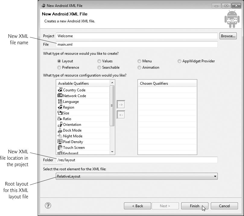
Fig. 3.10. Creating a new main.xml file in the New Android XML File dialog.
Configuring the Visual Layout Editor’s Size and Resolution
Figure 3.11 shows the new main.xml file in the Visual Layout Editor. Android runs on a wide variety of devices, so the Visual Layout Editor comes with several device configurations that represent various screen sizes and resolutions. These can be selected from the Device Configurations drop-down list at the top-left side of the Graphic Layout tab (Fig. 3.11). If these predefined configurations do not match the device you wish to target, you can create your own device configurations from scratch, or by copying and modifying the existing ones.

Fig. 3.11. Visual Layout Editor view of the app’s default GUI.
Our primary testing device for this book was the Samsung Nexus S, which has a 4-inch screen with 480-by-800 (WVGA) resolution. When designing an Android GUI, you typically want it to be scalable so that it displays properly on various devices. For this reason, the Visual Layout Editor’s design area does not need to precisely match your actual device’s. Instead, you can choose a similar device configuration. In Fig. 3.11, we selected the 3.7in WVGA (Nexus One) option—this device has the same WVGA resolution as the Nexus S, but a slightly smaller screen size. Many of today’s smartphones have 480-by-800 or 480-by-854 resolution.
Images and Screen Sizes/Resolutions
Because Android devices have various screen sizes, resolutions and pixel densities (that is, dots per inch or DPI), Android allows you to provide separate images (and other resources) that the operating system chooses based on the actual device’s pixel density. For this reason your project’s res folder contains three subfolders for images—drawable-hdpi (high density), drawable-mdpi (medium density) and drawable-ldpi (low density). These folders store images with different pixel densities (Fig. 3.12).

Fig. 3.12. Android pixel densities.
Images for devices that are similar in pixel density to our testing device are placed in the folder drawable-hdpi. Images for medium- and low-density screens are placed in the folders drawable-mdpi and drawable-ldpi, respectively. As of Android 2.2, you can also add a drawable-xhdpi subfolder to the app’s res folder to represent screens with extra high pixel densities. Android will scale images up and down to different densities as necessary.
For detailed information on supporting multiple screens and screen sizes in Android, visit developer.android.com/guide/practices/screens_support.html.
For images to render nicely, a high-pixel-density device needs higher-resolution images than a low-pixel-density device. Low-resolution images do not scale well.
Step 1: Adding Images to the Project
You’ll now begin designing the Welcome app. In this chapter, we’ll use the Visual Layout Editor and the Outline window to build the app, then we’ll explain the generated XML in detail. In subsequent chapters, we’ll also edit the XML directly.
Many Android professionals prefer to create their GUIs directly in XML and use the Visual Layout Editor to preview the results. As you type in the XML view, Eclipse provides auto-complete capabilities showing you component names, attribute names and values that match what you’ve typed so far. These help you write the XML quickly and correctly.
For this app, you’ll need to add the Deitel bug image (bug.png) and the Android logo image (android.png) to the project—we’ve provided these in the images folder with the book’s examples. Perform the following steps to add the images to this project:
1. In the Package Explorer window, expand the project’s res folder.
2. Locate and open the images folder provided with the book’s examples, then drag the images in the folder onto the res folder’s drawable-hdpi subfolder.
These images can now be used in the app.
Step 2: Changing the Id Property of the RelativeLayout
You can use the Properties window to configure the properties of the selected layout or component without editing the XML directly. If the Properties window is not displayed, you can display it by double clicking the RelativeLayout in the Outline window. You can also select Window > Show View > Other..., then select Properties from the General node in the Show View dialog. To select a layout or component, you can either click it in the Visual Layout Editor or select its node in the Outline window (Fig. 3.13). The Properties window cannot be used when the layout is displayed in XML view.
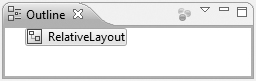
Fig. 3.13. Hierarchical GUI view in the Outline window.
You should rename each layout and component with a relevant name, especially if the the layout or component will be manipulated programmatically (as we’ll do in later apps). Each object’s name is specified via its Id property. The Id can be used to access and modify component without knowing its exact location in the XML. As you’ll see shortly, the id can also be used to specify the relative positioning of components in a RelativeLayout.
Select the RelativeLayout, then scroll to the Id property in the Properties window and set its value to
@+id/welcomeRelativeLayout
The + in the syntax @+id indicates that a new id (that is, a variable name) should be created with the identifier to the right of the /. The Properties and Outline windows should now appear as in Fig. 3.14.
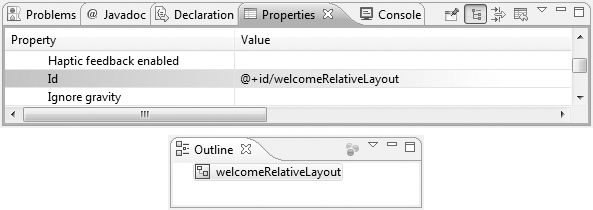
Fig. 3.14. Properties window after changing the RelativeLayout’s Id property.
Step 3: Changing the Background Property of the RelativeLayout
The layout’s default background color is black, but we’d like it to be white. Every color can be created from a combination of red, green and blue components called RGB values—each is an integer in the range 0–255. The first value defines the amount of red in the color, the second the amount of green and the third the amount of blue. When using the IDE to specify a color you typically use hexadecimal format. In this case, the RGB components are represented as values in the range 00–FF.
To change the background color, locate the Background property in the Properties window and set its value to #FFFFFF (Fig. 3.15). This represents white in the hexadecimal format #RRGGBB—the pairs of hexadecimal digits represent the red, green and blue color components, respectively. Android also supports alpha (transparency) values in the range 0–255, where 0 represents completely transparent and 255 represents completely opaque. If you wish to use alpha values, you can specify the color in the format #AARRGGBB, where the first two hexadecimal digits represent the alpha value. For cases in which both digits of each component of the color are the same, you can use the formats #RGB or #ARGB. For example, #FFF will be treated as #FFFFFF.
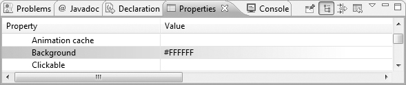
Fig. 3.15. Properties window after changing the RelativeLayout’s Background property.
Step 4: Adding a TextView
Next, we’ll add a TextView to the user interface. In the Form Widgets list at the left of the Visual Layout Editor window, locate TextView and drag it onto the design area (Fig. 3.16). When you add a new component to the user interface, it’s automatically selected and its properties are displayed in the Properties window.
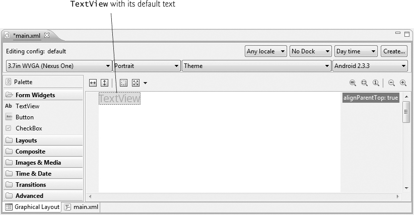
Fig. 3.16. TextView with its default text.
Step 5: Configuring the TextView’s Text Property Using a String Resource
According to the Android documentation for application resources
developer.android.com/guide/topics/resources/index.html
it’s considered a good practice to “externalize” strings, string arrays, images, colors, font sizes, dimensions and other app resources so that you, or someone else on your team, can manage them separately from your application’s code. For example, if you externalize color values, all components that use the same color can be updated to a new color simply by changing the color value in a central resource file.
If you wish to localize your app in several different languages, storing the strings separately from the app’s code allows you to change them easily. In your project’s res folder, the subfolder values contains a strings.xml file that’s used to store strings. To provide localized strings for other languages, you can create separate values folders for each language. For example, the folder values-fr would contain a strings.xml file for French and values-es would contain a strings.xml file for Spanish. You can also name these folders with region information. For example, values-en-rUS would contain a strings.xml file for U.S. English and values-en-rGB would contain a strings.xml file for United Kingdom English. For more information on localization, see
developer.android.com/guide/topics/resources/
providing-resources.html#AlternativeResources
developer.android.com/guide/topics/resources/localization.html
To set the TextView’s Text property, we’ll create a new string resource in the strings.xml file.
1. Ensure that the TextView is selected.
2. Locate its Text property in the Properties window, click its default value, then click the ellipsis button ( ) at the right size of the property’s value field to display the Resource Chooser dialog.
3. In the Resource Chooser dialog, click the New String... button to display the Create New Android String dialog (Fig. 3.17).
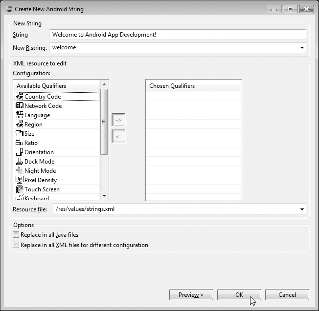
Fig. 3.17. Create New Android String window.
4. Fill the String and New R.string fields as shown in Fig. 3.17, then click OK to dismiss the Create New Android String dialog and return to the Resource Chooser dialog.
5. The new string resource named welcome is automatically selected. Click OK to select this resource.
In the Properties window, the Text property should now appear as shown in Fig. 3.18. The syntax @string indicates that an existing string resource will be selected from the strings.xml file, and the name welcome indicates which string resource to select.
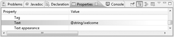
Fig. 3.18. Properties window after changing the TextView’s Text property.
A key benefit of defining your string values this way is that you can easily localize your app by creating additional XML resource files for string resources in other languages. In each file, you use the same name in the New R.string field and provide the internationalized string in the String field. Android can then choose the appropriate resource file based on the device user’s preferred language. For more information on localization, visit
developer.android.com/guide/topics/resources/localization.html
Step 6: Configuring the TextView’s Text size and Padding top Properties—Scaled Pixels and Density-Independent Pixels
The sizes of GUI components and text in Android can be specified in several different units (Fig. 3.19). The documentation for supporting multiple screen sizes
developer.android.com/guide/practices/screens_support.html
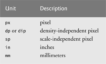
Fig. 3.19. Measurement units.
recommends that you use density-independent pixels for the dimensions of GUI components and other screen elements and scale-independent pixels for font sizes.
Defining your GUIs with density-independent pixels enables the Android platform to automatically scale the GUI, based on the pixel density of the actual device’s screen. One density-independent pixel is equivalent to one pixel on a screen with 160 dpi (dots per inch). On a screen with 240 dpi, each density-independent pixel will be scaled by a factor of 240/160 (i.e., 1.5). So, a component that’s 100 density-independent pixels wide will be scaled to 150 actual pixels wide. On a screen with 120 dpi, each density-independent pixel is scaled by a factor of 120/160 (i.e., .75). So, the same component that’s 100 density-independent pixels wide will be 75 actual pixels wide. Scale-independent pixels are scaled like density-independent pixels, and they’re also scaled by the user’s preferred font size specified on the device. [Note: At the time of this writing, users cannot yet change the preferred font size on Android devices, but this feature is expected in the future.]
You’ll now increase the size of the TextView’s font and add some padding above the TextView to separate the text from the edge of the device’s screen.
1. To change the font size, ensure that the TextView is selected, then change its Text size property to 40sp.
2. To add some space between the top edge of the layout and the TextView, set the Layout margin top property in the Misc section of the Properties window to 10dp.
Step 7: Configuring Additional TextView Properties
Configure the following additional TextView’s properties as well:
1. Set its Id property to @+id/welcomeTextView.
2. Set its Text color property to #00F (blue).
3. Set its Text style property to bold. To do so, click the Value field for this property, then click the ellipsis button () to display the dialog for selecting the font style. Click the bold checkbox, then click OK to set the text style.
4. To center the text in the TextView if it wraps to multiple lines, set its Gravity property to center. To do so, click the Value field for this property, then click the ellipsis button to display a dialog with the Gravity property’s options (Fig. 3.20). Click the center checkbox, then click OK to set the value.
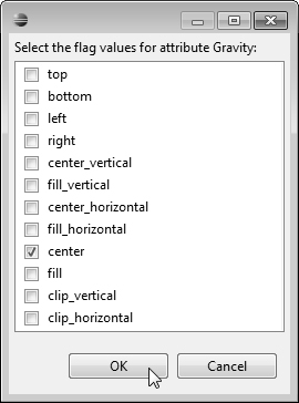
Fig. 3.20. Options for the gravity attribute of an object.
The Visual Layout Editor window should now appear as shown in Fig. 3.21.

Fig. 3.21. Visual Layout Editor window after completing the TextView’s configuration.
Step 8: Adding ImageViews to Display the Android Logo and the Deitel Bug Logo
Next, you’ll add two ImageViews to the GUI to display the images that you added to the project in Step 1. When you first drag an ImageView onto the Visual Layout Editor, nothing appears. For this reason, we’ll use the Outline window to add the ImageViews. Perform the following steps:
1. Drag an ImageView from the Images & Media category in the Visual Layout Editor’s Palette and drop it onto the Outline window as shown in Fig. 3.22. The new ImageView appears below the welcomeTextView node. This does not indicate that this component will appear below the TextView in the GUI. This requires setting the Layout below property, which we’ll do in a moment. [Note: If you drag the ImageView over the welcomeTextView and hover for a moment, a green rectangle with sections will appear around the welcomeTextView. If you then drag the ImageView over one of those sections and drop it, the Visual Layout Editor can set the relative positioning for you.]
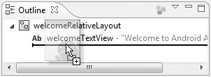
Fig. 3.22. Dragging and dropping an ImageView onto the Outline window.
2. Set the ImageView’s Id property to @+id/droidImageView. The Outline window now shows the object’s name as droidImageView.
3. Set the droidImageView’s Layout below property to @id/welcomeTextView to position the ImageView below the welcomeTextView. To do so, click the Value field for this property, then click the ellipsis button to display the Reference Chooser dialog (Fig. 3.23). The ID node contains the names of the objects in the GUI. Expand the ID node and select welcomeTextView.
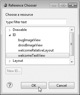
Fig. 3.23. Selecting the value for the droidImageView’s Layout below property.
4. Set the droidImageView’s Layout center horizontal property to true to center the ImageView in the layout.
5. Set the droidImageView’s Src property to the image that should be displayed. To do so, click the Value field for this property, then click the ellipsis button to display the Reference Chooser dialog (Fig. 3.24). The Drawable node contains the resources in your app’s drawable folders within the res folder. In the dialog, expand the Drawable node and select android, which represents the android.png image.

Fig. 3.24. Selecting the value for the droidImageView’s Src property.
6. Repeat items 1–5 above to create the bugImageView. For this component, set its Id property to @+id/bugImageView, its Src property to bug and its Layout below property to droidImageView.
The Visual Layout Editor window should now appear as shown in Fig. 3.25.
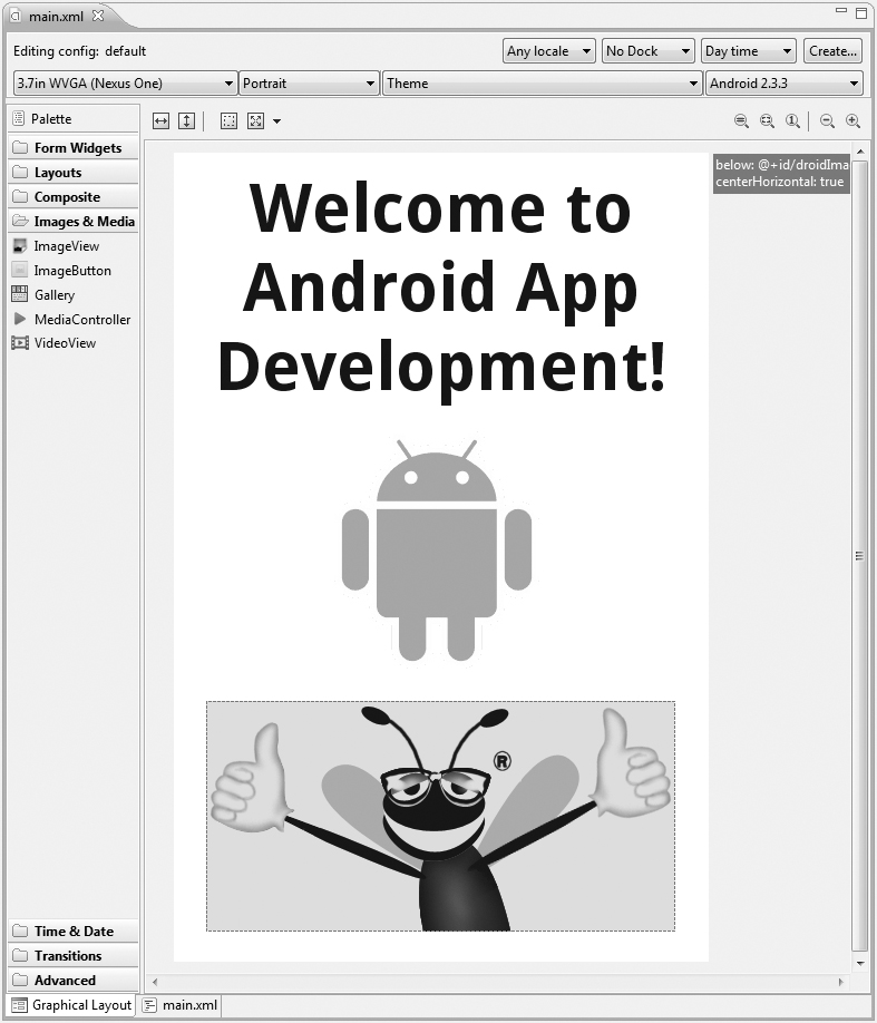
Fig. 3.25. Visual Layout Editor window after completing the GUI configuration.
3.6. Examining the main.xml File
XML is a natural way to express a GUI’s contents. It allows you, in a human- and computer-readable form, to say which layouts and components you wish to use, and to specify their attributes, such as size, position and color. The ADT Plugin can then parse the XML and generate the code that produces the actual GUI. Figure 3.26 shows the final main.xml file after you perform the steps in Section 3.5. We reformatted the XML and added some comments to make the XML more readable. (Eclipse’s Source > Format command can help you with this.) As you read the XML, notice that each XML attribute name that contains multiple words does not contain spaces, whereas the corresponding properties in the Properties window do. For example, the XML attribute android:paddingTop corresponds to the property Padding top in the Properties window. When the IDE displays property names, it displays the multiword names as separate words for readability.
1 <?xml version="1.0" encoding="utf-8"?>
2 <!-- main.xml -->
3 <!-- Welcome App's XML layout. -->
4
5 <!-- RelativeLayout that contains the App's GUI components. -->
6 <RelativeLayout xmlns:android="http://schemas.android.com/apk/res/android"
7 android:layout_width="match_parent"
8 android:layout_height="match_parent"
9 android:id="@+id/welcomeRelativeLayout" android:background="#FFFFFF">
10
11 <!-- TextView that displays "Welcome to Android App Development!" -->
12 <TextView android:layout_width="wrap_content"
13 android:layout_height="wrap_content"
14 android:text="@string/welcome"
15 android:textSize="40sp" android:id="@+id/welcomeTextView"
16 android:textColor="#00F" android:textStyle="bold"
17 android:layout_centerHorizontal="true" android:gravity="center"
18 android:layout_marginTop="10dp"></TextView>
19
20 <!-- ImageView that displays the Android logo -->
21 <ImageView android:layout_height="wrap_content"
22 android:layout_width="wrap_content" android:id="@+id/droidImageView"
23 android:layout_centerHorizontal="true"
24 android:src="@drawable/android"
25 android:layout_below="@id/welcomeTextView"></ImageView>
26
27 <!-- ImageView that displays the Deitel bug logo -->
28 <ImageView android:layout_height="wrap_content"
29 android:layout_width="wrap_content" android:id="@+id/bugImageView"
30 android:src="@drawable/bug"
31 android:layout_below="@id/droidImageView"
32 android:layout_centerHorizontal="true"></ImageView>
33 </RelativeLayout>
Fig. 3.26. Welcome App’s XML layout.
welcomeRelativeLayout
The welcomeRelativeLayout (lines 6–33) contains all of the app’s GUI components.
• Its opening XML tag (lines 6–9) sets various RelativeLayout attributes.
• Line 6 uses the xmlns attribute to indicate that the elements in the document are all part of the android XML namespace. This is required and auto-generated by the IDE when you create any layout XML file.
• Lines 7–8 specify the value match_parent for both the android:layout_width and android:layout_height attributes, so the layout occupies the entire width and height of layout’s parent element—that is, the one in which this layout is nested. In this case, the RelativeLayout is the root node of the XML document, so the layout occupies the entire screen (excluding the status bar).
• Line 9 specifies the values for the welcomeRelativeLayout’s android:id and android:background attributes.
welcomeTextView
The first element in the welcomeRelativeLayout is the welcomeTextView (lines 12–18).
• Lines 12 and 13 set the android:layout_width and android:layout_height attributes to wrap_content. This value indicates that the view should be just large enough to fit its content, including its padding values that specify the spacing around the content.
• Line 14 sets the android:text attribute to the string resource named welcome that you created in Section 3.5, Step 5.
• Line 15 sets the android:textSize attribute to 40sp and the android:id attribute to "@+id/welcomeTextView".
• Line 16 sets the android:textColor attribute to "#00F" (for blue text) and the android:textStyle attribute to "bold".
• Line 17 sets the android:layout_centerHorizontal attribute to "true", which centers the component horizontally in the layout, and sets the android:gravity attribute to "center" to center the text in the TextView. The android:gravity attribute specifies how the text should be positioned with respect to the width and height of the TextView if the text is smaller than the TextView.
• Line 18 sets the android:marginTop attribute to 10dp so that there’s some space between the top of the TextView and the top of the screen.
droidImageView
The last two elements nested in the welcomeRelativeLayout are the droidImageView (lines 21–25) and the bugImageView (lines 28–32). We set the same attributes for both ImageViews, so we discuss only the droidImageView’s attributes here.
• Lines 21 and 22 set the android:layout_width and android:layout_height attributes to wrap_content. Line 22 also sets the android:id attribute to "@+id/droidImageView".
• Line 23 sets the android:layout_centerHorizontal attribute to "true" to centers the component in the layout.
• Line 24 sets the android:src attribute to the drawable resource named android, which represents the android.png image.
• Line 25 sets the android:layout_below attribute to "@id/welcomeTextView". The RelativeLayout specifies each component’s position relative to other components. In this case, the ImageView follows the welcomeTextView.
3.7. Running the Welcome App
To run the app in an Android Virtual Device (AVD), right click the app’s root node in the Package Explorer window and select Run As > Android Application. Figure 3.27 shows the running app.
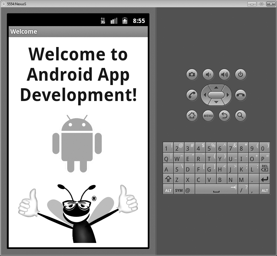
Fig. 3.27. Welcome app running in an AVD.
3.8. Wrap-Up
This chapter introduced key features of the Eclipse IDE and the ADT Visual Layout Editor. You used the Visual Layout Editor to create a working Android app without writing any code. You used the TextView and ImageView GUI components to display text and images, respectively, and you arranged these components in a RelativeLayout. You edited the properties of GUI components to customize them for your app. You then tested the app in an Android Virtual Device (AVD). Finally, we presented a detailed walkthrough of the XML markup that generates the GUI.
In the next chapter we introduce how to program Android apps using Java. Android development is a combination of GUI design, and Java and XML coding. Java allows you to specify the behavior of your apps. You’ll develop the Tip Calculator app, which calculates a range of tip possibilities when given a restaurant bill amount. You’ll design the GUI and add Java code to specify how the app should process user inputs and display the results of its calculations.
Self-Review Exercises
3.1. Fill in the blanks in each of the following statements:
a. Layout files are considered app resources and are stored in the project’s __________ folder. GUI layouts are placed within that folder’s layout subfolder.
b. When designing an Android GUI, you typically want it to be __________ so that it displays properly on various devices.
c. The Android pixel density __________ indicates that a resource should not be scaled regardless of screen density.
d. To change the background color to white, locate the Background property in the Properties window and set its value to __________.
e. You can easily __________ your app by creating additional XML resource files for string resources in other languages.
f. The two measurement units for density independent pixels are __________ and __________.
g. Setting the android:layout_width and android:layout_height attributes to __________ indicates that the view should be just large enough to fit its content, including its padding values that specify the spacing around the content.
h. To run an app in an Android Virtual Device (AVD), right click the app’s root node in Eclipse in the __________ window and select Run As > Android Application.
3.2. State whether each of the following is true or false. If false, explain why.
a. The Eclipse IDE and the ADT (Android Development Tools) Plugin are the most popular tools for creating and testing Android apps.
b. A LinearLayout always arranges GUI components in a line horizontally.
c. The layout RelativeLayout arranges components relative to one another or relative to their parent container.
d. Android also supports alpha (transparency) values in the range 0–100, where 0 represents completely transparent and 100 represents completely opaque.
e. Setting the android:layout_centerHorizontal attribute to "yes" centers the component horizontally in the layout.
Answers to Self-Review Exercises
a. res.
b. scalable.
c. nodpi.
d. #FFFFFF.
e. localize.
f. dp and dip.
g. wrap_content.
h. Package Explorer.
a. True.
b. False. LinearLayout arranges GUI components in a line horizontally or vertically.
c. True.
d. False. Android also supports alpha (transparency) values in the range 0–255, where 0 represents completely transparent and 255 represents completely opaque.
e. False. Setting the android:layout_centerHorizontal attribute to "true" centers the component horizontally in the layout.
Exercises
3.3. Fill in the blanks in each of the following statements:
a. The ADT’s __________ allows you to build GUIs using drag-and-drop techniques.
b. For an Android app that you create with Eclipse, the GUI layout is stored in an XML file called __________, by default.
c. The default GUI for a new Android app consists of a(n) __________ (layout) with a black background.
d. The __________ (layout) allocates space for a single component. You can add more than one component to this layout, but each will be displayed from the layout’s upper-left corner. The last component added will appear on top.
e. Your project’s res folder contains three subfolders for images—drawable-hdpi (high density), drawable-mdpi (medium density) and drawable-ldpi (low density). These folders store images with different __________ densities.
f. If you wish to use alpha values, you can specify the color in the format __________, where the first two hexadecimal digits represent the alpha value.
g. The documentation for supporting multiple screen sizes recommends that you use density-independent pixels for the dimensions of GUI components and other screen elements and __________ for font sizes.
h. One density-independent pixel is equivalent to one pixel on a screen with 160 dpi (dots per inch). On a screen with 240 dpi, each density-independent pixel will be scaled by a factor of __________.
i. On a screen with 120 dpi, each density-independent pixel is scaled by a factor of __________. So, the same component that’s 100 density-independent pixels wide will be 75 actual pixels wide.
j. Specifying the value match_parent for both the android:layout_width and android:layout_height attributes causes the layout to occupy the entire width and height of layout’s __________ element—that is, the one in which this layout is nested.
k. Setting the __________ attribute to "center" centers the text in the TextView.
l. Android development is a combination of GUI design, and __________ and XML coding.
3.4. State whether each of the following is true or false. If false, explain why.
a. For images to render nicely, a high-pixel-density device needs lower-resolution images than a low-pixel-density device.
b. Every color can be created from a combination of red, green and blue components called RGB values—each is an integer in the range 0–256.
c. It’s considered a good practice to “externalize” strings, string arrays, images, colors, font sizes, dimensions and other app resources so that you, or someone else on your team, can manage them separately from your application’s code.
d. You can use the Visual Layout Editor to create a working Android app without writing any code.
3.5. (Scrapbooking App) Find four open source images of famous landmarks using websites such as Flickr. Create an app in which you arrange the images in a collage. Add text that identifies each landmark.