
11. Advanced Editing Techniques
Lesson Overview
In this final chapter you’ll learn some advanced editing concepts and try some of the innovative tools that Adobe Photoshop Elements delivers to help you improve the quality and clarity of your images.
Discover the benefits of working with raw image files and how the power and simplicity of the Camera Raw plug-in makes it easy for you to achieve professional-looking results with your color corrections and tonal adjustments. Save your raw files in the versatile DNG format and take advantage of Camera Raw’s non-destructive editing.
Enjoy the creative possibilities of combining and calibrating multiple filters, creating your own special effects to turn your photos into art.
This lesson will introduce some essential concepts and skills for making the most of your photos:
• Working with raw images
• Converting files to DNG format
• Using the histogram to assess a photo
• Improving the quality of highlights and shadows
• Designing custom effects in the filter gallery
• Creating layer masks
• Using the Type Mask tool
You’ll probably need between one and two hours to complete this lesson.

Discover the advantages of working with raw images in the Camera Raw window, where the easy-to-use controls make it simple to correct and adjust your photos like a professional. Learn how to use the Histogram panel to help you understand what a less-than-perfect picture needs and to give you visual feedback on the solutions you apply. Finally, have some fun putting together your own filter effects.
Getting started
You can begin by importing the sample images for this lesson to the CIB Catalog that you created at the beginning of Lesson 1.
1. Start Photoshop Elements and click Organize in the Welcome Screen. When the Organizer opens, make sure that your CIB Catalog is loaded (if you need to refresh your memory, refer to step 2 in the Getting Started section in Lesson 5).
2. Choose File > Get Photos And Video > From Files And Folders. In the Get Photos And Videos From Files And Folders dialog box, locate and select your Lesson11 folder. Disable any automatic processing option that is currently active, and then click Get Media.
3. In the Import Attached Keyword Tags dialog box, select the Lesson 11 tag, and then click OK. Click OK to close any other alert dialog box.
Before you start working on this lesson, make sure that you’ve installed the software on your computer from the application CD (see the Photoshop Elements 10 documentation) and that you have correctly copied the Lessons folder from the CD in the back of this book onto your computer’s hard disk (see “Copying the Classroom in a Book files” on page 2). You should also have created a working catalog (see “Creating a new catalog” on page 8).
Working with camera raw images
In this first exercise you’ll be working with a raw image from a Nikon camera as you explore the correction and adjustment controls in the Camera Raw window.
1. In the Organizer, click the Show All button in the Find bar. Type the word hat in the Text Search box, at the left of the bar above the Media Browser. The test search returns a single image: 11_01_SunHat.NEF.
2. Right-click / Control-click the thumbnail in the Media Browser and choose Edit With Photoshop Elements Editor. Photoshop Elements opens the image in the Camera Raw window.
The moment you open a camera raw file for the first time, the Camera Raw plug-in creates what is sometimes referred to as a sidecar file in the same folder as the raw image file. The sidecar file takes the name of the raw file, with the extension “.xmp.” Any modification that you make to the raw photograph is written to the XMP (Extensible Metadata Platform) file, rather than to the image file itself, which means that the original image data remains intact, while the XMP file records every edit.
3. Use the Windows System Tray (XP), the Notification Area (Vista), or the Dock on Mac OS to switch back to the Elements Organizer.
4. With the image of the girl in the sun hat selected in the Media Browser, click the Display button (![]() ) at the upper right of the workspace and choose Folder Location from the menu. In the Folders panel at the left of the Media Browser, right-click / Control-click the Lesson11 folder and choose Reveal In Explorer / Reveal In Finder. A Windows Explorer / Finder window opens to show the contents of your Lesson11 folder. The new XMP sidecar file, 11_01_SunHat.XMP, is listed beside the NEF image file. Return to the Editor in Photoshop Elements.
) at the upper right of the workspace and choose Folder Location from the menu. In the Folders panel at the left of the Media Browser, right-click / Control-click the Lesson11 folder and choose Reveal In Explorer / Reveal In Finder. A Windows Explorer / Finder window opens to show the contents of your Lesson11 folder. The new XMP sidecar file, 11_01_SunHat.XMP, is listed beside the NEF image file. Return to the Editor in Photoshop Elements.
Getting to know the Camera Raw window
On the right side of the Camera Raw window is a control panel headed by three tabs: Basic, Detail, and Camera Calibration. For this set of exercises you’ll work with the Basic tab—the default—which presents controls for making adjustments that are not possible with the standard editing tools in Photoshop Elements.
Click the Detail tab to access controls for sharpening image detail and reducing the grainy digital artefacts known as noise.
1. Make sure that the Preview checkbox above the image window is activated.

2. In the toolbar above the image window, hold the pointer over each of the tools in turn to see a tooltip with the name of the tool and the respective keyboard shortcut. Click the Toggle Full Screen Mode button at the right of the tool bar to switch to full screen mode.
3. Click the menu icon at the right of the Basic tab’s header bar to see the choices available from the control panel Options menu. You can apply the same settings that you used for the last image you worked with, have Photoshop Elements revert to the default Camera Raw profile for your camera by choosing Reset Camera Raw Defaults, or save your own custom settings as the new default for the camera that captured this image.

Adjusting the white balance
The Camera Raw white balance presets can be helpful when you need to rectify a color cast caused by incorrect camera settings or poor lighting conditions. If your camera was not correctly set up to deal with overcast conditions, for example, you could correct your image by choosing the Cloudy preset from the White Balance menu. Other presets help you to compensate for the deficient color balance caused by different types of artificial lighting. Incandescent lighting typically causes an orange-yellow color cast; fluorescent lighting is notorious for a dull greenish tint.
The As Shot setting reads the embedded metadata that records the camera settings when the image was captured, while the Auto setting recalculates the white balance based on an analysis of the image data.
1. Experiment with some of the presets available in the White Balance menu. Switch the setting back and forth to compare the Auto, Cloudy, and Tungsten preset to the default As Shot setting. In the following pages you’ll discover why the appropriate white balance is so important to the overall look of the image.

2. For now, choose As Shot from the White Balance presets menu.
For many photos, the right white balance preset will produce satisfactory results, either used “as is,” or as a starting point for manual adjustment. When none of the presets seems to take your image in the right direction, you can use the White Balance tool (![]() ) to sample a color from the photo to be used as a neutral reference in relation to which Camera Raw will recalculate the white balance.
) to sample a color from the photo to be used as a neutral reference in relation to which Camera Raw will recalculate the white balance.
The ideal sample for this purpose is a light to medium gray that is neither discernibly warm or cool in tone. In some images it can be difficult to identify such a color; in the absence of a definitive visual reference you may sometimes rely on what you know about the photo: that it was taken on a cloudy day, for example, or under fluorescent lighting. It may help to look for references such as white paper, clothing, or paint, and then sample a shaded area. In our sample photo, the weathered wood is a potential reference, but we can probably be more certain that the steel fencing wire in the background is a neutral gray.
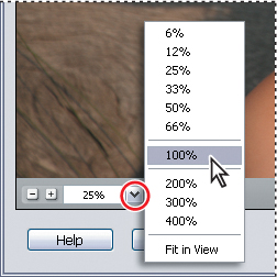
3. Zoom into the image by choosing 100% from the Zoom Level menu in the lower left corner of the preview window, or by double-clicking the zoom tool.
4. Select the Hand tool (![]() ) and drag the image downwards and to the right so that you can see the thick wire above the left side of the girl’s hat.
) and drag the image downwards and to the right so that you can see the thick wire above the left side of the girl’s hat.

5. Select the White Balance tool (![]() ), right beside the Hand tool in the tool bar. Sample a medium gray from the center of the wire where it crosses a relatively dark area. If you see little effect, click a slightly different point.
), right beside the Hand tool in the tool bar. Sample a medium gray from the center of the wire where it crosses a relatively dark area. If you see little effect, click a slightly different point.

6. Zoom out by choosing Fit In View from the Zoom Level menu in the lower left corner of the preview window.
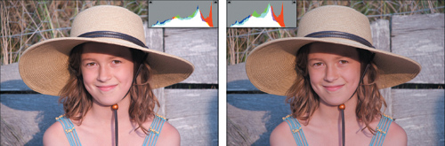
The White Balance is now set to Custom and the image has become cooler. The weathered wood in the background is a more neutral gray and the girl’s skin is rosier. Her eyes also look clearer, having lost the original yellow-orange cast.
7. Use the White Balance menu to alternate between your custom settings and the As Shot preset, noting the change in the preview window, as well as the differences in the Temperature and Tint settings.
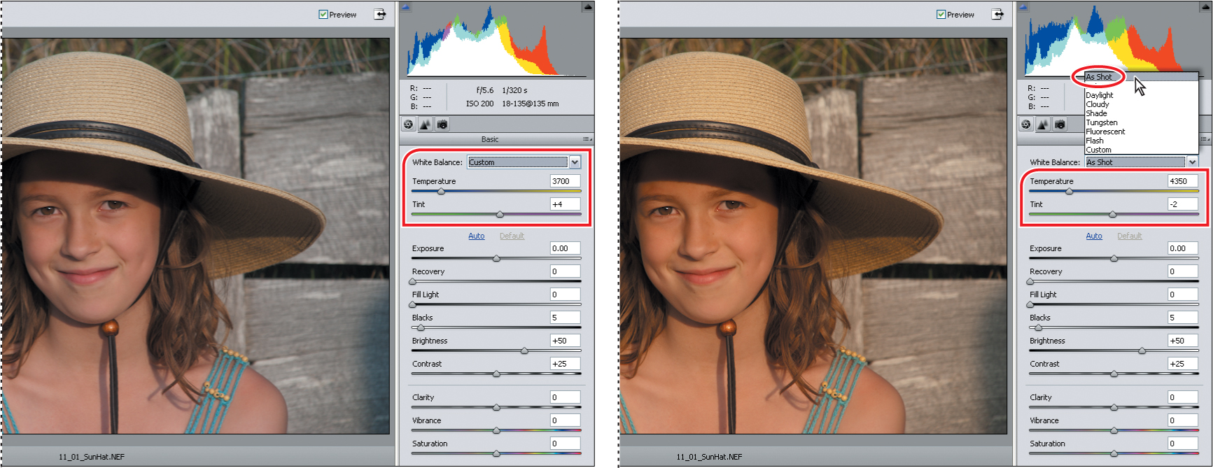
8. Repeat step 7 for each of the other white balance presets, comparing the position of the sliders and look of the image to your custom adjustment. When you’re done, return the white balance to your custom setting.

Working with the Temperature and Tint settings
The White Balance tool can accurately remove any color cast or tint from an image but you may still want to tweak the Temperature and Tint settings. In this case, the color temperature seems fine, but the girl’s skin still has a slightly sallow look that can be corrected by fine-tuning the green/magenta balance using the Tint control.
1. Use the Zoom tool or the Zoom Level menu in the lower left corner of the preview window to focus closely on the girl’s face.
2. Increase the Tint setting to +25 with the slider or type +25 in the Tint text box. Press Ctrl+Z / Command+Z to toggle between the new Tint setting and the value set with the White Balance tool, comparing the effect.

3. Double-click the Hand tool or by choose Fit In View from the Zoom Level menu. Test the Temperature slider by dragging it from one end of its range to the other. You’ll see that the colors of the image become cooler or warmer as you move the slider. In this case, the corrected temperature of the image seemed fine but this slider could help you on other occasions—for warming up the cold underwater tones resulting from fluorescent lighting, for example.

4. Reset the Temperature control to the corrected value of 3700 either by dragging the slider or typing the value 3700 into the Temperature text box.
5. Experiment with the extremes of the Tint slider; then, reset the value to +25.
As well as helping to correct color and improve the tonal range, the white balance settings can also be used creatively to achieve dramatic atmospheric effects.
Depending on the subject matter and the effect you wish to achieve, you might actually want a slight, controlled color cast or tint. For example, although technically in need of correction, you might prefer the original overly warm cast in our lesson image (a result of late afternoon sunlight) for its evocative, summery look.
Using the tone controls on a raw image
The settings for tonal adjustments are located below the White Balance controls on the Basic tab. In this exercise, you’ll use these controls to correct exposure, check highlights and shadows, and adjust brightness, contrast, and saturation. Before you adjust any of the settings, you should understand what each of the controls does:
Exposure adjusts the lightness or darkness of an image. Underexposed images are too dark and look dull and murky; overexposed images are too light and look washed out. Use the Exposure control to lighten an underexposed image or correct the faded look of an overexposed image.
Recovery attempts to recover details from burned-out highlights. The Recovery control can reconstruct some detail in areas where one or two color channels have been clipped to white. Clipping occurs when a pixel’s color values are higher or lower than the range that can be represented in the image; over-bright values are clipped to output white, and over-dark values are clipped to output black.
Fill Light recovers details from shadows, without brightening blacks. The Fill Light control does something close to the inverse of the Recovery control, reconstructing detail in areas where one or two of the color channels have been clipped to black. Blacks specifies which input levels are mapped to black in the final image. Raising the Blacks value expands the areas that are mapped to black.
Brightness adjusts the brightness of the image, much as the Exposure slider does. However, instead of clipping the image in the highlights (areas that are completely white, with no detail) or shadows (areas that are completely black, with no detail), Brightness compresses the highlights and expands the shadows when you move the slider to the right. In general, it’s best to use the Brightness slider to adjust the overall brightness after you have set the white and black clipping points with the Exposure and Blacks sliders.
Contrast is the amount of difference in brightness between light and dark areas of an image. The Contrast control determines the number of shades in the image, and has the most noticeable effect in the midtones. An image without enough contrast can appear flat or washed out. Use the Contrast slider to adjust the midtone contrast after setting the Exposure, Blacks, and Brightness values.
Clarity sharpens the definition of edges in the image. This process helps restore detail and sharpness that tonal adjustments may reduce.
Vibrance adjusts the saturation so that clipping is minimized as colors approach full saturation, acting on all lower saturated colors but having less impact on higher saturated colors. Vibrance also prevents skin tones from becoming oversaturated.
Saturation is the purity, or strength, of a color. A fully saturated color contains no gray. The Saturation control makes colors more vivid (containing less black or white) or more muted (containing more black or white).
First you’ll adjust the Exposure setting, checking for clipping in the brighter areas.
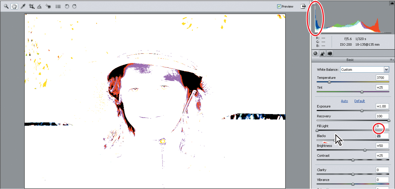
1. Hold down the Alt / Option key as you drag the Exposure slider slowly to the right. Watch the preview in the image window to see which parts of the image will be forced towards white as the highlights are clipped as a result of this adjustment. Set the Exposure to +2.00, where white appears in the preview. You can see the clipping at the right end of the graphed curve in the histogram.

2. Keep holding the mouse button down on the slider control, but release the Alt / Option key to see the effect of the excessive exposure adjustment on the image. Switch between these two views several times to see the correlation between the clipping preview and the over-exposed image. Drag the slider left to set a value of +1.20 and check the clipping preview. At this point the reflected highlights on the beads under the girl’s chin and at her shoulders are visible as the last few points of red showing in the highlights clipping preview.
In the histogram, the main body of the distribution curve has moved left—most of the clipping has been resolved. The tail end of the red curve that is still clipped at the right end of the graph represents the tiny reflected highlights in the image.
3. Reduce the Exposure further to set the value to +1.00.
4. The highlights of the girl’s skin, and the brightest-lit areas of her straw hat now look burnt out. Watch the curve in the histogram as you drag the Recovery slider to 70. The clipping is completely corrected. No part of the distribution curve reaches the right end of the graph, which is what we’d expect as there are no areas of pure white in this image.
5. Hold down the Alt / Option key and drag the Blacks slider to the right to a value of 20. Areas that appear in the clipping preview will be forced to a solid black. Switch between the clipping preview and the image to assess the effect.
6. Watch the clipping preview as you drag the slider slowly to the left until only the deepest shadows register as black. We set the Blacks value to 10. Click the Brightness slider, and then press the up arrow on the keyboard to increase the value to +60. Click the Contrast slider; then, press the up arrow key on the keyboard to increase the value to +50.
7. Choose a magnification level of 100% from the Zoom menu at the lower left of the image window. Use the Hand tool to center your view on the girl’s face; then, drag the Clarity slider to +50 and set the Vibrance value to +25. Double-click the Hand tool to see the entire image.
8. Toggle the Preview checkbox at the right of the tool bar on and off to compare the adjusted photo to the raw image.
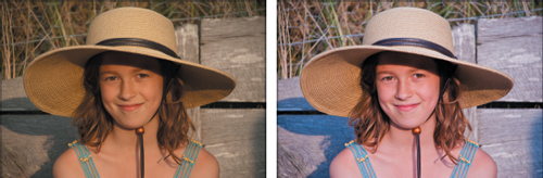
The photo looked somewhat dull, muddy, and indistinct, and a little too dark. It now shows a broader range of detail and is more vivid; the colors are brighter and the tones are more realistic. For the sake of clarity in our demonstration however, some of the adjustments you made were quite extreme. If you wish to tone down the corrections to balance the image to your taste, you can do so now.
Remember that everything you do to a raw image in the Camera Raw window is recorded only in the XMP sidecar file, not written to the original image file. This is one advantage of working with raw images: the original data remains absolutely intact. Your adjustments are applied only when you output a copy of the enhanced image in another file format.
Saving the image in the DNG format
Each camera manufacturer has its own proprietary raw format, and not every raw file can be read or edited by software other than that provided with the camera. There is also the possibility that manufacturers might not support every format indefinitely. To help alleviate these problems, Photoshop Elements gives you the option to save raw images in the DNG format, a publicly available archival format for raw images that provides an open standard for files created by different camera models, ensuring that you’ll still be able to access your images in the future.
1. To convert and save the image, click the Save Image button at the lower left of the Camera Raw dialog box. Under Destination in the Save Options dialog box, click Select Folder. Navigate to and open your Lessons folder; then, highlight your My CIB Work folder and click Select.
2. Under File Naming, leave Document Name selected in the menu on the left. Click the menu on the right and select 1 Digit Serial Number. This will add the number 1 to the end of the file name.
3. Click Save. The file, together with all your current settings, will be saved in DNG format, which you can reprocess repeatedly without losing the original data.
4. Click the Open Image button in the right lower corner of the Camera Raw dialog box. Your image will open in a regular image window in Photoshop Elements. Choose File > Save. Navigate to your My CIB Work folder, name the file 11_01_SunHat_Work, and choose the Photoshop format. Make sure that the new file will be included in the Organizer, but not in a Version Set.
5. Click Save, and then choose File > Close.
Using the histogram
In the previous exercise, you referred to the histogram in the Camera Raw window as you learned about clipping in highlights and shadows.
In this part of the lesson, you’ll learn how to use the Histogram panel in Full Edit mode—both as a guide to help you understand an image’s deficiencies, and also as a source of dynamic feedback as you make changes to improve its quality.
In the following exercises, you’ll work on an image that was shot in poor lighting and also has a slight magenta cast. This is quite a common problem—many digital cameras introduce a slight color cast into images.
About histograms
A histogram is a graph that maps the spread of tonal values present in an image, indicating how much tonal detail an image contains, from the shadows at the left end of the curve, through the midtones, to the highlights at the right of the curve. The histogram can help you to recognize where corrections need to be made, and then to assess how effective an adjustment will be, even as you set it up.

In the histogram below it’s very apparent that there is not a good spread of tonal information in this image. The curve is weighted heavily towards the shadows at the left and deficient in the midtones. You can see clearly that the image is overly dark, and has a flat, dullish appearance, lacking in midtone contrast.

Excessive tonal adjustment can degrade image information, causing posterization, or color-banding. The histogram in the illustration below reveals that the image has already lost tonal detail in certain ranges; there are gaps, bands, and anomalous spikes in the curve. Any further adjustment will only degrade the image more.

Understanding highlights and shadows
In the next part of this lesson, you’ll adjust the highlights and shadows and make additional tonal corrections to this photo while keeping an eye on the Histogram.
1. Make sure you are in Full Edit mode. Choose File > Open, navigate to your Lesson11 folder, select the file 11_02.psd and click Open.
2. Choose File > Save As. Name the image 11_02_Work and save it to your My CIB Work folder in Photoshop (PSD) format, with the usual option settings.
3. If the Histogram panel is not already visible, choose Window > Histogram. From the Channel menu at the top of the Histogram panel, choose RGB.
4. In order to watch the effects of your adjustments more closely, drag the Histogram panel out of the Panel bin and position it beside the image.

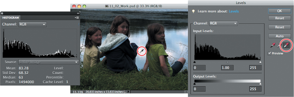
The histogram shows that there is a lack of data in the midtone range for this image: it needs more pixels with values in the midtones and less clustered in the shadows at the left end of the distribution curve. You can adjust the tonal range of this photo in the Levels dialog box, which includes its own histogram curve.
Adjusting levels
1. Choose Enhance > Adjust Lighting > Levels. In the Levels dialog box, make sure that the Preview is option is activated.

You’ll use the shadows, midtone, and highlights sliders (left, middle, and right respectively) below the histogram graph in the Levels panel as well as the Set Black Point, Set Gray Point, and Set White Point eyedroppers (left, middle, and right respectively).
Although the midtones are the range most in need of adjustment in this image, it’s important to get the highlights and shadows right first. We’ll try two slightly different methods for setting the white and black points in the image—both making use of the controls in the Levels dialog box.
2. In the Levels dialog box, hold down the Alt / Option key as you drag the highlights slider to the left to a value of 235—just inside the right-hand end of the tonal curve. The clipping preview shows you where the brightest parts of the image are: principally in the cloud reflections on the water.

3. Watch the histogram as you release first the Alt / Option key, and then the mouse button. The curve in the histogram shifts—possibly a bit far—to the right. You can see that the right-hand end of the curve has become truncated. Move the highlights slider in the Levels dialog box to a value of 240. The curve in the histogram is adjusted accordingly.
4. In the Levels dialog box, click Reset and we’ll try another method for adjusting the highlights. Select the Set White Point Eyedropper tool and watch the histogram as you click in the brightest of the reflections on the water. The white line in the histogram indicates the shape of the curve prior to this adjustment. The result is very similar to the previous method, but it won’t be as easy to fine-tune any clipping at the right end of the curve. Now you’ll correct the shadows.
If your image has an easily identified neutral grey, neither too warm nor cool, you can quickly remove a color cast using the Set White Point Eyedropper.
5. Hold down the Alt / Option key and drag the shadow slider to 4. The area below the right ear of the girl at the left shows as a dark patch in the clipping preview. Watch the histogram as you release the mouse button and the Alt / Option key.

6. In the Levels controls, drag the midtone slider (the gray triangle below the center of the graph) to the left to set the midtone value to 1.35.
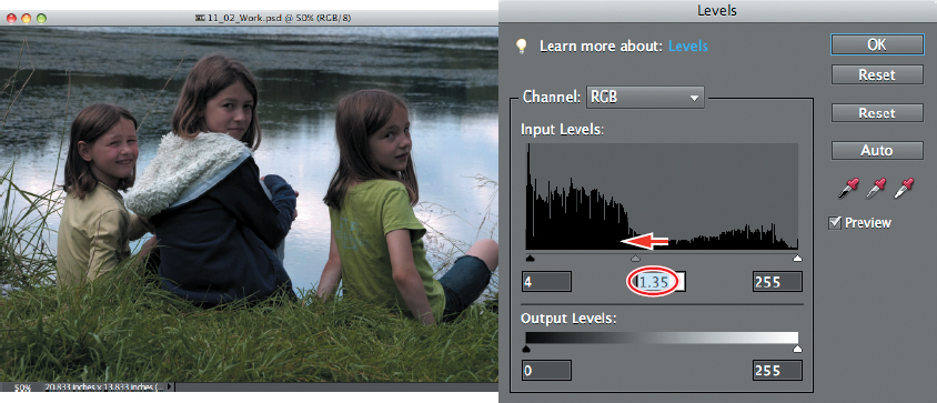
7. Notice the change in the Histogram. Compare the original data (displayed in white) to the data for the corrections that you have made (displayed in black). The fullest part of the curve has shifted right into the mid-tones and the highlights are better represented.
Don’t worry about the yellow alert icon in the Histogram panel; you’ll deal with that in a moment.

The changes have caused some gaps and banding in the distribution curve.
Where possible, you should try to avoid modifications that create large gaps in the histogram; even if the image still looks fine on screen, large gaps may indicate a loss of image data that will be apparent as color banding when the photo is printed.
8. Click OK to close the Levels dialog box. In the Histogram panel, click the yellow alert icon to refresh the histogram display with new, rather than cached data.
9. Select Edit > Undo Levels, or press Ctrl+Z / Command+Z to see how the image looked prior to redistributing the tonal values. Choose Edit > Redo Levels, or Press Ctrl+Y / Command+Y to reinstate your corrections.
10. Chose File > Save, and then close the file.

Creating effects with filters
You can have a lot of fun experimenting with special effects in the Filter Gallery, where you can apply multiple filters to your image and tweak the way they work together, effectively creating new custom effects. Each filter has its own sliders and settings, giving you a great deal of control over the effect it will have on your photo. The possibilities are limitless—it’s up to you! Have a look at “About Filters” in Photoshop Elements Help to find out more about the different filters.
Not all filters are available from the Filter Gallery—some are available only individually as Filter menu commands. The Filter Gallery does not include the effects and layer styles that you’ll find in the Effects panel.
You can achieve even more and sophisticated results by applying different combinations of filters to multiple duplicate layers of the same image, and then blending the layers using partial transparency, blending modes, or masks.
Before you start exploring the creative possibilities of the Filter Gallery, you can set up a work file with some extra layers.
1. In the Organizer, use the Lesson 11 tag, if necessary, to isolate the images for this lesson. Right-click / Control-click the image 11_03.jpg in the Media Browser and choose Edit With Photoshop Elements Editor from the context menu. In the Editor, click the Reset Panels button (![]() ) at the top of the workspace, or choose Window > Reset Panels.
) at the top of the workspace, or choose Window > Reset Panels.
2. Many filters use the foreground and background colors currently active in the toolbar to create effects, so you should reset them first. Click the Default Foreground And Background Colors button beside the overlapping color swatches at the bottom of the toolbox.

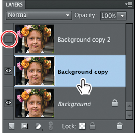
3. Drag the Background layer to the New Layer button (![]() ) at the bottom of the Layers panel to create another layer, named “Background copy” by default. Drag the new Background copy layer to the New Layer button to create a third layer.
) at the bottom of the Layers panel to create another layer, named “Background copy” by default. Drag the new Background copy layer to the New Layer button to create a third layer.

4. Click the the eye icon (![]() ) beside the top layer, Background copy 2, to hide it. Click the middle layer, Background copy, to make it active.
) beside the top layer, Background copy 2, to hide it. Click the middle layer, Background copy, to make it active.
5. In the toolbox, select the Quick Selection tool (![]() ), which is grouped in the toolbox with the Selection Brush.
), which is grouped in the toolbox with the Selection Brush.
6. With the Quick Selection tool, select the wreath of flowers and leaves on the girl’s head, and also her lips. Use the left and right square bracket keys ( [,]) to decrease or increase the brush size as you work. Hold down the Alt / Option key as you paint to subtract from your selection.
7. When the selection is complete, click Refine Edge in the Tool Options bar. In the Refine Edge dialog box, set the Smooth value to 0, the Feather amount to 1 px, and the Contract/Expand value to 1%. This will soften the edges of the selection, without reducing its effective area. Click OK.

8. Choose Select > Save Selection. Name the new selection color details. Under Operation, activate New Selection; then, click OK. Choose Select > Deselect.
9. Choose File > Save As. Navigate to your My CIB Work folder, name the file 11_03_Work, choose the Photoshop format, enable Layers, and then click Save.
Using the filter gallery
1. Choose Filter > Filter Gallery. If necessary, use the menu in the lower left corner of the Filter Gallery window to set the magnification level to 100%.
When you’re working with filters, the most reliable way to assess the effects of the filters you apply is to set the zoom level to 100%.
2. If you can’t see the entire photo, drag the image in the preview pane so that you can see most of the girl’s face. If you don’t see the center pane listing filter categories, click the blue button, to the left of the OK and Cancel buttons.
If you try a filter and see little effect, your image may be too big; although many of the filters include a brush size control, or a slider affecting the magnitude at which the filter is applied, if your file has too high a resolution the effect may not be discernible even at the maximum setting. Use the File > Image Size command to create a smaller copy of your file; then, try the filter again.

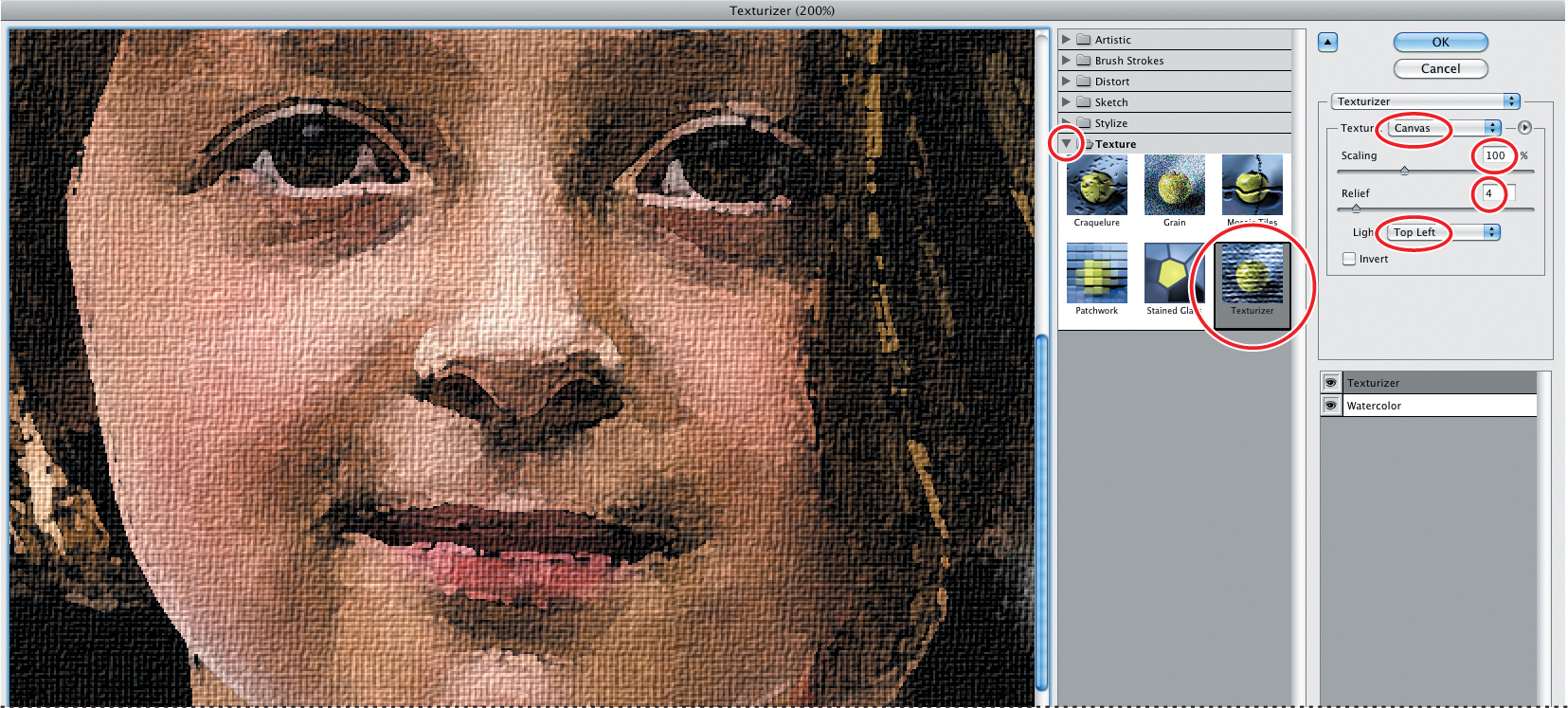
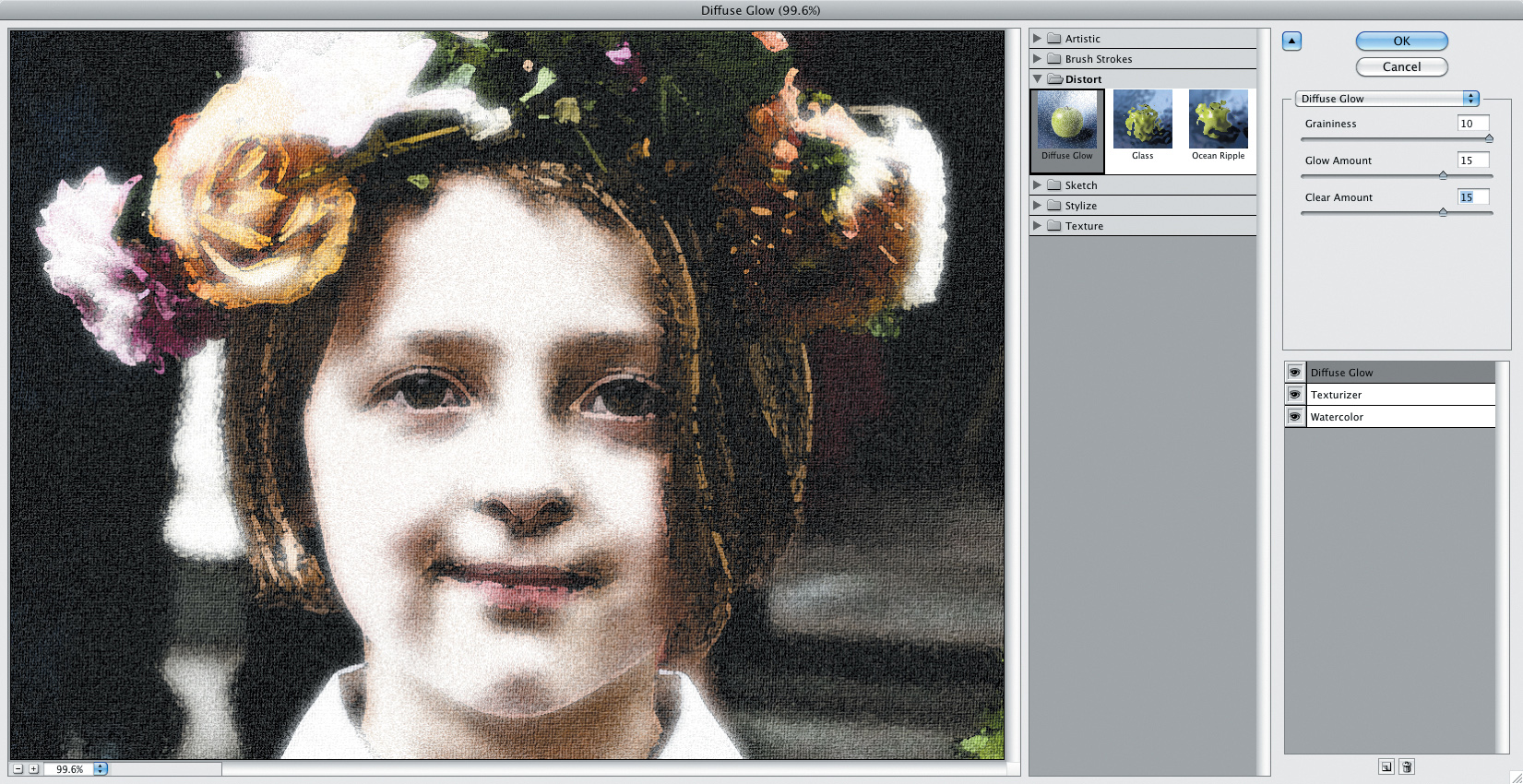
3. In the center pane, expand the Artistic filters category by clicking the arrow to the left of the category name, and then choose the Watercolor filter. Experiment with the full range of the control sliders. Set the Brush Detail to 5, the Shadow Intensity to 3, and the Texture to 2.

4. Collapse the Artistic category. Click the New Effect layer button (![]() ) below the right pane in the Filter Gallery dialog box, expand the Texture category, and choose the Texturizer filter. The Watercolor and Texturizer filters are applied simultaneously. Choose Canvas from the Texture menu; then, set the Scaling value to 100% and the Relief to 4. From the Light menu, choose Top Left.
) below the right pane in the Filter Gallery dialog box, expand the Texture category, and choose the Texturizer filter. The Watercolor and Texturizer filters are applied simultaneously. Choose Canvas from the Texture menu; then, set the Scaling value to 100% and the Relief to 4. From the Light menu, choose Top Left.
In the Filter Gallery, you can combine as many filters as you wish, building up your own complex custom effects.
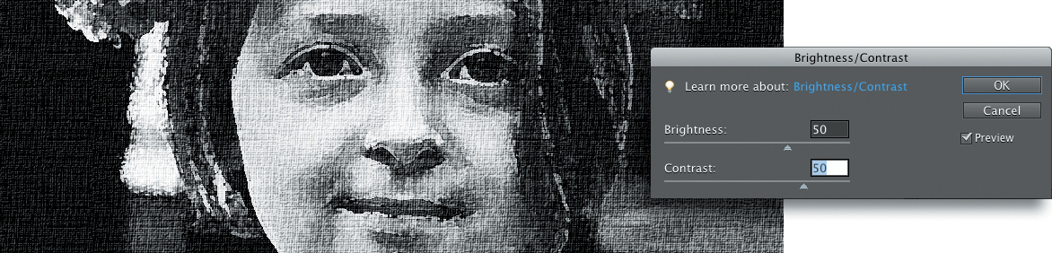
5. Click OK. The combined Watercolor and Texturizer filters are applied to the Background copy layer. Choose Enhance > Adjust Color > Remove Color; then, choose Enhance > Adjust Lighting > Brightness/Contrast. Increase both the Brightness and Contrast values to 50, and then click OK.
Layering filters and effects
In the Filter Gallery, the possibilities are endless for combining different filters at varied settings, but sometimes the best way to get the effect you want is to use the Filter Gallery in tandem with the Layers panel. By using layers and masks, layer opacity, and blending modes, you can achieve even more sophisticated results, and really make the most of the filters and effects.
1. Click the eye icon beside the layer Background copy 2 to make it visible again; then, click the layer thumbnail to make the layer active. Choose Filter > Filter Gallery. Be careful to choose the second listing for the Filter Gallery—the first listing simply applies the previous settings without opening the Filter Gallery.
If you’ve set up an effect that looks great in the background, but makes the faces of your subjects unrecognizable, use layer masks to separate the subjects from the background, and then apply the same set of filters at different settings—or a different effect—to each layer. Even without separating elements, you can apply different effects to duplicate layers, and then mix them.
2. The Filter Gallery window opens with your previous filters, and all their settings, exactly as you left them. Click the New Effect Layer button (![]() ) again. Expand the Distort category and choose the Diffuse Glow filter. Set the Graininess value to 10, and both the Glow Amount and Clear Amount to 15. Click OK.
) again. Expand the Distort category and choose the Diffuse Glow filter. Set the Graininess value to 10, and both the Glow Amount and Clear Amount to 15. Click OK.
The stacking order of filters in the list in the Filter Gallery will alter the way they interact, though this may be more noticeable with some filters than others. You can change the order of the filters by simply dragging them in the list.
3. In the Layers panel, click to select the layer Background copy. At the top of the panel, decrease the layer’s opacity setting to 70%.
4. Select the top layer, Background copy 2. Choose Overlay from the Blending Mode menu at the top left of the Layers panel and set the layer opacity to 30%.
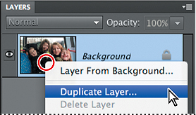
5. Right-click / Control-click the layer Background copy 2 and choose Duplicate Layer from the context menu. In the Duplicate Layer dialog box, type color details as the name for the new layer, and then click OK.
6. Change the new layer’s blending mode to Multiply, and its opacity to 70%.
7. Choose Select > Load Selection. The Load Selection dialog box shows your saved selection, color details, ready to be loaded as a new selection. Click OK.
8. With the saved selection active, and the top layer active in the Layers panel, click the Add Layer Mask button (![]() ) at the bottom of the panel. The selection is converted to a layer mask.
) at the bottom of the panel. The selection is converted to a layer mask.
In the Layers panel, a layer mask icon is added to the top layer, color details, which is now masked so that only the girl’s lips and the flowers on her head remain visible.

9. Toggle the visibility of each layer in turn, watching the effect in the Edit window. Choose File > Save, and then close the file.
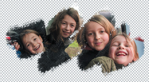
Creative fun with layer masks
There are endless ways to use layer masks to edit, blend, and combine photos.
In this exercise you’ll paint directly into a layer mask to produce a free-form cutout. Using layer masks in this way offers yet another way to create composite images.
1. In the Organizer, use the Lesson 11 tag, if necessary, to isolate the images for this lesson. Select the image 11_04.jpg in the Media Browser; then, click the arrow on the Fix tab above the Task Pane and choose Full Photo Edit. In the Editor, click the Reset Panels button (![]() ) at the top of the workspace, or choose Window > Reset Panels.
) at the top of the workspace, or choose Window > Reset Panels.
2. Right-click / Control-click the image’s single layer, the Background layer, and choose Duplicate Layer from the context menu. In the Duplicate Layer dialog box, click OK to accept the default layer name.
3. Click the eye icon beside the Background layer to hide it from view. With the new layer, Background copy, selected in the Layers panel, click the Add Layer Mask button (![]() ) at the bottom of the panel.
) at the bottom of the panel.

4. Click the new Layer Mask thumbnail on the Background copy layer to make it active for editing, and then choose Edit > Fill Layer. Under Contents in the Fill Layer dialog box, choose Black from the Use menu; then, click OK.
In the image window, you see only the checkerboard pattern that indicates layer transparency; the Background layer is currently invisible, and the black fill in the layer mask hides the image on the Background copy layer completely.
5. Click the box to the left of the Background layer thumbnail to reinstate the eye icon and make the layer visible again. Hold down the Shift key; then, Alt-click / Option-click the layer mask thumbnail to see the mask displayed as a semi-transparent overlay in the image window.
6. Press the E key to select the Eraser tool. In the tool options bar, choose Brush from the Mode menu and make sure that the Opacity is set to 100%.
7. Open the Brush Picker and choose Thick Heavy Brushes from the Brushes menu. The name of each brush appears in a tooltip when you hold the pointer over the swatch. Select the second brush in the set—the Rough Flat Bristle brush: then, press the Esc key to close the Brush Picker. Press the right bracket key ( ]) repeatedly to increase the brush size to 300 pixels.
8. With the Eraser tool, scribble a rough line in the image window to quickly clear the red overlay from the faces of all four girls.

9. Hold down Shift+Alt / Shift+Option and click the layer mask thumbnail to hide the mask overlay; then, hide the Background layer.
10. As you can see, the Rough Flat Bristle brush is partly transparent. In the image window, make another short stroke or two over each girl’s face.
When you wish to make a hard-edged mask, you can use any of the mechanical selection tools (either the Rectangular or Elliptical Marquee tool, or the Polygonal Lasso tool) rather than a brush or an eraser. You could also use any of the bit-mapped Shapes from the Content library as the basis for your clipping mask.
That’s all there is to it! By using a layer mask in this way, you’ve effectively created your own ragged-edged photo frame.
11. Choose File > Save As. Save the file to your work folder in Photoshop format with layers enabled. Make sure the file will be included in the Organizer without being saved in a Version Set. Name the new file 11_04_BrushMask, and then click Save. Close the file.
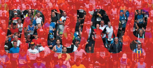
Creating a type mask
The Type Mask tool (![]() ) turns text outlines into a layer mask through which an underlying image is visible, effectively filling the letter shapes with image detail. This can create much visual impact than using plain text filled with a solid color.
) turns text outlines into a layer mask through which an underlying image is visible, effectively filling the letter shapes with image detail. This can create much visual impact than using plain text filled with a solid color.
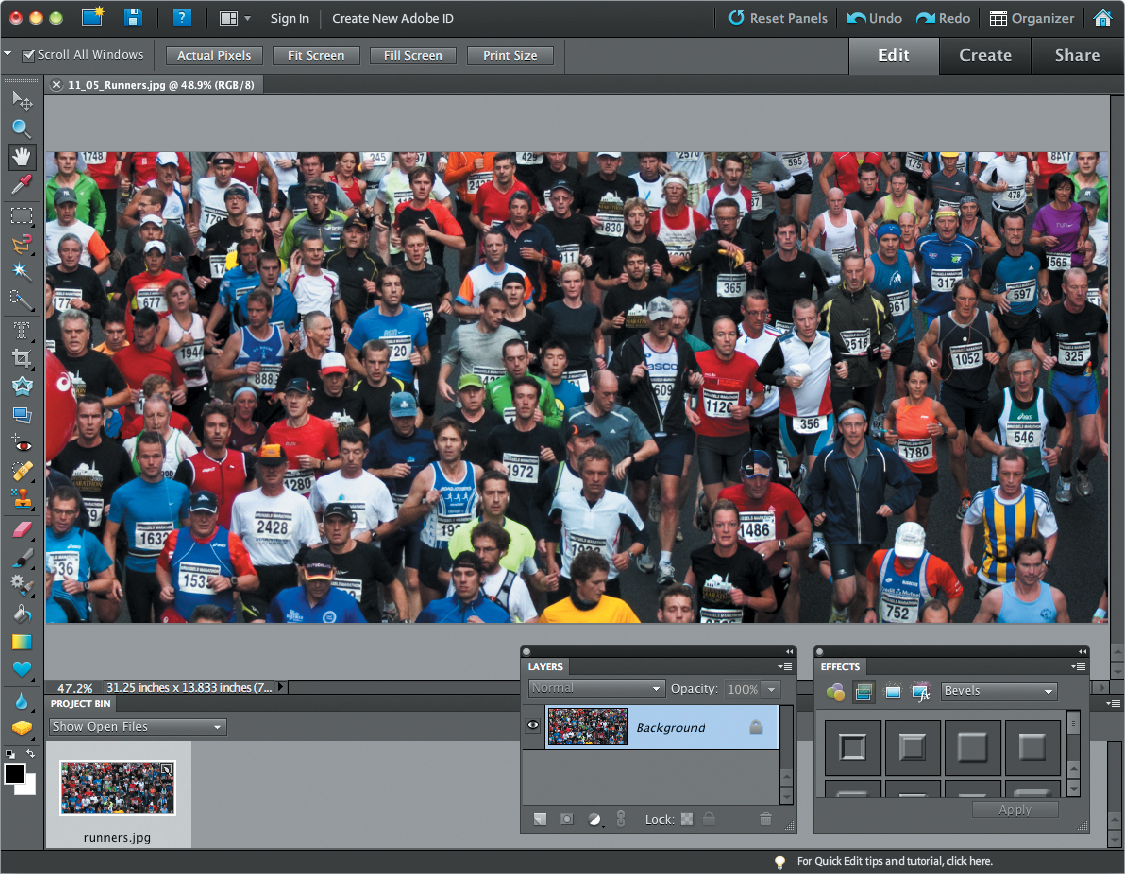
1. In the Organizer, click the Show All button in the Find bar, and then type the word run in the Text Search box, at the left above the Media Browser. The search returns one image: 11_05_Runners.jpg. Right-click / Control-click the thumbnail image and choose Edit With Photoshop Elements Editor.
2. In the Editor, either choose Window > Reset Panels or click the Reset Panels button (![]() ) at the top of the workspace. Drag the Layers and Effects panels out of the Panels Bin by their name tabs and position them at the bottom of the workspace where they won’t block your view of the image. Hide the Panels Bin by un-checking its name in the Window menu, and then double-click the Hand tool or choose View > Fit On Screen.
) at the top of the workspace. Drag the Layers and Effects panels out of the Panels Bin by their name tabs and position them at the bottom of the workspace where they won’t block your view of the image. Hide the Panels Bin by un-checking its name in the Window menu, and then double-click the Hand tool or choose View > Fit On Screen.
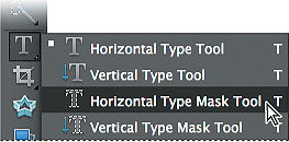
3. Select the Horizontal Type Mask tool (![]() ) which you’ll find grouped with the other type tools in the tool box.
) which you’ll find grouped with the other type tools in the tool box.
4. Set up the text attributes in the tool options bar: Choose a font from the Font Family menu. We chose Mercurius CT Std, Black Italic, but if you don’t have that font, choose any typeface that’s blocky enough to let plenty of the image show through the letter forms. Type a new value of 950 pt for the font Size (you may need to adjust that for a different font). Choose Center Text (![]() ) from the paragraph alignment options. You don’t need to worry about a color for the text; the type will be filled with detail from our marathon image.
) from the paragraph alignment options. You don’t need to worry about a color for the text; the type will be filled with detail from our marathon image.
5. Click at a horizontally centered point low in the image and type RUN!
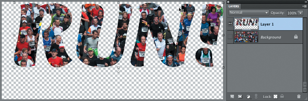
6. Hold down the Ctrl / Command key on your keyboard; a bounding box surrounds the text in the image window. Drag inside the bounding box to reposition the type mask.
7. If you wish to resize the text, hold down the Ctrl / Command key and drag a corner handle of the bounding box. The operation is automatically constrained so that the text is scaled proportionally. Alternatively, you can double-click the text with the Type Mask tool to select it, and then type a new font size in the tool options bar.
8. When you’re satisfied with the result, click the green Commit button in the tool options bar. The outline of the text becomes an active selection. If you’re not happy with the placement of the selection, use the arrow keys on your keyboard to nudge it into place.
9. Choose Edit > Copy, and then Edit > Paste. In the Layers panel, you can see that the cutout type image has been placed onto a new layer, surrounded by transparency.
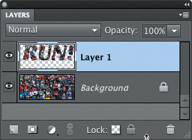
10. Hide the Background layer by clicking the eye icon beside the layer thumbnail.
Adding impact to a type mask
The text is no longer live—the mask was converted to a selection outline, so it can no longer be edited with a text tool; however, you can still apply a layer style or an effect to enhance it or make it more prominent.
1. If necessary, select Layer 1 in the Layers panel to make it active. With the Move tool (![]() ), drag the type to center it in the image window; then, press the up arrow and right arrow keys eight times each.
), drag the type to center it in the image window; then, press the up arrow and right arrow keys eight times each.
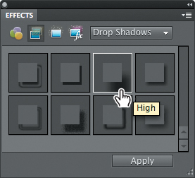
2. Expand the Effects panel, if necessary, and click the Layer Styles button (![]() ). Choose the effects category Drop Shadows from the menu.
). Choose the effects category Drop Shadows from the menu.

3. In the Drop Shadows panel, double-click the swatch for the drop-shadow effect named High.
4. In the Layers panel, select the Background Layer. Make the layer visible; then, choose Image > Rotate > Flip Layer Horizontal. Click OK to confirm the conversion of the background, and then click OK to accept the default name.
5. Choose Enhance > Adjust Color > Adjust Hue/Saturation. In the Hue/Saturation dialog box, reduce the Saturation value to –60 and increase the Lightness to +60; then, click OK.
6. In the Layers panel, select the layer with the cut-out type; then, double-click the fx icon. In the Style Settings dialog box, set the Lighting Angle to 45°. Increase the Drop Shadow Size to 40 px, the Distance to 50 px, and the Opacity to 80%; then, click OK.


7. Choose File > Save As. In the Save As dialog box, choose Photoshop (PSD) as the file format, enable layers, and save the file to your My CIB Work folder. Make sure that the new file will be included in the Organizer, but not in a Version Set; then, name the file runners_mask and click Save. Close the file.
Congratulations, you’ve finished this lesson on advanced editing in Photoshop Elements. You discovered how to take advantage of the Camera Raw plug-in and learned to correct images using the Histogram panel as both a diagnostic tool and a dynamic feedback reference. You also found out how to create custom effects using the Filter Gallery and had a little fun while gaining more experience with layer masks. Take a minute or two now to brush up on your new skills by reading through the lesson review on the facing page.
Learning more
You’ve picked up some great tricks and techniques—but this book is just a start. You can learn even more by using the Photoshop Elements Help system, which is integrated with the application. Don’t forget to look for tutorials, tips, and expert advice in the Inspiration Browser and on the Adobe website, www.adobe.com.
Review questions
1. What is a camera raw image, and what are some of its advantages?
2. How can you correct an image’s white balance in the Camera Raw window?
3. How do you use the Levels controls to correct highlights and shadows?
4. How do you create a Layer Mask to mask or reveal a specific area of an image?
Review answers
1. A raw file is one that is unprocessed by a digital camera, though not all cameras create raw files. One of the advantages of raw images is the flexibility of having detailed control over settings that are usually pre-applied by the camera. Image quality is another plus—because raw formats have 12 bits of available data, it’s possible to extract shadow and highlight detail that would have been lost in an 8 bits/channel JPEG or TIFF file. Finally, raw files provide an archival image format, much like a digital negative: you can reprocess the file whenever you want to produce different results, while your original image data remains unchanged.
2. In the Camera Raw window you can set the white balance in an image automatically by using the White Balance eyedropper. Clicking on a neutral color with the White Balance eyedropper automatically adjusts the Temperature and Tint sliders. Alternatively, you can choose a preset from the White Balance menu. The options include corrections based on a range of common lighting conditions. It’s also possible to correct the white balance manually with the Temperature and Tint sliders.
3. In the Levels dialog box, you can adjust the shadows and highlights in your image by using either the slider controls below the Levels histogram, or the Set Black Point and Set White Point eyedroppers. You can hold down the Alt / Option key as you drag a slider to see a clipping preview, which gives you visual feedback on the location of the darkest and lightest areas of your image. With the Set Black Point and Set White Point eyedroppers you can click directly in the image to define the white and black points, or double-click the eyedroppers to call up the color picker where you can define the values precisely.
4. Make sure the layer that you wish to mask is selected in the Layers panel. In the Edit window, select the area that you wish to reveal, and then click the Add Layer Mask button at the bottom of the Layers panel.