
Lesson 14: Building HTML5 Web Forms
Dreamweaver CC adds support for the new HTML5 form elements and attributes, allowing you to gather information from visitors to your website. In this lesson, you’ll learn how to add form elements to make your site more interactive and use the new required, validation and placeholder input attributes.
What you’ll learn in this lesson:
- • The basics of creating forms
- • Working with the <form> tag
- • Adding form elements
- • Styling forms with CSS
- • Choosing form processing options
- • Validating forms
- • Working with Behaviors
Starting up
Before starting, make sure that your tools and panels are consistent by resetting your workspace. See “Resetting the Dreamweaver workspace” in the Starting up section of this book.
You will work with several files from the dw14lessons folder in this lesson. Make sure that you have loaded the dwlessons folder onto your hard drive from www.digitalclassroombooks.com/epub/dreamweavercc. See “Loading lesson files” in the Starting up section of this book.
Before you begin, you need to create a site definition that points to the dw14lessons folder. Go to Site > New Site, or, for details on creating a site definition, refer to Lesson 2, “Setting Up a New Site.”
The basics of HTML5 forms
HTML5 forms are commonly used for questionnaires, hotel reservations, order forms, data entry, and a variety of other applications. Users provide information by entering text, selecting menu items, and so on, and then submit that information to you through a server.
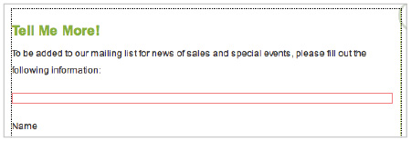
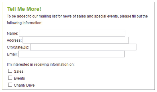
Here’s the simple form you will be creating that includes labels, radio buttons, and push buttons (used to reset the form or submit it):
Forms are a great choice when you want to gather information from your audience.
How forms work
An HTML5 form is a section of a document that often contains content such as text or images, markup, special elements called controls check boxes, radio buttons, and menus, among others), and labels on those controls. A form is completed when a user modifies its controls (by entering text and selecting menu items), and submits the form to an agent for processing.
When you add form controls in Dreamweaver, you are essentially creating the front-end of the form. A user can add all the data required on the page, but this data needs to saved and processed at a specific location when the user clicks the Submit button. It’s important to understand that Dreamweaver does not provide this location for you. You will need to work with your hosting provider or another service in order to have a system for accepting user data and then processing it in some way. You will learn more about this process a bit later in the lesson.
Building a contact form
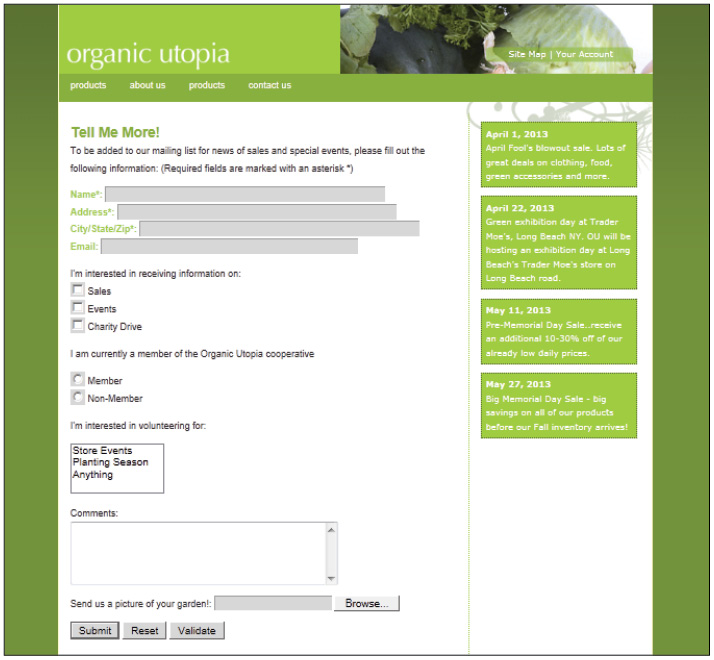
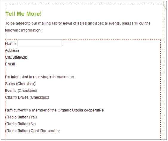
In this lesson, you’ll build a contact form for OrganicUtopia. This form allows users to be added to a mailing list for news of sales and special events, and it provides the site owners with relevant data, such as name, e-mail, and which information they would like to receive.
Inserting the <form> tag
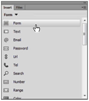
The first step in building a form in Dreamweaver is to add a form element, which serves as a container for the form fields you’ll be adding to it. In hand-coded HTML, you do this by inserting the <form> tag into your code. In the Design view, you can add a form element using the Form button.
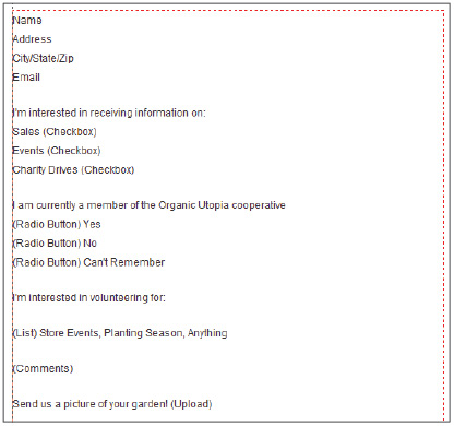
1 In the Files panel, double-click the formbase.html file to open it. We have added most of the form content for you, but you will have to remove the placeholder text and add the proper form controls.
2 In the Design view, place an insertion cursor where you want your form to appear. Because this is an existing page, click with your mouse in the white area immediately to the left of the word Name.
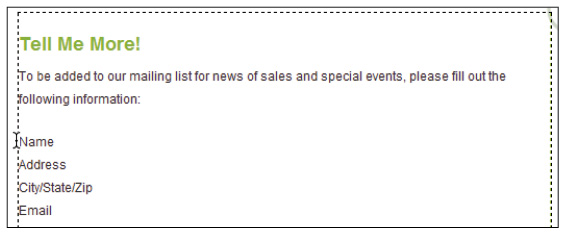
Insert your cursor before the Name text field label.
3 In the Insert panel on the right side of your screen, choose the Form category from the drop-down menu to display options for adding form elements to a page.
4 From the Form category of the Insert panel, select the Form element (  ).
).
Options for adding form elements to a page are found in the Form category of the Insert panel.
5 You should now see a red outline on your page. This is how a form is displayed in the Design view. If you don’t see this outline, choose View > Visual Aids > Invisible Elements to turn on the form element’s visibility.
A dotted red outline on your page indicates a placed form element.
Now you’ll take a look at the code generated by the steps you just completed in the Design view. This is for educational purposes to help you understand the foundations of how forms work.
6 In the Document toolbar just above your document window, click the Code view button to switch to your page’s HTML code view.
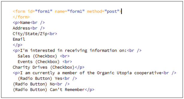
7 In line 214 of your code, you should see the newly added <form> element. Take note of the default attributes and values (id="form1" name="form1" method="post"). You’ll learn more about these attributes shortly. For now, simply note that these were created.
In HTML code, a form element is added using the <form> tag.
Since this form element is currently empty, you’ll need to move the existing content (Name, Address, and so on) from the current location on the page to the form element you just created.
8 In the Document toolbar just above your document window, click the Design view button to switch to your page’s visual layout view.
9 Starting with the text labeled Name, click and drag downward to select all the text below your form element.
10 Choose Edit > Cut to cut the text to your clipboard and remove it from its current location on the page.
11 Click inside the red outline that represents your form element to place an insertion cursor there.
12 Choose Edit > Paste to place the text from the clipboard into your form element.
All the text for your element label is now located inside the form element.
Cut and paste existing content from your page into the form element.
Setting form properties
As indicated previously, the <form> tag includes three different attributes and values by default. These attributes are listed as ID, name, and method, and they represent the HTML form element’s properties. The default values for these attributes are not necessarily ideal, so you’ll modify them.
1 Make sure the form element you added in the previous exercise is selected by clicking the edge of its red outline. A form field element must be selected before you modify its properties.
2 In the Property Inspector at the bottom of your document window, you now have access to some of the properties associated with the <form> tag.
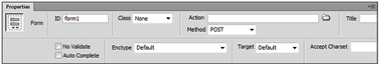
The fields in the Property Inspector reflect properties found inside the <form> tag in HTML code.
The Form ID makes it possible to identify and control the form with a script, as well as to style the form with CSS. It is also very important for form validation, which is discussed later in this lesson.
 A form ID is the same ID attribute you have been using to style divs. This form, for example, would have the ID #form1 by default, which is not a useful name.
3 In the Form ID text field, type the name contact. Press Enter (Windows) or Return (Mac OS).
The Action field allows you to specify the script, for example, a Common Gateway Interface (CGI) script or a PHP page, that processes the user’s form data. You can type the path to this file, or use the Browse button to navigate to the desired file. In most cases, you’ll need to get this information from your system Administrator or hosting provider.
4 Because you have not yet defined the processing method for this form, leave the Action text field blank.
5 For method, make sure the POST method for this exercise is selected, which it likely is by default.
6 Choose application/x-www-form-urlencoded from the Enctype drop-down menu. The Enctype field defines the encoding type of the data being submitted to a server. Application/x-www-form-urlencoded is used in most situations, unless you’re asking the user to upload a file, in which case you would choose multipart/form-data.
 The optional Target property specifies the window or frame in which to display the data that is returned. The target value is included in the <form> tag only when you choose to specify it.
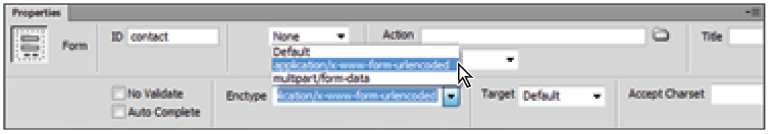
Form properties are set in the Property Inspector.
Now that you’ve defined the properties of the form, you’ll use options in the Insert panel’s Forms section to add elements to the form.
Adding form elements
A Dreamweaver form is not a working form until you add the elements, or fields, that allow the user to provide information to you. Thankfully, the Form category in the Insert panel contains everything you need to insert any kind of form field into your page.
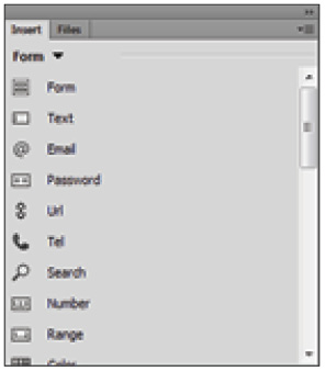
The Form category in the Insert panel contains everything you need to add interactive fields to your form.
Adding text fields
The simplest and most common type of form field is the text field. Users can enter anything, from their name, to their credit card number, to their dog’s name, into a text field. You control the formatting of their responses using the Property Inspector.
1 Within your form, select the word Name and press Ctrl+X (Windows) or Command+X (Mac OS) to cut the text and place it on the clipboard.
2 Click the Text Field button (  ) in the Insert panel. Dreamweaver will insert a text input element and a matching label element with the default text Text Field. Select Text Field and press Ctrl+V (Windows) or Command+V (Mac OS) to paste the word Name you cut earlier. The label element in a form provides additional usability for the user.
The label element provides additional usability for the user.
3 Select the text field by clicking it and notice the options that are available in the Property Inspector.

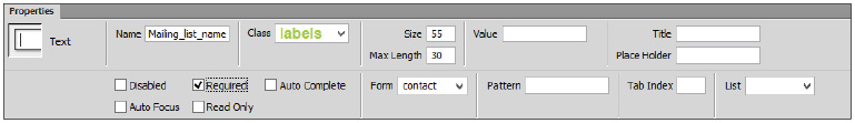
The Property Inspector displays the new HTML5 properties for the text element.
4 In the Name section, type Mailing_list_name and press Enter (Windows) or Return (Mac OS). Dreamweaver will use the value of this Name field to set both the Name and ID of the form element. The importance of this distinction will be covered in a moment.
5 Type 55 in the Size text field in the Property Inspector to set the text input area to a width of 55 characters.
6 Type 30 in the Max Length text field to set the maximum number of characters that can be entered. For example, if this were a telephone number field, you probably would have limited it to ten characters.
7 Choose contact from the Form drop-down menu. Associating the text field with a specific form will be helpful in the event there are multiple forms on a page.
8 Repeat steps 1 to 7 to add Address and City/State/Zip text fields beneath the Name field. When creating the Address text field, give it the ID Mailing_list_address and give the last text field the ID Mailing_list_city_state_zip. When naming form elements, you should stay away from using spaces between words. It is better to use underscores or hyphens instead.
9 Choose File > Save As. In the Save As dialog box, navigate to the dw14lessons folder and type organicform.html into the Name text field. Click Save.
Now preview the open page in a browser by clicking the Preview/Debug in browser button on the Document toolbar. Your form should look like this:

This is what your form should look like in the browser with text fields added.
10 Close the browser and return to Dreamweaver.
Adding a new HTML5 text field
HTML5 has added new text fields to make it easier to handle specific types of information such as e-mail addresses, web addresses and telephone numbers. You will use the e-mail text field to request the user’s email address and later validate that a properly-formed e-mail address was entered.
1 Within your form, select the word Email and delete the text.
2 Click the Email button (  ) in the Insert panel. Dreamweaver inserts an Email field that will accept a properly-formed email address as input.
3 Select the Email field by clicking it and notice the options that are available in the Property Inspector.
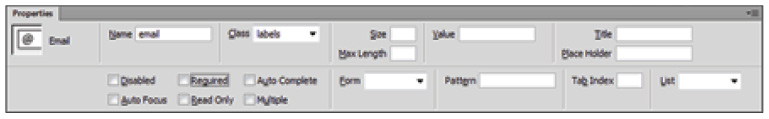
The Property Inspector displays the properties for the new HTML5 email element.
4 In the Name section, type Mailing_list_email and press Enter (Windows) or Return (Mac OS).
5 Type 55 in the Size text field in the Property Inspector to set the text input area to a width of 55 characters.
6 Type 128 in the Max Length text field to set the maximum number of characters that can be entered.
7 Choose contact from the Form drop-down menu, associating the text field with your contact form.
8 Choose File > Save and preview the open page in a browser by clicking the Preview/Debug in browser button on the Document toolbar. Your form should look like this:

This is what your form should look like with the email field added.
9 Close the browser and return to Dreamweaver.
Adding check boxes
Check boxes are another valuable tool in your form control toolkit. They’re valuable when you want to get specific responses from your users and you don’t want to give them the opportunity to enter incorrect information into text fields. Again, you control the formatting of their responses using the Property Inspector. In this exercise, you will take a look at the use of form labels as well as the importance of setting the names of your form elements.
1 Click and drag to select both the word Sales and the (Checkbox) placeholder text and delete them.
2 Click the Checkbox element (  ) in the Insert panel. Dreamweaver inserts a check box in your page along with a label element with default text, Checkbox. Select the word Checkbox and type Sales. The label tag is an optional element that adds an extra level of usability to your check boxes. Users will now be able to click the text (in addition to the check box) in order to make their selection.
3 Click the check box to select it, and notice the options that become available in the Property Inspector. In the Name field, type Sales, then press Enter (Windows) or Return (Mac OS).

Settings that are specific to the check box you’ve just added to your form appear in the Property Inspector.
4 As mentioned earlier, when you set the Name of the check box, Dreamweaver also sets the ID to the same value and associates the label to that field ID. It is important to understand the distinction between the Name and the ID. An ID is used to style an element and each ID must be unique, while the Name is what gets passed for scripting and validation when the user clicks Submit. In the case of check boxes, you want all of them to have the same Name, but they must each have a unique ID. To do this you will need to override Dreamweaver’s default settings. To make sure Dreamweaver only changes the Name, right-click (Windows) or Ctrl+click (Mac OS) the check box, select Name… from the popup menu, then type Receive_Info and press Enter (Windows) or Return (Mac OS).
5 With the check box still selected, type Sales in the Value text field in the Property Inspector to define the data that’s passed to the server when the user checks this check box.
6 Choose contact from the Form drop-down menu to associate this field with the contact form.
7 The Checked field defines how the check box should appear when the page is first loaded. It should not be selected; if it is, uncheck it now.
8 Next, select the word Events and the placeholder (Checkbox) text and delete them. Click the Checkbox element in the Insert panel. Dreamweaver inserts a check box in your page along with a label element with default text, Checkbox. Select the word Checkbox and type Events.
9 Click the check box and change the Name to Events in the Property Inspector. Remember, you will want the name to be same as the first check box, so that users will be able to check both and have the values passed. However, because Dreamweaver also sets the ID to this value, you need to manually intervene. To set only the Name, right-click (Windows) or Ctrl+click (Mac OS) the check box and select Name… from the popup menu, then type Receive_Info and press Enter (Windows) or Return (Mac OS). This will leave the ID set to Events while changing the Name so that the user can select both check boxes and have both values passed.
10 With the check box still selected, type Events in the Value text field in the Property Inspector to define the data that’s passed to the server when the user checks this check box. Choose contact from the Form drop-down menu to associate this field with the contact form and make sure Checked field is not checked.
11 Repeat steps 8, 9 and 10 with different values for the ID and Label to add a third check box for Charity Drive. Again, be sure to rename the check box Receive_Info by using the right-click (Windows) or Option+click (Mac OS) method to link the Name and ID values.
Now, preview the open page in a browser. Your form should look like this:
Your form, with check boxes inserted, should look like this.
12 With the page open in the browser, click the text next to the check boxes; notice that this action selects the box. This is a function of the label tag. Try clicking the text of your Name and Address text fields. They have the same behavior because they also have labels.
Labels improve accessibility for all users, in particular for those who might be using screen readers or other devices.
13 Close your browser and return to Dreamweaver.
Adding radio buttons
When you add radio buttons to your form, you encounter the same settings in the Property inspector as you do when you add check boxes. The only difference between check boxes and radio buttons is that from a group of radio buttons, only a single option can be selected. Check boxes allow the selection of multiple options.
To make two or more individual radio buttons mutually exclusive, you select two or more radio buttons and give them the same name in the Property Inspector.
Creating a group of radio buttons by adding buttons one by one is often more time-consuming than it’s worth. Thankfully, Dreamweaver offers a more efficient method for creating a list of mutually exclusive options: the radio group.
Adding radio groups
The Radio Group element in the Insert toolbar provides a quick and easy way to add a list of radio buttons to your form. The same rules regarding naming and values apply, but the Radio Group dialog box allows you to include several entries in a group at once.
1 Click and drag to select the three (Radio Button) placeholders and their labels (Yes, No, and Can’t Remember). Press Delete to remove them from your form. You’ll create your own labels for this group.
2 Click the Radio Button Group button in the Insert panel. The Radio Group dialog box opens, and offers several property options.

Set properties for your radio group in the Radio Group dialog box.
3 In the Name text field of the Radio Group dialog box, type Membership Status to give the group a name that associates all the radio buttons together.
You will now create a unique label for each button.
4 Click the first entry in the Label column and type Member.
5 In the Value column of the Radio buttons section, you assign a value to each button to be passed back to the server. Click the first entry in this column and type member. This returns a value of member when the user clicks on the Member radio button.
6 Make sure Line breaks (<br> tags) is selected in the Layout using section at the bottom of the dialog box. This will place a hard return after each radio button.
7 Repeat steps 4 to 6, but this time create a label called Non-Member and a value of nonmember.
8 Click OK. Choose File > Save, and then preview the open page in a browser. Click each of the two radio buttons and note that only one radio button can ever be selected. This is a function of a radio button group: for cases where you want more than one option to be selected and returned, you could use check boxes.

After adding the radio group, your form should look like this.
9 Close your browser and return to Dreamweaver.
 Check boxes can also be added as groups using the Checkbox Group option in the Insert panel.
Adding lists and menus
Lists and menus show choices within a list that permit users to choose single or multiple options. The List option displays as a scrolling list, and the Menu option displays as a drop-down menu. Both items are inserted using the Select element, but the behavior is determined by the properties you set in the Property Inspector.
1 Click and drag to select the placeholder text—(List) Store Events, Planting Season, Anything—that follows your radio group. Press Delete to remove it from your form. You’ll create your own labels for this list.
2 Click the Select button (  ) in the Insert panel and a new list or menu appears within the form outline on your page.
3 Select the text Select: in the label in front of the newly created form element and press Delete.
4 Click the Select form element to select it, and notice the options that are now available in the Property Inspector. Type Volunteer in the Name text field, then press Enter (Windows) or Return (Mac OS).

Enter the settings for your newly added list or menu in the Property Inspector.
5 Choose contact from the Form drop-down menu.
6 Click the check box labeled Multiple to the left of the Form drop-down menu to allow multiple selections. With this feature activated, the Select element will appear as a multi-select form field and allow users to choose more than one option from your list at a time.
7 Click the List Values button to enter items for your scrolling list. The structure of the List Values dialog box is identical to that of the Radio Group dialog box. Type Store Events as your first Item Label and store_events for the first value to be returned.
Now you will add two more items to the list.
8 Click the Plus button (+) in the left corner of the List Values window, and type Planting Season as the second Item Label. Then click under the Events value and type planting_season. Click the Plus button (+) again. Type Anything as the third Item Label, and, finally, click under the Planting value and type any_event. Click OK.
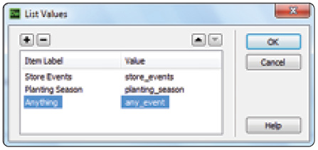
Adding the labels and values for a list control.
9 Choose File > Save to save your work. Preview your page in the browser and click one of the labels to see how it is selected. Close your browser and return to Dreamweaver.
Adding a Text Area
Sometimes within a Dreamweaver form, you want to have a field that simply provides an open area into which users can enter text. For this form, you’ll add a Text Area element to provide a region for users to type in their comments about the site.
1 Click and drag to select the placeholder text, (Comments), and delete it.
2 Click the Text Area button (  ) in the Insert panel and Dreamweaver inserts a new Text Area element in your page.
3 Select the words Text Area in the label to the left of the field, and replace them by typing Comments then press Shift+Enter (Windows) or Shift+Return (Mac OS) to move the Text Area down one line.
4 Click the Text Area, and notice the options that are now available in the Property Inspector.
5 Type Comments in the Name text field and press Enter (Windows) or Return (Mac OS).
6 Choose contact from the Form drop-down menu.
7 Type 5 in the Rows text field.
8 Type 40 in the Cols text field to set the text input area to a width of 40 characters.
9 Leave the other settings at their defaults and choose File > Save; then preview the open page in a browser. The Text Area will allow users to type inside of the box, and if the amount of text goes below the bottom of the text area, then a scrollbar will automatically appear.
The form at this point, rendered by Internet Explorer.
Adding a File Upload field
If you want users to be able to upload a file to your server—for example, a photo for ID purposes—you’ll want to add a File Upload field.
1 Close the browser and return to organicform.html in Dreamweaver. Click and drag to select (Upload), and delete it to place an insertion cursor next to your label.
2 Click the File button (  ) in the Insert panel and a new File element, with the Browse button included, appears within the form outline on your page. Select the text Send us a picture of your garden! and press Ctrl+X (Windows) or Command+X (Mac OS) to cut the text and place it in the clipboard. Next, select the word File in the label to the left of the File control and press Ctrl+V (Windows) or Command+V (Mac OS) to paste text in the clipboard as the new label.
3 Click to select the File field, and notice the options that become available in the Property Inspector.
4 Choose contact from the Form drop-down menu.
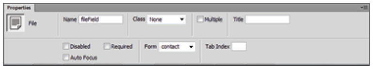
Set the properties for your File field in the Property Inspector.
The Class drop-down menu allows you to apply CSS to style this form field. Using CSS to style form fields is discussed in more detail later in this lesson.
You are now finished with the file field section of your form. Users can now either enter the desired file name or click Browse to navigate to it.
 For the file field element to actually upload a user’s file to your server, you’ll need to ask your server Administrator how the server is configured to accept files.
5 Choose File > Save, then preview the open page in a browser. Your form should look like this:

You’re almost finished adding form fields to your form.
6 Close the browser and return to Dreamweaver.
Creating Submit and Reset buttons
As you might expect, none of the field elements you’ve been adding to your form do any good if the user doesn’t have a way to send the information to you. Buttons provide the means for the user to either submit form data, or reset the fields and start over.
1 Place your cursor after the Browse button, then press Enter (Windows) or Return (Mac OS) to specify where you want your button(s) to appear.
2 Click the Submit Button element (  ) in the Forms category of the Insert panel. A new button, labeled Submit by default, appears within the form outline on your page.
3 If it’s not already selected, click to select the Submit button, and notice the options that are now available in the Property Inspector.
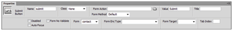
Button properties are set in the Property Inspector.
4 The word Submit is displayed in the Value field as well. You could change this value to a more user-friendly name such as Send, however, for now leave it as is.
5 Choose contact from the Form drop-down menu to associate this button with your contact form.
6 Place your cursor after the Submit button, then click the Reset Button element (  ) in the Insert panel. A new button, labeled Reset by default, appears within the form outline on your page.
7 Choose contact from the Form drop-down menu to associate this button with your contact form.
8 Finally, you will use the Button element to create a Validate button. Place your cursor to the right of the Reset button, then click the Button element (  ) in the Insert panel. A new button, labeled Button by default, appears next to your Reset button.
9 Click the Button element and type Validate in the Name text field within the Property Inspector. Additionally, you will need to type Validate in the Value field to change the default value.
10 Choose contact from the Form drop-down menu to associate this button with your contact form.
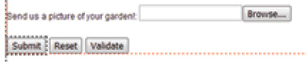
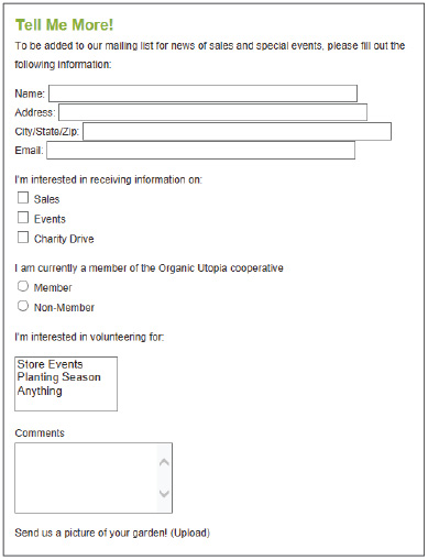
The Submit, Reset, and Validate button are now placed in the form.
11 Choose File > Save All to save your work.
Now that you’ve finished adding the necessary form fields to your Contact Form page, you’ll add style to the form and its elements, using CSS.
Styling forms with CSS
In Lesson 4, “Styling Your Pages with CSS,” you explored the many ways you can use CSS to format text and position content on an HTML page in Dreamweaver. However, the usefulness of CSS is not limited to static page content. Dynamic content, such as form fields, can also be successfully and creatively styled using CSS.
Attaching external styles
This exercise assumes you have already learned some of the basics of working with styles covered in previous lessons. You will now focus on applying some existing styles to the form elements that you’ve added in this lesson. The styles you apply have been created for you, but you must attach them to your form page in order to access them.
1 If your CSS Designer panel is not currently open, open it now by choosing Window > CSS Designer.
2 In the CSS Styles panel, click the Add CSS Source button (  ) in the Sources menu bar and choose Attach Existing CSS File. The Attach External CSS File dialog box opens.
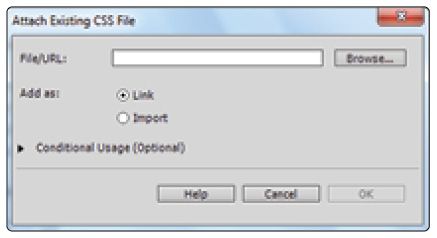
Select the CSS file you want to attach using the Attach External CSS File dialog box.
3 Next to the File/URL field, click the Browse button and select formstyles.css from the dw14lessons folder. Press OK (Windows) or Open (Mac OS) to exit the Select Style Sheet File dialog box.
4 In the Attach External CSS File dialog box, click the Link radio button to create a link <href> tag in the code for this page, and reference the location of the published style sheet. Most major web browsers support the link method.
5 In the Conditional Usage section of the Media drop-down menu, you can define the target medium for your style sheet. For this exercise, leave this setting at its default, which is blank.
 For more information on media-dependent style sheets, see the World Wide Web Consortium (W3C) website at W3.org/TR/CSS21/media.html.
6 Click OK to attach the style sheet to this document.
Setting a background color
Once the formstyles.css style sheet is attached, the backgrounds of your form fields change to a light blue color. This happens because formstyles.css contains a tag selector rule, which instructs the <form> tag you added earlier in the lesson to include a background color. The rule redefines the <form> tag, so the color is applied only to the background of the form fields themselves, and not to the entire body of the page.

The formstyles CSS contains a rule that specifies a background color.
A major benefit of using CSS is that once you complete the initial styling, you can revisit the CSS file and change the included style rules. Because the blue background doesn’t fit in with the color scheme of your site, you’ll edit the form rule to change the background to a light gray.
1 In the CSS Designer panel, click formstyles.css in the the Sources panel.
2 From the list of Selectors included within formstyles.css, click the input rule in the Selectors pane to select it for editing. Click the Show Set check box in the Properties panel to limit the list to only those properties that are set.

Selecting the input selector in your formstyles.css style sheet reveals the style being used.
3 Click the Background color text field in the Properties pane and type the hexadecimal code #d7d7d7 to replace the current color.
4 Press Enter (Windows) or Return (Mac OS) to preview the change to the background color.

You’ve successfully changed the background color of your form fields by editing an attached CSS.
You’ve just used a tag selector CSS rule to change the background color of your form. Next, you’ll use a class style to change the appearance of the labels on your form fields.
Styling form elements
You might have noticed another CSS rule included in formstyles.css along with the <form> definition. It’s a class style called .labels, and it contains properties that change the font, color, and weight of your form field labels.
1 In the CSS Designer panel, click the .labels selector to select it; in the Properties pane, you can see the properties currently set for the class.
The font-family has been changed to Arial, Helvetica, sans-serif.
The font-weight is set to bolder.
The color has been set to a hexadecimal notation of #9FCC41, or green.

The .labels selector can also be edited in the CSS Designer panel.
You’ll now apply this style.
2 In the document window, click anywhere within the Name label, which precedes the first text field in your form.
3 In the Property Inspector, click the HTML button if necessary; click the Class menu and choose labels from the list. Because the Name, Address, City/State/Zip, and Email are all within the same paragraph, the style will be applied, making them all green.

The .labels class applied to your form.
These are just a few of the ways you can use CSS to style form elements. Experiment further with different properties to make your form more visually pleasing.
Form processing and validation
As attractive as CSS styling can make your form in Dreamweaver, you can’t collect form data without using a server-side script or application (for example, CGI, PHP, ASP) to process the data.
CGI scripts are perhaps the oldest method of server-side scripting used to process form data. Several websites offer free CGI scripts that you can use. The hosting company for your website could also provide CGI scripts that perform many common tasks, such as collecting e-mail addresses or allowing visitors to send you comments through a web form. Other methods include the use of other scripting languages, such as PHP, ASP, and others. It is beyond the scope of this book to cover all the various ways to process form data.
Prior to HTML5, form validation, a method for ensuring that the user has entered the correct type of data in the form’s fields, also required scripting to work correctly. HTML5 adds built-in form validation that checks the contents of specified text fields directly within the browser. This functionality is automatically applied to forms in HTML5 and can be overridden using the novalidate form attribute. However, older browsers might still require the use of JavaScript so you will need to supply some level of scripting. Fortunately, Dreamweaver is capable of adding JavaScript to code that checks the contents of specified text fields. This code is added through the Validate Form behavior. You will be shown both methods of validation so that you can build your pages to work across various browsers.
HTML5 validation
HTML5 validation uses built-in browser support for the new HTML5 input elements and attributes. In order to take advantage of this validation you will mark certain fields as required to make sure the user has entered a value. You will also add new HTML5 input elements to collect the user’s e-mail address and check to make sure the user has entered a properly formed e-mail address.
1 Before you make any form fields required, it is common practice to provide visual clues to user. In organicform.html, click to place the cursor after the Name label in your form template and type an asterisk (*). Repeat this step and add asterisks after the Address, City, State, Zip, and Email labels.
2 Next, you will add a message informing users that fields marked with an asterisk are required. Place your cursor after the colon (:) in the first paragraph of text. Type (Required fields are marked with an asterisk *) and be sure to include the parenthesis.
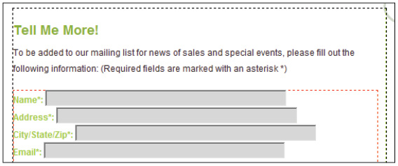
Visual cues inform users of required fields.
3 You are now ready to add the required attribute to the form fields. Click the Name text field to select it. The Property Inspector lists the attributes for this input element. Click the Required check box to place a checkmark in the box, marking this item as required. Browsers that support the HTML5 form elements will enforce that the user has typed a value in this field when the form is submitted.
The Property Inspector displays the new HTML5 input attributes.
4 Since the Name field is the first input element in the form, you can use the Auto Focus attribute to automatically place the user’s Insert cursor in the text box when the form loads. Click the Auto Focus check box to instruct the user’s Browser to set this field to the active field when the page loads.
5 Another attribute that can improve usability for a user is the Placeholder attribute. The Placeholder can include a text description or example to assist the user in entering the requested information. With the Name field still selected, type Please enter your full name in the Placeholder field in the Property Inspector.
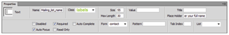
The attributes Required, Auto Focus and Placeholder set for the Name input field.
6 Press Ctrl+S (Windows) or Command+S (Mac OS) to save your progress and choose File > Preview in Browser to test your browser’s support for these HTML5 attributes. At the time of this writing, all current browsers, including Internet Explorer 10, support these attributes.
7 Click the Submit button without entering any data in the first field. If you are using the current version of any modern browser, you should see a popup window pointing to the Name field with a message asking the user to enter a value.

Firefox handles the required field by placing the input cursor in the field, showing a popup window, and outlining the field in a red border.
Older browsers will require JavaScript to process form validation. You will use Dreamweaver’s Validate Form Behavior to ensure backwards compatibility with older browsers in the next activity.
 Another way to ensure backwards compatibility for HTML5 form elements and attributes is to use polyfills. Polyfills use JavaScript to detect browser support of HTML5 and CSS3 features and provide scripted workarounds in browsers that do not support the features. Two commonly used polyfill techniques are the WebShims Lib (http://afarkas.github.io/webshim/demos/) and H5F (https://github.com/ryanseddon/H5F)
8 Close your browser and return to Dreamweaver.
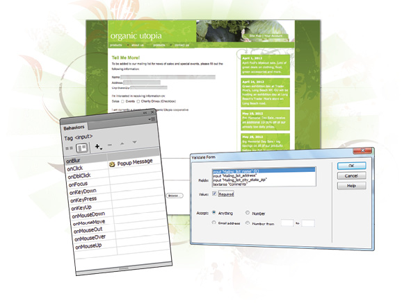
The Validate Form behavior
The Validate Form behavior provides checks and balances for users when they complete forms on your site. You can make certain fields required, make sure a user has entered a value in a required field, or make sure a user has entered the correct type of information in a field. You can run validation on all fields in a form, or on individual fields contained in that form.
The first step, however, is to get to know the Behaviors panel.
A look at the Behaviors panel
Generally speaking, the Behaviors panel provides a means for you to add JavaScript code to your page without actually having to type in the code. The code it inserts adds interactivity to your site, and is usually triggered by some user action. For example, when the user clicks on or hovers over a link, the behavior performs a task. Behaviors are hardly limited to use with forms, as they’re commonly used to add rollovers, open new windows, check for plug-ins, and add navigation elements, among other functions.
Specifically, you use the Behaviors panel to add, modify, and remove behaviors. Because you can apply multiple behaviors to the same object, you can also reorder them in the Behaviors panel.
1 Access the Behaviors panel by choosing Window > Behaviors. If necessary, expand the panel grouping.
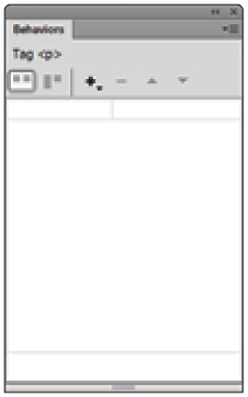
The Behaviors panel.
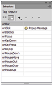
2 In the document window, click the Validate button you created earlier. You need to attach a behavior to objects on your page. For this exercise, you need to attach a behavior to the Validate button.
3 Click the Plus button (+) at the top of the Behaviors panel to see the list of available options for the selected object. In this case, the menu displays options associated with a button element. If an option is grayed out, that action is not available for the selected object.

The list of available behaviors for your selected button element.
4 Select the Popup Message action. The Popup Message dialog box appears.
5 Type Validate this form! into the Message text field, and click OK.

Enter text into the Popup Message dialog box to have it appear on the screen.
The behavior is set, but it needs an event, or trigger.
Setting an event or trigger
An event (or trigger) is generally a specific user action needed for the Popup Window (or other behaviors) to work. In this case, you’ll set the window to appear when the user clicks the Validate button.
1 In the top-left corner of the Behaviors panel, click the Show all events button ( ). The Show all events button provides a complete list of all possible triggers for this behavior.
There are a number of choices for the event that triggers your specific behavior.
In this case, the default option onClick is the correct choice.
2 Choose File > Save All and preview your page in a browser.
3 Click the Validate button at the bottom of your form. The popup message you set earlier appears.

Use this feature to warn your viewers, or to guide them in a certain direction.
 Depending on the security configurations of your browser, you might be prompted to allow blocked content. If you’d like to change your preferences to avoid conflicts with scripts created in the Behaviors panel, refer to your browser’s documentation for instructions on changing the default settings.
4 Click OK to close the message, and close your browser window and return to Dreamweaver.
To further explore the Behaviors panel and its features, you’ll add a Form Validation behavior to the same button.
Validating form fields
The Validate Form action allows you to prevent the submission of a form unless a certain field (or fields) is filled in by the user. You’ll apply this action to the Validate button you created.
1 In the document window, select the Validate button at the bottom of your form. The Behaviors panel should display the Popup Message action you added in the last exercise.
2 At the top of the Behaviors panel, click the Plus button (+), and select Validate Form from the drop-down menu that appears. The Validate Form dialog box opens. Dreamweaver automatically identifies the fields you have used on the page and lists them in the fields section.
3 Choose Mailing_list_name the first entry in the Fields list. Click the Required check box to require data entry into this field before the user can submit the form.
4 Click the Anything radio button so the field accepts any alphanumeric entry. If you want to require that only numerical data be entered, you would select the Number radio button. If you want to check for an @ symbol within the entered data, you would click the Email address radio button. Finally, if you want to check for a number within a specific range, you could enter that range in the Number from and to fields.
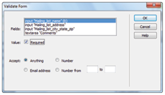
Specify which form elements get validated, and what is accepted.
5 Click OK to close the Validate Form dialog box.
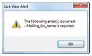
6 Choose File > Save, then preview the form page in your browser. Leave the Name field blank, and click the Validate button at the bottom of your form.
Unfortunately, the Popup Message behavior you added earlier runs before the Validate Form behavior, requiring you to close the Popup Message window to see the results of your validation. After you dismiss the Popup Message you will see the error message stating that the Mailing list name is required.
This means you have just a little more work to do; you’ll now adjust the Validate Form behavior to correct these errors.
Changing a form field’s behavior order
To keep the popup message from appearing before the results of your validation, you’ll need to change the Validate Form behavior’s position in the behavior order, delete it, and reapply it to the correct button.
1 In the Dreamweaver document window, click the Validate button to select it.
2 Click the Show Set events button in the Behaviors panel to toggle over to this view (if necessary). You will now see your two actions, Popup Message and Validate Form, which share the same event, or trigger.
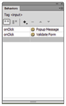
Use the Behaviors panel to reorder behaviors and make them behave differently for the viewer.
3 Click the Validate Form behavior to select it, and click the up arrow at the top of the panel to move it to a position above the Popup Message behavior. Although this makes the Validate Form action run first, the popup message still appears after the validation window is closed. It actually makes more sense not to have the Validate Form behavior attached to the Validate button at all. You will now remove this behavior and attach it to the Submit button instead.
4 Click the Minus button (–) to delete it from the behaviors associated with the Validate button.
5 Click the Submit button at the bottom of your form to select it. Repeat steps 2-4 in the preceding exercise to add the validation action to the Submit button.
Now it’s time to see the fruits of your labor.
Verifying field contents
Now that you’ve adjusted the Validate Form behavior, you’ll need to make sure the form function as you expect it to.
1 Preview the open page in your browser, and click the Validate button. This should now display only the Validate this form! popup message. Close it.
2 Click the Submit button. Even though the data is not actually submitted (for lack of a CGI script), the Validate Form warns you that required fields have not been filled.
The Validate Form behavior functions as you originally intended, thanks to some editing in the Behaviors panel.
You’ve successfully added validation to your form.
 For a more detailed look at adding modern forms to a website, see the HTML5 Digital Classroom book available in electronic and print formats.
Self study
Using your new knowledge of building and editing web forms in Dreamweaver, try some of the following tasks using organicform.html to build on your experience:
Add the HTML5 url or telephone input types to ask the user for their website address or telephone number. Test HTML5 validation of these input fields by viewing the page in a browser and entering both valid and invalid values for web addresses and telephone numbers.
Edit the Validate Form behavior you applied to the Submit button in the last exercise. Apply validation to the other text fields in your form, providing checks for the specific content to be filled out in each field. Preview the page in your browser to ensure that the validation works.
Create an internal CSS that redefines the <input> tag. Set the background color of each form field to light green to match your page’s color scheme. Experiment with the other styling options available to you in the CSS Rule Definition dialog box to further style your form elements.
Explore the other form field elements in the Forms category of the Insert panel. Add a hidden field to return the creation date of the form when it is submitted, while keeping this information hidden from the user. Add an Image field to turn a placed image into a button with a behavior attached. Group your form fields into labeled sections, using the Fieldset button.
Review
Questions
1 Why is it important to add a form element when building a web form in Dreamweaver?
2 When should you use a radio button group, as opposed to a set of check boxes, in a form?
3 How does CSS add creativity and efficiency to the form creation process?
4 What do you need in order to collect the form data that a user enters into your form?
5 Where would you access the different JavaScript actions that can be applied to a button in Dreamweaver?
6 How do the new HTML5 form features make it possible to handle and validate form data without JavaScript?
Answers
1 The form element serves as a container for the fields you’ll be adding to the form. If you simply add form fields to a page in Dreamweaver, the user’s browser won’t know what to do with the user’s information when they click the Submit button. To identify this information as part of a package, and to specify the route that information should take when submitted, you need to create a Dreamweaver form.
2 The difference between adding check boxes and radio buttons in a form is that from a group of radio buttons, only a single option can be selected. Check boxes allow the selection of multiple options.
3 Because CSS allows you to apply several formatting attributes with a single mouse click, both static and dynamic content (such as form fields) can be successfully and creatively styled using CSS. CSS also streamlines your workflow by allowing you to revisit CSS files and change the included style rules once you’ve completed the initial styling.
4 You can’t collect form data without using a server-side script or application such as CGI, JSP, or ASP to process the data. CGI scripts are the most popular form of server-side scripting mechanism to process form data. Several websites offer free CGI scripts that you can use. Your site’s ISP could also provide CGI scripts for you.
5 The Behaviors panel provides a means for you to add JavaScript code to your page without actually having to type in the code. The code it inserts adds interactivity to your site, and is usually triggered by some user action. For example, when the user clicks on or hovers over a link, the behavior performs a task. Behaviors are commonly used to add rollovers, open new windows, check for plug-ins, and add navigation elements. You use the Behaviors panel to add, modify, remove, or reorder behaviors.
6 The new HTML5 form features, such as the Required attribute, and the new input types for e-mail, web address and telephone number, make it possible to process and validate forms using functionality built into modern web browsers instead of relying on JavaScript.