
Chapter 11. Finding Your Way with Monitoring
Operating a distributed system without monitoring data is a bit like trying to get out of a forest without a GPS navigator device or compass.
RabbitMQ monitoring documentation1
As an avid outdoors person and survivor of cloud data pipelines with scant monitoring, I heartily agree with the opening quotation. The ability to see what’s going on in your data pipelines is as essential as a good map in the woods: it helps you keep track of where the system has been and where it’s headed, and it can help you get back on track when things careen off the beaten path.
In this chapter, you’ll see how to create and interpret the maps of good monitoring. Being able to inspect pipeline operation gives you insight on performance improvements, scaling, and cost optimization opportunities. It can also be handy for communicating.
To provide some motivation, the chapter opens with my experience working without a map. I’ll share the challenges our team faced and what kind of monitoring could have improved pipeline performance and reliability and reduced costs.
The rest of the chapter follows a similar blueprint, where you’ll get specific advice on monitoring, metrics, and alerting across different levels of pipeline observability. Starting with the system level to provide a high-level view, the chapter continues with sections that dig into more granular areas of monitoring: resource utilization, pipeline performance, and query costs.
A map provides you with information. Acting on that information is where you get real value from the map. Throughout this chapter, you’ll see examples of how I and others have acted on monitoring information to cut costs and improve scalability and performance.
Costs of Inadequate Monitoring
Without a map, it’s very easy to get lost in the woods. If you’ve planned for this possibility,2 you might have some extra granola bars to help you survive a few days before you’re found, but it will be a pretty miserable time.
Trying to debug, evolve, and scale data pipelines without good monitoring is similarly miserable. It’s also very costly. Much like search-and-rescue crews must be dispatched to find lost hikers, you’ll spend a significant amount of engineering time and compute resources making up for insufficient monitoring.
One of the best ways to learn about the importance of monitoring is to work on a system that has very little of it. This was the fate of a data platform team I worked on, where the only debug tools our team had access to were AWS EMR logs and some resource monitoring. There was one alert, which notified the team if a job failed.
Getting Lost in the Woods
If you haven’t had the (dis)pleasure of log-centric distributed system debugging, let me tell you—it is a real treat. When a process runs out of resources, you are lucky if you get a descriptive log message clueing you in to what happened. Many times you may get a message that not only doesn’t describe the resource shortfall but also makes you think something else is the problem, such as “could not bind to address.”
In the EMR-based data platform, large ingestion jobs would periodically fail while trying to retrieve a block of data from one of the cluster nodes. What is a “large” ingestion job? Good question: our team didn’t monitor data volume, so it wasn’t terribly clear where the cliff was that caused this problem.
Typically when a failure occurred, the on-call engineer had to race against the clock to inspect cluster metrics before they disappeared.3 For example, our team suspected that autoscaling events were related to these failures, but without monitoring, the only access to autoscaling events was the EMR console, which retained only the most recent events. If the critical time point occurred too far in the past, it would no longer be present in the console.
In addition, these jobs could run for several hours, only to fail after wasting half a day of compute resources. The only recourse was to relaunch the job with more capacity than the failed job. How much more? This also was not clear, since cluster configuration wasn’t monitored either, so our team didn’t know what had worked in the past. The engineer assigned to on-call that week would double the number of workers in the cluster configuration and hope for the best. Relatedly, because data size and cluster size weren’t monitored, a lot of money was wasted due to over-provisioning for smaller jobs.
Our team was deep in the woods with no map, compass, or GPS; just a vague idea that if we bushwhacked downhill, we would eventually find a road leading back to the trailhead.
In addition to engineering and cloud costs, the lack of reliability led to data downtime, eroding trust in the platform. In this case, the customers were a somewhat captive audience, but in other cases, these kinds of issues can negatively impact revenue. Who wants to pay for a data platform that doesn’t reliably ingest and surface data?
To summarize, inadequate monitoring resulted in this project incurring unnecessary costs over several areas:
Engineering hours spent on root cause analysis
Over-provisioned compute resources
Extra compute resources for rerunning failed jobs
Low platform adoption
I presume someone thought this process was less costly than monitoring. Given the system’s size and complexity, I doubt the cost of an entire developer was less expensive, particularly when the most senior developers had to stop their work to help debug especially thorny problems.
System Monitoring
System monitoring is your basic map when navigating data pipeline operation. Like the map in Figure 11-1, system monitoring helps you navigate the turns and intersections on a trail, shown with the dotted line. It also makes you aware of major geographical features, such as rivers and roads, that can help you get your bearings.

Figure 11-1. System monitoring map; image courtesy of CalTopo
With a high-level overview of pipeline performance, system monitoring can help you get to know the baseline conditions, such as typical data volumes and average job runtime. Baseline conditions provide a reference from which you can identify perturbations, such as higher data volumes and longer runtimes. These can be important signals for performance, scaling, and reliability.
Data Volume
In Chapter 1, the HoD team had access to a year’s worth of survey data, repeated here in Figure 11-2, to get a sense of ingestion job size. You saw how to use this data to develop an estimate of compute resources. Similar to this initial estimate, monitoring data volume over time will help you refine and redesign pipeline resources as needs change.

Figure 11-2. Survey data volume per month
For example, in Figure 11-2 there is very little bird survey activity from December through February. Based on migratory patterns, bird surveys peak from September through October, and are otherwise at a fairly consistent level from late March through early August. Assuming this trend is observed over earlier and subsequent years, this can help you budget and choose pricing plans wisely. Trends and seasonality can also help with capacity planning, as you have a sense of when you need more or fewer compute resources.
Monitoring source data volume can also help you track potential system issues; a sudden, unexpected decrease in volume could point to a bug causing data to be lost. I’ve seen this happen when expired credentials caused input data volumes to plummet. On the other hand, a sudden spike in volume could strain the provisioned compute resources.
Tip
If your data storage plan includes creating objects in cloud storage, consider monitoring new object creation. This can help you detect issues such as the recursive AWS Lambda and S3 situation, where an AWS Lambda function is triggered by an S3 PUT event and itself creates an object in S3, which creates another PUT event. This leads to an endless cycle of object creation and Lambda invocation events. Additionally, you can track object size in conjunction with object creation to detect a spike in the creation of small files.
Monitoring data volume as it moves through the pipeline is another place to check for problems. For example, let’s say you have a filtering step that you expect will eliminate 20% of the source data. If you observe that the volume of data exiting the filter step is 60% lower than the source data volume, there might be a bug in your filtering logic.
Reading through these last examples, you may be thinking: “But what if there is nothing wrong with the pipeline? Perhaps these data volume changes are due to changes in the source data.” You’d be right. Oftentimes metrics are most informative when considered as part of a group and with knowledge of pipeline operation and data characteristics.
For example, one pipeline I worked on primarily reformatted the source data. In this case, it’s expected that the volume of input data would roughly match the volume of output data. A significant delta between input and output data would have been cause for concern. Because this was such a cut-and-dried scenario, the pipeline included a size check as part of the data validation.
Another pipeline I worked on had a far less deterministic relationship between input and output data volume. In this case, we combined data volume with other metrics, such as number and type of customers active in the system, to deduce whether a change in data volume warranted closer inspection.
Remember that you have other tools for checking for issues in a data pipeline, such as the validation techniques covered in Chapter 6 and the testing techniques covered in Chapter 7. Consider changes in data volume in light of the other signals you get from the pipeline.
Throughput
With data volume you can also monitor throughput, the amount of data processed over a given time period. Monitoring the speed at which a pipeline processes data can give you a heads-up as to performance changes, system stability, and scaling opportunities.
For batch pipelines, throughput can be measured based on job duration. Returning to the scenario I described in “Getting Lost in the Woods”, if our team had monitored throughput, it would have been apparent that the EMR resourcing strategy was approaching a cliff for larger jobs.
Figure 11-3(A) shows an approximation of this performance issue, plotting data volume versus job duration. Prior to the data points in this graph, the relationship of increased data volume to job duration was roughly linear. While I’ve omitted this from the graph for brevity, establishing a baseline is essential to know what is within the expected range.
The solid line with the x’s shows the increase in data volume for successive ingestion jobs. The dotted line with the square markers shows the corresponding increase in job duration. Notice that while the data volume increases linearly, the job duration increases significantly beyond a certain data volume. Figure 11-3(B) shows the computed throughput based on data volume and job duration.

Figure 11-3. Reduced pipeline throughput as data volume increases, viewed as data volume and job duration changes (A) versus the computed throughput (B)
Table 11-1 shows the data for Figure 11-3, annotated with the percentage changes in data volume and throughput. Notice that the changes in data volume from one job to the next are about the same, but the changes in throughput more than double.
| Job ID | Source data volume (TB) | Job duration (hours) | Throughput (TB/hr) | Throughput change (%) | Data volume change (%) |
|---|---|---|---|---|---|
| 1 | 1.8 | 4 | 0.55 | — | — |
| 2 | 2.0 | 4.2 | 0.48 | −14 | 11 |
| 3 | 2.2 | 6 | 0.37 | −30 | 10 |
| 4 | 2.4 | 11 | 0.22 | −68 | 9 |
Had our team tracked throughput, the correlation between data volume, runtime, and reliability issues would have been visible before jobs began failing en masse. This would have given the team not only time to proactively address the problem, but also the data to go to the product owner and push for engineering time to make the fixes.
In this example, tracking data volume and job runtime would not have been a significant undertaking. At the most basic level, you can record these metrics in a spreadsheet to look at trends over time. One of the teams I worked on looked at throughput metrics on a weekly basis, using a spreadsheet to identify baseline behavior and deviations.
For streaming pipelines, throughput can be measured by looking at the lag between data acquisition at the beginning of the pipeline and data storage at the end of the pipeline,4 as you will see in the next section.
Consumer Lag
In streaming pipelines, the degree to which consumers are keeping up with the volume of messages from producers is an important metric for system stability. Lag is defined as the number of messages published versus the number of messages consumed. To keep things clearer, I’ll refer to consumers as “workers” in this section.
Let’s take a look at a few examples of lag to get a sense of how this metric can help identify data pipeline issues. Figure 11-4 illustrates a lag profile for a system that is increasingly unable to keep up with the inbound messages. I’ll talk through some different data pipeline issues that can cause this to occur.
First, though, a bit about lag profiles. The left side of each case a through d in Figure 11-4 represents the ramp-up of published messages from the producer. The saturation point, where the curve is flat, indicates that the workers are consuming about the same number of messages as the producer is creating. The ramp-down occurs when the publisher has finished producing and the workers consume the remaining messages.
I’m defining healthy lag as lag that gets resolved—that is, the consumer is eventually able to clear all the messages provided by the producer before the next set of messages come in. Cases a and b illustrate healthy lag, where lag goes to zero before the next group of messages are published.

Figure 11-4. Examples of healthy and unhealthy lag
Compared to a, the lag in b is higher, indicating that more messages are building up from the publisher before the workers process them. You can also see this from the narrower saturation duration. Another thing to note about b is the slope and duration of the ramp-down period. These are longer than a, another indication that it’s taking longer for all the messages to get consumed.
Unhealthy lag occurs when the consumer can’t keep up and messages start to pile up. Notice that in the c and d cases, the lag does not return to zero. If this trend continues, there will be a significant backlog of messages. In c and d, the trend of higher lag over a longer time period is worsening relative to cases a and b.
Why does a message backlog matter? For one thing, it means data isn’t getting processed as quickly, which can impact performance and SLAs. This can be especially detrimental when sub-second latency is required. From a cost-effectiveness point of view, very low-latency systems are expensive and in many cases are not necessary. To find the right trade-off between cost and latency, work with customers and product owners to determine a reasonable SLA. You can then monitor latency and tune resources to hit the target. If it’s going to take a lot of extra resources (read: costs) to hit an SLA, you can bring that information back to stakeholders to reevaluate.
A message backlog consumes resources on the message broker, which is responsible for handling the message exchange between publishers and workers. What starts as sluggish performance due to message backlog can tip over into exhausting broker resources.
You can preempt this failure mechanism by alerting when lag gets into concerning territory. By monitoring over the long term, you’ll get to know how much lag the system can clear and what level of lag indicates you might be headed for trouble. Recalling alert fatigue, be sure to consider whether alert thresholds could be tripped by noncritical events, such as heavyweight testing.
Why would the lag changes in Figure 11-4 occur in a data pipeline? It could be that more messages are getting produced as a result of higher data volume. In this case, you would see more messages from the publisher and may need to add more workers to reduce the lag. Thinking back to scaling in Chapter 2, you could address this with scaling rules based on message volume and backlog. Scale out to clear pending messages, and scale back in when the backlog is clear.
On the other hand, changes in data volume don’t necessarily mean you want to ingest all the data. I was working on a data pipeline where one of the data sources suddenly started producing significantly more data, resulting in the pipeline lag increasing dramatically. This prompted a developer to take a look at the source data, ultimately determining that the higher volume was due to new data features that weren’t relevant to the product. In this case, the extra data was filtered at the source, returning the data volume to its previous size and resolving the unhealthy lag.
Another possibility is that the worker has slowed down. I’ve seen this happen as a secondary effect of increased data volumes, where data transformation time increases as a result of processing more data. Lag can also build up if the worker is waiting on an external resource. Perhaps another service your pipeline interacts with is under-provisioned or starts throttling back connections. It’s essential to root out these bottlenecks in real-time systems, as they limit your operational and scaling capacity.
I’ve seen this scenario in the field, when working on a pipeline that interacted with several different databases. Our team observed that pipeline jobs started failing suddenly, as if the system was at a tipping point and had just gone over the edge.
Some system monitoring was in place at the time, so our team could see that job-processing times had increased considerably. Unfortunately, there wasn’t enough granularity in our monitoring to determine where exactly the slowdown was coming from. Investigating resource utilization on the databases didn’t turn up anything. Much like a game of Whac-A-Mole, the path forward involved progressively disabling different parts of the pipeline to figure out where the issue was.
The root cause was resource contention at one of the databases. The queries executed by the pipeline were taking a very long time as a result of some recent data changes. The issue wasn’t that the databases didn’t have enough resources to run the queries; rather, the number of workers and concurrency settings per worker needed to be increased to take advantage of the available database resources. In other words, the current worker settings were insufficient now that database queries were taking longer.
This story is a good example of the multidimensional seesaw of managing data pipeline operation. The system was performing well until one of the many data pipeline dependencies changed, throwing the balance off. While I mentioned increasing worker count and concurrency as a solution, our team did more than that. The data changes that precipitated the event were addressed by rethinking our data storage strategy to minimize database contention. The capacity planning for the database was revisited; as with more consumer throughput, the stress point would move from the workers to the database. These changes spanned infrastructure, data modeling, and code.
So far, I’ve focused on unhealthy lag, what it can mean in data pipelines, and strategies to mitigate it. It’s also possible for lag to show where you are over-provisioned, that is, where you’ve allocated more consumer resources than necessary.
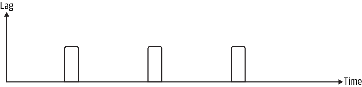
Figure 11-5. Minimal lag example
This can be tricky territory, as you saw in the example of database contention that lag is only part of the story when it comes to data pipeline performance. Notice in Figure 11-5 that the lag is very small compared to the amount of time between message publishing events. If you consistently see very little lag compared to the amount of time available for processing, you may be able to reduce worker resources. To make sure you don’t prematurely scale down and create performance issues, keep the following in mind:
- Broker resources
Fewer workers means more messages are sitting on the broker.
- Consumer variability
Are there scenarios where the consumer could take longer to process a message that could lead to unhealthy lag?
- Producer consistency
Are the received messages consistent, such as from a well-characterized, consistent data source, or could messages change without notice?
- Alerting
Choose a threshold to alert on unhealthy lag to give you time to reevaluate resourcing.
As an example, I was working on a pipeline where our team observed minimal lag and tried downsizing the Spark deployment to see whether costs could be saved. With the reduced deployment, the lag increased to near unhealthy levels, so the downsizing wasn’t possible. While our team couldn’t cut costs in this situation, this example illustrates how to look for signals in lag and assess whether changes can be made.
Worker Utilization
While consumer lag gives you information about streaming throughput, worker utilization can illuminate causes of lag and cost-saving opportunities. By comparing the worker settings with the number of tasks executing over a given time period, you can see whether you’ve saturated your resources or whether you’re leaving cycles on the table.
Converting worker settings to the number of tasks that could execute at a given time is dependent on your system architecture. In this section, I’ll roughly approximate the total number of slots available by the following:
Worker slots = Number of workers × concurrency per worker
For example, if you’re running two workers with a concurrency of four, you can have at most eight tasks running at once. When looking at the total tasks executing, if you see eight tasks running at once, you’ve saturated your available worker resources. If you see unhealthy lag with all workers utilized, this could be a sign that you need to add more workers or that you need to optimize worker dependencies by providing more resources or changing configurations to allow more tasks to run at once.
If instead fewer than eight total tasks are executing at a given time, you’re underutilizing the available resources. This could be due to broker settings that don’t correctly share tasks among all available workers or a worker being offline due to resourcing shortfalls. You may also just not have enough messages coming through the system to warrant having eight worker slots, in which case you should consider downsizing to reduce waste.
To illustrate how worker utilization can help you get the best bang for your buck, let’s take a look at a case where I was able to halve data ingestion costs with this information.
The product I was working on processed data for customers, similar to the heron identification as a service (HiaaS) example in Chapter 6. Since the processes to be run were common but the customer jobs had to run independently, I used a top-level Airflow DAG for each customer that called a secondary DAG to run the common process. The system started out with eight worker slots for running Airflow tasks.
As is smart when deploying a new process, our team gradually added customers to the Airflow deployment. After we hit about eight customers, performance completely tanked. When I looked at the Airflow web server, I could see that most of the DAGs were failing due to timeouts. My next stop was to look at worker utilization, which looked something like Figure 11-6.
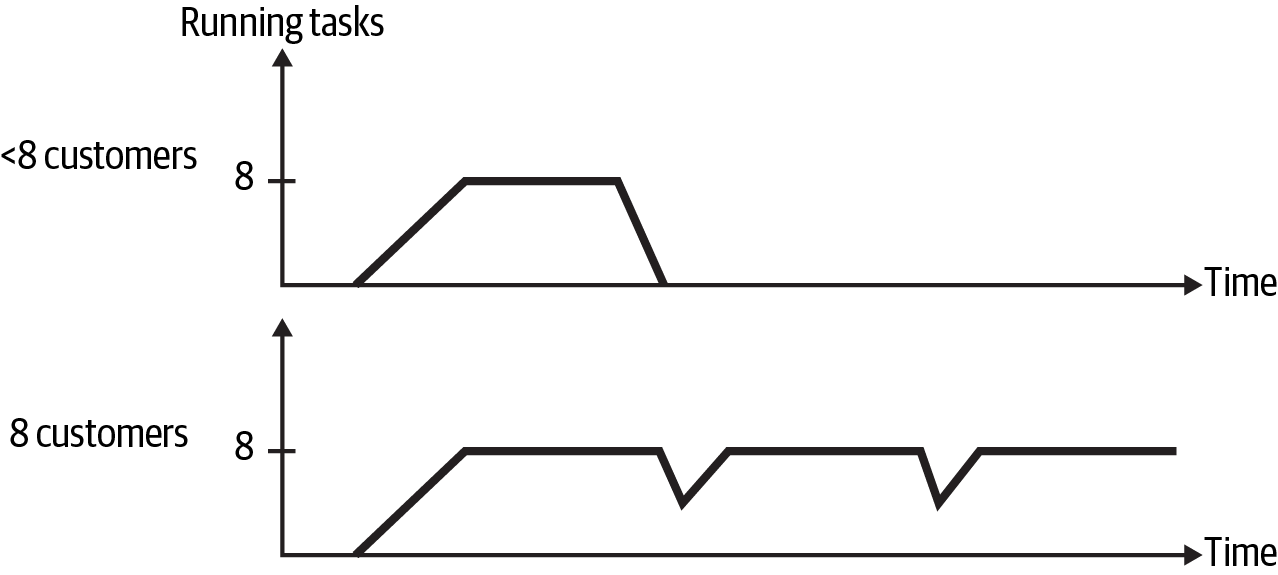
Figure 11-6. Airflow task deadlock
Both before and after the eight-customer threshold, all eight worker slots were utilized. An additional piece of information is that all the DAGs started at the same time. With eight customer DAGs running, all the worker slots were filled by the task that triggered the secondary DAG. For these tasks to complete, worker slots had to be available to run the secondary DAG, which resulted in deadlock. The few DAGs that managed to succeed were just fortunate to be able to get the secondary DAG to run when one of the trigger DAG tasks timed out.
With this information, I refactored the pipelines to eliminate the secondary DAG. Now, instead of consuming two worker slots per task, I could accomplish the same processing with a single slot, effectively halving the cost of running the DAGs.
Tip
Eliminating the secondary DAG wasn’t the only solution to this problem. I could have looked at the worker utilization in Figure 11-6 and piled on more workers, which would have solved the issue but at more than twice the cost. This is a key benefit of the cost-effective approaches in this book: having the time to focus on true engineering problems instead of being constantly sidetracked by lack of observability, unreliable systems, and codebases that are hard to change.
As you’ve seen in this section, system-level metrics (including data volume, throughput, consumer lag, and worker utilization) help you get a high-level sense of how a pipeline is performing. Like a dotted line on a map representing a hiking trail, system monitoring guides you in turning left or right or continuing straight to reach your destination.
Like the map on the left of Figure 11-7, system monitoring is helpful for finding your way in the woods, but you can do better! The topographical (topo) map on the right of Figure 11-7 includes contour lines, which show elevation changes along the trail. The additional detail in the topo map shows you whether the trail ascends or descends and the steepness of these gradients.

Figure 11-7. Maps representing system-level monitoring (left) versus resource and performance monitoring (right); image courtesy of CalTopo
Similar to how a topo map gives you a better idea of what you’re in for on a hike, the next section (“Resource Monitoring”) and “Pipeline Performance” help you delve deeper into the landscape of data pipeline performance.
Resource Monitoring
While system monitoring gives you a lot of information about health and performance at a high level, resource monitoring drills down to the fundamental elements of memory, CPU, disk usage, and network traffic. Oftentimes these are the root causes of reliability, performance, and cost issues.
This section focuses on how to identify under-resourcing and the issues it can cause. Similar to the system monitoring areas, if you consistently observe low resource utilization, this could be a sign that you’ve over-provisioned and that you could reduce costs by reducing the amount of resources allocated. Consider utilization in conjunction with trends and the amount of overhead needed to accommodate data spikes or high-performance requirements, as discussed in Chapter 1.
Understanding the Bounds
You may have heard processes referred to as being “CPU bound” or “memory bound” to communicate what is limiting performance. For example, the performance of joining large datasets in memory is likely to be bound by the memory available in the container or cluster where the process is running.
Knowing which attribute is limiting performance will show you which resource changes will help and which will not. In the large join example, throwing more CPU capacity at the problem is unlikely to help, unless you’re trying to help your CSP make more money.
In some cases, you can exacerbate issues by over-provisioning the wrong resource. Let’s say you have a data-processing stage that acquires data from another resource. If this process is I/O bound, meaning its performance is limited by waiting for the data source, adding more CPU could make the problem worse. Consider that the faster the data processing stage runs, the more requests it can make to the data source. If the data source is responding slowly due to its own resource limitations, the delay between request and response could increase.
Understanding how pipelines process data can help you determine what is bounding your process. In the EMR pipeline example at the beginning of this chapter, the source data was copied to disk and then processed in memory with Spark. Given this, disk and memory were logical assumptions for what bounded that process. You also saw an example in Chapter 1 of how choosing a high-memory machine type performed more quickly and more cheaply for another Spark workload, hinting at the memory-bound nature of that process.5
Fortunately, resource monitoring is pretty well established. It’s likely you can access this information within your infrastructure. The exception to this is managed pipeline services, where you might be able to get insight into system-level metrics such as lag, but you may not have access to more in-depth metrics such as resource utilization.
Understanding Reliability Impacts
In the most severe cases, processes that overrun resource allocations can keel over. This can impact a pipeline directly if a stage runs out of resources or indirectly if a service the pipeline communicates with is killed due to out-of-resource issues. In one case in which I saw this happen with a database, the pipeline began failing as a result of the database running out of resources and being unable to respond to requests. This is where idempotency and retries come into play, as you learned about in Chapter 4.
If you’re working in a containerized environment, monitoring service restarts can help identify inadequate resourcing. A container that consistently restarts unexpectedly may be running into resource issues.
A process getting killed repeatedly is a pretty direct sign that something is wrong. Sometimes resource shortfalls can be more difficult to detect. In one situation, I observed a Spark job get stuck in a cycle of stalling, then making progress when garbage collection ran. The garbage collection freed up just enough memory for the job to move forward a little before running out of resources again. Sometimes the job managed to succeed after several hours, but other times it failed.
Warning
It can be tricky to divine whether high-resource utilization is a cause for concern. For example, given a block of memory and no constraints on executors, Spark will consume all available memory in its pursuit of parallelizing data processing. Similarly, Java will also consume available memory, running garbage collection periodically to clean up after itself.
In these cases, simply observing high memory consumption in the container or cluster doesn’t necessarily point to an issue. If you see high resource utilization, check your resource settings to help discern next steps. Resource utilization on its own is only part of the picture; consider the impact of high utilization to determine whether action is needed.
Memory leaks are another source of instability that isn’t readily apparent. Memory utilization that slowly but steadily increases over time can be a sign of a leak. This is a situation where a longer observation window is helpful; if you don’t monitor memory long enough to see the leak, you won’t be aware that it’s happening.
On the other end of the observation spectrum is how frequently metrics are evaluated. This is a trade-off with cost, as frequent evaluation is expensive, and with usability, as temporary resource spikes may go undetected because the evaluation window is too long.
Similar to the Airflow example in “Worker Utilization”, addressing resource shortfalls by adding more resources isn’t necessarily the most cost-effective approach. I worked on a system that used Redis to cache results for common queries. At some point, queries started to fail. Looking into the issue, it turned out that Redis was running out of memory. By inspecting memory use over time, our Ops team noticed that Redis was holding on to a lot of memory outside of the time frame where the queries ran.
This finding prompted the developers to get involved to figure out why this was happening. The developers reevaluated the time-to-live (TTL), a duration after which a Redis entry is deleted. It turned out that the TTL was too long, so one optimization was reducing this to a more reasonable duration.
The investigation also revealed that a handful of Redis entries were using up most of the memory. After further discussion, it was determined that these entries were no longer needed, having been part of a deprecated feature. With the TTL adjustments and unused entries removed, Redis memory was reduced, which not only fixed the query failures but also reduced compute costs. Had our team simply provisioned more resources to fix the memory issue, we would have been wasting money.
Pipeline Performance
While system-level metrics such as overall pipeline runtime and consumer lag give you a sense of how long it takes for a job to run, inspecting performance within the pipeline can provide details about the processes happening during the job.
Digging into this level of detail is like a higher-resolution topo map, where the contour lines represent smaller gradations. While pipeline throughput gives you the view in Figure 11-8 (left), inspecting performance within the pipeline gives you more detailed information, as in Figure 11-8 (right).

Figure 11-8. System monitoring view with less detail (left) compared to pipeline performance monitoring view with more detail (right); image courtesy of CalTopo
Pipeline Stage Duration
To dig into pipeline performance at a lower level, let’s revisit the HoD batch pipeline from previous chapters, repeated here in Figure 11-9.
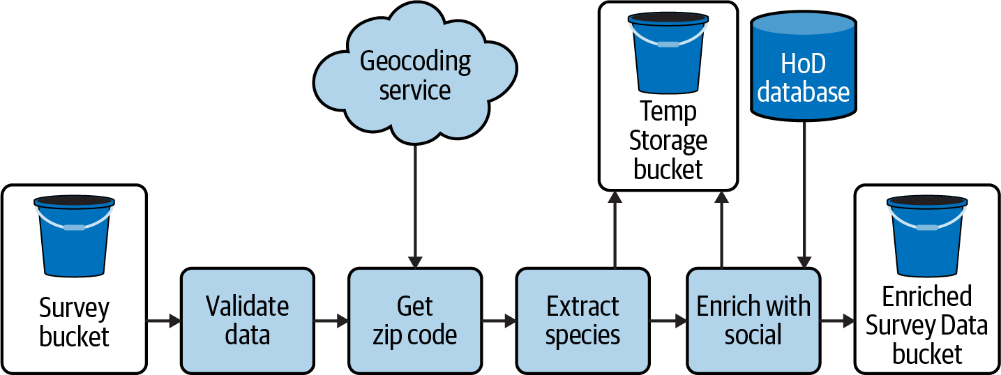
Figure 11-9. HoD batch pipeline
Let’s say you’ve been monitoring the overall runtime of the pipeline for a while and recently noticed some deviations from the expected baseline. Table 11-2 shows the baseline runtime and two cases that have started to appear frequently. In Case 1 the runtime is about three times the expected runtime, and in Case 2 it is about 30 times the expected runtime.
| Case | Runtime |
|---|---|
| Baseline | 10 |
| Case 1 | 35 |
| Case 2 | 310 |
The runtime on its own tells you something is amiss, but without more detail it’s difficult to know what is going on. Before reading on, think about some ways you would try to get to the bottom of these longer runtimes.
This is the situation I was presented with in the database contention problem I shared in “Consumer Lag”. Something was taking an unusually long time, but it wasn’t clear what it was.
Table 11-3 shows some examples of the more in-depth picture you get when looking at runtimes within the pipeline, with the pipeline stage names abbreviated.
| Case | Validate | Zip code | Extract | Enrich | Total time |
|---|---|---|---|---|---|
| Baseline | 2 | 2 | 1 | 5 | 10 |
| Case 1 | 2 | 2 | 1 | 30 | 35 |
| Case 2 (a) | 2 | 300 | 1 | 7 | 310 |
| Case 2 (b) | 1 | 1 | 2 | 306 | 310 |
Table 11-3 makes it clear where the slowdowns are, but typically you would first observe this information in a dashboard, visually inspecting metrics to look for anomalies. Figure 11-10 shows an idealized trace for the Baseline and Case 1. The top graph shows the overall throughput of the pipeline, and the bottom graph breaks down traces by pipeline stage. For readability, the stage traces are offset on the y>-axis, and I’ve limited the stage traces to zip code (solid line), validate (dashed line), and enrich (dotted line).

Figure 11-10. Baseline versus Case 1: dashboard view
Getting familiar with the typical characteristics of metrics will help you debug at a glance whether something isn’t as expected. In the overall view at the top of Figure 11-10, it’s clear that Case 1 has very different throughput than Baseline does, which would prompt you to take a look at the stage traces for further inspection. At the stage level, you can see that the throughput of the Enrich stage is lower than Baseline, and as a result, it takes longer for this stage to complete.
Returning to Table 11-3, let’s think through the different cases. Interestingly, Case 2 appears to have two different underlying causes. At this level, you can start drawing on your knowledge of pipeline operation to consider what might cause these deltas. For example, perhaps you recall that there is a five-minute retry when connection issues occur with the zip code API or the database.
A further step you can take here is to consult the logs, as you saw in Chapter 10. If you’ve left yourself some good breadcrumbs, you might see connectivity errors and retry attempts corresponding to the Case 2 scenarios. From there, you can go back to the API and database to troubleshoot further.
What about Case 1? If there are no connectivity errors, what else could be the problem? If you’ve logged or created metrics for data volume at each pipeline stage, as suggested in “Data Volume”, this would be another place to look. Another option for sub-stage level observation is profiling.
Profiling
If you need more fine-grained visibility into where a pipeline is spending time, profiling can help you get to a much lower level of detail. A word of caution: profiling can suffer from the observer effect, where the act of measuring runtime can impact the overall duration. Whereas job- and stage-level runtime observability can leverage metadata, such as the task runtime metrics made available by systems like Airflow and Celery, profiling depends on putting probes within the code itself.
Profiling can be expensive from a cost and performance perspective. If you choose to implement profiling, be able to turn it on selectively—for example, on a per-job or per-customer basis, or perhaps only in a test environment where performance isn’t critical.
How profiling is implemented and the level of detail required impact cost. If your interests are limited to method runtime, using a wall timer and logging the metric is an inexpensive option. I’ve seen this approach used to generate JSON logs that were then analyzed in Google BigQuery, similar to this example where the event_id was traceable throughout the pipeline (times here are in seconds):
{"event_id":"bird-23ba""total_time":10,"enrich_with_social":7,"store_result":0.4,...}
If you want to monitor runtime continuously, setting up a custom time-series metric is another option. Each function you monitor will be a new trace, which can multiply by other factors depending on how the metrics are labeled. More about that shortly.
Many observability services offer application performance monitoring (APM), which includes the ability to profile the full range of resource metrics down to the class and method levels. This can be quite expensive, but it can also be very illuminating to help tune performance.
If you’ve implemented the code design strategies described in Chapter 6, you’ll already have a codebase set up to easily probe the amount of time it takes for discrete processes to run. Continuing Case 1 from Table 11-3, assuming you’ve separated the concerns of interacting with the database from the join performed in “Enrich with social,” you can probe these processes separately, as shown in Table 11-4.
| Case | Enrich total time | Merge species and social | Store result |
|---|---|---|---|
| Baseline | 5 | 1 | 5 |
| Case 1 | 30 | 20 | 10 |
With this level of detail, you can see that, while both the merge and store processes have increased compared to the baseline, the merge has increased by 20 times compared to two times for storing the result.
Errors to Watch Out For
So far, you’ve seen ways to monitor data pipelines to help you keep ahead of performance and reliability issues, while looking for opportunities to reduce costs. Inevitably, you will also have to deal with failures and errors, the reporting of which is an important aspect of monitoring.
In some sense, you can think about error monitoring as going the last mile when it comes to building data pipelines. A lot of times, so much emphasis is on design and development that it’s easy to forget that making a connection from the pipeline to monitoring tools is essential to deal with failures quickly and effectively.
Depending on your infrastructure, you may already have access to some error metrics. For example, Airflow provides various failure metrics, as does Spark. While it’s helpful to know that an Airflow DAG failed, being able to convey why it failed can expedite prioritization and debug. In addition, frequent failures of a particular type can be signs that the design needs to be updated.
Ingestion success and failure
Knowing whether ingestion failed is certainly important from an alerting perspective. Keeping track of ingestion successes and failures also gives you a longer-term perspective on system reliability. From both a debug and tracking perspective, annotating ingestion failures with a failure reason will help you further isolate underlying issues. The remaining metrics in this section can be rolled up into an overall pipeline failure metric to this end.
Stage failures
The next level of error detail comes from tracking the failure rate of individual pipeline stages. Just like you can get more detail from looking at pipeline stage duration, as you saw in “Pipeline Performance”, stage failure metrics show you specifically where the pipeline failed.
Tracking stage failures is especially helpful when more detailed failure reasons could be shared by multiple stages. Typically you’ll have failures that fall into two groups: those that can be explicitly identified, such as validation and communication failures, which you’ll see next; and those that are not identifiable. These unidentified errors could occur at any stage in the pipeline, so annotating pipeline failure with which stage failed can help disambiguate where something went wrong.
Validation failures
As you learned in Chapter 6, an uptick in data validation failures could be indicative of changes in data or bugs in validation code. Monitoring validation failures over time will help you discern which might be the cause. For example, if there is a sudden spike in validation failures following a release, code could be the place to look. If instead you see a steady increase in validation failures across releases, this could be indicative of a change in data characteristics.
Communication failures
When failures occur, it’s helpful to be able to isolate the cause. With the number of external dependencies in data pipelines, reporting whether a failure occurred because of a connection issue will show you where to focus debug and improvement efforts. You saw this in Chapter 4 with retries, where it may make sense to retry on a connection failure but not if you executed a bad query.
Authentication failures are a subset of communication failures. It can be tricky to isolate whether a communication failure is due to a failure to authenticate, particularly if you’re working through a CSP client library. You saw this with the GCS example in Chapter 8, where failures to upload objects to GCS were due to authentication issues, but because the client library wrapped the exceptions, it wasn’t easy to introspect what the root cause was.
In scenarios where you can isolate authentication issues, identifying failures as being specifically due to authentication problems will really speed up remediation. One pipeline I worked on had a specific error type for authentication problems. As a result, the product was able to surface directly to customers if their credentials weren’t working. This completely bypassed the need for debugging by the engineering team, saving engineering costs.
Stage timeouts
As you saw in “System Monitoring”, changes in how long it takes to run a task can impact system performance, stability, and scaling. Setting timeouts for a stage can help you track performance changes or enforce a certain level of pipeline throughput.
In the error metric setting, timeouts would be a hard failure, where a stage that takes longer than the allotted time fails. You can also set softer timeout limits, such as Airflow SLAs, that will not fail a stage but will emit a metric when a task takes too long.
Let’s consider how the error metrics in this section could be applied to the HoD batch pipeline in Figure 11-9. Table 11-5 shows failure reasons for a few of the individual pipeline stages. All three stages have an UNDEFINED or a TIMEOUT error type, which would be used if an error occurs that isn’t related to a specific failure reason or if the stage timed out, respectively.
| Validate data | Get zip code | Enrich with social |
|---|---|---|
VALIDATION | ZIP_SERVICE | DB_CONN |
DB_QUERY | ||
TIMEOUT | TIMEOUT | TIMEOUT |
UNDEFINED | UNDEFINED | UNDEFINED |
The other failure reasons correspond to specific issues. VALIDATION indicates that data validation failed, ZIP_SERVICE is for failures to communicate with the zip code service, and the DB_CONN and DB_QUERY failures separate the conditions of failing to communicate with the database or a query error, respectively. Note that there are 10 possible failure reasons, which is definitely within cardinality constraints for metrics annotations.
Table 11-6 shows some hypothetical metrics results using the failure reasons in Table 11-5 for a sequential set of ingestion events. Events 1 and 3 show no errors. In Event 2, 1% of jobs failed communicating with the zip code service. This seems like a temporary communication failure.
| Event ID | Errors | Percent errors |
|---|---|---|
| 1 | — | 0 |
| 2 | ZIP_SERVICE | 1 |
| 3 | — | 0 |
| 4 | ENRICH.TIMEOUT | 3 |
| 5 | ENRICH.TIMEOUT | 8 |
| 6 | ENRICH.TIMEOUT | 12 |
Events 4 through 6 show some more interesting behavior, where progressively higher percentages of jobs are failing due to the “Enrich with social” step timing out.
This example is modeled after a pattern I’ve seen in my work, where a particular stage timing out for a given percentage of jobs meant more resources were needed to complete a process with several database interactions. Typically this could mean that code changes had slowed down the queries or that data volume had increased. You’ve already seen how to track data volume changes. In the next section, you’ll see how to monitor query performance to investigate the other potential root cause in this example.
Query Monitoring
Query performance can give you insight into the efficacy of data modeling and storage layout strategies, and it can surface slow queries that would benefit from refactoring.
Queries can take place as part of data pipeline operation, such as acquiring the relevant data for “Enrich with social” in Figure 11-9, or after the fact, such as queries executed against ingested data by analytics users. In this section, I’ll talk about some metrics to help you introspect these processes to improve performance.
At a high level, query monitoring is similar to pipeline performance monitoring in that keeping track of runtime and success/failure rate provides important performance tuning insight. Capturing query plans can give you a sense of how data modeling is holding up to how the data is being used.
Especially if you don’t know what queries are executed a priori, such as with a system that generates queries dynamically, query monitoring can be an invaluable tool. Without insight into how data is being accessed, it is difficult to create performant data structures, including data models, views, and partitioning strategies. These decisions trickle back into how a pipeline is designed.
I encountered this chicken-and-egg–type problem when working on a data platform that surfaced insurance data to policy analysts. The analysts ran huge queries that were several pages long, which created a lot of intermediate tables to slice and dice the data. This strategy has its roots in the legacy tools used to query data before the Spark platform was available.
To improve performance, I developed a strategy for surfacing and analyzing user queries, which you can read more about in the article “User Query Monitoring in Spark”. I’ll walk through the more widely applicable steps here to provide advice on how to generalize this approach:
- Get information on queries users are running: the query statement, runtime, and query plan.
In the article referenced in the preceding paragraph, I had to reverse-engineer part of the Spark ecosystem to get the SQL queries users were executing. Hopefully you have simpler options. For example, the Postgres documentation includes a note on how to log query statements and duration for queries that exceed a certain duration, which are some handy settings for acquiring information on long-running queries.
- Identify the highest-impact queries.
The definition of highest impact depends on the use case. These could be the set of queries executed by the most important system users, or they could be a set of queries that are identified as the most critical.
In the Spark platform, there wasn’t a cut-and-dried list of queries or personnel to work from. In addition, when I compiled a list of distinct queries, there were far too many to profile independently. If this is your situation, look for query patterns as opposed to specific queries. This is described in the linked article as “query signature analysis.” You might find that queries against a particular table are especially slow or that the most common query filters do not coincide with current partitioning strategies.
To identify high-impacting queries, consider looking at metrics that combine the query runtime, the query frequency, and how much the query runtime fluctuates:
Total query time = sum of query times
Average query time = total query time / number of occurrences
Coefficient of variation (CV) = standard deviation of query time / the average query time
Total query time helps you identify how much computation time a given query consumes. The CV shows you which queries are consistent time hogs; the lower this number is, the smaller the deviation is. To get a sense of how to use these values, let’s take a look at some example query metrics in Table 11-7.
Table 11-7. Query metrics (time values are in seconds) Query ID Average query time CV Total query time 1 1 0.1 4,000 2 40 0.2 3,200 3 75 0.8 1,800 Query ID 1 illustrates a case in which the total query time is significant and the variation is low, but the average query time is also low. This could be something like a basic
SELECTstatement withoutJOINs or an expensiveWHEREclause—the sort of query that may occur frequently but is not necessarily worth trying to optimize. You could filter out query IDs with a low average query time and low CV to further isolate high-impact queries.Query ID 2 shows a more promising case. The average query time is high and the CV is low, so this query likely takes a consistently long period of time. It also is the second highest consumer of total query time.
Finally, Query ID 3 is an example of a query that, on average, takes a significant amount of time to run, but the high CV indicates the average isn’t a reliable indicator. While you might be able to improve execution of this query, the variability in runtime makes it unclear how much performance improvement you will get.
- Look for optimization opportunities.
With the high-impacting queries identified, you can now focus on optimization opportunities.
One of the biggest impacts of query monitoring was giving feedback to the analysts. I set up a Databricks notebook that showed the top slowest queries, which the analysts accessed to better understand how they could rework their jobs for better performance.
You might also find that query patterns have changed, necessitating updates to data modeling strategies. For example, in a different project, a job that computed pipeline metrics slowed down significantly over time, starting out running in a few seconds and ballooning to a few minutes. It turned out that a core query in the metrics job was filtering on a value that wasn’t an index, and as the data in the system had grown over time, the performance of this filter degraded.
Minimizing Monitoring Costs
Keeping track of metrics over the long term can help you better understand system health, identify trends, and predict future needs. Rather than incurring the expense of storing telemetry data over the long term, you can persist a subset of metrics for future reference. Essentially, you can pull out the important, discrete data points from the continuous monitoring data, greatly reducing the metric data footprint.
When deciding which metrics to persist, keep in mind that you won’t have the underlying monitoring data to draw from. For example, perhaps you have a metric for average consumer lag per day. Depending on how you want to use this data in the future, recording the quartile can give you more insight into the distribution of the lag. Another approach is to use percentiles, such as P99, to exclude outliers.
You can incorporate saving discrete metrics into pipeline operation with surfacing telemetry metrics. I worked on a streaming pipeline that published data volume and success metrics to a separate metrics data model. This was cost conscious, as data volume from any time period could be queried from a database instead of saving telemetry data. An added benefit of this approach was that it provided diagnostic information for both the engineering team and our customers. Customers could see their data volumes, and engineers could use this information to plan scaling and architecture changes as well as debug issues.
Similar to my advice in Chapter 10 regarding logging, focus your monitoring on high-impact metrics such as the ones in this chapter, rather than trying to capture everything. If monitoring costs are a concern, remember that having a map is better than having no map. Start with system monitoring and capturing ingestion success and failure metrics, and add detail from here as you are able.
Summary
Monitoring enables you to look across all the decisions about design, implementation, and testing to observe how these decisions hold up to the realities of pipeline operation in the wild. This map can help you improve performance and reliability and save costs across the board, from cloud service costs to engineering costs and the cost of lost revenue due to system downtime.
Throughout this chapter, you saw advice for monitoring data pipelines, from high-level system metrics to more granular insights about resource usage, pipeline operation, and query performance. Like a good map, the ability to introspect system behavior helps you plan for the path ahead, adopting a proactive stance instead of a reactive one.
System monitoring gets you started with a basic trail map. Data volume, throughput, consumer lag, and worker utilization provide a high-level picture of the data pipeline landscape, showing you how data changes impact performance and infrastructure needs.
Having a map is a good start. Being able to both read the map and interpret it alongside other signals is essential for putting it to good use. You saw how data volume fluctuations could be happenstance, as in the case of changes in data sources, or how it could be indicative of bugs in the pipeline. Understanding which of these is the case requires combining the metric of data volume with your knowledge of pipeline operation and data characteristics.
Beyond pipeline performance, tracking metrics such as data volume can help with capacity planning and budgeting. The seasonality in the bird migration data is an example of different data volumes over time, which can be used to determine reservation purchases and adjust cloud spend forecasts.
Changes in data volume and resourcing can impact pipeline throughput, which shows you how much data is processed over a given period. Decreased throughput can indicate under-resourcing, which can escalate to reliability issues, as you saw in the example. Conversely, increased throughput can indicate an opportunity to save costs.
Understanding changes in throughput can require more detailed metrics. For streaming pipelines, consumer lag can show you whether decreased throughput is due to a mismatch between publisher and consumer volumes. Whether due to higher data volumes, producer performance improvements, or consumer performance degradation, a persistent message backlog can limit performance. In extreme cases, reliability can become a concern as well, which is why alerting when consumer lag exceeds a healthy threshold can be helpful.
Monitoring worker utilization shows you how well the pipeline is saturating the resources being provisioned. Consistently using fewer worker slots than are available can indicate wasted resources and an opportunity to reduce workers. Comparing worker utilization and consumer lag can help you determine how to improve performance; unhealthy lag and saturated workers could be a sign that workers or their dependencies need more resources. You also saw, with the Airflow deadlock example, how worker saturation is a careful balance.
Adding more detail to the monitoring map, resource utilization shows you what’s going on with memory, CPU, disk, and network resources. Knowing which resources are bounding your processes will help you choose the right vertical scaling solution.
Killed processes, frequent and/or unexpected container restarts, and long job runtimes can be signs that you should check resource utilization. Check these metrics alongside resource limits and configurations to understand where limits are being imposed before upsizing.
While throughput gives you a sense of how the pipeline performs at a high level, digging into pipeline performance at the stage and process levels helps you determine more precisely where improvements can be made. Profiling gives you very finely detailed information about performance, but it can also slow things down. Using profiling in test environments and being able to turn it off selectively will help you benefit from its insights without reducing performance.
Monitoring pipeline failures is good; annotating these error metrics with the failure reason is better. This approach provides a head start on root cause analysis and helps differentiate between intermittent issues and trends that benefit from more immediate attention. Adding low-cardinality information such as pipeline stage and source of error, including validation, communication, and timeouts, gives you this information at a glance. Couple this with logging high-cardinality information to have a solid debug strategy.
Data access is an end goal of data pipelines and can also be part of pipeline operation. Monitoring query performance is another opportunity to optimize cost–performance trade-offs. Analyzing the highest-impact queries, those that consistently take up the lion’s share of compute time, can give you insight into optimizing data models or the queries themselves. Improving query performance reduces compute costs and makes for happier analytics customers.
Being able to pull up a dashboard to inspect lag versus data volume versus worker utilization is helpful for point-in-time debugging, but keeping endless amounts of this telemetry data isn’t necessary or cost-effective. To track over the long term, capture statistics about continuous monitoring data.
It’s always reassuring to know where you’ve been, where you’re going, and what’s happening in the present. Without that confidence, things can be pretty uncomfortable, whether you’re in the woods or working on a data pipeline. With a map of what to monitor and guidance on different ways this information can be interpreted, you can feel secure in your data pipeline journey and avoid falling off the cliffs of performance, reliability, and cost.
Recommended Readings
Chapter 18 of Spark: The Definitive Guide, which provides advice on monitoring for Spark and mitigation strategies for common issues
Chapter 6 of Google’s Site Reliability Engineering (O’Reilly), which notes the four golden signals for monitoring distributed systems
1 The RabbitMQ monitoring documentation is a nice primer on monitoring, even if you don’t use RabbitMQ.
2 Technically, carrying a map is part of good hiking prep.
3 This setup required a full-time developer to debug job failures.
4 Keep in mind startup penalties when using this metric, such as if there is additional latency waiting for resources to scale out when the data load increases.
5 Spark processes can be bound by other attributes besides memory; this is just one example.
6 Grafana provides a good overview of the cardinality problem.