
6
Types of Analytics
If you look at the objective of the exam, you will find that you need to understand four general categories of analyses: exploratory data analysis (EDA), performance analysis, trend analysis, and link analysis. Here, we will cover everything you need to understand about the types of analyses for the exam. You will learn what EDA is, why it’s used, and some common types. For performance analysis, we will explain what it is before jumping into some subcategories. Trend and link analysis are pretty straightforward to understand what they are, and we will discuss some common techniques to execute them. Finally, we will talk about how to choose which category of analysis you will need at any given time.
In this chapter, we’re going to cover the following main topics:
- Exploring your data
- Checking on performance
- Discovering trends
- Finding links
- Choosing an analysis
Technical requirements
There is nothing that you absolutely have to do to prepare for this chapter, but there is an example in this chapter using Python in Jupyter Notebook. If you would like to follow along, you can find the EDA_Example_Data.csv dataset by following the link provided:
https://github.com/PacktPublishing/CompTIA-Data-DAO-001-Certification-Guide
This GitHub link will take you to a repository that contains the data as well as my example code.
Exploring your data
EDA is a general term for a broad category of analyses that are used to understand your data better. Is that definition a little vague? Yes, but the term means slightly different things to different people. Even what analyses fall into this category are up for debate. What is EDA, then? It’s dipping your toe into the water to check the temperature before jumping into the data lake.
Important note
It should be noted that some analysts include the cleaning and wrangling processes in what they consider EDA because they are all things you do to prepare your data for use. However, for the purpose of this exam, they are considered separate.
When you first receive a new dataset, before you know what questions to ask or analyses to run, you need to understand some basic information about the data. This can take the form of basic descriptive statistics, simple charts or visualizations, or even simple modeling or machine learning algorithms. What analyses you run may depend entirely on what you need to do with the data. EDA encompasses any preliminary information gathering that you must do before you can jump into what you actually want to know. Maybe you need to know about frequencies, averages, trends, or the relationships between your variables before you can get started.
Important note
As you go through this chapter, you may find that there is some overlap between EDA and the other types of analyses. This is because if your goal is to use the more advanced forms of any type of analysis, you may perform one of the simpler forms as part of your EDA. For example, Structural Equation Modeling is an advanced form of link analysis and isn’t any fun to run, so you might do scatter plots as part of your EDA to see whether it is even worth running the advanced model.
Lots of people argue that EDA is only this or only that, but the truth of the matter is that EDA is whatever you need it to be to lay the groundwork for your later analyses.
Common types of EDA
Okay, anything can be an EDA, but a few types are definitely more common than others. Let’s start with the most basic and work our way up.
Descriptive statistics
Often, the first thing you need is a suite of simple descriptive statistics. Aptly named, they are there specifically to describe your data. That’s all they do. They don’t predict or indicate anything. They just give you basic information. There are roughly four categories of descriptive statistics:
- Measures of central tendency
- Measures of dispersion
- Measures of frequency
- Measures of position
Now, these are all more or less what they sound like. Measures of central tendency include things such as mean, median, and mode. We will discuss these in more depth in Chapter 7, Measures of Central Tendency and Dispersion. Until then, just know that they help you find the middle of your data. In the context of EDA, these are usually just given as numbers in a table but can be denoted on graphics that show other things.
Measures of dispersion, also to be covered in detail in Chapter 7, Measures of Central Tendency and Dispersion, effectively explain how spread out your data is. How much variance you have in your dataset can be an important indicator of how reliable it will be in predictive models. You can expect concepts such as standard deviation, range, variance, min, max, and quartiles. Measures of dispersion are usually visualized as histograms, but box plots are also popular. Again, these values can just be placed in a table.
Measures of frequency will tell you how often specific values come up. This includes concepts such as counts, ratios, or percentages. In EDA, counts are usually just represented in a table but can technically be presented as a bar chart. When it comes to the visualization of percentages, you will sometimes see people use heat maps.
Important note
All of the charts and graphs listed in this chapter, excluding burndown charts, will be explained in detail in Chapter 13, Common Visualizations, where we will go over each visualization in more depth.
Measures of position aren’t usually used in EDA. They are all about figuring out how a single value compares to a distribution. These include percentiles, z-scores, and – some would argue – quartiles.
Overall, all of these measures are invaluable in EDA and should be one of the first things you use. It may sound like a lot, but the fact that this information is important has been noted by the people who design data analytics tools. As such, most tools will have some shortcuts to help you get this information faster. For example, if you are using the pandas package in Python 3, you can just use the .describe() function, which will automatically give you a table that has a lot of measures done for you.
Relationships
There are several ways to see whether there is a relationship between two variables. These methods range from vague and simple to incredibly specific and complicated. At a high level, the relationships between variables are called correlations. When variable A changes, does variable B change as well? We will go over correlation specifically in Chapter 10, Introduction to Inferential Statistics. However, for now, know that it is common practice to use a simple visualization such as a scatter plot during EDA. Let’s look at one in Figure 6.1:

Figure 6.1 – Scatter plot
In Figure 6.1, we see an example that gives you a rough idea about whether variables might be correlated so you know whether it is worth taking the time to perform a more in-depth analysis.
Dimension reduction
Dimension reduction, sometimes called feature reduction, like the reduction we have discussed before, is the idea that you should simplify the data as much as you can before trying to use it. The idea is simple, but when people talk about dimension reduction, they are talking about a specific set of advanced multivariate statistics, such as principal component analysis (PCA) or non-negative matrix factorization (NMF). These are by no means simple to execute or common at this level of data analytics. Another approach is to use machine learning clustering methods, such as k-nearest neighbors or k-means clustering, to create groups to simplify the data. Let’s see how this might work in Figure 6.2:

Figure 6.2 – Dimension reduction with clusters
Figure 6.2 is an example of how a clustering method might break data down into groups, then use those groups to generalize instead of using every data point. Nothing about this will be on the exam. I only mention it here because there are those who argue, mostly statisticians, that it is the most important part of EDA.
EDA example
This is all sounding pretty vague, so how about we walk through an example together? We will use a sample of customer data. For the purpose of this example, I will be using Python 3 through Jupyter Notebook.
Important note
Again, you do not need to know how to use any particular software or programming language for the exam. This example is in Python because it is a popular tool and one I personally use. You are encouraged to practice this on your own, but if you would rather, you can simply read along to get a general idea of the process.
If you would like to practice this on your own, I would encourage you to go to the website www.anaconda.com. Anaconda is a free collection of data science tools and modules. Not only will you get Python and even Jupyter Notebook, but it will automatically install the majority of packages that you will need for data analytics. Let’s import a package and pull in our data:
import pandas as pd
MyData = pd.read_csv("EDA_Example_Data.csv")
MyData.head()
The preceding code is pretty straightforward. The first line imports the pandas package and saves it as pd. The second line uses a function from pd to load our data into the program and save it as MyData. The third line is a function that will just display the first few lines of our data. Overall, this imports the package we need, and our data, and gives us a sneak peek of it. The results will look something like this:

Figure 6.3 – First five rows of the dataset
The dataset displayed in Figure 6.3 is a sample of 100 customers from an e-commerce website, though we are only seeing the first five entries. Client_ID is a unique ID number attributed to every client. Age_Bracket shows what age range the client falls into. AB_Recode is a recode of the Age_Bracket variable, and we will talk about why it is there in a moment. Orders is the number of orders placed by the client. Total_Spent is how much money the client has spent in total.
Okay, we have brought in our data and glanced at it. Before we go too in-depth, we should start with a broad view of the data as a whole by executing the following line of code:
MyData.info()
This one little line will give us a rough description of our dataset as a whole. The results should be as follows:

Figure 6.4 – Summary of the dataset with info()
In Figure 6.4, we see that our data is formatted as a pandas DataFrame, which is fine for what we are doing. We also get a list of every variable, the number of values that are not banked for every variable, what data type each variable is, the counts of each data type, and how much memory it is using. Because the data has already been cleaned, every variable has all 100 values as non-null. We see that Client_ID, AB_Recode, and Orders are integers, Total_Spent is a float, and Age_Bracket is an object, which, in this case, means it is a string variable.
Important note
In the majority of programming languages, you will find common variable types. To put it simply, integers are whole numbers, floats are decimals, and strings are text.
It should be noted that if Total_Spent was formatted as currency, that dollar sign in front would mean that when we brought it into Python, it would be treated as an object as well, and we would not be able to use it in calculations. There are ways to convert it to a float within Python, but that is something that should be completed before this process, if possible.
For this example, we know that in the future, we will want to perform calculations on Total_Spent, so let’s look at it a little closer:
MyData["Total_Spent"].describe()
This line of code performs the describe() function on the Total_Spent variable found in MyData. The results are as follows:

Figure 6.5 – Summary of Total_Spent with describe()
In Figure 6.5, we see where the descriptive statistics come in. Here, we have the number of values, the average of the values, the standard deviation, the smallest and largest values, as well as the quartiles. This gives us a lot of information about this variable. If you want, you can repeat this process for Orders simply by rerunning the previous line of code, but you will have to replace Total_Spent with Orders. You could, theoretically, also run it on Client_ID, Age_Bracket, or AB_Recode, but it would be meaningless. Client_ID is a key variable and not something you will generally use for analytics, Age_Bracket is a categorical variable, and you will only get general counts and what value pops up the most, and AB_Recode is a categorical variable pretending to be an integer, so the results won’t make any sense.
Okay, well, if the describe() function won’t help with a categorical variable, what should you use?
MyData["Age_Bracket"].value_counts()
This is a quick way to take a glance at a categorical variable. It is also a quick way to check for typos in a variable. The results are as follows in Figure 6.6:

Figure 6.6 – Value count results
In the preceding figure, we see every value that is found in Age_Bracket, and the number of times each occurs. The values are, by default, sorted from the most frequent to the least. Here, we see that the majority of clients for this website are between the ages of 31 and 40.
Next, we are going to combine a few steps all in one very convenient line of code:
EDA_Plots = pd.plotting.scatter_matrix(MyData)
This creates a scatter plot matrix of all numerical variables. Also, in the squares on the grid where a variable crosses itself, it displays a histogram that gives you a rough idea of the distribution of that variable. The results are as follows:
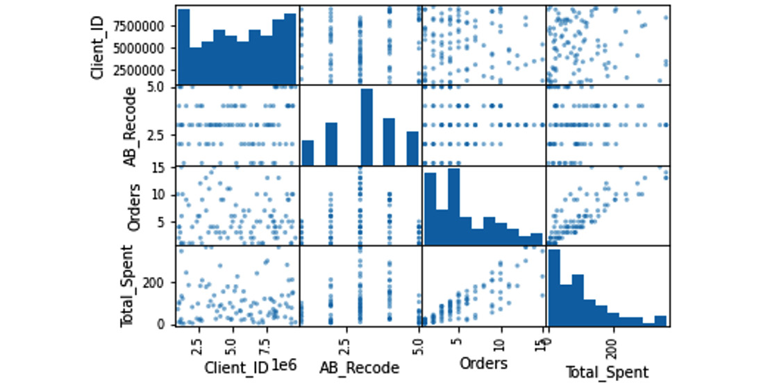
Figure 6.7 – Scatter plot matrix
There is a ton of information packed into this little visualization, as shown in Figure 6.7. Let’s look at the variables one at a time. The column on the far left is Client_ID. Normally, you would not include a key variable in something like this. You would actually create a new dataset, which would be a subset that only included the variables you wanted. However, I left it here to show you what the results would be. The histogram in the top-left corner, which shows the distribution of Client_ID, tells us that the distribution is random and does not show any trends, which makes sense because client ID numbers are often generated at random. The next square down, AB_Recode / Client_ID, shows what it looks like when you include a categorical variable in this matrix, and means nothing. The two squares below that, Client_ID / Orders and Client_ID / Total_Spent, show how Client_ID relates to Orders and Total_Spent.

Figure 6.8 – Scatterplots with no relationship
This random scattering shown in Figure 6.8 does not show anything. There is no relationship between Client_ID and anything.
The second column in Figure 6.7 shows AB_Recode. Again, you generally do not want a categorical variable in this kind of matrix, but we included it for the histogram, not the scatter plots. This histogram actually shows a pretty normal distribution, as seen in Figure 6.9:

Figure 6.9 – Histogram of AB_Recode
We can do this because there is an inherent order to the values in Age_Bracket; it is ordinal. In other words, we have an order to the categories: <21, 21–30, 31–40, 41–50, and >50. This is because the age brackets are based on the client’s age, which is a number.
If you were to try to create a histogram based on a categorical variable such as color, it would be completely meaningless. Blue could be 1, 2, or 27. There is no logic to the order, so there would be no meaning to the shape created by the order.
The third column in Figure 6.7 is Orders. We have already discussed the relationship between Client_ID and AB_Recode, so let’s look at the histogram:

Figure 6.10 – Histogram of Orders
In Figure 6.10, we see it is skewed to the right and not a normal distribution, so we should treat it as non-parametric until we try to adjust for the skew. The last box shows how Orders relates to Total_Spent. There is a rough line from the lower left to the upper right, as shown in Figure 6.11:
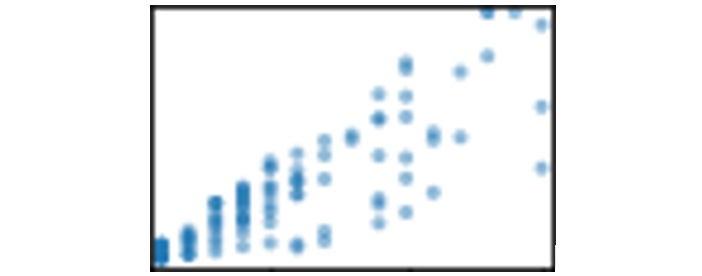
Figure 6.11 – Scatter plot of Orders and Total_Spent
This indicates that there might be a positive relationship between Orders and Total_Spent. Logically, it makes sense that the more orders a customer makes, the more likely they are to spend more money.
The last column is Total_Spent and shows what we would expect at this point. The histogram shows a right skew, it has a positive relationship with Orders, a meaningless relationship with AB_Recode, and no relationship with Client_ID.
This is a lot of information to glean from one line of code. We could go more in-depth if we had specific goals or things to check, but this is a solid amount of basic information from a quick, high-level EDA. We now know enough about our variables to go ahead and get started.
That’s what you need to know about EDA. Next, we will move on to performance checks.
Checking on performance
Performance analysis is another slightly open-ended category that is used heavily in the business and industrial fields. At a high level, performance analysis is all about meeting goals. Are you selling as much as you thought you would? Are you producing as much as you expected? Is your team meeting deadlines? Is the manufacturing process as efficient as it should be? Are your competitors’ key performance indicators (KPIs) looking better than yours? The goals that are trying to be met change from field to field, company to company, department to department, and even team to team, so the analyses used to see whether the goals are being met vary drastically. Remember, at a high level, performance analysis is only checking to see whether you are performing as expected. There are a few general subcategories that you might find helpful.
KPIs
We have discussed KPIs previously, but as a quick reminder, they are metrics that are used to gauge performance. Any metric can be a KPI, depending on your circumstances. If your only goal is to make 10 people happy a day, then the number of customers who left with a smile on their face could be a KPI. That said, some KPIs are more common than others. Return on investment (ROI) is a classic example because most companies want to know whether they are making money on investments or losing money.
As you can imagine, KPIs are one of the most popular subcategories of performance analytics. There are business analysts who spend most of their time working with these specific metrics. Not only do they have to generate these metrics, but they have to test them to see whether they are reliable and then compare them to the goals. Did they perform better than expected or worse? Is there a statistically significant difference between the goal and the KPI, or is the difference just chance brought on by variance within the sample? What is the percentage difference between the KPI and the goal? These are all things that can be answered by analyzing KPIs.
Project management
Project management has its own set of tools for performance analytics. In this case, the project manager is wondering how this team is performing. Are they completing tasks? Are those tasks on time? Is the productivity consistent throughout the sprint? These are all about keeping a team on track. You could argue that these still use metrics, which could be considered KPIs for the team, but the tools and analyses used are so different and specialized that it is often considered that they are in their own subcategory.
A lot of project, team, or task management software will automatically calculate a lot of these metrics for you. For example, Jira will automatically generate burndown charts, burnup charts, velocity charts, and sprint reports. Let’s see what one looks like in Figure 6.12:

Figure 6.12 – Burndown chart
In Figure 6.12, we see a simplified example of a burndown chart. Even when these are created manually, it is often the job of the project manager to deal with these specific analytics and not the data analyst.
Process analytics
Process analytics is about looking at a process that involves multiple steps. This is used heavily in fields such as manufacturing, where how efficient a process is makes a huge difference to the company as a whole. Not only does it look at the final outcome, but it looks at every step along the way and how it interacts with the next step. Here, you might find analyses such as process capability or process control. The goal of process analytics is focused on the efficiency of a series of steps instead of one large KPI at the end.
That wraps up progress checks. Let’s jump right into trend analysis.
Discovering trends
Trend analysis, sometimes called time series analysis and projections, does exactly what it sounds like, analyze trends. Again, this topic is very broad because it is used in so many fields in so many ways. The general idea is that you are looking at a variable over time to see whether there are any patterns or whether you can predict what will happen in the immediate future. The further into the future you go, the less accurate the predictions become.
For example, you know your own weight in pounds. It is a decently safe bet to say that in 1 second, your weight may go up or down a pound because of measurement errors, but it probably won’t change. What about in a week? You could probably say your weight won’t change, but it could theoretically go up or down 5 pounds. A month? Give or take 15 pounds. A year? Give or take 50 pounds. A decade? Give or take 100 pounds. I think you see where this is going. The further into the future you get, the more chance there is for things to change and the less accurate your predictions can be.
Trend analysis is used heavily in fields such as finance, accounting, or investment, but it can be used in any field. Yes, trying to predict how stocks will change or how much money your company will bring in next year are important things. However, trend analysis also includes things such as sentiment analysis or recommendation engines that can predict how popular things are or whether or not you are likely to purchase an item.
Simple to extremely complicated, trend analyses run the whole gamut. A lot of data analytics tools will have a feature that will automatically add a trendline for you. That is technically a trend analysis. Extending that trendline into the future is called forecasting. Let’s see what this looks like in Figure 6.13:

Figure 6.13 – Forecasting
In Figure 6.13 we see what this might look like. The thicker line is the historical data that has been recorded, while the thin line is a trend line that gives a general idea of where it might be going. There are several different ways to do this, but often this is some type of linear regression, which we will discuss in detail in Chapter 10, Introduction to Inferential Statistics.
Finding links
Link analysis on this test is not what you would expect. If you try to look up link analysis on your own, you are going to be very confused. You will probably find something about it being part of network theory and the relationship between nodes, or you may find information on how Google analyzes hyperlinks. You might even find link analysis and criminology or link analysis and customer data analytics. The list goes on and on, and none of these are the link analysis that CompTIA wants you to know. Oops.
For the purpose of this exam, link analytics is a general category of tools and techniques that explain the relationships between variables. These range in terms of difficulty and accuracy. On one end of the spectrum, you have things such as scatter plots that are quick and easy but not particularly accurate. A lot of data analysts still use these as a place to start to see whether more accurate methods are required. In the middle, you have correlation analyses. There are several different kinds of correlation analyses, but they all follow the same basic concepts. They are accurate and within the reach of a data analyst. Correlation of one sort or another makes up a large percentage of what people actually use. At the far end of the spectrum, we have Structural Equation Modeling. This is an advanced multivariate technique that tells you much more than a basic correlation, but it is also a pain to actually use. In the grand scheme of things, these are beyond most data analysts, so you don’t need to worry about them.
Choosing the correct analysis
With advances in coding and data analytics programs, it can take longer to choose the correct analysis than it does to actually run it. Now there are data analytics positions where you will never have to choose because it has already been decided for you; run this code on this data every Thursday to generate a report using this template. There is nothing wrong with this, but the majority of data analytics positions will have some element of choice involved.
Now, you may have to choose between specific analyses in the exam, and we will cover those later in Chapter 10, Introduction to Inferential Statistics. A lot of the information in this section is just to help you along in your future career as a data analyst.
Why is choosing an analysis difficult?
There are dozens of different analyses for different situations, and many of those have several specialized types, and even among the specialized types, we may have variations or modifications. You can even use some analyses that only exist to modify other analyses. To make matters worse, there are often debates about which is more effective in certain situations. There are even some aspects that may be a matter of preference. If two analyses do the same thing, but one is more conservative and is more likely to reject things that should be accepted, while the other is more daring and is more likely to accept things that should be rejected, which is the right choice? The answer is that it depends.
To make things even more fun, the code and the software will usually run no matter what, which means you will still get an answer even if you are using the wrong analysis or you don’t meet the requirements for that analysis. You won’t even know that anything is wrong and will blithely report false information. Long story short, choosing the correct analysis without a lot of experience is a pain.
Before we jump into how to deal with this, we need to talk about prerequisites.
Assumptions
You often hear people saying that you should not make assumptions, but the fact of the matter is that they are absolutely necessary, and you make them all the time. There is a huge amount of sensory data flooding your brain every moment, so much that you literally cannot process it all and still function. How, then, are you reading this book? Your brain automatically makes assumptions about what is important, and a lot of the rest is filtered out. Even what is stored in your memory is largely filtered based on what your brain assumes you will want to know later.
Beyond that, you make choices based on assumptions all the time. You go to work because you assume that they will stop paying you if you stop going, which is a safe assumption. You also assume that you will want that money in the future and that you will have the time and ability to spend it. You even assume that the great robotic uprising will not happen before your next paycheck.
While you are making all of these assumptions, analyses are also making assumptions. Every statistical analysis is, at its heart, an equation. Now, if analyses did not make assumptions, you would have to rewrite every equation every time you wanted to use it to account for your specific data. That sounds like a lot of work. Luckily, statistical analyses make assumptions. They assume specific things about your data are true.
If the assumptions are not true, but you run the analysis anyway, the results are not reliable. It is a shot in the dark whether they are accurate or not. It depends on the assumptions they don’t meet and blind luck. They could be accurate totally by accident, but the odds are not in your favor. Long story short, make sure you know what assumptions an analysis is making and make sure you meet those assumptions.
Making a list
Before you jump into choosing an analysis, there is something you should do. You will need to create a list of analyses. Every time you learn a new analysis, you will add it to this list. It doesn’t matter whether it is a .txt file on your computer or a physical notebook. You can even keep this list in your unicorn diary; I won’t judge. You just need to write the analyses down somewhere and keep them together. When you do write them down, every entry will need very specific information:
- What is the purpose of the analysis?
- What variables does it require?
- What assumptions does it make?
You will need to answer these three questions for every entry. The purpose of the analysis can be a high-level summary in your own words, just so you know at a glance what it does. What variables it uses can include information on the number of independent or dependent variables or whether it needs a quantitative variable or a qualitative variable. The assumptions are just a list of prerequisites, which we just discussed.
There is nothing stopping you from adding additional information if you like. Maybe you want to add a link to an example of the code to use to actually run it, or maybe you just want to add a doodle of the researcher who came up with it. You can organize it alphabetically or by analysis type – whatever is easiest for you.
Finally choosing the analysis type
Okay, are you ready for the magic bullet that will instantly help you choose the perfect analysis every time?
Too bad. It doesn’t exist.
However, there is a process that helps:
- Know your goal.
- Know your variables.
- Check your assumptions.
Let’s break this down. First, know your goal. When picking a specific type of analysis, you need to have a clear objective. This is usually to answer a specific business question, and we will talk more about how to write those questions in Chapter 9, Hypothesis Testing. Are you comparing two things? Are you seeing whether two variables are related? Are you trying to predict something? Even simple questions such as this can push you in the general direction. Using the analysis types covered in this chapter, you can narrow down your search.
Now it’s time to use your statistical analysis list! Go through and find any analyses that have a purpose that is similar to your goal. Sometimes you will only have one, which keeps things simple. Next, we have to check whether that one will work or not.
Step 2 is to know your variables. This means, yes, check the type of analyses in your list to see whether you have the variables those analyses require, but it also means knowing what variables you have available to you. Trying to do forecasting without some time variable will get you nowhere. Sometimes, if you don’t have the variables you need, you can find or make them, but sometimes it means there is no way to do that analysis, and you have to find another approach.
Okay, now you have a short list of the various types of statistical analyses that have the correct general purpose and require variables that you actually have. This brings us to step 3, check your assumptions. This step can take the longest, and occasionally you will need to run a type of analysis to see whether you meet the assumptions to run another analysis. That is why this is the last step, so you check assumptions on the smallest number of analyses possible.
This approach to choosing an analysis does require you to go out of your way to learn new analyses and record them in a very specific way, but it is a simple and practical approach to a complicated process. As time goes on and you gain enough experience, you will be able to skip this process more and more. Until then, stick with it and start making that list!
Summary
This chapter was all about analysis types. First, you learned that EDA is a set of quick, preliminary analyses designed to give you some basic information about your data. Using it, you will have a better idea of what questions to ask, how to ask them, and whether it is worth trying more advanced analytics, and it gives you a general idea of what your data is like. You also covered common types of EDA, such as descriptive statistics, relationships, and dimension reduction.
While talking about performance analysis, or analyses designed to check the progress of a company, team, or process, we covered KPIs, which focus on comparing key metrics; project management, which focuses on tracking how a team is performing; and process analysis, which tracks the efficiency of a multi-stage process.
Trend analysis is all about looking at things over time. Often, this is used to forecast, or predict, what a number will do in the future, but it can also be used to track how a group of people feel about something, or even recommend products to customers.
Link analysis is about finding relationships between variables. If one variable changes, does it impact this other variable? Is there a link between a customer’s hair color and whether or not they buy eye makeup? These analyses strive to find out.
Finally, this chapter wrapped up by going over how to choose the correct statistical analysis. You learned that choosing the correct one can be difficult. Assumptions are requirements that need to be met for an analysis to be accurate. We discussed making a list of every analysis you know, containing its purpose, its variables, and its assumptions. Finally, we walked through the process of using this list to find the correct analysis by knowing your goals, knowing your variables, and checking your assumptions.
In the next chapter, we will start going over the specific calculations you will need for the exam, so get ready to brush off your arithmetic skills!
Practice questions
Let’s try to practice the material in this chapter with a few example questions.
Questions
- What is the purpose of EDA?
- Checking on the efficiency of a program or project
- Understanding basic information about your data before performing more advanced analytics
- Understanding how or whether different variables relate to one another
- Checking on the progress of a variable over time
- A manager of a small team wants to gather some metrics to track how the team is doing and where they have room for improvement. What type of analysis would they need to do?
- Exploratory data analysis
- Link analysis
- Performance analysis
- Trend analysis
- Forecasting falls into which analysis type?
- Link analysis
- Performance analysis
- Exploratory data analysis
- Trend analysis
- Scatter plots, correlation, and structural equation modeling all fall into which analysis type?
- Performance analysis
- Trend analysis
- Link analysis
- Exploratory data analysis
- In reference to statistical analyses, what are assumptions?
- A list of prerequisites that must be met
- You should never make assumptions, confirm everything
- A list of things to avoid
- None of the above
Answers
Now we will briefly go over the answers to the questions. If you got one wrong, make sure to review the topic in this chapter before continuing:
- The answer is: Understanding basic information about your data before performing more advanced analytics
Exploratory data analysis is your chance to get a feel for your data and learn the basics about it. It is important to take this step, so you know what you can or should do next.
- The answer is: Performance analysis
Performance analysis can include a wide range of different statistical methods, but they generally focus on using key metrics to track progress and performance.
- The answer is: Trend analysis
Forecasting is a specific kind of trend analysis that looks at predicting the future of a metric by looking at what it has done in the past.
- The answer is: Link analysis
Scatter plots, and even correlation, technically can be used in EDA but they are still considered part of link analysis. Also, structural equation modeling is an advanced technique that would not be used in EDA.
- The answer is: A list of prerequisites that must be met
Assumptions are things that the equation assumes about the data to be true, and the data must meet those expectations in order to give an accurate result.