
Chapter 7
Changing That Boring Gray Default Material
As you work on your models in Blender, you're eventually going to get tired of that plastic gray material that all Blender objects have by default. Nothing against neutral colors — or plastic, for that matter — but the world is a vibrantly colorful place, and you may occasionally want to use these colors in your 3D scenes. To add colors to your scenes and models, you use materials and textures. Think of a material as a collection of instructions that you give Blender to describe the appearance of your 3D object. What color is it? Is it see-through? Is it shiny enough to show a reflection? In some ways, Blender's way of adding materials and textures to an object is one of the most confusing parts of the program. It can be a pretty big challenge to wrap your brain around the full functionality of it.
This chapter is intended to give you the skills to know enough to be dangerous with Blender's materials. Hopefully, with a little practice, you can become lethal. Well, lethal might be the wrong word: I don't think I've ever heard of anyone killed by excessively sharp specular highlights. (Don't worry if you don't get the joke right now. After you finish this chapter, you'll realize how horrible a pun this is.)
Understanding Materials and Render Engines
Before you throw yourself down the rabbit hole of working with materials, it's worth it to stop and consider the type of image you're trying to produce. Are you trying to achieve photorealism? Do you want a more cartoony look? Is your image (or animation) meant to have the appearance of a technical illustration? It's important to ask the questions before you start working on your materials, because the answers will dictate the render engine that you choose. A render engine, or renderer, is what you use to convert the 3D data in your scene to a 2D image (or series of images, for animation). As you can imagine, there are all kinds of ways to convert 3D data into an image. Each has its own strengths and weaknesses. More importantly, every render engine has a different way of going through this conversion, so each has its own preferred way to work with materials and textures. So it's best to know the final look you're trying to attain and by extension, the most suitable renderer to get there — before you start to seriously add materials to your objects.
Blender supports a wide array of render engines, but three are built in:
You can find more detailed information on the differences between Blender Internal and Cycles in Chapter 14. Currently, Blender's default renderer is BI, but Cycles likely will be enabled as the default in future releases. In general, I recommend that if you still don't know what final look you're trying to achieve, you should render with Cycles. Realistically behaving materials are easier to set up; if you decide that you want a more stylized look, it's not too difficult to either cheat that stylized look in Cycles or start over in BI.
 To change the current render engine in a given scene, left-click the Render Engine drop-down menu in the Info editor's header (usually at the top of the Blender window).
 It is actually possible to take advantage of features in both render engines, but the process is a bit advanced. The short version goes something like this (this assumes all of your modeling and animation is done and you just need to do materials, lighting, and rendering):
- From the Scene datablock, name your current scene according to its current renderer (for example,
Scene.BI). - Make a full copy of your current scene (left-click the Plus[+] button next to the Scene datablock in the Info editor's header and choose Full Copy).
- Name your new scene according to the other render engine (for example,
Scene.Cycles). - In your new scene, change the render engine to the other render engine (for example Cycles, if the original scene used BI).
- Create a new empty scene (Scene datablock Plus[+]
 New) and name it
 Composite. - In the
Compositescene, combine render layers from your BI scene with those from your Cycles scene using the Compositing nodes in the Node Editor.This is the advanced part. See Chapter 15 for more on render layers and compositing.
Quick n' Dirty Coloring
By default, all newly added objects in Blender share a gray, plastic-like material, whether you're using BI or Cycles. Unless your model is a rhinoceros or a stretch of sidewalk, you may be wondering how you change the material's color. There are quite a few ways to make that change, and they vary a bit depending on what your final goal is in your image. This chapter starts with the simple methods and builds up to some of the more advanced ones.
Setting diffuse colors
The simplest way to set an object's color is from Material Properties. If your object doesn't have a material, Material Properties looks the same regardless of whether you're using BI or Cycles. Use the following steps to add a new material to your object:
- Left-click the Plus(+) button next to the list box at the top of Material Properties.
- Left-click the New button in the materials datablock that appears.
Once you do those steps, Material Properties can look very different depending on which renderer you're using. Figure 7-1 shows the different Material Properties settings available based on the render engine you've chosen.
Although Material Properties looks quite a bit different depending on whether you're using BI or Cycles, the basic steps for defining a base color are the same. You need to set the diffuse color for the material. A diffuse color is the color that a material reflects when light hits it. Referring back to Figure 7-1, you should notice that in the BI Material Properties, there's a color swatch in the Diffuse panel just beneath the preview. In the Cycles Material Properties, the Diffuse Color swatch is in the Surface panel. Left-click on the color swatch and Blender's color picker pops up. Figure 7-2 shows what the color picker looks like.
The default color picker is a bit different from what you might find in other graphics applications. Left-click anywhere in the large color wheel to choose the color you want to use. Scroll your mouse wheel or use the vertical slider to the right of the color wheel to adjust brightness.
Picking absolute white with your mouse in this color picker is difficult. You can use the value sliders at the bottom of the picker, but the fastest way is to press Backspace on your keyboard and scroll your mouse wheel all the way up.

Figure 7-1: Material Properties with a single material added. On the left is how it looks when using BI and on the right is how it looks when using Cycles.

Figure 7-2: Blender's color picker.
Another cool feature is that the color picker gives you a sampler. Left-click the Sample button below the value slider (it has an icon of an eye dropper), and your mouse pointer changes to a color dropper. The next place you left-click is sampled for color, making it your selected color. The cool thing is that you can sample any color in Blender's interface, including the buttons and icons, if you want to.
In fact, when working in design, it's often best to work with a limited and consistent color palette. So some artists will paint an image (or set up objects in the 3D View) with blobs of the exact colors they want to limit themselves to. Then whenever they need that color, it's readily available to be sampled with the eyedropper.
If you find Blender's current color picker to be a bit disorienting, you have the ability to choose other color pickers in the User Preferences editor under System.
Assigning multiple materials to different parts of a mesh
Using the same material across an entire object is great for objects that are the same uniform material, but what if you want to use multiple different materials on the same object? For that situation, you want to use material slots. Basically, you create a material slot, sometimes referred to as a material index, by defining a set of object subcomponents — faces in meshes, individual characters in text, and control points in curves and surfaces — and assigning them to a material.
Whether you've chosen to render with BI or Cycles, you create material slots directly from the top of Material Properties. In fact, if you added a diffuse color (as described in the previous section), you've already added one material slot. You add more material slots the same way: left-click the Plus(+) button next to the material slots list box and then left-click the New button in the materials datablock that appears. However, in order to actually use those new materials in each material slot, you have to be in Edit mode.
For an idea of how this process works, say that you want to model a beach ball and give it the classic primary-colored panels. Use the following steps:
- Add a UV sphere mesh (Shift+AMeshUV Sphere).
Using the Last Operator panel of the Tool Shelf or the F6 pop-up panel, edit the UV sphere to have 12 segments, 12 rings, and a radius of 1.00. You may also add a Subdivision Surface modifier (Ctrl+1) and set the faces to render as smooth (Tools tab of the Tool Shelf
ShadingSmooth). - Tab into Edit mode and switch to Face Select mode (Tab, Ctrl+TabFace).
- Add a new material using the material datablock.
Left-click the New button to add a new material or choose an existing material from the datablock drop-down menu.
- Use the datablock text field to name your material.
For this example, name it
White. - Change the diffuse color to white as described in the previous section.
The entire ball turns white. All the faces are currently assigned to this material slot.
- Use face loop select to select two adjacent vertical face loops (Alt+right-click, Shift+Alt+right-click).
- Add another new material slot.
Left-click the button with the Plus (+) icon in the upper left of the materials list box. An empty material slot appears at the bottom of the materials list box.
- Left-click the New button in the material datablock.
You should get a material named something like
Material.001. - Change the material name to
Blue. - Change the diffuse color to blue like in Step 5.
After you change the color of this swatch, you might expect the faces that you have selected to automatically change to match this color. That's not quite how it works: Even though you have these faces selected, they're still assigned to the
Whitematerial slot. Use the next step to remedy that situation. - Assign the selected faces to the current material slot,
Blue, by clicking the Assign button beneath the material list box.The moment you left-click the Assign button, the selected faces all change to the blue color you picked in Step 10.
- Using the process in Steps 6 through 11, work your way around the sphere, creating and assigning colors for the other panels.
If you create a beach ball like the one in Figure 7-3, you should end up with four material slots, one for each color on the ball.

Figure 7-3: Creating a beach ball with a UV sphere and four material slots.
Material slots aren't limited to be used only by meshes. You can also use them on curves, surfaces, and text objects. The process is similar to meshes, with one main exception. Meshes, as shown in the preceding example, allow you to assign individual faces to different material slots. This exception isn't the case with curves, surfaces, and text objects, which assign material slots to discrete closed entities. So you can assign individual text characters and curves to a material slot. However, you can't set the material slot of an individual control point or a portion of a text character. Figure 7-4 shows material slots working on a curve, surface, and text object.
Using vertex colors
One downside to material slots is the fact that, although they make defining multiple colors and materials on a single mesh easy, there's a very distinct line between materials. The color of one material doesn't smoothly transition into the next. For example, if you want to create a car with a paint job that's light blue near the ground and smoothly transitions to a bright yellow on its roof and hood, you can't effectively do this color graduation with material slots. You could use a texture, as described in Chapter 8, but that might be overkill for a simple object. There is another technique that gives you an effective way of quickly coloring a mesh without the hard-edged lines that material slots give you: vertex colors.
Figure 7-4: Material slots on curves, surfaces, and text objects.
The way vertex colors works is pretty simple. You assign each vertex in your mesh a specific color. If the vertices that form a face have different colors, a gradient goes from each vertex to the others; the color is most intense at the vertex and more blended with other colors the farther away it gets.
Although vertex colors are a very flexible way of adding smoothly transitioning colors to your object, they only work on mesh objects. You can't use vertex colors on other objects like curves, text, or metaballs.
Of course, trying to explicitly set the color for each and every vertex in a mesh can get really tedious on complex meshes. To alleviate this problem, Blender has a Vertex Paint mode. You activate Vertex Paint mode by selecting (right-click) the mesh object that you want to paint in the 3D View and then pressing V. You can also use the mode drop-down menu in the 3D View's header. If you're using the Pie Menus add-on, you can choose Vertex paint from the pie that appears when you press Tab.
When you enter Vertex Paint mode, your mouse cursor changes to include a paint brush circle similar to the one you see when in Sculpt mode and the Tools tab of the Tool Shelf updates with paint options. The Tool Shelf panels for vertex painting are shown in Figure 7-5.
The most options for vertex painting in the Tool Shelf are in the Brush panel. Here you set the color you want to use and control how that color is applied to the selected object. You can choose the color you want by adjusting the embedded color picker.

Figure 7-5: The paint options in the Tool Shelf while in Vertex Paint mode.
Below the Radius and Strength sliders in the Brush panel of the Tool Shelf is a drop-down menu labeled Blend. Typically, the option chosen in this menu is pre-set, depending on the specific brush you've chosen. However, by adjusting it manually, you can have direct control over how the paint color is applied to your vertices. The following are your choices:
After you pick the color you want to use, left-click and drag your mouse over vertices in the 3D View. Those vertices take on the color you defined. To get an idea of where the vertices that you're painting actually exist on your mesh, you may want to have Blender overlay the object's wireframe in the 3D View. To do so, navigate to Object Properties and left-click the Wire check box in the Display panel. Blender adds the wireframe over the surface of the object, making it much clearer where each of the vertices of the mesh lie.
By default, the base vertex color for an object is a flat white. If you would rather start with a different base color, choose Paint![]() Set Vertex Colors (Shift+K) from the 3D View's header. Doing that sets all the vertices in your mesh to have the color you defined in the Vertex Paint color swatch.
Set Vertex Colors (Shift+K) from the 3D View's header. Doing that sets all the vertices in your mesh to have the color you defined in the Vertex Paint color swatch.
If you're familiar with Sculpt mode (see Chapter 5) or Texture Paint mode (see Chapter 8), you may be tempted to try to adjust the radius of your brush by using the F hotkey. Go ahead, try it; it works! The same goes for using Shift+F to adjust the strength of your brush. If you have a drawing tablet with pressure sensitivity, you can take advantage of that by enabling the pressure sensitivity buttons to the right of the Radius and Strength sliders in the Brush panel on the Tool Shelf.
You can have multiple sets, called layers, of vertex colors. Over in Mesh Properties, there's a Vertex Colors panel near the bottom with a list box in it. When you enter Vertex Paint mode for the first time, this list box automatically gets a vertex color layer, named Col, added to it. You can rename the layer by double-clicking it. New vertex color layers can be added by left-clicking the Plus (+) button next to the list box. Figure 7-6 shows the Vertex Colors panel in Mesh Properties with a few vertex color layers.
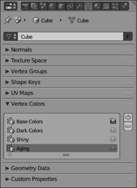
Figure 7-6: You can add multiple layers of vertex colors to a single mesh object from the Vertex Colors panel of Mesh Properties.
While you can have multiple layers of vertex colors, you can only set one as active for rendering. To make a vertex color layer active for rendering, left-click the camera icon to the right of the vertex color layer's name. You should notice that only one vertex color layer can have that camera icon active.
Defining color palettes
In the preceding section, labeled “Setting diffuse colors”, I mentioned that it's a common practice for artists and designers to work with a palette of very specific colors. If you're painting the walls of your house blue and green, you usually want to make sure that if you run out of paint, you get the exact same blue and green. Otherwise your walls are going to look all kinds of hideous. Likewise when vertex painting, if you choose a particular color, it's good to have a way to come back to that color later if you need to. Fortunately, in Blender's painting system, you have this capability built-in. Conveniently, they're called palettes.
Look at the bottom of the Brush panel (if you need to, refer back to Figure 7-5). Notice a datablock menu there with a New button next to it? That's the palette datablock. You can create, transfer, and reuse palettes in Blender, the same as any other datablock.
To create a new palette, left-click the New button in the palette datablock. A new palette is created, named Palette. You should also notice that below the color picker, there are now two new buttons: Plus (+) and Minus (−). Left-click the Plus(+) button and the current color gets added to the current active palette. You can tell because a square color swatch with your chosen color appears beneath the Plus (+) and Minus (−) buttons. You can add as many colors as you want to your palette. As you work, if you want to go back to a color in your palette, just left-click its square swatch.
When a color in your palette is picked, a little dark triangle appears in the upper left corner of the palette square. If you ever want to remove a color from the palette, simply choose the color and then left-click the Minus (−) button.
Creating painting masks
Occasionally when vertex painting, your mesh may have some faces on it that you don't want to receive any of the color you're currently painting. In this case, you define face selection masking by left-clicking the Painting Mask button in the 3D View's header. It has an icon of a cube with one face showing a checkerboard pattern, as shown in Figure 7-7.
When you enable the painting mask, you can select faces of your mesh by right-clicking. After you do, these faces are the only ones that are affected by your painting. This is an excellent method of isolating a portion of your mesh for custom painting without changing the color of the faces around that area. By using a painting mask, you can actually get the hard-edged color changes that you get with material slots, should you want such a thing.
Figure 7-7: Enabling the Painting Mask button.
Making vertex paint renderable
One of the things that really highlights the difference between BI and Cycles becomes evident when trying to get vertex colors to show up when you render. In BI, it's pretty simple:
- Find the Options panel in Material Properties.
- Enable the Vertex Color Paint check box.
That's it! Now when you render using BI (press F12 or toggle Rendered viewport shading by pressing Shift+Z), your vertex colors appear on your mesh object.
For Cycles, the situation is a bit more complex. Go to Material Properties and use the following steps:
- In the Surface panel, left-click the Use Nodes button.
Clicking Use Nodes should expand the Surface panel. Instead of a simple diffuse color swatch, you should see a drop-down menu labeled Surface and it should already have Diffuse BSDF as the chosen option. Cycles' material system is node-based. For all but the most simple of materials, you should use the Node Editor to tweak and customize your materials. There's more on that later in this chapter. Fortunately, for this example, it can stay pretty simple. You just need to enable the functionality of nodes at this point. You don't actually need to work in the Node Editor right now.
- Left-click the connector button (its icon is a small circular dot) to the right of the color swatch and choose Attribute from the menu that appears.
This act tells Blender that, rather than use the color defined by the swatch, you want to connect some attribute (in this case, the vertex colors you've painted) to control the color. After you choose Attribute (it's in the far left column of the menu that appears), the color swatch is replaced with a drop-down menu that has Attribute I Color as the chosen option. Below that menu is a text field, labeled Name.
- In the Name field, type in the name of the vertex color layer you want to use.
If you're going with defaults, you'd type Col here. Otherwise, take a quick glance at the Vertex Colors panel in Mesh Properties to check the name of your vertex color layer.
That should do the trick. Now when you render (F12) or use Rendered viewport shading, your vertex colors should be visible on your object. Figure 7-8 shows what your Surface panel in Material Properties should look like. The figure also shows the corresponding node configuration that Blender automatically creates for you.

Figure 7-8: On the left, the Surface panel of Material Properties when you use vertex colors on your mesh. On the right is the node graph that Blender automatically creates as a result.
Setting Up Node Materials in Cycles
As covered earlier in this chapter in the section titled “Making vertex paint renderable”, it's entirely possible to work with Cycles materials from Material Properties. However, working that way can be a bit clunky and it doesn't take full advantage of the power afforded by Cycles. When Cycles was first integrated into Blender, the developers decided that they would take full advantage of Blender's Node Editor. While this section details parts of the Node Editor that are specific to Cycles materials, see Chapter 15 for a broader overview of the Node Editor in general. That chapter covers the Node Editor in the context of compositing, but the interaction and navigation work the same for materials as well.
Blender Internal's materials can be customized with the Node Editor as well, but it's a bit “bolted on.” The node integration with Cycles was part of its design from the beginning.
Adjusting your layout to work with node materials
Blender doesn't ship with a screen layout that's specific to working with materials. Fortunately, for Cycles materials, you can make a few quick adjustments to the default layout and you should be good to go. Starting with the Default layout, follow these steps:
- Left-click and drag upward the seam between the 3D View and the Timeline.
The Timeline should take up a third to a half of the Blender window.
- Change the area containing the Timeline to instead contain a Node Editor (Shift+F3)
Your screen layout should now look a bit like Figure 7-9.
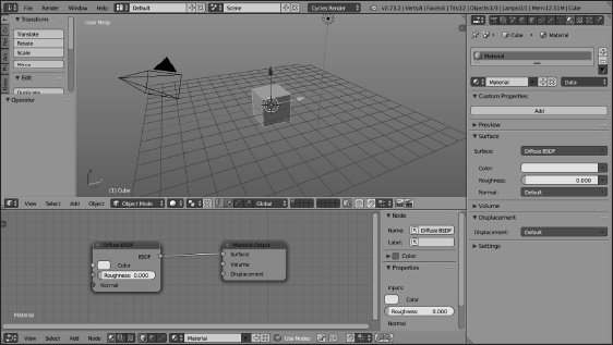
Figure 7-9: A screen layout that's ideal for working with node materials in Cycles.
Working with nodes
Earlier in this chapter (see the section titled “Quick n' Dirty Coloring”), I cover how to add a material to your object. Now, if the material is added with Cycles as your chosen renderer, you should have something that looks like Figure 7-9. However, if the material was added when you still had Blender Internal as your renderer, there are a couple of steps you need to do. You need to either
When the use of nodes is enabled on your Cycles material, the default node network you have is very simple; a Diffuse BSDF shader node connected to a Material Output node. All materials need to have a Material Output node. The Material Output node is how material properties get mapped to your object; if your material node network doesn't have this node, then Cycles doesn't know anything about your material.
If you've already worked with the Node Editor for compositing, you should notice that material nodes have another socket color in addition to the standard yellow, blue, and gray sockets. Material nodes may also have a green socket that indicates a shader input or output. Cycles shaders are similar to shaders in BI, but you have much more fine-grained control over them and how they work. See the next section for more detail on the shaders available to you in Cycles.
Understanding shaders
The workhorses of Cycles' materials are the shaders. By intelligently mixing them with each other (often using textures — see Chapter 8), you can create some very striking and convincing materials in your 3D scene. To see the shaders available to you, press Shift+A![]() Shaders in the Node Editor or click the Surface drop-down menu in Material Properties. Figure 7-10 shows the list of shaders.
Shaders in the Node Editor or click the Surface drop-down menu in Material Properties. Figure 7-10 shows the list of shaders.
 Many of the shaders, like the Diffuse BSDF, have “BSDF” at the end of their names. BSDF is an abbreviation for bidirectional scattering distribution function. That's a fancy way of saying “mathy description of how light interacts with a surface.” The Diffuse BSDF is Cycles' rough equivalent to the Diffuse panel when working with BI materials. Due to length limitations, I can't give a thorough description of all the things that can be done with node-based shaders and materials. Complete books can be (and have been!) written on that topic. My website for this book,
 www.blenderbasics.com, gives a practical example that should give you a clear idea of how to proceed.
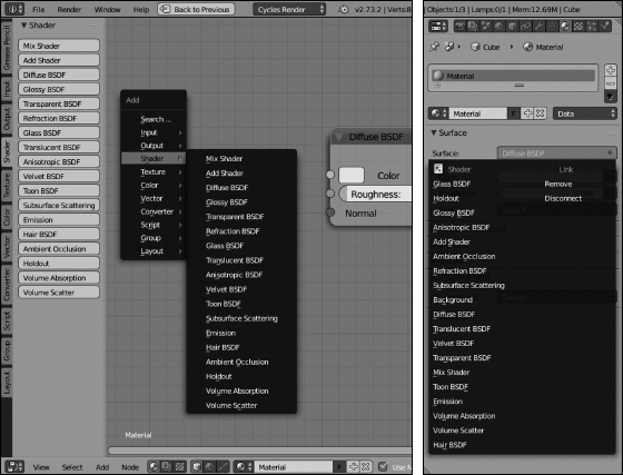
Figure 7-10: From the Node Editor (left) or Material Properties (right) you can add shaders to your material.
Figure 7-11 shows each of the available shader nodes so you can see their configuration settings.

Figure 7-11: Cycles gives you the ability to assign a wide variety of shaders materials in your scene.
The following is a brief description of each of the shaders available in Cycles:
- Mix Shader: This shader, along with the Add shader (covered next), is a powerful way of layering multiple shaders in a single material. The key to its strength is the Fac (short for factor) socket. You can uniformly control how shaders are mixed by adjusting this slider, or you can connect a grayscale texture to make one part of your object have the properties of one shader and another part of your object have properties of another (for example, a partially tarnished spoon will only be glossy where there isn't any tarnish).
- Add Shader: When creating materials, there are times when you want your material to have the properties of multiple shaders. For instance, glass is glossy, transparent, and refracts light. Car paint has a diffuse color, but it's also glossy. The Add shader allows you to account for these multifaceted materials.
- Diffuse BSDF: The Diffuse BSDF shader is the foundation that most materials are based upon. Nearly all materials have a base color of some sort. This shader is the primary way you define those colors. As mentioned previously, it's similar to the Diffuse panel in BI.
- Glossy BSDF: Some materials have a mirror-like reflectivity. In BI, that's controlled from the Mirror panel in Material Properties. In Cycles, the Glossy BSDF shader wields that control. The Glossy BSDF is also how you get a little specular highlight (in fact, BI's specularity settings are really a way to fake the reflection of a light source on a glossy material).
A good starting point for a glossy material is to have a Diffuse BSDF and a Glossy BSDf, mixed with a Mix shader. As a starting point, let the Diffuse BSDF and the Glossy BSDF have the same color (remember that you can copy and paste color swatches by hovering your mouse over the swatch and using Ctrl+C and Ctrl+V, respectively).
- Transparent BSDF: The closest parallel to this in BI is z-transparency. You can achieve similar effects using a Refraction BSDF with a white color and an IOR of 1.00. However, if that effect is what you're trying to achieve, the Transparent BSDF is a less resource-hungry way of getting it.
- Refraction BSDF: Most naturally occurring transparent materials like glass and water bend, or refract, light as it goes through them. The Refraction BSDF shader adds this property to your material.
- Glass BSDF: When covering the Mix shader, I mentioned that some materials, like glass, share the attributes of multiple shaders. Well, glass is a bit of a special case. It (and materials like it) shows up so frequently in 3D renders that it makes sense to have a convenience node that has all of the attributes pre-mixed so you don't have to re-make it every time you need glass in your scene. The Glass BSDF is that convenience node in Cycles.
- Translucent BSDF: Some materials, like sandblasted glass or thin linens, aren't transparent, but things do show somewhat through them, like shadowy silhouettes. This is translucent behavior, and you can use the Translucent BSDF lend it to materials in your object.
- Anisotropic BSDF: Not all glossy materials reflect light evenly. For example, the brushed aluminum used in many industrial designs has a highlight that's stretched along the grain of the brushing. In computer graphics, this effect is called an anisotropic highlight. In Cycles, the Anisotropic BSDF shader node is what you use to replicate it.
- Velvet BSDF: The Velvet BSDF behaves similarly to the Diffuse BSDF with the key difference being that light bounces off it less evenly. Where the Diffuse BSDF gives an even hue to a material, the Velvet BSDF yields a more mottled, uneven tone. Used smartly, you can use this shader to give a natural feel to cloth-like materials.
- Toon BSDF: Cycles is typically thought of and used as a physically correct renderer that can produce photorealistic results. However, Cycles isn't limited to just photorealism. Using the Toon BSDF, you can produce a cel shaded look in Cycles, too.
- Subsurface Scattering: I mentioned the subsurface scattering effect earlier in this chapter when covering BI. It's basically what you see on the back of your hand when you hold a flashlight against your palm. You can try to achieve this by combining a bunch of the other BSDF shaders, but the result won't be very accurate. This is because the subsurface scattering algorithm can't be generalized as a BSDF. It's a bidirectional surface-scattering reflectance distribution function (BSSRDF). That's a lot of words to basically say, “light can bounce around beneath the surface of a material, too.” What you need to know is that the Subsurface Scattering shader is used in realistic shaders for materials like skin, candle wax, and milk.
- Emission: When using BI, you illuminate your scenes using lamps. In Cycles, it's often more desirable to have meshes behave as light sources. And even if you're using lamp objects, the Emission shader is still what you use to add light to your scene. See Chapter 9 for more on lighting in Blender using Cycles and BI as your render engines.
If you're rendering fire, consider connecting the Emission shader to the Volume socket on the Material Output node rather than the Surface socket.
- Hair BSDF: I don't care what you do in computer graphics, any part of it that involves hair always is complex. And materials for hair are no exception. However, the Hair BSDF node in Cycles goes a long way toward giving you refined control over how hair on your objects appears when rendered.
- Ambient Occlusion: I cover the concept of ambient occlusion (AO) in more detail in Chapter 9. However, the most basic explanation of AO is that it's a way of emphasizing recesses and crevices in a model. In order to use AO in Cycles or BI, you need to enable it from World Properties. Once enabled for Cycles, you can use the AO shader node to control how much the global AO effect has an influence on your material.
- Holdout: The Holdout shader is pretty unique among the shaders, as it has absolutely no basis in physical reality. With a Holdout shader, you're basically saying, “there's nothing here, not even background.” When Cycles renders a material with a Holdout shader, it makes that section of rendered image completely transparent, with an alpha of zero. This can be useful in compositing, as the effect can give you a 3D mask (much like setting the Alpha value to zero without actually enabling transparency in the Transparency panel of Material Properties when using BI).
- Volume Absorption: This shader, along with the Volume Scatter shader (covered next), should be connected to the Volume socket on the Material Output node. You can use this shader alone for materials like black smoke or colored glass. For fire or materials with more of a subsurface scattering look, you'll want to mix it with Volume Scatter, and possibly the Emission shader.
- Volume Scatter: It's pretty rare that you'll want to use this shader on its own. Typically, the Volume Scatter shader gets mixed with the Volume Absorption shader for volumetric effects like smoke and dust.
Of the three shaders that it makes sense to connect to the Volume socket of the Material Output node (Volume Absorption, Volume Scatter, and Emission), it's helpful to think of them this way:
- The Volume Absorption shader controls how much light gets trapped by the volume (black smoke).
- The Volume Scatter shader controls how much light the volume reflects (a bright cloud).
- The Emission shader controls how much light the volume generates (fire).
As you work with your material in the Node Editor, it can sometimes feel like you're “flying blind” because it's not immediately obvious what some changes to your node network do to your final material. You could use Rendered viewport shading in the 3D View (Shift+Z), but that could be slow on a large scene, especially if you're not rendering with GPU acceleration. So another solution would be to expand the Preview panel in Material Properties. It works just like the Preview panel that's there when working in BI; it's just collapsed by default when you use Cycles. You just need to left-click the panel title to expand it and make it visible.
Playing with Materials in Blender Internal
As I mentioned earlier in this chapter, the way you configure materials is different in BI and Cycles. This section covers the parts that are specific to BI.
In BI, the place to change the look of an object is Material Properties. Twelve panels are visible in Material Properties:
Figure 7-12 shows the panels in Material Properties when using BI.
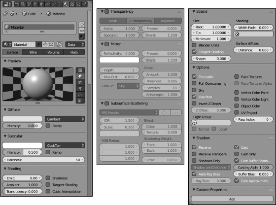
Figure 7-12: Material Properties for Blender Internal.
Understanding how light reflects
To understand materials, it helps if you have an idea of how human sight works. Most render engines use eyesight as the basic model for how they work. In order to see, you need to have light. The light comes from one or more sources and bounces off of any object within its range. When the light hits these objects, they influence the direction that the light bounces and how much of the incoming light is absorbed versus reflected. When you look around, you're seeing light that is bounced off of these objects and into your eyes.
Most render engines, BI and Cycles included, use a simplified version of this scenario. The following sentence sums up the biggest difference as it pertains to BI: Unless otherwise stipulated, light bounces only once. Professional photographers often have their flash aimed away from their subject and into an umbrella-shaped reflector that bounces light back to whatever they're shooting. The light from the flash has at least two bounces to get to the camera's lens; once off of the umbrella and once off of the subject. Because this fairly common meatspace scenario uses more than one light bounce, it's a bit difficult to set up something similar in BI and expect it to work accurately (although it's gotten easier in recent releases of Blender). Instead, you're better off directly lighting your scenes, so then your materials themselves control that one bounce of the light into the 3D camera.
Exceptions to this rule do, of course, exist, as do ways to cheat around them. You can use techniques (particularly those including ray tracing) covered throughout this chapter and in Chapter 8, to implement those cheats. Or you could render using Cycles.
Of these panels, the Context panel gives you the most high-level control over the material, defining which material gets assigned to the selected object and how BI recognizes the material. The first control element is a list box. This list box shows all the material slots associated with your object.
Below the list box is a datablock field. From this datablock field, you can tie a material to the current active material slot in the list box. This datablock functions the same as any other datablock field, as explained in Chapter 4.
From left to right, here is a description of what each button in the datablock does.
To the right of the datablock control buttons is a Nodes button. This button activates the advanced node-based material editor. It's similar to how nodes are used in Cycles (covered later in this chapter), but not quite as powerful. Because that's a more advanced topic, look to Blender's online documentation for more information.
The Link drop-down menu after the node button is a pretty unique control. Using these menu options requires recalling information about how .blend files are structured. Chapters 2 and 4 detail how .blend files are structured, but basically Blender objects are just containers for the low-level data (mesh, curve, and so on). Now, here's how this information relates to materials. By default, Blender's materials link to the low-level data, as indicated by the Link drop-down menu in the Context panel being set to Data. However, you also have the option of linking the material to the object as well, as shown in the schematics of Figure 7-13.
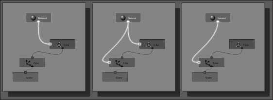
Figure 7-13: A schematic showing a material linked to a mesh and to an object.
Why is having the ability to link a material to either the mesh or the object a useful option? Well, say that you have a bunch of objects that are linked duplicates (Alt+D), sharing the same mesh information. If the material is linked to the mesh, all your linked duplicates have the exact same material. If you want to have a different material for each duplicate, you can link the material to the object datablock rather than the mesh datablock. Figure 7-14 shows a set of linked duplicate Suzanne heads, each with a different material This control over linking is available to you in both BI and Cycles.
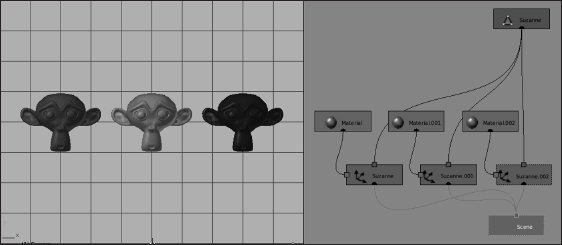
Figure 7-14: Linked duplicates of Suzanne, except they don't share the same material.
Adjusting shader values
Ah, computer graphics: You have nearly complete control over how your materials look. Part of this control is how the diffuse and specular colors are dispersed across the surface of the object. You control both of these attributes independently in BI with shader types. A shader type is a computer algorithm that defines how the color reacts in the material, and it's usually named after the computer scientist or mathematician who came up with it. So although the names may seem weird or arbitrary, the good news is that their names are pretty universal from one piece of 3D software to another.
Your shaders are set and controlled in the panel tied to the type of color you're adjusting. Both the Diffuse and Specular panels have a drop-down menu to the right of the color swatch where you can pick the shader you want to use. To change your diffuse shader type, left-click the drop-down menu at the upper right of the Diffuse panel. By default, its value is set to the Lambert shader, but you have the following options:
Figure 7-15 shows Suzanne shaded with each of the different diffuse shaders. For simplicity, the specular intensity has been reduced to 0 in this figure.

Figure 7-15: Suzanne with Lambert, Oren-Nayar, Toon, Minnaert, and Fresnel shaders.
You also have control over the way the specular highlight appears on your materials. You change this in the Specular panel the same way you change the diffuse shader: Left-click the drop-down menu next to the color swatch. All specular shaders share an Intensity value that controls the strength of the specular highlights. Higher values make the highlights brighter; lower values make them dimmer and can reduce the specularity altogether. As with the diffuse shaders, you have a choice of algorithms that control how the specular highlight appears:
Figure 7-16 shows Suzanne with the default Lambert diffuse shader and each of the different specular shaders.
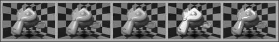
Figure 7-16: Suzanne with Cook-Torrance, Phong, Blinn, Toon, and Ward Isotropic specular shaders.
When it comes to setting colors for materials, more often than not, I keep my specular color set to white. The only exception is that, on occasion, it makes more sense to set the specular color to a value that is slightly lighter than the diffuse color. This technique is sometimes used when faking a metallic look on materials. Of course, no hard-and-fast rule tells you when to go one way and when to go another in terms of the specular color. It's really a matter of experience and changing to what looks right in your final render.
Reflection and transparency
A common challenge of 3D computer graphics is making your materials reflective and transparent. Fortunately, adding those properties to your materials in Blender isn't too difficult when using BI. The bulk of the work is done in two panels of Material Properties (see Figure 7-1): Mirror and Transparency.
Adding reflectivity to your material
Enable mirroring by left-clicking the Mirror check box and increasing the Reflectivity slider within the Mirror panel of Material Properties. An important thing to know about doing reflections this way is that it uses ray tracing. To create accurate reflections, BI follows, or traces, a ray of light as it bounces off of objects and into the camera. This is the exact same technique used in Cycles, but the implementation in BI is quite a bit less efficient. To ensure its accuracy, BI follows thousands of these rays. This accuracy comes at the expense of using more processing power from your computer and has a high likelihood of lengthening the rendering process. Figure 7-17 shows an example image with high reflectivity.
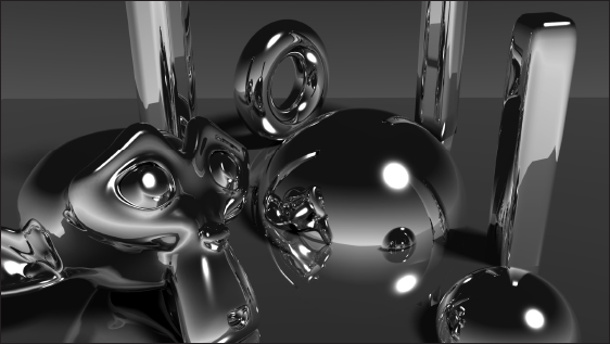
Figure 7-17: An example image with high levels of ray traced reflectivity.
In order to properly see any ray traced results in your render when using BI, make sure that the Ray Tracing check box is enabled in the Shading panel of Render Properties.
Ray traced reflectivity is also one of those exceptions to the “light only bounces once” rule. In order to get a reflection, you have to have at least two bounces. The light comes from the light source, bounces off of one object, and then off of your reflective object before it reaches the camera. You can actually define how many bounces BI recognizes by adjusting the Depth value in the Mirror panel. Of course, the higher the Depth value, the more bounces that Blender has to trace and therefore the longer your renders are likely to take.
Making your material transparent
In addition to reflectivity, you can also control an object's transparency. The main control for a 3D material's transparency is its alpha value. The alpha value in BI materials runs on a scale from 0, for completely transparent, to 1, for completely opaque. You adjust this value with the slider labeled Alpha in the Transparency panel of Material Properties.
You can adjust the alpha value even if you have the Transparency check box disabled. If you keep Transparency disabled, however, the preview panel shows a white-to-blue gradient over the preview object instead of the checkerboard pattern in the background. This gradient shows that as you reduce the alpha value, the more your object's material is replaced with your scene's sky color. The sky color is set in World Properties. Chapter 9 covers setting the sky color and other World Properties in greater detail.
Getting the object's material to show the sky color rather than what's actually behind it doesn't initially seem useful, but it's actually a really quick way to create a material that can make an object behave as a three-dimensional mask. Of course, you may not want a mask and instead you want to see the actual 3D environment through your object. Enable the Transparency check box to make the checkerboard background show up through the preview object.
By default, Blender uses Z transparency to get the rest of your scene's environment to show up through your object. However, if you're trying to recreate glass, you might realize that things don't look quite right. With real glass, you have refraction. The transparent material actually bends the light, warping what you see through it, like a magnifying glass. Regular Z transparency can't easily re-create this effect. In order to get that effect, you should use ray traced transparency instead.
You can activate ray traced transparency by left-clicking the Raytrace button in the Transparency panel. When you enable this button, it automatically disables the Z Transparency button. You can't have both of these settings active at the same time. In addition, initially, it doesn't look like much changed by enabling Raytrace. This is because the IOR value for ray traced transparency is set to 1.00. A value of 1.00 means that the material has the same IOR as the air around it and therefore doesn't bend light as it passes through it. However, increasing the IOR warps the checkerboard pattern seen through the object. Now, the cool thing about the IOR value is that it actually matches the physical IOR values of real-world materials. You could look up the IOR value of a specific material, like glass or jade, on a table online or in a physics book and use it to get an accurately transparent material.
Figure 7-18 shows the difference in results that you get with straight alpha transparency, Z transparency, and ray traced transparency.

Figure 7-18: From left to right, alpha transparency, Z transparency, and ray traced transparency with an alpha value of 0.5.
Common values for reflectivity and transparency
When it comes to the ray tracing settings, both the Mirror and Transparency panels have a few values in common. The first ones you might notice are the Fresnel and Blend sliders. The Fresnel setting adjusts an effect that's similar to the Fresnel diffuse shader, but with a specific influence on reflectivity and transparency. For reflectivity, rather than decreasing the material's color value in the direction of the light source like the Fresnel diffuse shader, increasing this value reduces the reflectivity relative to the camera. The Blend slider acts like a multiplication factor for the Fresnel effect, with higher values intensifying the effect.
For transparency, it's a bit different. It's also relative to the camera view, but instead of clouding out the transparency in that direction, it actually increases the transparency, reducing the color in the direction of the camera. Another interesting thing about the Fresnel setting for ray traced transparency is that it also works on Z transparency, so you can take advantage of the Fresnel effect without having to fake it.
If you want Fresnel or Blend (or any other value for that matter) values to be consistent in both the Transparency and Mirror panels, you can use Blender's copy-and-paste feature. Hover your mouse cursor over the value you want to copy (don't click!) and press Ctrl+C. Then hover your mouse cursor over the value you paste into (again, without clicking) and press Ctrl+V. Alternatively, you can copy and paste using the menu that appears when you right-click a value.
Another common setting between these ray traced effects are the Gloss settings. The default value of 1.00 makes the material perfectly reflective and transparent. Reducing this value in either panel blurs the reflection or makes the material more translucent than transparent. When changing the glossiness, the blurry reflection may look dirty or pixelated. This blurriness is because of how Blender Internal handles glossiness. The glossiness is approximated based on the Samples value, which is located beneath the Gloss slider for both ray traced reflection and ray traced transparency. Increasing the number of samples makes the glossiness appear more accurate, but at the expense of longer render times. Figure 7-19 shows some of the cool effects that you can get by varying the Gloss value.
Controlling how materials handle shadows
In the “Adjusting shader values” section earlier in this chapter, I cover how BI gives you control over the way your materials reflect diffuse color and deal with specular highlights. You can also control how your BI material works with shadows. Most important, you can dictate the type of shadows the material can receive, as well as whether the material itself casts a shadow.

Figure 7-19: Playing with the gloss value on an object with ray traced reflections and ray traced transparency.
All these controls live in the Shadow panel of Material Properties. The following list describes the most important controls in this panel: