Chapter 4
More User Interface Fun
In Chapter 3, we discussed the MVC concept and built an application that brought that idea to life. You learned about outlets and actions, and used them to tie a button control to a text label. In this chapter, we're going to build an application that will take your knowledge of controls to a whole new level.
We'll implement an image view, a slider, two different text fields, a segmented control, a couple of switches, and an iOS button that looks more like, well, an iOS button. You'll learn how to use the view hierarchy to group multiple items under a common parent view and make manipulating the interface at runtime easier. You'll see how to set and retrieve the values of various controls, both by using outlets and by using the sender argument of our action methods. After that, we'll look at using action sheets to force the user to make a choice and alerts to give the user important feedback. You'll also learn about control states and the use of stretchable images to make buttons look the way they should.
Because this chapter's application uses so many different user interface items, we're going to work a little differently than we did in the previous two chapters. We'll break our application into pieces, implementing one piece at a time and bouncing back and forth between Xcode and the iOS simulator, testing each piece before we move on to the next. Dividing the process of building a complex interface into smaller chunks makes it much less intimidating, as well as more like the actual process you'll go through when building your own applications. This code-compile-debug cycle makes up a large part of a software developer's typical day.
A Screen Full of Controls
As we mentioned, the application we're going to build in this chapter is a bit more complex than the one we created in Chapter 3. We're still going to use only a single view and controller, but as you can see in Figure 4–1, there's quite a bit more going on in this one view.

Figure 4–1. The Control Fun application, featuring text fields, labels, a slider, and several other stock iOS controls
The logo at the top of the iPhone screen is an image view, and in this application, it does nothing more than display a static image. Below the logo are two text fields: one that allows the entry of alphanumeric text and one that allows only numbers. Below the text fields is a slider. As the user moves the slider, the value of the label next to it will change so that it always reflects the slider's value.
Below the slider are a segmented control and two switches. The segmented control will toggle between two different types of controls in the space below it. When the application first launches, two switches will appear below the segmented control. Changing the value of either switch will cause the other one to change its value to match. Now, this isn't something you would likely do in a real application, but it does demonstrate how to change the value of a control programmatically and how Cocoa Touch animates certain actions without you needing to do any work.
Figure 4–2 shows what happens when the user taps the segmented control. The switches disappear and are replaced by a button. When the Do Something button is pressed, an action sheet pops up, asking users if they really meant to tap the button (see Figure 4–3). This is the standard way of responding to input that is potentially dangerous or that could have significant repercussions, and gives users a chance to stop potential badness from happening. If Yes, I'm Sure!is selected, the application will put up an alert, letting the user know that everything is OK (see Figure 4–4).
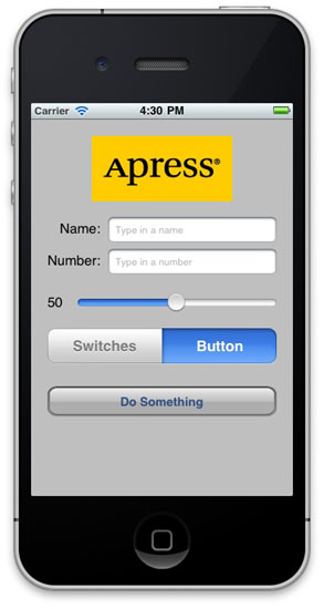
Figure 4–2. Tapping the segmented controller on the left side cause a pair of switches to be displayed. Tapping the right side causes a button to be displayed.

Figure 4–3. Our application uses an action sheet to solicit a response from the user.

Figure 4–4. Alerts are used to notify the user when important things happen. We use one here to confirm that everything went OK.
Active, and Passive Controls
User interface controls come in three basic forms: activeand passive. The buttons that we used in the previous chapter are classic examples of active controls. You push them, and something happens—usually, a piece of code fires.
Some controls can work in a passive manner, simply holding on to a value that the user has entered until you're ready for it. These controls don't trigger action methods, but the user can interact with them and change their values. A classic example of a passive control is a text field on a web page. Although there can be validation code that fires when you tab out of a field, the vast majority of web page text fields are simply containers for data that's submitted to the server when you click the submit button. The text fields themselves don't actually trigger any code to fire, but when the submit button is clicked, the text field's data goes along for the ride.
On an iOS device, many of the available controls can be used in all both ways, depending on your needs. All iOS controls are subclasses of UIControl and, because of that, are capable of triggering action methods. Most controls can also be used passively. However, some controls, such as buttons, really don't serve much purpose unless they are used in an active manner to trigger code.
As you might expect, there are some behavioral differences between controls on iOS and those on your Mac. Here are a few examples:
- Because of the multitouch interface, all iOS controls can trigger multiple actions depending on how they are touched. The user might trigger a different action with a finger swipe across the control than with just a touch.
- You could have one action fire when the user presses down on a button and a separate action fire when the finger is lifted off the button.
- You could have a single control call multiple action methods on a single event. You could have two different action methods fire on the touch up inside event, meaning that both methods would be called when the user's finger is lifted after touching that button.
NOTE: Having a control call multiple action methods would be a bit of a deviation from the MVC architecture, and you're probably better off implementing a single action method that does all you need for that particular button press instead. But it's good to bear in mind when working in Interface Builder that connecting an event to an action doesn't necessarily disconnect a previously connected action from the same event! This can lead to surprising misbehaviors in your app, so keep an eye open when retargeting an event in Interface Builder.
Another major difference between iOS and the Mac stems from the fact that, normally, iOS devices have no physical keyboard (unless, of course, you attach an external keyboard). The standard iOS keyboard is actually just a view filled with a series of button controls. Your code will likely never directly interact with the iOS keyboard, but as you'll see later in the chapter, sometimes you need to write code to make the keyboard behave in exactly the manner you want.
Creating the Application
Fire up Xcode if it's not already open, and create a new project called Control Fun. We're going to use the View-based Application template again, so create your project just as you did in the previous two chapters.
Now that you've created your project, let's get the image we'll use in our image view. The image must be imported into Xcode before it will be available for use inside Interface Builder, so we'll import it now. You can find a suitable .png image in the project archives in the 04 Control Funfolder, or you can use an image of your own choosing. If you use your own image, make sure that it is a .png image sized correctly for the space available. It should be fewer than 100 pixels tall and a maximum of 300 pixels wide so that it can comfortably fit at the top of the view without being resized.
Add the image to the Resources folder of your project, just as we did in Chapter 2, by dragging the image from the Finder to the Resources folder.
Implementing the Image View and Text Fields
With the image added to your project, your next step is to implement the five interface elements at the top of the application's screen: the image view, the two text fields, and the two labels (see Figure 4–5).

Figure 4–5. The image view, labels, and text fields we will implement first
Determining Outlets
Before we start building this GUI, we need to figure out which of these objects requires an outlet. Remember that outlets must be defined in your controller class's header file before you can connect them to anything in the nib editor.
The image view is just a static image. We're going to designate the image to be displayed directly in Interface Builder, and that image won't change while our application is running. As a result, it does not require an outlet. If we did want to change the image or any of its characteristics at runtime, we would need an outlet. That is not the case here.
The same is true for the two labels. They are there to display text, but won't be changed at runtime, and the user won't interact with them. So, we don't need outlets for them either.
On the other hand, the two text fields are not really much use if we can't get to the data they contain. The way to access the data held by a passive control is to use an outlet, so we need to define an outlet for each of these text fields. This is old hat for you by now, so why don't you add two outlets and their corresponding properties to your Control_FunViewController.h class file using the names nameField and numberField? When you're finished, Control_FunViewController.h should look something like this:
#import <UIKit/UIKit.h>


@interface Control_FunViewController : UIViewController {

    UITextField *nameField;

    UITextField *numberField;

}

@property (nonatomic, retain) IBOutlet UITextField *nameField;

@property (nonatomic, retain) IBOutlet UITextField *numberField;

@end
Before we move on to the nib file, let's also add our @synthesize directives to Control_FunViewController.m:
#import "Control_FunViewController.h"


@implementation Control_FunViewController

@synthesize nameField;

@synthesize numberField;

...
NOTE: See the ellipsis (...) at the end of that code listing? We'll use that symbol to indicate that there is existing code beyond what we've shown in the listing that does not require any changes. In this chapter, we'll add all of our code to the top of the implementation file, so by using the ellipsis, we can avoid needing to show the whole file every time we have you add a line or two of code.
We also need to make sure that we're careful about memory. Since we declared the nameField and numberField properties with the retain keyword, we need to release them both in our dealloc method. Scroll down to the bottom of the file, and add the following two lines to the existing dealloc method:
- (void)dealloc {

    [nameField release];

    [numberField release];

    [super dealloc];

}
Determining Actions
Take a look at the five objects in Figure 4–5 again. Do you see the need to declare any actions? Since we won't be allowing our user to interact with the labels or image view, there's no reason to create actions for them, right? Right.
What about the two text fields? Text fields are the classic passive control. The vast majority of the time, all they do is hold onto values until you're ready for them. We're not doing any validation on these fields, other than limiting the input of the number field by showing only the number pad instead of the full keyboard (which we can do entirely in Interface Builder), so we don't need an action for these either, right? Well, hold that thought. Let's build and test the first part of our user interface.
Building the Interface
Make sure both of those files are saved, expand the Resources folder in the Groups & Files pane, and double-click Control_FunViewController.xib to launch Interface Builder. If the window titled View is not open, double-click the View icon in the nib file's main window.

Figure 4–6. The Image View element in Interface Builder's library
Now, turn your attention to the library. If it's not open, select Library from the Tools menu. Scroll about one-fourth of the way through the list until you find ImageView (see Figure 4–6).
Adding the Image View
Drag an image view onto the window called View. Because this is the first item you're putting on your view, Interface Builder is going to automatically resize the image view so that it's the same size as the view. Since we don't want our image view to take the entire space, use the drag handles to resize the image view to the approximate size of the image you imported into Xcode. Don't worry about getting it exactly right yet. It'll be easier to do that in a moment.
By the way, sometimes an object will get deselected and can be very hard to select again because it is behind another object, takes up the entire view, or has no drawn border. In those cases, don't despair! There is a way to select the object again. In the nib's main window, you'll see three buttons labeled View Mode. Click the middle one, and you'll get a hierarchical view of the nib, which will let you drill down into subviews, as shown in Figure 4–7. Double-clicking any item in this view will also cause the same item to become selected in the View window.
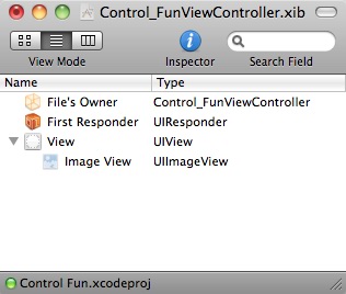
Figure 4–7. Putting the nib's main window in hierarchical view and drilling down to subviews

Figure 4–8. The image view attributes inspector
With the image view selected, bring up the inspector by pressing  1, and you should see the editable options of the
 UIImageView class, as shown in Figure 4–8.
The most important setting for our image view is the topmost item in the inspector, labeled Image. If you click the little arrow to the right of the field, a menu will pop up with the available images, which should include any images that you added to your Xcode project. Select the image you added a minute ago. Your image should now appear in your image view.
Resize the Image View
Now, resize your image view so that it is exactly the same size as your image. We'll talk about why in a moment. An easy way to resize the view so that it's the same size as the selected image is to press = or to select Size to Fit from the Layout menu, which will automatically resize any view to the exact size needed to contain its contents. You'll also want to move the resized image so that it's centered and the top is aligned with the blue guidelines. You can easily center an item in the view by choosing Align Horizontal Center in Container from the Layout menu's Alignment submenu.
TIP: Dragging and resizing views in Interface Builder can be tricky. Don't forget about the hierarchical View Mode button in the main nib window. It will help you find and select (double-click) the image view. When it comes to resizing, hold down the option key. Interface Builder will draw some helpful red lines on the screen that make it much easier to get a sense of the image view's size. This trick won't work for dragging, but if you select Show Bounds Rectangles from the Layout Menu, it will draw a line around all of your interface items, making them easier to see. You can turn those lines off by selecting Show Bounds Rectangles a second time.
The Mode Attribute
The next option down in the image view inspector is a pop-up menu labeled Mode. The Mode menu defines how the image will be aligned inside the view and whether it will be scaled to fit. You can feel free to play with the various options, but choosing the value of Center is probably best for our needs. Keep in mind that choosing any option that causes the image to scale will potentially add processing overhead, so it's best to avoid those and size your images correctly before you import them. If you want to display the same image at multiple sizes, generally it's better to have multiple copies of the image at different sizes in your project rather than force the iOS device to do scaling at runtime.
The Alpha Slider
The next item in the inspector is Alpha, and this is one you need to be very careful with. Alpha defines how transparent your image is: how much of what's beneath it shows through. If you have any value less than 1.0, your iPhone will draw this view as transparent so that any objects underneath it show through. With a value less than 1.0, even if there's nothing actually underneath your image, you will cause your application to spend processor cycles calculating transparency, so don't set this to anything other than 1.0 unless you have a very good reason for doing so.
Ignore the Background
You can ignore the next item down, called Background. This is a property inherited from UIView, but it doesn't impact the appearance of an image view.
The Tag Attribute
The next item down—Tag—is worth mentioning, though we won't be using it in this chapter. All subclasses of UIView, including all views and controls, have a property called tag, which is just a numeric value that you can set that will tag along with your image view. The tag is designed for your use; the system will never set or change its value. If you assign a tag value to a control or view, you can be sure that the tag will always have that value unless you change it.
Tags provide an easy, language-independent way of identifying objects on your interface. Let's say you had five different buttons, each with a different label, and you wanted to use a single action method to handle all five buttons. In that case, you would probably need some way to differentiate among the buttons when your action method was called. Sure, you could look at the button's title, but code that does that probably won't work when your application is translated into Swahili or Sanskrit. Unlike labels, tags will never change, so if you set a tag value here in Interface Builder, you can then use that as a fast and reliable way to check which control was passed into an action method in the sender argument.
The Drawing Checkboxes
Below Tagare a series of Drawing checkboxes. The first one is labeled Opaque. Make sure it is checked. This tells the iOS that nothing behind your view should be drawn and allows the iOS drawing methods to do some optimizations that speed up drawing.
You might be wondering why we need to select the Opaque checkbox, when we've already set the value of Alpha to 1.0 to indicate no transparency. The reason is that the alpha value applies to the parts of the image to be drawn, but if an image doesn't completely fill the image view, or there are holes in the image thanks to an alpha channel or clipping path, the objects below will still show through regardless of the value set in Alpha. By selecting Opaque, we are telling iOS that nothing below this view ever needs to be drawn no matter what, so it needn't waste processing time with anything below our object. We can safely select the Opaque checkbox, because we earlier selected Size to Fit, which caused the image view to match the size of the image it contains.
The Hiddencheckbox does exactly what you think it does. If it's checked, the user can't see this control. Hiding the control can be useful at times, including later in this chapter when we hide the switches and button, but the vast majority of the time you want this to remain unchecked. We can leave this at the default value.
The next checkbox, called Clear Context Before Drawing, will rarely need to be checked. When it is checked, iOS will draw the entire area covered by the control in transparent black before it actually draws the control. Again, it is turned off for the sake of performance and because it's rarely needed. Make sure this check box is unchecked.
Clip Subviews is an interesting option. If your view has subviews, and those subviews are not completely contained within the bounds of its parent view, this checkbox determines how the subviews will be drawn. If Clip Subviews is checked, only the portions of subviews that lie within the bounds of the parent will be drawn. If Clip Subviews is unchecked, subviews will be drawn completely even if they lie outside of the bounds of the parent.
It might seem that the default behavior should be the opposite of what it actually is: that Clip Subviews should be enabled by default. As with many other things on the iPhone, this has to do with performance. Calculating the clipping area and displaying only part of the subviews is a somewhat costly operation, mathematically speaking, and most of the time, a subview won't lay outside the bounds of the superview. You can turn on Clip Subviews if you really need it for some reason, but it is off by default for the sake of performance.
The final checkbox in this section, AutoresizeSubviews, tells iOS to resize any subviews if this view is resized. Leave this checked. Since we don't allow the view to be resized, this setting does not really matter.
The Interaction Checkboxes
The last two checkboxes have to do with user interaction. The first checkbox, User Interaction Enabled, specifies whether the user can do anything at all with this object. For most controls, this box will be checked, because if it's not, the control will never be able to trigger action methods. However, labels and image views default to unchecked, because they are very often used just for the display of static information. Since all we're doing here is displaying a picture on the screen, there is no need to turn this on.
The last checkbox is Multiple Touch, and it determines whether this control is capable of receiving multitouch events. Multitouch events allows complex gestures like the pinch gesture used to zoom in many iOS applications. We'll talk more about gestures and multitouch events in Chapter 15. Since this image view doesn't accept user interaction at all, there's no reason to turn on multitouch events, so leave it unchecked.
Adding the Text Fields
Once you have your image view all finished, grab a text field from the library, and drag it over to the View window. Place it underneath the image view, using the blue guides to align it with the right margin (see Figure 4–9). A horizontal blue guideline will appear just above the text field when you move it very close to the bottom of your image. That guideline tells you when you are as close as you should possibly be to another object. You can leave your text field there for now, but to give it a balanced appearance, consider moving the text field just a little further down. Remember, you can always come back to Interface Builder and change the position and size of interface elements without having to change code or reestablish connections.
After you drop the text field, grab a label from the library, and drag that over so it is aligned with the left margin of the view and aligned vertically with the text field you placed earlier. Note that multiple blue guidelines will pop up as you move the label around, making it easy to align the label to the text field using the top, bottom, middle, or text baseline. We're going to align the label and the text field using the text baseline guide, which will draw a line from the bottom of the label's text going through the text field, as shown in Figure 4–10. If the blue guideline is being drawn through the middle of the label's text, you're on the center guideline, not the text baseline guide. Using the text baseline guide will cause the label's text label and the text that the user will type into the text field to be at the same vertical position on the screen.

Figure 4–9. Placing the text field. Notice the blue guideline just above the text field that tells you not to move the text field any closer to the image.

Figure 4–10. Aligning the label and text field using the baseline guide
Double-click the label you just dropped, change it to read Name: instead of Label, and press the return key to commit your changes. Next, drag another text field from the library to the view, and use the guidelines to place it below the first text field (see Figure 4–11).
Once you've placed the second text field, grab another label from the library, and place it on the left side, below the existing label. Use the blue text baseline guide again to align it with the second text field. Double-click the new label, and change it to read Number:.
Now, let's expand the size of the bottom text field to the left. Single-click the bottom text field, and drag the left resize dot to the left until a blue guideline appears to tell you that you are as close as you should ever be to the label (see Figure 4–12).
Now expand the top text field the same way so that it matches the bottom one in size. Note that we did the bottom one first because the bottom label is the larger of the two labels.
We're basically done with the text fields except for one small detail. Look back at Figure 4–5. See how the Name: and Number: are right-aligned? Right now, ours are both against the left margin. To align the right sides of the two labels, click the Name: label, hold down the shift key, and click the Number: label so both labels are selected. From the Alignment submenu of the Layout menu, select Align Right Edges.

Figure 4–11. Adding the second text field

Figure 4–12. Expanding the size of the bottom text field

Figure 4–13. The inspector for a text field showing the default values
When you are done, the interface should look very much like the one shown in Figure 4–5. The only difference is the light gray text in each text field. We'll add that now.
Click somewhere where there's no control to deselect the two labels, then select the top text field and press 1 to bring up the inspector (see Figure 4–13).
The Text Field Inspector Settings
Text fields are one of the most complex controls on iOS as well as being one of the most commonly used. Let's look at the topmost section of the inspector first. In the first field, Text, you can set a default value for this field. Whatever you type in this field will show up in the text field when your application launches.
The second field, Placeholder, allows you to specify a bit of text that will be displayed in gray inside the text field, but only when the field has no value. You can use a placeholder instead of a label if space is tight, or you can use it to clarify what the user should type into this field.
Type in the text Type in a name as the placeholder for this text field.
The next two fields are used only if you need to customize the appearance of your text field, which is completely unnecessary and actually ill-advised the vast majority of the time. Users expect text fields to look a certain way. As a result, we're going to skip right over the Background and Disabled fields and leave them blank.
Below these fields are three buttons for controlling the alignment of the text displayed in the field. We'll leave this field at the default value of left-aligned (the leftmost button).
Next are four buttons labeled Border. These allow you to change the way the text field's edge will be drawn. You can feel free to try all four different styles, but the default value is the rightmost button, and it creates the text field style that users are most accustomed to seeing for normal text fields in an iOS application, so when you're done playing, set it back to that one.
The Clear When Editing Begins checkbox specifies what happens when the user touches this field. If this box is checked, any value that was previously in this field will get deleted, and the user will start with an empty field. If this box is unchecked, the previous value will stay in the field, and the user will be able to edit it. Make sure this checkbox is unchecked.
The Text Color field is a combination of a color well (if you click on the left side) and a popup menu. We'll leave Text Color at its default setting of black.
The Adjust to Fitcheckbox specifies whether the size of the text should shrink if the text field is reduced in size. Adjusting to fit will keep the entire text visible in the view even if the text would normally be too big to fit in the allotted space. To the right of the checkbox is a text field that allows you to specify a minimum text size. No matter the size of the field, the text will not be resized below that minimum size. Specifying a minimum size will allow you to make sure that the text doesn't get too small to be readable.
Text Input Traits
The next section defines how the keyboard will look and behave when this text field is being used. Since we're expecting a name, let's change the Capitalize drop-down to Words, which will cause every word to be automatically capitalized, which is what you typically want with names. Let's also change the value of the Return Key pop-up to Done and leave all the other text input traits at their default values. The Return Key is the key on the lower right of the keyboard, and its label changes based on what you're doing. If you are entering text into Safari's search field, for example, then it says Google. In an application like this, where there text fields share the screen with other controls, Done is the right choice. We'll leave the other three popups at their default values.
If the Auto-enable Return Key checkbox is checked, the return key is disabled until at least one character is typed into the text field. Leave this unchecked because we want to allow the text field to remain empty if the user so chooses.
The Secure checkbox specifies whether the characters being typed are displayed in the text field. You'd check this checkbox if this text field was being used as a password field. Leave it unchecked.
And the Rest . . .
The next section allows you to set general control attributes inherited from UIControl, but these generally don't apply to text fields and, with the exception of the Enabled checkbox, won't affect the field's appearance. We want to leave these text fields enabled so that the user can interact with them, so just leave everything here as is.
The last section on the inspector should look familiar to you. It's identical to the section of the same name on the image view inspector we looked at a few minutes ago. These are attributes inherited from the UIView class, and since all controls are subclasses of UIView, they all share this section of attributes. Note that for a text field, you do not want to check Opaque, because doing so will make the entered text unreadable. In fact, you can leave all the values in this section exactly as they are.
Set the Attributes for the Second Text Field
Next, single-click the second text field in the View window, and return to the inspector. In the Placeholder field, type Type in a number. In the section called Text Input Traits, click the KeyboardType pop-up menu. Since we want the user to enter numbers only, not letters, go ahead and select Number Pad. By doing this, the users will be presented with a keyboard containing only numbers, meaning they won't be able to enter alphabetical characters, symbols, or anything besides numbers. We don't have to set the Return Key value for the numeric keypad, because that style of keyboard doesn't have a return key, so everything else on the inspector can stay at the default values.
Connecting Outlets
OK, for this first part of the interface, all that's left is hooking up our outlets. Control-drag from File's Owner to each of the text fields, and connect them to their corresponding outlets. Save the nib file once you've connected both text fields to their corresponding outlets, and then go back to Xcode.
Closing the Keyboard
Let's see how our app works, shall we? Select Build and Run from Xcode's Build menu. Your application should come up in the iOS simulator. Click the Name text field. The traditional keyboard should appear. Type in a name. Now, tap the Number field. The numeric keypad should appear (see Figure 4–14). Cocoa Touch gives us all this functionality for free just by adding text fields to our interface.

Figure 4–14. The keyboard comes up automatically when you touch either the text field or the number field.
Woo-hoo! But there's a little problem. How do you get the keyboard to go away? Go ahead and try. We'll wait right here while you do that.
Closing the Keyboard When Done Is Tapped
Because the keyboard is software-based, rather than a physical keyboard, we need to take a few extra steps to make sure the keyboard goes away when the user is finished with it. When the user taps the Done button on the text keyboard, a Did End On Exit event will be generated, and at that time, we need to tell the text field to give up control so that the keyboard will go away. In order to do that, we need to add an action method to our controller class, so add the following line of code to Control_FunViewController.h:
#import <UIKit/UIKit.h>


@interface Control_FunViewController : UIViewController {

     UITextField     *nameField;

     UITextField     *numberField;

}

@property (nonatomic, retain) IBOutlet UITextField *nameField;

@property (nonatomic, retain) IBOutlet UITextField *numberField;

- (IBAction)textFieldDoneEditing:(id)sender;

@end
Now switch over to Control_FunViewController.m, and we'll implement this method. Only one line of code is needed in this new action method to make it work. Add the following method to Control_FunViewController.m:
- (IBAction)textFieldDoneEditing:(id)sender {

    [sender resignFirstResponder];

}
As you've learned in Chapter 2, the first responder is the control with which the user is currently interacting. In our new method, we tell our control to resign as a first responder, giving up that role to the previous control the user worked with. When a text field yields first responder status, the keyboard associated with it goes away.
Save both of the files you just edited. Double-click Control_FunViewController.xib to hop back over to Interface Builder and trigger this action from both of our text fields.
Once you're back in Interface Builder, single-click the Name text field, and press 2 to bring up the connections inspector. This time, we don't want the Touch Up Inside event that we used in the previous chapter. Instead, we want Did End On Exit since that is the event that will fire when the user taps the Done button on the keyboard. Drag from the circle next to Did End On Exit to the File's Owner icon, and connect it to the textFieldDoneEditing: action. Repeat with the other text field, and save. Let's go back to Xcode to build and run again.
TIP: If you drag from Did End On Exit but the File's Owner icon does not highlight, signifying you can complete the drag, chances are that you did not save your source code before you switched over to editing the nib file. Select the controller's header file, save, and try again. That should do the trick!
When the simulator appears, click the Name field, type in something, and then tap the Done button. Sure enough, the keyboard drops away, just as you expected. All right! What about the Number field, though? Um, where's the Done button on that one (see Figure 4–14)?
Well, crud! Not all keyboard layouts feature a Done button. We could force the user to tap the Name field and then tap Done, but that's not very user-friendly, is it? And we most definitely want our application to be user-friendly. Let's see how to handle this situation.
Touching the Background to Close the Keyboard
Can you recall what Apple's iOS applications do in this situation? Well, in most places where there are text fields, tapping anywhere in the view where there's no active control will cause the keyboard to go away. How do we implement that?
The answer is probably going to surprise you because of its simplicity. Our view controller has a property called view that it inherited from UIViewController. This view property corresponds to the View icon in the nib file. This property points to an instance of UIView in the nib that acts as a container for all the items in our user interface. It has no appearance in the user interface, but it covers the entire iPhone window, sitting “below” all of the other user interface objects. It is sometimes referred to as a nib's container view because its main purpose is to simply hold other views and controls. For all intents and purposes, the container view is the background of our user interface.
Using Interface Builder, we can change the class of the object that view points to so that its underlying class is UIControl instead of UIView. Because UIControl is a subclass of UIView, it is perfectly appropriate for us to connect our view property to an instance of UIControl. Remember that when a class subclasses another object, it is just a more specific version of that class, so a UIControlis a UIView. If we simply change the instance that is created from UIView to UIControl, we gain the ability to trigger action methods. Before we do that, though, we need to create an action method that will be called when the background is tapped.
We need to add one more action to our controller class. Add the following line to your Control_FunViewController.h file:
#import <UIKit/UIKit.h>


@interface Control_FunViewController : UIViewController {

     UITextField *nameField;

     UITextField *numberField;

}

@property (nonatomic, retain) IBOutlet UITextField *nameField;

@property (nonatomic, retain) IBOutlet UITextField *numberField;

- (IBAction)textFieldDoneEditing:(id)sender;

- (IBAction)backgroundTap:(id)sender;

@end
Save the header file.
Now, switch over to the implementation file and add the following code, which simply tells both text fields to yield first responder status if they have it. It is perfectly safe to call resignFirstResponder on a control that is not the first responder, so we can call it on both text fields without needing to check whether either is the first responder.
- (IBAction)backgroundTap:(id)sender {

    [nameField resignFirstResponder];

    [numberField resignFirstResponder];

}
TIP: You'll be switching between header and implementation files a lot as you code. Fortunately, in addition to the convenience provided by the assistant, Xcode also has a key combination that will switch you between counterparts quickly. The default key combination is 
 (option-command-up arrow), although you can change it to anything you want using Xcode's preferences.
Save this file, and go back to Interface Builder. We now need to change the underlying class of our nib's view. If you look at the nib's main window in icon view mode (Figure 4–15), you'll see that there are three icons in that view. The third icon, View, is our nib's main view that holds all the other controls and views as subviews.
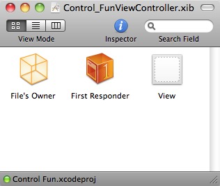
Figure 4–15. The nib's main window has three icons. The third one, labeled View, is our nib's content view.
Single-click the View icon and press 4 to bring up the identity inspector (Figure 4–16). This is where we can change the underlying class of any object instance in Interface Builder.

Figure 4–16. The identity inspector allows you to change the underlying class of any object instance in a nib.
The field labeled Class currently says UIView. Change it to read UIControl. All controls that are capable of triggering action methods are subclasses of UIControl, so by changing the underlying class, we have just given this view the ability to trigger action methods. You can verify this by pressing 2 to bring up the connections inspector (Figure 4–17). You should now see all the events that you saw before when you were connecting buttons to actions in the previous chapter.
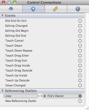
Figure 4–17. By changing the class of our view from UIView to UIControl, we gain the ability to trigger action methods on any of the standard events.
Drag from the Touch Down event to the File's Owner icon, and choose the backgroundTap: action. Now, touches anywhere in the view without an active control will trigger our new action method, which will cause the keyboard to retract.
NOTE: You might be wondering why we selected Touch Down instead of Touch Up Inside, like we did in the previous chapter. The answer is that the background isn't a button. It's not a control in the eyes of the user, so it wouldn't occur to most users to try to drag their finger somewhere to cancel the action.
Save the nib, and let's go back and try it. Compile and run your application again. This time, the keyboard should disappear not only when the Done button is tapped but also when you click anywhere that's not an active control, which is the behavior that your user will expect.
Excellent! Now that we have this section all squared away, are you ready to move onto the next group of controls?
Implementing the Slider and Label
Now that we have the text fields complete, let's implement the slider. We'll also add a label that will change to reflect the slider's value.
Determining Outlets and Actions
Want to take a stab at figuring out how many outlets we'll need for our slider and label? Well, the label will need to be changed programmatically when the slider changes, so we'll need an outlet for it. What about the slider?
The slider will trigger an action, and when it does, that action method will receive a pointer to the slider in the sender argument. We'll be able to retrieve the slider's value from sender, so we won't need an outlet to get the slider's value. So, do we need an outlet for the slider at all? In other words, do we need access to the slider's value outside the action method it will call?
In a real application, you will often need access to a slider's value. For instance, you might be presenting a view controller that needs to display an existing value in the slider. Without an outlet, you would have no way to set it. Here, since we have another control that will have the same value as the slider and already has an outlet, there's no reason to have one for the slider itself.
Remember that you want to get in the habit of being cautious with memory when programming for iOS devices. Even though a pointer is a minimal amount of memory, why use it if you don't need it, and why clutter up your code with extra stuff you aren't going to use?
Figuring out the actions for this pair of controls is straightforward. We need one for the slider to call when it is changed. The label is static, and the user can't do anything with it directly, so it won't need to trigger any actions.
Adding Outlets and Actions
Let's declare one more outlet and one more action in our Control_FunViewController.h file, like so:
#import <UIKit/UIKit.h>


@interface Control_FunViewController : UIViewController {

    UITextField *nameField;

    UITextField *numberField;

    UILabel     *sliderLabel;

}

@property (nonatomic, retain) IBOutlet UITextField *nameField;

@property (nonatomic, retain) IBOutlet UITextField *numberField;

@property (nonatomic, retain) IBOutlet UILabel *sliderLabel;

- (IBAction)textFieldDoneEditing:(id)sender;

- (IBAction)backgroundTap:(id)sender;

- (IBAction)sliderChanged:(id)sender;

@end
Since we know exactly what our method needs to do, let's switch to Control_FunViewController.m to add our property synthesizer and write our sliderChanged: method:
#import "Control_FunViewController.h"


@implementation Control_FunViewController

@synthesize nameField;

@synthesize numberField;

@synthesize sliderLabel;


- (IBAction)sliderChanged:(id)sender {

    UISlider *slider = (UISlider *)sender;

    int progressAsInt = (int)(slider.value + 0.5f);

    NSString *newText = [[NSString alloc] initWithFormat:@"%d",

    progressAsInt];

    sliderLabel.text = newText;

    [newText release];

}


- (IBAction)backgroundTap:(id)sender {

...
Let's talk about what's going on in the sliderChanged: method. The first thing we do is cast sender to a UISlider *. This simply makes our code more readable and lets us avoid needing to typecast sender every time we use it. After that, we get the value of the slider as an int, add 0.5 in order to round it to the nearest integer, and use that integer to create a new string that we use to set the label's text. Since we allocated newText, we are responsible for releasing it, so we do that in the last line of code in the method. Simple enough, right?
Speaking of being responsible for memory, since we added the sliderLabel property with the retain keyword, we need to make sure we release it. To do that, add the following line of code to the dealloc method:
- (void)dealloc {

    [nameField release];

    [numberField release];

    [sliderLabel release];

    [super dealloc];

}
We're finished here, so save your changes. Next, we'll add the objects to our interface.
Adding the Slider and Label
You know the routine by now. Double-click Control_FunViewController.xib, or if it's already open, just go back to Interface Builder.
Before we add the slider, let's add a little bit of breathing room to our design. The blue guidelines we used to determine the spacing between the top text field and the image above it are really suggestions for minimum proximity. In other words, the blue guidelines tell you, “don't get any closer than this.” Drag the two text fields and their labels down a bit, using Figure 4–1 as a guide. Now let's add the slider.
From the library, bring over a slider and arrange it below the number text field taking up most but not all of the horizontal space. Leave a little room to the left for the label. Again, use Figure 4–1 as a guide. Single-click the newly added slider to select it, and then press 1 to go back to the inspector if it's not already visible. The inspector should look similar to the one shown in Figure 4–18.

Figure 4–18. The inspector showing attributes for a slider
A slider lets you choose a number in a given range, and here, we can set the range and the initial value in Interface Builder. Put in a minimum value of 1, a maximum value of 100, and an initial value of 50. That's all we need to worry about for now.
Bring over a label and place it next to the slider, using the blue guidelines to align it vertically with the slider and to align its left edge with the left margin of the view (see Figure 4–19).

Figure 4–19. Placing the slider and label
Double-click the newly placed label, and change its text from Label to 100. This is the largest value that the slider can hold, and we can use that to determine the correct width of the slider. Since “100” is shorter than “Label,” you should resize the label by grabbing the right-middle resize dot and dragging to the left. Make sure you stop resizing before the text starts to get smaller. If it does start to get smaller, bring the resize dot back to the right until it returns to its original size. You can also use the size-to-fit option we discussed earlier by pressing = or selecting Size to Fit from the Layout Menu. Next, resize the slider by single-clicking the slider to select it and dragging the left resize dot to the left until the blue guides indicate that you should stop.
Now double-click the label again, and change its value to 50. That is the starting value of the slider, and we need to change it back to make sure that the interface looks correct at launch time; once the slider is used, the code we just wrote will make sure the label continues to show the correct value.
Connecting the Actions and Outlets
All that's left to do with these two controls is to connect the outlet and action. Well, what are you waiting for? You know how to do that. Well, in case you've forgotten, control-drag from the File's Owner icon to the label you just added, and select sliderLabel. Next, single-click the slider, press 2 to bring up the connections inspector, and drag from—hmm, we don't want Touch Up Inside, this time, do we? How about Value Changed? That sounds like a good one, huh? Yep, go ahead and drag from that one to File's Owner, and select sliderChanged.
Save the nib; go back to Xcode; and try out the slider. As you move it, you should see the label's text change in real time. Another piece falls into place. Now, let's look at implementing the switches.
Implementing the Switches, Button, and Segmented Control
Back to Xcode we go once again. Getting dizzy yet? This back and forth may seem a bit strange, but it's fairly common to bounce around, editing source code in Xcode, tweaking your interface in Interface Builder, with the occasional stop to test your app in the appropriate iOS simulator while you're developing.
Our application will have two switches, which are small controls that can have only two states: on and off. We'll also add a segmented control to hide and show the switches. Along with that control, we'll add a button that is revealed when the segmented control's right side is tapped. Let's implement those next.
Adding Outlets and Actions
We won't need an outlet for the segmented control, since we won't be changing its attributes from code. We will need some outlets for the switches, however, since changing the value of one switch will trigger a change in the value of the other switch. We'll have access to the selected switch via sender. To get at the other switch, we'll need an outlet. We'll also need an outlet for the button we'll be adding.
The segmented control will need to trigger an action method that will hide or show the switches. We're also going to need an action that will fire when either switch is tapped. We'll have both switches call the same action method, just as we did with the two buttons in Chapter 3. In Control_FunViewController.h, add three outlets and two actions, like so:
#import <UIKit/UIKit.h>


#define kSwitchesSegmentIndex    0


@interface Control_FunViewController : UIViewController {

    UITextField    *nameField;

    UITextField    *numberField;

    UILabel        *sliderLabel;

    UISwitch       *leftSwitch;

    UISwitch       *rightSwitch;

    UIButton       *doSomethingButton;

}

@property (nonatomic, retain) IBOutlet UITextField *nameField;

@property (nonatomic, retain) IBOutlet UITextField *numberField;

@property (nonatomic, retain) IBOutlet UILabel *sliderLabel;

@property (nonatomic, retain) IBOutlet UISwitch *leftSwitch;

@property (nonatomic, retain) IBOutlet UISwitch *rightSwitch;

@property (nonatomic, retain) IBOutlet UIButton *doSomethingButton;

- (IBAction)textFieldDoneEditing:(id)sender;

- (IBAction)backgroundTap:(id)sender;

- (IBAction)sliderChanged:(id)sender;

- (IBAction)toggleControls:(id)sender;

- (IBAction)switchChanged:(id)sender;

- (IBAction)buttonPressed;

@end
In the code we'll be writing soon, we're going to refer to a UISegmentedControl property named selectedSegmentIndex, which tells us which segment is currently selected. That property is an integer number. The Switches segment will have an index of 0. Rather than stick that 0 in our code, the meaning of which we might not remember a few months from now, we define the constant kSwitchesSegmentIndex to use instead, which will make our code more readable.
Switch over to Control_FunViewController.m, and add the following code:
#import "Control_FunViewController.h"


@implementation Control_FunViewController

@synthesize nameField;

@synthesize numberField;

@synthesize sliderLabel;
@synthesize leftSwitch;

@synthesize rightSwitch;

@synthesize doSomethingButton;


- (IBAction)toggleControls:(id)sender {

    if ([sender selectedSegmentIndex] == kSwitchesSegmentIndex)

    {

        leftSwitch.hidden = NO;

        rightSwitch.hidden = NO;

        doSomethingButton.hidden = YES;

    }

    else

    {

        leftSwitch.hidden = YES;

        rightSwitch.hidden = YES;

        doSomethingButton.hidden = NO;

    }

}


- (IBAction)switchChanged:(id)sender {

    UISwitch *whichSwitch = (UISwitch *)sender;

    BOOL setting = whichSwitch.isOn;

    [leftSwitch setOn:setting animated:YES];

    [rightSwitch setOn:setting animated:YES];

}


- (IBAction)buttonPressed {

    // TODO: Implement Action Sheet and Alert

}


- (IBAction)sliderChanged:(id)sender {

...
The first method we added here, toggleControls:, is called whenever the segmented control is tapped. In this method, we look at the selected segment and either hide the switches and show the button or show the switches and hide the button, as appropriate.
The second method we added, switchChanged:, is called whenever one of the two switches is tapped. In this method, we simply grab the value of sender, which represents the switch that was pressed, and use that value to set both switches. Now, sender is always going to be either leftSwitch or rightSwitch, so you might be wondering why we're setting them both. It's less work to just set the value of both switches every time than to determine which switch made the call and set only the other one. Whichever switch called this method will already be set to the correct value, and setting it again to that same value won't have any effect.
Notice that when we change the value of the switch, we call the setOn:animated: method, which takes two BOOL values as parameters. The first parameter determines whether the switch should be on or off. The second parameter lets us specify whether the button should slide over slowly, just as if someone had pressed it, or it should just be moved instantly to the new position. For the first parameter, we send the new on/off value that we determined based on the current state. For the second parameter, we specified YES because having the switches slide over looks cool, and iOS device users have come to expect that kind of visual feedback. You can try specifying NO if you want to see the difference, but unless you have a good reason, it's generally a good idea to animate changes made programmatically to the user interface so the user is aware of them.
The third new method, buttonPressed, is called when the button is pressed. We're not going to implement this method quite yet, but we stubbed it out as a reminder.
Since we declared three new outlets, we need to release those outlets in our dealloc method. Add the following three lines to the existing dealloc method in Control_FunViewController.m:
- (void)dealloc {

    [nameField release];

    [numberField release];

    [sliderLabel release];

    [leftSwitch release];

    [rightSwitch release];

    [doSomethingButton release];

    [super dealloc];

}
Adding the Switches, Button, and Segmented Control
Next, we're going to tackle the segmented control and the switches and button that it toggles between. Back in Interface Builder, drag a segmented control from the library (see Figure 4–20) and place it on the View window, a little below the slider.

Figure 4–20. The Segmented Control option in the library
Expand the width of the segmented control so that it stretches from the view's left blue guideline to its right right blue guideline, as it does in Figure 4–21. Place your cursor over the word First on the segmented control and double-click. This should cause the segment's title to become editable, so change it from First to Switches, as shown in Figure 4–21. After doing that, repeat the process with the Second segment; rename it Button.

Figure 4–21. Renaming the segments
Adding Two Labeled Switches
Grab a switch from the library, and place it on the view. Place it below the segmented control, against the left margin (Figure 4–22). Drag a second switch and place it against the right margin, aligned vertically with the first switch.
TIP: Holding down the option key and dragging an object in Interface Builder will create a copy of that item. When you have many instances of the same object to create, it can be faster to drag only one object from the library and then option-drag as many copies as you need.
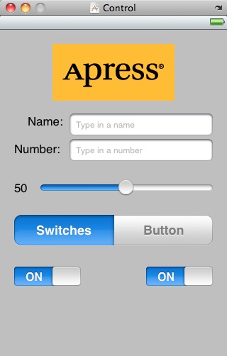
Figure 4–22. Adding the switches to the view
Connecting the Switch Outlets and Actions
Before we add the button, we're going to connect the switches to the leftSwitch and rightSwitch outlets. The button that we'll be adding in a moment will actually sit on top of the switches, making it harder to control-drag to and from them, so we want to do the switches' connections before we add the button. Since the button and the switches will never be visible at the same time, having them in the same physical location won't be a problem.
Control-drag from File's Owner to each of the switches, and connect them to the appropriate leftSwitch or rightSwitch outlet.
Now select the left switch again by single-clicking it, and press 2 to bring up the connections inspector. Drag from the Value Changed event to the File's Owner icon, and select the switchChanged: action. Repeat with the other switch.
Single-click the segmented control, and look for the Value Changed event on the connections inspector. Drag from the circle next to it to the File's Owner icon, and select the toggleControls: action method.
Adding the Button
Next, drag a Round Rect Button from the library to your view. Add this one right on top of the left-most button, aligning it with the left margin and vertically aligning its center with the two switches (Figure 4–23).

Figure 4–23. Adding a round rect button on top of the existing switches
Now grab the right center resize handle and drag all the way to the right until you reach the blue guideline that indicates the right margin. The button should completely cover the two switches (Figure 4–24).

Figure 4–24. The round rect button, once placed and resized, will completely obscure the two switches.
Double-click the button and give it a label of Do Something. Because the segmented control will start with the Switches segment selected, we need to hide this button. Press 1 to bring up the attribute inspector and click the Hidden checkbox down in the bottommost section.
Connecting the Buttons Outlets and Actions
Control-drag from File's Owner to the new button, and select the doSomethingButton outlet. Then, press 2 to go back to the connections inspector. Drag from the circle next to the Touch Up Inside event to File's Owner, and select the buttonPressed action. Now your button is all wired up.
Save your work.
Go back to Xcode, and take the application for a test drive. The segmented control should now be live. When you tap the Switches segment, the pair of switches should appear. Tap one of the switches, and both switches should toggle. Tap the Button segment, and the switches should be be hidden, replaced by the Do Something button. Tapping the button doesn't do anything yet, because we haven't implemented that particular method. Let's do that now.
Implementing the Action Sheet and Alert
Action sheetsand alerts are both used to provide the user with feedback.
Action sheets are used to force the user to make a choice between two or more items. The action sheet comes up from the bottom of the screen and displays a series of buttons for the user to select from (Figure 4–3). The user is unable to continue using the application until they have tapped one of the buttons. Action sheets are often used to confirm a potentially dangerous or irreversible action such as deleting an object.
Alerts appear as a blue rounded rectangle in the middle of the screen (Figure 4–4). Just like action sheets, alerts force users to respond before they are allowed to continue using their application. Alerts are used more to inform the user that something important or out of the ordinary has occurred and, unlike action sheets, alerts may be presented with only a single button, though you have the option of presenting multiple buttons if more than one response is appropriate.
NOTE: A view that forces users to make a choice before they are allowed to continue using their application is known as a modal view.
Conforming to the Action Sheet Delegate Method
Remember back in Chapter 3 when we talked about the application delegate? Well, UIApplication is not the only class in Cocoa Touch that uses delegates. In fact, delegation is a common design pattern in Cocoa Touch. Action sheets and alerts both use delegates so that they know which object to notify when they're dismissed. In our application, we'll need to be notified when the action sheet is dismissed. We don't need to know when the alert is dismissed, because we're just using it to notify the user of something, not to actually solicit a choice.
In order for our controller class to act as the delegate for an action sheet, it needs to conform to a protocol called UIActionSheetDelegate. We do that by adding the name of the protocol in angle brackets after the superclass in our class declaration.
Add the following code to Control_FunViewController.h:
#import <UIKit/UIKit.h>


#define kSwitchesSegmentIndex    0


@interface Control_FunViewController : UIViewController

        <UIActionSheetDelegate> {

    UITextField *nameField;

    UITextField *numberField;

    UILabel     *sliderLabel;

...
Showing the Action Sheet
Let's switch over to Control_FunViewController.m and implement the button's action method. We actually need to implement another method in addition to our existing action method: the UIActionSheetDelegate method that the action sheet will use to notify us that it has been dismissed.
Here are the changes you need to make to the buttonPressed method in Control_FunViewController.m:
- (IBAction)buttonPressed {

    // TODO: Implement Action Sheet and Alert

    UIActionSheet *actionSheet = [[UIActionSheet alloc]

                                  initWithTitle:@"Are you sure?"

                                  delegate:self

                                  cancelButtonTitle:@"No Way!"

                                  destructiveButtonTitle:@"Yes, I'm Sure!"

                                  otherButtonTitles:nil];

    [actionSheet showInView:self.view];

    [actionSheet release];

}
Next, add this method to Control_FunViewController.m, just below the buttonPressed method:
- (void)actionSheet:(UIActionSheet *)actionSheet

    didDismissWithButtonIndex:(NSInteger)buttonIndex

{

    if (buttonIndex != [actionSheet cancelButtonIndex])

    {

       NSString *msg = nil;
       if (nameField.text.length > 0)

          msg = [[NSString alloc] initWithFormat:

                 @"You can breathe easy, %@, everything went OK.",

                 nameField.text];

       else

           msg = @"You can breathe easy, everything went OK.";

       UIAlertView *alert = [[UIAlertView alloc]

                             initWithTitle:@"Something was done"

                             message:msg

                             delegate:self

                             cancelButtonTitle:@"Phew!"

                             otherButtonTitles:nil];

       [alert show];

       [alert release];

       [msg release];

    }

}
What exactly did we do there? Well, first, in the buttonPressed action method, we allocated and initialized a UIActionSheet object, which is the object that represents an action sheet (in case you couldn't puzzle that one out for yourself):
   UIActionSheet *actionSheet = [[UIActionSheet alloc]

           initWithTitle:@"Are you sure?"

           delegate:self

           cancelButtonTitle:@"No Way!"

           destructiveButtonTitle:@"Yes, I'm Sure!"

           otherButtonTitles:nil];
The initializer method takes a number of parameters. Let's look at each of them in turn. The first parameter is the title to be displayed. Refer back to Figure 4–3 to see how the title we're supplying will be displayed at the top of the action sheet.
The next argument is the delegate for the action sheet. The action sheet's delegate will be notified when a button on that sheet has been tapped. More specifically, the delegate's actionSheet:didDismissWithButtonIndex: method will be called. By passing self as the delegate parameter, we ensure that our version of actionSheet:didDismissWithButtonIndex: will be called.
Next, we pass in the title for the button that users will tap to indicate they do not want to proceed. All action sheets should have a cancel button, though you can give it any title that is appropriate to your situation. You do not want to use an action sheet if there is no choice to be made. In situations where you want to notify the user without giving a choice of options, an alert view is more appropriate.
The next parameter is the destructive button, and you can think of this as the “yes, please go ahead” button, though once again, you can assign it any title.
The last parameter allows you to specify any number of other buttons that you may want shown on the sheet. This final argument can take a variable number of values, which is one of the nice features of the Objective-C language. If we had wanted two more buttons on our action sheet, we could have done it like this:
       UIActionSheet *actionSheet = [[UIActionSheet alloc]

           initWithTitle:@"Are you sure?"

           delegate:self

           cancelButtonTitle:@"No Way!"

           destructiveButtonTitle:@"Yes, I'm Sure!"

           otherButtonTitles:@"Foo", @"Bar", nil];
This code would have resulted in an action sheet with four buttons. You can pass as many arguments as you want in the otherButtonTitles parameter, as long as you pass nil as the last one. Of course, there is a practical limitation on how many buttons you can have, based on the amount of screen space available.
After we create the action sheet, we tell it to show itself:
[actionSheet showInView:self.view];
Action sheets always have a parent, which must be a view that is currently visible to the user. In our case, we want the view that we designed in Interface Builder to be the parent, so we use self.view. Note the use of Objective-C dot notation. self.view is equivalent to saying [self view], using the accessor to return the value of our view property.
Why didn't we just use view, instead of self.view? view is a private instance variable of the UIViewController class and must be accessed via the accessor.
Finally, when we're finished, we release the action sheet. Don't worry—it will stick around until the user has tapped a button.
Using the Action Sheet Delegate
Well, that wasn't so hard, was it? In just a few lines of code, we showed an action sheet and required the user to make a decision. iOS will even animate the sheet for us without requiring us to do any additional work. Now, we just need to find out which button the user tapped. The other method that we just implemented, actionSheet:didDismissWithButtonIndex, is one of the UIActionSheetDelegate methods, and since we specified self as our action sheet's delegate, this method will automatically be called by the action sheet when a button is tapped.
The argument buttonIndex will tell us which button was actually tapped. But how do we know which button index refers to the cancel button and which one refers to the destructive button? Fortunately, the delegate method receives a pointer to the UIActionSheet object that represents the sheet, and that action sheet object knows which button is the cancel button. We just need look at one of its properties, cancelButtonIndex:
if (buttonIndex != [actionSheet cancelButtonIndex])
This line of code makes sure the user didn't tap the cancel button. Since we gave the user only two options, we know that if the cancel button wasn't tapped, the destructive button must have been tapped, and it's OK to proceed. Once we know the user didn't cancel, the first thing we do is create a new string that will be displayed to the user. In a real application, here you would do whatever processing the user requested. We're just going to pretend we did something, and notify the user using an alert.
If the user has entered a name in the top text field, we'll grab that, and we'll use it in the message that we'll display in the alert. Otherwise, we'll just craft a generic message to show:
   NSString *msg = nil;


   if (nameField.text.length > 0)

       msg = [[NSString alloc] initWithFormat:

           @"You can breathe easy, %@, everything went OK.",

           nameField.text];

   else

       msg = @"You can breathe easy, everything went OK.";
The next lines of code are going to look kind of familiar. Alert views and action sheets are created and used in a very similar manner:
    UIAlertView *alert = [[UIAlertView alloc]

            initWithTitle:@"Something was done"

            message:msg

            delegate:nil

            cancelButtonTitle:@"Phew!"

            otherButtonTitles:nil];
Again, we pass a title to be displayed. We also pass a more detailed message, which is that string we just created. Alert views have delegates, too, and if we needed to know when the user had dismissed the alert view or which button was tapped, we could specify self as the delegate here, just as we did with the action sheet. If we had done that, we would now need to conform our class to the UIAlertViewDelegate protocol also, and implement one or more of the methods from that protocol. In this case, we're just informing the user of something and giving the user only one button. We don't really care when the button is tapped, and we already know which button will be tapped, so we just specify nil here to indicate that we don't need to be pinged when the user is finished with the alert view.
Alert views, unlike action sheets, are not tied to a particular view, so we just tell the alert view to show itself without specifying a parent view. After that, it's just a matter of some memory cleanup, and we're finished. Save the file, and then build, run, and try out the completed application.
Spiffing Up the Button
If you compare your running application to Figure 4–2, you might notice an interesting difference. Your Do Something button doesn't look like the one in the figure, and it doesn't look like the button on the action sheet or those in other iOS applications, does it? The default round rect button doesn't really look that spiffy, so let's take care of that before we finish up the app.
Most of the buttons you see on your iOS device are drawn using images. Don't worry; you don't need to create images in an image editor for every button. All you need to do is specify a kind of template image that iOS will use when drawing your buttons.
It's important to keep in mind that your application is sandboxed. You can't get to the template images that are used in other applications on your iOS device or the ones used by iOS itself, so you must make sure that any images you need are in your application's bundle. So, where can you get these image templates?
Fortunately, Apple has provided a bunch for you. You can get them from the iOS sample application called UICatalog, available from the iOS Reference Library:
http://developer.apple.com/library/ios/#samplecode/

UICatalog/Introduction/Intro.html
Alternatively, you can simply copy the images out of the 04 - Control Fun folder from this book's project archive. Yes, it is OK to use these images in your own applications, because Apple's sample code license specifically allows you to use and distribute them.
Add the two images named blueButton.png and whiteButton.png to your Xcode project, grabbing them from either the 04 - Control Fun folder or the Images subfolder of the UICatalog project's folder.
If you open one of these two images in Preview.app or in an image editing program, you'll see that there's not very much to them, and there's a trick to using them for your buttons.
Go back to Interface Builder, single-click the Do Something button, and press 1 to open the attributes inspector. In the inspector, use the first pop-up menu to change the type from Rounded Rect to Custom. You'll see in the inspector that you can specify an image for your button, but we're not going to do that, because these image templates need to be handled a little differently. Save the nib, and go back to Xcode.
Using the viewDidLoad Method
UIViewController, our controller's superclass, has a method called viewDidLoad that we can override if we need to modify any of the objects that were created from our nib. Because we can't do what we want completely in Interface Builder, we're going to take advantage of viewDidLoad. Go ahead and add the following method to your Control_FunViewController.m file. When you're finished, we'll talk about what the method does.
- (void)viewDidLoad

{

    UIImage *buttonImageNormal = [UIImage imageNamed:@"whiteButton.png"];

    UIImage *stretchableButtonImageNormal = [buttonImageNormal

        stretchableImageWithLeftCapWidth:12 topCapHeight:0];

    [doSomethingButton setBackgroundImage:stretchableButtonImageNormal

        forState:UIControlStateNormal];


    UIImage *buttonImagePressed = [UIImage imageNamed:@"blueButton.png"];

    UIImage *stretchableButtonImagePressed = [buttonImagePressed

        stretchableImageWithLeftCapWidth:12 topCapHeight:0];

        [doSomethingButton setBackgroundImage:stretchableButtonImagePressed

        forState:UIControlStateHighlighted];

}
NOTE: The project template we used actually created a stub implementation of viewDidLoad, but it's commented out in the file. You can place the preceding code inside that stub, or simply retype the method from scratch and delete the commented-out stub—whichever you prefer.
This code sets the background image for the button based on those template images we added to our project. It specifies that, while being touched, the button should change from using the white image to the blue image. This short method introduces two new concepts: control states, and stretchable images. Let's look at each of them in turn.
Control States
Every iOScontrol has four possible control states and is always in one and only one of these states at any given moment:
- Normal: The most common state is the normal control state, which is the default state. It's the state that controls are in when not in any of the other states.
- Highlighted: The highlighted state is the state a control is in when it's currently being used. For a button, this would be while the user has a finger on the button.
- Disabled: Controls are in the disabled state when they've been turned off, which can be done by unchecking the Enabled check box in Interface Builder or setting the control's
enabledproperty toNO. - Selected: Only some controls support the selected state. It is usually used to indicate that the control is turned on or selected. Selected is similar to highlighted, but a control can continue to be selected when the user is no longer directly using that control.
Certain iOS controls have attributes that can take on different values depending on their state. For example, by specifying one image for UIControlStateNormal and a different image for UIControlStateHighlighted, we are telling iOS to use one image when the user has a finger on the button and a different image the rest of the time.
Stretchable Images
Stretchable images are an interesting concept. A stretchable image is a resizable image that knows how to resize itself intelligently so that it maintains the correct appearance. For these button templates, we don't want the edges to stretch evenly with the rest of the image. End caps are the parts of an image, measured in pixels, that should not be resized. We want the bevel around the edges to stay the same, no matter what size we make the button, so we specify a left end cap size of 12.
Because we pass in the new stretchable image to our button rather than the image template, iOS knows how to draw the button properly at any size. We could now go in and change the size of the button in the nib file, and it would still be drawn correctly. If we had specified the button image right in the nib file, it would resize the entire image evenly, and our button would look weird at most sizes.
TIP: How did we know what value to use for the end caps? It's simple really: we copied them from Apple's sample code.
Being a Good Memory Citizen
Before we take our new button for a spin, there's one more topic we would like to discuss. In every version of iOS since 3.0, the UIViewController class includes a method to help our apps maintain a low memory footprint. UIViewController is the class from which all view controllers in Cocoa Touch descend, including Control_FunViewController. This new method is called viewDidUnload, and it's an important method in terms of keeping down memory overhead
In Chapter 6, we'll start talking about applications with multiple views. We don't want you to worry too much about multiple views yet, but we do want to show you the correct way of implementing a view controller class.
When you have multiple views, iOS will load and unload nib files to preserve memory. When a view is unloaded, any object that your controller class has an outlet to can't be flushed from memory, because you have retained that object by specifying the retain keyword in the outlet's property. Therefore, when your controller is notified that its view has been unloaded, it is important to set all the controller's outlet properties to nil so that memory can be freed. Cocoa Touch will automatically reconnect your outlets when the nib file is reloaded, so there's no danger here. Using this approach makes you a good memory citizen who does not hog memory you don't need.
Our Control Fun application is a single-view application, so viewDidUnload will never be called while the program is running. But just because an application starts as a single-view application doesn't mean it will always be one, so you should be a good memory citizen even when you know you can get away with not being one. Let's be good memory citizens by replacing the stub of the following method in Control_FunViewController.m to free up our outlets when our view is unloaded:
- (void)viewDidUnload {

    self.nameField = nil;

    self.numberField = nil;

    self.sliderLabel = nil;

    self.leftSwitch = nil;

    self.rightSwitch = nil;

    self.doSomethingButton = nil;


    [super viewDidUnload];
}
Note the use of Objective-C dot notation once again. This time, since it is used as the left side of an assignment, the dot notation is equivalent to calling our mutator. For example, this line of code:
self.nameField = nil;
is equivalent to this line of code:
[self setNameField:nil];
Think about what happens when our mutator does its thing. Remember that we synthesized our mutators using the retain keyword. First, our mutator retains the new object, then it releases the old object, and then it assigns the new object to its instance variable. In this case, the mutator retains nil, which doesn't do anything. Next, the old object is released, which is exactly what we want to do, since that old object was retained when it was originally connected. And, finally, nil is assigned to nameField. Pretty cool, eh?
Once you've added that method, why don't you save the file and try out our app? Everything should work exactly as it did earlier, but that button should look a lot more iPhone-like. You won't see any difference in the way the application behaves as a result of adding the viewDidUnload method, but you can sleep soundly at night knowing you did the right thing. Good job, citizen!
Crossing the Finish Line
This was a big chapter. Conceptually, we didn't hit you with too much new stuff, but we took you through the use of a good number of controls and showed you a lot of different implementation details. You got a lot more practice with outlets and actions, and saw how to use the hierarchical nature of views to your advantage. You learned about control states and stretchable images, and you also learned to use both action sheets and alerts.
There's a lot going on in this little application. Feel free to go back and play with it. Change values, experiment by adding and modifying code, and see what different settings in Interface Builder do. There's no way we could take you through every permutation of every control available in iOS, but the application you just put together is a good starting point and covers a lot of the basics.
In the next chapter, we're going to look at what happens when the user rotates an iOS device from portrait to landscape orientation or vice versa. You're probably well aware that many apps change their displays based on the way the user is holding the device, and we're going to show you how to do that in your own applications.