Finishing and presenting work
This final chapter is about completing your work and presenting it to other people in the most effective way. Finishing off means mounting, spotting if necessary, and deciding how pictures might be brought to the attention of potential clients. Probably you will have to trudge around showing your portfolio … or you may be lucky enough to get work published or have an exhibition … or you could decide to display your talent via the Internet. In all these forms of presentation communication skills are important. You not only have to pick what images to show, but how to back them up with verbal or written information.
Image stability is a vital element in professional photography. Clients have a right to expect the work they have purchased to last a reasonable time – either as many years as possible, or at least sufficient for its intended purpose. Over time a great deal has been learnt about the permanence of prints on silver halide papers. The recent use of ink-jet prints however has created some concern over how long they will last without fading.
Conventional silver halide prints
In chemical processing you can either aim to get prints of average stability for normal commercial use and storage conditions, or you can work to the highest possible archival permanence. The latter should certainly be the aim when selling a print as an expensive piece of fine art, or producing records which will be filed away in archives and so must survive unchanged for the longest possible period. An archival print is one that is as free as possible of residual thiosulphate (fixer) and silver by-products, and has extra protection from chemical reactions with air pollutants. One form of protecting the silver image is to coat it or convert it to a more stable material by toning. Present thinking suggests the following as the best archival printing routine. Choose a fibre-based printing paper, preferably a silver-enriched premium weight type. Make sure you develop fully. Follow this by effective stop-bath treatment but don’t use the solution at greater than the recommended concentration. Fix in rapid fixer with hardener, using a two-bath system and remembering to agitate regularly. Then there are two choices. Either rinse and treat in hypo clearing agent, or tone the image using selenium toner made up in working-strength hypo clearing agent. In both cases agitate continuously. Finally wash prints for 60 minutes in an effective print-wash system, then squeegee and air dry them.
Ink-jet prints
Early (pre 1997) digital ink-jet prints had a bad reputation for fading. Manufacturers prioritized other needs, such as smooth-toned images and quick drying, so the paper used was very porous in order to have excellent ink absorption. As a result prints readily absorbed atmospheric gases which in conjunction with strong light caused image fading after about three months. Since then intensive research by ink and paper manufacturers has greatly improved permanence. Lifetimes before noticeable fading occurs have since been quoted as around five years for ink-jet prints, six for dye-sublimation prints and ten years for laser prints. As with all relatively new materials the way tests are made have taken time to establish, and improvements are made all the time. Lyson fine art inks for example have since been given an (indoor) life expectancy of over eight years when used with the recommended coated paper. This is as good as an average neg/pos silver halide colour print, tested under the same conditions.
However, just how long your finished print will last depends on many factors outside your control – adverse temperature or humidity, display under excessive UV rich radiation, effects of atmospheric pollution, or contact with non-archival packing, mounting or framing materials.
Mounting is an important stage in presenting professional-looking work. In addition it can help to protect the photographic image from chemical deterioration and handling damage.
Dry mounting
Provided you have access to a heated, thermostatically controlled press, dry mounting is the best means of attaching a print to a board with a professional looking finish. As Figure 15.1 shows, you first attach a thin sheet of heat-sensitive material to the back of your (untrimmed) print. Then you trim the print plus heat-sensitive material together, and position them accurately on a suitable acid-free board, preferably museum board.
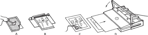
Figure 15.1 Dry mounting. A: attach the centre of the mounting tissue to the back of the print, using a heated tacking iron. B: trim off borders plus excess tissue. C: tack corners to your mount. D: cover the print with silicon release paper and place it in the heated mounting press
You next protect the print surface with a sheet of silicon non-stick release paper. Board, print and silicon cover sheet must all be absolutely dry. The whole sandwich then goes face-up into the topheated press, which melts the adhesive layer into both print and mount within a few seconds. Press temperature is especially critical with RC prints, and above 99°C (210°F) blisters may occur. If your print was made by ink-jet printer or some other digital output, check the paper maker’s recommendations. Most dry-mounting materials are designed for temperatures between 66° and 95°C, according to type.
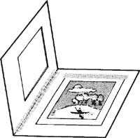
Figure 15.2 Window mat mount construction, using thin linen tape to tack the untrimmed print in place and hinge the top board over it. The cut-out area looks best given bevelled edges
The most common dry-mounting faults are (1) tiny pits or protrusions in the print surface due to grit caught between print and press, or print and mount, respectively; (2) unmounted patches due to uneven heat or pressure; (3) adhesive sheet firmly mounted to the print but not to the mount, owing to insufficient heat; (4) adhesive stuck to the mount but the print detached (and blistered if RC) because of excessive heat.
Adhesive tape
Double-sided adhesive tape (or sheet) is a quick way of mounting small prints, especially RC materials, but it is less permanent than dry mounting. Alternatively, if the paper is of reasonable weight, use singlesided linen tape to tack one side of the untrimmed print to mounting board. (One-sided attachment allows for differences in expansion.) Then the print is held down flat with a window mat cut from similar or thicker high-quality board; see Figure 15.2. The mat also protects the print surface from sticking against glass if the work is framed, and allows air circulation.
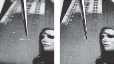
Figure 15.3 Spotting-in white specks and a hair mark by hand on the surface of a mounted bromide print. Use an almost dry 0 size watercolour brush with a good point. Far right: the patient stippling-in of tone is half completed. A hair line like this is best broken in two or more parts first, then each section matched into surrounding tone
Liquid adhesives
Most general-purpose household adhesives are unsuitable for photographic mounting, as chemicals eventually attack the image. Heavy-duty wallpaper adhesive is the most practical way to mount very large bromide prints. Handle them the same way as wallpaper, and if you are mounting on to flexible board, remember to paste several strips of paper across the back of the board too, to prevent it curling as your print dries and contracts. Resin-coated bromide prints can only be mounted this way if your board is porous enough to allow solvent from the adhesive to evaporate.
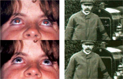
Figure 15.4 Removal of defects from a digital image, using the computer’s clone tool (page 275) before printing-out. Near right: ‘Red eye’ corrected by cloning in from a dark shadow area elsewhere in the picture. Far right: this cracked area of an old print is filled in by cloning from adjacent picture detail. As you drag the large cross horizontally over this image tones from just above the tear (see small cross) are copied and fill in the defect
Impact adhesive is another way of mounting oversize prints: coat both the print back and mount, allow them to dry, then bring them firmly into contact with a roller squeegee. Aerosol spray-on adhesive is recommended only for temporary ‘paste-ups’ such as montages or panoramas which will eventually be re-photographed. Dry-mount your base print. Then cut out and chamfer the edges of the print you want to mount on top, by sandpapering the back until wafer thin. Spraying then allows you to apply a very thin layer of adhesive to this surface before pressing the cut-out print into place. (Note: often impact adhesives are highly flammable – use them only in a well-ventilated place.)
Silver halide materials. Often prints have a few white spots which you must ‘spot in’. Use diluted dye or water colour – either black or the appropriate tint – and apply it with an almost dry, fine-tipped brush. By patiently adding tiny specks (not a wash) of matching tone, pale defects can be merged with adjacent image grain; see Figure 15.3. As an alternative to a conventional brush, ‘brush tip’ pens which each contain their own shade of dye are sold in sets of ten. A set for monochrome spotting for example provides a grey scale ranging from a very pale grey pen to one giving deep black.
Spotting is easiest with a grainy image on matt or semi-matt paper. Glazed glossy prints are almost impossible to spot without leaving some evidence of retouching on their mirror-like surface. However, gum arabic (e.g. from the glue flap of an envelope) mixed in with the water-colour helps it to dry with some form of matching glaze.
Dark spots are best tackled earlier – turned into white by spotting the negative, or by touching the print with a brush tip loaded with iodine bleach (page 319). Then they are spotted like any other white defects. However, on matt prints you can also try direct print spotting with white pigment.
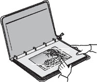
Figure 15.5 A 24 × 20 inch weatherproof, zip-up portfolio. Having individual prints in plastic sleeves protects the work, and allows you to change prints or alter their order
Digital materials. It should not be necessary to spot the actual hard copy print-outs from digital files. Image defects are very easily eliminated using your manipulation software before the picture goes to your printer. The cloning tool is invaluable here, see Figure 15.4.
The world of photography is very competitive, so at the earliest opportunity it is important to start to get yourself known. For example, enter as many photographic competitions as possible – even if you don’t win they can provide you with good sources of project themes, get you used to working to deadlines. Try to have some pictures published, together with a credit line. Look up the Writers and Artists Yearbook. Even something in a local newspaper or a trade magazine will mean you can put a photo-copy in the back of your portfolio, helping to prove that other people have confidence in you. Seek out cafes, bars, etc., willing for you to put up a display. And check out how to create a web site to show your work; see page 301.
Portfolios. Taking around a battered parcel of prints of all sizes to show people makes you seem amateurish, immature … or just arrogant. At least have work mounted on thin boards matching in size, which are shown in a box (Figure 15.6) or a ring-binder type book. These make it simple to change your selection and the order of pictures to suit the occasion. (20–25 pictures is about the right number.) Better still invest in a zip-up professional 20 × 16 or 24 × 20 inch portfolio with acetate leaves to contain each print in complete protection, Figure 15.5. Just remember that if people only view your work through the acetate the tone qualities appear degraded. Darkest tones especially look weak and lost.
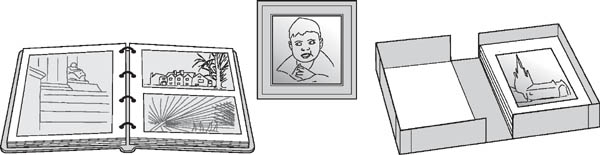
Figure 15.6 Some basic forms of presentation. Left: album for prints up to 10 × 8 in, back to back in acetate sleeves. Centre: framed behind glass. Right: fold-open box for loose mounted prints – pictures are transferred to the other half of the box as viewed
As much as possible take your portfolio around to art directors, gallery curators and other potential clients. Their comments are always worth hearing, even though you may not always agree. Think ahead too in terms of how to give intelligent answers to the sort of questions you could be asked as someone in the art world examines your work. ‘Why did you take this photograph?’ ‘What were you trying to convey – what led you to this place and moment in time?’ ‘Which is your favourite picture in this collection you are showing me. Why?’ Be prepared to openly express your thought process – it will help to prove that the work has direction and cohesion. Can you discuss the work of other photographers, seen in books or the Net, or in exhibitions?
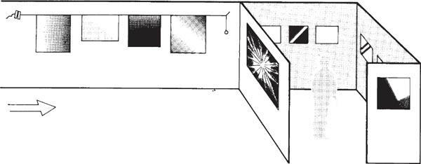
Figure 15.7 Exhibition display. When hanging pictures of mixed proportions work to a common top line using tensioned horizontal cord set by spirit level as a hanging guide. For variety, use end facing walls for large bold ‘points of emphasis’, and enclosed areas to show smaller prints in a contrasting environment
Displays and exhibitions. If you are lucky enough to be offered some form of exhibition the standard of presentation becomes even more important. (After all, you will not be there all the time to speak for your pictures). Take care over the lighting. The same tone range degradation effect caused by viewing prints through portfolio acetate applies to photographs framed behind glass. You may be able to control this by careful positioning of spotlighting, Figure 15.8. In locations with many surrounding reflective surfaces, or having only flat frontal lighting, it may even be best to remove glass from the frames.
The form of presentation which least influences a picture’s content is flush mounting – attachment to a board or block, trimmed to the picture edge. This is often a good direct way to show journalistic and social documentary photography. Flush mounted prints, displayed proud from a wall and spotlit, also suit commercial and industrial exhibitions, etc.
At the other end of the scale, framed portraits, decorative landscapes, etc., for hanging in a domestic or office location are effectively picked out if plenty of space is left between picture edge and frame. This might be a wide border left on the print or mounting board, or a window mat, Figure 15.2. (Bear in mind that a mat also gives you a final opportunity to adjust composition.) Make sure that the tone and width of any surround suits the picture content. For example, a strongly coloured window mat is likely to overwhelm a black and white picture. Unless you aim for a special effect, use only a mount or mat which has a very muted hue, and harmonizes with any dominant colour in the print.
A dark-toned surround (mat, or wall area) tends to emphasize your picture’s lighter contents, and any shapes formed where pale objects are cut by picture edges stand out. A white surround has the opposite effect. Bear in mind too that wide areas surrounding a relatively small print tend to make it look smaller (and more intimate) still.
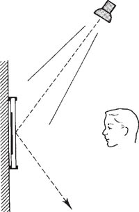
Figure 15.8 For prints exhibited behind glass, position lighting from a high, oblique angle. Flare reflection will then be directed downwards on to the floor, not towards the viewer However, have the light source as distant as possible, to minimize unevenness between top and bottom
With any exhibition or display area, the size and tone density of your pictures, and the form of presentation, should be related to the physical conditions in which they will be seen. The intensity and evenness of the lighting is one factor; the height and layout of display walls is another. Corners offer natural breaks in a picture sequence and alcoves provide intimate enclaves, whereas a long unbroken surface and tall ceiling suit a run of large prints. Think too of likely spectator viewing distance relative to the perspective of your major pictures (page 82).
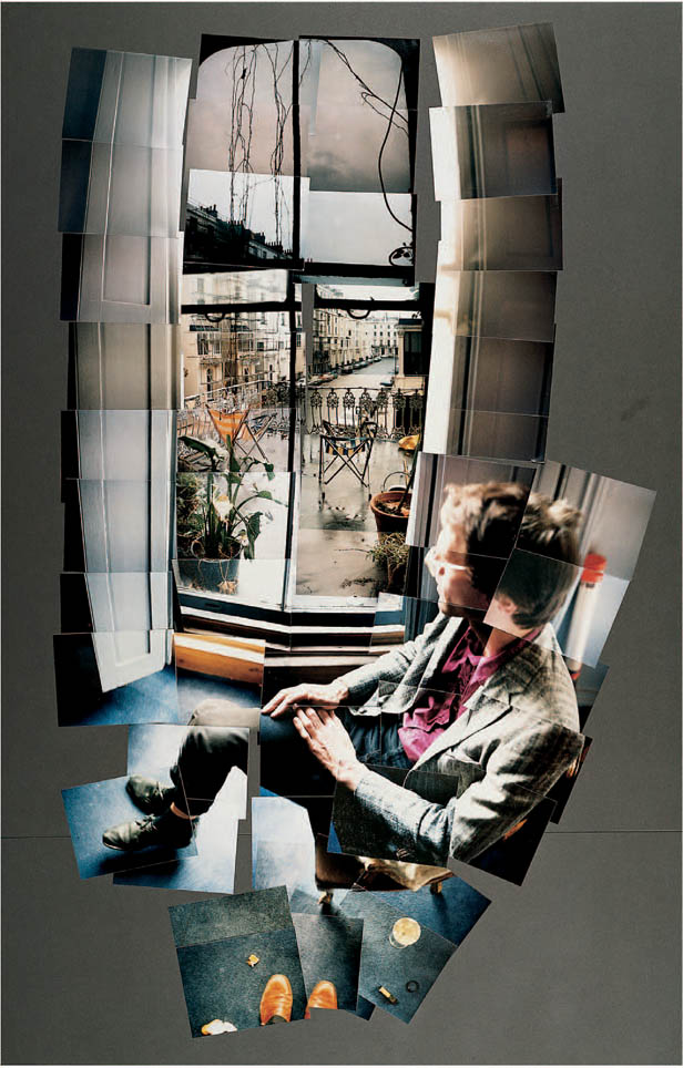
Figure 15.9 Opposite: ‘David Graves Looking at Bayswater, London, November 1982’, a collage, using paste-up instant picture prints. David Hockney’s ‘joiners’ are not meant to be accurate mosaics but a selective build-up of a scene from its detailed elements
An exhibition should contain variety – carefully considered ‘highpoints’ created through juxtaposition of picture content, size and proportions. You need a thread of continuity, too, without lapsing into dull uniformity. Much can be done here by maintaining consistent image colour, mat tint and style of frame, and ensuring that they also relate well to the tone and texture of the exhibition display surfaces.
Pictures on the World Wide Web
The World Wide Web is a widely used special service. Like e-mail it runs on the Internet, the world-wide network of computers linked by telephone line and providing an interactive information resource. The WWW is made up of billions of web ‘sites’, gathered through servers and channelled into the Internet. Each site itself is made up of web pages which contain images, text, etc., called up and displayed on your computer monitor with the aid of a piece of software (usually given away) called a browser.
The web makes it possible to show your photography all over the world, to any web user who chooses to ‘visit’ your site. Typically a portfolio is displayed in the form of up to a dozen thumbnail size images per page, Figures 15.10 and 15.11. Images this size are just big enough to give a reasonable impression of image content. Anyone browsing may click onto a chosen shot to double or quadruple it in size on screen, but since you keep the displayed image file down to quite a small number of pixels image quality is not good enough for people to download and illegally re-use.
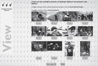
Figure 15.10 The web site of Digital Press Office. This is an image distribution system representing a number of British photographers. Visitors to the site can order images either for downloading direct to computer or in various other media, digital or conventional photographic
Showcasing your work on a web site means that it can be seen in over 100 countries and is accessible 24 hours a day. Anyone who wants to publish one of your portfolio pictures or buy a copy can contact you by e-mail to have a high resolution version downloaded to their computer, or be sent the work as a disk or in photographic print form. Often too potential clients – design studios, art editors, publishers – visit web-located portfolios, looking at the style and quality of different photographers’ work before deciding who to commission for a job.
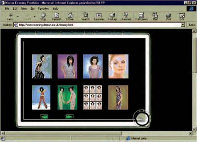
Figure 15.11 A page from a web site designed to appear as an array of medium format colour transparencies viewed on a light box. Selection of one of the ‘thumbnail’ images may open a link to a larger, more detailed image or related information. The images can be updated as necessary
On the other hand, with such a vast number of web pages now in use around the globe it is important for people to know how to log onto your site. As the WWW expands, users get increasingly frustrated attempting to locate what they need from upwards of 20,000 sites now specifically related to photography. This is where web ‘search engine’ software is helpful. Of course, if people know your name they can find you by simply typing this into the search engine. But more often they enter the required category of photography and the program retrieves a list of web sites (with brief written descriptions of content) relevant to their query. Using the mouse they can then click on any one of hundreds of sites to make its home page appear. If your site has several pages your first home page can display an index of your own picture categories.
How to get connected
Apart from a computer, which can be quite basic for WWW purposes you will need:
1 |
A modem to link the computer to your phone line. Modern computers often have a modem built-in. A 56kb/s modem downloads data at 56 kilobits per second, which has become a standard specification for speed. |
2 |
An account with an Internet service provider (ISP). This is a very competitive industry – ISPs offer unlimited access to the Internet, charging a monthly rent. Their start-up package includes all software needed for connection, plus your user name and password. |
Additional software such as a web browser. Simple software like this often comes free, attached to magazines and similar publications. Netscape Navigator and Microsoft Internet Explorer are popular browsers in the UK. |
You can easily do the designing of your web site appearance yourself, using WYSIWYG (what you see is what you get) authoring tools. Most photo manipulation software includes these as a feature, or you can buy them as software plug-ins. You can get then on with pasting in your choice of images plus text, without having to worry about technical complexities to ensure it will all work on the web.
Although you may not have a web site of your own, being on the web gives you access to an enormous volume of photographic reference material, visual and technical. Galleries, museums, photographic manufacturers, publishers, even auction houses selling antique photographs and equipment are all worth a web visit. Remember too that you are sourcing worldwide – one minute you can be viewing a leading photographer’s work in Australia, then drop by the Royal Photographic Society’s historical collection in England before visiting the massive Eastman Kodak site in America …
Summary. Finishing and presenting work
1 |
Examining a series of small, hand-size prints in a set order is an intimate one-person experience, very different to looking at a wall of big pictures in a public exhibition. Make yourself a 6 × 4 in book of 12–15 pages containing one small print per double page. The theme might be a poem, or a nostalgic memory of childhood, a diary of a simple event, or visual recollections of a place. Think carefully about your approach to shooting, print qualities and the order in which each picture is to be separately viewed. |
2 |
Mock up a World Wide Web site which displays up to 10 of your pictures, plus brief text material to explain how you can be contacted. Scan in the work so that it fills your monitor screen, or prepare it as small bromide prints mounted on card the size and shape of a 17 inch screen. |
3 |
Shoot a panorama, or a ‘joiner’. For the panorama shoot from one position with a normal or long focal length lens, panning the camera between shots. The subject content of each frame should overlap that of the next by at least 30 per cent. A joiner (Figure 15.9) can be more loosely structured, varying viewpoint slightly to give more an impression than a record. Make a series of prints matched in tone and size, and mount to give one composite picture. |