
Chapter 5. Anomaly Detection in Network Traffic with K-means Clustering
There are known knowns; there are things that we know that we know. We also know there are known unknowns; that is to say, we know there are some things we do not know. But there are also unknown unknowns, the ones we don’t know we don’t know.
Donald Rumsfeld
Classification and regression are powerful, well-studied techniques in machine learning. Chapter 4 demonstrated a classifier as a predictor of unknown values. There was a catch: in order to predict unknown values for new data, we had to know that target value for many previously seen examples. Classifiers can only help if we, the data scientists, know what we are looking for already, and can provide plenty of examples where input produced a known output. These were collectively known as supervised learning techniques, because their learning process receives the correct output value for each example in the input.
However, there are problems in which the correct output is unknown for some or all examples. Consider the problem of dividing up an ecommerce site’s customers by their shopping habits and tastes. The input features are their purchases, clicks, demographic information, and more. The output should be groupings of customers. Perhaps one group will represent fashion-conscious buyers, another will turn out to correspond to price-sensitive bargain hunters, and so on.
If you were asked to determine this target label for each new customer, you would quickly run into a problem in applying a supervised learning technique like a classifier: you don’t know a priori who should be considered fashion-conscious, for example. In fact, you’re not even sure if “fashion-conscious” is a meaningful grouping of the site’s customers to begin with!
Fortunately, unsupervised learning techniques can help. These techniques do not learn to predict any target value, because none is available. They can, however, learn structure in data, and find groupings of similar inputs, or learn what types of input are likely to occur and what types are not. This chapter will introduce unsupervised learning using clustering implementations in MLlib.
Anomaly Detection
The problem of anomaly detection is, as its name implies, that of finding unusual things. If we already knew what “anomalous” meant for a data set, we could easily detect anomalies in the data with supervised learning. An algorithm would receive inputs labeled “normal” and “anomaly” and learn to distinguish the two. However, the nature of anomalies is that they are unknown unknowns. Put another way, an anomaly that has been observed and understood is no longer an anomaly.
Anomaly detection is often used to find fraud, detect network attacks, or discover problems in servers or other sensor-equipped machinery. In these cases, it’s important to be able to find new types of anomalies that have never been seen before—new forms of fraud, new intrusions, new failure modes for servers.
Unsupervised learning techniques are useful in these cases, because they can learn what input data normally looks like, and therefore detect when new data is unlike past data. Such new data is not necessarily attacks or fraud; it is simply unusual, and therefore, worth further investigation.
K-means Clustering
Clustering is the best-known type of unsupervised learning. Clustering algorithms try to find natural groupings in data. Data points that are like one another, but unlike others, are likely to represent a meaningful grouping, and so clustering algorithms try to put such data into the same cluster.
K-means clustering is maybe the most widely used clustering algorithm. It attempts to detect k clusters in a data set, where k is given by the data scientist. k is a hyperparameter of the model, and the right value will depend on the data set. In fact, choosing a good value for k will be a central plot point in this chapter.
What does “like” mean when the data set contains information like customer activity? Or transactions? K-means requires a notion of distance between data points. It is common to use simple Euclidean distance to measure distance between data points with K-means, and as it happens, this is the only distance function supported by Spark MLlib as of this writing. The Euclidean distance is defined for data points whose features are all numeric. “Like” points are those whose intervening distance is small.
To K-means, a cluster is simply a point: the center of all the points that make up the cluster. These are in fact just feature vectors containing all numeric features, and can be called vectors. It may be more intuitive to think of them as points here, because they are treated as points in a Euclidean space.
This center is called the cluster centroid, and is the arithmetic mean of the points—hence the name K-means. To start, the algorithm picks some data points as the initial cluster centroids. Then each data point is assigned to the nearest centroid. Then for each cluster, a new cluster centroid is computed as the mean of the data points just assigned to that cluster. This process is repeated.
Enough about K-means for now. Some more interesting details will emerge in the course of the use case to follow.
Network Intrusion
So-called cyber attacks are increasingly visible in the news. Some attacks attempt to flood a computer with network traffic to crowd out legitimate traffic. But in other cases, attacks attempt to exploit flaws in networking software to gain unauthorized access to a computer. While it’s quite obvious when a computer is being bombarded with traffic, detecting an exploit can be like searching for a needle in an incredibly large haystack of network requests.
Some exploit behaviors follow known patterns. For example, accessing every port on a machine in rapid succession is not something any normal software program would need to do. However, it is a typical first step for an attacker, who is looking for services running on the computer that may be exploitable.
If you were to count the number of distinct ports accessed by a remote host in a short time, you would have a feature that probably predicts a port-scanning attack quite well. A handful is probably normal; hundreds indicates an attack. The same goes for detecting other types of attacks from other features of network connections—number of bytes sent and received, TCP errors, and so forth.
But what about those unknown unknowns? The biggest threat may be the one that has never yet been detected and classified. Part of detecting potential network intrusions is detecting anomalies. These are connections that aren’t known to be attacks, but do not resemble connections that have been observed in the past.
Here, unsupervised learning techniques like K-means can be used to detect anomalous network connections. K-means can cluster connections based on statistics about each of them. The resulting clusters themselves aren’t interesting per se, but they collectively define types of connections that are like past connections. Anything not close to a cluster could be anomalous. Clusters are interesting insofar as they define regions of normal connections; everything else outside is unusual and potentially anomalous.
KDD Cup 1999 Data Set
The KDD Cup was an annual data mining competition organized by a special interest group of the ACM. Each year, a machine learning problem was posed, along with a data set, and researchers were invited to submit a paper detailing their best solution to the problem. It was like Kaggle, before there was Kaggle. In 1999, the topic was network intrusion, and the data set is still available. This chapter will walk through building a system to detect anomalous network traffic, using Spark, by learning from this data.
Don’t use this data set to build a real network intrusion system! The data did not necessarily reflect real network traffic at the time, and in any event it only reflects traffic patterns as of 15 years ago.
Fortunately, the organizers had already processed raw network packet data into summary information about individual network connections. The data set is about 708 MB and contains about 4.9M connections. This is large, if not massive, but will be large enough for our purposes here. For each connection, the data set contains information like the number of bytes sent, login attempts, TCP errors, and so on. Each connection is one line of CSV-formatted data, containing 38 features, like this:
0,tcp,http,SF,215,45076,
0,0,0,0,0,1,0,0,0,0,0,0,0,0,0,0,1,1,
0.00,0.00,0.00,0.00,1.00,0.00,0.00,0,0,0.00,
0.00,0.00,0.00,0.00,0.00,0.00,0.00,normal.
This connection, for example, was a TCP connection to an HTTP service—215 bytes were sent and 45,706
bytes were received. The user was logged in, and so on. Many features are counts, like num_file_creations
in the 17th column.
Many features take on the value 0 or 1, indicating the presence or absence of a
behavior, like su_attempted in the 15th column. They look like the one-hot encoded categorical
features from Chapter 4, but are not grouped and related in the same way.
Each is like a yes/no feature, and is therefore arguably a categorical feature. It is
not always valid to translate categorical features to numbers and treat them as if they had an ordering.
However, in the special case of a binary categorical feature, in most machine learning algorithms,
it will happen to work well to map these to a numeric feature taking on values 0 and 1.
The rest are ratios like dst_host_srv_rerror_rate in the next-to-last column, and take on
values from 0.0 to 1.0, inclusive.
Interestingly, a label is given in the last field. Most connections are labeled normal., but some have been
identified as examples of various types of network attacks. These would be useful in learning to distinguish
a known attack from a normal connection, but the problem here is anomaly detection, and finding potentially new
and unknown attacks. This label will be mostly set aside for our purposes here.
A First Take on Clustering
Unzip the kddcup.data.gz data file and copy it into HDFS. This example, like others,
will assume the file is available at /user/ds/kddcup.data. Open the spark-shell, and load the CSV data as
an RDD of String:
valrawData=sc.textFile("hdfs:///user/ds/kddcup.data")
Begin by exploring the data set. What labels are present in the data, and how many are there of each? The following code counts by label into label-count tuples, sorts them descending by count, and prints the result:
rawData.map(_.split(',').last).countByValue().toSeq.sortBy(_._2).reverse.foreach(println)
A lot can be accomplished in a line in Spark and Scala! There are 23 distinct labels, and the most frequent
are smurf. and neptune. attacks:
(smurf.,2807886)
(neptune.,1072017)
(normal.,972781)
(satan.,15892)
...
Note that the data contains nonnumeric features. For example, the second column may be tcp, udp, or icmp, but
K-means clustering requires numeric features. The final label column is also nonnumeric. To begin, these will simply
be ignored. The following Spark code splits the CSV lines into columns, removes the three categorical value columns
starting from index 1, and removes the final column. The remaining values are converted to an array of
numeric values (Double objects), and emitted with the final label column in a tuple:
importorg.apache.spark.mllib.linalg._vallabelsAndData=rawData.map{line=>valbuffer=line.split(',').toBuffer
buffer.remove(1,3)vallabel=buffer.remove(buffer.length-1)valvector=Vectors.dense(buffer.map(_.toDouble).toArray)(label,vector)}valdata=labelsAndData.values.cache()
toBuffercreatesBuffer, a mutable list
K-means will operate on just the feature vectors. So, the RDD data contains just the second element of each
tuple, which in an RDD of tuples are accessed with values. Clustering the data with
Spark MLlib is as simple as importing the KMeans implementation and running it. The
following code clusters the data to create a KMeansModel, and then prints its centroids:
importorg.apache.spark.mllib.clustering._valkmeans=newKMeans()valmodel=kmeans.run(data)model.clusterCenters.foreach(println)
Two vectors will be printed, meaning K-means was fitting k = 2 clusters to the data. For a complex data set that is known to exhibit at least 23 distinct types of connections, this is almost certainly not enough to accurately model the distinct groupings within the data.
This is a good opportunity to use the given labels to get an intuitive sense of what went into these two clusters, by counting the labels within each cluster. The following code uses the model to assign each data point to a cluster, counts occurrences of cluster and label pairs, and prints them nicely:
valclusterLabelCount=labelsAndData.map{case(label,datum)=>valcluster=model.predict(datum)(cluster,label)}.countByValueclusterLabelCount.toSeq.sorted.foreach{case((cluster,label),count)=>println(f"$cluster%1s$label%18s$count%8s")}
Format string interpolates and formats variables
The result shows that the clustering was not at all helpful. Only one data point ended up in cluster 1!
0             back.    2203
0  buffer_overflow.      30
0        ftp_write.       8
0     guess_passwd.      53
0             imap.      12
0          ipsweep.   12481
0             land.      21
0       loadmodule.       9
0         multihop.       7
0          neptune. 1072017
0             nmap.    2316
0           normal.  972781
0             perl.       3
0              phf.       4
0              pod.     264
0        portsweep.   10412
0          rootkit.      10
0            satan.   15892
0            smurf. 2807886
0              spy.       2
0         teardrop.     979
0      warezclient.    1020
0      warezmaster.      20
1        portsweep.       1
Choosing k
Two clusters are plainly insufficient. How many clusters are appropriate for this data set? It’s clear that there are 23 distinct patterns in the data, so it seems that k could be at least 23, or likely, even more. Typically, many values of k are tried to find the best one. But what is “best”?
A clustering could be considered good if each data point were near to its closest centroid. So, we define a Euclidean distance function, and a function that returns the distance from a data point to its nearest cluster’s centroid:
defdistance(a:Vector,b:Vector)=math.sqrt(a.toArray.zip(b.toArray).map(p=>p._1-p._2).map(d=>d*d).sum)defdistToCentroid(datum:Vector,model:KMeansModel)={valcluster=model.predict(datum)valcentroid=model.clusterCenters(cluster)distance(centroid,datum)}
You can read off the definition of Euclidean distance here by unpacking the Scala function, in
reverse: sum (sum) the squares (map(d => d * d)) of differences
(map(p => p._1 - p._2)) in corresponding elements of two vectors (a.toArray.zip(b.toArray)),
and take the square root (math.sqrt).
From this, it’s possible to define a function that measures the average distance to centroid, for a model built with a given k:
importorg.apache.spark.rdd._defclusteringScore(data:RDD[Vector],k:Int)={valkmeans=newKMeans()kmeans.setK(k)valmodel=kmeans.run(data)data.map(datum=>distToCentroid(datum,model)).mean()}
Now, this can be used to evaluate values of k from, say, 5 to 40:
(5to40by5).map(k=>(k,clusteringScore(data,k))).foreach(println)
The (x to y by z) syntax is a Scala idiom for creating a collection of numbers between a start
and end (inclusive), with a given difference between successive elements. This is a compact way
to create the values “5, 10, 15, 20, 25, 30, 35, 40” for k, and then do something with each.
The printed result shows that the score decreases as k increases:
(5,1938.858341805931)
(10,1689.4950178959496)
(15,1381.315620528147)
(20,1318.256644582388)
(25,932.0599419255919)
(30,594.2334547238697)
(35,829.5361226176625)
(40,424.83023056838846)
Again, your values will be somewhat different. The clustering depends on a randomly chosen initial set of centroids.
However, this much is obvious. As more clusters are added, it should always be possible to make data points closer to a nearest centroid. In fact, if k is chosen to equal the number of data points, the average distance will be 0, because every point will be its own cluster of one!
Worse, in the preceding results, the distance for k = 35 is higher than for k = 30. This shouldn’t happen, because higher k always permits at least as good a clustering as a lower k. The problem is that K-means is not necessarily able to find the optimal clustering for a given k. Its iterative process can converge from a random starting point to a local minimum, which may be good but not optimal.
This is still true even when more intelligent methods are used to choose initial centroids. K-means++ and K-means|| are variants with selection algorithms that are more likely to choose diverse, separated centroids, and lead more reliably to a good clustering. Spark MLlib, in fact, implements K-means||. However, all still have an element of randomness in selection, and can’t guarantee an optimal clustering.
The random starting set of clusters chosen for k = 35 perhaps led to a particularly suboptimal clustering, or, it
may have stopped early before it reached its local optimum. We can improve this by running the clustering many times
for a value of k, with a different random starting centroid set each time, and picking the best clustering.
The algorithm exposes setRuns() to set the number of times the clustering is run for one k.
We can improve it by running the iteration longer.
The algorithm has a threshold via setEpsilon() that controls the minimum amount of cluster centroid movement that
is considered significant; lower values means the K-means algorithm will let the centroids continue to move longer.
Run the same test again, but try larger values, from 30 to 100. In the following example, the range from 30 to 100 is turned into a parallel collection in Scala. This causes the computation for each k to happen in parallel in the Spark shell. Spark will manage the computation of each at the same time. Of course, the computation of each k is also a distributed operation on the cluster. It’s parallelism inside parallelism. This may increase overall throughput by fully exploiting a large cluster, although at some point, submitting a very large number of tasks simultaneously will become counterproductive:
...kmeans.setRuns(10)kmeans.setEpsilon(1.0e-6)...(30to100by10).par.map(k=>(k,clusteringScore(data,k))).toList.foreach(println)
Decrease from default of 1.0e-4
This time, scores decrease consistently:
(30,862.9165758614838)
(40,801.679800071455)
(50,379.7481910409938)
(60,358.6387344388997)
(70,265.1383809649689)
(80,232.78912076732163)
(90,230.0085251067184)
(100,142.84374573413373)
We want to find a point past which increasing k stops reducing the score much, or an “elbow” in a graph of k versus score, which is generally decreasing but eventually flattens out. Here, it seems to be decreasing notably past 100. The right value of k may be past 100.
Visualization in R
At this point, it could be useful to look at a plot of the data points. Spark itself has no tools for visualization. However, data can be easily exported to HDFS, and then read into a statistical environment like R. This brief section will demonstrate using R to visualize the data set.
While R provides libraries for plotting points in two or three dimensions, this data set is 38-dimensional. It will have to be projected down into at most three dimensions. Further, R itself is not suited to handle large data sets, and this data set is certainly large for R. It will have to be sampled to fit into memory in R.
To start, build a model with k = 100 and map each data point to a cluster number. Write the features as lines of CSV text to a file on HDFS:
valsample=data.map(datum=>model.predict(datum)+","+datum.toArray.mkString(",")).sample(false,0.05)sample.saveAsTextFile("/user/ds/sample")
mkStringjoins a collection to a string with a delimiter
sample() is used to select a small subset of all lines, so that it more comfortably fits in memory in R.
Here, 5% of the lines are selected (without replacement).
The following R code reads CSV data from HDFS. This can also be accomplished with libraries like
rhdfs, which can take some setup and installation.
Here it just uses a locally installed hdfs command
from a Hadoop distribution, for simplicity. This requires HADOOP_CONF_DIR to be set to
the location of Hadoop configuration,
with configuration that defines the location of the HDFS cluster.
It creates a three-dimensional data set out of a 38-dimensional data set by choosing three random unit vectors and projecting the data onto these three vectors. This is a simplistic, rough-and-ready form of dimension reduction. Of course, there are more sophisticated dimension reduction algorithms, like Principal Component Analysis or the Singular Value Decomposition. These are available in R, but take much longer to run. For purposes of visualization in this example, a random projection achieves much the same result, faster.
The result is presented as an interactive 3D visualization. Note that this will require running R in an
environment that supports the rgl library and graphics (for example, on Mac OS X, it requires X11 from
Apple’s Developer Tools to be installed):
install.packages("rgl")# First time onlylibrary(rgl)clusters_data<-read.csv(pipe("hadoop fs -cat /user/ds/sample/*"))<-clusters_data[1]data<-data.matrix(clusters_data[-c(1)])rm(clusters_data)random_projection<-matrix(data=rnorm(3*ncol(data)),ncol=3)random_projection_norm<-random_projection/sqrt(rowSums(random_projection*random_projection))projected_data
<-data.frame(data%*%random_projection_norm)num_clusters
<-nrow(unique(clusters))palette<-rainbow(num_clusters)colors=sapply(clusters,function(c)palette[c])plot3d(projected_data,col=colors,size=10)
Read cluster and data with
hdfscommandCreate random unit vectors in 3D
Project the data
The resulting visualization in Figure 5-1 shows data points shaded by cluster number in 3D space. Many points fall on top of one another, and the result is sparse and hard to interpret. However, the dominant feature of the visualization is its “L” shape. The points seem to vary along two distinct dimensions, and little in other dimensions.
This makes sense, because the data set has two features that are on a much larger scale than the others. Whereas most features have values between 0 and 1, the bytes-sent and bytes-received features vary from 0 to tens of thousands. The Euclidean distance between points is therefore almost completely determined by these two features. It’s almost as if the other features don’t exist! So, it’s important to normalize away these differences in scale to put features on near-equal footing.
Feature Normalization
We can normalize each feature by converting it to a standard score. This means subtracting the mean of the feature’s values from each value, and dividing by the standard deviation, as shown in the standard score equation:

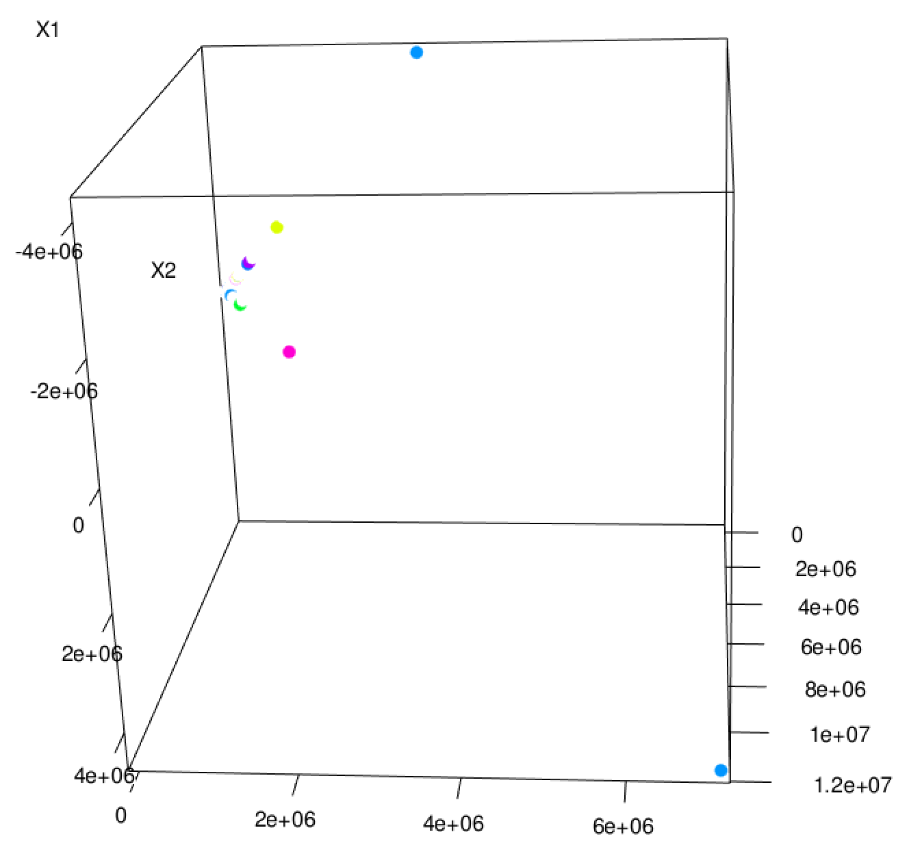
Figure 5-1. Random 3D projection
In fact, subtracting means has no effect on the clustering, because the subtraction effectively shifts all of the data points by the same amount in the same directions. This does not affect interpoint Euclidean distances. For consistency, however, the mean will be subtracted anyway.
Standard scores can be computed from the count, sum, and sum-of-squares of each feature. This can be done jointly,
with reduce operations used to add entire arrays at once, and fold used to accumulate sums of squares from
an array of zeros:
valdataAsArray=data.map(_.toArray)valnumCols=dataAsArray.first().lengthvaln=dataAsArray.count()valsums=dataAsArray.reduce((a,b)=>a.zip(b).map(t=>t._1+t._2))valsumSquares=dataAsArray.fold(newArray[Double](numCols))((a,b)=>a.zip(b).map(t=>t._1+t._2*t._2))valstdevs=sumSquares.zip(sums).map{case(sumSq,sum)=>math.sqrt(n*sumSq-sum*sum)/n}valmeans=sums.map(_/n)defnormalize(datum:Vector)={valnormalizedArray=(datum.toArray,means,stdevs).zipped.map((value,mean,stdev)=>if(stdev<=0)(value-mean)else(value-mean)/stdev)Vectors.dense(normalizedArray)}
We can run the same test with normalized data, on a higher range of k:
valnormalizedData=data.map(normalize).cache()(60to120by10).par.map(k=>(k,clusteringScore(normalizedData,k))).toList.foreach(println)
This yields some evidence that k = 100 may be a reasonably good choice:
(60,0.0038662664156513646)
(70,0.003284024281015404)
(80,0.00308768458568131)
(90,0.0028326001931487516)
(100,0.002550914511356702)
(110,0.002516106387216959)
(120,0.0021317966227260106)
Another 3D visualization of the normalized data points reveals a richer structure, as expected. Some points are spaced in regular, discrete intervals in a direction; these are likely projections of discrete dimensions in the data, like counts. With 100 clusters, it’s hard to make out which points come from which clusters. One large cluster seems to dominate, and many clusters correspond to small compact subregions (some of which are omitted from this zoomed detail of the entire 3D visualization). The result, shown in Figure 5-2, does not necessarily advance the analysis, but is an interesting sanity check.
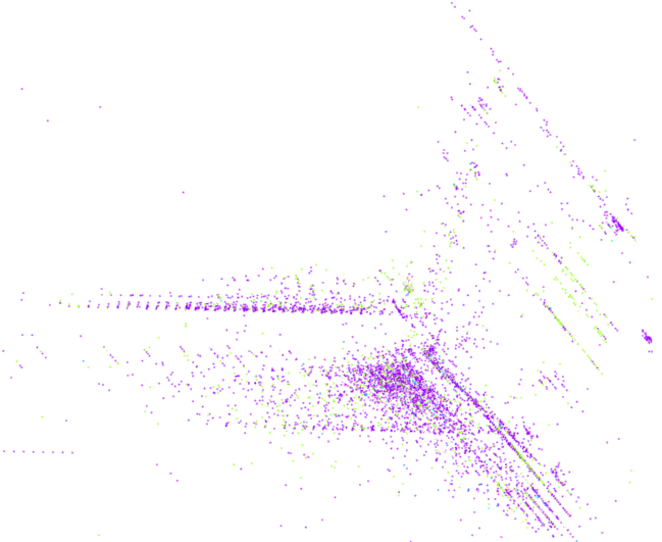
Figure 5-2. Random 3D projection of normalized data
Categorical Variables
Earlier, three categorical features were excluded, because nonnumeric features can’t be used with the Euclidean distance function that K-means uses in MLlib. This is the reverse of the issue noted in Chapter 4, where numeric features were used to represent categorical values, but a categorical feature was desired.
The categorical features can translate into several
binary indicator features using one-hot encoding, which can be viewed as numeric dimensions.
For example, the second column contains the protocol type: tcp, udp, or icmp. This feature could be thought
of as three features, perhaps is_tcp, is_udp, and is_icmp. The single feature value
tcp might become 1,0,0; udp might be 0,1,0; and so on. The accompanying source code implements this
transformation to replace these categorical values with a one-hot encoding; it is not reproduced here.
This new, larger data set can be normalized again, and clustered again, perhaps trying larger k as well.
Because the individual clustering jobs are getting large, it may be best to remove the .par and return to
computing one model at a time:
(80,0.038867919526032156)
(90,0.03633130732772693)
(100,0.025534431488492226)
(110,0.02349979741110366)
(120,0.01579211360618129)
(130,0.011155491535441237)
(140,0.010273258258627196)
(150,0.008779632525837223)
(160,0.009000858639068911)
These sample results suggest k = 150, although even with 10 runs each, at this size, k = 160 fails to produce a better clustering. There is still some uncertainty about these scores.
Using Labels with Entropy
Earlier, we used the given label for each data point to create a quick sanity check of the quality of the clustering. This notion can be formalized further and used as an alternative means of evaluating clustering quality, and therefore, of choosing k.
It stands to reason that a good clustering would create clusters that contain one or a few types of the known attacks, and little of anything else. You may recall from Chapter 4 that we have metrics for homogeneity: Gini impurity and entropy. Entropy will be used here for illustration.
A good clustering would have clusters whose collections of labels are homogeneous and so have low entropy. A weighted average of entropy can therefore be used as a cluster score:
defentropy(counts:Iterable[Int])={valvalues=counts.filter(_>0)valn:Double=values.sumvalues.map{v=>valp=v/n-p*math.log(p)}.sum}defclusteringScore(normalizedLabelsAndData:RDD[(String,Vector)],k:Int)={...valmodel=kmeans.run(normalizedLabelsAndData.values)vallabelsAndClusters=normalizedLabelsAndData.mapValues(model.predict)valclustersAndLabels=labelsAndClusters.map(_.swap)vallabelsInCluster=clustersAndLabels.groupByKey().valuesvallabelCounts=labelsInCluster.map(_.groupBy(l=>l).map(_._2.size))
valn=normalizedLabelsAndData.count()labelCounts.map(m=>m.sum*entropy(m)).sum/n
}
Predict cluster for each datum
Swap keys/values
Extract collections of labels, per cluster
Count labels in collections
Average entropy weighted by cluster size
As before, this analysis can be used to obtain some idea of a suitable value of k. Entropy will not necessarily decrease as k increases, so it is possible to look for a local minimum value. Here again, results suggest k = 150 is a reasonable choice:
(80,1.0079370754411006)
(90,0.9637681417493124)
(100,0.9403615199645968)
(110,0.4731764778562114)
(120,0.37056636906883805)
(130,0.36584249542565717)
(140,0.10532529463749402)
(150,0.10380319762303959)
(160,0.14469129892579444)
Clustering in Action
Finally, with confidence, we can cluster the full normalized data set with k = 150. Again, we can print the labels for each cluster to get some sense of the resulting clustering. Clusters do seem to contain mostly one label:
0             back.       6
0          neptune.  821239
0           normal.     255
0        portsweep.     114
0            satan.      31
...
90        ftp_write.       1
90       loadmodule.       1
90          neptune.       1
90           normal.   41253
90      warezclient.      12
...
93           normal.       8
93        portsweep.    7365
93      warezclient.       1
Now, we can make an actual anomaly detector. Anomaly detection amounts to measuring a new data point’s distance to its nearest centroid. If this distance exceeds some threshold, it is anomalous. This threshold might be chosen to be the distance of, say, the 100th-farthest data point from among known data:
val distances = normalizedData.map(
  datum => distToCentroid(datum, model)
)
val threshold = distances.top(100).last
The final step is to apply this threshold to all new data points as they arrive. For example, Spark Streaming can be used to apply this function to small batches of input data arriving from sources like Flume, Kafka, or files on HDFS. Data points exceeding the threshold might trigger an alert that sends an email or updates a database.
As an example, we will apply it to the original data set, to see some of the data points that are, we might believe, most anomalous within the input. To interpret the results, we keep the original line of input with the parsed feature vector:
val model = ...
val originalAndData = ...
val anomalies = originalAndData.filter { case (original, datum) =>
  val normalized = normalizeFunction(datum)
  distToCentroid(normalized, model) > threshold
}.keys
For fun, the winner is the following data point, which is the most anomalous in the data, according to this model:
0,tcp,http,S1,299,26280,
0,0,0,1,0,1,0,1,0,0,0,0,0,0,0,0,15,16,
0.07,0.06,0.00,0.00,1.00,0.00,0.12,231,255,1.00,
0.00,0.00,0.01,0.01,0.01,0.00,0.00,normal.
A network security expert would be more able to interpret why this is or is not actually a strange connection.
It appears unusual at least because it is labeled normal., but involved more than 200 different connections
to the same service in a short time, and ended in an unusual TCP state, S1.
Where to Go from Here
The KMeansModel is, by itself, the essence of an anomaly detection system. The preceding code demonstrated how
to apply it to data to detect anomalies. This same code could be used within
Spark Streaming to score new data as it arrives in near real time, and
perhaps trigger an alert or review.
MLlib also includes a variation called StreamingKMeans, which can update a clustering incrementally
as new data arrives in a StreamingKMeansModel. We could use this to continue to learn, approximately,
how new data affects the clustering, and not just assess new data against existing clusters.
It can be integrated with Spark Streaming as well.
This model is only a simplistic one. For example, Euclidean distance is used in this example because it is the only distance function supported by Spark MLlib at this time. In the future, it may be possible to use distance functions that can better account for the distributions of and correlations between features, such as the Mahalanobis distance.
There are also more sophisticated cluster quality evaluation metrics that could be applied, even without labels, to pick k, such as the Silhouette coefficient. These tend to evaluate not just closeness of points within one cluster, but closeness of points to other clusters.
Finally, different models could be applied too, instead of simple K-means clustering; for example, a Gaussian mixture model or DBSCAN could capture more subtle relationships between data points and the cluster centers.
Implementations of these may become available in Spark MLlib or other Spark-based libraries in the future.
Of course, clustering isn’t just for anomaly detection either. In fact, it’s more usually associated with use cases where the actual clusters matter! For example, clustering can also be used to group customers according to their behaviors, preferences, and attributes. Each cluster, by itself, might represent a usefully distinguishable type of customer. This is a more data-driven way to segment customers rather than leaning on arbitrary, generic divisions like “age 20–34” and “female.”