
Lesson 17: Customizing a Flex Application with Skins
In this lesson, you will:
• Learn the relationship between skins and components
• Learn how to work with states and skins
• Create Button skins
• Create a skin for the application’s controlBar region
In the previous lesson, you learned about using the style API to customize parts of an application. You also learned that there are more customizations that you can make that are unavailable using the style API. In this lesson, you’ll learn how to quickly and easily adjust the skins of a Spark component to completely change how that component looks.
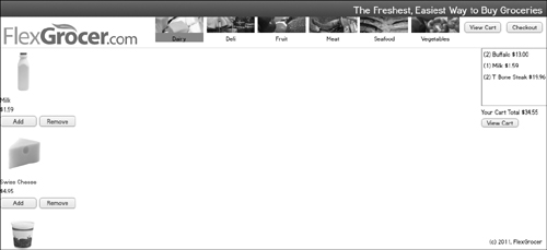
The FlexGrocer.com application gets an extreme makeover through the use of a few simple skins.
Understanding the Role of Skins in a Spark Component
As you learned in Lesson 12, “Using the Flex DataGrid,” Spark components are built by composition, meaning that the functionality of the components is separated from the look of the component. In this lesson, you’ll learn how to adjust the look of the components through the use of skins.
In this exercise you’ll create a skin for the FlexGrocer button on the homepage. Up to this point, this button has simply had the text FlexGrocer on it. You’ll now modify the skin so it will display the FlexGrocer logo instead.
- Open your FlexGrocer project.
Alternatively, if you didn’t complete the previous lesson or your code is not functioning properly, you can import the FlexGrocer.fxp project from the Lesson17/start folder. Please refer to the appendix for complete instructions on importing a project should you skip a lesson or if you have a code issue you cannot resolve.
- Right-click the FlexGrocer project, and create a new package named skins.

This package will hold all the skin classes you create for the application.
- Right-click the skins package, and choose New > MXML Skin. Name the skin HomeButtonSkin, set the Host component to spark.components.Button, choose to create it as a copy of spark.skins.spark.ButtonSkin, and then click Finish.
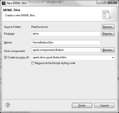
This will copy the native Spark ButtonSkin class and save it in your skins package under the name HomeButtonSkin. Skins must know the name of the class that they will be skinning, which allows the compiler to verify that all the proper pieces (known as skin parts) are present in the skin class. If any required skin parts are missing, a compile-time error will be thrown. If you have any questions on which skin parts are required for a given component, the ActionScript 3.0 Language references has a section for each component listing the skin parts, and whether or not they are required.

As you can see in the figure, the Button has no required skin parts, which makes skinning a button easy to do.
- Remove the Script block from the component, which was automatically added by the compiler.
The Script block in the component allows for programmatic control over the skinning, and lets you set some aspects of the skin in style sheets. Since you won’t need this functionality for this skin, it is safe to remove the whole block.
- Remove all the code between the end of the states block and the closing tag for this skin.
The resulting code for the skin class should look like this (comments from the top of the class have been intentionally omitted):
<s:SparkButtonSkin xmlns:fx="http://ns.adobe.com/mxml/2009"
xmlns:s="library://ns.adobe.com/flex/spark"
xmlns:fb="http://ns.adobe.com/flashbuilder/2009"
minWidth="21" minHeight="21"
alpha.disabled="0.5">
<fx:Metadata>
<![CDATA[
/**
* @copy spark.skins.spark.ApplicationSkin#hostComponent
*/
[HostComponent("spark.components.Button")]
]]>
</fx:Metadata>
<!-- states -->
<s:states>
<s:State name="up" />
<s:State name="over" />
<s:State name="down" />
<s:State name="disabled" />
</s:states>
</s:SparkButtonSkin>What you removed were the various elements that make up a label: the shadow, the fill color, a lowlight color, a highlight color, a highlight stroke, the border, and the label. For the moment, these are extraneous. Later in this lesson you’ll add some of these elements back.
- Between the end of the states block and the closing SparkButtonSkin tag, add a BitmapImage that uses an
Embeddirective for assets/FlexGrocerButton.png as its source. Specify ahorizontalCenterof0, averticalCenterof1, and thealphain thedisabledstate as.5.<s:BitmapImage source="@Embed('assets/FlexGrocerButton.png')"
horizontalCenter="0" verticalCenter="1" alpha.disabled=".5"/>You have now given this skin a visual look; instead of looking like a typical Flex Button, it will instead use this graphic as its complete look and feel.
- Save HomeButtonSkin.mxml. Open FlexGrocer.mxml from the default package.
- Find the instantiation of the button labeled Flex Grocer in the controlBarContent node. Add a
skinClassattribute with a value ofskins.HomeButtonSkin.<s:Button label="Flex Grocer" x="5" y="5"
click="returnToShopping( event )"
skinClass="skins.HomeButtonSkin"/>This code instructs this particular button to use the HomeButtonSkin class as its skin, instead of the class it would have used by default. If you save and run the application now, you’ll find that the Flex Grocer button you have seen in the top-left corner has been replaced by a graphic, which still responds to users’ clicks, just as the original button did.

- Open FlexGrocer.mxml. Find the List with an
idofcategoryList. Removeleft="200"and replace it withright="171".As the FlexGrocer button is now much larger than it was, the List component doesn’t fit properly in the screen, so the category list will be constrained to stay 171 pixels from the right edge of the screen.
- To prevent the category list from overlapping the logo if the browser is resized too small, set
minWidth="1024"in the top Application tag.<s:Application xmlns:fx="http://ns.adobe.com/mxml/2009"
xmlns:s="library://ns.adobe.com/flex/spark"
xmlns:views="views.*" xmlns:services="services.*" xmlns:cart="cart.*"
creationComplete="handleCreationComplete(event)"
locale="en_US"
minWidth="1024">
 Tip
TipOne problem still persists with this button. It does not currently seem like a button because as users hover their mouse over it, or click it, it doesn’t change its appearance at all, whereas all the other buttons in Flex do. You’ll correct this problem in the next exercise, as you learn about states and how they relate to skins.
Understanding the Relationship between Skins and States
Early in this book, you learned how each Flex component can use different states to allow for adjusting and controlling how a component looks at various times throughout the application. States can also be modified in the component’s skin as well.
Drawing Programmatically in Flex
The Flex framework offers tools for drawing programmatically: the AS3 Drawing API and FXG Graphics. In both cases, you can use code that instructs Flash Player how to draw graphical elements, rather than simply having it render a binary graphical file (such as JPEG, GIF, or PNG). The benefit of using a programmatic graphic is that it becomes much easier to control and change the graphic in your application than it would be when dealing with any of the binary formats. In most cases, if you wanted to change the color of a binary graphic, you would open that file in a graphics editing program, such as Fireworks or Photoshop, make the changes, and resave the file. When using programmatic graphics, you can simply adjust the properties of the graphical object that is drawing to the screen without having to be familiar with another program.
The AS3 Drawing API uses the graphics property that is native to all instances of the Sprite class in Flash Player. This API includes methods such as moveTo, lineTo, beginFill, endFill, and curveTo, all of which allow developers to draw vector graphics directly on a visual element in Flash Builder.
FXG, on the other hand, allows for XML-based syntax to define graphics, which work well directly inside MXML. In fact, if you were to open any of the Spark skin classes that ship with Flex 4, you would find that all the borders and background colors drawn in any of the Flex components are done with a series of FXG declarations. Even better, many of Adobe’s other tools, such as Photoshop, Illustrator, and Flash Catalyst, export their graphics as FXG, so you can use them directly in your Flex application.
The reality is you can do exactly the same thing with both FXG and the Flash Drawing API. Consider the following, which draws a similar red box with a blue border twice: first with FXG and then with the AS3 Drawing API:
<?xml version="1.0" encoding="utf-8"?>
<s:Application xmlns:fx="http://ns.adobe.com/mxml/2009"
xmlns:s="library://ns.adobe.com/flex/spark"
creationComplete="doDraw()">
<fx:Script>
<![CDATA[
private function doDraw():void{
var g:Graphics = drawingGroup.graphics;
g.lineStyle(10,0x0000ff,.5);
g.beginFill(0xff0000);
g.drawRect(0,0,200,200);
g.endFill();
}
]]>
</fx:Script>
<s:Group x="100" y="10">
<s:Rect width="200" height="200">
<s:fill>
<s:SolidColor color="0xFF0000" />
</s:fill>
<s:stroke>
<s:SolidColorStroke weight="10" color="0x0000FF" alpha="0.5" />
</s:stroke>
</s:Rect>
</s:Group>
<s:Group id="drawingGroup" x="100" y="260"/>
</s:Application>

When this code runs, an identical box will be drawn twice, once using the Drawing API’s drawRect() method and setting the lineStyle and fill, and the other time, using the FXG Rect tag, specifying fill and stroke as properties. The real benefit for Flex skinning in using FXG is that the XML markup can easily honor Flex states, so it would become trivial to change the look of the drawing as users move their mouse over the rectangle.
<?xml version="1.0" encoding="utf-8"?>
<s:Application xmlns:fx="http://ns.adobe.com/mxml/2009"
xmlns:s="library://ns.adobe.com/flex/spark"
creationComplete="doDraw()">
<s:states>
<s:State name="normal"/>
<s:State name="over"/>
</s:states>
<fx:Script>
<![CDATA[
private function doDraw():void{
var g:Graphics = drawingGroup.graphics;
g.lineStyle(10,0x0000ff,.5);
g.beginFill(0xff0000);
g.drawRect(0,0,200,200);
g.endFill();
}
]]>
</fx:Script>
<s:Group x="100" y="10" mouseOver="this.currentState='over'"
mouseOut="this.currentState='normal'">
<s:Rect width="200" height="200">
<s:fill>
<s:SolidColor color="0xFF0000" color.over="0x00ff00" />
</s:fill>
<s:stroke>
<s:SolidColorStroke weight="10" color="0x0000FF" alpha="0.5"
alpha.over="1" />
</s:stroke>
</s:Rect>
</s:Group>
<s:Group id="drawingGroup" x="100" y="260"/>
</s:Application>
In this example, two states are defined: a normal and an over state. The state is switched as you move the mouse over or off the rectangle. The fill and stroke of the rectangle are defined to change in the over state. This is how Flex achieves the different looks as the user interacts with the components in an application. If you were to open the spark.skins.spark.ButtonSkin class, you would see a series of rectangles defined that have fills or strokes, which change based on the state (up, over, down, or disabled).

For full details on the FXG specification, please see http://opensource.adobe.com/wiki/display/flexsdk/FXG+1.0+Specification.
Customizing Button States with Skins
In this next exercise, you’ll continue to work with the Skin class you created for the homepage button in the previous exercise and you’ll adjust how it looks in other states, such as when the user hovers the mouse over it or clicks on it.
- Open HomeButtonSkin.mxml, which you created in the previous lesson.
- Between the ending states tag and the Bitmap image tag, define a rectangle (use the Spark Rect class), which has an
idoffill, and avalueof1for thetop,bottom,left, andrightpositioning.<s:Rect id="fill" left="1" right="1" top="1" bottom="1">
</s:Rect>This block defines a Rectangle that will fill the component, except for 1 pixel on each of the four sides.
- Add a tag pair to specify the
fillproperty of the rectangle.<s:Rect id="fill" left="1" right="1" top="1" bottom="1">
<s:fill>
</s:fill>
</s:Rect>The
fillproperty of the FXG shapes can accept any element implementing the IFill interface as a value. Among the framework classes that implement this interface are BitmapFill (which uses a graphic as a fill), LinearGradient (which will use a gradient of 2 or more colors as a fill along an axis), RadialGradient (which will use 2 or more colors as a fill, starting from a central point and radiating out to the edges), and SolidColor (which specifies a solid color to use as a fill). In the image here, you can see the four different fills native to the framework. Of course, the IFill interface is a relatively simple one, so you’re free to build your own classes that implement it if the framework classes don’t meet your needs.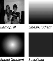
- Populate the
fillproperty with a LinearGradient, but add a LinearGradient tag as a child of the fill tag. Specify arotationof90for the gradient.<s:Rect id="fill" left="1" right="1" top="1" bottom="1">
<s:fill>
<s:LinearGradient rotation="90">
</s:LinearGradient>
</s:fill>
</s:Rect>This creates an instance of the LinearGradient class and instructs the gradient to rotate 90 degrees from its standard top-to-bottom approach, so the gradient will appear left to right. All that remains is to instruct the gradient about the elements it will gradate between.
- Create as children of the LinearGradient tag two instances of the GradientElement class. Both should have a color of white (
0xffffff); the differences will be the colors in the various states. The first Gradient should have an over color of white and a down color of olive green (0xafbcac). The second should have a light olive green (0xdfecdc) as both the over and down color.<s:Rect id="fill" left="1" right="1" top="1" bottom="1">
<s:fill>
<s:LinearGradient rotation="90">
<s:GradientEntry color="0xffffff"
color.over="0xffffff"
color.down="0xafbcac"
alpha="1" />
<s:GradientEntry color="0xffffff"
color.over="0xdfecdc"
color.down="0xdfecdc"
alpha="1" />
</s:LinearGradient>
</s:fill>
</s:Rect>The ButtonSkin is told by the Button when the user is over it, or when the user presses down. You have taken advantage of that information by altering the color of your button’s fill in these different states.
- Save and run the application.

The Flex Grocer button now visually reacts to the users’ gestures, giving them a much clearer indication that they can interact with it.
Now that you understand how to create a custom skin for a spark button, you are going to create another button skin; this one will be applied to all the other buttons in the application.
- Right-click the skins package and choose New > MXML Skin.
- Name the skin FlexGrocerButtonSkin, specify spark.components.Button as the Host component, and create it as a copy of spark.skins.spark.ButtonSkin.

- In FlexGrocerButtonSkin.mxml, scroll down to the
<s:Rect>tag with theidoffill. Find the first GradientEntry in the LinearGradient. Change the color to be pale green (0xf3fbf4), the over color to be a light olive green (0xdfecdc), and the down color to be a darker green (0x6aa95f). For the second GradientEntry, use a spring green as the color (0xd4f1d8) and a light olive green (0xdfecdc) for the over and down colors. Leave the defaultalphaof.85for both.<s:Rect id="fill" left="1" right="1" top="1" bottom="1" radiusX="2">
<s:fill>
<s:LinearGradient rotation="90">
<s:GradientEntry color="0xf3fbf4"
color.over="0xdfecdc"
color.down="0x6aa95f"
alpha="0.85" />
<s:GradientEntry color="0xd4f1d8"
color.over="0xdfecdc"
color.down="0xdfecdc"
alpha="0.85" />
</s:LinearGradient>
</s:fill>
</s:Rect>This will allow the buttons to use various greens, in keeping with the color palette of the application.
- Delete the next five rectangles.
The design for the application’s buttons do not require a lowlight, highlight, or highlight stroke.
- The next Rect down has an
idofborder. Remove the child tags for the stroke from the Rect, and replace them with an instance of the SolidColorStroke class. Specify acolorof the SolidColorStroke to be mint green (0x8eb394) with analphaof1and adisabled alphaof.5.<s:Rect id="border" left="0" right="0" top="0" bottom="0" width="69"
height="20" radiusX="2">
<s:stroke>
<s:SolidColorStroke color="0x8eb394" alpha="1" alpha.disabled="0.5"/>
</s:stroke>
</s:Rect>Rather than using the complex linear gradient native to the ButtonSkin class, the FlexGrocerButtonSkin simply has a mint green border, which becomes more transparent when disabled.
There are a few references to the rectangles you removed in the class’s
updateDisplayList()method which must be removed or you’ll encounter compile-time errors. - Scroll up to the
<fx:Script>block and find theupdateDisplayList()method. - Remove the lines that set the
radiusXproperty of the lowlight, highlight, highlightStroke, hldDownStroke1, and hldDownStroke2 rectangles. The revisedupdateDisplayList()should read like this:override protected function updateDisplayList(unscaledWidth:Number,
unscaledHeight:Number) : void
{
var cr:Number = getStyle("cornerRadius");
if (cornerRadius != cr)
{
cornerRadius = cr;
shadow.radiusX = cornerRadius;
fill.radiusX = cornerRadius;
border.radiusX = cornerRadius;
}
super.updateDisplayList(unscaledWidth, unscaledHeight);
}As those rectangles are no longer in existence, you need to remove any references to them in the code.
The ButtonSkin is now complete; next you’ll apply the skin to all Spark Buttons by using the CSS file.
- Save and close FlexGrocerButtonSkin, and then open defaultStore.css from the assets directory.
- After the end of the
s|Application:checkoutstyle declaration but before the start of theProductListLabel declaration, add a new Type Selector for the Spark Button class.s|Application:checkout {
backgroundColor:#BBC8B8;
}
s|Button {
}
components|ProductList s|Label {
color: #013FAC;
} - Define a
skin-classstyle property for the Button to use a class reference to the newly createdskins.FlexGrocerButtonSkin.s|Button{
skin-class:ClassReference('skins.FlexGrocerButtonSkin'),
}The ClassReference allows the CSS file to provide the StyleManager with a reference to your skin class. As you explore further in Flex, you’ll find the ClassReference syntax is used any time you are providing an ActionScript class as a value for a style property.
- Still in the Spark Button style declaration, specify a
color(meaning font color) of#1111b9and acorner-radiusof5.s|Button{
skin-class:ClassReference('skins.FlexGrocerButtonSkin'),
color:#1111b9;
corner-radius:5;
} - Save the CSS file and run the application. You should find the new look and feel in use throughout the application for buttons that don’t already have their styles set more explicitly.

Creating a Skin for the Application
As you might imagine, skins don’t apply only to buttons; larger, more complex components have skins as well. As mentioned earlier in the chapter, each Flex component has its look determined by the skins associated with it, and using the Spark components, you can easily customize any of them.
In this exercise, you’ll create a skin for the Application component.
- Open FlexGrocer.mxml. In the root
<s:Application>tag, add askinClassattribute. If you use the code-hinting feature, you’ll find Flash Builder presents you with a list of skins or an option to create a new skin. (If you don’t see the code-hinting, press Ctrl-Spacebar while your cursor is between the open and closing quotes of the attribute.) Choose the Create Skin option.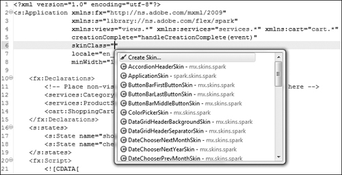
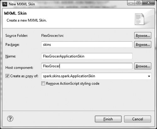
- In the New MXML Skin dialog box, specify skins as the package, FlexGrocerApplicationSkin as the Name, and FlexGrocer as the Host component, and leave the other choices at their default values. Click Finish and save FlexGrocer.mxml.
Just like the other skins you created earlier in the lesson, this skin will be created in the skins package, and you’ll start with the native Spark ApplicationSkin.
- In the new FlexGrocerApplicationSkin file, find the Rect just below the comment that reads
<!-- layer 0: control bar highlight -->. Remove the LinearGradientStroke being used as the stroke of that Rect, and remove its child tags. In its place add a SolidColorStroke with a light olive green color (0xdfecdc).<!-- layer 0: control bar highlight -->
<s:Rect left="0" right="0" top="0" bottom="1" >
<s:stroke>
<s:SolidColorStroke color="0xdfecdc"/>
</s:stroke>
</s:Rect>For this application, the gradient stroke is not necessary; instead, a simple solid color stroke in the palette of the application will work fine.
- Find the next Rect in the file, which will have the comment
<!-- layer 1: control bar fill -->just above it. Change thetopattribute from1to32.<s:Rect left="1" right="1" top="32" bottom="2" >
<s:fill>
<s:LinearGradient rotation="90">
<s:GradientEntry color="0xEDEDED" />
<s:GradientEntry color="0xCDCDCD" />
</s:LinearGradient>
</s:fill>
</s:Rect>You’ll soon be adding a different rectangle above the control bar area, so here you are going to limit the background for the control bar area to start 32 pixels from the top of the application.
- Still in the control bar fill Rect, remove the LinearGradient (and its child tags) used as the fill, and replace it with a SolidColor with a color value of white (
0xffffff).<!-- layer 1: control bar fill -->
<s:Rect left="1" right="1" top="32" bottom="2" >
<s:fill>
<s:SolidColor color="0xffffff"/>
</s:fill>
</s:Rect>Again, the native colors and gradients used as a background for the control bar group of a Flex application do not match the palette for the FlexGrocer application. Instead, a simple solid white background will work better.
- Find the next Rect down, which has the comment
<!-- layer 2: control bar divider line -->above it. Change the color of the SolidColor fill from black (0x000000) to light olive green (0xdfecdc).<!-- layer 2: control bar divider line -->
<s:Rect left="0" right="0" bottom="0" height="1" alpha="0.55">
<s:fill>
<s:SolidColor color="0xdfecdc" />
</s:fill>
</s:Rect>You are once again replacing the default Flex colors with those matching your application.
- After the end of the control bar divider line Rect, add a new Rect, with
x,y,left, andrightattributes set to0, and aheightof32.<s:Rect x="0" y="0" left="0" right="0" height="32">
</s:Rect>This Rect will define a new area above the top navigation, which will house the company’s motto.
- Add a
fillproperty to the rectangle. Populate the fill with a LinearGradient rotated 90 degrees. Add two GradientEntries to the LinearGradient. The first GradientEntry should have a Kelly green color (0x439235) with analphaof1. The second GradientEntry should have a dark Kelly green color (0x2E6224) with analphaof1.<s:Rect x="0" y="0" left="0" right="0" height="32">
<s:fill>
<s:LinearGradient rotation="90">
<s:GradientEntry color="0x439235" alpha="1"/>
<s:GradientEntry color="0x2e6224" alpha="1"/>
</s:LinearGradient>
</s:fill>
</s:Rect>The gradient fill in this rectangle will act as a background for the FlexGrocer tag line, which will appear at the top of the application.
- Just below this rectangle, add a Label with the text The Freshest, Easiest Way to Buy Groceries. Set the
topandrightattributes to10. Specify a color of white (0xffffff) and a 20 pointfontSize:<s:Label text="The Freshest, Easiest Way to Buy Groceries"
right="10" top="10"
color="0xffffff"
fontSize="20" />This label will be positioned in the top-right corner, on top of the gradient green background you created.
- Find the Group under the comment
<!-- layer 3: control bar -->.Adjust thetopattribute to a value of32.<s:Group id="controlBarGroup"
left="0" right="0"
top="32" bottom="1"
minWidth="0" minHeight="0">By setting the
topvalue to32, you ensure the content of the controlGroup will be placed only over the white background, not over the green gradient. - Save FlexGrocerApplicationSkin. Open and run FlexGrocer.
What You Have Learned
• Learned about skins in a Spark component (pages 400–404)
• Learned about the relationship between skins and components (pages 404–407)