
Lesson 3: Laying Out the Interface
In this lesson, you will:
• Use containers
• Lay out an application in Source view
• Work with constraint-based layouts
• Work with view states
• Control view states
• Lay out an application in Design view
• Refactor code as needed
Every application needs a user interface, and one of the strengths of Adobe Flash Builder is that it enables developers to lay out their application’s interface with ease. In this lesson, you will learn about containers and layout objects in Flex, what differentiates them, and how to use them when laying out your applications. Finally, you will use view states to make the applications dynamically change to react to users’ actions.
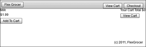
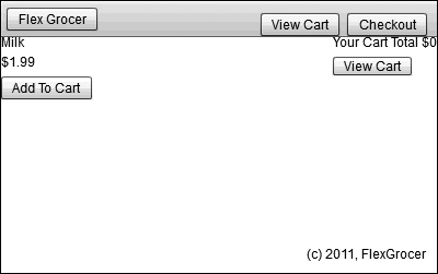
The user interface for the e-commerce application
Learning About Layouts
Almost all positioning of components in Flex is done using containers and layout objects.
Working with a kitchen analogy for the moment, you can think of the container as a food processor without a blade. There are different food processors with different features on the market, and you need to choose one that works best for your application.
You can think of layout objects as blades that can be inserted into a food processor to slice, dice, and chop. Neither the processor nor the blade is useful without the other, but when they’re assembled, they’re a powerful tool. The same is true of containers and layout objects.
Understanding Containers
On a technical level, containers are simply a special type of component that contains and groups other items. These items are collectively referred to as children or, more specifically, as layout elements (which is just a broad term for components such as Buttons, Checkboxes, and the like) and graphical elements (such as squares, circles, and so on). Although containers know how to group and keep these items together, they do not know the position or order of those items on the screen. When you select a container type to use, you will do so based on a number of criteria; however, the most fundamental is its ability to be skinned.
Skinning is the process of defining the visual appearance of a component. In terms of a container, you can think of the visual appearance as including things such as backgrounds, borders, drop shadows, and so on. Some containers in Flex can be skinned, meaning you can define how they appear on the screen. Other containers exist only to ensure that their children are grouped; they do not have a visual display of their own.
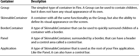
There are several more Flex containers, including DataGroup and SkinnableDataContainer, in addition to several specialized containers, such as Form, which will be used in the coming lessons. However, those containers follow a slightly different layout metaphor, so they will be introduced a bit later when their specific use can be explained more clearly.
Understanding Layout Objects
Layout objects work with containers (and other types of objects, as you will learn in later lessons) to determine how the grouped items of a container should appear on the screen. Flex provides a number of layout objects by default and allows you to create your own layout objects for complete customization.

Combining Containers and Layout Objects
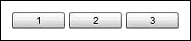
Once you have chosen a container and a layout object, you assemble them in MXML to produce the desired effect. Look at the following examples of setting a layout object using the layout property to control the positioning of the buttons.
<s:Group>
<s:layout>
<s:HorizontalLayout/>
</s:layout>
<s:Button label="1"/>
<s:Button label="2"/>
<s:Button label="3"/>
</s:Group>
<s:Group>
<s:layout>
<s:VerticalLayout/>
</s:layout>
<s:Button label="1"/>
<s:Button label="2"/>
<s:Button label="3"/>
</s:Group>

If you do not specify a layout object, BasicLayout is used, meaning you must specify x and y positions for each button or they will all default to appear at the origin coordinates (0,0).
Scrolling Content
You will occasionally find a situation in an application in which it is desirable to scroll the contents of a group. In previous versions of Flex, every container had this functionality by default. While extremely convenient for the developer, it also meant that every container was burdened with this extra code even though it was hidden the vast majority of times. In the latest versions of Flex, you need to specifically indicate when an area is scrollable. This is accomplished via a special tag named Scroller that wraps your Group tag.
<s:Scroller height="65">
<s:Group>
<s:layout>
<s:VerticalLayout/>
</s:layout>
<s:Button label="1"/>
<s:Button label="2"/>
<s:Button label="3"/>
</s:Group>
</s:Scroller>

Just wrapping the Group in a Scroller will not necessarily make a scroll bar appear. The Scroller will add scroll bars (vertical, horizontal, or both) as needed when there is not enough room to display the Group at full size. In the previous example, the height of the Scroller is specifically set to 65 pixels to ensure that a vertical scroll bar appears. If you do not set specific width and heights, then Flex will always try to fit the whole Group on the screen first and will resort to scrolling only if that is not possible.
Decoding MXML Tags
Before you begin the exercise in the next section, there is an important concept to learn. It is the difference between class instances and properties in MXML. If you look at the code snippet from the previous section, you will see a Flex button defined in MXML. Right now the label property of that Button is defined as an attribute of the Button’s XML tag:
<s:Button label="3"/>
However, in MXML, you are also allowed to define this same property using child tags. In that case, the code would appear as follows:
<s:Button>
<s:label>3</s:label>
</s:Button>
These two ways of defining the classes will yield identical results on the screen. After you have used Flex for a while, it will become a natural part of your development process to choose the correct syntax in a given situation; however, it can be very confusing when you are new to the language.
Now, how do you know, regardless of the definition style, which is a property and which is a class? The key to decoding this logic is to watch the case of the first letter after the namespace (after s: in this example). When the first letter is uppercase, such as the B in Button, the code is referring to a new instance of a class. When the first letter is lowercase, such as the l in label, you are setting a property of an instance of a class.
If you consider a slightly larger example from the previous code:
<s:Group>
<s:layout>
<s:VerticalLayout/>
</s:layout>
<s:Button label="1"/>
<s:Button label="2"/>
<s:Button>
<s:label>3</s:label>
</s:Button>
</s:Group>
The G in the <s:Group> tag is uppercase, so it refers to an instance of a Flex class named Group. The l in the <s:layout> tag is lowercase, so it is a property of the Group. The V in the <s:VerticalLayout> tag is uppercase, so it is referring to a new instance of a Flex class named VerticalLayout.
If you were to translate the code into words, it would read as follows: Create an instance of the Group class. Set the layout property of that Group instance to a new instance of the VerticalLayout class. Add three Buttons to that Group with the labels 1, 2, and 3, respectively.
Make sure this section makes complete sense before continuing in the book. If you ensure you understand these points, the rest of this lesson will be smooth sailing. If you are unsure, the remainder can be a very disheartening experience.
Laying Out the E-Commerce Application
The e-commerce application of FlexGrocer is the means through which customers shop for groceries. The top region of the application’s user interface displays the store logo as well as navigation links that appear throughout the application. Below that is a series of clickable icons that users can use to browse the various categories of groceries (dairy, meat, fruit, and so on). Below the icons is an area for displaying products.
In this lesson, you will use both Design view and Source view to begin laying out the application. Design view is a powerful feature of Flash Builder but can be a very frustrating experience, especially when you are new to it. It is often very difficult to get objects to align correctly or to be placed inside the intended container on the screen. Therefore, you’ll also see a code sample for everything you do in Design view. If your interface does not look like the one in the book as you proceed, feel free to switch to Source view and make the changes before switching back to Design view.
Starting Your Layout in Source View
The first steps of laying out your new application will be done in Source view as you define the area of your application that will hold the logo and some navigation elements.
- Open the FlexGrocer.mxml file that you created in the previous lesson.
Alternatively, if you didn’t complete the previous lesson or your code is not functioning properly, you can import the FlexGrocer.fxp project from the Lesson03/start folder. Please refer to the appendix for complete instructions on importing a project should you skip a lesson or if you have a code issue you cannot resolve.
- Ensure that Flash Builder is in Source view.
To switch between Design view and Source view in Flash Builder, click the buttons in the title bar near the top of the window.
- Find and delete the Label tag with the text “My First Flex Application” that you added in the last lesson.
- Insert a new controlBarLayout tag pair in place of the Label tag you just removed.
<s:controlBarLayout>
</s:controlBarLayout>This tag starts with a lowercase letter, indicating that it is a property of the Application object.
A control bar is a section of a container that is visually distinctive. In this application, you are going to use the control bar to hold a logo and some buttons for navigation.
- Immediately inside the controlBarLayout tag pair, place a self-closing
<s:BasicLayout>tag.<s:controlBarLayout>
<s:BasicLayout/>
</s:controlBarLayout>Remember, a self-closing tag simply means that instead of having an open tag and a close tag like the controlBarLayout, you have just a single tag that ends in a forward slash and a greater than sign (
/>).Adding the
<s:BasicLayout/>tag tells the Application that you want to use absolute positioning inside the control bar for this application. In other words, you will take responsibility for positioning the x- and y-coordinates of the items inside it. - Directly below the controlBarLayout tag pair, add a new tag pair named
<s:controlBarContent>.Inside this tag, you will define which items should appear in the control bar.
- Add a Button tag inside the controlBarContent tag pair and set its
labelproperty to Flex Grocer.<s:Button label="Flex Grocer"/>
Setting the
labelproperty of this Button will make it display “Flex Grocer” on the screen. Because you added this Button inside thecontrolBarContenttag pair, the Button will appear in the control bar area of the application.Ensure that your code looks like the following sample before continuing:
<?xml version="1.0" encoding="utf-8"?>
<s:Application xmlns:fx="http://ns.adobe.com/mxml/2009"
xmlns:s="library://ns.adobe.com/flex/spark"
minWidth="955" minHeight="600">
<fx:Declarations>
<!-- Place non-visual elements (e.g., services, value objects) here -->
</fx:Declarations>
<s:controlBarLayout>
<s:BasicLayout/>
</s:controlBarLayout>
<s:controlBarContent>
<s:Button label="Flex Grocer"/>
</s:controlBarContent>
</s:Application> - After verifying that your code looks like the example, save the FlexGrocer.mxml file and make sure you do not have any errors in the Problems view.
- Choose FlexGrocer from the Run menu to execute your application in the web browser.

When your application launches, you should see a gray block near the top of the screen. This is the control bar. Inside that control bar you should see a single button with the words “Flex Grocer”. While the application may not do much yet, you have actually defined several properties, used a layout object, and added a child object to a container. It will get easier and faster from here. When you are finished admiring your work, close the web browser and get ready to learn about Design view.

Continuing Your Layout in Design View
You have already defined a portion of your application layout using MXML, but you will now use Design view to add several more elements and to define their properties.
- Switch Flash Builder to Design view.

To switch between Design view and Source view in Flash Builder, click the buttons in the title bar at the top of the window. You will see a visual representation of your work so far.
- Start by clicking anywhere in the large white background area of the screen.
The Properties panel on the right side of the screen should change so that s:Application is the heading. This is where you will set all component properties while in Design view.
If the Properties panel is not currently visible on your screen, choose Window > Perspective > Reset Perspective (or Window > Reset Perspective on MacOS). This will reset your Design view options to the default settings and display the Properties panel.
- Click the Flex Grocer Button instance that you positioned in the previous exercise.
When you click the Button, the Properties panel on the right side of the screen will change to read s:Button, indicating that the Button you just selected is now being configured.
- Toward the bottom of the Properties view, expand the Size and Position category by clicking the triangle next to the word Size (you may need to scroll down depending on your screen resolution). There are text boxes for Width, Height, X, and Y. Use the X and Y fields to set the x-coordinate to 5 and the y-coordinate to 5.
When you change the y-coordinate, the control bar will grow to accommodate the position of the Button. Later in the book, you will apply styles to set the company logo colors and size. For now, you are just placing the Button in the appropriate position. This is an example of using absolute-coordinates positioning.
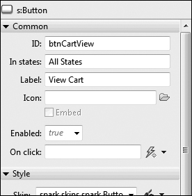
- Find the Components view; by default this will be in the lower-left corner of your screen. Open the Controls folder by clicking the triangle next to the word Controls, and drag a Button control to the control bar so the Button control is positioned near the right edge of the control bar. In the Properties view, give the Button control the ID btnCartView and the label View Cart.
A blue bar will appear, indicating where other components exist horizontally or vertically from your position. This line will aid you in quickly lining up multiple components.
Don’t worry about the exact x and y placement. Later in this lesson, you will learn how to use a constraint-based layout to position the button so that its right edge is always 10 pixels from the right edge of the Application object.
- Drag a second Button control to the control bar, just to the left of the first Button control. In the Properties view, give the new Button control the ID btnCheckout and the label Checkout.
FlexGrocer users will click this button to indicate that they are finished shopping and want to complete the purchase of the selected products. Again, the exact placement will happen later in this lesson, when you learn about constraint-based layout.
- Drag a Label control from the Controls folder and place it near the bottom-right edge of the screen. Double-click the Label and set the
textproperty to (c) 2011, FlexGrocer.Much like the Button controls you just added, you needn’t worry about the exact placement of the Label control because it will be handled later with constraints.
- In the Components panel, collapse the Controls folder and expand the Layout folder.
- Drag a Group container from the Layout folder of the Components view and place it in the large white area below the control bar. Use the Properties panel to set the ID of the Group to bodyGroup. Then set both the height and width properties to 100% and the x- and y-coordinates to 0.
- With the bodyGroup still selected, scroll to the bottom of the Properties panel. You will see a Layout drop-down menu. Choose spark.layouts.HorizontalLayout, indicating that you would like this Group to arrange its children horizontally.
This Group will hold the product details and shopping cart for the application. Remember that a Group with a HorizontalLayout displays its children horizontally. You will have products shown on the left and the shopping cart displayed on the right.
- Drag another Group container from the Layout folder of the Components view and drop it inside the existing Group that you named bodyGroup. In the Properties view, give this new Group the ID products and then assign a height of 150 and width of 100%.
- At the bottom of the Properties panel, assign the new Group a spark.layouts.VerticalLayout, indicating that you would like this Group to arrange its children vertically.
This vertical group will hold the details for a product.
- Before continuing, switch to Source view and ensure that your code matches the following code. If any tags are different or missing, fix them before continuing. It is okay if your code has slightly different values for the
xandyproperties of the Checkout Button, View Cart Button, and Label, as you have not set those yet.<?xml version="1.0" encoding="utf-8"?>
<s:Application xmlns:fx="http://ns.adobe.com/mxml/2009"
xmlns:s="library://ns.adobe.com/flex/spark"
minWidth="955" minHeight="600">
<fx:Declarations>
<!-- Place non-visual elements (e.g., services, value objects) here -->
</fx:Declarations>
<s:controlBarLayout>
<s:BasicLayout />
</s:controlBarLayout>
<s:controlBarContent>
<s:Button label="Flex Grocer" x="5" y="5" />
<s:Button id="btnCartView" x="463" y="10" label="View Cart"/>
<s:Button id="btnCheckout" x="541" y="10" label="Checkout"/>
</s:controlBarContent>
<s:Label x="500" y="546" text="(c) 2011, FlexGrocer"/>
<s:Group id="bodyGroup" x="0" y="0" width="100%" height="100%">
<s:layout>
<s:HorizontalLayout/>
</s:layout>
<s:Group id="products" width="100%" height="150">
<s:layout>
<s:VerticalLayout/>
</s:layout>
</s:Group>
</s:Group>
</s:Application>
 Note
Note
 Tip
TipDefining the Product Section
Once you verify that your source code matches the example code, switch back to Design view, where you will continue defining the product section. Now, you will begin defining the controls that will eventually represent all the products in your online grocery store.
Sometimes when switching between Source and Design views, you can lose track of the Flash Builder Properties panel in Design view. If this panel ever goes missing, simply choose Windows > Properties (Window > Show View > Properties on Mac OS) to bring it back.
- Drag a Label control from the Controls folder of the Components view to the vertical Group to which you assigned the ID of products in the previous exercise. When looking at Design view, this vertical group will have a faint border starting directly below the control bar and continuing down for 150 pixels, where it crosses the screen. You can drop the Label anywhere in this area.
- Set the ID of the Label control to prodName and the Text property to Milk.
- Drag a second Label control below the first one. Give the second one the ID price and set $1.99 as the Text.
Because these new Label controls are children of the Group container, and the Group has a VerticalLayout object, the product name appears above the price of the product.
If you open Outline view by clicking the Outline tab (this is adjacent to the Components tab you have been using so far), you can see the hierarchy of your application. The root is the Application tag, which contains a Label (copyright) and a Group named bodyGroup as children along with controlBarContent and a controlBarLayout as properties. You can also see the various children of the controlBarContent and the bodyGroup. If you expand the Group named products, you will see the two labels you just added. This is a useful view if you want to make a change to a component. But, it can be difficult to select just the products Group in Design view. Click Outline view to easily select the products Group.
- Add a Button control below the two Label controls, with an ID of add and the label Add To Cart.
For each product, you want the name of the product and its price to be displayed. The add Button gives users the ability to add a product to their shopping cart. Because the two Label controls and the Button control are in a group with a vertical layout, they appear one above the other. You’ll add functionality for the Button control in a later lesson.
- Save the file and click Run.
You can clearly see the difference between elements in the control bar section and those in the body.

Working with Constraint-Based Layouts
Flex supports constraint-based layouts that let you arrange elements of the user interface with the freedom and pixel-point accuracy of absolute positioning while being able to set constraints to stretch or move the components when the user resizes the window. This method of controlling the size and position of components is different from laying out nested containers (like the Group containers in the previous exercise).
In constraint-based layouts, all the controls are positioned in relation to the edges of a parent container, which has been set with a BasicLayout to allow absolute positioning. With the exception of some specialized containers such as Form (which you will use in subsequent lessons), you can use the BasicLayout on any Group or SkinnableContainer, including Application and Panel.
Containers using a BasicLayout object require that elements be positioned to absolute coordinates; however, layout constraints allow users to dynamically adjust the layout based on the window size of their browsers. For example, if you want a label to always appear in the bottom-right corner of an application regardless of the browser size, you can anchor the control to the right edge of the parent container. The control’s position is then always maintained relative to the right edge of the parent container.
In Flex, this is accomplished via layout anchors. They are used to specify how a control should appear relative to the edge of the parent container. To ensure that a control is a certain distance from the bottom and right edges, you will select the check boxes below and to the right of the control in the Constraints area in the Layout section of the Properties view, and use the text boxes to specify the number of pixels away from the edge of the container where you want the control constrained.
Flex allows constraints from the top, vertical center, bottom, left, horizontal center, or right of a container.
All constraints are set relative to the edges of the container, as long as the container uses absolute positioning (BasicLayout). Constraints cannot be set relative to other controls or containers.
- Open the FlexGrocer.mxml file that you used in the previous exercise.
Alternatively, if you didn’t complete the previous lesson or your code is not functioning properly, you can import the FlexGrocer-PreConstraints.fxp project from the Lesson03/intermediate folder. Please refer to the appendix for complete instructions on importing a project should you skip a lesson or if you have a code issue you cannot resolve.
- Ensure that you are in Design view, then find and select the Checkout Button. Toward the bottom of the Properties view, in the Constraints area of the Size and Position section, add a constraint so the right edge of the Button is 10 pixels away from the right edge of the container. Make sure that the Y position of this control is set to 10 pixels.
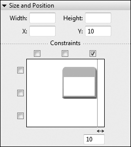
To set a constraint from the right edge, click the rightmost check box above the button icon in the Constraints area. In the text box that appears, enter the number of pixels away from the edge you want the button to be. If the label seems to disappear from the screen, check the scroll bars on the bottom of Design view. By default, Design view shows you just a portion of the application, and you may need to scroll occasionally to find what you need.
- Find and select the View Cart Button. Add a constraint so that the right edge of the button is 90 pixels from the right edge of the container. Make sure that the Y position of this control is set to 10 pixels.
You now have it set so that, regardless of the width of the browser, the two navigation buttons are always anchored relative to the top-right edge of the container.
- Find and select the Label control (outline view may be very helpful if you have trouble selecting this otherwise) with the copyright notice. Constrain this Label so that it is 10 pixels above the bottom and 10 pixels away from the right edge of its container. Click the check box in the top-right corner of the Constraints area, and enter 10 in the text box that appears. Also, click the bottom check box and enter 10 in the text box that appears.
Because the copyright label is below other containers, it is probably easiest to select it using the Outline view. These settings ensure that, regardless of the width of the Label control, its bottom-right edge will always be 10 pixels above and 10 pixels to the left of the bottom-right corner of the application.
If you switch to Source view, the entire file should look similar to the following:
<?xml version="1.0" encoding="utf-8"?>
<s:Application xmlns:fx="http://ns.adobe.com/mxml/2009"
xmlns:s="library://ns.adobe.com/flex/spark"
minWidth="955" minHeight="600">
<fx:Declarations>
<!-- Place non-visual elements (e.g., services, value objects) here -->
</fx:Declarations>
<s:controlBarLayout>
<s:BasicLayout />
</s:controlBarLayout>
<s:controlBarContent>
<s:Button label="Flex Grocer" x="5" y="5" />
<s:Button id="btnCartView" y="10" right="90" label="View Cart"/>
<s:Button id="btnCheckout" y="10" right="10" label="Checkout"/>
</s:controlBarContent>
<s:Label right="10" bottom="10" text="(c) 2011, FlexGrocer"/>
<s:Group id="bodyGroup" x="0" y="0" width="100%" height="100%">
<s:layout>
<s:HorizontalLayout/>
</s:layout>
<s:Group id="products" width="100%" height="150">
<s:layout>
<s:VerticalLayout/>
</s:layout>
<s:Label id="prodName" text="Milk"/>
<s:Label id="price" text="$1.99"/>
<s:Button id="add" label="Add To Cart"/>
</s:Group>
</s:Group>
</s:Application>Your code may differ slightly, depending on the order in which you added the items and set properties. Don’t worry; the order isn’t particularly important in this case. Every container and control that you added in Design view is represented by a tag in Source view. When you add elements inside a container, they appear as child tags to the container’s tag. Also note that the layout constraints are set as attributes of the related component.
- Switch back to Design view and insert a second Group container in the bodyGroup container, to the right of the products (the bodyGroup is the first container you added whose width and height are set to 100%). Set the ID of the new Group to cartGroup, clear the Width property so it is blank, and set the Height to 100%. Remember, you can always choose the bodyGroup from the Outline view if you have difficulty finding it.
If you accidentally place the new Group in the wrong container, the easiest fix is to switch to Source view and move the tags yourself. The code in Source view for this area should look like this:
<s:Group id="bodyGroup" x="0" y="0" width="100%" height="100%">
<s:layout>
<s:HorizontalLayout/>
</s:layout>
<s:Group id="products" width="100%" height="150">
<s:layout>
<s:VerticalLayout/>
</s:layout>
<s:Label id="prodName" text="Milk"/>
<s:Label id="price" text="$1.99"/>
<s:Button id="add" label="Add To Cart"/>
</s:Group>
<s:Group id="cartGroup" height="100%">
</s:Group>
</s:Group> - In Design view, set the layout of the cartGroup container to VerticalLayout.
If you can’t find the cartGroup, remember to choose it from the Outline view and scroll in the Design view window until you see the highlighted container.
- Add a Label control in the cartGroup container with the
textproperty set to Your Cart Total: $0.To the right of the products, there will always be a summary of the shopping cart, indicating whether there are items in the cart and what the current subtotal is.
At this point you have set the products container to take 100% of the space, but then you added the cartGroup to its right and added a Label. Isn’t that a problem, as you are now using more than 100%? Flex enables you to assign more than 100% total width or height for a container. Flex containers take this into account and divide the space proportionally based on the requested percentages. Because more space was requested than is available, each request receives a relative portion based on the available space. If any elements were assigned a fixed width (that is, a number of pixels instead of a percentage), the fixed size requests are subtracted from the available space before any relative size requests are allocated.
- From the Controls folder of the Components view, drag a Button control below the newest Label control and set the
labelproperty of the Button to View Cart.This Button shows users the full contents of their shopping cart.
If you accidentally place any components in the wrong container, switch to Source view and move the tags yourself. The code in Source view for this area should look like this:
<s:Group id="bodyGroup" x="0" y="0" width="100%" height="100%">
<s:layout>
<s:HorizontalLayout/>
</s:layout>
<s:Group id="products" width="100%" height="150">
<s:layout>
<s:VerticalLayout/>
</s:layout>
<s:Label id="prodName" text="Milk"/>
<s:Label id="price" text="$1.99"/>
<s:Button id="add" label="Add To Cart"/>
</s:Group>
<s:Group id="cartGroup" height="100%">
<s:layout>
<s:VerticalLayout/>
</s:layout>
<s:Label text="Your Cart Total $0"/>
<s:Button height="17" label="View Cart"/>
</s:Group>
</s:Group> - In Outline view, choose the Application. In the Properties panel, remove the Min width and Min height values of 955 and 600.
As the application runs, you can resize the browser and see that the buttons and bottom text are always properly constrained. A minimum width and height would prevent resizing from occurring on smaller screens.
- Save the file and click Run.
Working with View States
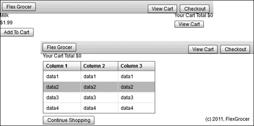
You can use Flash Builder to create applications that change their appearance based on the task the user is performing. For example, the e-commerce application starts by showing users the various products they can buy. When they start adding items to the cart, you want to add something to the view, such as the total cost, so users can get a feel for what is currently in the cart. Finally, users need a way to view and manage the full contents of the shopping cart.
Creating View States
In Flex, you can add this kind of interactivity with view states. A view state is one of several views that you define for an application or a custom component. Every MXML page has at least one state, referred to as the default state, which is represented by the default layout of the file.
Additional states are represented in the MXML as modified versions of the base view state or of other states.
- Open the FlexGrocer.mxml file that you used in the previous exercise.
Alternatively, if you didn’t complete the previous lesson or your code is not functioning properly, you can import the FlexGrocer-PreStates.fxp project from the Lesson03/intermediate folder. Please refer to the appendix for complete instructions on importing a project should you skip a lesson or if you have a code issue you cannot resolve.
- Ensure you are in Design view. If it is not already open, open the States view in Flash Builder.
If you don’t currently see the States view when you look at Flash Builder in Design view, you can add it to the view by choosing Window > States (Windows > Show View > States on Mac OS). Notice that there is already one state created to represent the default layout of the application.
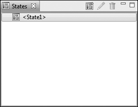
- Create a new state named cartView, which is a duplicate of
<State1>.You can create a state by clicking the New State icon
 at the top of the States view or by right-clicking in the view and selecting the New option. The cartView state will show users the details of all the items they have added to their cart. Leave the default options, and click OK.
 - With the new cartView state selected, click the products container and set its height and width to 0, then choose the cartGroup container and set its height and width values to 100%.
In the cartView state, the shopping cart will entirely replace the products in the center of the screen. Therefore, you will resize the products container to take up no space and resize the cartGroup container to take up all the available space.
At this point, the controls on your screen will be quite a mess. You will likely see an ugly combination of all the controls in the system on top of each other. This is a very important lesson. In Flex, the width and height properties are used to compute the location of items on the screen. In this case, you told Flex that the products container will not take any space, so Flex responded by moving the cartGroup container left to take the newly available space. However, not allocating space to an item on the screen does not ensure that it is invisible.
- Select the products container and change its
visibleproperty to false. You can do this by clicking the CategoryView of the Properties panel, finding thevisibleproperty, and changing its value to false.
- Ensure that the cartView state is still selected in States view and then drag a DataGrid control from the Controls folder of the Components view and drop it below the View Cart button. Set the ID of the DataGrid control to dgCart, and set the DataGrid control’s width to 100%.
In a later lesson, the DataGrid control will be used to show the user the full contents of the cart.
Make sure you are adding the DataGrid control to the cartGroup container. Your application and code will look a bit different if you accidentally add the DataGrid control before the cartGroup container.
If you look at the file in Source view, you should see that the DataGrid has been added to the following code:
<?xml version="1.0" encoding="utf-8"?>
<s:Application xmlns:fx="http://ns.adobe.com/mxml/2009"
xmlns:s="library://ns.adobe.com/flex/spark">
<s:states>
<s:State name="State1"/>
<s:State name="cartView"/>
</s:states>
<fx:Declarations>
<!-- Place non-visual elements (e.g., services, value objects) here -->
</fx:Declarations>
<s:controlBarLayout>
<s:BasicLayout />
</s:controlBarLayout>
<s:controlBarContent>
<s:Button label="Flex Grocer" x="5" y="5" />
<s:Button id="btnCartView" y="10" right="90" label="View Cart"/>
<s:Button id="btnCheckout" y="10" right="10" label="Checkout"/>
</s:controlBarContent>
<s:Label right="10" bottom="10" text="(c) 2011, FlexGrocer"/>
<s:Group id="bodyGroup" x="0" y="0" width="100%" height="100%">
<s:layout>
<s:HorizontalLayout/>
</s:layout>
<s:Group id="products" width="100%" height="150"
visible.cartView="false" width.cartView="0" height.cartView="0">
<s:layout>
<s:VerticalLayout/>
</s:layout>
<s:Label id="prodName" text="Milk"/>
<s:Label id="price" text="$1.99"/>
<s:Button id="add" label="Add To Cart"/>
</s:Group>
<s:Group id="cartGroup" height="100%"
width.cartView="100%">
<s:layout>
<s:VerticalLayout/>
</s:layout>
<s:Label text="Your Cart Total $0"/>
<s:Button height="17" label="View Cart"/>
<s:DataGrid includeIn="cartView" requestedRowCount="4">
<s:columns>
<s:ArrayList>
<s:GridColumn dataField="dataField1"
headerText="Column 1"></s:GridColumn>
<s:GridColumn dataField="dataField2"
headerText="Column 2"></s:GridColumn>
<s:GridColumn dataField="dataField3"
headerText="Column 3"></s:GridColumn>
</s:ArrayList>
</s:columns>
<s:typicalItem>
<fx:Object dataField1="Sample Data"
dataField2="Sample Data"
dataField3="Sample Data"></fx:Object>
</s:typicalItem>
<s:ArrayList>
<fx:Object dataField1="data1"
dataField2="data1"
dataField3="data1"></fx:Object>
<fx:Object dataField1="data2"
dataField2="data2"
dataField3="data2"></fx:Object>
<fx:Object dataField1="data3"
dataField2="data3"
dataField3="data3"></fx:Object>
<fx:Object dataField1="data4"
dataField2="data4"
dataField3="data4"></fx:Object>
</s:ArrayList>
</s:DataGrid>
</s:Group>
</s:Group>
</s:Application> - Save the file.
Note some of the new syntax added during this operation. First, in the DataGrid class, you will see the
includeInproperty, indicating that this control should appear on the screen only when in the cartView state. Second, the products container still has awidthof100%andheightof150; however, it also haswidth.cartView="0"andheight.cartView="0". This syntax instructs Flex to set those properties in the corresponding states.
Testing the file now shouldn’t show any differences because you haven’t added any ability for the user to toggle between the states. In the next exercise, you will add that navigational ability.
Controlling View States
Each MXML component has a property called currentState. You can use this property to control which state of the application is shown to a user at any given time.
- Open the FlexGrocer.mxml file that you used in the previous exercise.
Alternatively, if you didn’t complete the previous lesson or your code is not functioning properly, you can import the FlexGrocer-PreControl.fxp project from the Lesson03/intermediate folder. Please refer to the appendix for complete instructions on importing a project should you skip a lesson or if you have a code issue you cannot resolve.
- Switch to Design view and, if it is not already open, open the States view in Flash Builder and select State1 to set the current state.
You will add functionality to the default view state so that users can navigate to the other states of the application.
- Switch the Properties view to the Standard View mode, and choose the View Cart Button control from the cartGroup container. In the Properties view, set the
On click:property tothis.currentState='cartView'.Events such as the Button’s
clickwill be explored in detail in Lesson 5, “Handling Events.” The important thing to understand now is that when the user clicks the link, the view will change to the cartView state.
The state name is case sensitive and must exactly match the name as you typed it in the previous exercise. You should use single quotes around the state name when entering it in Design view; otherwise, Flash Builder will create escape code
(") for the double quotes, and your code will be confusing to read. - Choose the View Cart Button control from the control bar. In the Properties view, also set the
On click:property tothis.currentState='cartView'. You now have two ways to enter the cartView state. - Switch to the cartView state. Add a new Button control below the DataGrid control with the label set to Continue Shopping and the
clickproperty set tothis.currentState=''. Note this is a single open and single close quote, as opposed to one double quote.Setting
currentStateto an empty string resets the application to its default state. - Delete the View Cart Button that is inside the cartGroup from the cartView state.
When the user is viewing the cart, there is no need for a View Cart Button. You can delete the Button by selecting it in Design view and pressing Delete.
The completed application as shown in Source view should read as follows:
<?xml version="1.0" encoding="utf-8"?>
<s:Application xmlns:fx="http://ns.adobe.com/mxml/2009"
xmlns:s="library://ns.adobe.com/flex/spark">
<s:states>
<s:State name="State1"/>
<s:State name="cartView"/>
</s:states>
<fx:Declarations>
<!-- Place non-visual elements (e.g., services, value objects) here -->
</fx:Declarations>
<s:controlBarLayout>
<s:BasicLayout />
</s:controlBarLayout>
<s:controlBarContent>
<s:Button label="Flex Grocer" x="5" y="5" />
<s:Button id="btnCartView" y="10" right="90" label="View Cart"
click.State1="this.currentState='cartView'"/>
<s:Button id="btnCheckout" y="10" right="10" label="Checkout"/>
</s:controlBarContent>
<s:Label right="10" bottom="10" text="(c) 2011, FlexGrocer"/>
<s:Group id="bodyGroup" x="0" y="0" width="100%" height="100%">
<s:layout>
<s:HorizontalLayout/>
</s:layout>
<s:Group id="products" width="100%" height="150"
visible.cartView="false" width.cartView="0" height.cartView="0">
<s:layout>
<s:VerticalLayout/>
</s:layout>
<s:Label id="prodName" text="Milk"/>
<s:Label id="price" text="$1.99"/>
<s:Button id="add" label="Add To Cart"/>
</s:Group>
<s:Group id="cartGroup" height="100%"
width.cartView="100%">
<s:layout>
<s:VerticalLayout/>
</s:layout>
<s:Label text="Your Cart Total $0"/>
<s:Button includeIn="State1" height="17" label="View Cart"
click="this.currentState='cartView'"/>
<s:DataGrid includeIn="cartView" requestedRowCount="4">
<s:columns>
<s:ArrayList>
<s:GridColumn dataField="dataField1"
headerText="Column 1"></s:GridColumn>
<s:GridColumn dataField="dataField2"
headerText="Column 2"></s:GridColumn>
<s:GridColumn dataField="dataField3"
headerText="Column 3"></s:GridColumn>
</s:ArrayList>
</s:columns>
<s:typicalItem>
<fx:Object dataField1="Sample Data"
dataField2="Sample Data"
dataField3="Sample Data"></fx:Object>
</s:typicalItem>
<s:ArrayList>
<fx:Object dataField1="data1"
dataField2="data1"
dataField3="data1"></fx:Object>
<fx:Object dataField1="data2"
dataField2="data2"
dataField3="data2"></fx:Object>
<fx:Object dataField1="data3"
dataField2="data3"
dataField3="data3"></fx:Object>
<fx:Object dataField1="data4"
dataField2="data4"
dataField3="data4"></fx:Object>
</s:ArrayList>
</s:DataGrid>
<s:Button includeIn="cartView" label="Continue Shopping"
click="this.currentState=''"/>
</s:Group>
</s:Group>
</s:Application> - Save and test the application. You can now navigate between the states by clicking the buttons to which you added code.
 Caution
Refactoring
Refactoring is one of the least understood and most useful tools in a developer’s arsenal. It is particularly relevant for a Flex and ActionScript developer, because dynamic interfaces are often recombined with code during the prototype and development stages of a project.
Refactoring is simply the process of reorganizing your code in a way that is better suited to a long-term goal without changing the way it functions. Long-term goals might include increasing the maintainability of the software, modifying the architecture to make additional development steps easier, or simply changing the location and structure of the project to make it more understandable to a new developer. However, one thing is always true: At the end of a successful refactoring session, the changes will be imperceptible to an individual running the application who does not look at the source code. The application functions the same way.
Many developers find this notion and this process frustrating. Why would you want to spend time changing code you have already written if it makes no noticeable change in the application’s execution? The answers are varied, but here are a few important ones.
• Learning: Learning a new language and continuing to use it is an ongoing experience. You will be learning new things and techniques every day. That often leads to the realization that the code you wrote days, weeks, or months ago may be inefficient, or even ineffective in certain circumstances. Keeping a keen eye on what you have written in the past and being willing to revisit it often provides a more cohesive code base and tighter, more maintainable code.
• Duplication and redundancy: As you are developing, it is extremely common to need the same functionality in multiple places in your application. Usually due to time constraints, this code stays forever duplicated. One of the many problems with this is that later, when that code needs to change, you have to be sure to hunt down and fix all the places it is used. A willingness to avoid duplication and move shared code into new places as you continue developing can not only eliminate large headaches down the road, but can also makes your day-to-day development more efficient and faster.
• The big picture: Often it is difficult, if not impossible, to know how all the pieces in a system will fit together when you begin writing code. If these pieces written early in the process are set in stone, you will end up bending or breaking code down the line when you try to integrate. If you are comfortable with the idea of refactoring your code as needed throughout the process, you can hone your vision of the system as you progress, ending up with objects and structures that work more cohesively when they’re finished.
We have a couple of reasons for addressing refactoring here. First, many new developers to the Flex and ActionScript world attempt to apply a rigid approach to their development that does not include refactoring. Over the course of time, we have noticed that these developers, above all others, struggle against the language instead of learning to use it as a tool. We simply want you to avoid that pain.
Second, throughout this book you are going to be learning. In fact, quite often you are going to learn multiple techniques for accomplishing the same goal. It is not always feasible to introduce the one “right” way to do something from the beginning because these concepts tend to build upon each other. So, once you have learned enough to approach writing something in a new way, you will end up refactoring it. This provides two benefits: the ability to understand multiple ways to accomplish a goal (and hopefully the reasons why you would or would not use one or the other) and the ability to hone the code base into a final application with valid examples for reference.
That said, you are going to refactor the application you have built to date, to make it easier to maintain as you continue through this book.
Using Composed Containers
As you learned in this lesson, most containers in Flex accept a layout object that dictates the orientation of their children. This layout object is generally specified by adding a LayoutObject to a Group using the layout property, as the following example shows:
<s:Group>
<s:layout>
<s:HorizontalLayout/>
</s:layout>
<s:Button label="1"/>
<s:Button label="2"/>
<s:Button label="3"/>
</s:Group>
While this provides the utmost flexibility, it does require a little extra typing each time you create a new Group. In a small application this is not a very big issue; however, in a large application, adding layout objects to tens of thousands of Groups can become tedious. To solve this problem, Flex allows you to create new components composed of existing components and properties. You can then use these new constructs as shortcuts to desired functionality.
The Flex framework has prebuilt a few of these shortcuts in the form of two containers called VGroup and HGroup. In the following chart, the horizontal columns are functionally equivalent.

If you were to examine the VGroup and HGroup source code, you would find that they are little more than the Group you have already learned to use with the layout property preset for your use. In Lessons 9, “Breaking the Application into Components,” and Lesson 18, “Creating Custom ActionScript Components,” you will learn to create your own components wherever you see a similar opportunity to reuse code.
Refactoring Your Application
In this section, you will convert all the Groups with HorizontalLayouts to HGroups, and Groups with VerticalLayouts to VGroups. The goal of this exercise is to successfully change the internal structure of the application without changing its functionality.
- Open the FlexGrocer.mxml file that you used in the previous exercise.
Alternatively, if you didn’t complete the previous lesson or your code is not functioning properly, you can import the FlexGrocer-PreRefactor.fxp project from the Lesson03/intermediate folder. Please refer to the appendix for complete instructions on importing a project should you skip a lesson or if you have a code issue you cannot resolve.
- Switch to Source view.
- Find the group named bodyGroup and change it to an HGroup. Be sure to also change the closing tag for this group.
- Eliminate the tag for the
layoutproperty and theHorizontalLayoutobject from within thebodyGroup. - Find the
productsgroup and change it to aVGroup. Be sure to change the closing tag as well. - Eliminate the tag for the
layoutproperty and theVerticalLayoutobject from within theproductsgroup. - Repeat this process for the
cartGroup.When you are finished refactoring the application, your code should appear as follows:
<?xml version="1.0" encoding="utf-8"?>
<s:Application xmlns:fx="http://ns.adobe.com/mxml/2009"
xmlns:s="library://ns.adobe.com/flex/spark">
<s:states>
<s:State name="State1"/>
<s:State name="cartView"/>
</s:states>
<fx:Declarations>
<!-- Place non-visual elements (e.g., services, value objects) here -->
</fx:Declarations>
<s:controlBarLayout>
<s:BasicLayout />
</s:controlBarLayout>
<s:controlBarContent>
<s:Button label="Flex Grocer" x="5" y="5" />
<s:Button id="btnCartView" y="10" right="90" label="View Cart"
click.State1="this.currentState='cartView'"/>
<s:Button id="btnCheckout" y="10" right="10" label="Checkout"/>
</s:controlBarContent>
<s:Label right="10" bottom="10" text="(c) 2011, FlexGrocer"/>
<s:HGroup id="bodyGroup" x="0" y="0" width="100%" height="100%">
<s:VGroup id="products" width="100%" height="150"
visible.cartView="false" width.cartView="0" height.cartView="0">
<s:Label id="prodName" text="Milk"/>
<s:Label id="price" text="$1.99"/>
<s:Button id="add" label="Add To Cart"/>
</s:VGroup>
<s:VGroup id="cartGroup" height="100%"
width.cartView="100%">
<s:Label text="Your Cart Total $0"/>
<s:Button includeIn="State1" height="17" label="View Cart"
click="this.currentState='cartView'"/>
<s:DataGrid includeIn="cartView" requestedRowCount="4">
<s:columns>
<s:ArrayList>
<s:GridColumn dataField="dataField1"
headerText="Column 1"></s:GridColumn>
<s:GridColumn dataField="dataField2"
headerText="Column 2"></s:GridColumn>
<s:GridColumn dataField="dataField3"
headerText="Column 3"></s:GridColumn>
</s:ArrayList>
</s:columns>
<s:typicalItem>
<fx:Object dataField1="Sample Data"
dataField2="Sample Data"
dataField3="Sample Data"></fx:Object>
</s:typicalItem>
<s:ArrayList>
<fx:Object dataField1="data1"
dataField2="data1"
dataField3="data1"></fx:Object>
<fx:Object dataField1="data2"
dataField2="data2"
dataField3="data2"></fx:Object>
<fx:Object dataField1="data3"
dataField2="data3"
dataField3="data3"></fx:Object>
<fx:Object dataField1="data4"
dataField2="data4"
dataField3="data4"></fx:Object>
</s:ArrayList>
</s:DataGrid>
<s:Button includeIn="cartView" label="Continue Shopping"
click="this.currentState"/>
</s:VGroup>
</s:HGroup>
</s:Application> - Save the file and click Run.
You should have the same functionality with the View Cart Button as before and see absolutely no change in functionality, yet have slightly more maintainable code.
What You Have Learned
• Used containers and layout objects (pages 33–50)
• Begun an application layout in Source view (pages 51–53)
• Laid out an application in Design view (pages 53–58)
• Worked with constraint-based layouts (pages 58–63)
• Worked with view states (pages 63–67)