
InDesign Lesson 3: Working with and Formatting Text

This lesson covers the essential capabilities for importing, formatting, and flowing text using InDesign CC.
What you’ll learn in this lesson:
- • Importing text
- • Formatting text
- • Defining a font favorite
- • Using the Story Editor
- • New ways of searching the font menu
- • Applying Styles to text
Starting up
Before starting, make sure that your tools and panels are consistent by resetting your preferences. See “Resetting the InDesign workspace and preferences” in the Starting up section of this book.
You will work with several files from the id03lessons folder in this lesson. Make sure that you have copied the CClessons folder onto your hard drive from www.digitalclassroombooks.com/CC/DesignTools. See “Loading lesson files” in the Starting up section of this book for details. This lesson may be easier to follow if the id03lessons folder is on your desktop.
The project
In this lesson you will add text into your layout and import type created using a word processing program such as Microsoft Word. You will also use InDesign’s text controls to control text formatting as you create a layout for a fictitious magazine, Tech.
To view the finished project before starting, choose File > Open, navigate to the id03lessons folder, select id0301_done.indd, and then click Open. Choose View > Fit Page in Window or press Ctrl+0 (Windows) or Command+0 (Mac OS). After reviewing the layout, you can keep the lesson open for reference, or close it by choosing File > Close. You’ll use InDesign’s Typography workspace for this lesson. From the Workplace Switcher menu, choose Typography.
Adding text to your document
Text in an InDesign layout is always contained within a text frame. You can create text frames using the Type tool or use any of the other frame or shape tools to create an object that can easily be converted to a text frame. You can also add text into your layout that was created using other programs, such as Microsoft Word.
Creating a frame is usually the starting point for adding text to a layout. You’ll start by using the most efficient way to define a new text frame: clicking and dragging with the Type tool.
Creating a text frame
You will start by creating a new text frame and then enter text into the frame.
1 Choose File > Open. In the Open dialog box, navigate to the id03lessons folder, select the file id0301.indd, and then click Open. You’ll start by working on the first page of this document. If necessary, double-click the page 1 icon in the Pages panel to navigate to this page.
The lower-left section of page 1 has a listing of the stories featured in this issue. You will create a text frame above this box and add text to it.
 If necessary, use the Pages panel to navigate to the first page.
2 Choose the Type tool (![]() ) from the Tools panel. Position the cursor on the left edge of the page so it is at the margin guide, approximately one-half inch above the list of stories. Use your mouse to click and drag diagonally down and to the right to create a new text frame. Release the mouse when it is positioned just above the existing text frame that contains the list of stories. The new frame should be placed above the existing frame and the left and right edges should be similarly positioned to the corresponding edges of the existing frame
) from the Tools panel. Position the cursor on the left edge of the page so it is at the margin guide, approximately one-half inch above the list of stories. Use your mouse to click and drag diagonally down and to the right to create a new text frame. Release the mouse when it is positioned just above the existing text frame that contains the list of stories. The new frame should be placed above the existing frame and the left and right edges should be similarly positioned to the corresponding edges of the existing frame

Click and drag with the Type tool to create a new frame.
3 Type Inside this issue: into the text frame.
 If you need to reposition the text frame, choose the Selection tool (
![]() ) from the Tools panel, then click and drag the frame to move it. You can also use the frame handles to adjust the size of the frame. When using the Selection tool, you can switch to the Type tool (
) from the Tools panel, then click and drag the frame to move it. You can also use the frame handles to adjust the size of the frame. When using the Selection tool, you can switch to the Type tool (![]() ) by double-clicking a text frame.
) by double-clicking a text frame.
4 Choose File > Save As. In the Save As dialog box, navigate to the id03lessons folder and type id0301_work.indd in the File name (Windows) or Save as (Mac OS) text field. Click Save to save the file.
Changing character attributes
You can use the Control panel located at the top of the workspace to adjust text formatting. The Character Formatting Controls button ( ![]() ), and, below that, the Paragraph Formatting Controls button (
), and, below that, the Paragraph Formatting Controls button ( ![]() ) are located at the left side of the Control panel, and you can use them to switch between controls that affect either paragraphs or characters.
) are located at the left side of the Control panel, and you can use them to switch between controls that affect either paragraphs or characters.
 Additional character and paragraph formatting options are available through dedicated panels for formatting type. You can access these other options by choosing Type > Character, or Type > Paragraph.
Changing font and type styles using the new font search feature
You can make adjustments to text formatting using the Control panel which you’ll explore in this exercise.
1 Make sure you have the Type tool (![]() ) selected, then click and drag the text Inside this issue: to highlight it so that it is selected.
) selected, then click and drag the text Inside this issue: to highlight it so that it is selected.
![]()
The Character Formatting Controls.
In the Control panel at the top of the workspace, make sure the Character Formatting Controls icon ( ![]() ) is selected.
) is selected.
You will change the font by typing the font name to access it more quickly.

2 In the Font drop-down menu in the Control panel, click and drag to select (highlight) the font name and type Garam. The options available in the font menu are filtered to display only fonts that contain garam in the font name. Use the up and down arrow keys on your keyboard to navigate to the font Adobe Garamond Pro Regular, press Enter (Windows) or Return (Mac OS) to select this font and the text is formatted appropriately.
You will now change the type style to bold.
 To see how text in your document will appear when using a certain font, first select the text to be changed, then click to place the cursor in the Font drop-down menu in the Control panel. With the text in the document still selected, use the up- and down-arrows on your keyboard to apply different fonts to the text.
3 With the text still selected, locate the Font Style drop-down menu, under the menu where you changed the font in the previous step. Choose Bold from the Font Style drop-down menu. Your type now appears as bold Adobe Garamond Pro. Keep the text selected.
Use this drop-down menu to set the style of the font, such as bold, italic, or black. InDesign only makes available font styles that are installed on your computer. For example, if you have Arial, but you don’t have Arial Bold, you can choose Arial, but the Bold option will not be available. This avoids possible problems when printing, but is different from many other software programs which allow you to apply styles such as italic or bold to any font.

Changing the type style to bold.
 InDesign CC utilizes a new way of searching for fonts in the font menu by typing its name. By default when you begin typing in the font menu, InDesign will display any font that contains that string of characters regardless of where that string appears in the name of the font. To change this behavior to the traditional method that InDesign used (which would only display fonts that begin with the string of characters), click the
 ![]() icon at the left of the font menu, and choose Search First Word Only.
icon at the left of the font menu, and choose Search First Word Only.
Setting a font favorite
InDesign CC introduces a new feature, which is the ability to define a font as a favorite, which makes it easy to access a certain font quickly from the font menu.
1 With the Inside This Issue text still selected, click the font menu to display the list of available fonts on your system.
2 Adobe Garamond Pro should be listed at the top of the menu because it was a recently used font. Click the ![]() icon to the left of the font name to change the icon to
icon to the left of the font name to change the icon to ![]() . This defines the font as a favorite and will always appear at the top of the font list.
. This defines the font as a favorite and will always appear at the top of the font list.
Once you define a font as a favorite, you can quickly see a list of those favorite fonts by clicking the Show Favorite Fonts Only check box in the font menu.

Defining a font as a favorite, and filtering the font list to show only favorites.
Adjusting size
You can increase or decrease text size from the Control panel. Here you will increase the size of the selected text.
1 In the Control panel, use the mouse to click and select the font size ( ![]() ) and replace it by typing 20 and then pressing Enter (Windows) or Return (Mac OS). The font size increases to 20 points. You can also choose from pre-defined sizes in the drop-down menu, but entering a specific value can be faster if you know the exact size you want. Similarly, if the size you want to use isn’t part of the predefined sizes, you’ll need to enter the value by typing it into the Control panel.
) and replace it by typing 20 and then pressing Enter (Windows) or Return (Mac OS). The font size increases to 20 points. You can also choose from pre-defined sizes in the drop-down menu, but entering a specific value can be faster if you know the exact size you want. Similarly, if the size you want to use isn’t part of the predefined sizes, you’ll need to enter the value by typing it into the Control panel.
2 Choose File > Save to save your work.
Adjusting Leading
The space between lines of text is known as leading. Before computers were used to set type, original letter presses used bars of lead to separate the lines of type, and so the term leading remains, even though it now only requires the click of the mouse instead of inserting a piece of metal between the lines of type. Leading is measured from the bottom of one line (the “baseline”) to the bottom of the line above it.
Here you will continue to work on the cover, adjusting the leading for the list of stories located below the text you formatted in the previous exercise.
1 Using the Type tool ( ![]() ), click to insert the cursor in the text frame containing the list of stories in this issue. Select all the text in the frame by clicking five times, or choose Edit > Select All.
), click to insert the cursor in the text frame containing the list of stories in this issue. Select all the text in the frame by clicking five times, or choose Edit > Select All.
2 In the Control panel, set the Leading ( ![]() ) to 16 by selecting the existing value and typing 16. Press Enter (Windows) or Return (Mac OS) to set the leading. This sets the space from the bottom of one line to the bottom of the next at 16 points. Keep the text selected as you will continue formatting it in the next part of this exercise.
) to 16 by selecting the existing value and typing 16. Press Enter (Windows) or Return (Mac OS) to set the leading. This sets the space from the bottom of one line to the bottom of the next at 16 points. Keep the text selected as you will continue formatting it in the next part of this exercise.
As with the text size, if you want to use one of the pre-set choices, you can select them from the drop-down menu.

Changing the leading.
Leading controls in InDesign are applied to individual lines of text. To apply leading to an entire paragraph, select all the text in the paragraph before adjusting the leading, or incorporate the leading value in a paragraph style, which you will learn about in the next lesson, “Using Styles to Save Time.”
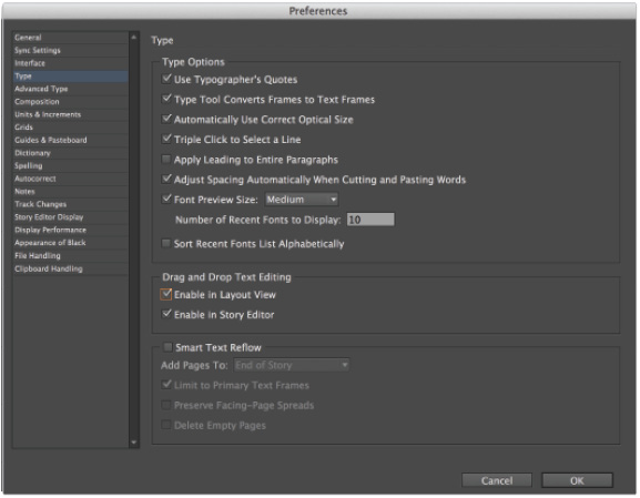
 Although leading is applied to individual lines of text by default, you can change this behavior in the InDesign preferences so that leading applies to an entire paragraph of text. To do this, go to the Edit menu (Windows) or the InDesign menu (Mac OS) and choose Preferences > Type. In the resulting dialog box, check the option to Apply Leading to Entire Paragraphs.
Adjusting character spacing: kerning and tracking
Just like you can adjust the space vertically between lines of type, you can also adjust the space between either a specific pair of characters or between a range of characters. Adjusting the space between two characters is kerning, while adjusting the space between a range of characters is tracking.
1 Make sure that all of the text in the list of stories is still selected, then click to place the cursor in the Tracking value ( ![]() ) portion of the Control panel, then type 10 and then press Enter (Windows) or Return (Mac OS) to increase the tracking.
) portion of the Control panel, then type 10 and then press Enter (Windows) or Return (Mac OS) to increase the tracking.
Tracking is measured using a fraction of an em space. A full em space is the width of the letter M of a particular font in a particular size; in other words,, an em space varies depending upon the size and font you are using. In this case, the value 10 represents 10/1000ths of an em space.

Changing the tracking.
Next you will use the word Tech in the lower-left corner of the page to serve as a logo for the start of the High Tech Corner section. You will kern the letters closer together, and then use baseline shift to further adjust some of the letters to create a visual effect with the type.
2 Using the Type tool (![]() ), click between the e and the c in the word Tech in the same block of text where you are currently working. Click to select the kerning value (
), click between the e and the c in the word Tech in the same block of text where you are currently working. Click to select the kerning value ( ![]() ) which is currently set to 0 and type -120, being certain to include the minus symbol to indicate a negative value. Press Enter (Windows) or Return (Mac OS) to set the kerning.
) which is currently set to 0 and type -120, being certain to include the minus symbol to indicate a negative value. Press Enter (Windows) or Return (Mac OS) to set the kerning.

Changing the kerning.
Using a baseline shift
The baseline is the horizontal line upon which the bottom part of characters rests. Some characters, like lowercase q or p fall below the baseline, but most characters sit upon the baseline. You can use baseline shift to change the vertical position of individual characters. This is useful for trademark and copyright symbols along with fractions and footnotes or endnotes. Here you will use baseline shift to style the text to gain an understanding of how to access these capabilities using InDesign.
1 Select the letters e and c of the word Tech and change their size to 10 using the Font Size drop-down menu in the Control panel.
2 Select only the letter e and in the Baseline Shift value ( ![]() ) in the Control panel type 6 pt, and then press Enter (Windows) or Return (Mac OS). The e is shifted upward, 6 points off the baseline.
) in the Control panel type 6 pt, and then press Enter (Windows) or Return (Mac OS). The e is shifted upward, 6 points off the baseline.

Apply the baseline shift to the letter.
3 Choose File > Save to save your work.
Changing paragraph attributes
The text formatting you applied earlier in this lesson impacted only the text you had selected. In this part of the lesson, you will work with attributes that are applied to an entire paragraph, including text alignment, spacing, and tabs. Because these attributes apply to an entire paragraph, you do not need to select any text; all you need to do is place the mouse cursor within the paragraph that is to be formatted. The adjustments you will make are found in the paragraph controls section of the Control panel.
Horizontally aligning text
For most Western languages, text reads from left-to-right, and aligns to the left side of a text frame. You can change the alignment of text so that text aligns to the right side of the frame, is centered, or aligns along both sides of the frame (justified), or have InDesign adjust the alignment depending upon whether the text is on the left or right side of a publication.
1 Click the Pages button ( ![]() ) to open the Pages panel. Double-click page 2 to navigate to it, which also centers this page in the workspace.
) to open the Pages panel. Double-click page 2 to navigate to it, which also centers this page in the workspace.
2 On page 2, click anywhere in the line of text that reads Average Cell Phone Usage. You don’t need to highlight the line of text; simply place the cursor in this line.
3 In the Control panel, click the Paragraph Formatting Controls button ( ![]() ) to access the paragraph portion of the Control panel.
) to access the paragraph portion of the Control panel.
![]()
The paragraph formatting controls.
4 Click the Align Center button ( ![]() ) to align the text to the center of the text frame. The text is now centered. Keep the cursor in this text.
) to align the text to the center of the text frame. The text is now centered. Keep the cursor in this text.
Changing the spacing before and after paragraphs
Adding space before or after paragraphs makes each paragraph stand out, and creates a clear transition between ideas and sections. A common mistake is to apply additional returns between paragraphs. Applying additional returns quickly adds space, but the space cannot be easily refined, or made to be consistent between all paragraphs in a single step. Using the space before and space after option provides more control over spacing between paragraphs than just inserting an additional return.
In this section, you will adjust the spacing between the headline and the list of city names. You will start by placing some extra space after the text Average Cell Phone Usage.
1 Using the Type tool (![]() ), click anywhere within the line of text that reads Average Cell Phone Usage.
), click anywhere within the line of text that reads Average Cell Phone Usage.
2 In the Control panel, locate the Space After text field ( ![]() ), type .0625, and then press Enter (Windows) or Return (Mac OS).
), type .0625, and then press Enter (Windows) or Return (Mac OS).
3 Choose File > Save to save your work.
Using tabs
Tabs, and tab stops, are used to align text and insert space between words or numbers. Tabs are inserted into text by pressing the Tab key on the keyboard, and you can then use InDesign to specify exactly where the tab stops should be positioned. A common use of tabs is in a restaurant menu, where menu items are positioned on the left side of the menu, and prices are aligned along the right side of the menu, with a series of periods, or dot leaders, separating the menu items from the prices. Similarly, a Table of Contents at the start of a book such as this one uses tabs to align page numbers and separate the content from the page numbers. In this exercise, you will use tabs to separate the city name from the average hours of cell phone usage.
1 Using the Type tool (![]() ), select all the text in the Average Cell Phone Usage text frame by clicking in the text frame and choosing Edit > Select All or by clicking five times with your mouse in the text frame.
), select all the text in the Average Cell Phone Usage text frame by clicking in the text frame and choosing Edit > Select All or by clicking five times with your mouse in the text frame.
2 Choose Type > Show Hidden Characters to see the tab, represented by a (>>). You can see that when the text was entered, a tab was placed between the city name and the hours. Choose Type > Hide Hidden Characters to hide these non-printing characters from view. Next you will specify where the tabs should be positioned using the Tabs panel.
3 Choose Type > Tabs to open the Tabs panel. The Tabs panel appears aligned to the top of the selected text frame.
 If the Tabs panel is not aligned to the top of the text frame, use the Zoom tool (
![]() ) to reduce the magnification so that the top of the text frame is fully visible within the workspace. After reducing the magnification, select the Type tool (
) to reduce the magnification so that the top of the text frame is fully visible within the workspace. After reducing the magnification, select the Type tool (![]() ), click within the text frame, and select all the text within the frame. In the corner at the right of the Tabs panel, click the Position Panel above Text Frame button (
), click within the text frame, and select all the text within the frame. In the corner at the right of the Tabs panel, click the Position Panel above Text Frame button ( ![]() ). You can also use this if you move the Tabs panel or adjust the page magnification. The Position Panel above Text Frame button positions the Tabs panel over the text frame as long as the entire width of the text frame is visible within the workspace.
). You can also use this if you move the Tabs panel or adjust the page magnification. The Position Panel above Text Frame button positions the Tabs panel over the text frame as long as the entire width of the text frame is visible within the workspace.

InDesign provides four options for aligning tabs. Located at the top-left of the Tabs panel, front left to right, are the Left-Justified Tab ( ![]() ), Center-Justified Tab (
), Center-Justified Tab ( ![]() ), Right-Justified Tab (
), Right-Justified Tab ( ![]() ), and Align to Decimal (or Other Specified Character) Tab (
), and Align to Decimal (or Other Specified Character) Tab ( ![]() ) buttons.
) buttons.
4 In the Tabs panel, click the Right-Justified Tab button ( ![]() ), then click in the space above the ruler toward the right edge of the tab area. In the selected text, the time values now align to the right of the frame at the location where you placed the tab.
), then click in the space above the ruler toward the right edge of the tab area. In the selected text, the time values now align to the right of the frame at the location where you placed the tab.
5 Confirm that the tab stop you entered in the previous step is selected. You can see the tab stop positioned above the ruler. Highlight the X value in the Tabs panel and type 3.3611 to specify the exact location for this tab stop. Press Enter (Windows) or Return (Mac OS) to set this as the new location for this tab stop. The text that corresponds to this tab stop is repositioned to the new location.
6 With the tab stop still selected in the ruler, type a period (.) into the Leader text field in the Tabs panel, then press Enter (Windows) or Return (Mac OS). A series of periods now connects the cities with the time values.

Add leader dots to the listing.
7 Close the Tabs panel, and then choose File > Save to save your work.
While this example used tabs to organize the data, there are several other options. You can place data in tables. You can also use bulleted or numbered lists which can be accessed from the Paragraph controls option of the Control panel. After creating a list, choose the Bullets ( ![]() ) and Numbering (
) and Numbering ( ![]() ) command from the Control panel menu to convert the text to a list. To specify the bullet characters to use, any text that should be placed after the bullet, any indent that should occur, and any character style to use on the bulleted text, press Alt+click (Windows) or Cmd+click (Mac OS) on the Bullets or Numbering buttons in the Control panel.
) command from the Control panel menu to convert the text to a list. To specify the bullet characters to use, any text that should be placed after the bullet, any indent that should occur, and any character style to use on the bulleted text, press Alt+click (Windows) or Cmd+click (Mac OS) on the Bullets or Numbering buttons in the Control panel.


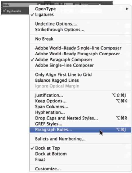
Adding rules above or below paragraphs
Rules are horizontal lines placed above or below a paragraph. You can use rules to separate paragraphs or call attention to headlines. Rules are text elements that move with the text to which they are attached, making them different from a line you might draw separately and place on the page which is considered a graphic object. You will add a rule below the words Average Cell Phone Usage.
1 Using the Type tool (![]() ), click anywhere inside the text Average Cell Phone Usage.
), click anywhere inside the text Average Cell Phone Usage.
2 Click the panel menu button ( ![]() ) located at the far-right side of the Control panel, and choose Paragraph Rules from the drop-down menu.
) located at the far-right side of the Control panel, and choose Paragraph Rules from the drop-down menu.
Choose Paragraph Rules from the panel menu in the Control panel.
3 In the Paragraph Rules dialog box, choose Rule Below from the drop-down menu and select the Rule On check box to enable the rule. Select the Preview check box in the lower-left corner of the dialog box to see the rule applied. Keep the dialog box open.
The line appears and is automatically aligned relative to the baseline of the text. Next you will examine the offset value, allowing you to move the rule vertically.
4 In the Offset text field, make sure the offset value is set to 0.0625. This shifts the line below the baseline. If the offset is set to 0 it aligns to the baseline, so by giving it a positive offset value, the rules is moved down below the baseline for the headline. A negative value would shift the rule upward.
5 Confirm that Text is chosen from the Width drop-down menu so that the line appears only beneath the selected text. Click OK.

The Paragraph Rules dialog box with the correct settings.
The result.
Changing text color
Changing the color of text can make it more visually appealing or stand-out from the text around it. When changing text color, you can adjust either the fill or stroke of the text.
1 Using the Type tool (![]() ), select the words Average Cell Phone Usage. Clicking three times with your mouse selects the entire line. Choose Type > Show Hidden Characters to make certain that the paragraph return at the end of the line is also selected. After verifying this, choose Type > Hide Hidden Characters or press Ctrl+Alt+I (Windows) or Command+Option+I (Mac OS).
), select the words Average Cell Phone Usage. Clicking three times with your mouse selects the entire line. Choose Type > Show Hidden Characters to make certain that the paragraph return at the end of the line is also selected. After verifying this, choose Type > Hide Hidden Characters or press Ctrl+Alt+I (Windows) or Command+Option+I (Mac OS).
2 Click the Swatches button ( ![]() ) in the panel docking area to open the Swatches panel. You can also access the Swatches panel by choosing Window > Color > Swatches.
) in the panel docking area to open the Swatches panel. You can also access the Swatches panel by choosing Window > Color > Swatches.
3 In the top-left corner of the Swatches panel, make certain the Fill icon ( ![]() ) is displayed in the foreground. If not, click to select it so that color adjustments affect the fill of the selected object.
) is displayed in the foreground. If not, click to select it so that color adjustments affect the fill of the selected object.

The Fill and Stroke controls in the Swatches panel. Make certain the fill option is selected.
4 With the words Average Cell Phone Usage still selected, locate the color Blue in the Swatches panel, and then click to select it. The color of the text is changed. The color of the rule below the text is also changed because the rule was specified to be the same color as the text. If the rule color does not change with the text color, make sure that the return at the end of the line was also selected as described in step 1.

Select the blue swatch in the Swatches panel.
5 Choose File > Save to save your work.
Creating drop caps
Drop caps, or initial caps, help to draw a reader’s attention to the start of a story. You will create a drop cap for the beginning of a story on the second page of the magazine.
1 Using the Type tool (![]() ), click anywhere in the first paragraph of the story on page 2. You do not need to highlight the text.
), click anywhere in the first paragraph of the story on page 2. You do not need to highlight the text.
2 In the Paragraph Formatting Controls area of the Control panel ( ![]() ), locate the Drop Cap Number of Lines text field (
), locate the Drop Cap Number of Lines text field ( ![]() ) and change the value to 3. Press Enter (Windows) or Return (Mac OS) to commit the change, causing the first character to become the size of three lines of type.
) and change the value to 3. Press Enter (Windows) or Return (Mac OS) to commit the change, causing the first character to become the size of three lines of type.
3 Click the panel menu button ( ![]() ) located at the far right side of the Control panel and choose Drop Caps and Nested Styles.
) located at the far right side of the Control panel and choose Drop Caps and Nested Styles.
4 In the Drop Caps and Nested Styles dialog box, select the Preview check box on the right side to view the changes as they are made. Select the Align Left Edge check box to align the left edge of the letter I to the edge of the text box, then click OK.
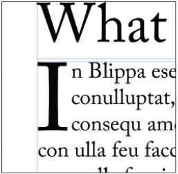
The drop cap’s left edge is aligned to the edge of the text box.
Finding and changing text
Finding and changing text automatically can be a big time-saver. You might discover that a product name needs to be changed across an entire document, or that a website address needs to be located and made italic in every location it is used. In both cases, InDesign’s Find/Change feature helps to automate the process.
Finding and changing text and text attributes
In this exercise you will make the text Tech Magazine bold across the top of each page.
In InDesign Lesson 2, “Working Smarter with Master Pages,” you discovered that a master page could be used to format and adjust an object that is placed in a consistent location across a document. Here we elected to not use a master page, which makes the Find/Change feature especially useful.
1 Choose the Zoom tool (![]() ) from the Tools panel and increase the magnification on the top of page 2 so that the words Tech Magazine are clearly visible. After the words are visible, switch to the Type tool (
) from the Tools panel and increase the magnification on the top of page 2 so that the words Tech Magazine are clearly visible. After the words are visible, switch to the Type tool (![]() ).
).
 If you are working with the Type tool and want to temporarily switch to the Zoom tool, press and hold Ctrl+spacebar (Windows) or Command+space bar (Mac OS) to temporarily activate the Zoom tool while working with the Type tool.
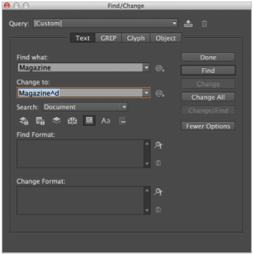
2 Choose Edit > Find/Change to open the Find/Change dialog box. In the Find/Change dialog box, type Tech Magazine in the Find what text field. Next you’ll identify the changes to make to this text.
3 In the Change Format text field at the bottom of the Find/Change dialog box, click the Specify Attributes to Change button ( ![]() ). The Change Format Settings dialog box appears.
). The Change Format Settings dialog box appears.
4 On the left side of the dialog box, choose Basic Character Formats. Select Bold from the Font Style drop-down menu, and then click OK. This changes text that meets the Find criteria to bold.

Using Find/Change to find specific text and change its formatting.
 You can also search for text based upon style attributes. For example, you can have InDesign locate all text that uses a certain font, style, or color, and have it changed to another font, style, or color. This is accomplished by using the Specify Attributes to Find button in the Find Format section of the Find/Change dialog box. The Find what: and Change to: sections can be left blank when locating or changing only the text formatting.
5 In the Find/Change dialog box, make sure the Search drop-down menu is set to Document so that the entire document is searched. In this example you want to search the entire document, but in other cases you can use this to limit the area being searched.
6 Click Change All. A dialog box appears, indicating that the search is complete and that four replacements were made.
7 Click OK to accept the changes, and then click the Done button. All four instances of the words Tech Magazine are now bold. If desired, you can scroll or use the Pages panel to navigate to the other pages to confirm the changes.
8 Choose File > Save to save your work.
Finding and changing text using GREP
InDesign offers another powerful option to find and change text and objects in your layout. GREP, or Global Regular Expression Print, makes it possible to search for patterns across your layout and change, organize, or format the text or object.
In this exercise, you’ll use GREP to standardize the formatting of phone numbers that appear on the last page of the document.
1 In the Pages panel, double-click page 6 to center the page in the workspace and make it the active page. When the page is displayed, use the Zoom tool to increase the magnification of the Information box in the lower-right corner of the page.
This box lists companies and their phone numbers so that customers can contact them. Notice that the phone numbers have been entered in a variety of formats and are inconsistent. You’ll use GREP to make the formatting more consistent.
2 Select the Type tool (![]() ) and select the entries that contain phone numbers. There are a total of five lines to select.
) and select the entries that contain phone numbers. There are a total of five lines to select.
3 Choose Edit > Find/Change to open the Find/Change dialog box, and click the GREP tab to make it active. Confirm that Search area is set to Selection rather than searching the entire document.
4 For this exercise, you’ll use a built-in GREP search that is included with InDesign. From the Query drop-down menu, choose Phone Number Conversion (dot format). The Find what and Change to fields are automatically populated.

Choosing a predefined GREP search from the Query drop-down menu.
5 Click the Change All button. A window is displayed, indicating that five replacements have been made. Click OK and notice that all of the phone numbers in the information box have been standardized. You can also use GREP to change other items in the text.
6 With the Find/Change dialog box still open, click in the Change to text field and make these changes:
- • add parentheses around the $1 text
- • replace the period after the number 1 with a space
- • replace the remaining period with a hyphen.
The text in the Change to field should read: ($1) $2-$3. Click the Change All button. A window appears indicating that five replacements have been made. If you think you’ll use this modified GREP search in the future, click the Save Query button (![]() ) to the right of the Query drop-down menu and give these settings a new name. This way you can re-use the search easily in the future.
) to the right of the Query drop-down menu and give these settings a new name. This way you can re-use the search easily in the future.

The GREP expression used in the Find/Change dialog box and the text after applying the GREP search.
7 Click OK, then click Done.
Checking and correcting spelling
Checking spelling is an important part of creating a professional-looking document, and InDesign has several options to help you prevent and correct spelling mistakes and simple typographical errors.
The Dynamic Spelling and Autocorrect options alert you to misspelled words and can automatically change them for you. In this exercise, you will take a closer look at the ability to find and change words across an entire document or group of documents.
Checking spelling
InDesign can help you locate misspelled words, repeated words, uncapitalized words, and uncapitalized sentences.
1 In the Pages panel, double-click page 2 to center the page in the workspace.
2 Select the Type tool (![]() ) from the Tools panel, and then click anywhere in the headline at the top of page 2 that reads What is the next inovation in cell phones?.
) from the Tools panel, and then click anywhere in the headline at the top of page 2 that reads What is the next inovation in cell phones?.
The word innovation is intentionally misspelled to help you gain an understanding of InDesign’s spell-checking capabilities.
3 Choose Edit > Spelling > Check Spelling. The Check Spelling dialog box appears.
4 Select Story from the Search drop-down menu at the bottom of the dialog box so that only this text frame is searched. A story is the InDesign term for a text frame and any other text frames that are linked to it. The Check Spelling dialog box is displayed.
5 Inovation is displayed at the top of the Check Spelling dialog box under the Not in Dictionary category. The correctly spelled innovation appears in the Suggested Corrections field. Select the correct spelling, innovation, and then click Change.

Checking and correcting spelling.
Because InDesign has completed spell-checking the story, the Start and Done buttons are both available. The Start button would recheck the story, while Done closes the Check Spelling dialog box.
6 Click Done.
Adding words to the dictionary
You can add words to the dictionary so they are not listed as incorrectly spelled, such as proper names, or business-specific terms that should be ignored when checking spelling.
1 Using the Type tool (![]() ), insert the cursor at the very beginning of the first paragraph at the top of page 2.
), insert the cursor at the very beginning of the first paragraph at the top of page 2.
2 Choose Edit > Spelling > Check Spelling.
In the Not in Dictionary section, Blippa appears. This is the name of a new product that appears throughout this document.
3 Click Add to place Blippa in the user dictionary, and then click Done.

Adding a word to the dictionary.
 You can add or remove words from your user dictionary by choosing Edit > Spelling > User Dictionary. You can add or remove individual words, or use the Import option to import a list of words to add to the dictionary.
4 Choose File > Save to save your work.
To create and share a dictionary, choose Edit > Preferences > Dictionary (Windows), or InDesign > Preferences > Dictionary (Mac OS). Click the New User Dictionary button ( ![]() ). When the New User Dictionary dialog box appears, name the new dictionary. The location and name of the new dictionary file appear listed under the Language drop-down menu.
). When the New User Dictionary dialog box appears, name the new dictionary. The location and name of the new dictionary file appear listed under the Language drop-down menu.
After adding your commonly used words to the new dictionary, access the new dictionary file on another user’s InDesign program using the Add User Dictionary button ( ![]() ) in their Preferences > Dictionary dialog box and specifying the location of the user dictionary file that you created.
) in their Preferences > Dictionary dialog box and specifying the location of the user dictionary file that you created.
Checking spelling as you type
InDesign’s Dynamic Spelling can help you avoid spelling errors by checking spelling as you type. Words not found in the InDesign dictionaries are marked with a red underline in your layout. If you use word processing applications such as Microsoft Word, this will look familiar to you.
1 Click the Pages button ( ![]() ) in the panel dock to open the Pages panel. Locate page 3 and double-click the page 3 icon to center the page in the workspace.
) in the panel dock to open the Pages panel. Locate page 3 and double-click the page 3 icon to center the page in the workspace.
2 Using the Type tool (![]() ), click inside the text frame containing the headline When is the best time to update equpment?
), click inside the text frame containing the headline When is the best time to update equpment?
3 Choose Edit > Spelling > Dynamic Spelling to activate the Dynamic Spelling feature. A red line appears under the word equpment. This may take a moment to occur, as InDesign will review the entire document once Dynamic Spelling is enabled.

Accessing Dynamic Spelling through the Edit menu.
Dynamic Spelling turned on.
4 Right-click (Windows) or Control+click (Mac OS) the word equpment. A list of suggested corrections appears in the contextual menu. Choose the word equipment from the list, and the misspelled word is corrected.

Replacing a word using Dynamic Spelling.
5 Disable Dynamic Spelling by choosing Edit > Spelling > Dynamic Spelling.
Automatically correcting spelling
You can use the Autocorrect feature to correct commonly misspelled words and typographical errors as you type. For example, if you type hte when you intend to type the, you can have InDesign automatically correct this error as you enter text while typing. You will now enable Autocorrect and add a word to the list of those that are automatically corrected.
1 Using the Pages panel, navigate to page 2 by double-clicking the page 2 icon.
2 Choose Edit > Preferences > Autocorrect (Windows), or InDesign > Preferences > Autocorrect (Mac OS).
3 When the Preferences dialog box appears, select the Enable Autocorrect check box, if it is not already selected.

The Autocorrect Preferences dialog box.
4 Click the Add button at the bottom of the dialog box to add your own word to be automatically corrected.
5 In the Add to Autocorrect List dialog box, type useage in the Misspelled Word text field, and usage in the Correction text field.
This provides InDesign with the incorrect spelling that should be changed and the correct spelling that should be used instead.

Entering a word into Autocorrect.
6 Click OK, and then click OK again to close the Preferences dialog box.
7 In the Average Cell Phone Usage text frame on page 2, highlight the word Usage and delete it from the text frame. You will now retype this word, intentionally spelling it incorrectly.
8 Type Useage, and then press the spacebar. The Autocorrect feature corrects the misspelled word. Press the Backspace (Windows) or Delete (Mac OS) key to remove the extra space.
9 Disable Autocorrect by choosing Edit > Spelling > Autocorrect.
Editing text using the Story Editor
Sometimes it is easier to view the text separately from the layout. Instead of following text across multiple text frames, or across different pages, it can be easier to edit text in one window. You can use the Story Editor to more easily work with text in one window, even if it is linked across multiple pages or text frames.
The Story Editor also displays text that does not fit into existing frames, known as overset text. Overset text is indicated by a red plus sign that appears at the bottom-right corner of a frame when there is more text than fits within the frame.
1 In the Pages panel, double-click page 5 to center the page in the workspace. Using the Type tool (![]() ), click anywhere inside the text frame on page 5 containing the story.
), click anywhere inside the text frame on page 5 containing the story.
2 Choose Edit > Edit in Story Editor to open the Story Editor window and view the entire story across several pages.

Viewing text using the Story Editor.
3 Use the scroll bar on the right side of the window to navigate to the bottom of the story and see any overset text that does not fit into the text frame.

The Story Editor identifies overset text, which does not fit in the current text frames.
4 Highlight the overset text and delete it, then close the Story Editor.
 While the overset text was deleted in this example, there are several other ways in which overset text is typically addressed. Making edits to the existing story can create room for the text to fit into the existing text frames. Creating additional space by adding new text frames or enlarging the existing frames can also eliminate overset text. Similarly, linking the text to a new frame can give the overset text another frame into which it can be displayed. You can also reduce the size of the text, decrease the leading, or adjust the tracking so that more text fits in the same area.
5 Notice that the red plus sign at the end of the text frame has disappeared, indicating that there is no longer any overset text.
6 Choose File > Save to save your work.
Using Track Changes
If you collaborate with other users, you may find Track Changes useful for displaying changes that have been made to the text in your documents. You can use it to view changes and also approve or reject changes made by others.
1 If, necessary, click the Pages panel button to display it, and double-click the page 3 icon. Zoom in on the text frame below the photo.
2 Choose Window > Editorial > Track Changes to display the Track Changes panel.

Use the Track Changes panel to see edits made to text in your documents.
3 Select the Type tool (![]() ), and click anywhere within the text frame on page 3.
), and click anywhere within the text frame on page 3.
4 Click the Enable Track Changes in Current Story button ( ![]() ). This enables the Track Changes feature for the current story only.
). This enables the Track Changes feature for the current story only.
 You can enable all stories at once by choosing the option from the Track Changes panel menu (
 ![]() ).
).
5 Highlight the word ultimate and change it to best. Also, highlight the word update and change it to replace.
Although Track Changes is enabled, the current view shows the revised text and doesn’t provide any indication that the text has been modified. To see the original and updated text, you will switch from the layout view to the Story Editor.
6 Choose Edit > Edit in Story Editor to display the Story Editor. Note that all the text changes made within this story are highlighted.

Changes highlighted in the Story Editor.
7 Click at the very beginning of the text in the Story Editor and then click the Next Change button ( ![]() ) in the Track Changes panel to highlight the first change displayed in the current story. The word best is highlighted.
) in the Track Changes panel to highlight the first change displayed in the current story. The word best is highlighted.
8 Click the Accept Change button ( ![]() ) to accept the insertion of the word best into the final text of the story.
) to accept the insertion of the word best into the final text of the story.
9 Click the Next Change button again to highlight the next change, which is the deletion of the word ultimate.
10 This time, press and hold the Alt key (Windows) or Option key (Mac OS) when accepting the change. The next change is automatically highlighted in the Story Editor. The word replace is highlighted.
11 To change this word to its original state press and hold the Alt key (Windows) or Option key (Mac OS) and then click the Reject Change button ( ![]() ) to reject the change and automatically highlight the next change.
) to reject the change and automatically highlight the next change.
12 Finally, click the Reject Change button to reject the deletion of the word update.
After accepting or rejecting changes in the Story Editor, the changes are displayed in layout view. Any changes made to the text in your document appear in the layout view, whether the changes have been accepted or not. The Track Changes feature allows you to monitor the changes and revert to the original text, but the text revisions are displayed immediately in the layout view.
13 Close the Story Editor window and the Track Changes panel. View the final text as it appears in your document layout.
Drag-and-drop text editing
When editing text, it can be faster to use your mouse to move text instead of using menu commands to cut, copy, and paste it. Here you will use drag-and-drop text editing to highlight words or characters, and then drag them to a different location. You can use this option in both the Story Editor and in layout view, although you need to enable this option in layout view, as it is turned off by default.
1 Choose Edit > Preferences > Type (Windows), or InDesign > Preferences > Type (Mac OS).
2 When the Type Preferences dialog box appears, in the Drag and Drop Text Editing section, select the Enable in layout view check box, and then click OK.
Enabling Drag and Drop text editing in the layout view.
3 Navigate to the smaller headline on page 5. Click and drag to select the words cell phone, without the s, in the headline. With the text selected, click and drag the highlighted words so that they are placed before the word innovation. Release the mouse to relocate these words.

Once text is highlighted, click and drag the highlighted text to a new location to reposition it.
4 Delete the word in and also the letter s. Also add a space after phone, if necessary. The question mark now follows the word innovation.

The final text after editing.
5 Choose File > Save to save your work.
Special characters and glyphs
You can use the Glyphs panel in InDesign to see all the characters, known as glyphs, within every font. This makes it easy for you to easily access symbols such as those used for dollars, cents, bullets, copyrights, and registered trademark, without needing to remember the appropriate keystrokes. You will use the Glyphs panel to add a trademark symbol to the words Tech Magazine, and you will then use the Find/Change feature to add the symbol to all instances of the name throughout the layout.
1 Choose the Zoom tool (![]() ) from the Tools panel and increase the magnification so you can clearly see the words Tech Magazine in the top text frame on page 5.
) from the Tools panel and increase the magnification so you can clearly see the words Tech Magazine in the top text frame on page 5.
2 Choose the Type tool (![]() ) from the Tools panel and click after the word Magazine to insert the cursor.
) from the Tools panel and click after the word Magazine to insert the cursor.
3 Choose Type > Glyphs to open the Glyphs panel. From the Show drop-down menu, choose Symbols and scroll down until you see the trademark glyph (™).
4 In the Glyphs panel, double-click the trademark symbol to place it after the word Magazine.

Insert the trademark glyph from the Glyphs panel into the text.
The symbol after it is placed into the layout.
5 Using the Type tool, highlight the word Magazine along with the trademark glyph you just inserted.
6 Choose Edit > Copy to copy these characters.
7 Choose Edit > Find/Change to open the Find/Change dialog box. Click the Text tab to make it active.
8 In the Find what: text field, type Magazine.
Find the word Magazine, and change it to include the trademark symbol.
9 Click inside the Change to text field and choose Edit > Paste. The notation for the symbol is pasted.
10 Click the Clear Specified Attributes icon ( ![]() ) to the right of the Change Format section to remove these attributes.
) to the right of the Change Format section to remove these attributes.
This is necessary because the Bold attribute remained from a previous use of the Find/Change dialog box.
11 Make sure that Document is chosen from the Search drop-down and that the Whole Word button ( ![]() ) is enabled. Click Change All. menu and click Change All. A dialog box appears, indicating that the search is complete and that five changes have been made. Click OK.
) is enabled. Click Change All. menu and click Change All. A dialog box appears, indicating that the search is complete and that five changes have been made. Click OK.
12 Click Done. All instances of the words Tech Magazine now include a trademark symbol.
13 Choose File > Save to save your work.
Using the Glyphs panel and glyph sets
You can use the Glyphs panel to create a set of commonly used glyphs, making it easy to access the special characters and symbols you use most frequently.
1 In the Glyphs panel, click the panel menu button ( ![]() ), and then choose New Glyph Set. In the New Glyph Set dialog box, type My Glyphs in the Name text field. Leave the Insert Order drop-down menu at its default, and then click OK.
), and then choose New Glyph Set. In the New Glyph Set dialog box, type My Glyphs in the Name text field. Leave the Insert Order drop-down menu at its default, and then click OK.

Creating a new glyph set.
2 In the Glyphs panel, select the trademark symbol, if it is not already selected. Click the panel menu button and choose Add to Glyph Set; then choose My Glyphs from the menu that appears.
3 In the Glyphs panel, click the Show drop-down menu, and choose My Glyphs from the top of the list. You can add as many glyphs as you need to this glyph set. You can add different glyphs from various fonts to a set. You may prefer to add only glyphs from one font to each glyph set so that you are certain that you are inserting the correct version of a glyph whenever you use the glyph set.

Use a custom glyph set to easily access commonly used symbols and characters.
4 Close the Glyphs panel.
Text frame options
Use text frame formatting options to control the vertical alignment of type, the distance text is inset from the edge of the frame, and the number of columns inside a text frame. Some of these options are accessible only within the Text Frame Option dialog box, while others are also accessible in the Control panel. In this exercise, you will change some of the text frame options for a text frame on page 2.
Adjusting text inset
Inside the Average Cell Phone Usage text frame, the text touches the side of the text frame. You will adjust the position of the text relative to the frame on the outside edge of the frame.
1 In the Pages panel, double-click the page 2 icon to center the page on the workspace.
2 Using the Type tool (![]() ), click inside the Average Cell Phone Usage text frame on page 2.
), click inside the Average Cell Phone Usage text frame on page 2.
3 Choose Object > Text Frame Options to access the Text Frame Options dialog box.
 The keyboard shortcut to open the Text Frame Options dialog box is Ctrl+B (Windows) or Command+B (Mac OS).
4 When the Text Frame Options dialog box appears, make sure the Make all settings the same button ( ![]() ) in the Inset Spacing section is selected.
) in the Inset Spacing section is selected.
5 In the Top text field, highlight the current value, and then type .125. Press the Tab key, and the cursor moves to the next text field. Click to select the Preview check box, and notice the text is pushed in from the edge of the frame by .125 inches.
6 Click OK. The text has moved and is no longer touching the sides of the frame.

Setting a text inset.
The text inset from the edge of the text frame.
Vertically aligning text
You can align text inside a frame both horizontally and vertically. With vertical alignment, you determine whether text aligns with the top, bottom, or center of a frame. You can also justify the type so that multiple lines of type are evenly distributed between the top and bottom of a text frame.
1 With the Selection tool (![]() ) active, click to select the text frame containing the text Average Cell Phone Usage.
) active, click to select the text frame containing the text Average Cell Phone Usage.
2 Choose Object > Text frame options. In the Vertical Justification section, choose Justify from the Align drop-down menu.

Use text frame options to set the text to be vertically justified.
 You can also access the Text Frame Options dialog box by pressing and holding the Alt (Windows) or Option (Mac OS) key and double-clicking the text frame. Or use the keyboard shortcut Ctrl+B (Windows) or Command+B (Mac OS).
3 Click OK. Notice that the text now snaps to the top and bottom of the frame, although the text inset remains.
4 Choose File > Save to save your work.
Importing text
There are three ways to flow text into an InDesign document: You can flow text manually, and link the text boxes yourself. You can also flow text semi-automatically, and you can automatically flow text into your InDesign document so that new frames and pages are created for you.
Flowing text manually
In this first exercise, you will manually flow text and practice threading text between frames.
1 In the Pages panel, locate and navigate to page 3 by double-clicking the page 3 icon, then choose Edit > Deselect All to make certain nothing is selected.
2 Choose File > Place. In the Place dialog box, navigate to the id03lessons folder, select the id0301.doc file, make sure Show Import Options is checked, and click Open. The Microsoft Word Import Options dialog box appears because this text file was created using Microsoft Word.
3 In the Microsoft Word Import Options dialog box, confirm that the Remove Styles and Formatting from Text and Tables option is selected, and directly under this option, that Preserve Local Overrides is not checked. Click OK to close the dialog box.
This keeps styles used in the Microsoft Word document from being imported into your InDesign layout.
 If you accidentally flow text into your previously selected frame, choose Edit > Undo.
4 A preview of the file you are importing is displayed inside the cursor. The cursor previews the first few sentences of text being imported. Click just below the headline text frame and the imported text from the Microsoft Word document fills the column.

Flowing text into a column.
 You can also create text frames at the time you import by clicking and dragging with the loaded cursor. The size of the frame is determined by how large or small a frame you draw. You can also create multiple frames in a single step by pressing the up-arrow on the keyboard to create additional frames stacked vertically, or press the right-arrow on the keyboard to split the frames horizontally as you are dragging to create a frame. After pressing the up or right-arrow key, you can press the other key to split the frames again at the time you are creating them, or press the left or down-arrow key to reduce the number of frames.
You have successfully placed a story in the first column, but there is more type than fits into this frame. You can tell this because a red plus sign appears in the bottom-right corner of the text frame indicating that there is overset text. In the next exercise, you will thread the text from this frame to another frame, creating a link where the story will continue.
Threading text between frames
You can flow text between columns, pages, and between different text frames. At the top-left corner of a text frame is the In Port, which indicates if text flows into the frame from another location. At the bottom-right corner is the Out Port which indicates if text flows to another frame or if there is more text than fits within the frame. You will use the Out Port to thread the text to another frame.

1 Choose the Selection tool (![]() ) from the Tools panel.
) from the Tools panel.
2 Click the red plus sign in the bottom-right corner of the text frame. This is the Out Port, and the red plus sign indicates that there is overset text that does not fit in this frame. After clicking the Out Port, the cursor is ready to link to another text frame so that the story can continue in a different location in the document.

The Out Port showing overset text.
3 Move the cursor under the headline to the top-left side of the second column. Click and drag from the top-left side of the column down to the bottom-right side of the column. The two text frames are now linked because you created the second text frame after clicking the out port in the first text frame.
4 If the links between the text frames are not showing, choose View > Extras > Show Text Threads. InDesign displays the link between the two frames. Choose View > Extras > Hide Text Threads to stop displaying the linked frames. Linked frames are visible when one of the frames in the link is selected.
5 Choose File > Save to save your work.
Using semi-autoflow to link several text frames
Clicking the out port for each individual text frame may work on smaller documents, but it is not efficient for longer documents. Fortunately you can place text into one frame, then move to the next frame to continue linking without clicking the out port. This allows you to link multiple text frames without needing to click the Out Port of each frame. To achieve this, press and hold the Alt (Windows) or Option (Mac OS) key when importing text into the first frame, or after linking text from a text frame, as you will see in the following exercise.
1 In the Pages panel, double-click the page 4 icon to center the page in the workspace.
2 Choose the Selection tool (![]() ) from the Tools panel and click anywhere in the pasteboard to make sure that there is nothing selected, or choose Edit > Deselect All.
) from the Tools panel and click anywhere in the pasteboard to make sure that there is nothing selected, or choose Edit > Deselect All.
3 Choose File > Place. In the Place dialog box, navigate to the id03lessons folder and select the id0302.doc file. Deselect the Show Import Options check box, and then click Open.
4 With the loaded cursor ready to place text, press and hold the Alt (Windows) or Option (Mac OS) key on your keyboard, and then click in the first column, just below the headline. Release the Alt or Option key.
The text flows into the first column and the cursor is automatically loaded so you can link the first column to another frame without clicking the Out Port.
5 In the second column, click and drag to draw a new frame below the image of the Data Center Server. The text flows into the new frame.
 You can also have InDesign automatically add columns and pages as needed by pressing and holding the Shift key while clicking with a loaded cursor that is ready to flow text into your layout. When you automatically flow text, InDesign creates new frames based on where you click inside the margin guides. InDesign automatically generates enough frames to flow all the text based on the column guides defined for each page.

Changing the number of columns in a text frame
You can change the size and shape of a text frame at any time. In this exercise, you will make a new text frame, and then resize it.
1 Choose the Selection tool (![]() ). Click to select the frame you created in the previous exercise, located on the right side of the page below the image. Press the Delete key to delete only this frame. The first column displays the symbol for overset text.
). Click to select the frame you created in the previous exercise, located on the right side of the page below the image. Press the Delete key to delete only this frame. The first column displays the symbol for overset text.
2 Continuing to use the Selection tool, click to select the text frame in the first column. Move the cursor to the right side of the frame and locate the white dot located at the halfway point of the right side of the frame. The white dot is a handle. Click, hold, and drag the handle to the right. As you drag the handle, the column expands so that it overlaps the picture and extends to the right side of the page.
Release the mouse when the text spans the entire width of the page. You will divide this single text frame into two columns.
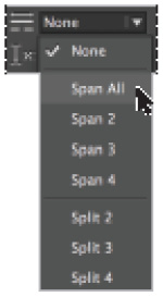
3 Choose the Type tool (![]() ) from the Tools panel. In the Paragraph Formatting Options section of the Control panel, type 2 for the number of columns (
) from the Tools panel. In the Paragraph Formatting Options section of the Control panel, type 2 for the number of columns ( ![]() ), then press Enter (Windows) or Return (Mac OS).
), then press Enter (Windows) or Return (Mac OS).
4 Continuing to work in the Paragraph Formatting Options section of the Control panel, type .167 in in the gutter field ( ![]() ), which sets the distance between the columns. Press Enter/Return.
), which sets the distance between the columns. Press Enter/Return.

Setting the number of columns and gutter distance.
The text does not flow over the image because the image has text wrap applied to it, causing the text to flow around the image. See InDesign Lesson 5, “Designing with Graphics,” for more on text wrap.
5 Choose File > Save to save your work.

Baseline grid
If you create documents with multiple columns, you can use the baseline grid to align the text across the different columns. In this part of the lesson, you will display the baseline grid, change the grid settings, and align the text to the baseline grid.
Viewing and changing the baseline grid
1 To view the baseline grid, choose View > Grids & Guides > Show Baseline Grid.
 The baseline grid guides may not be visible when viewing the document at a magnification less than 100 percent. If the baseline grid is not displaying after selecting the Show Baseline Grid command, increase the magnification at which you are viewing the document.

The baseline grid displays horizontal lines across the page at increments you can define. You can specify text to be aligned to the grid lines.
If you plan to have text align to the baseline grid, the grid should be spaced at least at the value used for leading for the body copy. Defining the leading values for text was discussed earlier in this lesson. In this exercise, you will adjust the spacing for the document’s baseline grid.
2 Select the Type tool (![]() ) from the Tools panel and click in the body text in either of the columns on page 4.
) from the Tools panel and click in the body text in either of the columns on page 4.
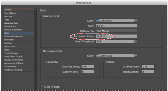
3 In the Control panel, click the Character Formatting Controls button ( ![]() ); notice that the Leading (
); notice that the Leading ( ![]() ) is set to 14.4 pt. You will use this value for the baseline grid, which is controlled using the Baseline Grid Preferences.
) is set to 14.4 pt. You will use this value for the baseline grid, which is controlled using the Baseline Grid Preferences.
4 Choose Edit > Preferences > Grids (Windows), or InDesign > Preferences > Grids (Mac OS). In the Baseline Grid section of the Grids Preferences dialog box, type 14.4 pt in the Increment Every text field. Click OK to close the Preferences dialog box.
Although this step establishes the value for the grid, you have not yet specified that the text needs to align to the grid. In the next part of this exercise, you will align the text to the baseline grid.
Specifying the spacing for the baseline grid.
5 Making certain that the cursor is still in the body text, choose Edit > Select All, then click the Paragraph Formatting Controls button ( ![]() ) in the Control panel.
) in the Control panel.
6 In the Control panel, click the Align to Baseline Grid button ( ![]() ). The selected text in both columns aligns to the baseline grid. Aligning to the baseline grid is defined on a paragraph-by-paragraph basis, which is why the different paragraphs needed to be selected before specifying that the text should align to the grid.
). The selected text in both columns aligns to the baseline grid. Aligning to the baseline grid is defined on a paragraph-by-paragraph basis, which is why the different paragraphs needed to be selected before specifying that the text should align to the grid.
7 Choose View > Grids & Guides > Hide Baseline Grid, and then choose File > Save to save your work.
Adding story jumps
If you create documents with text that flows from one page to another, you will want to direct the reader to the location where a story continues. Rather than manually entering the page number where each story continues, InDesign makes it easy to automatically do this.
You will use a page marker on page 2 of this document, helping readers to see that a story continues on page 5. We’ve created text frames for you to enter the marker that will specify where the text continues. In this exercise, you will enter in the marker that automatically reflects where text continues and see how InDesign displays the linked page information.
1 In the Pages panel, navigate to page 2 by double-clicking the page 2 icon.
2 Select the Type tool (![]() ) from the Tools panel and place the cursor in the text frame located in the lower-right corner of page 2, directly after the words Please see page.
) from the Tools panel and place the cursor in the text frame located in the lower-right corner of page 2, directly after the words Please see page.
3 Press the spacebar once to put a space between the word “page” and the marker you will insert to specify where the story continues.
4 Choose Type > Insert Special Character > Markers > Next Page Number. This marker displays the number 5. For the page marker to function, the text frame containing the marker needs to be touching a text frame that flows to another text frame on a different page. Now you will add the page marker on page 5, specifying where the story originates.
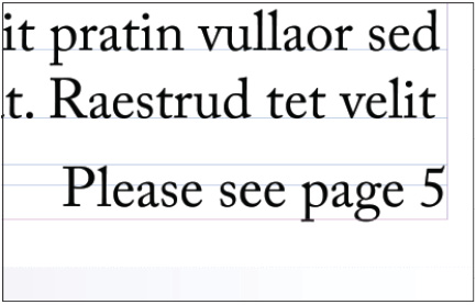
The text frame with the Next Page marker.
5 In the lower-left corner of the workspace, click the page drop-down menu to navigate to page 5. You can use this method or use the Pages panel if you prefer to navigate to page 5 in the layout.
6 Using the Type tool, place the cursor after the words From page.
7 Press the spacebar to put a space between the words and the marker.
8 Choose Type > Insert Special Character > Markers > Previous Page Number. The number 2 appears because the text in the adjacent frame is linked from page 2.
9 Choose File > Save to save your work.
2 Choose Edit > Place and Link. You can also use the Content Collector tool ( ![]() ), located in the Tools panel, to gather linked content.
), located in the Tools panel, to gather linked content.
3 Move the cursor to the page where you want the text to be repeated and click. This can be in the same document or in a different InDesign document. If you used the Content Collector tool to gather the content to be linked, then use the Content Placer tool ( ![]() ) to place the content into the same or a different InDesign document.
) to place the content into the same or a different InDesign document.
Using styles to format text
Styles save time when you’re working with text that shares the same look and feel across a document. If you decide that your body text should be a different size or font, styles let you make the change in one location, avoiding the need to make changes on every page. Additionally, styles make it easy to keep a consistent design, as you can use styles to apply multiple text attributes in a single click. A more complete discussion of styles occurs in the next lesson, InDesign Lesson 4, “Using Styles to Save Time.”
Creating a headline and applying a style
In this exercise, you will create a style and apply it to a headline.
1 In the Pages panel, double-click the page 2 icon.
2 Select the Type tool (![]() ) from the Tools panel.
) from the Tools panel.
3 Select the text in the headline What is the next innovation in cell phones?
4 Choose Type > Paragraph Styles or click the Paragraph Styles button in the panel docking area. The Paragraph Styles panel opens.
5 Click the panel menu button ( ![]() ) in the upper-right corner of the Paragraph Styles panel and choose New Paragraph Style. In the Style Name text field, type Headline, and then click OK.
) in the upper-right corner of the Paragraph Styles panel and choose New Paragraph Style. In the Style Name text field, type Headline, and then click OK.
The new style contains the text attributes from where the cursor was located when you created the new style, including font, style, color, and spacing.

Creating a new paragraph style.
6 Select the Headline style in the Paragraph Styles panel to apply the style to the text. The appearance of the text does not change, but the text is now attached to the style. If the style is updated, the appearance of this headline will also update.
 When you create a new style, you can also have InDesign apply it to the current selection. In the General section of the New Paragraph Style dialog box, select the Apply Style to Selection check box.
7 On page 3, click to place the cursor in the headline When is the best time to update equipment? In the Paragraph Styles panel, select the Headline style to apply it. The headline is formatted with the paragraph style you created.
Importing styles from other documents
You can import styles from one InDesign document to another, making it possible to share formatting across various documents. In this exercise, you will import a Drop Cap style from another document and use the style in this document.
1 In the Paragraph Styles panel, click the panel menu button ( ![]() ) and choose Load Paragraph Styles. You will locate a file from which to import a style.
) and choose Load Paragraph Styles. You will locate a file from which to import a style.
2 In the Open a File dialog box, navigate to the id03lessons folder and select the id0301_done.indd file. Click Open. The Load Styles dialog box appears.
3 In the Load Styles dialog box, click the Uncheck All button to deselect all the styles, because you will only import one specific style. Select the Drop Cap check box to select only this one style.
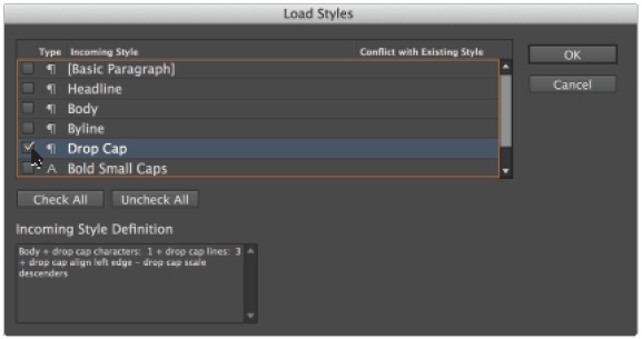
Loading the Paragraph style Drop Cap.
4 Click OK. Drop Cap is now added to the styles in the Paragraph Styles panel in your document. In the next exercise, you will update an existing style, and then apply the Drop Cap style.
Redefining styles
You will now update the Body paragraph style to contain a new attribute, which will align the text to the baseline grid you specified earlier in this lesson.
1 Navigate or scroll to view page 2.
2 Choose the Type tool (![]() ) and click in the text frame containing the story on page 2; then choose Edit > Select All.
) and click in the text frame containing the story on page 2; then choose Edit > Select All.
3 Select the Body style in the Paragraph Styles panel to apply this style to all the selected paragraphs.
4 If a plus sign appears next to the style name, press and hold the Alt (Windows) or Option (Mac OS) key and select the style name again. This removes any formatting changes that have been made since the style was applied.
 Changes made to text after a style has been applied are known as overrides. If you edit a style attribute outside the Paragraph Styles panel, the style is manually overridden, and a plus sign displays next to the style name in the styles panel. If you place your cursor over the style in the Paragraph Styles panel without clicking, and pause, a tooltip appears. The tooltip identifies which attribute is causing the override.

Applying the Body style.
5 In the Paragraph Formatting Controls section of the Control panel, click the Align to Baseline Grid button ( ![]() ).
).
6 In the Paragraph Styles panel notice that a plus sign (+) is displayed next to the style name. This plus sign indicates that the style was changed after it was applied to this text. You changed the text by aligning it to the baseline grid—something that was not part of the original style definition. Next you will change the style so it includes this change as part of the definition of this style, and all text using this style will include this modification.
7 In the Paragraph Styles panel, click the panel menu or right-click (Windows) Control+click (Mac OS) on the style name, and choose Redefine Style. All the text styled with the Body style now aligns to the baseline grid.

Redefining the Body style.
8 Click anywhere in the first paragraph of the story. In the Paragraph Styles panel, click to select the Drop Cap style. The first paragraph is now formatted with the Drop Cap style, and the rest of the story is formatted using the Body style.
9 Choose File > Save to save your work.
Placing text on a path
Text placed on a path can follow a line or shape, such as the outline of a circle, square, or an arc.
1 In the Pages panel, double-click page 4 and navigate to the logo at the top of the page. If necessary, increase the magnification to zoom-in on the logo containing a green arrow using the Zoom tool (![]() ).
).
2 Notice that there is an oval surrounding the word Tech in this logo. The logo should read High Tech Corner. You will place the word High on the oval.
3 Click and hold the Type tool (![]() ) in the Tools panel until the hidden tools are revealed, and then choose the Type on a Path tool (
) in the Tools panel until the hidden tools are revealed, and then choose the Type on a Path tool (![]() ).
).
4 Move your cursor over the bottom center of the oval until you see a plus sign appear next to the cursor, and then click once.

The cursor changes to indicate that you are able to place text on the path.
5 Type HIGH, and then highlight the text using the Type on a Path tool by clicking and dragging or double-clicking to select the word.
6 In the Paragraph Formatting Controls section of the Control panel, click the Align Center button ( ![]() ). You will adjust the exact position of the text in the next steps, as the text may be positioned upside-down or along the bottom of the circle.
). You will adjust the exact position of the text in the next steps, as the text may be positioned upside-down or along the bottom of the circle.
7 Choose the Selection tool (![]() ) from the Tools panel. Notice that there are two vertical handles that appear directly to the left of where you clicked on the path. These are handles and they mark the starting and ending points for the text on the path.
) from the Tools panel. Notice that there are two vertical handles that appear directly to the left of where you clicked on the path. These are handles and they mark the starting and ending points for the text on the path.
8 Select the left-most vertical handle that appears along the path and drag it clockwise, stopping when the line is centered between the top and bottom half on the right side of the oval—where the 3 o’clock location would be on a clock. If the text moves so that it is placed inside the oval as you are moving the handle, choose Edit > Undo and repeat the process, carefully following the oval as you drag clockwise. Be careful to not click the boxes when you move the handles, as these boxes are the In and Out Ports, which are used for flowing text into and out of the path.
9 Take the handle that marks the ending point of the text and drag it counterclockwise, positioning it so it is centered along the left half of the oval—where the 9 o’clock location would be on a clock.
Because you had already centered the text, aligning the start and end points of the text to the opposite sides of the circle lets you know that the text is centered correctly.

The new start and end points of the text.
10 Choose File > Save to save your work.
 To center text on a path you can also click the bottom of the circle using the Type on a Path tool (
![]() ). This causes text to start and end at the bottom of the shape and you can quickly center the text by setting the paragraph alignment to align center.
). This causes text to start and end at the bottom of the shape and you can quickly center the text by setting the paragraph alignment to align center.
Importing text from Microsoft Word
You’ve already seen that you can import text from Microsoft Word documents into your InDesign layouts. When importing text from Microsoft Word, InDesign uses the Remove Styles and Formatting from Text and Tables option to automatically eliminate styles applied to the text using Microsoft Word. You can also have the styles imported or even converted to styles you’ve set-up in your InDesign layout, as you’ll discover in this exercise.
1 Navigate to page 6 in the document.
2 Choose File > Place. In the Place dialog box, navigate to the id03lessons folder and select the id0302.doc file. Select the Show Import Options check box, which is located toward the bottom of the Place dialog box, and then click Open. The Microsoft Word Import Options dialog box opens.

The Show Import Options and Replace Selected Item check boxes.
 To open the Import Options dialog box automatically when opening a file, press and hold the Shift key while you click Open.
3 In the Microsoft Word Import Options dialog box, select the Preserve Styles and Formatting from Text and Tables radio button. This maintains styles and other text formatting in the imported file. Also select the Customize Style Import radio button.
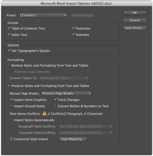
The Microsoft Word Import Options dialog box.
4 Click the Style Mapping button at the bottom of the dialog box, next to the Customize Style Import radio button. The Style Mapping dialog box appears.
The Style Mapping window shows that the Body and Byline styles from the Word document have mapped to the InDesign styles with the same names. Identically named styles are automatically mapped so that they use the InDesign style when you use Style Mapping at the time you import the Microsoft Word document into your InDesign layout.
5 The dialog box shows that the Microsoft Word style Normal is not mapped to a style in this InDesign document. Next to Normal, select the New Paragraph Style and choose Basic Paragraph style from the drop-down menu. This causes the text in the Word document that uses the style Normal to be formatted using the Basic Paragraph style once it is imported into InDesign.

Mapping styles.
6 Click OK to close the Style Mapping dialog box. Click OK again to accept the Microsoft Word Import Options. The cursor is loaded with text that is ready to be placed with already-applied paragraph styles.
7 Click in the left column on page 6 to place the text from the Microsoft Word document into the InDesign layout.
Missing fonts
Fonts, like graphics, are not embedded within an InDesign document. If you receive an InDesign document from a colleague, you may need the fonts that they used when creating the document if you don’t have them installed on your computer. In this exercise, you will import text from a Microsoft Word document that uses a font that you may not have installed on your computer, and you will discover how to address errors that are displayed when fonts are not available.
 By default, InDesign highlights missing fonts in pink within a layout to alert you to the fact that the font being displayed is not the same as what was used when the text was originally formatted.
Finding and fixing missing fonts
1 In the Pages panel, navigate to page 5 by double-clicking the page 5 icon.
2 Select the Type tool (![]() ) in the Tools panel.
) in the Tools panel.
3 Click inside the empty text frame at the top of page 5.
4 Choose File > Place. In the Place dialog box, navigate to the id03lessons folder and select the id0303.doc file. Select the Show Import Options check box if it is not selected, and then click Open.
5 Confirm the Preserve Styles and Formatting from Text and Tables radio button is selected. Click OK.
The Missing Font dialog box appears if you do not have the font Futura Bold already installed on your computer.

The Missing Font dialog box.
6 Click the Find Font button. The Find Font dialog box opens. Highlight the font Futura Bold by clicking it in the Fonts in Document section. Notice the Warning icon ( ![]() ) next to the font name. This indicates that the font is missing.
) next to the font name. This indicates that the font is missing.
7 In the Replace With section at the bottom of the dialog box, highlight the text in the Font Family text field and type Adobe Caslon Pro. You are going to replace Futura Bold with Adobe Caslon Pro Regular. If you do not have Adobe Caslon Pro Regular, you may use another font that is available on your computer.
Replacing a font.
8 Click Change All. To see the missing font replaced, click Done.
9 Choose File > Save to save your work, and then choose File > Close.
Self study
1 Starting on page 1, navigate through the document and apply styles to all text, including body, byline, drop cap, and headline.
2 Change the color of the body text and redefine the style.
3 Turn on Show Text Threads and use the Selection tool (![]() ) to select the linked text frames on page 5, create a new page at the end of the document and drag the frames to the new page. Return to page 2 and see if the story jump automatically updates.
) to select the linked text frames on page 5, create a new page at the end of the document and drag the frames to the new page. Return to page 2 and see if the story jump automatically updates.
4 Make a new headline box on page 7 and type in a fictitious headline. Format the headline using the headline style as a starting point. You may need to adjust the size depending on how many words you enter.
Review
Questions
1 If you have a font that doesn’t have the style of italic, can you make it italic?
2 Can you flow text into an existing frame?
3 Can you divide one text frame into multiple columns?
4 How can you add Previous and Next page markers?
5 What is the best way to see changes that have been made to text in a given story?
Answers
1 No, if you have a font that doesn’t have the style of italic, you can’t make it italic. You need the actual font with the italic font face to make this change, which is also true for other styles, including bold. One exception to this is the ability to apply a skew or false italic using the Skew button ( ![]() ) in the Character formatting panel. Although this is possible, it’s typically not recommended because it is not a true italic font.
) in the Character formatting panel. Although this is possible, it’s typically not recommended because it is not a true italic font.
2 Yes, you can flow text into existing frames, including frames that already contain text.
3 Yes, you can have many columns in a single frame. You make column adjustments in the Control panel or by choosing Object > Text Frame Options.
4 To add Preview and Next page markers, choose Type > Insert Special Characters > Markers or use the context menus when entering the text.
5 The best way to see changes that have been made to text in a given story is to enable Track Changes for a story by choosing Window > Editorial > Track Changes and view the changes made in the Story Editor.