 Chapter 11
Using Statistics
in Evaluation
George R. Mussoline
In This Chapter
This chapter explores the basic statistical analysis that can be conducted to interpret the data collected from the evaluation program. Upon completion of this chapter, you will be able to
- explain the importance of using statistics in analyzing data
- identify the appropriate statistics to analyze the data
- interpret the statistics to have a better understanding of the data set
- apply the steps to calculate the statistics to interpret the evaluation program data
The Importance of Using Statistics in Analyzing Data
Typically, data collected from an evaluation program are the result of a survey, exam, or assessment. There are other methods to collect the data; however, the end result is usually the compilation of responses to questions. These responses could be the result of the participants’ reaction to how much they agree (for example, on a scale of 1 [completely disagree] to 5 [completely agree]) with a survey question; the number of times an answer choice was selected on a multiple-choice test question; or the result of an evaluator’s observation of how well a specific task was performed (for example, on a scale of 1 [incomplete/incorrect] to 5 [complete/correct]). No matter what the collection method, the end result is data that can be organized, characterized, summarized, and presented. The following sections of this chapter give methods to interpret the evaluation data so that the data can be converted into actionable information. This actionable information can then be used to support decisions or inform the end user of areas where additional data are needed to support the final decision. This information comes from the application of descriptive and inferential statistics.
Descriptive Statistics
Descriptive statistics clarify the various features of a data set. Descriptive statistics are the end result of the methods to collect, present, organize, and characterize the data set. These statistics describe the various features of a data set so the end user can draw conclusions and compare one data set to another. Some common descriptive statistics are the measures of central tendency, which include the mean, median, and mode, and measures of variability including the standard deviation, sample variance, and range. These statistics will be discussed further in the following sections of this chapter.
Inferential Statistics
Inferential statistics are used to make a decision or an inference from a small set of data (a sample) to a larger group (the population). Inferential statistics can be defined as the methods used that make it possible to associate the characteristics of a population or the ability to make a decision concerning a population based only on the results of a sample.
Measures of Central Tendency
Some of the most common descriptive statistics are the mean, median, and mode. The mean (arithmetic mean, sometimes referred to as the average) is a commonly used measure that describes the data set’s tendency around a specific value. The mean is calculated by summing all the values in the data set and dividing that sum by the total number of values. Table 11-1 is an example series of values that represent the grades that were recorded for a midterm exam.
 Practitioner Tip
When looking at data, it is important to analyze them in a way that allows the quantitative data to provide you direction on what your audience is trying to tell you and context for examining qualitative data. Both quantitative and qualitative data create synergies and are much more powerful together than they are apart.
—Jennifer Iannetta
Merck & Co.
Practitioner Tip
People tend to want to use descriptive statistics—incorrectly—to make generalizations and predictions. So I’m always careful to include an explanation that descriptive statistics are not in and of themselves representative of any population—other than the test respondents, and therefore shouldn’t be used to predict opinions or behaviors.
—Ira Greenberg
PDG
The mean grade from this data set is calculated by summing all the grades and dividing that sum by 8 (the number of grades). This calculation is expressed below:
(98 + 96 + 95 + 92 + 90 + 88 + 88 + 85)/8
732/8 = 91.5
The median is another measure of central tendency. It is the middle value in the ordered sequence of the data. When the data set contains an odd number of values, the median is represented by value that is in the mid-point of the sequenced data set. When the sample size is an even number, then the median lies between the two middle values in the sequenced data set. The median, in this situation, is then found by calculating the average of the numerical values representing the two middle values. The median from the data set in table 11-1 is 91. This is because the data set contains an even number of values; the middle values are 90 and 92, thus, (90 + 92)/2 = 91.
Table 11-1. Midterm Exam Grades
| Student | Grade |
| A | 98 |
| B | 96 |
| C | 95 |
| D | 92 |
| E | 90 |
| F | 88 |
| G | 88 |
| H | 85 |
A third measure of central tendency is called the mode. The mode is the value in the data set that occurs the most. The mode is calculated by tallying the number of times each value occurs in the data set. Looking to table 11-1, all values occur only once except 88, which occurs twice. Therefore, 88 is the mode for the data in table 11-1. If no value is present more than one time, then the data set has no mode. Note that there is a difference between a data set having no mode and a mode of zero. If zero is the most frequently observed value in the data set, then zero is the mode for those data. Additionally, one data set can have more than one mode. In the circumstance where more than one value occurs in the data set with the same frequency, then the data set is described as bimodal. Because of these circumstances, the mode is not used for anything more than describing the data set.
In general, the mean is a more precise measure than the median and the mode, while the mode is a more precise measure than the median. Table 11-2 is a set of general guidelines that may give additional clarity about when to use these measures of central tendency.
Measures of Variation
The measures presented in the previous section (mean, median, and mode) describe the central tendencies for the data set. Additional measures (range, standard deviation, and sample variance) describe the variability of the data set. These measures of variation describe the dispersion or “spread” in the data set.
Table 11-2. Guidelines for Using Measures of Central Tendency
| Measure | When to Use |
| Mode | When analyzing categorical data (for example, baseball team affiliation, religious affiliation, political party affiliation, etc.) or when values fit into a category and these categories are mutually exclusive |
| Median | When analyzing data that contain extreme values (for example, a data set that contains extremely high and low exam scores) |
| Mean | When analyzing a normal data set that is not categorical in nature and does not contain extreme values (for example, a set of exam scores, the number of seconds it takes an individual to run the 100 yard dash during a track season, the number of hits a baseball player has over a baseball season, etc.) |
The range describes the total spread in the data set. It is the difference between the highest and lowest values in the data set. The range for the data in table 11-1 is 13 (98 – 85 = 13). The range is only one measure of variability, and it gives an indication of the dispersion of the data; however, it should not be the only measure of variability reported. The standard deviation and the sample variance are additional measures of variability that add to the description of the data set’s variability.
The sample variance and standard deviation represent the average amount of variability in the data set or the average distance the data points are from the mean. The larger the sample variance or standard deviation, the larger the average distance each data point is from the mean of the data set. The computation of a standard deviation is accomplished by
1. subtracting the mean of the data set from each value in the data set
2. squaring each individual difference
3. summing all these squared deviations
4. dividing this sum by the total number of values minus one
5. calculating the square root of this value.
The sample variance is simply the square of the standard deviation. Sample variance and standard deviation will always be positive values because, as indicated in step 2 above, the differences in the sample value and the mean are squared in each computation. Sample variance and standard deviation values can be zero, but never negative. The only time when the sample variance can be zero is when there is no variation in the data set (for example, all values in the data set are exactly the same). In this case, the range would be zero, and the mean, median, and mode would all be the same value.
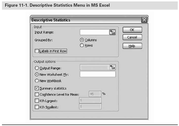
Many computer software packages including Microsoft Excel, SPSS, and Minitab compute the descriptive statistics listed above, so it is not necessary to know how to compute these values. What is important is that the end user knows how to interpret and use these statistics to understand the data set. The statistical analysis of the data in the following section is the output of the software packages Excel and Minitab. The descriptive statistics data can be obtained from Excel by going to the Tools Menu, selecting Data Analysis, and then Descriptive Statistics. The descriptive statistics menu is presented in figure 11-1.
Interpreting and Understanding the Data
An example data set is presented in table 11-3. These data will be used to calculate the descriptive statistics referenced above and enable additional interpretations of the results. The data presented in table 11-3 are a typical data set that might be received from a survey or evaluation conducted immediately following a training session. Table 11-3 shows two potential sets of the responses for one specific question asked on the training program evaluation, namely “How likely are you to recommend this course to a friend or colleague?” (1 = not at all; 5 = definitely).
To get an appropriate understanding of the data set, represent the data visually so the end user can see any interesting trends in the data. Figures 11-2 and 11-3 are histograms of the data presented in table 11-3. A histogram is one way of visually representing the data set; it is a vertical bar representation of the frequency distribution where the frequencies are represented by bars. The frequencies can be presented as counts or percentages. Histograms allow the end user to view how the data are distributed. This visual representation allows the end user to quickly observe any trends in the data: Are the data clustered around one end of the scale? Are the data trending toward the middle of the scale? Are the data evenly dispersed over the entire range of the scale? This is important so that the end user can have a quick understanding of the data and any general trends that are present in the data set. Additional statistical interpretation of the data will further define the data set; however, this visual representation gives a first pass, general look at the data and any trends that may exist.
Table 11-3. Example Data
How likely are you to recommend this course to a friend or colleague?
(1 = not at all; 5 = definitely)
| Respondent | Data Set 1 | Data Set 2 |
| 1 | 3 | 1 |
| 2 | 3 | 1 |
| 3 | 3 | 1 |
| 4 | 3 | 2 |
| 5 | 3 | 2 |
| 6 | 3 | 2 |
| 7 | 3 | 3 |
| 8 | 3 | 4 |
| 9 | 4 | 5 |
| 10 | 4 | 5 |
| 11 | 4 | 5 |
| 12 | 4 | 5 |
| 13 | 4 | 5 |
| 14 | 4 | 5 |
| 15 | 4 | 5 |
| 16 | 5 | 5 |
| 17 | 5 | 5 |
| 18 | 5 | 5 |
| 19 | 5 | 5 |
| 20 | 5 | 5 |
| 21 | 5 | 5 |
| 22 | 5 | 5 |
| 23 | 5 | 5 |
| 24 | 5 | 5 |
| 25 | 5 | 5 |
| 26 | 5 | 5 |
| 27 | 5 | 5 |
| 28 | 5 | 5 |
| 29 | 5 | 5 |
| 30 | 5 | 5 |


Table 11-4 is the descriptive statistics output from Excel of the data presented in table 11-3. As seen from figures 11-2 and 11-3, the two data sets are visually quite different (data set 1 has no responses of 1 or 2 whereas data set 2 has six values or 20 percent of the sample responding 1 or 2). However, the mean and the mode presented in table 11-4 for each data set is the same. The visual representation of the data enables the end user to see that even though two measures of central tendency (that is, the mean and the mode) are the same for each data set, the data sets are actually quite different. The differences in the data sets come to light visually in the respective histograms and when the measures of variability (standard deviation, sample variance, and range) are evaluated.
The standard deviation and sample variance for data set 1 are 0.858 and 0.737, respectively. The standard deviation and sample variance for data set 2 are 1.447 and 2.097, respectively. How does the end user of the data interpret these results? An interpretation of the standard deviations for each data set will be discussed; however, the same general interpretation can also be applied to the sample variance because the standard deviation is simply the square root of the sample variance.
Practitioner Tip
Ideally, instructional designers will want to clearly understand during their course planning whether they will be following up with Level 1, 2, or 3 evaluations. And those tests should be developed at the same time as the course. In that way, the assessment will be meaningful and useful.
—Ira Greenberg
PDG
Table 11-4. Microsoft Excel Descriptive Statistics Summary
Data Set 1 Output
| Mean | 4.2 | 4.2 |
| Median | 4.5 | 5 |
| Mode | 5 | 5 |
| Standard Deviation | 0.858 | 1.447 |
| Sample Variance | 0.737 | 2.097 |
| Range | 2 | 4 |
The standard deviation for data set 1 is 0.858, which indicates that the “average” scatter of the data points around the mean value in data set 1 is 0.858 units around the mean. In other words, data set 1 has a standard deviation of 0.858 units, which indicates that most responses in this sample are clustered within 0.858 units around the mean value of 4.2 (for example, between 3.3 [4.2 – .858] and 5.0 [4.2 + .858]). The standard deviation for data set 2 is 1.447, which indicates that the “average” scatter of the data points around the mean value in data set 2 is 1.447 units around the mean. Therefore, the most responses in data set 2 are clustered within 1.447 units around the mean value of 4.2 (for example, between 2.8 and 5.0 because the upper end of the scale is 5). The interpretation of these data is that data set 1 is more closely clustered around the mean value whereas data set 2 is more dispersed across the response scale. This can be visually observed in figure 11-4, where the two data sets are fitted to a standard curve and presented on the same graph. The standard curve in figure 11-4 was created using Minitab Statistical Software package. Minitab enables the end user to fit a normal curve to the data sets.
Additional Statistics
The descriptive statistics in the previous sections of this chapter enable the end user to have a good general understanding of the data set and its properties. However, additional basic statistics further describe the data set and enable the end user to have an even better understanding of the data. Again, many computer software packages (Excel, SPSS, Minitab, and so forth) compute these additional statistics, so it is not necessary to know how to compute these values. What is important is that the end user knows how to interpret and use these statistics to understand the data set.

Practitioner Tip
Culture can have a definite impact on survey scores and their analytic results. Typically, the value of 3.5 on a 5.0 scale in the United States translates to a lower score in Japan. Organizations need to be mindful of cross-cultural differences to ensure measurements are interpreted accurately.
—Jean Grabowski
Merck & Co.
The additional statistics presented in this section further describe the shape of the data set. It is important to understand the data set’s shape because the shape is a visual representation of the way the data are distributed. Once the shape of the data is visualized (for example, through a histogram as in figures 11-2 and 11-3 or through a fitted curve as in figure 11-4), then additional descriptions that define the data’s symmetry can be evaluated. The distribution of the data could be relatively flat or peaked. This measure is the kurtosis of the data. Additionally, the distribution of the data set can either be symmetrical or not. If the distribution is not symmetrical, then it is asymmetrical or skewed.
The kurtosis of the data set is one method to measure the shape of the data. Kurtosis is a measurement that has to do with how flat or peaked a distribution appears. The kurtosis of data set 1 is –1.484 and the kurtosis of data set 2 is 0.484. Why is this important? How would one use this information? Kurtosis is a useful statistic to evaluate because it is another indication of how tightly the data points are centered around the mean. In data set 1, the curve is more peaked than that of data set 2. Normally distributed data establish the baseline for kurtosis: not too flat, not too sharply peaked. Data that followed a normal distribution perfectly would have a kurtosis value of 0. Because significant kurtosis indicates that the data are not normal, you may think of the statistic as a first check for normality. Another method to evaluate the shape of the data is to review the mean and median. If these two values are the same, then the data set can be considered symmetrical or not skewed. If the value of the mean is greater than that of the median, then the data are generally considered to be positively skewed (or right skewed). If, on the other hand, the mean is less than the median, then the data are considered to be negatively skewed (or left skewed).
Positive skewed or right-skewed data are so named because the “tail” of the distribution points to the right, and because its skewness value will be greater than 0 (or positive). Salary data are often skewed in this manner: many employees in a company make relatively little, while increasingly few people make very high salaries. Left-skewed data are also called negatively skewed data (the distribution’s tail points to the left, and it produces a negative skewness value). Failure rate data are often left skewed. An example of left-skewed data is month ending accounting transaction activity. A lot of businesses “close” their accounting books at month’s end, and this transaction activity is typically left skewed. When a data set is skewed, then the more accurate measure of central tendency is the median, not the mean, because very few values in the data set are extreme values and cause the mean to be a misrepresentation of the data set’s central value.
When plotting data from an evaluation plan, it may be desirable to end up with data that are right or left skewed. The desired skewness depends upon the type of question that is posed to the survey participant. For example, a left-skewed data set may be observed from a survey question when most respondents “agree” with the proposed statement. Additionally, a set of exam scores may be left skewed when most individuals performed well on the exam. A quick and simple way to compute the skewness of the data set is to subtract the value of the median from the mean. If value of this difference is positive, then the distribution is positively skewed. If value of this difference is negative, then the distribution is negatively skewed. Table 11-5 is the same output from Excel as presented in table 11-4 with the addition of the skewness and kurtosis values. The skewness values are calculated using a formula different than the one presented above. The formula used to calculate the skewness from Excel takes into consideration the standard deviation of the distribution to allow different data sets to be compared to one another.


Table 11-5. Additional Microsoft Excel Statistics Summary
| Data Set 1 Output | Data Set 2 Output | |
| Mean | 4.2 | 4.2 |
| Median | 4.5 | 5 |
| Mode | 5 | 5 |
| Standard Deviation | 0.858 | 1.447 |
| Sample Variance | 0.737 | 2.097 |
| Range | 2 | 4 |
| Skewness | –0.487 | –1.469 |
| Kurtosis | –1.484 | 0.484 |
Chi-Square
Another useful statistic is called a Chi-square (χ2) distribution. Chi-square is a common distribution used to test how well a sample fits a theoretical distribution or to test the independence between categorical variables. For example, a Chi-square distribution would be a useful statistic if a manufacturer wants to know if the occurrence of three types of defects (small particle size, broken pellets, and high moisture content) is related to shift (day, evening, night). A Chi-square distribution describes the likelihood of obtaining each possible value of a statistic from a random sample of a population; in other words, what proportion of all random samples of that size will give that value.
T-Test
An important property of the t-test is its robustness against assumptions of population normality—in other words, t-tests are often valid even when the samples come from non-normal populations. This property makes them one of the most useful procedures for making inferences about population means. A t-test could be used to evaluate the hypothesis test of the mean of one or two normally distributed populations. Several types of t-tests exist for different situations, but they all use a test statistic that follows a t-distribution under the null hypothesis.
Sample t-test 1. Tests whether the mean of a single population is equal to a target value. For example, is the mean height of female college students greater than 5.5 feet?
Sample t-test 2. Tests whether the difference between the means of two independent populations is equal to a target value. For example, does the mean height of female college students significantly differ from the mean height of male college students?
Paired t-test. Tests whether the mean of the differences between dependant or paired observations is equal to a target value. For example, if you measure the weight of male college students before and after each subject takes a weight-loss pill, is the mean weight loss significant enough to conclude that the pill works?
T-test in regression output. Tests whether the values of coefficients in the regression equation differ significantly from zero. For example, are high school SAT test scores significant predictors of college GPA?
Summary
The proper use of statistics will enable the end user to better understand the data collected as part of an evaluation program. Statistics that measure the data set’s central tendencies and those that measure the data set’s variance help give a good overall description of the data. Additionally, visual representations of the data set will enable the end user to quickly observe any trends in the data and get a better understanding of the data collected as part of the evaluation program. As discussed, it is important for the end user to understand how to interpret the data in order to make better decisions (it is not necessary for the end user to fully understand how to calculate the statistics). This chapter discussed basic statistics to help interpret the data set; additional statistics can be used to further understand the data and additional information on these statistics can be found in the suggested readings at the end of this chapter.
![]()
Knowledge Check: Statistical Analysis
Now that you have read this chapter, try your hand at calculating and interpreting the data in the following data set.
On a scale of 1 (no knowledge at all) to 10 (complete understanding), please rate your level of comprehension of the subject matter discussed in the training session.
| Respondent | Data Set 1—Knowledge before attending training | Data Set 2—Knowledge after attending training |
| 1 | 5 | 9 |
| 2 | 6 | 8 |
| 3 | 4 | 9 |
| 4 | 5 | 8 |
| 5 | 7 | 9 |
| 6 | 3 | 8 |
| 7 | 3 | 9 |
| 8 | 8 | 9 |
| 9 | 6 | 8 |
| 10 | 6 | 8 |
| 11 | 6 | 9 |
| 12 | 6 | 9 |
| 13 | 3 | 8 |
| 14 | 7 | 9 |
| 15 | 3 | 8 |
| 16 | 6 | 7 |
| 17 | 3 | 7 |
| 18 | 5 | 9 |
| 19 | 2 | 9 |
| 20 | 5 | 8 |
Following the steps described in this chapter, what are the general statistics and the interpretation of the statistics?
1. Using Microsoft Excel, calculate the mean, median, mode, standard deviation, sample variance, kurtosis, skewness, and range.
2. Create a histogram of the data.
3. Fit a curve to the data.
4. Determine if the data are symmetrical or skewed (if they are skewed, are the data left or right skewed?).
Check your answers in the appendix.
![]()
About the Author
George R. Mussoline is the manager of evaluation and assessment within Merck & Co.’s Global Human Health Learning & Development department. He is responsible for designing, implementing, and reporting the results of the evaluation strategies associated with the various learning interventions within the department. He is a coauthor of the article entitled “Level 3 Evaluation Data: A Visual Interpretation” (Proven-Human Integration, 2009). He can be reached at [email protected].
Additional Reading
Berenson, Mark L., and D. M. Levine. (1996). Basic Business Statistics—Concepts and Applications, 6th ed. Englewood Cliffs, NY: Prentice Hall.
Gladwell, M. (2008). Outliers—The Story of Success. New York: Little, Brown.
Levitt, S. D., and S. J. Dubner. (2005). Freakonomics. New York: HarperCollins.
Lewis, M. (2003). Moneyball: The Art of Winning an Unfair Game. New York: W. W. Norton.
Mager, R. F. (1997). Measuring Instructional Results, 3rd ed. Atlanta: The Center for Effective Performance, Inc.
Reichheld, F. F. (2006). The Ultimate Question: Driving Good Profits and True Growth. Boston: Harvard Business School.
Salkind, N. J. (2006). Tests & Measurement for People Who (Think They) Hate Tests & Measurement. Thousand Oaks, CA: Sage.
Salkind, N. J. (2008). Statistics for People Who (Think They) Hate Statistics, 3rd ed. Thousand Oaks, CA: Sage.
Williams, M. A., and S. Pautz. (2004). Guide to Minitab: Minitab Release 14. Lexington, MA: Rath & Strong.