
CHAPTER 3
Panels
All classes that derive from the Panel abstract base class are referred to as panels. Panels hold other controls and assist in their layout and presentation. Each XAML panel can hold any number of controls in its Children collection. What differentiates the various panels is how it arranges those children.
Canvas, StackPanel, Grid, and VariableSizedWrapGrid all derive directly from Panel as does VirtualizingPanel. OrientedVirtualizingPanel derives from VirtualizingPanel and itself has two derived classes: VirtualizingStackPanel and WrapGrid, as shown in Figure 3-1.
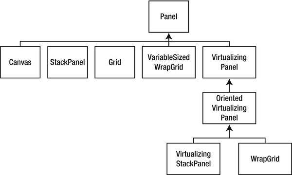
Figure 3-1. Class hierarchy
The most popular panels are Canvas, StackPanel, Grid, and WrapGrid, and so those are the panels I’ll focus on for this chapter. You can learn more about the other, less popular panels at http://msdn.microsoft.com/en-us/library/windows/apps/windows.ui.xaml.controls.panel.aspx.
Canvas
The simplest panel is the Canvas. The Canvas uses absolute positioning to layout its elements. Elements use attached properties of Canvas.Left and Canvas.Top to set the offset from the upper left hand corner of the Canvas. Canvas also uses Canvas.ZIndex to define the apparent ordering of elements one on top of another.
 Note Attached properties are not part of the class that uses them; they are part of another class. Thus, none of the controls such as button have a
 Canvas.Left or even a Left property; they attach this property from the Canvas class.
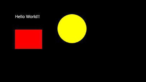
Each element is considered to be enclosed by a rectangle, the upper left hand corner of which is placed at the left/top coordinates you specify. The following code illustrates creating a number of elements and placing them on the canvas:
Note Place this code between the opening and closing <Page> tags in MainPage.xaml.
<Canvas>

     <TextBlock

         Text="Hello World!!"

         Canvas.Top="40"

         Canvas.Left="40" />

     <Rectangle

         Fill="Red"

         Height="50"

         Width="70"

         Canvas.Top="80"

         Canvas.Left="40" />

     <Ellipse

         Fill="Yellow"

         Height="75"

         Width="75"

         Canvas.Top="40"

         Canvas.Left="150" />

 </Canvas>
This creates three objects, each offset by the designated amount from the top left corner, as shown in Figure 3-2.
Note This and subsequent illustrations assume that the page color is black, which you can set in the Page element, like <Page Background=”Black” …>.
It is possible for the objects to overlap. In that case, the objects created later will overlap on top of the objects created earlier, unless you specify a z-order, as shown in the following code:
<Canvas>

    <Rectangle

        Height="50"

        Width="70"

        Canvas.Left="40"

        Canvas.Top="40"

        Fill="Red" />


    <Rectangle

        Height="50"

        Width="70"

        Canvas.Left="75"

        Canvas.Top="50"

        Fill="Blue" />

    <Rectangle

        Height="50"

        Width="70"

        Canvas.Left="110"

        Canvas.Top="60"

        Canvas.ZIndex="10"

        Fill="Red" />


    <Rectangle

        Height="50"

        Width="70"

        Canvas.Left="145"

        Canvas.Top="70"

        Fill="Blue" />

</Canvas>
Here you have four overlapping rectangles, placed onto the canvas in the order Red-Blue-Red-Blue. That is how they would display, except that the default z-order is zero and the third rectangle has a declared z-order of 10, as set by the ZIndex property. This pushes the third rectangle out on top of the others, as shown in Figure 3-3.
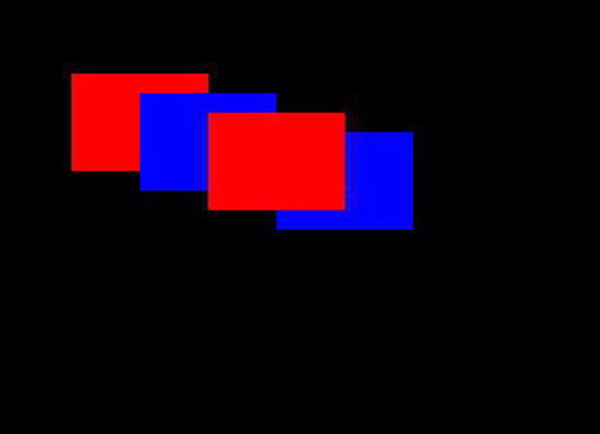
Figure 3-3. Three rectangles
Stack Panel
You saw the StackPanel in Chapter 1. It allows you to place objects either one on top of another, or one to the side of another. There are no attached properties to set; the stack panel handles the layout itself.
StackPanels are popular in Windows 8 programming because they are adaptable to the screen size. Each object is given the room it needs in the panel, and the panel itself can be set to stretch to the available room. Items are placed right next to one another by default, so it is common to set margins to allow for a bit of spacing. Let’s take a look at stacking items in the following code:
<StackPanel

     Name="LayoutRoot"

     VerticalAlignment="Stretch">

     <TextBlock

         Text="Red Rectangle"

         Margin="5"

         FontSize="40"/>

     <Rectangle

         Height="40"

         Width="60"

         Fill="Red"

         Margin="5"

         HorizontalAlignment="Left"/>

     <StackPanel

         Name="InnerStack"

         Orientation="Horizontal">
         <TextBlock

             Text="Blue Rectangle"

             FontSize="40"

             Margin="5" />

         <Rectangle

             Height="40"

             Width="60"

             Fill="Blue"

             Margin="5" />


     </StackPanel>

 </StackPanel>
The outer StackPanel’s orientation is vertical (the default) and so the red rectangle is placed below the TextBlock. The inner StackPanel is placed below that, but since its orientation has been set to horizontal, its contents (the TextBlock and the blue rectangle) are placed next to one another, as shown in Figure 3-4.
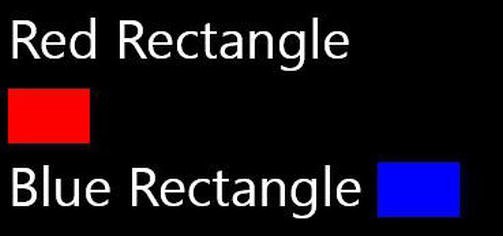
Figure 3-4. Red and blue rectangle
Grid
The Grid is by far the most popular of the panels. It is the most flexible and makes placement of controls on the page easy. More importantly in Windows 8, the Grid will allow your controls to expand or contract based on the available space. Given that Windows 8 applications must run on everything from small slate computers to giant desktop monitors, this can be critically important.
The Grid is so popular that it is the default panel created for you when you start a new application or create a new page. A grid consists of rows and columns. You can specify the number and size of both rows and columns, and you can specify the size in any of three ways:
- Explicit size (e.g., 20px)
- Automatic size
- Relative size
Explicit size is the easiest to understand but the least useful much of the time. When you specify that a row will be 50px high, it will be exactly that—no higher and no less high. When you use automatic sizing, the row will be as high as the tallest control you place in the row and the column will be as wide as the widest control it holds. Relative sizing, sometimes called start sizing, asks Windows to take all the remaining size (after allocating for explicit and automatic size) and divides it up among all the relative sized rows (or columns) proportionally. To see how this works, let’s declare a few rows.
<Grid.RowDefinitions>

    <RowDefinition

        Height="80" />

    <RowDefinition

        Height="Auto" />

    <RowDefinition

        Height="Auto" />

    <RowDefinition

        Height="4*" />

    <RowDefinition

        Height="2*" />

    <RowDefinition

        Height="*" />
</Grid.RowDefinitions>
The first row is defined to have a height of 80 pixels. It will have that height no matter what you place in the row. The second and third rows are marked with a height of Auto and will size themselves based on what is placed in the rows. The final three rows use relative (or star) sizing.
The first of these is 4* and the second is 2*, so the first will be twice as large as the second. The third just has a star with no number, which is equivalent to 1*, so the second will be twice as big as this. Another way to think about this is that there is a total of 7*, so the remaining space (after the 80 and the two Auto rows) will be divided into sevenths, with the first of the relative rows receiving 4/7 of the space, the second receiving 2/7, and the final row receiving 1/7.
Now let’s add rectangles to the grid.
        <Rectangle Fill="Red"

                   VerticalAlignment="Top"

                   Grid.Row="0"

                   Height="50"

                   Width="50" />

        <Rectangle Fill="Red"

                   VerticalAlignment="Top"

                   Grid.Row="1"

                   Height="50"

                   Width="50" />

        <Rectangle Fill="Red"

                   VerticalAlignment="Top"

                   Grid.Row="2"

                   Height="50"

                   Width="50" />

        <Rectangle Fill="Red"

                   VerticalAlignment="Top"

                   Grid.Row="3"

                   Height="50"

                   Width="50" />

        <Rectangle Fill="Red"

                   VerticalAlignment="Top"

                   Grid.Row="4"

                   Height="50"

                   Width="50" />

        <Rectangle Fill="Red"
                   VerticalAlignment="Top"

                   Grid.Row="5"

                   Height="50"

                   Width="50" />
Let’s take a look at the output, shown in Figure 3-5, and see if we can make sense of it.
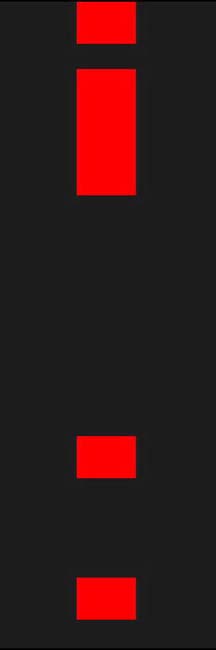
Figure 3-5. Placing rectangles
The first rectangle is 50 units high and the row is 80, so you see a margin at the bottom of 30 units. Note that all the rectangles were set with VerticalAlignment = top, meaning they will cling to the top of their row. The next three are all together with no space between them. This is because two of the next three are autosized and thus fill their space, and the third of the three is the first of the relative sized rows and the rectangle is at the very top of that row. You can see that it gets twice as much space as the one below it, which in turn has twice as much space as the final rectangle.
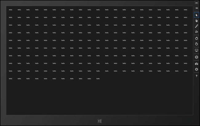
WrapGrid
With a normal Grid you specify the number of rows and columns and then populate the resulting cells with controls. With a WrapGrid you supply a collection of objects to the wrap grid and it lays them out in columns, wrapping to the next row as required (or, conversely, it lays them out in rows, wrapping to the next column as needed).
The WrapGrid itself must be inside an items control, as shown in the following code:
<ItemsControl

     x:Name="xItems">

     <ItemsControl.ItemsPanel>

         <ItemsPanelTemplate>

             <WrapGrid Orientation="Horizontal" />

         </ItemsPanelTemplate>

     </ItemsControl.ItemsPanel>

 </ItemsControl>
The ItemsControl wraps an ItemsPanel which in turn has an ItemsPanelTemplate. Inside the template you place your WrapGrid, in this case adding the attribute orientation = “Horizontal” so that the items will lay out in rows rather than in columns.
The codebehind populates the WrapGrid by adding controls to it, and the grid takes care of laying out the controls depending on the available room. In this example, just to show that it can be done, you’ll add the TextBlocks programmatically. Not only is that wicked cool, but it saves adding 200 TextBlocks by hand to the XAML.
protected override void OnNavigatedTo(NavigationEventArgs e)

{

    for ( int i = 0; i < 200; i++ )

    {

        xItems.Items.Add( new TextBlock() { Text = "hello", Margin=new Thickness(20) } );

    }

}
When you run out of room in one row, the WrapGrid wraps the next control to the second row, and so forth, as shown in Figure 3-6.
Border
Border does not inherit from Panel, but it is often used as a panel, so I’ve included here because it is a popular control. While there are other creative uses for Border, its principle usage is to create a border around one or more controls (hence the name). When you create a border, you define the border color and the thickness of the border. You might also define the size of the border and its alignment, especially if it is going to sit inside a slot bigger than the border itself (e.g., inside a grid with one cell). This is illustrated in the following code:
        <Border

            BorderBrush="Blue"

            BorderThickness="3"

            Width="200"

            Height="100"

            HorizontalAlignment="Left"

            VerticalAlignment="Top"

            Margin="20">

            <TextBlock

                Text="I'm inside a border!" />


        </Border>