
CHAPTER 1
XAML For Windows 8: Read Me First
Writing Programs With XAML
It is the intention of this book to get to the heart of the matter—and not waste your time—so I will not review the history of XAML (pronounced “zamel,” It rhymes with “camel”), nor the theory of XAML, nor will I tell you why XAML is a great markup language. Instead I will turn immediately to writing programs for Windows 8 using XAML. While XAML is also the markup language for WPF, Silverlight, Windows Phone, and other technologies, this book focuses on XAML for Windows 8 and assumes that you have already installed Windows 8 and Visual C#. Note that it does not matter which version of Visual Studio/ Visual C# you are using.
 Note Even if you have not programmed in C# before, you should be able to follow all of the examples in this book, though this is not a primer on C#. If you prefer, you may want to keep a C# primer on your desk for easy reference. I recommend Introducing C# by Adam Freeman (Apress) or Learning C# 3.0 by Jesse Liberty and Brian MacDonald( O’Reilly).
Creating Your First XAML Application
Open Visual Studio and select New Project. In the New Project dialog, look in the left pane and expand Templates  Visual C# Windows Store. This is how you will create every program in this book. In the right hand pane, select Blank App (XAML). Give the application a name and click OK, as shown in Figure 1-1.
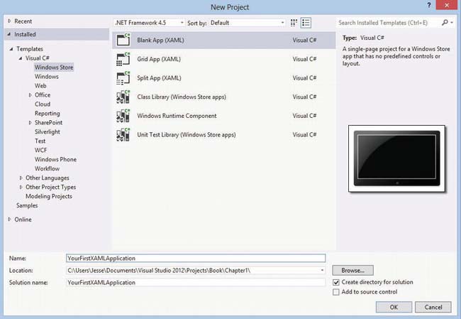
Figure 1-1. Visual Studio’s New Project dialog
When your application opens, double-click MainPage.xamlin the Solution Explorer (which will appear as a pane on the right side of your workspace). MainPage.xaml is where you’ll work for most of this book. What you are looking at is XAML, the default XAML that Visual Studio puts into the MainPage of your application.
<Page

    x:Class="YourFirstXAMLApplication.MainPage"

    IsTabStop="false"

    xmlns="http://schemas.microsoft.com/winfx/2006/xaml/presentation"

    xmlns:x="http://schemas.microsoft.com/winfx/2006/xaml"

    xmlns:local="using:YourFirstXAMLApplication"

    xmlns:d="http://schemas.microsoft.com/expression/blend/2008"

    xmlns:mc="http://schemas.openxmlformats.org/markup-compatibility/2006"

    mc:Ignorable="d">


    <Grid Background="{StaticResource ApplicationPageBackgroundThemeBrush}">


    </Grid>

</Page>
The first element is of type Page and it represents the page itself. On line 2, the class for this page (MainPage) is identified, complete with its full namespace (see the “XML Namespaces” sidebar). Because the Page is a control, its default setting for IsTabStop is true. Since you don’t want the page itself to be in the list of tab stops in the page, you set IsTabStop to false.
This is followed by the identification of a number of useful namespaces. Note that most have the syntax xamlns:namespaceName such as xmlns:local or xmlns:x but the first (http://schemas.microsoft.com/winfx/2006/xaml/presentation) does not have the colon and namespace prefix and thus is the default namespace for controls on this page.
XML NAMESPACES
Below the namespace definitions is the declaration of a Grid. A Grid is one of numerous types of panels (see Chapter 3) that you can use in XAML to organize the layout of the controls on your page. A Grid typically has rows and columns defined. In this case, however, no rows or columns have been defined yet so the default Grid consists of a single giant cell.
The background color for the Grid is set to a StaticResource named ApplicationPageBackgroundThemeBrush. Static resources will be described in detail later (see Chapter 5), but they are a common way to reuse resources such as brushes and styles. In this case, you are setting the background of the grid to whatever color is stored in ApplicationPageBackgroundThemeBrush.
In order to see anything interesting when you run this application you must add at least one display control to the Grid. There are many ways to do this, as you'll see throughout the book. For now, you’ll type the XAML directly into the XAML editor.
Notice that the Grid (like all elements) has an open and a close tag. The close tag is just like the open tag except that it begins with a forward slash and has no attributes.
</Grid>
Every element must have a close tag, though it is legal for elements to be self-closing.
<TextBlock Text=”Hello” />
You’ll place the control inside the Grid by placing it between the opening and closing tags. To get started, you’ll use a TextBlock element, which is designed to display text. Each element can take a number of attributes for detailing how the text is displayed; you’ll use just a few.
    <Grid Background="{StaticResource ApplicationPageBackgroundThemeBrush}">

        <TextBlock

            Text="Hello World"

            FontFamily="Segoe UI"

            FontSize="45"
            FontWeight="SemiBold" />

    </Grid>
The effect of this (which you can see on the design surface, and especially when you run the project by pressing Control-F5) is to display the words “Hello World” in the font family, size, and weight designated by the attributes, as shown in Figure 1-2.

Figure 1-2. Hello World
Stack Panel
For all the fun of being able to display text, there isn’t much excitement until the user can interact with what is on the screen. TextBlock has a close cousin, TextBox, that gathers text from the user. Let’s create a very small data entry form using a few TextBlocks, TextBoxes, and a Button in a new project named “A small form.” You’ll arrange these on top of one another (and in some cases next to one another) using the StackPanel, as shown in Figure 1-3.

Figure 1-3. A small form
Here is the XAML for the form in Figure 1-3:
<Page

    x:Class="A_small_form.MainPage"

    IsTabStop="false"

    xmlns="http://schemas.microsoft.com/winfx/2006/xaml/presentation"

    xmlns:x="http://schemas.microsoft.com/winfx/2006/xaml"

    xmlns:local="using:A_small_form"

    xmlns:d="http://schemas.microsoft.com/expression/blend/2008"

    xmlns:mc="http://schemas.openxmlformats.org/markup-compatibility/2006"

    mc:Ignorable="d">


    <Grid Background="{StaticResource ApplicationPageBackgroundThemeBrush}">

        <StackPanel VerticalAlignment="Stretch" HorizontalAlignment="Stretch">

            <StackPanel Orientation="Horizontal" VerticalAlignment="Stretch" HorizontalAlignment="Stretch" Margin="5">

                <TextBlock

                    Text="Your Name "

                    FontSize="40"

                    VerticalAlignment="Bottom"

                    Margin="5"/>
                <TextBox

                    Name="Name"

                    Width="300"

                    Height="60"

                    FontSize="40" />

            </StackPanel>

            <StackPanel

                Orientation="Horizontal"

                VerticalAlignment="Stretch"

                HorizontalAlignment="Stretch"

                Margin="5">

                <TextBlock

                    Text="Your Phone"

                    FontSize="40"

                    VerticalAlignment="Bottom"

                    Margin="5" />

                <TextBox

                    Name="Phone"

                    Width="300"

                    Height="60"

                    FontSize="40" />

            </StackPanel>

            <Button

                Name="ProcessForm"

                Content="Process"

                Height="60"

                Width="300"

                FontSize="40"

                Click="ProcessForm_Click_1" />


        </StackPanel>

    </Grid>

</Page>
Note While you can download all the source code from the Apress web site, I strongly recommend typing in the code to better learn the material. You can save some keystrokes, however, by using the properties window (described below) to fill in the properties of various controls.
This is a considerably more complex set of code. You are not using the rows and columns of the grid, but rather you’ve placed a StackPanel directly into the grid. A StackPanel, as its name implies, stacks one object atop or next to another. The default orientation for a StackPanel is vertical (one on top of another) but you can set it to horizontal.
Inside your StackPanel you placed two more StackPanel (with horizontal orientations) and a Button. The effect, as shown in Figure 1-3, is to have an outer stacked panel with two inner stacked panels, and then a button below.
The inner StackPanels are marked with orientation set to horizontal, and inside each is a TextBlock and a TextBox, aligning these two next to one another. The StackPanels have their vertical and horizontal alignments set. The possible values for horizontal and vertical alignment are from enumerated constants (e.g., Left, Center, Right, Stretch) and thus are shown by IntelliSense (Microsoft’s implementation of autocompletion), making coding with these values easier. You’ll find that IntelliSense is pervasive in Visual Studio programming of XAML.
Notice that the TextBoxes have Name attributes; this allows you to refer to them in the code. Any XAML object that is given a name can be referred to in the code. However, you do not have to declare controls in the code; the XAML declaration is enough to establish the name of the object. You’ll see this in just a moment when you examine the event handler for the button click event. Each TextBox also has its Width and Height set as the TextBox does not (yet) have text, and thus cannot size itself automatically.
At the bottom of the outer-most StackPanel you’ve added a Button. It too has a name, as you’ll refer to it in code, and a Width, FontSize, etc. The Button has a Content attribute, which can be any form of content, though the most common is to use a string with the text you want to appear in the Button.
Event Handling
Entering text, however, won’t do much good unless you can do something with the text that is entered. This is where event handling comes in.
The Button also has an event, Click, and when you add the Click event, Visual Studio also adds an event handler. If you allow Visual Studio to do so, it will name the event handler for you and create a stub of the event handler in the codebehind file. The codebehind file has the same name as the XAML file but with the extension .cs for C# or .vb for Visual Basic.
When the button is clicked, the event is raised and the event handler is called. Open MainPage.xaml.cs and you’ll see the stubbed out event handler. You want a place to put the text you pick up from the TextBoxes, so let’s add one more TextBlock below the button, as follows:
            <TextBlock

                Name="Message"

                Margin="5" />
This TextBlock does not have a Text property (initially it will be blank) but it does have a Name property as you’ll be updating the content of the Text property programmatically.
Let’s turn to the event handler in the codebehind file. To open the codebehind file, click the arrow next to MainPage.xaml in Solution Explorer to expose MainPage.xaml.cs and double-click that file to open it. When you open the file, you’ll notice that there are three methods already in place.
public sealed partial class MainPage : Page

 {

     public MainPage()

     {

         this.InitializeComponent();

     }


     protected override void OnNavigatedTo(NavigationEventArgs e)

     {

     }


     private void ProcessForm_Click_1( object sender, RoutedEventArgs e )

     {

     }

 }
The first method (named for the class) is the constructor, which initializes all the controls and runs before any other method. The OnNavigatedTo method is called when you navigate to the page (which you do in this case just by starting the application). It is very common to put code into this method to set up the page. The third method is the stub for your event handler. This was created when you created the event, and now it is time to fill in the logic for the event handler. All you will do, in this case, is pick up the entries from the two TextBoxes and place their data into the Message TextBlock.
Before you begin adding code to the event handler, notice that the event handler has two parameters. This is true of all event handlers. The first parameter is the object that raised the event, called sender. In this case, sender will be the button whose click event was raised. The second parameter is either of type RoutedEventArgs or a type derived from RoutedEventArgs. A simple RoutedEventArgs argument has nothing in it, but the derived types can have information that is very valuable when handling the event.
private void ProcessForm_Click_1( object sender, RoutedEventArgs e )

{

    var name = Name.Text;

    var phone = Phone.Text;

    var message = string.Format( "{0}'s phone number is {1}", name, phone );

    Message.Text = message;

}
In this event handler, you first extract the values from the Name and Phone TextBoxes and then you concatenate them in a local string variable named message. Finally, you assign message to the Text attribute of the Message TextBlock. I broke it out this way for clarity, but you can write it in a single line of code:
Message.Text = string.Format( "{0}'s phone number is {1}", Name.Text, Phone.Text );
Note For the sake of clarity, I will most often use the more verbose form in coding throughout this book. This way, if things don’t go as expected, it is far easier to set break points and examine the value of each variable in turn.
Before leaving this example, notice that the XAML elements Name, Phone, and Message were available in the C# without explicit declaration. Declaration in the XAML was sufficient to declare these in the C#, and so they could be referenced and used in the code.
Notice also that, because C# is case-sensitive, there is no confusion between message (lower case), which is the local variable holding the string, and Message (upper case), which is the control that will display the string. That said, there can be human confusion when you use the same name for more than one thing and so it may have been better programming practice to name the local variable msg.
    var msg = string.Format( "{0}'s phone number is {1}", name, phone );

    Message.Text = msg;
Improving the Layout with Grid Rows and Columns
You may have noticed in Figure 1-3 that while the StackPanel did the job and was very convenient, in this case the result was not as gratifyingly attractive as it might have been. The TextBoxes did not line up properly and things looked a bit sloppy.
You can fix that with margins and padding, but a cleaner and easier way is to use the Grid as it was intended, with rows and columns, placing your controls into individual cells. To do this, you must first declare the rows and columns themselves, together with their respective sizes. Each row or column can have its dimensions set using a number of different measures. The three most common, however, are
With absolute sizing, you define the height or width with as a number of pixels, just as you did in the previous example.
With relative sizing, you describe what fraction of the height or width each row will have. Relative sizing can be a bit confusing at first, so let’s take an example. To indicate a relative size, you add a star (asterisk) after the value. Thus you might write
        <Grid.RowDefinitions>

            <RowDefinition

                Height="2*" />

            <RowDefinition

                Height="*" />

        </Grid.RowDefinitions>
In this case, you have set up a 2:1 size ratio (a star with no number is equivalent to 1*). Whatever the height of your application, the first row will be twice as high as the second. If there are 900 pixels available, then the first row will be 600 pixels and the second row 300.
If you add a new first row that is marked as 3*, then you will have the ratio 3:2:1, and thus you get 450 pixels, 300 pixels, and 150 pixels if your total is 900. Whatever the size of your window, however, the proportions will be 3/6 to the first row, 2/6 to the second row and 1/6 to the third, as shown in Figure 1-4.

Figure 1-4. Ratios and resulting real estate
Automatic sizing uses the keyword Auto to indicate that the row ought to take up whatever size is required for the controls in that row, but no more. It is not uncommon to see something like this:
        <Grid.RowDefinitions>

            <RowDefinition

                Height="Auto" />

            <RowDefinition

                Height="*" />

        </Grid.RowDefinitions>
This code will cause the first row size to be big enough for its controls, and the second row to take up all the remaining room.
You’ll learn a good bit more about sizing as you continue. For now, you simply want to size your two prompts, a button, and the output message. You want the prompts to take up 1/3 of the width of the grid, and the answers to take up the remaining 2/3. To place an object in the first row (offset 0), use the designation
grid.row = “0”;
To place an object in the second column (offset 1), use the designation
grid.column = “1”;
The default is for the row and column to be zero, but it is best to be explicit and set the grid row and column for each control even in row and/or column zero.
Note The class name changes from example to example: that is because the downloadable code breaks these into separate projects. If you are continuing on in the same project, be sure to fix the class name at the top of the XAML and the namespace in the codebehind.
<Page

    x:Class="Grid_Layout.MainPage"

    IsTabStop="false"

    xmlns="http://schemas.microsoft.com/winfx/2006/xaml/presentation"

    xmlns:x="http://schemas.microsoft.com/winfx/2006/xaml"

    xmlns:local="using:Grid_Layout"

    xmlns:d="http://schemas.microsoft.com/expression/blend/2008"

    xmlns:mc="http://schemas.openxmlformats.org/markup-compatibility/2006"

    mc:Ignorable="d">


    <Grid Background="{StaticResource ApplicationPageBackgroundThemeBrush}">

        <Grid.RowDefinitions>

            <RowDefinition

                Height="Auto" />

            <RowDefinition

                Height="Auto" />

            <RowDefinition

                Height="Auto" />

            <RowDefinition

                Height="Auto" />

        </Grid.RowDefinitions>
        <Grid.ColumnDefinitions>

            <ColumnDefinition

                Width="*" />

            <ColumnDefinition

                Width="2*" />

        </Grid.ColumnDefinitions>

        <TextBlock

            Grid.Row = “0”

            Grid.Column = “0”

            Text="Your Name "

            FontSize="40"

            VerticalAlignment="Bottom"

            Margin="5" />

        <TextBox

            Grid.Row = “0”

            Grid.Column="1"

            Name="Name"

            Width="300"

            Height="60"

            HorizontalAlignment="Left"

            Margin="5"

            FontSize="40" />

        <TextBlock

            Grid.Row="1"

            Text="Your Phone "

            FontSize="40"

            VerticalAlignment="Bottom"

            Margin="5" />

        <TextBox

            Grid.Row="1"

            Grid.Column="1"

            Name="Phone"

            Width="300"

            Height="60"

            HorizontalAlignment="Left"

            Margin="5"

            FontSize="40"/>

        <Button

            Grid.Row="2"

            Name="ProcessForm"

            Content="Process"

            Height="Auto"

            Width="Auto"

            FontSize="30"

            Click="ProcessForm_Click_1" />

        <TextBlock

            Name="Message"

            Margin="5"

            FontSize="20"

            Grid.Row="3"/>

    </Grid>
</Page>
The default grid row and column is zero and zero, respectively (that is, first row and first column). You’ll notice that the prompts (and button) do not designate the column. While this works, I actually don’t encourage it (and show it here only to demonstrate that these are the defaults). It is usually better to be explicit in naming the grid row and column for each element to make maintenance easier (easier-to-understand code is easier to maintain).
Notice that I changed the height and width of the button to Auto, thus sizing it to the contents of the button. The result of running the code is shown in Figure 1-5.
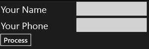
Figure 1-5. The new and improved grid
Note Grid rows and columns are zero-indexed. Thus the first row is Grid.Row = 0 and the second row is Grid.Row=1.
Windows 8 and Layout
With Windows 8, your application must run on a diverse set of display devices from small slate computers to state-of-the-art high-resolution monitors. While the lower limit is 768x1024, below a width of 1366 pixels the ability to create a split is disabled. Note that aspect ratios vary significantly, with some monitors being much wider with respect to their height than others. In other words, you cannot safely predict what the aspect ratios your application will encounter.
In addition to supporting the various screen resolutions, your application will need to look good in both landscape and portrait mode. With the movement of Windows to slate computers, changing the orientation of the screen is simple, common, and frequent.
Positioning and Sizing
Critical to the positioning of elements within a panel is the size of the element. Typically you can use the intrinsic size of the element, but at times you’ll want to set the height and width explicitly.
Most common is to use “size to content” where the element’s size is determined by the size of what it contains. For example, a text element would be sized to fit the assigned text, taking into account the length of the text, the size of the font, etc. On the other hand, you might choose to set the width of a text element, letting the text wrap and thus ensuring the horizontal alignment you might need on a page.
Often you will not need to or be able to set the width or height of an element because its dimensions are constrained. For example, a Text element inside a Grid view might be constrained by the size of the cell it occupies. The outer panel (e.g., the Grid) might well be constrained by the size of the device it is running on.
While you may want to allow controls such as buttons and text elements to size to their content, you may also want to impose arbitrary limits on their minimum or maximum size. Setting, for example, MinHeight and MinWidth can avoid the problem of having touchable controls that are too small for a finger to touch accurately.
Because the operating system may be forced to override even your minimum sizes (so that the element stays on the screen) you can inquire for the actual sizes with ActualWidth and AcutalHeight. You can read these in an event handler for the LayoutUpdatedEvent to ensure that you are getting the current value
Available Space
Each element is allocated a certain amount of space, called the layout slot. If the element is set to size to content, the space available may exceed the space needed. You can position your element within the layout slot in a number of ways. One way, and the most direct, is to set a margin on the element, as shown in Figure 1-6.
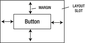
Figure 1-6. Setting a margin on the element
You can set a top margin, a margin for left or right, or a margin for the bottom. If you set the margin to just one number like this
Margin=”5”
a margin of 5 pixels will be set all around the object. However, if you provide two values, like
Margin=”10,20”
the first value will be split between the left and right margin (thus, in this case, a margin of 5 each) and the second number will be split between the top and bottom margins.
Finally, you can explicitly set the margin for all four positions, in the order of Left, Top, Right, Bottom. Thus, if you want a margin of 5 on the left and 10 on the bottom but zero on top and right, you would set
Margin = “5,0,0,10”
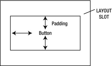
Padding
Padding is very similar to margins in many respects, but it affects the amount of space within an element that has text. For example, a button typically has text content, and padding that determines how much space surrounds that text within the button itself. You can set the padding in the same way you set the margin (a single number, a pair of numbers, or four numbers), as shown in Figure 1-7.
Alignment
You can also position an element within the available space using the VerticalAlignment and HorizontalAlignment. Thus, if you set a button to size to content but the area available for that button is bigger than the button itself, these alignment settings will determine where in the available area the button (with its margin) is positioned.
The possible settings for HorizontalAlignment are Left, Center, Right, and Stretch; for vertical alignment the settings are Top, Center, Bottom, and Stretch. If Stretch is set, the element will be stretched to fill the available space.
Alignment can be used across different controls to cause their tops to align, while padding is most often used to provide space between a border and whatever is inside the border, and a margin is typically used to reposition the control within its assigned space. All of these can be combined to provide the exact look you desire.
Layout Conventions
The UI design guidelines provide guidance on how to layout your application so that it not only looks professional but so that it is consistent with other Windows 8 applications. Microsoft’s guidelines suggest restricting yourself to four font sizes of 42, 20, 11, and 9 (with 42 reserved for page headers, 20 reserved for sub-headers, 11 for navigation and text, and 9 for secondary information, labels, and so forth). The most common font for Windows 8 applications is Segoe UI, though other Segoe variants are used. The relative font sizes are shown in Figure 1-8.

Figure 1-8. Relative font sizes
Further, the guidelines state that you should align everything in your UI to a grid based on units of 20 pixels. The goal is for all shapes, and in particular rectangles, to align with the (imaginary) gridlines. Similarly, text baselines should fall on the gridlines.
Note In Microsoft’s documentation, 20 pixels is referred to as a unit.
You can turn on gridlines in Visual Studio by clicking on the Gridlines button at the bottom of the Design surface, as shown in Figure 1-9.
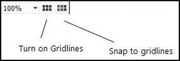
Figure 1-9. Gridlines button
Headings should be on a unit line, five units from the top. Remembering that a unit is 20 pixels, this means that your heading should be 100 pixels from the top. Your content should be seven units from the top (140 pixels). Typically you will achieve these alignments by using the built-in templates and by setting margins on controls rather than by using absolute positioning on a canvas.
Adding Controls and Setting Properties
There are numerous ways to add controls to the design surface and to set their properties. The most direct, but also the approach requiring the most experience with XAML, is to add the control directly to the XAML code itself. For example, for the Grid for the MainPage of your new application you might write the following code:
<Grid Background="{StaticResource ApplicationPageBackgroundThemeBrush}">

    <TextBlock

        Margin="100,40,0,0"

        Text="Hello World"

        FontFamily="SegoeUI"

        FontSize="40" />

</Grid>
Another approach, however, would be to open the design surface and drag a TextBlock onto the design surface from the Toolbox. You can then set the properties (attributes) on the TextBlock from the Properties window (typically found on the right side of the design surface, below the Solution Explorer), as seen in Figure 1-10.
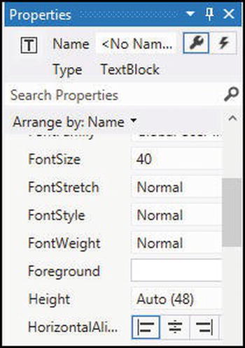
Figure 1-10. The properties window (excerpt) for the TextBlock
You are of course free to mix and match, dragging from the Toolbox and then editing in the XAML, declaring in the XAML and then editing from the Toolbox, even dragging from the Toolbox directly onto the XAML!
Notice that as you change properties in the properties window, the attributes are immediately updated in the XAML, and vice versa; as you update the XAML, the properties window is updated. These are two views of the same information.
Note A third approach is to use Blend, which I will cover later in this book.
To keep things simple, I’ll often show the XAML for a control, but feel free to create that XAML by dragging the control from the Toolbox and setting its properties in the Properties window. In fact, that is very good practice—real programmers do use design surfaces.