
187
Job no:59657 Title : Rockport-Complete Colour Harmony Client : Provision
Scn :
#
175 Size : 171.45(w)228.6(h)mm Co : M8 C6Q3 O/P: V2
Dept : DTP D/O : 04.10.03 (Job no:000000 D/O : 00.00.02 Co: CM0)
8 8
p187
text
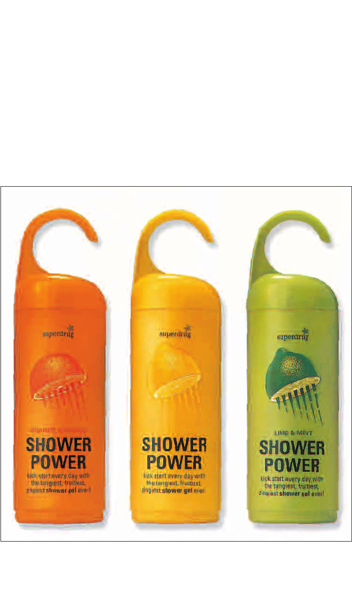
COLOR: RETAIL VERSUS
THE CONSUMER
In selecting colors for products or
graphic design, there are two end users
to keep in mind: the retailer and the
consumer.
In a store or magazine advertisement,
the challenge is to get noticed. Here color
can be used for its psychological impact
on the consumer, as well as for creating
the desired illusion of size, dimension, and
weight. To clinch the sale, designers must
also be careful not to obscure directions
or necessary purchasing information.
Legibility of type is as important as eye-
catching graphics.
To complicate matters, consumers
will also be picturing the product in their
home, wondering if that cooking oil bottle
will look nice sitting on their kitchen
counter. Removable outer wrappings
and specially designed display units can
help designers meet both objectives
simultaneously.
CompColorHarmp154-187/.qxd20/8/04 2:23PM Page187
..................Content has been hidden....................
You can't read the all page of ebook, please click here login for view all page.