Chapter 9. Using ActionScript 3.0 Components
It’s entirely possible, of course, to produce Flash content without ActionScript. Even if not interactive, such content typically bears the visual distinction of compelling custom artwork, which is why the Flash authoring tool has appealed to designers and developers alike for years. When ActionScript does enter the equation, the creative possibilities extend even further, occasionally venturing into territory that, in recent years, has become the mainstay of Flex; namely, Rich Internet Applications (RIAs). When you develop content that requires sophisticated user input—for example, when input text fields aren’t enough, and you need radio buttons, combo boxes, and the like—the Components panel becomes your genie in a bottle. The Flash CS4 Professional ActionScript 3.0 component set, introduced in Flash CS3, is easier to skin and use, and performs more efficiently, than ever before.
Overview of the Component Set
Out of the box, the Components panel (Window→Components) offers a handy number of predesigned
components—often informally called
widgets or controls—that provide
a wide range of features without the need for complicated programming. In
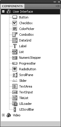
ActionScript 3.0 documents, these components are divided into two
categories: User Interface (UI) and Video, as seen in Figure 9-1. The UI group
contains numerous components comparable to HTML <form> elements, such as CheckBox, RadioButton, ComboBox, and Button. The Button component differs from button symbols in
that you can select and deselect it to switch it on and off, it has a
built-in disabled state, and shares other features consistent with the
component set as a whole. This group also contains useful components that
have no equivalent in HTML, such as ColorPicker, NumericStepper, and TileList.
The Video group contains the FLVPlayback component, used to deploy video files in Flash with drag-and-drop ease;
the FLVPlaybackCaptioning component,
which facilitates captioning for foreign language subtitles and the
hearing impaired; and numerous video-specific user interface components,
such as a standalone play button, mute button, and volume control
slider.
Increased Performance and Reduced File Size
The UI and Video components have been rewritten from the ground up in ActionScript 3.0, which lets them benefit from the same performance enhancements recounted throughout this book (in particular, see Chapter 4). This also means you can’t mix and match the components with those that were written for ActionScript 2.0. Fortunately, the Components panel automatically updates its choices depending on the version of ActionScript selected for the current FLA file. If you start in one version of ActionScript, add components to the stage or library, and then change the FLA file’s publish settings to ActionScript 3.0—or vice versa—you’ll see warning messages when you try to compile the SWF file, and the compile will fail.
The performance improvement for ActionScript 3.0 components is
substantial and can be demonstrated with a simple for loop, using practically the same code for
a side-by-side comparison between ActionScript 2.0 and 3.0 components.
Create a new ActionScript 2.0 FLA file, and then open the Components panel. Drag a copy of the
ComboBoxcomponent to the stage. Use the Property inspector to give this component the instance namemyComboBox.Select frame 1 in the Timeline, and then open the Actions panel. Enter the following ActionScript 2.0 code:
var startTime:Number = getTimer();

for (var i:Number = 0; i < 50000; i++) {
    myComboBox.addItem({label:i, data:i});
}

trace((getTimer() - startTime) / 1000);
In this code, a
startTimevariable performs the ActionScript equivalent to starting a stopwatch. Aforloop increments a numeric variable,i, from 0 to 49,999, which populates theComboBoxinstance with 50,000label/datapairs. Finally, the “stopwatch” is halted, and the result is converted to seconds and displayed in the Output panel.Select Control→Test Movie to review the length of time it takes your SWF file to display. Be prepared to wait several seconds! Your actual elapsed time may vary, depending on the speed of your computer, but in one series of tests, the code in Step 2 executes in 6.337 seconds.
The following steps demonstrate an equivalent test using the ActionScript 3.0 version of the same component.
Create a new ActionScript 3.0 FLA file, and then drag a copy of the
ComboBoxcomponent to the stage. Give it the instance namemyComboBox.Select frame 1 in the Timeline, and then enter the following ActionScript 3.0 into the Actions panel:
var startTime:int = getTimer();

for (var i:int = 0; i < 50000; i++) {
    myComboBox.addItem({label:i, data:i});
}

trace((getTimer() - startTime) / 1000);
This code is almost identical. In fact, the only change is the numeric variable typing, from
Numbertoint.Select Control→Text Movie to review the new elapsed time. Again, your actual results may vary, but in one series of tests, the ActionScript 3.0 version of this same component displayed in 1.419 seconds, which is a remarkable increase in speed.
In addition to working more efficiently, the components tend to add significantly less weight to SWF files than their ActionScript 2.0 counterparts. Table 9-1 shows a comparison of the components shared by both languages.
Component | AS 2.0 file size | AS 3.0 file size |
| 27KB | 15KB |
| 28KB | 15KB |
| 56KB | 35KB |
| 59KB | 40KB |
| 23KB | 14KB |
| 48KB | 29KB |
| 27KB | 15KB |
| 29KB | 18KB |
| 26KB | 16KB |
| 29KB | 16KB |
| 39KB | 22KB |
| 40KB | 21KB |
| 25KB | 15KB |
| 34KB | 18KB |
| 35KB | 57KB |
It’s important to realize that these file sizes aren’t cumulative.
In both ActionScript 2.0 and 3.0, each component shares its common
framework with other components in the component set for that language.
The biggest penalty comes with the first component’s file size;
additional components add only a small increase because they share most
of the programming framework already provided by the first component.
For example, the combined weight of the ActionScript 3.0 versions of Button and CheckBox is only 17KB—not the 30KB you might
expect—which is only 2KB more than either component alone.
Feature Changes
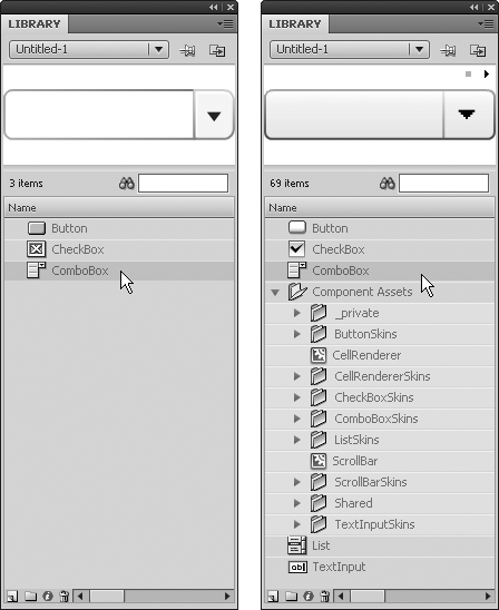
In ActionScript 2.0 documents, components are generally stored in
the Library as discrete entities. In ActionScript 3.0 documents, the
introduction of even a single component creates a new library folder
named Component Assets. This folder contains movie clip symbols used by
the components’ skins, and must not be deleted unless respective
components are purposefully removed from the FLA file (skinning is
discussed in greater detail in the sections “Styling Components with
Code” and “Skinning Components Manually” in this chapter). Figure 9-2 shows the same three
components—Button, CheckBox, and ComboBox—as dragged into an ActionScript 2.0
FLA file (left side) versus an ActionScript 3.0 FLA file (right side).
Note the Component Assets folder on the right, and note also that the
ActionScript 3.0 version of ComboBox
carries with it a copy of List and
TextInput, whose respective weights
are already included in the total file size for ComboBox.
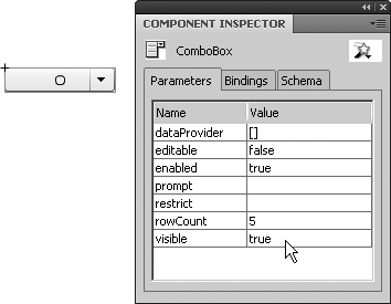
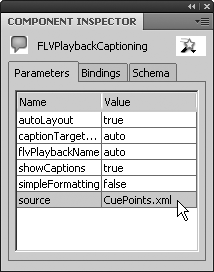
You can configure all components in the Component Inspector panel (Window→Component Inspector), as shown in Figure 9-3. Just select the component on the stage and arrange the settings as you please. In ActionScript 3.0 documents, the Bindings and Schema tabs of the Component Inspector panel are clickable, but their panes are disabled, as they apply only to data components, which are not compatible with ActionScript 3.0.
Because of the general event handling changes in ActionScript 3.0, the components are programmed somewhat differently from the ActionScript 2.0 set. For details, see the section Changes in Writing Code for Components later in this chapter.
Although it has an application programming
interface (API) and can be fully programmed like any other
component, the ActionScript 3.0 FLVPlayback component has been updated so that
its composition can be customized without any need for code.
Create a new ActionScript 3.0 FLA file, and then open the Components panel. Drag a copy of the
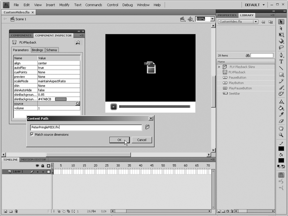
FLVPlaybackcomponent to the stage. No instance name is necessary. Save this file as CustomVideo.fla, because you’re going to use it again later in this chapter.Select the Component Inspector panel, and then ensure that the
skinproperty is set toNone. You don’t need a skin in this case, because in the next step you’ll be supplying a pair of individual skin elements to customize video playback features.Drag a copy each of the
PausePlayButtonandSeekBarcomponents, and position them on the stage wherever you prefer. If you like, change the dimensions of the FLA file to match the surface area taken up by these components. None of the components requires instance names.With the
FLVPlaybackcomponent selected, use the Component Inspector panel to set thesourceproperty to an FLV file, as shown in Figure 9-4. Click OK to close the Content Path dialog box.Select Control→Test Movie to verify that the
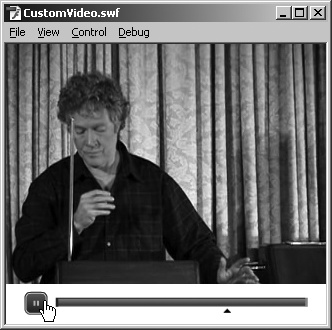
PausePlayButtonandSeekBarcomponents do indeed control video playback, even without the use of ActionScript or instance names (Figure 9-5).
New and Removed Components
Flash CS3 introduced six components for use in ActionScript 3.0
documents that remain available in Flash CS4: ColorPicker,
Slider, TileList, FLVPlaybackCaptioning, CaptionButton, and FullScreenButton. These components are
demonstrated in the section Changes in Writing Code for Components later in this chapter.
In conjunction with these additions, a number of previously available
components have been removed, which only happens when a FLA file is
configured for ActionScript 3.0. The removed items consist of the
non-visual data components, including XMLConnector and WebServiceConnector; the media components,
superseded in Flash 8 by FLVPlayback;
and the following UI components: Accordion, Alert, DateChooser, DateField, Menu, MenuBar, Tree, and Window.
Note
The media components are actually intended for ActionScript 1.0 but still function in ActionScript 2.0 documents. They are not, however, compatible with ActionScript 3.0.
The full list of authoring tool components for ActionScript 2.0 and 3.0 is shown in Table 9-2, Table 9-3, Table 9-4, and Table 9-5.
Component | AS 2.0 | AS 3.0 |
| X | |
| X | |
| X | |
| X | |
| X | |
| X |
Component | AS 2.0 | AS 3.0 |
| X | Superseded by |
| X | Superseded by |
| X | Superseded by |
Component | AS 2.0 | AS 3.0 |
| X | |
| X | |
| X | X |
| X | X |
| X | |
| X | X |
| X | X |
| X | |
| X | |
| X | X |
| X | X |
| X | X (renamed |
| X | |
| X | |
| X | X |
| X | X |
| X | X |
| X | X |
| X | |
| X | X |
| X | X |
| X | |
| X | |
| X | X |
| X |
Component | AS 2.0 | AS 3.0 |
| X | X |
| X | |
| X | X |
| X | X |
| X | |
| X | X |
| X | |
| X | X |
| X | X |
| X | X |
| X | X |
| X | X |
| X | X |
| X | X |
Note
For details on how to work around many of the missing components in ActionScript 3.0 documents, see Chapter 10.
Changes in Writing Code for Components
Thanks to the improved event-handling model in ActionScript 3.0,
writing code for the component set is as straightforward as any of the
event handling examples illustrated in other chapters of this book. Like
movie clip symbols and button symbols, components inherit from
the EventDispatcher class,
which means they all support the addEventListener() method that lets you
associate an event with a custom function that responds to that event. The
similarity among the following examples underscores the consistency
inherent throughout the ActionScript 3.0 API. These examples demonstrate
how to use the UI components that weren’t available in versions of the
authoring tool prior to Flash CS3.
Until you get familiar with a particular component, your first step
in programming one should always be to consult its class entry in the
ActionScript 3.0 Language and Components Reference, available at a
moment’s notice from the documentation (Window→Help), which opens in a
browser window. A class entry’s Events summary, in particular, lets you
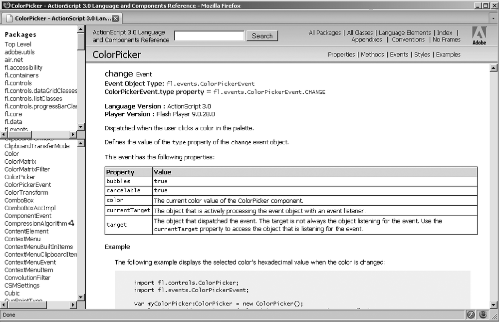
know immediately what events a component supports, as well as what data
type the event belongs to. For example, the ColorPicker class entry features a change event. Clicking on the hyperlink for this event indicates that the
event is referenced by way of the ColorPickerEvent class, as seen in Figure 9-6.
All the components reveal their secrets in this way, so you can easily program them. In all cases, the parameters shown in the Component Inspector panel correspond to properties of the component’s class. Properties may be configured in the panel, with ActionScript, or a combination of both.
ColorPicker
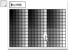
The ColorPicker component
displays a clickable color chip that expands into a
configurable color palette that lets you select a color or type in a
color (Figure 9-7).
Assuming a ColorPicker component on
the stage with the instance name myColorPicker and a movie clip with the
instance name myMovieClip,the following
ActionScript handles the selection of a color from the component’s
configurable color palette:
import fl.events.ColorPickerEvent;

var myColor:ColorTransform = new ColorTransform();

myColorPicker.addEventListener(ColorPickerEvent.CHANGE, ¬
     changeHandler);
function changeHandler(evt:ColorPickerEvent):void {
    myColor.color = myColorPicker.selectedColor;
    myMovieClip.transform.colorTransform = myColor;
}
The ColorPickerEvent class must
be imported, even in a frame script, because it isn’t part of the
flash package. A myColor variable is declared and set to an
instance of the ColorTransform class,
waiting to be used in response to a change event from the component. The operative
code here is the addEventListener() method, which
associates the ColorPickerEvent.CHANGE event constant with a
custom changeHandler()
function.
The changeHandler() function
sets the color property of the
myColor instance to the currently
selected color, and is then assigned to the colorTransform property of a movie clip with
the instance name myMovieClip. All DisplayObject objects, including
movie clip symbols and sprites, support color transformation in this
way.
The color palette of the ColorPicker component is fully customizable,
and can display up to 1,024 colors. To have the myColorPicker instance display red, white, and
blue, simply assign an array of hexadecimal values to the ColorPicker.colors property:
myColorPicker.colors = new Array(0xFF0000, 0xFFFFFF, 0x0000FF);
Slider
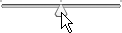
The Slider component provides a slider with a draggable knob that optionally
snaps to a configurable range of values (Figure 9-8).
As Figure 9-9 indicates,
the Slider component can be displayed
horizontally, but is easily set to a vertical orientation by a change to
the direction parameter (the first
entry in the Name column). Numerous other parameters are available. The
liveDragging parameter determines how
often Slider dispatches its change event. When liveDragging is set to true, SliderEvent.CHANGE is dispatched while the
knob is dragged, as often as the Slider.value property updates. When set to
false, the SliderEvent.CHANGE event is dispatched only
when you release the knob.
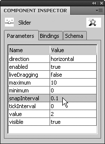
The maximum and minimum parameters define the component’s
range of selectable values, and snapInterval determines the rate at which
snapping should occur. The tickInterval parameter determines the
distribution of visible tick marks, and value determines the starting position of the
knob.
Warning
According to the Slider class
documentation, a snapInterval value of 0 is
supposed to mean continuous dragging, but this isn’t what actually
happens. In a range from 0 to 10, a snapInterval value of 1 snaps the knob to the values 0, 1, 2, 3,
etc. A value of 5 snaps the knob to
the values 0, 5, and 10. To achieve continuous dragging, enter a very
small value, such as 0.1.
The following ActionScript shows the Slider component as a volume slider, assuming
its range is set from 0 to 1. The volume setting is taken from the Slider.value property (see code in
bold):
import fl.events.SliderEvent;

var mySound:Sound = new Sound();
mySound.load(new URLRequest("sampleSong.mp3"));
var myChannel:SoundChannel = mySound.play();
var myTransform:SoundTransform = new SoundTransform();

mySlider.addEventListener(SliderEvent.CHANGE, changeHandler);
function changeHandler(evt:SliderEvent):void {
    myTransform.volume = mySlider.value;
    myChannel.soundTransform = myTransform;
}
A Sound instance is associated
with a SoundChannel instance, which
makes it available to volume transformations. Here again, the actual
event handler is very simple: the SliderEvent.CHANGE event is associated with a
custom changeHandler() function, which
invokes the Slide.value property on
the mySlider instance in order to
update the volume property of a
SoundTransform instance that, in
turn, updates the volume of the Sound
instance.
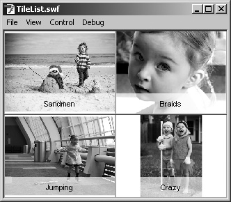
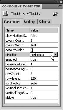
TileList
The TileList component is
comparable in some ways to an HTML table or a simplified version of the
DataGrid component. In a nutshell, it
provides a grid of rows and columns to display images (Figure 9-10).
Like the Slider component, the
properties of TileList are easy to
configure in the Component Inspector panel (Figure 9-11). The columnCount and rowCount parameters determine the
number of columns and rows in the grid, respectively, while columnWidth and rowHeight determine their dimensions. The
direction parameter specifies whether
images progress sequentially across or down the grid before wrapping.
Scrolling is configured with scrollPolicy parameter, which you can set to
auto, on, or off.
The following ActionScript produces the 2 by 2 grid shown in Figure 9-10:
myTileList.addItem({label:"Sandmen", source:"sandmen.jpg"});
myTileList.addItem({label:"Braids", source:"braids.jpg"});
myTileList.addItem({label:"Jumping", source:"jumping.jpg"});
myTileList.addItem({label:"Crazy", source:"crazy.jpg"});

myTileList.addEventListener(Event.CHANGE, changeHandler);

function changeHandler(evt:Event):void {
    trace(myTileList.selectedItem.label);
}
Note that the change event for
this component comes directly from the Event class, which means no import directive is necessary in frame scripts
that handle TileList events.
FLVPlaybackCaptioning and CaptionButton
Video subtitles and captions have been possible for several
releases of Flash, but until the FLVPlaybackCaptioning component, introduced in
Flash CS3, they required custom programming. In ActionScript 3.0
documents, you can now add captioning to your videos without code.
You do need an XML document that adheres to the World Wide
Web Consortium’s (W3C) specification for TimedText (TT) documents
(http://www.w3.org/AudioVideo/TT/). The CaptionButton component selects and deselects
captioning. Here’s an example of a TimedText XML document:
<?xml version="1.0" encoding="iso-8859-1"?>
<tt xmlns="http://www.w3.org/2006/04/ttaf1"
    xmlns:tts="http://www.w3.org/2006/04/ttaf1#styling">
<head>
    <styling>
        <style id="1" tts:textAlign="left"
            tts:fontFamily="Arial" />
        <style id="2" tts:textAlign="center"
            tts:fontFamily="Arial" />
    </styling>
</head>
<body>
    <div>
        <p begin="00:00:09.50" dur="1000ms" style="1">
            Okay, action!</p>
        <p begin="00:00:11.00" dur="2800ms" style="2">
            Twinkle, twi ... le</p>
        <p begin="00:00:15.50" dur="1500ms" style="1">
            Okay, action!</p>
        <p begin="00:00:17.50" dur="4600ms" style="2">
            Twink ... le ... tink [hiccup]!  Oh!</p>
        <p begin="00:00:22.75" dur="2100ms" style="1">
            Okay, action!</p>
        <p begin="00:00:25.75" end="00:00:29.25" style="2">
            Twinkle, twinkle, little star</p>
        <p begin="00:00:29.75" end="00:00:32.50" style="2">
            how I wonder what you are</p>
        <p begin="00:00:33.00" end="00:00:36.00" style="2">
            bup bup bup ... world so high,</p>
        <p begin="00:00:36.50" end="00:00:39.00" style="2">
            like a diamond in the sky,</p>
        <p begin="00:00:39.50" end="00:00:40.00" style="2">
            Oh!</p>
        <p begin="00:00:41.25" end="00:00:41.75" style="2">
            Oh dear.</p>
        <p begin="00:00:42.25" end="00:00:43.25" style="1">
            Action!</p>
        <p begin="00:00:43.50" end="00:00:47.00" style="2">
            [sproing! sproing! sproing!]</p>
        <p begin="00:00:48.00" end="00:00:53.00" style="2">
            How I wonder what you are.  Bup!</p>
        <p begin="00:00:54.00" end="00:00:55.50" style="2">
            Buh buh buh, oh ...</p>
        <p begin="00:00:56.00" end="00:00:57.00" style="2">
            Buh buh, oh ...</p>
        <p begin="00:00:57.50" end="00:00:58.50" style="2">
            Nooo!</p>
    </div>
</body>
</tt>
Note that a <styling>
element, nested in the <head>
element, allows for the declaration of styles—here, left- and
center-alignment—that can be referenced by an id attribute later in the body of the
document. Note, also, the alternate ways to specify the duration of a
caption, including collaborative begin and dur attributes, such as begin="00:00:09.50" dur="1000ms", and
collaborative begin and end pairings, such as begin="00:00:25.75" end="00:00:29.25". Once a
TimedText document is prepared, the process of captioning is
trivial.
Drag a copy of the FLVPlayback
and FLVPlaybackCaptioning components
to the stage. Neither component needs an instance name. FLVPlaybackCaptioning becomes
invisible at runtime. Position it where you like.
Use the Component Inspector panel to configure the skin
parameter of the FLVPlayback
component to None or to one of the
skins with the word “Under” in the name, like SkinUnderPlaySeekCaption (this is important
because skins with “Over” in the name obscure the captioning text
field). Set the source parameter to a
video file that correlates with the TimedText document.
Select the FLVPlaybackCaptioning component, and then set its source
parameter to the location of the TimedText document, as shown in Figure 9-12.
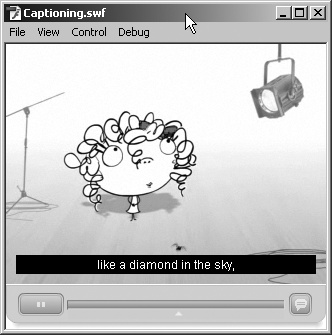
At runtime, captions are automatically transferred from XML format
to visual display, as seen in Figure 9-13. The CaptionButton component is built-in to any
skin whose name contains the word “Caption” and allows the user to
select and deselect captions. If no skin is selected, captions are displayed by default.
The CaptionButton component can also
be used on its own, apart from any skin, in the same manner described in
the FLVPlayback exercise in the Feature Changes of
this chapter.
FullScreenButton
The FullScreenButton component
exists as a built-in element of several of the provided skins for the
FLVPlayback component, as well as a
standalone component used with FLVPlayback. Ultimately, the FullScreenButton component is just a button
that invokes the FLVPlayback.enterFullScreenDisplayState()
method. To demonstrate its use, you have to view the SWF file and video
content in a properly configured browser window.
Open the CustomVideo.fla file created in this chapter’s Feature Changes, and then resave it as FullScreenButton.fla.
Open the Components panel, and then drag a copy of the
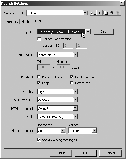
FullScreenButtoncomponent to the stage. No instance name is necessary.Select File→Publish Settings→HTML, and then change the Template drop-down list to “Flash Only - Allow Full Screen,” as shown in Figure 9-14.
The selection of this template automatically inserts crucial lines of code in the HTML that embeds the SWF file, although the addition can certainly be made by hand. If you prefer to work manually, you have to add a new
<param>element inside the existing<object>element to explicitly permit full-screen viewing (new code in bold):<object><param name="allowFullScreen" value="true" />then add a corresponding attribute to the companion
<embed>element:<embed src="FullScreenButton.swf" ...
other attributes... allowFullScreen="true" ... />These additions must be mirrored in the JavaScript function that appears in the same HTML document.
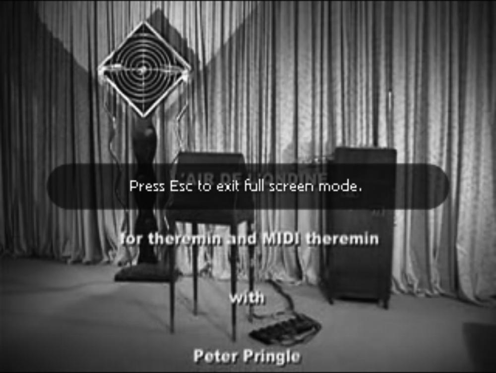
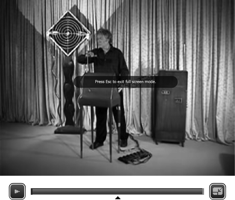
Select File→Publish Preview→HTML to launch the SWF file in a browser. Click the
FullScreenButtoncomponent to see the video display in full-screen mode (Figure 9-15). Press the Esc key at any time to exit full-screen mode.Note that during full-screen mode, the video UI controls are hidden from view. This happens because the
FLVPlayback.fullScreenTakeOverproperty is set totrueby default.
Close the SWF file. Select the
FLVPlaybackcomponent on the stage, and then use the Property inspector to name itmyFLVPlayback. Select frame 1 in the Timeline, and then open the Actions panel. Enter the following code:myFLVPlayback.fullScreenTakeOver = false;
Select File→Publish Preview→HTML once again to launch the SWF file in a browser. Note that this time, the components remain visible in either mode (Figure 9-16).
Changing the Appearance of Components
The standard look and feel of the ActionScript 3.0 component set can be freely changed, a procedure called styling or skinning, depending on how you go about it.
Styling Components with Code
The StyleManager class lets you
reference special styling properties—called styles—for each component.
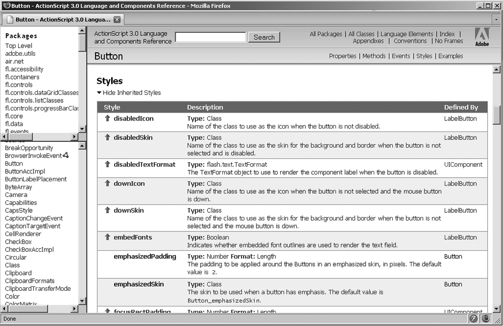
For example, in the Help menu’s ActionScript 3.0 Language and Components
Reference, if you consult the class entry for the Button component, you find that in addition to
Public Properties, Public Methods,
and Events summaries, the Button
class also features a summary for Styles, as seen in Figure 9-17. Make sure to always
click “Show Inherited Styles” to see them all.
One of these styles (not shown in Figure 9-17) is called textFormat, which makes a quick and useful
demonstration of two StyleManager
methods.
Create an ActionScript 3.0 FLA file, and then open the Components panel. Drag a copy of the
ButtonandCheckBoxcomponents to the stage.Select frame 1 in the Timeline, and then open the Actions panel. Enter the following code:
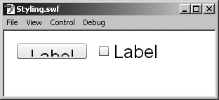
import fl.managers.StyleManager;
import fl.controls.Button;
import fl.controls.CheckBox;

var myTextFormat:TextFormat = new TextFormat();
myTextFormat.size = 26;

StyleManager.setStyle("textFormat", myTextFormat);
The
StyleManager,Button, andCheckBoxclasses must be imported, even in frame scripts, because none of these classes belongs to theflashpackage. AmyTextFormatvariable is declared and set to an instance of theTextFormatclass, and then has itssizeproperty set to 26. Finally, the staticStyleManager.setStyle()method is invoked, with"textFormat"as the first parameter, and themyTextFormatinstance as the other. The"textFormat"parameter is a string that refers to thetextFormatstyle that both of these components happen to share.Select Control→Test Movie to experience a font size that’s too large for the current dimensions of the components (Figure 9-18), showing that the
setStyle()method applies styling to all components in a document that feature thetextFormatstyle.Close the SWF file, and then return to the Actions panel. Update the existing ActionScript so that it looks like this (changes in bold):
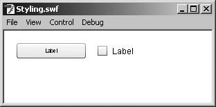
import fl.managers.StyleManager;
import fl.controls.Button;
import fl.controls.CheckBox;

var myTextFormat1:TextFormat = new TextFormat();
myTextFormat1.size = 26;

var myTextFormat2:TextFormat = new TextFormat();
myTextFormat2.size = 8;

StyleManager.setStyle("textFormat", myTextFormat1);
StyleManager.setComponentStyle(Button, "textFormat", ¬
     myTextFormat2);
This time, two
TextFormatinstances exist. The first one, as before, is fed into theStyleManager.setStyle()method, and updates thetextFormatstyle of both components. The second one, which was configured with a smaller font size, is fed into theStyleManager.setComponentStyle()method, which accepts one additional parameter; namely, the class name of one of the components,Button. This second method overrides the global formatting established by thesetStyle()method, because it calls out a particular component type by name.Select Control→Test Movie again to verify that the
Buttoncomponent now has a much smaller font size (Figure 9-19).Close the SWF file again. You’ve seen how to affect the styling of all components in a document, and you’ve also seen how to affect the styling of all of one type of component. The final way to stylize components is to invoke the
UIComponent.setStyle()method, which is inherited by each component individually. Select theCheckBoxcomponent, and then use the Property inspector to give it the instance namemyCheckBox. Return again to the Actions panel, and then update the existing code so it looks like this (changes in bold):import fl.managers.StyleManager; import fl.controls.Button; import fl.controls.CheckBox; var myTextFormat1:TextFormat = new TextFormat(); myTextFormat1.size = 26; var myTextFormat2:TextFormat = new TextFormat(); myTextFormat2.size = 8; var myTextFormat3:TextFormat = new TextFormat(); myTextFormat3.size = 12; StyleManager.setStyle("textFormat", myTextFormat1); StyleManager.setComponentStyle(Button, "textFormat", ¬ myTextFormat2); myCheckBox.setStyle("textFormat", myTextFormat3);
A third
TextFormatinstance has been added, this one routed specifically to themyCheckBoxinstance, via its inheritedUIComponent.setStyle()method. The original size-26 formatting is still in effect, but theButtoncomponent overrides it, thanks to its more specifically honedmyTextFormat2instance. Here, theCheckBoxcomponent also overrides it, thanks to its even more specifically honedmyTextFormat3instance.Select Control→Test Movie one last time to verify that the
CheckBoxcomponent now features a practically normal-sized font (Figure 9-20).

The textFormat style isn’t the
only property available, of course. Many components feature an icon style, for example, that lets you
incorporate a small image into the component’s display. Consult the
class entry of the component(s) in question, and have fun
experimenting!
Skinning Components Manually
It goes without saying that some design choices are more successful when implemented manually. Changing the actual make-up of a component’s skin—that is, redrawing or manipulating the actual movie clips that comprise a component’s features—is called skinning, and from a designer’s standpoint, it couldn’t be any more intuitive than the following steps.
Create a new ActionScript 3.0 FLA file, and then open the Components panel. Drag a copy of the
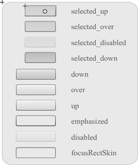
Buttoncomponent to the stage.Double-click the
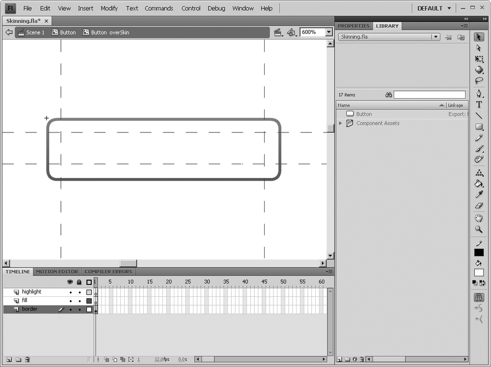
Buttoncomponent on the stage, just as you would to edit in place any movie clip symbol. Doing so opens the component into an “exploded view” that reveals each element of its default skin, as seen in Figure 9-21.
Double-click the representation of the
overstate to enter the timeline of that element. Most component skins take advantage of 9-slice scaling, as seen in Figure 9-22. The dashed lines indicate which portions of the image will scale when resized and which portions won’t. In Figure 9-22, the corner regions maintain their present aspect ratios, while the top, bottom, and sides stretch as necessary.Individual component skins may vary, but you’ll typically find a number of timeline layers already in place. Here, these include layers named
highlightandfill. Carefully select the content of these layers, and then delete it. Select the Paint Bucket tool, choose a markedly different fill color, such as pink, and then click inside theborderlayer stroke to fill the rounded rectangle.Select Edit→Edit Document to return to the main timeline. Drag another copy of the
Buttoncomponent from the Library to the stage.Select Control→Test Movie, and then move your cursor over and away from both
Buttoncomponents to verify that their over states have visually changed.