
Adapt to Ventura Changes
In later chapters, I cover specific apps that have had significant changes, such as Mail, Messages, and Safari, as well as new or improved system-wide technologies like Copy Subject and Live Text. Before we get to those details, though, I want to walk you through a few big overall changes that may disorient you—especially if you weren’t previously running Big Sur or later.
Get Your Visual Bearings
In Ventura, almost everything has the same overall look as in Monterey and Big Sur, so if you’re upgrading from one of those, nothing should be particularly surprising; feel free to skip ahead to Explore System Settings. However, if you’re upgrading from Catalina or earlier, some things will look and act significantly different, and just to avoid confusion, you should get familiarize yourself with some of the new(er) user interface elements.
The Menu Bar
Starting at the top of the screen, we have the familiar Mac menu bar. It’s now even more translucent than before, letting your background image show through, with text that changes in shade depending on the color behind it. The menus themselves are also more translucent. (If you dislike this effect, see the sidebar Turn Off the Translucency.)
As always, the Apple menu is on the left, followed by other menus such as File, Edit, and View. Individual items on each menu are now more widely spaced, as are the icons for menu extras on the right.
Apple-provided menu extras such as the clock, Wi-Fi ![]() , Spotlight
, Spotlight ![]() , and Time Machine
, and Time Machine ![]() (each of which can be enabled or disabled on the appropriate pane of System Settings) are still there. You’ll also see new icons for Battery
(each of which can be enabled or disabled on the appropriate pane of System Settings) are still there. You’ll also see new icons for Battery ![]() (on laptops only) and Control Center
(on laptops only) and Control Center ![]() , which gives you quick access to system settings (see Control Center).
, which gives you quick access to system settings (see Control Center).
The Dock
Your Mac’s Dock (Figure 7) is now more translucent than before (again, see the sidebar Turn Off the Translucency if that makes you unhappy). It looks much like the Dock on an iPad, in that it floats near the bottom of the screen (or near the left or right edge, if you’ve changed its position in System Settings > Desktop & Dock). I think it strains the metaphor to use the word dock for a thing that floats, but that’s me. In any case, the change in position is subtle; you’re more likely to notice the redesigned icons, about which I say more next.

Icons
Almost every icon for Apple software included with macOS—including the Finder, Siri, all the apps in the Applications folder, and the panes of System Settings—has been updated. (Figure 8 shows some examples; you can see a few more in Figure 7, above, and still more below in Explore System Settings.)

Most of the icons are similar to, or derivatives of, their earlier versions, while others are dramatically different. For app icons, Apple has chosen to use the same design as on iOS and iPadOS, where each icon is a rounded rectangle. They’ve reduced the color palette, too, to favor just a handful of shades.
Windows
Windows, like menus, now have more widely spaced elements and are predominantly white (or translucent) with some gray accents. They also have much rounder corners than in earlier versions of macOS. And the disclosure triangle (![]() )—that little icon to the left of folders that you click to expand or collapse the view of what’s inside them—is now no longer a triangle: it’s more of a caret (
)—that little icon to the left of folders that you click to expand or collapse the view of what’s inside them—is now no longer a triangle: it’s more of a caret (![]() ). So it’s called the disclosure arrow now.
). So it’s called the disclosure arrow now.
There are also two other significant changes to windows:
Toolbars: The toolbar is the area at the top of a window that typically contains icons for changing the view and performing actions on items in the window. In Catalina and earlier (Figure 9, top), it was a gray bar that extended across the entire window; in Big Sur and later (Figure 9, bottom), it’s a white area that begins to the right of the sidebar (if any) and has subtler icons without borders that make them look like buttons.
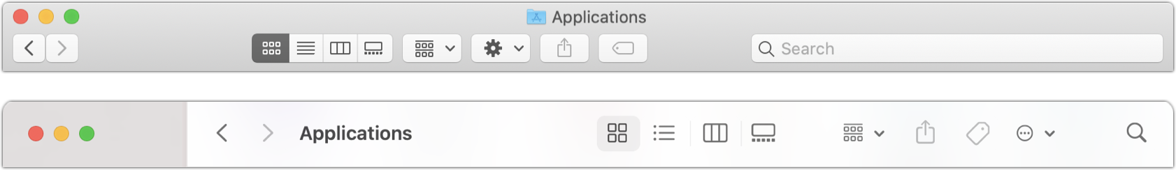
Figure 9: The toolbar of a Finder window in Catalina (top) and Ventura (bottom). Sidebar: The sidebar (see Figure 10) in apps like the Finder, Mail, Notes, and Photos now extends all the way to the top of the window, and now features blue rather than gray icons for Favorites. (You can adjust the size of the text and icons in the sidebar by going to System Settings > Appearance and choosing Small, Medium, or Large from the “Sidebar icon size” pop-up menu.)
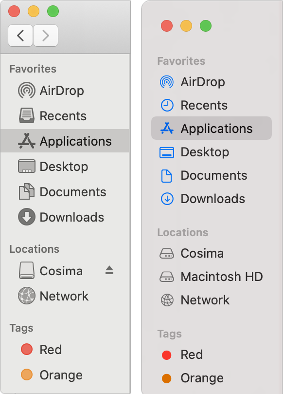
Figure 10: The sidebar of a Finder window as it appears in Catalina (left) and Ventura (right).
Alerts
The standard shape of alerts has changed from a horizontal orientation to a vertical orientation. Figure 11 shows the difference. Although some alerts (especially from third-party apps) may continue to have the old-style appearance for a while, the new standard is to make alerts look much like they do in iOS and iPadOS.

Control Center
If you have an iPhone or iPad, you’re already familiar with Control Center there: swipe down from the upper-right corner of your device’s screen to get quick access to common settings and controls—without having to dig around in Settings or open any apps. The macOS Control Center (first introduced in Big Sur) is the same concept.
To display Control Center on your Mac, click the Control Center ![]() icon on your menu bar. A panel overlay (Figure 12) appears.
icon on your menu bar. A panel overlay (Figure 12) appears.

Here, you can do three types of activities:
Manipulate a control directly: If you want to turn something on or off, click the round toggle button next to the label. For example, click the Bluetooth
 button to toggle Bluetooth. You can also drag the Display or Sound slider to change brightness or volume levels, and use the icons on the Music tile to control playback in the Music app.
Display controls: Some Control Center tiles, such as Keyboard Brightness and Screen Mirroring, have no visible controls, but if you click the tile, a separate control panel appears. For example, click Screen Mirroring to display a panel with a list of other screens to which you can mirror or extend your display and a link to open the Display pane of System Settings.
Display expanded controls: If a tile (or a portion of a tile) displays a disclosure
 arrow when you hover over it, you can click the tile in that spot to display an expanded set of controls. For example, if you click the Focus tile, you see a display with options for Do Not Disturb and other focus modes, as well as a link to the Focus pane of System Settings.
The tiles and their capabilities are:
Wireless: This tile has sections for Wi-Fi, Bluetooth, and AirDrop. Use one of the three buttons to enable or disable the appropriate wireless feature, or click for additional options (such as choosing a different Wi-Fi network).
Focus: Click the tile to enable Do Not Disturb or another focus mode.
Stage Manager: Click the tile to turn on Stage Manager, a new way of managing your windows (see Discover Stage Manager).
Screen Mirroring: Click to see other devices you can mirror your screen to using AirPlay.
Display: Drag the bar to set your screen brightness. Click to see controls for Dark Mode, Night Shift, True Tone (if your display supports it), and connecting to an iOS or iPadOS device as a second screen using Sidecar.
Sound: Drag the bar to adjust your system volume. Click the tile to send the output to a different destination via AirPlay.
Music: See what’s currently playing and use the icons to play, pause, or skip to the next track. Click the tile to see expanded playback controls.
Customize Control Center
Control Center offers limited customizability. The seven main Control Center tiles listed above are always visible, but you can optionally add any of three additional items, each of which then appears as a tiny tile at the bottom of Control Center. To do this, go to System Settings > Control Center, scroll to the bottom, and turn on Show in Control Center for any or all of these:
Accessibility Shortcuts: Provides one-click toggles for common accessibility features. Also includes shortcuts to open System Settings > Keyboard > Shortcuts and System Settings > Accessibility.
Battery (laptops only): Shows your battery’s current charge with an icon and percentage; click this to see more details, including which apps are using significant energy.
Hearing: Turn background sounds on or off, or jump directly to Accessibility Settings.
Fast User Switching: Click this to switch to a different user. Also includes shortcuts to the login window and the Users & Groups pane of System Settings.
Keyboard Brightness (laptops only): Adjust the level of backlighting on your built-in keyboard or open the Keyboard pane of System Settings.
Manage Menu Items
Every item in Control Center can also appear as a separate icon on your menu bar. For example, you can have a standalone Bluetooth ![]() icon on your menu bar that shows you exactly what you’d see if you clicked the Bluetooth portion of the wireless tile in Control Center. Some of these icons may already be visible (and can be removed), while others can be added.
icon on your menu bar that shows you exactly what you’d see if you clicked the Bluetooth portion of the wireless tile in Control Center. Some of these icons may already be visible (and can be removed), while others can be added.
To add Control Center items to your menu bar, you can:
Display Control Center and then drag any tile up to your menu bar to “pin” it in that location.
Open System Settings > Control Center, and under Control Center Modules, choose Show in Menu Bar for any item. (For some items, instead of Show in Menu Bar, you can choose Always Show in Menu Bar to display the item persistently, or Show When Active to display it only when the relevant feature is in use.)
To remove menu bar icons for Control Center items, you can:
⌘-drag the icon off your menu bar. (You might have to drag it more than a short distance for macOS to be convinced you’re really trying to remove it.)
Open System Settings > Control Center, and under Control Center Modules, choose Don’t Show in Menu Bar for any item.
Notification Center
Mac users previously clicked the Notifications ![]() icon on the menu bar to display a slide-in view called Notification Center. Starting in Big Sur, to show Notification Center, click the time on your menu bar. You’ll see something like Figure 13.
icon on the menu bar to display a slide-in view called Notification Center. Starting in Big Sur, to show Notification Center, click the time on your menu bar. You’ll see something like Figure 13.
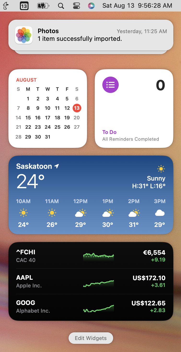
Like the pre-Big Sur Notification Center, this new version, by default, shows upcoming calendar and reminder items, the weather, and stock prices. But the big change is notifications themselves, which appear above these widgets. Now, instead of a single, endlessly scrolling, reverse-chronological list, notifications are grouped by app in “stacks.” If you see a stack, you can click it to expand it and show all the individual notifications inside. To collapse it again, click Show Less.
Notifications can also be interactive—for example, you can click and hold on a notification from Podcasts about a new episode to play that episode, or click and hold on a Mail notification to compose a reply right there.
To dismiss a notification, hover over it and click the X ![]() icon that appears in the upper-left corner. For an unexpanded stack, this icon becomes Clear All when you hover over it, enabling you to dismiss all the notifications from an app at once.
icon that appears in the upper-left corner. For an unexpanded stack, this icon becomes Clear All when you hover over it, enabling you to dismiss all the notifications from an app at once.
And, to dismiss Notification Center altogether, press Esc or click the clock again.
To customize your widgets, display Notification Center and click Edit Widgets at the bottom. You can then do any of several things:
To delete an existing widget, click its minus
 icon. (You can always add it again later.)
To rearrange widgets, drag them to a new location.
To add widgets, drag one from the large display in the center to your desired location. (You can use the list on the left to sort by app; some apps have more than one associated widget.)
Some widgets come in two or three sizes, indicated by S, M, and/or L icons at the bottom. (Larger sizes display more information or offer more controls.) Select a size before dragging the widget to see which configuration is most useful to you.
When you’re finished, click Done.
Explore System Settings
When I first heard that System Preferences was going to be reorganized with a sidebar on the left listing the categories and the settings themselves on the right, I thought, “Wow, great! Now I’ll finally be able to find stuff!” My enthusiasm was premature, however. Although there are some definite pluses to the new layout of what is now called System Settings, I find it more cumbersome to use overall. (Your mileage, as always, may vary.)
System Settings (which you can open by clicking the Dock icon, or by double-clicking System Settings in the Applications folder, or by choosing Apple > System Settings) now—for better or worse—mimics the user interface of an iPhone or iPad, borrowing heavily from the design of the Settings app on those platforms (Figure 14).

The first thing you’ll want to know is: “Where do I find the controls for x?” I have great news: you get to go on a treasure hunt! If you’ve been using macOS for many years and have developed strong intuitions as to where certain preferences can be set, your best bet—seriously—is to discard all those expectations and plan to find most things from scratch (or use the Search field). You’ll get it eventually, but plan on a learning curve.
To be fair, some of the old System Preferences panes map directly to new ones. For example, in Monterey and earlier, you would go to System Preferences > Displays to see your display settings; now you go to System Settings > Displays (that is, you select the Displays category in the sidebar).
However, Apple did an extraordinary amount of rearranging, with some of the old panes split, others combined, and still others decomposed and scattered entirely. I have no problem with rethinking long-used interfaces if the new way makes more sense. But if the goal is helping users to find things, System Settings is no better, and arguably worse, than System Preferences.
A common criticism of System Preferences was that the arrangement of icons representing the various panes was seemingly arbitrary. So, one might have expected that the new categories in Ventura’s System Settings would be arranged, I don’t know, maybe alphabetically. But one would be hilariously wrong. There are now eight unlabeled groupings of categories, plus a ninth at the bottom if you have any third-party settings. Even within those eight groups, categories are not alphabetized. Alert readers may notice that the groupings and arrangement vaguely resemble what we have in iOS and iPadOS—which is reasonable enough in terms of consistency, but terrible in terms of actually being able to find anything.
In an early draft of this book, I started listing all the settings that had moved to entirely new (and typically unpredictable) locations, but by the time my bulleted list got to three pages, I realized no one would ever want to slog through learning all those new locations. So, as I mentioned earlier, I recommend relying heavily on the Search field at the top. That will almost certainly lead you to the correct destination more quickly than scanning through a long list. (I do, however, tell you about entirely new settings in Ventura, as well as some that have disappeared, just ahead.)
Within each pane, you’ll notice still more changes. Controls previously represented as a checkbox are now generally unlabeled on/off switches (Figure 15), multi-level panes (such as General) now force you to click through individual subcategories that then hide the remainder of the list (Figure 16), and many controls are now in dialogs that appear when you click an Info ![]() icon.
icon.


 icon next to Sharing at the top to navigate back!
In my opinion, this interface is better suited for touch-screen devices, whereas the old System Preferences interface was better suited for a keyboard-and-mouse/trackpad setup. In particular, many of the things I did regularly in System Preferences now require more navigation and clicking in System Settings.
Be that as it may, I want to point out two especially positive changes:
The System Settings window is now resizable (though only vertically)—just drag up or down from the bottom edge of the window. This lets you see more at once, which is helpful. Of course, the flip side of this is that many of the panes now require either resizing or scrolling to see their full contents whereas they didn’t before; this adds irritating busywork to using System Settings.
By default, none of Apple’s built-in panes require you to unlock them before using them. (OK, you do have to enter a password to see the contents of the Passwords pane, but there are no more lock icons in the corner, as there have been for years.) Instead, System Settings prompts you for authentication after the fact, only when you change one of the specific settings that requires it. This makes the app a bit less cumbersome to use, and I appreciate it.
Whether you love or hate the new System Settings, you’ll certainly want to know about changes that are not merely cosmetic, such as moving a setting to a new location, changing a checkbox to a switch, or adjusting the text of a label. In the topics that follow, I look at what capabilities are new or significantly different—they’re listed by the name of the pane as it appears in the sidebar of System Settings. I list these in the order they appear in the sidebar.
Apple ID Settings
Two new settings appear on the Apple ID pane, both of which I explain in more detail in Apple ID:
Automatic Verification: This new switch, in Apple ID > Password & Security, will eventually enable you to bypass some CAPTCHA tests for faster webpage logins.
Wallet: In Apple ID > iCloud there’s now an on/off switch for Wallet.
Family Settings
The Family pane in System Settings now has entries for each family member. Click a family member’s name to display a dialog (Figure 17) where you can view and edit a variety of details all in one place, including Location Sharing and Parent(s)/Guardian(s); and, for children, Screen Time, Ask to Buy, Subscriptions, and Purchases. Select a subcategory on the left to see or adjust the corresponding settings.

Wi-Fi Settings
The new Wi-Fi pane gives you a shortcut to Network > Wi-Fi. If you click Details next to the current Wi-Fi network (or hover over any of the Known Networks, click the More ![]() icon, and choose Network Settings from the pop-up menu), you’ll see a new option: Low Data Mode. Turn this on to limit the amount of data used on this Wi-Fi network (similar to the way you’ve previously been able to limit cellular data usage on an iPhone or cellular iPad).
icon, and choose Network Settings from the pop-up menu), you’ll see a new option: Low Data Mode. Turn this on to limit the amount of data used on this Wi-Fi network (similar to the way you’ve previously been able to limit cellular data usage on an iPhone or cellular iPad).
There is another little change in this pane. macOS has long stored Wi-Fi passwords and synced them among your devices via iCloud Keychain, and Ventura adds a potentially more convenient way to find and copy these passwords (for example, if you want to share them with someone else).
Scroll down to the very bottom and click the Advanced button. In the Known Networks list, click the More ![]() menu next to a Wi-Fi network to access commands for Auto-Join and Remove from List (both of which you could do in Monterey and earlier), plus a new one: Copy Password. Choose this to put the Wi-Fi network’s password on your clipboard.
menu next to a Wi-Fi network to access commands for Auto-Join and Remove from List (both of which you could do in Monterey and earlier), plus a new one: Copy Password. Choose this to put the Wi-Fi network’s password on your clipboard.
Network Settings
The big change here is not what’s new, but what’s missing. You can no longer configure different sets of network settings for different locations and then switch among them with a simple menu command. It’s possible that such a small percentage of Mac users knew about or employed this feature that Apple felt it wasn’t worth keeping around, but the people who liked it, really liked it. Take Control author Jason Snell decries the loss of this feature in Apple removes Network Locations from macOS Ventura.
Focus Settings
Ventura introduces focus filters, which give you control over which portions or aspects of an app can notify you in a focus mode; it also lets you choose whether to allow or silence a list of people or apps. I cover these features later in Focus.
General Settings
Whereas the General pane of System Preferences in Monterey and earlier was just that—a small selection of general preferences—in Ventura, General is a broader category with a dozen subcategories, most of which were separate panes in earlier versions of macOS:
About: The information here is similar to what’s in the About This Mac window (Apple > About This Mac)—with buttons that link to other locations in System Settings for things like Displays and Storage. (Because of this change, Ventura’s About This Mac window has become much smaller and simpler, as in considerably older versions of macOS.)
Software Update: This is where you now go to update macOS and built-in apps, and to configure automatic updates if you want them. Click the Info
 icon next to Automatic Updates to see a new switch, “Install Security Responses and System files,” which is on by default. These are special, urgent security updates that can be installed and applied as needed without restarting your Mac.
Storage: The Storage subcategory gives you information about disk usage—the same information that used to be on the Storage tab of the About This Mac window. It also lets you move your Desktop and Documents folder to iCloud Drive (which I don’t recommend), enable an optimized storage feature for movies and TV shows, or turn on automatic trash emptying.
Login Items: Your login items were previously shown in System Preferences > Users & Groups > Your Name > Login Items. Unlike in Monterey and earlier, there’s no Hide checkbox for each item (to open items at login in the background). However, there is a new Allow in the Background list, with switches for each app and process that wants to be able to perform actions when it’s not actively running—things like checking for updates or syncing data. I recommend reviewing this list to check for anything that you don’t want to run in the background.
Language & Region: The Language & Region subcategory, formerly its own pane in System Preferences, has a new setting that appears if you have more than one Preferred Language configured: List Sort Order. (Unless your lists are sorting in an obviously incorrect manner, Universal is almost certainly the right choice here.) Unfortunately, Ventura no longer offers granular control over number separators, currency symbol, and user-defined date and time formats.
Time Machine: I’m surprised that Time Machine is no longer a top-level option, given how important it is, but it’s now a subcategory of General. It has a new feature that lets you change backup frequency. Click Options and choose an option from the “Back up frequency” pop-up menu: Manually, “Automatically every hour” (the default), “Automatically every day,” or “Automatically every week.” In addition, when configuring a new, APFS-formatted local volume for Time Machine backups, you can now set a maximum size for the portion of the disk dedicated to Time Machine.
Transfer or Reset: This subcategory, on the other hand, is easier to find than it once was (it was on the application menu in Monterey’s System Preferences). Click Open Migration Assistant to move data to or from another Mac, or click Erase All Contents and Settings (and follow the prompts) to delete the contents of your Mac’s Data volume, leaving a plain installation of macOS itself.
Accessibility Settings
The Accessibility pane now has new options for configuring AirPods (see AirPods Controls), playing soothing sounds such as rain or ocean in the background (see Background Sounds), controlling screen zoom (see Zoom Control), and captioning audio and video playing through your Mac (see Live Captions).
AirPods Settings
If you have AirPods that are currently connected to your Mac, there will be a separate entry in System Settings for them, right above Keyboard; the name of the entry will match the name you’ve given your AirPods. Select this to customize all your AirPods settings in one place.
Control Center Settings
Two items now appear on the Control Center pane that previously did not:
Hearing: There are now switches to show the Hearing
 icon on your menu bar or in Control Center. When one of these is enabled and you click the icon, you can turn background sounds on or off, or jump directly to Accessibility Settings.
VPN: If you have a VPN (virtual private network) configured on your Mac, you can show or hide it on your menu bar using the VPN pop-up menu.
Siri & Spotlight Settings
In System Settings > Siri & Spotlight, click Siri Responses to see two new options:
Always Show Siri Captions: When this is on, Siri’s audio responses are also shown on screen.
Always Show Speech: When this is on, what Siri recognizes you as having said appears on screen.
Privacy & Security Settings
Three new settings appear on the Privacy & Security pane:
App Management: A new subcategory under the Privacy heading, App Management lets you choose which apps are allowed to update or delete other apps. Before you object that this would be a weird and obviously unsafe thing to do, keep in mind that Setapp does exactly this: it installs, updates, and removes other apps. This setting is off by default; turn it on for Setapp or any other app you want to have this capability.
Connection alert: M-series Macs can now notify you when a USB or Thunderbolt accessory is attached (Figure 18). From the “Allow accessories to connect” pop-up menu, choose “Ask every time,” “Ask for new accessories” (the default), “Automatically when unlocked,” or Always.

Figure 18: A dialog like this asks you to confirm that it’s OK for your Mac to use the newly attached accessory—even if you used it under Monterey or earlier. Lockdown Mode: This new and, in Apple’s own words, extreme mode makes your Mac extra resistant to targeted cyberattacks, which also severely restricts normal activities. (Read Apple’s description here.)
Desktop & Dock Settings
The only new Desktop & Dock settings are to turn Stage Manager on or off, and customize it; see Discover Stage Manager.
Battery Settings
Battery settings, as usual, appear only on Mac laptops. If you click the Options button on an M-series Mac laptop, you’ll see a new switch: “Optimize video streaming while on battery,” which is on by default. This reduces battery drain when streaming video, presumably at the expense of video quality.
Game Center Settings
The Game Center pane has a new option: “Requests from contacts only” (off by default). If you turn this on, then only Game Center requests from people who are in your Contacts will appear in your inbox; others will be ignored.
Keyboard Settings
In the Dictation subcategory of Keyboard settings there’s a new Auto-Punctuation switch, which is on by default. To learn more about this, flip ahead to Dictation.
Game Controller Settings
If you have any game controllers connected to your Mac, this new pane appears with options to configure the controllers. I don’t have any such controllers, so I was unable to test this feature.
Update Your Backup Strategy
I hope that you’re backing up your Mac regularly! (If not, today is an excellent time to start.) For the most part, whatever backup strategy you may have used with Big Sur or Monterey should continue to work under Ventura. For example, Time Machine backups should keep running as usual, as will online backup services such as Backblaze. Read my book Take Control of Backing Up Your Mac for more advice.
If you were already running Monterey or Big Sur and have adapted your backups to the changes that took place in those versions of macOS, you can skip this topic and move on to Discover Stage Manager. But if you’re upgrading from Catalina or earlier, there are a couple of significant changes to recent versions of macOS that may affect how you think about backups.
Time Machine on APFS
Up through Catalina, Time Machine could use only Mac OS Extended (HFS Plus) volumes as destinations, even when the source volume was formatted as APFS. (In some situations, Time Machine could use a disk image formatted as Mac OS Extended, where the image itself was stored on an APFS volume, but the actual volume Time Machine wrote to could not be APFS.) Starting in Big Sur, however, Time Machine can also store backups on APFS-formatted volumes.
Why would any of this matter? Well, APFS (see More About APFS) has advantages in both reliability and security. And, when Time Machine backs up to an APFS volume, it uses space much more efficiently (copying only the portions of files that have changed, not the whole files). That means you can store more backups on a smaller drive.
This development is good news, but it won’t have any practical affect on most users, because:
Ventura does not automatically convert Time Machine volumes from Mac OS Extended to APFS.
You can’t manually convert an existing Time Machine volume from Mac OS Extended to APFS without erasing it and starting over from scratch. However, if you format a new, empty volume as APFS, Time Machine can use it in Ventura.
Even if you can start over from scratch with a newly formatted volume, you may not want to, as your Time Machine backup will then be usable only by Macs running Big Sur or later—this change is not backward-compatible to Catalina and earlier.
So, even though you can do this now, the only situation in which I currently recommend using APFS for Time Machine is when it will be used only to back up Ventura sources, and you’re starting fresh with a new Time Machine backup.
Bootable Duplicates in Ventura
I long recommended bootable duplicates as one of the pillars of a complete backup strategy, but as I mentioned earlier in Back Up Your Disk, I no longer do. If you’re still depending on them, you should be aware of two gotchas:
Split volumes: Most Mac backup apps designed to make bootable duplicates evolved to handle the split-volume structure introduced in Catalina, in which there’s a read-only volume for system files and then a separate (but normally invisible) read-write volume for your data. However, in Big Sur and later, Apple took the split volumes further, adding a digital signature to the system volume. That signature becomes invalid if copied conventionally, and without a valid signature, you can’t boot from the volume. Apps such as Carbon Copy Cloner and SuperDuper! can now create bootable duplicates of this structure, but with a catch: the destination volume must be erased before creating a bootable duplicate, and once it has been created, only the Data volume can later be updated with new or changed information. (If macOS is updated and you want your backup to reflect that, you must start your Mac from the bootable duplicate and update macOS there using Software Update.)
As an alternative, I now recommend creating a duplicate of just the Data volume, which can solve nearly all of the same problems that previously required a bootable duplicate, though in a somewhat more cumbersome way. (If you want, you can install macOS onto the data-only backup disk after the fact, thus making it bootable. For details, read Creating and restoring data volume backups on the Carbon Copy Cloner site.)
Bootable duplicates over a network: Apps like Carbon Copy Cloner, ChronoSync, and Retrospect can no longer create bootable duplicates over a network (with the destination volume on a drive connected to another Mac); your backup disk must now be directly connected to your Mac, via USB or Thunderbolt.