Displaying Descriptive Statistics
In This Chapter
![]()
- How to construct different frequency distributions
- How to graph a frequency distribution with a histogram
- The usefulness of pie, bar, and line charts
- How to construct a stem and leaf display
- Using Excel to construct charts
Having explained the various types of data that exist for statistical analysis in Chapter 2, here we will explore the different ways in which we can present data. In its basic form, making sense of the patterns in the data can be very difficult because our human brains are not very efficient at processing long lists of raw numbers. We do a much better job of absorbing data when it is presented in a summarized form through tables and graphs.
In the next several sections, we will examine many ways to present data so that it will be more useful to the person performing the analysis. Through these techniques, we are able to get a better overview of what the data is telling us. And believe me, there is plenty of data out there with some very interesting stories to tell. Stay tuned.
Because data is all around us, an important part of statistics is to know how to organize and present the data in a meaningful way so that the reader can get the information he or she needs quickly. As an example, Goldey-Beacom College (where we work) has over 2,000 students. The president of the college wants to know the percentage of students with a GPA of 3.00 or higher. GBC’s President asks the admissions dean for the students’ GPA data. The dean gave him a very long list with the name and GPA of each student at GBC. How useful is this for the president to get the information he needs? How long will it take him to figure the percentage of students with a GPA of 3.00 or higher? Yes, I hear you, a really long time. Instead, the admissions dean can give him the same information organized in a table, such as the one below, and GBC’s President can find the percentage of students with a GPA of 3.00 or higher in a second, literally!
Relative Frequency Distribution
GPA |
Number of Students |
Percentage of Students |
1.00-1.50 |
50 |
3% |
1.51-2.00 |
100 |
5% |
2.01-2.50 |
300 |
15% |
2.51-3.00 |
450 |
23% |
3.01-3.50 |
600 |
30% |
3.51-4.00 |
500 |
25% |
Total |
2000 |
100% |
This table is an example of the relative frequency distribution that we will see in this chapter.
Organizing and presenting data sets can take three main forms: frequency distributions, graphs, and stem and leaf designs.
Frequency Distributions
Frequency distributions can take several forms:
- Frequency distribution
- Relative frequency distribution
- Cumulative frequency distribution
- Contingency table
DEFINITION
A frequency distribution is a table with two columns: One column has the classes for the variable of interest and the second column has the frequency in each class.
A frequency distribution is the basic table type. Once you master it, you can add another column for each of the next two table types to give the reader more information. To see how useful frequency distributions are, let’s look at an example. The grades for 20 students in my statistics class are as follows:
You are my helper today, so I asked you to tell me the number of students with grades in the 80s and 90s. Doing so by looking at the data above will take you a long time. But you remembered your statistics class and said, “I’ll use the information I learned in class.” You know we can present the data in a frequency distribution by dividing the variable (the grades) into ranges and counting the frequency of the variables in each range.
BOB’S BASICS
The intervals in the frequency distribution are known as classes, and the number of observations in each class is known as frequency.
To construct the frequency distribution, you need to do three things:
- Determine the number of classes
- Determine the class width
- Count the observations in each class
Doing these steps, you came up with the following frequency distribution:
Frequency Distribution
Grade Range |
Number of Students |
51 - 60 |
3 |
61 - 70 |
3 |
71 - 80 |
5 |
81 - 90 |
5 |
91 - 100 |
4 |
Total = 20 |
I looked at the frequency distribution and said, “Well done!” In just a second, I can see that I have 5 students with grades in the 80s and 4 students with grades in the 90s. How long would have taken me to get this information by looking at the data themselves? And those are only 20 observations. Imagine if they were 2,000 observations!
In constructing the frequency distribution, make sure you follow these rules:
- Form classes of equal size. In the example above, we assigned 10 data values to be in each class. The first class includes grades of 51, 52, 53, 54, 55, 56, 57, 58, 59, and 60. 61 goes into the next class.
- Make classes mutually exclusive. Or in other words, avoid overlapping classes. In the example above, don’t use 51 – 60 and 60 – 69. If you use overlapping classes, then a student with a grade of 60 would go into both of the different classes, and you would be double-counting the student.
- Avoid open-ended classes, if possible (for instance, the last class shouldn’t be 91 and higher).
- Make sure you include all the data. Design the classes to include the lowest and the highest observations in your data—in other words, the classes should be exhaustive.
I know the question you want to ask me is, “how many classes should I have?” Try to have a reasonable number of classes for your data. Too few or too many classes will obscure patterns in a frequency distribution. Consider an extreme case where there is only one class with all the observations in it. The other extreme case is where we have too many classes and each class has only one observation. In this case, you didn’t really organize the data, and it would be a pretty useless frequency distribution!
(A Distant) Relative Frequency Distribution
Now you did such a good job with the frequency distribution, so I asked you to do one more thing for me. I want to know the percentage of students with grades in the 80s and 90s. You think to yourself, “This is easy. I’ll just add a column to the table for the percentage.” You came up with the following table:
Relative Frequency Distribution
Grade Range |
Number of Students |
Percentage of Students |
51 - 60 |
3 |
3/20 = 15% |
61 - 70 |
3 |
3/20 = 15% |
71 - 80 |
5 |
5/20 = 25% |
81 - 90 |
5 |
5/20 = 25% |
91 - 100 |
4 |
4/20 = 20% |
Total = 20 |
= 100% |
This is a relative frequency distribution. Rather than to just display the number of observations in each class, the relative frequency distribution calculates the percentage of observations in each by dividing the frequency of each class by the total number of observations.
DEFINITION
Relative frequency distributions display the percentage of observations in each class relative to the total number of observations. The percentages are called relative frequencies.
Another job well done! In a second, I can tell that 25 percent of students in my class got 80s, and 20 percent got 90s!
The Cumulative Frequency Distribution
Now I want to know the number of students in the class with grades less than or equal to 80. I can tell you are thinking that this is easy, and you just add the frequency in each class to the frequencies of all previous classes. In just a few minutes, you give me the following cumulative frequency distribution:
Cumulative Frequency Distribution
Classes |
Frequency |
Cumulative Frequency |
51 - 60 |
3 |
3 |
61 - 70 |
3 |
3 + 3 = 6 |
71 - 80 |
5 |
5 + 3 + 3 = 11 |
81 - 90 |
5 |
5 + 5 + 3 + 3 = 16 |
91 - 100 |
4 |
4 + 5 + 5 + 3 + 3 = 20 |
Total = 20 |
I look at the table and say, “I’ve 16 students in the class with a grade of 90 or less and no student with a grade less than 50.” This looks like a good class!
DEFINITION
The cumulative frequency distribution displays the number of observations that are less than or equal to the current class. In other words, it sums the frequency in the current class and the frequencies in the previous classes.
TEST YOUR KNOWLEDGE
What is the difference between cumulative frequency and relative frequency? Cumulative frequency is determined by adding the frequency in a class to all previous frequencies. Relative frequency is determined by dividing the frequency in a class by the total frequency.
The Contingency Table
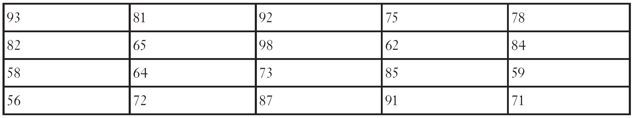
You like the tables you created, and now you ask yourself, “What if I want to see the data for two variables instead of one?” You have both the grades and the genders of the students, and you want to see the distribution of grades by gender. So you asked me how you could do that, and I said, “This is what the contingency table is all about.” The contingency table organizes data for two variables simultaneously. You have the following data for the 20 students:
93 (F) |
81 (F) |
92 (M) |
75 (F) |
78 (M) |
82 (M) |
65 (F) |
98 (F) |
62 (M) |
84 (F) |
58 (F) |
64 (F) |
73 (M) |
85 (M) |
59 (M) |
56 (F) |
72 (M) |
87 (M) |
91 (F) |
71 (M) |
You start by making the frequency distribution table, but with two frequency columns, one for each gender. You came up with the following contingency table:
Contingency Table
Classes |
M |
F |
Total |
51 - 60 |
1 (5%) |
2 (10%) |
3 (15%) |
61 - 70 |
1 (5%) |
2 (10%) |
3 (15%) |
71 - 80 |
4 (20%) |
1 (5%) |
5 (25%) |
81 - 90 |
3 (15%) |
2 (10%) |
5 (25%) |
91 - 100 |
1 (5%) |
3 (15%) |
4 (20%) |
Total |
10 (50%) |
10 (50%) |
20 (100%) |
Looking at this table gives me very useful information. I know that out of the 5 students with grades in the 80s, 3 are male and 2 are female, and out of the 4 students with grades in the 90s, 1 is male and 3 are female.
To get even more useful information, I can also include the percentages (relative frequencies), as in this table. I know that out of 25 percent of students with grades in the 70s, 20 percent are male and 5 percent are female. This useful information would have taken me a long time to find if I didn’t organize the data into the contingency table.
DEFINITION
A contingency table lists the actual and relative frequencies of two variables at the same time. Contingency tables are also known as cross-tabulations or cross-tabs.
Charting Your Course: Graphs
Charts are yet another efficient way to summarize and display patterns in a set of data. There are several forms of graphs: histograms, bar charts, pie charts, and line charts. So let’s take a look at each one of them.
Histogram
A histogram is a graph to turn your frequency distribution table into something even more visual. It is a special type of bar chart that plots classes on the horizontal axis and frequencies on the vertical axis. The height of each bar represents the number of observations (frequencies) in each class. The histogram does not have gaps between its bars since the classes shown on the horizontal axis are continuous. Figure 3.1 shows the histogram for the students’ grades in the previous example.
DEFINITION
A histogram is a bar graph showing the number of observations in each class as the height of each bar.

Figure 3.1
A histogram of students’ grades.
Letting Excel Do Our Dirty Work
Excel can actually construct the frequency distribution for us and then plot the histogram. How nice!
Before we start, make sure you have the Data Analysis add-in installed on your computer. If you don’t see this option in your Data tab, then see the section “Installing the Data Analysis Add-In” from Chapter 2. Now let’s put Excel to work and create the frequency distribution and histogram for our grades example. Follow these steps:
1. Open a blank Excel sheet, and in cell A1 type the name of the variable (in our example, “Grades”). Starting in cell A2, enter all the raw data (in our example, each grade).
2. In cell B1, again type the name of the variable (“Grades”). Starting in cell B2, enter the upper limits of each class (see Figure 3.2). For example, in the class 51-60, the upper limit would be 60. Excel refers to the classes as bins.

3. Go to the Data tab at the top of the Excel window, click on Data Analysis, and select Histogram (see Figure 3.3). Click the OK button.
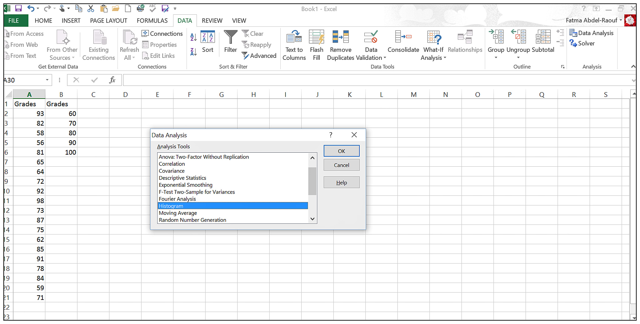
Figure 3.3
Excel Data Analysis dialog box.
4. The Histogram dialog box (see Figure 3.4) will appear. Click in the Input Range list box, and then click in the worksheet to select the data cells and the column label (cells A1 through A21 in our example). Then click in the Bin Range list box, and in the worksheet select the upper limit cells and the column label (cells B1 through B6 in our example).

Figure 3.4
Excel Histogram dialog box.
5. Click the Labels check box since we typed the name of the variable in the first cells, A1 and B1. (This way, Excel will display the labels you typed on the output graph instead of having to add them manually, later.) Click the Chart Output check box.
6. Click the OK button to generate the frequency distribution and the histogram (see Figure 3.5).

Figure 3.5
Frequency distribution and histogram.
Excel does a good job with the histogram, but we need to make two changes:
1. Go to the table and clear the cells with “more” and “0” in them. Look at what happens in the graph! Cool isn’t it? Excel removed the word from the graph, also (see Figure 3.6).

Figure 3.6
Removing “More” from the histogram.
2. Because the histogram doesn’t have gaps between its bars, we should remove them. Highlight the bars in the graph, right click, and select Format Data Series…. A dialog box will appear, as shown in Figure 3.7.

Figure 3.7
Removing the gaps between bars on the histogram.
3. Reduce the Gap Width percentage to a single digit to show that the classes are continuous. I reduce it to 4 percent in our example (see Figure 3.8).

Figure 3.8
Final histogram.
Check it out! Now your frequency distribution and the histogram are final. Thanks Excel!
Bar Chart
A bar chart is useful when you’re plotting individual data values next to each other. To demonstrate this type of chart (see Figure 3.9), we’ll use the data from the following table, which represents the monthly credit card balances for an unnamed spouse of an unnamed person writing a statistics book. (Somebody is going to be in big trouble when she sees this.)
Anonymous Credit Card Balances
Month |
Balance ($) |
1 |
375 |
2 |
514 |
3 |
834 |
4 |
603 |
5 |
882 |
6 |
468 |

Figure 3.9
Bar chart for somebody’s credit card balances.
You might be thinking now, “How can I get Excel to help me out?” Here is how:
1. Enter the labels and the data in columns A and B as shown in Figure 3.10.

Figure 3.10
Data entered in Excel.
2. Highlight the balance data and label, cells B1 to B7. Go to the Insert tab at the top of Excel window, select the Column chart, and from the menu choose the first graph under 2-D Column. Excel will output the graph shown in Figure 3.11.

Figure 3.11
Excel bar chart.
3. Click on the plus sign next to the chart for the Chart Elements dialog, and select the Axis Titles checkbox to add labels to the axes (see Figure 3.12). On the horizontal axis, type “Month” and on the vertical axis, type “Credit Card Balance ($).” For the chart title, delete “Balance” and type “Bar Chart for Credit Card Balances.”

Figure 3.12
A fine-tuned bar chart in Excel.
Now you have a nice looking bar chart.
RANDOM THOUGHTS
Now you might be asking yourself “Why did I choose the Column chart and not the Bar chart in Excel when I’m trying to create a bar chart?” Excel simply uses different names; When the bars are vertical, Excel calls it a Column chart, and when the bars are horizontal, Excel calls it a Bar chart. Go figure!
TEST YOUR KNOWLEDGE
What is the difference between a histogram and a bar chart? There are two main differences:
1. For the histogram, you have to present the classes on the horizontal axis and the frequency on the vertical axis, whereas for the bar chart, you can present any variable on the axes.
2. The histogram has no gaps between the bars, whereas the bar chart does have gaps between the bars. Also, in the bar chart, bars can be represented vertically or horizontally.
Pie Chart
Pie charts are commonly used to describe data from relative frequency distributions. This type of chart is simply a circle divided into portions whose area is equal to the relative frequency distribution. Pie charts are used extensively in statistics, as they show the importance of a part (or a wedge of the circle) relative to the whole. Let’s use an example to illustrate it. An anonymous statistics professor submitted the following final grade distribution:
Grade |
Number of Students |
Relative Frequency |
A |
9 |
9/30 = 30% |
B |
13 |
13/30 = 43% |
C |
6 |
6/30 = 20% |
D |
2 |
2/30 = 7% |
Total = 30 |
= 100% |
We can present these data using a pie chart, shown in Figure 3.13.

Figure 3.13
A pie chart illustrating a grade distribution.
I know you must be wondering if Excel can do this for you. Yes, Excel can easily help. Type the data and labels in columns A and B. Highlight the data in cells A1 to B5, select the Insert tab at the top of Excel window, and choose the Pie chart. You get this nice looking pie chart!
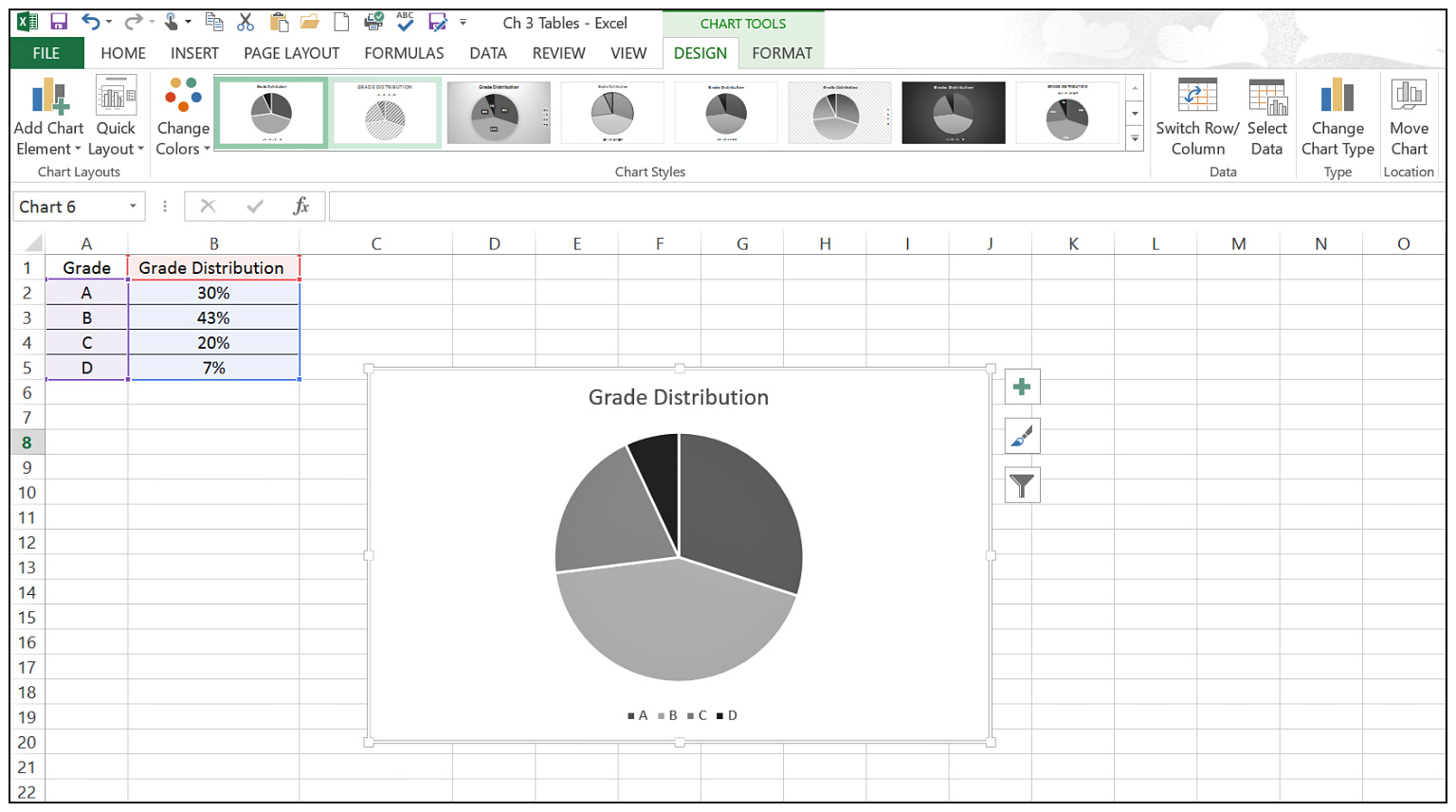
Figure 3.14
Pie chart in Excel.
We need to add a few things to make it look nicer and more informative. Click on the plus sign next to the chart, and select the Data Labels checkbox. You can also move around the legend; I like to have it on the right instead of at the bottom! Just double click on the Legend and choose a different placement. You will get this nice looking pie chart shown in Figure 3.15!
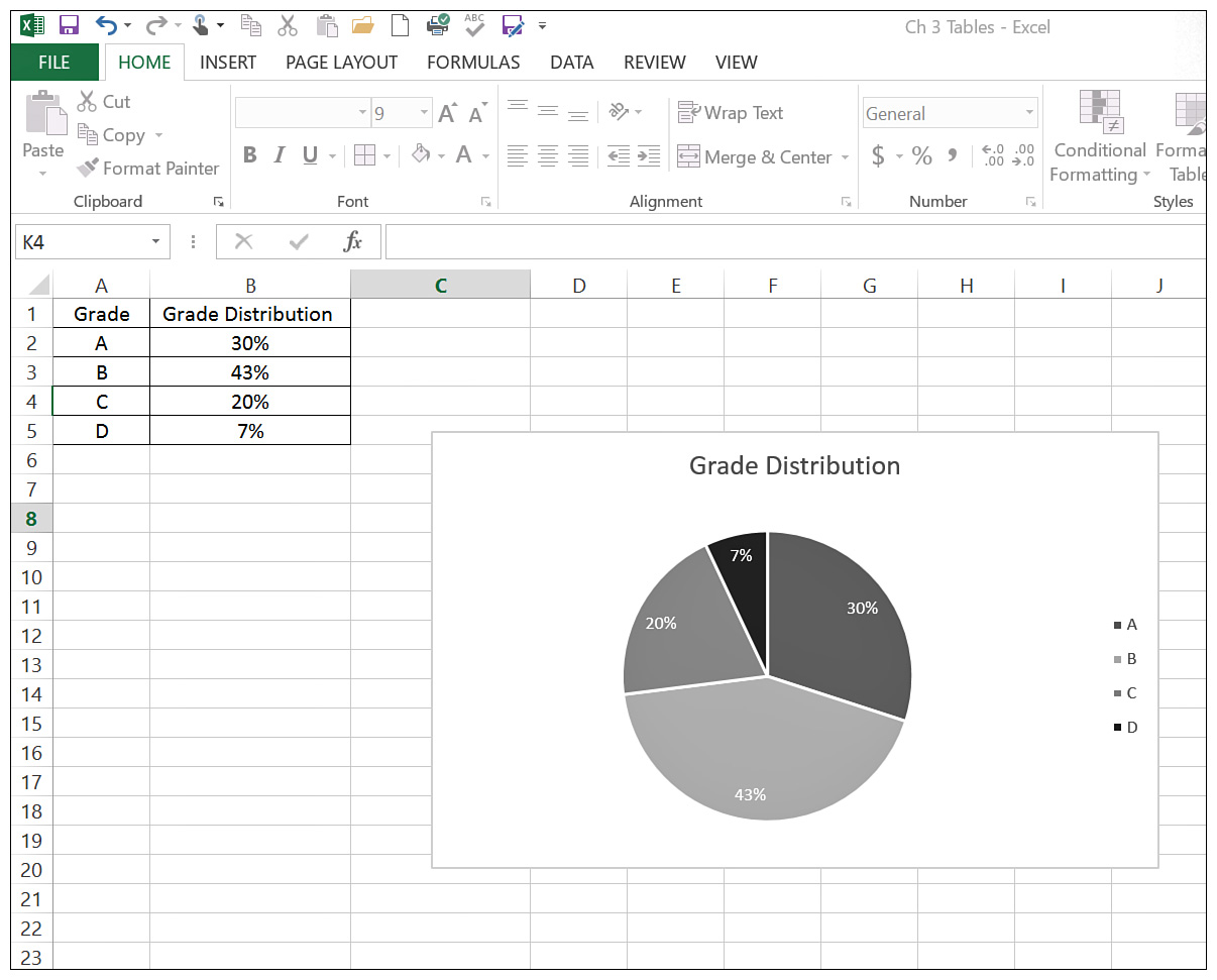
Figure 3.15
A final pie chart in Excel.
As you can see, the pie chart is much easier to interpret compared to the data in the table. This person must be a pretty good statistics teacher!
BOB’S BASICS
Pie charts are an excellent way to colorfully present data from a relative frequency distribution. Also use patterns and textures to distinguish the different slices.
To construct a pie chart by hand, you first need to calculate the center angle for each slice in the pie, which is illustrated in Figure 3.16.

Figure 3.16
The center angle of a pie chart slice.
You determine the center angle of each slice by multiplying the relative frequency of the class by 360 (which is the number of degrees in a circle). These results are shown in the following table.
Center Angle for Pie Chart Construction
Grade |
Relative Frequency |
Central Angle |
A |
9/30 = 0.30 |
0.30 • 360 = 108° |
B |
13/30 = 0.43 |
0.43 • 360 = 155° |
C |
6/30 = 0.20 |
0.20 • 360 = 72° |
D |
2/30 = 0.07 |
0.07 • 360 = 25° |
Total = 1.00 |
= 360° |
By using a device to measure angles, such as a protractor, you can now divide your pie chart into slices of the appropriate size. This assumes, of course, that you’ve mastered the art of drawing circles.
TEST YOUR KNOWLEDGE
Who was the first one to create the pie chart? William Playfair (a businessman, engineer, and economics writer from Scotland) created it in 1801 in his publication “The Statistical Breviary.”
I’m sure your inquisitive mind is now screaming with the question “How do I choose between a pie chart and a bar chart?” If your objective is to compare the relative size of each class to one another, use a pie chart. Bar charts are more useful when you want to highlight the actual data values.
Line Chart
A line chart is used to help identify patterns between two sets of data. To illustrate the use of line charts, we will use the following unemployment data in the United States from 2005 to 2015.
Year |
Unemployment Rate, January of each Year |
2005 |
5.3 |
2006 |
4.7 |
2007 |
4.6 |
2008 |
5.0 |
2009 |
7.8 |
2010 |
9.8 |
2011 |
9.2 |
2012 |
8.3 |
2013 |
8.0 |
2014 |
6.6 |
2015 |
5.7 |
To be able to see the pattern in the unemployment rate in the United States from 2005 to 2015, we can plot the data on a line chart, which is shown in Figure 3.17.
The line chart shows an increase in the unemployment rate from 2008 to 2010 (this is a reflection of the Great Recession in the U.S. economy at that time), and then the rate decreases.
I see you thinking about how you can probably create this with Excel the same way you did the bar chart and the pie chart. Yes, you are right. Enter the data and select a line chart from the Insert tab. Excel is very helpful, isn’t it?
RANDOM THOUGHTS
When you draw any graph, don’t forget to label the axes. This is a must do! The same graph with different labels on the axes can represent an entirely different data relationship.

Figure 3.17
A line chart representing the unemployment rate in the United States.
The Stem and Leaf Display–Statistical Flower Power
The stem and leaf display is another graphical technique you can use to display your data. A statistician named John Tukey originated the idea during the 1970s. The major benefit of this approach is that all the original data points are visible on the display.
DEFINITION
The stem and leaf display splits the data values into stems (the first digit or digits in the value) and leaves (the remaining digit or digits in the value). By listing all of the leaves to the right of each stem, we can graphically describe how the data is distributed.
To demonstrate this method, we will use Bob’s son Brian’s golf scores for his last 24 rounds, shown in the following table. Normally, Brian would only report his better scores, but we statisticians must be unbiased and accurate.
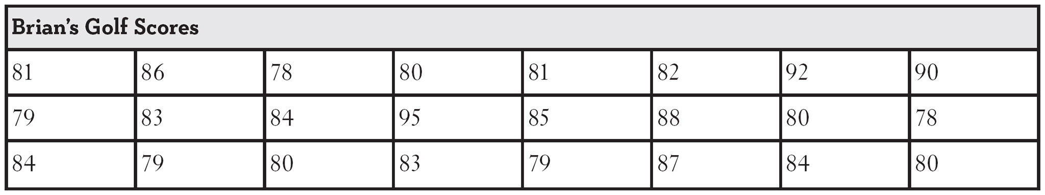
Figure 3.18 shows the stem and leaf display for these scores.

Figure 3.18
Stem and leaf display.
The “stem” in the display is the first column of numbers, which represents the first digit of the golf scores. The “leaf” in the display is the second digit of the golf scores, with 1 digit for each score. Because there were 5 scores in the 70s, there are 5 digits to the right of 7.
If we choose to, we can break this display down further by adding more stems. Figure 3.19 shows this approach.

Figure 3.19
A more detailed stem and leaf display.
Here, the stem labeled 7 (5) stores all the scores between 75 and 79. The stem 8 (0) stores all the scores between 80 and 84. After examining this display, I can see a pattern that’s not as obvious when looking at Figure 3.18: Brian usually scores in the low 80s.
Now that you have mastered the art of displaying descriptive statistics, you are ready to move on to calculating them in the next chapter.
1. The following table represents the exam grades from 36 students from a certain class that I taught. Construct a frequency distribution with 9 classes ranging from 56 to 100.
Exam Scores
60 |
95 |
75 |
84 |
85 |
74 |
81 |
99 |
89 |
58 |
66 |
98 |
99 |
82 |
62 |
86 |
85 |
99 |
79 |
88 |
98 |
72 |
72 |
72 |
75 |
91 |
86 |
81 |
96 |
86 |
78 |
79 |
83 |
85 |
92 |
68 |
2. Construct a histogram using the solution from Problem 1.
3. Construct a relative and a cumulative frequency distribution from the data in Problem 1.
4. Construct a pie chart from the solution to Problem 1.
5. Construct a stem and leaf display from the data in Problem 1 using one stem for the scores in the 50s, 60s, 70s, 80s, and 90s.
6. Construct a stem and leaf display from the data in Problem 1 using two stems for the scores in the 50s, 60s, 70s, 80s, and 90s.
The Least You Need to Know
- Frequency distributions are an efficient way to summarize data by counting the number of observations in various groupings.
- Histograms provide a graphical overview of data from frequency distributions.
- Pie, bar, and line charts are effective ways to present data in different graphical forms.
- Stem and leaf displays not only provide a graphical display of the data’s distribution, but they also contain the actual data values of interest.