
8
Measuring Value Stream Performance
In our last chapter, we started our exploration of Value Streams by referring to the Three Ways found in The Phoenix Project: A Novel about IT, DevOps, and Helping Your Business Win. The First Way was about achieving flow through the establishment of Value Streams.
This chapter moves beyond the establishment of Value Streams to verify their performance. For this chapter, we look at the Second Way: amplify feedback loops. To follow the Second Way, we need to look for and pay attention to the feedback from our Value Streams.
We can use metrics as a feedback mechanism. There are a few metrics frameworks that have emerged, such as DevOps Research and Assessment (DORA) metrics and the Flow Framework®, that can function as feedback loops.
We will cover the following topics in this chapter:
- Creating good measurements
- Looking at the DORA metrics
- Looking at the Flow Framework® and Flow Metrics
- Understanding measurements in SAFe®
Let’s begin by understanding how to get effective feedback.
Creating good measurements
We originally saw the different types of measurements we can apply in Chapter 5, Measuring the Process and Solution, where we looked at measurements in three of the following areas:
- The development process
- The environment
- The customer value delivered
The set of metrics that can adequately cover these three areas of measurement are called Key Performance Indicators (KPIs).
KPIs are metrics chosen to determine whether an individual, a team, a Value Stream or an Agile Release Train (ART) in our case is meeting its goals. KPIs are evaluated both at specific points in time as well as over a given time period to highlight trends and movements away from or toward a goal.
KPIs should be objective measurements and not subject to opinion or interpretation.
While looking at these measurements, we cautioned against using vanity metrics, which are measurements that yield good information but don’t really supply any meaningful data. Examples of this include the number of hits on a website or the cumulative number of subscribers to a service.
To set up KPIs, let’s look at the steps in the following diagram, as advised by kpi.org.

Figure 8.1 — KPI establishment process
Let’s look at each step in detail.
Describing the goal or intended result
When looking at the intended goal, it’s important to understand whether it is a strategic goal or a result that is more tactical. The desired goal should be a concise, concrete result rather than a broad objective.
In this way, KPIs are different from Objectives and Key Results (OKRs). OKRs generally describe broad strategic goals with desired results as the measurement of whether that strategic goal was achieved. An example of an OKR is shown in the following table:
|
Objective |
Key Results |
|
We delight customers at every opportunity through excellent usability and service |
Our usability score goes up from 6 to 9 by Q3 |
|
Our customer satisfaction score goes up from 7 to 10 by Q3 | |
|
The number of monthly active users goes up from 56% to 65% |
Table 8.1 — Example of an OKR
A KPI points to whether a concrete target was achieved. An example of a KPI would be the measurement of Net Promoter Score (NPS) survey results from favorite customers.
If you have performed a value stream mapping as shown in the last chapter, Chapter 7, Mapping Your Value Streams, then the desired future state of your value stream is an effective tactical goal that your ART or value stream can strive toward.
Understanding the method for measuring the goal
For your intended goal, you need to understand how the measurements will work. Are there direct measurements that will correspond to the intended goal? If so, those should be the measures you use.
However, what happens if you cannot directly measure the intended goal? In that case, you may need to look at creating hypotheses and measuring the results against the hypotheses as experiments.
Selecting measures for each goal
With the goals in place and possible measurements defined for each goal, it’s time to winnow down your choices to the important measurements to take. In most cases, a total of five to seven KPIs is enough to get an adequate picture of how the value stream is doing. It’s better to focus on a few key measurements as opposed to being awash in a sea of data.
We want the following characteristics for our KPIs:
- Answer questions about our performance in line with our objectives
- Provide clear information needed for strategy
- Are valid and can be verified
- Encourage desirable employee behavior
- Are not difficult to acquire
Now that we have our measurements, we need to see what the ideal values are for our value stream.
Defining composite indices if needed
There may be some measures that cannot individually provide all of the information to get the intended result. This is especially pertinent when the intended result is intangible, such as customer satisfaction.
When that is the case, you may need to bundle individual measurements into a composite index so that analysis becomes easier.
Defining targets or thresholds
We want to see how we are performing against the KPI. To judge our performance, we need to set a target value for each KPI. This target value should reside in a threshold for optimum performance. Thresholds should also be defined for poor performance.
Defining and documenting the selected measurements
We have now defined our KPIs, as well as target values and thresholds for good, satisfactory, and poor performance. It’s time to expand and detail other information about our KPIs.
The following additional information may help when collecting and analyzing our KPIs:
- Its intended goal
- The KPI
- A description of the KPI
- The type of measurement
- The formula to calculate the measurement
- Units of measure
- Where the measurement is stored
- Who makes the measurement and is responsible for it
- The data source
- The frequency at which it is collected and reported
- The individuals responsible for validation
- The individuals responsible for verification
- The method of presenting the KPI
For a development value stream, it may be acceptable to start with a standard set of KPIs. One standard of this kind was devised by DORA and examined in annual surveys. Let’s look at these metrics and see their applicability for a new development value stream.
DORA metrics
Since 2014, an annual report detailing the state of DevOps adoption has been published by Nicole Forsgren, Gene Kim, and Jez Humble of DORA and Alanna Brown of Puppet. Each year, they detail the general state of DevOps adoption and the maturity of respondents in adopting DevOps practices.
In 2016, they outlined certain metrics meant to measure the throughput and stability of DevOps practices across different organizations. These metrics have come to be known as DORA metrics.
The annual report has served as a barometer of the extent to which DevOps practices are being incorporated and how effectively this is being done. Each year, the report identifies the following aspects of the DevOps movement:
- Key KPIs
- Performance levels of organizations based on the KPIs
- Upcoming trends
Let’s look at each of these aspects now.
The DORA KPI metrics
The Accelerate State of DevOps report looks at the following four metrics to determine performance levels for participating organizations:
- Lead time
- Deployment frequency
- Change failure rate
- Mean time to repair
The first two metrics measure an organization’s velocity, or how quickly it can deliver changes to production. The third and fourth metrics determine an organization’s stability, or how well an organization can keep its production environment running.
Let’s look at these metrics in more detail.
Lead time
We have discussed lead time before in our previous chapter, Chapter 7, Mapping Your Value Streams. In it, we saw that each process step has a lead time. The total lead time was the sum of the lead times of all the process steps.
The DORA metrics look for the lead time for changes – that is, the length of time from a commit to the version control repository to the deployment of that code into a production environment. This is a subset of the total lead time. The authors of the book Accelerate: Building and Scaling High Performing Technology Organizations, Nicole Forsgren, Jez Humble, and Gene Kim (all key contributors to the definition of DORA metrics), specify the delivery lead time and disregard any lead time related to design. This is primarily due to the uncertainty of when to start the clock for the design lead time. The delivery lead time is easier to measure and is resistant to any variability.
Let’s look at the following illustration of a sample value stream:

Figure 8.1 — Sample value stream for DORA lead time
In the preceding diagram, we see that with Continuous Integration, automation performs tests in a non-production environment. If no errors are found, this process takes 4 hours, and the changes are deployed to a staging environment.
In the staging environment, perhaps automated testing is not performed. This may explain why the time to move from a staging environment to a production environment takes 40 hours.
So, for this value stream we total the times for each stage (4 hours + 40 hours), resulting in a total lead time of 44 hours.
Deployment frequency
The DORA metrics look at how frequently organizations can successfully deploy code to production with this KPI.
If we continue with our value stream example that has a lead time of 44 hours, or 1.83 days (given that lead times are measured against a 24/7 calendar), we can see that they deploy roughly 16 times per month.
Change failure rate
This metric is the examination of quality in the deployment process. It measures how often a release to production results in a degraded or failed service that requires a fix, either by rolling back or patching and implementing a hotfix.
Determining the change failure rate comes from examining the record of deployments and seeing whether any directly led to any production failures.
Suppose that in our value stream, we looked at the past 12 deployments. Of those 12 deployments, the production environment experienced three problems.
Our change failure rate would come from the following calculation:

= 3/12 = 25%
Recovery time
This metric looks at instances where service incidents occurred in production environments. For those incidents, how long did it take to restore service?
Often, when there is more than one incident, the metric for recovery time is expressed as the Mean Time to Recovery (MTTR), or the average time to recover.
In our value stream, for those three failures that were experienced in the past 12 deployments, if the times to repair for each failure were 3 hours, 2 hours, and 7 hours, the mean time to repair would be that shown in the following calculation:
 = 4 hours
For the preceding four metrics, DORA has done a cluster analysis of the responses and established four performance levels. Let’s look at these levels.
DORA metric performance levels
Every year in the Accelerate State of DevOps report, DORA analyzes the responses to view the levels of performance among the respondents. From the four DORA metric KPIs, they have created the following four performance levels:
- Elite
- High
- Medium
- Low
The criteria for each level change every year that the survey is produced. This is due to an overall improvement in practices not only at each organization but also within the industry as a whole. The 2021 report saw an increase in the number of respondents that were at the Elite or High performer levels compared with previous years, signifying the role continuous improvement plays in adopting DevOps practices.
The 2022 State of DevOps report saw a major change in these performance levels. For the first time, the Elite tier was removed. The survey results indicated that the highest-performing group was not performing at the same level as the Elite tier in the previous year. More data is required to look for possible reasons.
Emerging trends from the State of DevOps report
To adjust to changing times, the survey also includes ancillary questions about the organization’s environment in order to view emerging aspects. The two most recent reports (2021 and 2022) included the following additional items:
- Since 2018, DORA has added another metric: reliability. This measure looks at performance beyond software delivery into how well an organization maintains its environments or operational performance.
- DORA has investigated the adoption of cloud infrastructures since 2019, noting that the adoption of cloud technologies is an enabling technology that improves all four DORA metric KPIs.
- The 2021 report started investigating the adoption of SRE practices, as a way of finding a correlation with reliability.
- In addition to inquiring about technical DevOps practices, DORA has expanded the scope of its inquiry to include documentation and security practices integrated into the development process.
- Because of the disruption to established work patterns due to the COVID-19 pandemic, questions were included to gauge the resiliency of organizations to continue delivering while avoiding burnout.
- As part of the inquiry of security practices, the 2022 State of DevOps report inquired about whether companies had adopted measures to ensure the security of their software supply chain. These measures fall into one of two frameworks for standardization: Supply Chain Levels for Software Artifacts (SLSA) and the Secure Software Development Framework (SSDF).
The DORA metrics offer a good elementary look at KPIs to measure, but often, not all the work done by value streams is directly related to providing customer value. To measure those KPIs, adopting the Flow Framework® and measuring the Flow Metrics® may be a good option. Let’s now take a look at the Flow Framework® model.
Flow Framework® and Flow Metrics®
The Flow Framework® model is described in detail in Mik Kersten’s book Project to Product: How to Survive and Thrive in the Age of Digital Disruption with the Flow Framework. In this book, Kersten describes the need to move from project-based design to product development using long-lived value streams.
To measure the performance of the value streams, Kersten proposes the Flow Framework®, a structure of Flow artifacts and the measurement of those artifacts using Flow Metrics®.
Kersten initially formulated the Flow Framework® in order to measure the flow of software delivery for his company, Tasktop. While looking at the value streams at Tasktop, Kersten identified the following four outcomes that he wanted to monitor:
- Value
- Cost
- Quality
- Happiness
He related these items to four Flow Items, which were the types of work done by Tasktop’s value streams. To track the progress of these Flow Items, Kersten found four Flow Metrics® that these Flow Items exhibited.
Let’s start our look at the Flow Framework® by examining the four Flow Items.
Flow Items
Kersten identified the following four types of work done by a value stream:
- Features to deliver
- Defect fixes
- Risk avoidance
- Technical debt reduction
Each item has unique differences in terms of the stakeholders that desire them and the value of these items.
Features
Features are items that bring about direct business value. Customers pull features from the value stream to provide the solutions they want or need. This work is considered the primary type of work a value stream will deliver.
In SAFe®, Flow Framework® features can be mapped to features, the items of work that are decomposed into user stories and enabler stories, which have a timebox of one Program Increment (PI).
Defect fixes
A value stream may also work on fixing any defects discovered. These fixes may be for defects uncovered during the development process or defects that have made their way to production. Regardless of when the defect was discovered, the fix is pulled by the customer as part of the solution.
SAFe does not directly identify separate work for fixing defects, but that work is frequently tracked as part of the work tracking system that value streams use. An example of this is when value streams using Jira identify a distinct issue type (bug) to track the effort to fix defects.
Risk avoidance
Value streams may work in organizations where compliance, security, governance, and privacy are important Non-Functional Requirements (NFRs). These NFRs may be related to the industry they’re in, which may have important contractual requirements or regulations to comply with. Items meant to reduce risks are delivered by the value stream to different stakeholders. These stakeholders are frequently internal to the organization, such as security or governance groups.
In SAFe, items that are meant to fulfill NFRs and mitigate or eliminate risks are compliance enablers. Compliance enablers that are timeboxed to a PI are identified as features meant for an ART to accomplish while story-sized compliance enablers are worked on by an individual team inside the ART.
Technical debt reduction
Paring down technical debt is an important kind of work that value streams carry out. If technical debt is not managed to a controllable level, the delivery of the other Flow Framework® items (features, defect fixes, and risk avoidance) will be impacted due to deficiencies in the architecture.
SAFe categorizes Flow Framework® debt items as enablers. We have seen compliance enablers when talking about Flow Framework® risks. The other types of enablers help to maintain the architecture of a product or solution.
Infrastructure enablers are used by ARTs and teams to enhance the development process. Work of this kind includes the incorporation and maintenance of automation for testing and deployment.
Architectural enablers directly improve the architecture of the ART’s product or solution. A series of architectural enablers created so that these enhancements can be utilized by future features is known as the Architectural Runway.
Exploration enablers allow team members of the ART to research unknown technologies or determine the best functional approach. Spikes are a prevalent example of exploration enablers.
Value streams that use the Flow Framework® for measurement divide their work into all four of these Flow Items. We will now take a look at the measurements applied to these items.
Flow Metrics
In the Flow Framework®, we want to see how well our value stream is performing against all the kinds of work there are. To do that, we will apply the following measurements to each Flow Item:
- Flow Velocity®
- Flow Time®
- Flow Load®
- Flow Efficiency®
In addition, we have one more metric, Flow Distribution®, so we can see which Flow Items the value stream works on most.
Let’s look further into each metric now.
Flow Velocity®
Flow Velocity® looks at the number of Flow Items, regardless of type, completed in a standard unit of time. The following diagram illustrates Flow Velocity® for a Value Stream:

Figure 8.3 — Illustration of Flow Velocity® (Copyright © 2018 Tasktop Technologies, Incorporated. All rights reserved. Published with permission)
This is analogous to measuring the velocity in Scrum. A value stream that is stable and working well will maintain consistent Flow Velocities® across multiple periods of time.
Flow Time®
Flow time® is the time to complete an individual Flow Item as it traverses the value stream, from when it is accepted into the value stream to when it is released by the value stream. The Flow Time® includes both active times and wait times. The following diagram illustrates Flow Time®:

Figure 8.4 – Illustration of Flow Time® (Copyright © 2018 Tasktop Technologies Incorporated. All rights reserved. Published with permission)
The difference between Flow Time® and lead time is that the latter is a customer metric. With Flow Time®, we’re looking to determine the length of time needed to develop our product or solution.
Flow Load®
We discussed the problems with having large numbers of WIP in Chapter 4, Leveraging Lean Flow to Keep the Work Moving. Flow Load® is a measure of WIP. As shown in the following diagram, we can see the number of Flow Items that are in progress with Flow Load®:

Figure 8.5 – Illustration of Flow Load® (Copyright© 2018 Tasktop Technologies Incorporated. All rights reserved. Published with permission)
Remember that just as high numbers of WIP lead to longer lead times and reduced performance, high Flow Load® values are an indicator of reduced performance that will result in longer Flow Times® and reduced Flow Velocity®.
Flow Efficiency®
We looked at Flow Time® earlier and saw that it includes both times when the value stream is actively working and times when it is idle, waiting at some process step. You can figure out the efficiency by looking at the ratio of active time to Flow Time®.
The following diagram completes our preceding Flow Time® example by calculating the Flow Efficiency®:
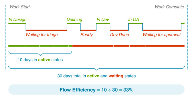
Figure 8.6 – Illustration of Flow Efficiency® (Copyright © 2018 Tasktop Technologies Incorporated. All rights reserved. Published with permission.)
Flow Efficiency® is analogous to activity ratio, which was introduced in Chapter 7, Mapping Your Value Streams. The difference is that Flow Efficiency® looks at the development perspective of the value stream.
Flow Distribution®
When looking at the Flow Metrics® so far, we have not considered the type of Flow Item that is being measured. We will now look to Flow Distribution® to guide us on whether the work of our value stream is balanced.
Flow Distribution® looks at the number of Flow Items complete for a value stream and measures each type of Flow Item as a percentage of the total number of Flow Items. A calculation of Flow Distribution® is demonstrated by the following diagram:

Figure 8.7 – Illustration of Flow Distribution® (Copyright © 2018 Tasktop Technologies Incorporated. All rights reserved. Published with permission)
In SAFe, looking at the Flow Distribution® allows the ART to determine the proper allocation ratio of features and enablers so that a proper balance of delivering the customer value and ensuring that the needed enhancements are made.
Measurements in SAFe
When looking at an organization’s value streams realized as ARTs, Scaled Agile recommends viewing their performance in terms of these three following aspects:
- Outcomes
- Flow
- Competency
Let’s see how these three aspects are measured in SAFe.
Measuring outcomes in SAFe
The primary mechanism for measuring outcomes comes from establishing and measuring value stream KPIs.
We saw KPI frameworks for measuring customer outcomes, such as Pirate (ARRRR) metrics and Fit-for-Purpose metrics, in Chapter 5, Measuring the Process and Solution. Determining the set of KPIs for your team or ART was discussed earlier in this chapter.
Validating the benefit hypothesis that comes from Epics, large pieces of work, may lead to desirable outcomes. Epic development is done experimentally by creating a Minimum Viable Product (MVP) and using leading indicators to measure the hypothesized value. Closely monitoring the leading indicators produces evidence that either validates or invalidates the Epic hypothesis, allowing us to pivot or persevere with further Epic development.
Agile teams on the ART also want to measure the Iteration Goals they create at every iteration, as well as the PI Objectives they create for every PI. These goals and objectives help the teams focus their efforts, not on completing every feature and story, but on making sure customer value is delivered.
Measuring the Flow in SAFe
Some of the value stream KPIs a team or ART decide to adopt will be related to performance in terms of ensuring the delivery of value. Scaled Agile has recommended using the Flow Metrics® from the Flow Framework® to ensure that the flow successfully results in the delivery of the product. The Flow Items and Flow Metrics® against those items have been discussed in the preceding section.
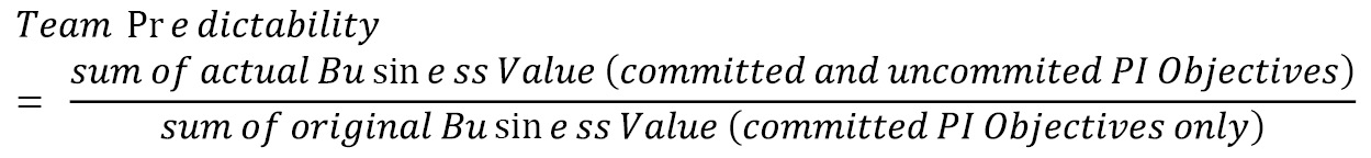
In addition, Scaled Agile recommends an additional Flow Metric: Flow Predictability. This metric measures how well teams and the ART can plan their PI and meet their PI Objectives.
To measure Flow Predictability, teams and the ART use the SAFe Program Predictability Measure (PPM). To calculate the PPM, teams look at the original Business Value of the PI Objectives determined during PI Planning. They then compare the sum of these against the actual Business Value for both committed and uncommitted PI Objectives determined in the Inspect and Adapt workshop at the end of the PI. The measure is determined by the following equation:
An example of the calculation for a team’s PPM is shown in the following table:
|
PI Objective |
Planned (Original) Business Value |
Actual Business Value | |
|
Committed Objectives |
Increase indexing speed by 50% |
9 |
4 |
|
Build and release e-commerce capabilities |
10 |
10 | |
|
Build and release intelligent search |
8 |
4 | |
|
Uncommitted Objectives |
Add 2,000 new products to the database and index them |
7 |
7 |
|
Support purchase with Bitcoin |
5 |
0 |
Table 8.2 — Example calculation for a team’s PPM
In the preceding table, the sum of actual Business Value for both committed and uncommitted PI objectives is 25. The sum of the planned Business Value is 27. The team PPM is then 25/27:

Figure 8.8 — An example team predictability rollup to PPM (© Scaled Agile, Inc. All rights reserved)
The preceding diagram shows the rollup that happens to create the PPM. The ART receives a PPM by averaging the PPM values of the teams that make up the ART.
Measuring competency in SAFe
On a grander scale, an enterprise that utilizes SAFe strives for business agility, where strategy and execution are combined to achieve business results through the frequent delivery of customer value.
Business agility in SAFe is measured through self-assessment of the following seven core competencies practiced by different parts of the organization:
- Team and technical agility
- Agile product delivery
- Enterprise solution delivery
- Lean portfolio management
- Organizational agility
- Continuous learning culture
- Lean-Agile leadership
The teams and the ART use the DevOps Health Radar to assess their competency in adopting DevOps principles and practices. Let’s take a look at how to use the DevOps Health Radar.
The DevOps Health Radar
The DevOps Health Radar is a tool that lists all the activities related to the four aspects of the Continuous Delivery Pipeline. An illustration of the DevOps Health Radar is as follows:
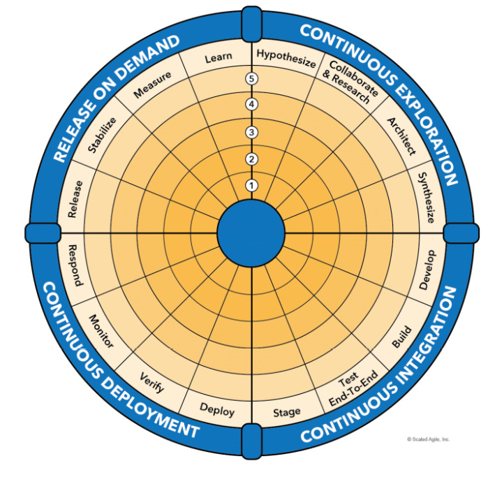
Figure 8.9 – DevOps Health Radar (©Scaled Agile, Inc. All rights reserved)
For each of the 16 activities of the Continuous Delivery Pipeline, the teams and ART rate themselves in terms of their maturity in performing the activity. Ratings range from Sit (1 to 2), Crawl (3 to 4), Walk (5 to 6), Run (7 to 8), and Fly (9 to 10), the apex.
Teams and the ART should periodically self-assess with the DevOps Health Radar to track the maturity of their DevOps performance. This assessment is available for free on the Scaled Agile Framework website at https://www.scaledagileframework.com/?ddownload=38794.We will examine the Continuous Delivery Pipeline and its activities in Part 3.
Summary
In this chapter, we wanted to ensure that we were on the right track by adopting the Second Way through amplifying feedback loops. The key feedback loops that we will use for our value streams are often metrics.
When selecting metrics, we want to view them as KPIs. We saw how to start with our desired objectives, look at the metrics that line up with our objectives, refine a set of metrics to collect, and collect them as KPIs.
We first looked at one standard of metrics to use as part of our set of KPIs: the DORA metrics that form the basis of the annual Accelerate State of DevOps report. By collecting these metrics and continuously improving, a value stream may be identified with a performance level based on comparison with other organizations as collected by the annual report.
If looking at other types of work beyond those that provide customer value, a value stream may look at the Flow Framework® created by Tasktop. With the Flow Framework®, we outlined the four Flow Items that define the type of work done by the value stream. We also set four Flow Metrics® against individual Flow Items and applied Flow Distribution® to a set of Flow Items.
Now that we’ve seen how we can view measurements of our feedback, we will move on to the Third Way, where we apply Continuous Experimentation and Learning. We will discover the methods for doing so in our next chapter.
Questions
- What is the optimal number of KPIs for a value stream to have?
- 2 to 4
- 5 to 7
- 6 to 9
- 10 to 12
- Which is not a characteristic of a KPI?
- Are valid and can be verified
- Encourage desirable employee behavior
- Answer questions about progress toward objectives
- Are difficult to collect
- Which is not a DORA metric KPI?
- Cycle time
- Deployment frequency
- Change failure rate
- Mean time to repair
- Which of the DORA metrics’ KPIs measure stability? (pick two)
- Lead time
- Cycle time
- Deployment frequency
- Change failure rate
- Mean time to repair
- Which is not a Flow Item in the Flow Framework®?
- Features
- Projects
- Risk avoidance
- Technical debt reduction
- Which is not a Flow Metric® in the Flow Framework®?
- Flow Velocity®
- Flow Load®
- Flow Predictability®
- Flow Time®
Further reading
To learn more about the topics that were covered in this chapter, take a look at the following resources:
- The Phoenix Project: A Novel about IT, DevOps, and Helping Your Business Win by Gene Kim, George Spafford, and Kevin Behr
- https://f.hubspotusercontent00.net/hubfs/8944057/The%20State%20of%20Value%20Stream%20Management%20Report%202021.pdf – the State of Value Stream Management 2021 Report from the Value Stream Management Consortium
- https://kpi.org/KPI-Basics – a look at defining what KPIs are and how to develop your set of KPIs
- https://www.devops-research.com/research.html#reports – landing page for all versions of the Accelerate State of DevOps reports produced by DORA and Puppet Labs
- https://cloud.google.com/blog/products/devops-sre/the-2019-accelerate-state-of-devops-elite-performance-productivity-and-scaling – findings from the 2019 Accelerate State of DevOps report by DORA
- https://cloud.google.com/blog/products/devops-sre/announcing-dora-2021-accelerate-state-of-devops-report – findings from the 2021 Accelerate State of DevOps Report
- Project to Product: How to Survive and Thrive in the Age of Digital Disruption with the Flow Framework by Mik Kersten – the reference for all aspects of the Flow Framework®, including Flow Items and Flow Metrics
- https://flowframework.org/flow-metrics/ – a look at the Flow Metrics from the Flow Framework® Institute
- https://www.scaledagileframework.com/devops/ – an article on the scaledagileframework.com website, providing, among other things, a description of the DevOps Health Radar
- https://www.scaledagileframework.com/metrics/ – this article on the scaledagileframework.com website illustrates the interplay between KPIs, Flow Metrics, and other forms of assessment