
It is easy to skip over minor features of a BI platform. Unlike Qlikview, which has a high number of options for chart customizations, Qlik Sense features are more universal. The majority of components will be relevant to you and as such should be given due consideration.
Here, our aim is to simplify the environment by adding thumbnails and metadata descriptions at a high level to the application and the sheets within.
Open the Qlik Sense Desktop hub and either open up an existing application or create a new one.
- Find an image you want to use as the thumbnail for your application. Copy the image into the following folder
C:Users*your own user folder*Documents QlikSenseContentDefault - From the App overview screen click on the edit
 button in the top right corner.
 - Give your application a Title and Description.
- Adjacent to the Title and Description window is the area for the application thumbnail.
- Click the change thumbnail image
 .
. - Select the image that you added to the Qlik folder in step one and then click Insert.
- Finally, click the stop editing tick button in the top right hand corner:

- Depending on the image you have chosen, the color of the background will also change as shown in the preceding image.
- You can repeat the process for sheets by clicking on the
 button next to each sheet description.
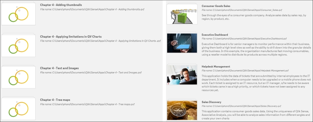
 - You can see a great example of how this should be implemented in the default helpdesk management application that is available with each fresh install of Qlik Sense desktop. Take special note of the sheet descriptions that prompt questions you can answer:

I have seen many unorganized BI environments before and it really has a negative impact on the user experience. When you first go into the Qlik Sense hub what do you prefer to be presented with:
1: Default image and text 2: With Thumbnails and descriptions
The second image looks more pleasing and professional to the eye. User experience is an important factor in adoption of the tool. If the first screen you see looks rushed or is confusing, it will start the user off on a bad foot.
The thumbnails and descriptions also apply to sheets within an application. By default, small thumbnails are displayed as an image showing objects by type and placement. These can be replaced with something clearer and more meaningful to the audience. This is hardly storyboarding, but you should know what each page is trying to achieve. Actually, asking questions about each screen can help you get a feel for the shape of the application and the flow of analysis. Are you asking these questions?
- Who are the users of this screen?
- What is the page showing?
- What questions will the page answer?
- What actions will that enable?
While not universal, asking questions such as these regularly will help keep your focus on the audience.