
Chapter 9
jQuery UI Part II—Mouse Interactions
WHAT’S IN THIS CHAPTER?
- Dragging and Dropping Elements
- Sorting
- Resizing Elements
- Making Elements Selectable
In this chapter, you continue exploring jQuery UI features centered on moving, sorting, resizing, and selecting elements with the mouse. Different from the plugins mentioned in the previous chapter, these aren’t widgets, but rather, interesting behaviors you can add to DOM elements.
By default, divs, spans, and the like can’t be dragged across a web page or resized. You need the help of JavaScript to make these elements dynamic, and with the help of jQuery UI, it becomes a trivial issue to do these kinds of operations that were once reserved for the desktop environment.
In this chapter, you review dragging, dropping, sorting, resizing, and making elements selectable. As you’ll see, most of the details of implementing these operations are taken care of for you; yet you’re given a healthy set of options to accommodate these interactions to your needs.
Dragging and dropping an element usually go together. There might be moments where just dragging around an element is enough, but usually you’ll want both features. A draggable DOM element can be moved around by clicking and then moving the mouse. Droppable elements can accept draggable elements.
Dragging and dropping aren’t features that are available to web pages by default, although they are very common idioms of everyday computer use. Thankfully, jQuery UI makes it simple and approachable. Although the actions are coupled, they require separate calls.
A component is made draggable by calling the jQuery UI draggable method, $(selector).draggable(), as simple as that. Like many of the method calls you’ve seen in this book, the .draggable() method is overloaded, reducing namespace clutter. (See Table 9-1.)
TABLE 9-1: $.draggable() Methods
| METHOD | DESCRIPTION |
| $(selector).draggable(); | Makes selected element draggable. |
| $(selector).draggable(“destroy”); | Removes the draggable functionality completely. This option rolls the selected element back to its initial state. |
| $(selector).draggable(“disable”); | Disables the draggable element. |
| $(selector).draggable(“enable”); | Enables the draggable element. |
| $(selector).draggable(“option”, optionName, “value”); | Gets or sets any draggable element option. If the third argument is omitted, acts as a getter. Otherwise, it sets the optionName with the provided value. |
| $(selector).draggable(“widget”); // | Returns the .ui-draggable element. |
Table 9-2 shows the different options for draggable elements.
TABLE 9-2: Draggable Elements
| OPTIONS | ACCEPTS | DESCRIPTION |
| disabled | Boolean | Enables/disables the draggable functionality. |
| addClasses | Boolean | Prevents adding the ui-draggable class when set to false. |
| appendTo | Element, Selector | Defines where the helper element is appended to during the drag. |
| axis | String | Constrains movement to either the x or y axis. |
| cancel | Selector | Prevents dragging from starting on specified elements. |
| connectToSortable | Selector | Allows the selected draggable element to be dropped on a sortable element. |
| containment | Selector, Element, String, Array | Limits dragging to a contained area. Valid options are window, document, parent, or an array in the form of [x1,y1,x2,y2]. |
| cursor | String | The CSS cursor type used during the drag. For example, crosshair. |
| cursorAt | Object | Adjust the dragging helper offset position, relative to the mouse position. |
| delay | Integer | Delay time, in milliseconds, before drag goes into effect. |
| distance | Integer | The distance the mouse must move after mousedown before dragging begins to work. |
| grid | Array | When specified, the dragging helper snaps to a grid, which is spaced every x and y pixels. Expects an array of the form [x,y]. |
| handle | Element, Selector | Gives the element a drag “handle”; in other words, restricts where an element can be dragged from to an element/area. |
| helper | String, Function | Allows for a helper element to be used for dragging display. |
| iframeFix | Boolean, Selector | Prevents iframes from capturing the mousemove events during a drag. |
| opacity | Float | The opacity level of the helper while being dragged. |
| refreshPositions | Boolean | When true, on every mousemove, the droppable position is calculated. Degrades the application’s performance. |
| revert | Boolean, String | If set to true, the draggable element will return to its original position when dragging stops. |
| revertDuration | Integer | The duration, in milliseconds, of the revert animation. |
| scope | String | Used to group sets of draggable and droppable items. |
| scroll | Boolean | If set to true, container auto-scrolls while dragging. |
| scrollSensitivity | Integer | Distance, in pixels, from the edge of the viewport after which the viewport should scroll. |
| scrollSpeed | Integer | The speed at which the window should scroll once the mouse pointer gets within the scrollSensitivity distance. |
| snap | Boolean, Selector | Indicates whether or not a draggable element should snap to the edges of the selected element. |
| snapMode | String | Defines the edges which snap elements will adhere to. Possible values are inner, outer, or both. |
| snapTolerance | Integer | Defines the distance, in pixels, from the edges of the snap element where the snap should occur. |
| stack | Selector | Controls the z-index of the matched elements. |
| zIndex | Integer | z-index for the element being dragged. |
In a very similar fashion, the $.droppable() method is also overloaded. Table 9-3 lists all available $.draggable() methods.
TABLE 9-3: $.draggable() Methods
| METHOD | DESCRIPTION |
| $(selector).droppable(); | Makes selected element droppable. |
| $(selector).droppable(“destroy”); | Removes the droppable functionality completely. This option rolls the selected element back to its initial state. |
| $(selector).droppable(“disable”); | Disables the droppable element. |
| $(selector).droppable(“enable”) | Enables the droppable element. |
| $(selector).droppable(“option”, optionName, “value”); | Get or set any droppable element option. If the third argument is omitted, acts as a getter. Otherwise, it sets the optionName with the provided value. |
| $(selector).droppable(“widget”); | Returns the .ui-droppable element. |
All draggable components have a class of ui-draggable. While in a dragging state, the class changes to ui-draggable-dragging.
The following example uses both drag and drop to demonstrate a visual way of dividing tasks. At the top are square elements that each represent a task. At the bottom are the different states of a task: in progress or finished. By making the tasks draggable, the end user can intuitively organize tasks. Upon dropping a task box, the task box changes color. Figure 9-1 shows the output of this code.

<!DOCTYPE html>
<html>
  <head>
    <link type=”text/css”
      href=”css/ui-lightness/jquery-ui-1.8.13.custom.css” rel=”stylesheet” />

    <script src=”http://code.jquery.com/jquery-1.7.1.js”></script>
    <script src=”js/jquery-ui-1.8.13.custom.min.js”></script>
    <style type=”text/css”>
      div {
        width : 150px;
        margin-bottom : 20px;
        margin-right : 20px;
        float: left;
      }

      #flow {
        float: left;
        height : 400px;
      }

      #task3 {
        clear: both;
      }

    </style>
    <script type=”text/javascript”>
      $(function(){
        $('div[id^=”task”]').draggable({
          snap : 'div',
          snapMode : 'both'
          // snap tolerance
        });

        $('#flow').droppable({
          drop : function( event, ui ) {
            $( this ).addClass( “ui-state-highlight” );
          }
        });
      });
    </script>
  </head>
  <body>
    <div id=”task1” class=”ui-widget-content”>
      <p>Task 1</p>
    </div>
    <div id=”task2” class=”ui-widget-content”>
      <p>Task 2</p>
    </div>
    <div id=”task3” class=”ui-widget-content”>
      <p>Task 3</p>
    </div>
    <div id=”flow” class=”ui-widget-content”>
      <p class=”ui-widget-header”>In Progress</p>
    </div>
    <div id=”flow” class=”ui-widget-content”>
      <p class=”ui-widget-header”>Finished</p>
    </div>
  </body>
</html>
Code snippet is from drag-drop.txt
A group of sortable elements are reorderable drag/drop components; for example, a list, a grid of elements, or even sorting an interconnected set of elements. Table 9-4 shows the different methods available for sortable elements.
TABLE 9.4: $.sortable() Methods
| METHOD | DESCRIPTION |
| $(selector).sortable(); | Makes selected element sortable. |
| $(selector). sortable (“destroy”); | Removes the sortable functionality completely. This option rolls the selected element back to its initial state. |
| $(selector). sortable (“disable”); | Disables the sortable element. |
| $(selector). sortable (“enable”) | Enables the sortable element. |
| $(selector). sortable (“option”, optionName, “value”); | Gets or sets any sortable element option. If the third argument is omitted, acts as a getter. Otherwise, it sets the optionName with the provided value. |
| $(selector). sortable (“widget”); | Returns the .ui-sortable element. |
| $(selector).sortable(“serialize”,[options]); | Converts the sortable elements to a string suitable for form submission. |
| $(selector).sortable(“toArray”); | Converts the sortable elements to an array. |
| $(selector).sortable(“refresh”); | Refreshes the sortable elements. |
| $(selector).sortable(“refreshPositions”); | Refreshes the cached positions of the sortable items. |
| $(selector).sortable(“cancel”); | Cancels a change in the current sortable elements. |
Along with the different call methods, you also have a nice long list of options available for configuration, as shown in Table 9-5. These options give you control over the sensitivity and tolerance of the sortable elements. Sortable elements can also be interconnected between two different sets.
TABLE 9-5: Sortable Options
| OPTION | ACCEPTS | DESCRIPTION |
| disabled | Boolean | Enables or disables the sortable element. |
| appendTo | String | Defines where the helper element is appended to during the drag. |
| axis | String | Constrains movement to either the x or y axis. |
| cancel | Selector | Prevents sorting on specified elements. |
| connectWith | Selector | Connects the sortable element with another sortable element matching the supplied selector. |
| containment | Element, String, Selector | Constrains dragging to within the bounds of the specified element. |
| cursor | String | Defines the cursor shown when sorting. |
| cursorAt | Object | Adjust the dragging helper offset position, relative to the mouse position. |
| delay | Integer | Delay time, in milliseconds, before drag goes into effect. |
| distance | Integer | The distance the mouse must move after mousedown before dragging begins to work. |
| dropOnEmpty | Boolean | If false, items from this sortable can’t be dropped to an empty linked sortable. |
| forceHelperSize | Boolean | If true, forces the helper to have a size. |
| forcePlaceholderSize | Boolean | If true, forces the placeholder to have a size. |
| grid | Array | When specified, the dragging helper snaps to a grid, which is spaced every x and y pixels. Expects an array of the form [x,y]. |
| handle | Selector, Element | Gives the element a drag “handle”; in other words, restricts where an element can be dragged from to an element/area. |
| helper | String, Function | Allows for a helper element to be used for dragging display. |
| items | Selector | Specifies which items inside the element should be sortable. |
| opacity | Float | The opacity level of the helper while being dragged. |
| placeholder | String | Class that gets applied to the otherwise white space. |
| revert | Boolean/Integer | If set to true, the draggable element will return to its original position when dragging stops. |
| scroll | Boolean | If set to true, container auto-scrolls while dragging. |
| scrollSensitivity | Integer | Distance, in pixels, from the edge of the viewport after which the viewport should scroll. |
| scrollSpeed | Integer | The speed at which the window should scroll once the mouse pointer gets within the scrollSensitivity distance. |
| tolerance | String | This is the way the reordering behaves during drag. Possible values: 'intersect', 'pointer'. In some setups, 'pointer' is more natural. |
| zIndex | Integer | z-index for the element being dragged. |
Sortable elements are built on top of the drag-and-drop functionality, but with a bit more specific behavior.
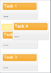
The following example revisits the task list. Each of the individual task boxes now has a “portlet” style interface. When reordering one of the component boxes, the new position of the orderable component is highlighted with a different style. An example of the reordering in process can be seen in Figure 9-2.
<!DOCTYPE html>
<html>
  <head>
    <link href=”css/ui-lightness/jquery-ui-1.8.13.custom.css”
      rel=”stylesheet” />
    <script src=”http://code.jquery.com/jquery-1.7.1.js”></script>
    <script src=”js/jquery-ui-1.8.13.custom.min.js”></script>
    <style type=”text/css”>
        .column {
          width: 170px;
          float: left;
          padding-bottom: 100px;
        }
        .portlet {
           margin: 0 1em 1em 0;
         }
        .portlet-header {
           margin: 0.3em;
           padding-bottom: 4px;
           padding-left: 0.2em;
        }
        .portlet-header .ui-icon {
           float: right;
        }
        .portlet-content {
           padding: 0.4em;
        }
        .ui-state-highlight {
           height: 1.5em;
           line-height: 1.2em;
        }
    </style>
    <script>
      $(function(){
        $( “.portlet” )
          .addClass( “ui-widget ui-widget-content”
            + “ui-helper-clearfix ui-corner-all” )
          .find( “.portlet-header” )
          .addClass( “ui-widget-header ui-corner-all” )
          .prepend( “<span class='ui-icon ui-icon-minusthick'></span>”)
           .end()
           .find( “.portlet-content” );
        $('.column').sortable({ placeholder: “ui-state-highlight” });
      });
    </script>
  </head>
  <body>
<div class=”column”>
    <div class=”portlet”>
      <div class=”portlet-header”>Task 1</div>
      <div class=”portlet-content”>...</div>
    </div>
    <div class=”portlet”>
      <div class=”portlet-header”>Task 2</div>
      <div class=”portlet-content”>...</div>
    </div>
    <div class=”portlet”>
      <div class=”portlet-header”>Task 3</div>
      <div class=”portlet-content”>...</div>
    </div>
    <div class=”portlet”>
      <div class=”portlet-header”>Task 4</div>
      <div class=”portlet-content”>...</div>
    </div>
</div>
  </body>
</html>
Code snippet is from sortable.txt
When “resizing” is applied to an element, the element is given a handle and can be visually resized using a mouse. You’ve already seen this ability indirectly with the dialog widget, which is a resizable widget. Table 9-6 lists all available $.resizable() methods.
TABLE 9-6: $.resizable() Methods
| METHOD | DESCRIPTION |
| $(selector).resizable(); | Makes selected element resizable. |
| $(selector).resizable.(“destroy”); | Removes the resizable functionality completely. This option rolls the selected element back to its initial state. |
| $(selector).resizable(“disable”); | Disables the resizable element. |
| $(selector).resizable(“enable”) | Enables the resizable element. |
| $(selector).resizable(“option”, optionName, “value”); | Gets or sets any resizable element option. If the third argument is omitted, acts as a getter. Otherwise, it sets the optionName with the provided value. |
| $(selector).resizable(“widget”); | Returns the .ui-resizable element. |
Given that resizing is such a basic operation, you might be surprised at how many options are available, as shown in Table 9-7. Like the other mouse interactions in this chapter, the default utility fits many needs, but it still allows for many flexible options.
TABLE 9-7: Resizable Options
| OPTION | ACCEPTS | DESCRIPTION |
| disabled | Boolean | Enables/disables the resizable functionality. |
| alsoResize | Selector, jQuery, Element | Additionally, resizes the selected elements when resizing. |
| animate | Boolean | If true, animates to the final size after resizing. |
| animateDuration | Intefer, String | Duration time for the animation, in milliseconds. Other possible values are slow, normal, and fast. |
| animateEasing | String | The easing effect to use for the animation. |
| aspectRatio | Boolean, Float | If set to true, resizing is constrained by the element’s original aspect ratio. |
| autoHide | Boolean | If set to true, automatically hides the selection handles except when the mouse hovers over the element. |
| cancel | Selector | Prevents resizing from starting on specified elements. |
| containment | String, Element, Selector | Constrains resizing to within the bounds of the specified element. |
| delay | Integer | Delay time, in milliseconds, before resize event goes into effect. |
| distance | Integer | The distance the mouse must move after mousedown before resize event begins to work. |
| ghost | Boolean | If set to true, a semi-transparent helper element is shown for resizing. |
| grid | Array | When specified, the resizing helper snaps to a grid, which is spaced every x and y pixels. Expects an array of the form [x,y]. |
| handles | String, Object | If specified as a string, should be a comma-spearated list of any of the following: n, e, s, w, ne, se, sw, nw, or all. If specified as an object, the same arguments are available as keys. The value of any specified keys should be a jQuery selector matching the child element of the resizable to use as that handle. |
| helper | String, Function | Allows for a helper element to be used for resizing display. |
| maxHeight | Integer | This is the maximum height the resizable should be allowed to resize to. |
| maxWidth | Integer | This is the maximum width the resizable should be allowed to resize to. |
| minHeight | Integer | This is the minimum height the resizable should be allowed to resize to. |
| minWidth | Integer | This is the minimum width the resizable should be allowed to resize to. |
In the following example, you create a resizable widget with an animation, a minimum width and height of 300 pixels, ghosting, and a red box helper outline. The filled-in text uses the “bacon ipsum” text generator. Lorem ipsum is nice but bacon ipsum is tastier.
<!DOCTYPE html>
<html>
  <head>
    <link
    type=”text/css”
    href=”css/ui-lightness/jquery-ui-1.8.13.custom.css”
    rel=”stylesheet” />
    <script src=”http://code.jquery.com/jquery-1.7.1.js”></script>
    <script src=”js/jquery-ui-1.8.13.custom.min.js”></script>
    <style type=”text/css”>
      .ui-resizable-helper {
        border: 1px solid red;
      }

      #resize_me {
        border: 1px solid black;
        overflow : hidden;
      }
    </style>
    <script type=”text/javascript”>
      $(function(){
        $('div#resize_me').resizable({
          animate: true,
          ghost : true,
          helper: “ui-resizable-helper”,
          minWidth: 300,
          minHeight : 300
        });
      });
    </script>
  </head>
  <body>
    <div id=”resize_me” class=”ui-widget-content”>
      <h2 class=”ui-widget-header”>Pork and Stuff</h2>
Bacon ipsum dolor sit amet pastrami flank short ribs tongue, salami ham short loin shank
Pancetta venison bacon shankle, swine jerky beef cow pork pork loin ham fatback beef rib
salami ham hock. Salami beef bacon pork brisket, t-bone flank ball tip. Ham hock beef
venison, t-bone andouille ribeye sirloin salami pork shankle. Ground round beef ribs
tip, sirloin venison rump pork loin shoulder boudin salami flank chuck ham corned beef
tenderloin. Tongue pork loin boudin, turkey ribeye salami pig biltong ham ham hock strip
steak. Beef ribs short ribs turkey, pancetta swine pork meatloaf strip steak ham bacon
corned beef short loin salami.
    </div>
  </body>
</html>
Code snippet is from resizable.txt
Is that slick or what? Figure 9-3 shows the resizable widget.

Yet another desktop paradigm brought to the web environment is selectable. A selectable component is selected by clicking and holding a blank area and dragging the mouse up to another area and releasing the mouse button. Or you can just click inside of the component.
Clicking on an outside area deselects a group, and holding Ctrl + click (or Command + click on Apple computers) enables you to select multiple items, as shown in Table 9-4. Selected elements are given the class ui-selected.
TABLE 9-4: Selectable Options
| OPTION | ACCEPTS | DESCRIPTION |
| disabled | Boolean | Enables/disables the selectable functionality. |
| autoRefresh | Boolean | This determines whether to refresh the position and size of each selected element at the beginning of each selection operation. |
| cancel | Selector | Prevents selection from starting on specified elements. |
| delay | Integer | Delay time, in milliseconds, before selection goes into effect. |
| distance | Integer | The distance, in pixels, for when selecting should start. |
| filter | Selector | The matching child elements will be able to be selected. |
The following example shows a combination of a div, anchor (link), and list items all made selectable.
<!DOCTYPE html>
<html>
  <head>
    <meta http-equiv=”Content-Type” content=”text/html; charset=iso-8859-1” />
    <link
    type=”text/css”
    href=”css/ui-lightness/jquery-ui-1.8.13.custom.css”
    rel=”stylesheet” />
    <script src=”http://code.jquery.com/jquery-1.7.1.js”></script>
    <script src=”js/jquery-ui-1.8.13.custom.min.js”></script>
    <style type=”text/css”>
        #selectable div {
          width   : 150px;
          height  : 30px;
          padding : 10px;
          margin  : 10px;
          border  : 1px solid;
        }

        #selectable div.ui-selecting {
          background: blue;
        }

        #selectable div.ui-selected {
          background: lightblue;
        }

    </style>
    <script type=”text/javascript”>
      $(function(){
        $( “#selectable” ).selectable();
      });
    </script>
  </head>
  <body>
    <div id=”selectable”>
      <div class=”ui-widget-content unselectable”>Item 1</div>
      <div class=”ui-widget-content”>Item 2</div>
      <div class=”ui-widget-content”>Item 3</div>
      <div class=”ui-widget-content”>Item 4</div>
      <div class=”ui-widget-content”>Item 5</div>
      <div class=”ui-widget-content”>Item 6</div>
      <div class=”ui-widget-content”>Item 7</div>
    </div>
  </body>
</html>
Code snippet is from selectable.txt
Figure 9-4 illustrates the selectable items in the state of being selected, and after selection. The first item is not selectable, which is accomplished by giving that item the CSS class unselectable.

This chapter concludes your brief tour of jQuery UI. You’ve seen how the interactive components, such as drag and drop, build on top of one another to create more complex interactions such as reorderable. It’s also easy to see how you can create your own window-style widgets with similar operations on the web. Tasks that were once an enormous undertaking are now as simple as calling a method. A good portion of this chapter was dedicated to also documenting the myriad options for configuring each of the interaction helpers, which demonstrates the flexibility that jQuery UI offers.