
We already showed a lot of possibilities of visualizing data. Now, let's put it all together in one prezi.
The basis for this prezi is the World Map 2 template. We used the prezi that we already created for our Visualizing locations task.
- Go to Your prezis and open a New prezi.
- Choose the template category More and choose World Map 2.
- Delete the existing path from the prezi and remove all the unnecessary objects.
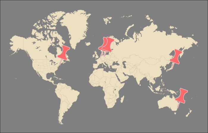
- Navigate to Insert | Symbols & shapes... and choose the category Stickers. Drag a pin to the world map. Position the pin to a location, make it the right size, and rotate it a bit. Select it and duplicate it four times with the Ctrl/Command + D keys.
- Also position the other pins, as shown in the following screenshot:
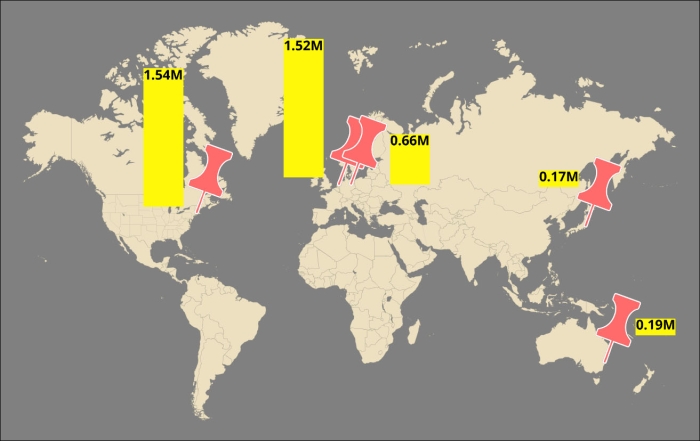
- Navigate to Insert | Symbols & shapes... and choose the category Shapes. Drag a rectangle to the canvas and duplicate it four times. Positions the rectangle next to the pins. Select a rectangle and drag the top to give it the desired length. This visualizes the sales volume of that specific location. Repeat this for the other rectangles. Add the size of the sales volume in the rectangle in the form of text. Try to shorten the number. This result is shown in the following screenshot:
- Now, let's add some detailed information.
- Zoom into one of the pins.
- Navigate to Insert | Symbols & shapes... and choose the category Shapes. Drag a rectangle on the canvas. Put the name of the location in the rectangle and at the left side the words
service,convenience, andadded value. We will add ratings for these subjects, so the audience can see how well (or badly) your business is doing. - Drag a circle to the canvas right after the word service and duplicate this circle four times. Now, you have five circles. Choose the filled circles for the value of the rating and empty circles for the rest. So, four filled circles means the rating is four out of five. Repeat this for the other subjects as shown in the following screenshot:
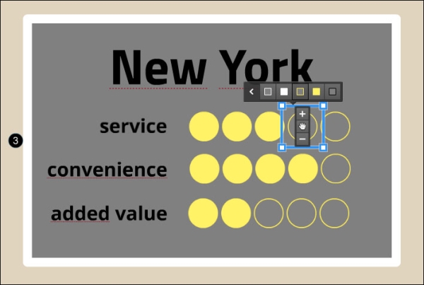
- Place another rectangle under the first rectangle.
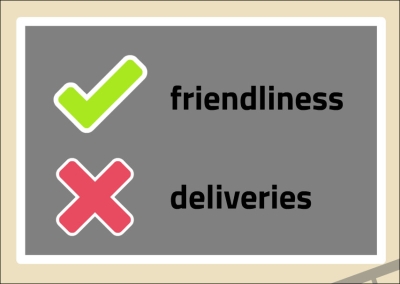
- Navigate to Insert | Symbols & shapes... and choose the category Stickers. Drag the checkmark and the red cross in the rectangle. Write one advantage beside the checkmark and a disadvantage beside the red cross.
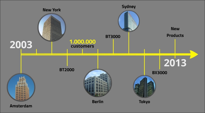
- The last thing we'll add to our prezi is the timeline. We already created this in the Interesting Timelines task.
- So, we'll copy and paste it to this prezi and change some colors so that it fits in with our template, as shown in the following screenshot:
..................Content has been hidden....................
You can't read the all page of ebook, please click here login for view all page.