
1. Color Management
In This Chapter
Introduction to color management
Choosing a color space for Photoshop
Synchronizing color settings among Creative Suite applications
Customizing color policies for Photoshop
Installing and saving custom color settings
Welcome to Photoshop! We know you want to dive into the editing features of Camera Raw or Photoshop right away, but achieving successful results will depend on your establishing proper color management settings first.
In this chapter, you will launch Photoshop and familiarize yourself with the Photoshop color basics. Key color management tasks that you will learn about include calibrating your display, choosing and saving color settings in Photoshop, and downloading and installing the correct printer profiles. (In Chapter 25, color management will come into play once more, when you prepare your final files for output.)
Launching Photoshop
To launch Photoshop in Windows
Do one of the following:
In a 32-bit version of Windows, click the Start button on the taskbar, choose All Programs, then click Adobe Photoshop CS6.
In a 64-bit version of Windows, click the Start button, choose All Programs, then click Adobe Photoshop CS6 (64-bit).
Double-click a Photoshop file icon (the file will open and Photoshop will launch).
To launch Photoshop in the Mac OS
Do one of the following:
Click the Photoshop icon ![]() in the Dock. (If that icon isn’t in your dock, open the Adobe Photoshop CS6 folder in the Applications folder, then drag the Adobe Photoshop CS6 application icon into the Dock.)
in the Dock. (If that icon isn’t in your dock, open the Adobe Photoshop CS6 folder in the Applications folder, then drag the Adobe Photoshop CS6 application icon into the Dock.)
Open the Adobe Photoshop CS6 folder in the Applications folder, then double-click the Adobe Photoshop CS6 application icon. ![]()
Double-click a Photoshop file icon (the file will open and Photoshop will launch).
Finding the New Stuff in This Book
This symbol ![]() identifies Photoshop features that are new or improved.
identifies Photoshop features that are new or improved.
Photoshop color
The building blocks of a Photoshop image
Onscreen, your Photoshop image is a bitmap — a geometric arrangement, or mapping, of dots on a rectangular grid. Each dot (pixel) represents a different color or shade. If you drag with a painting tool, such as the Brush tool, across an area of an image, pixels below the pointer are recolored. If you display your document at a high zoom level, you will be able to see the individual pixels (and also edit them individually).A Bitmap programs like Photoshop are best suited for editing photographic or painterly images that contain subtle gradations of color, called “continuous tones.” The images you work with in Photoshop can originate from a digital camera, from a photo print that was input via a scanner, from a file that was saved in another application, or even from scratch using Photoshop features, such as painting tools and filters.
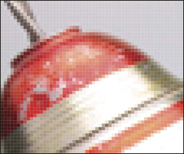
A In this extreme close-up of a photo in Photoshop, you can see the individual pixels that make up the image.
To enable color images to be viewed onscreen, your computer display projects red, green, and blue (RGB) light. Combined in their purest form, these additive primaries produce white light. If you were to send your Photoshop file to a commercial print shop for four-color process printing, it would be rendered using cyan (C), magenta (M), yellow (Y), and black (K) inks. Because your display uses the RGB model, it can only simulate the CMYK inks used in commercial printing.
The successful translation of a digital image to a printed one is more complex than you might expect. For one, the same document may look surprisingly dissimilar on different displays due to such variables as the temperature of the display, the lighting in the room, and even the paint color of the wall. Second, many colors that you see in the natural world or that can be displayed onscreen can’t be printed (have no ink equivalents), and conversely, some colors that can be printed cannot be displayed the same way onscreen. And thirdly, the same image will produce different results depending on the device and paper type. The color management techniques that we outline in this chapter are designed to help smooth out the color discrepancies that can arise when an image is transferred from digital input to display onscreen, then finally to print.
Photoshop channels
Every Photoshop image contains one, three, or four channels, each of which stores the intensity of a particular color component (e.g., red, green, or blue) as one of 256 levels of gray. Because the 256 gray levels are represented by 8 bits (short for “binary digits”) of computer data, the bit depth of such an image is said to be 8 bits per channel. Files that have a higher bit depth of 16 or 32 bits per channel contain more color information than those containing 8 bits per channel (to learn about 16-bit images, see page 17).
• Open an RGB Color image and display the Channels panel ![]() (Window > Channels) (A, next page). Click Red, Green, or Blue on the panel to display only that channel, then click the topmost channel name on the panel to restore the composite display. Although you can make adjustments to individual channels, normally you will edit all the channels simultaneously while viewing the composite image.
(Window > Channels) (A, next page). Click Red, Green, or Blue on the panel to display only that channel, then click the topmost channel name on the panel to restore the composite display. Although you can make adjustments to individual channels, normally you will edit all the channels simultaneously while viewing the composite image.
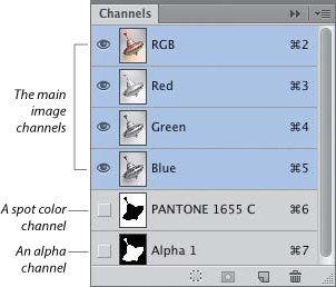
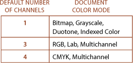
A The number of main image channels is determined by the document color mode (alpha and spot color channels are optional additions).
In addition to the core channels (e.g., RGB or CMYK), you can add two other kinds of channels to a Photoshop document. You can save a selection as a mask in a grayscale (alpha) channel, and you can add channels for individual spot colors (colors that are output by a commercial print shop using premixed inks).
Photoshop document color modes
In Photoshop, a document can be converted to, displayed in, and edited in any of the following color modes: Bitmap, Grayscale, Duotone, Indexed Color, RGB Color, CMYK Color, Lab Color, or Multichannel. This conversion is done primarily to take advantage of specific editing or output options. The availability of some Photoshop commands and options will vary depending on the current color mode of your document.
To convert a document to a different mode, make a selection from the Image > Mode submenu.B If a mode is dimmed on the menu and you want to make it available, you need to convert the file to a different mode as an intermediary step first. For example, to convert a file to Duotone mode, you need to put it into Grayscale mode first. The most common mode that Photoshop users work in is RGB Color.
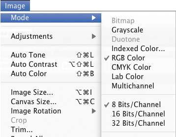
B Use the Mode submenu to change the color mode of your document.
Some mode conversions can cause noticeable color shifts. For example, if you convert a file from RGB Color mode (the mode used by computer displays) to CMYK Color mode (which contains fewer colors than RGB but is necessary for commercial printing), printable colors in the image will be substituted for any RGB colors that are outside the printable gamut (range). The fewer times you convert a file, the better, as the color data is altered with each conversion. Some conversions flatten layers, such as a conversion to Indexed Color, Multichannel, or Bitmap mode. Other conversions (such as from RGB to CMYK) give you the option to preserve layers via a Don’t Flatten button in an alert dialog that pops up.
Digital cameras and medium- to low-end scanners produce images in the default color mode of RGB. We recommend keeping your files in that mode for faster editing, and to preserve access to all the Photoshop filters. In fact, most desktop color inkjet printers, especially those that use six or more ink colors, are designed to accept RGB files.
• To “soft-proof” your RGB document onscreen (make it look as if it was converted to CMYK Color mode without performing an actual mode change), see page 449.
The following is a brief summary of the document color modes that are available in Photoshop:
In Bitmap mode, pixels are either 100% black or 100% white, and no layers, filters, or adjustment commands are available. To convert a file to this mode, you must convert it to Grayscale mode first.
In Grayscale mode, pixels are black, white, or up to 254 shades of gray (a total of 256). If you convert a file from a color mode to Grayscale mode and then save and close it, its luminosity (light and dark) values are preserved, but its color information is deleted permanently. (In Chapter 12, we show you how to change the colors in a layer to grayscale without actually changing the document color mode.)
To produce a duotone, a grayscale image is printed using two or more extra plates, which add tonal richness and depth. Producing a duotone requires special preparatory steps in Photoshop, and in the case of commercial printing, expertise on the part of the print shop.
A file in Indexed Color mode contains just one channel and a maximum number of 256 colors or shades in an 8-bit color table. When you optimize a file in the GIF format via the Save for Web dialog in Photoshop, the file is converted to this color mode automatically (see pages 465–466).
RGB Color is the most versatile and widely used of all the Photoshop modes.A It’s the mode in which digital cameras save your photos; the only mode in which all the Photoshop tool options and filters are accessible; and the mode of choice for export to the Web, mobile devices, video, multimedia programs, and most inkjet printers.
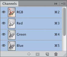
A The mode of this document is RGB Color, so it contains three channels.
In Photoshop, although you can display and edit a document in CMYK Color mode,B a better approach is to perform all your image edits in RGB Color mode first, then convert a copy of your file to CMYK Color mode only when required for commercial printing or for export to a page layout application. Images that are saved by high-end scanners in CMYK Color mode are exceptions; you should keep those files in CMYK to preserve their original color data.

B We converted the document to CMYK Color mode, which upped the number of channels to four.
Lab Color, a 3-channel mode, was developed for the purpose of achieving consistency among various devices, such as between printers and displays. Lab Color files are device-independent, meaning their color definitions stay the same regardless of how each output device defines color. The channels represent lightness (the image details), the colors green to red, and the colors blue to yellow. The lightness and color values can be edited independently of one another. Although Photoshop uses Lab Color to produce conversions between RGB and CMYK Color modes internally, Photoshop users like us rarely, if ever, need to convert files to this mode.
Multichannel images contain multiple 256-level grayscale channels. If you convert an image from RGB Color to Multichannel mode, its Red, Green, and Blue channels are converted to Cyan, Magenta, and Yellow (as a result, the image may become lighter and the contrast reduced). Some Photoshop pros assemble individual channels from several images into a single composite image by using this mode.
Introduction to color management
Problems with color inconsistency can arise due to the fact that hardware devices and software packages read or output color differently. If you were to compare an image onscreen in an assortment of imaging programs and Web browsers, the colors may look completely different in each case, and worse still, may look different from the picture you originally shot with your digital camera. Print the image, and you’ll probably find the results are different yet again. In some cases, these differences might be slight and unobjectionable, but in other cases such color shifts can wreak havoc with your design or even turn a project into a disaster!
A color management system can prevent most color discrepancies from arising by acting as a color interpreter. The system knows how each particular device and program interprets color, and if necessary, adjusts the colors accordingly. The result is that the colors in your files will display and output more consistently as you shuttle them among various programs and devices. Applications in the Adobe Creative Suite adhere to standard ICC (International Color Consortium) profiles, which tell your color management system how each specific device defines color.
Each particular device can capture and reproduce only a limited range, or gamut, of colors. In the jargon of color management, this gamut is known as the color space. The mathematical description of the color space of each device, in turn, is known as a color profile. Furthermore, each input device, such as a camera, attaches its own profile to the files it produces. Photoshop uses that profile in order to display and edit the colors in your document; or if a document doesn’t contain a profile, Photoshop will use the current working space (a color space that you choose for Photoshop) instead. Color management is important for both print and online output, and when outputting the same document in different media.
On the following pages, we give instructions for choosing color management options, and we strongly recommend that you follow them before editing your images in Photoshop. The steps are centered on using Adobe RGB as the color space for your image-editing work in order to maintain color consistency throughout your workflow. We’ll show you how to set the color space of your digital camera to Adobe RGB, give guidelines on calibrating a display, specify Adobe RGB as the color space for Photoshop, acquire the proper profiles for your inkjet printer and paper type, and assign the Adobe RGB profile to files that you have opened in Photoshop.
You’ll need to focus on color management later in the production cycle if and when you prepare your file for printing. In Chapter 25, we’ll show you how to create a soft-proof setting for your particular inkjet printer and paper using the profiles you have acquired, and then use that setting to soft-proof your document onscreen. The same profile will also be used to output files on a color inkjet printer. Finally, we’ll show you how to obtain and install the proper profiles for outputting either to the Web or to a commercial press.
The first step in color management is to establish Adobe RGB as the color space for your camera — before you attend to the settings in Photoshop. Via an onscreen menu, most high-end, advanced amateur digital cameras and digital SLR cameras give you an opportunity to customize how the camera processes your photos. Here a Nikon D700 is used as a representative model for setting a camera to the Adobe RGB color space, but you can follow a similar procedure to set the color space for your camera.
Note: If you shoot photos in the JPEG format, you should choose Adobe RGB as the color space for your camera, regardless of the camera model. If you shoot raw files, the following steps are optional, as you will have an opportunity to assign the Adobe RGB color space to your photos at a later point in Camera Raw (see page 58).
To set a camera’s color space to Adobe RGB (Nikon used as an example)
1. On the back of your Nikon camera, press the Menu button to access the menu on the LCD screen, then press the up or down arrow on the multiselector to select the Shooting Menu tab. ![]()
2. From the Shooting Menu, press the down arrow on the multiselector to select the Color Space category.A (Note: On a Canon EOS Rebel camera, this category is labeled Parameters). Press the right arrow on the multiselector to move to the submenu.
3. Press the down arrow to select Adobe RGB.B–C
4. Press the OK button to set your choice,D then press the Menu button to exit the Menu screen.
Nikon D700
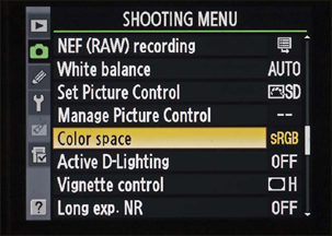
A From the Nikon Shooting Menu, we selected the Color Space category.

B We pressed the right arrow, chose Adobe RGB from the Color Space submenu, then pressed OK.

C Adobe RGB is now the Color Space for our camera.
Canon EOS Rebel T3

D On a Canon EOS Rebel T3, we clicked the Shooting 2 tab, chose Color Space, chose Adobe RGB, then pressed Set.
Calibrating your display
Why calibrate a display?
In an LCD (liquid crystal, or flat panel) display, a grid of fixed-sized liquid crystals filters color from a light source in the back. Although the color profile that is provided with a typical LCD display (and that is installed in your system automatically) describes the display characteristics accurately, over time — a period of weeks or months — the colors you view onscreen will gradually become less accurate and will need adjustment.
Although you can adjust the brightness setting on an LCD monitor, it’s best to leave that setting alone and give your display a periodic tune-up using an external calibration device instead. This device, or calibrator, will produce a profile containing the proper settings (white point, black point, and gamma) for your particular display. The Adobe color management system, in turn, will interpret the colors in your Photoshop document and display them more accurately based on that profile.
Calibrators range widely in cost, from a $100 to $300 colorimeter to a much more expensive (but more precise) high-end professional gadget, such as a spectrophotometer. Even with a basic colorimeter and its simple step-by-step wizard, you will be able to calibrate your display more precisely than by using subjective “eyeball” judgments.
Among moderately priced calibrators, our informal reading of hardware reviews and other industry publications has yielded the following list of currently popular models: Spyder3Pro and Spyder3Elite by Datacolor; i1 Display Pro by X-Rite; and hueyPro, which was developed jointly by PANTONE and X-Rite.
• On our blog at elaineandpeter.com, we show you how to use the Spyder3Elite.
Note: Don’t be tempted to use the calibration utility that’s built into your computer system — it’s not going to give you accurate results. If you want to achieve good output from Photoshop, you owe it to yourself to invest in a hardware calibrator. Even the least expensive external device is superior to the internal controls.
The basic calibration settings
An external calibrator will evaluate and then adjust three basic characteristics of your display: It will set the white (brightest) point to a consistent working standard; it will set the black (darkest) point to the maximum value; and it will establish a gamma (neutral gray) by equalizing the values of R, G, and B.
• The white point data sets the brightest white for the display to the industry-standard color temperature. Photographers favor using D65/6500K as the temperature setting for the white point; it is the standard white point setting in LCD displays.
• The black point is the darkest black a display can project. In other words, all the other shades that a monitor displays are lighter than this black. With the black point set correctly, you will be better able to view the shadow details in your photos.
• The gamma controls the display of midtones (the tones between the black and white points), for improved contrast. A gamma setting of 1.0 reproduces the linear brightness scale that is found in nature. However, a setting of 1.0 would make your photos look washed out because human vision responds to brightness in a nonlinear fashion. Instead, photography experts recommend using a gamma setting of 2.2 for both Windows and Macintosh displays. This higher setting redistributes more of the midtones into the dark range, which our eyes are more sensitive to, and enables your photos to look closer to the way you expect them to.
Choosing a color space for Photoshop
Next, you will establish the color space for Photoshop (the gamut of colors that Photoshop works with and displays). This is an essential step in color management. If you produce images primarily for print output and you want to get up and running quickly, you can choose a preset, as in these steps.
To choose a color settings preset for Photoshop
1. Choose Edit > Color Settings (Ctrl-Shift-K/Cmd-Shift-K). The Color Settings dialog opens.
2. Choose Settings: North America Prepress 2 A (readers residing outside North America, choose an equivalent for your geographic location). This preset changes the RGB working space to Adobe RGB (1998), and sets all the color management policies to the safe choice of Preserve Embedded Profiles, enabling each file you open in Photoshop to keep its own profile.
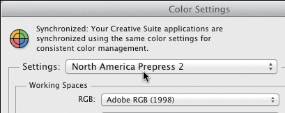
A From the Settings menu in the Color Settings dialog, we chose North America Prepress 2.
3. Click OK.
Here you can delve further into the Color Settings dialog. Be sure to choose options that are suitable for your output requirements.
To choose color settings options for Photoshop
1. Choose Edit > Color Settings (Ctrl-Shift-K/Cmd-Shift-K). The Color Settings dialog opens.
2. From the Settings menu, choose one of the following presets, depending on your output needs:
Monitor Color sets the RGB working space to your display profile. This preset is a good choice for video output, but not for print output.
North America General Purpose 2 meets general requirements for screen and print output in North America, but we don’t recommend it for print output because it uses the sRGB IEC61966-2.1 color space (see step 3 at right). All profile warnings are shut off.
North America Newspaper manages color for output on newsprint paper stock.
North America Prepress 2 manages color to conform to common press conditions in North America using the Adobe RGB (1998) color space. We recommend this preset for print output. When CMYK documents are opened, their values are preserved.
North America Web/Internet is designed for online output. All RGB images are converted to the sRGB IEC61966-2.1 color space.
3. The Working Spaces settings govern how colors are treated in documents that lack an embedded profile. You can either leave these menu settings as they are or choose one of these recommended RGB color spaces, depending on your output needs (for CMYK settings, see pages 10 and 11):
Adobe RGB (1998) contains a wide range of colors and is useful when converting RGB images to CMYK. This option is recommended for print output but not for Web output.
ProPhoto RGB contains a very wide range of colors and is useful for output to high-end inkjet and dye sublimation printers.
sRGB IEC61966-2.1 is a good choice for Web output, as it reflects the settings of the average computer display. Although this setting isn’t a good choice for print output (because it contains fewer colors in the printable CMYK gamut than Adobe RGB), many online Web printing sites accept or require files to be in this color space.
4. Click OK.
• Avoid the Working Spaces settings of Apple RGB and ColorMatch RGB, which were designed for displays that are no longer standard. The Monitor RGB [current display profile] is used for sharing files with applications that don’t support color management; the display profile on the current user’s system is used as the color space. ColorSync RGB matches the Photoshop RGB space to the space that’s specified in the Apple ColorSync Utility; the ColorSync space on the current user’s system is used as the color space. With both of these settings, color consistency is undermined.
Synchronizing color settings among Creative Suite applications
If the color settings differ among the Adobe Creative Suite programs that you have installed on your system (such as between Photoshop and Illustrator or InDesign), an alert will display at the top of the Color Settings dialog.A If you haven’t installed one of the full Adobe Creative Suites, you’ll have to start up each application and establish its color settings by hand. If you do have one of the suites installed, you can use the Suite Color Settings dialog in Bridge to quickly synchronize the color settings for all of the color-managed Adobe programs in your system.
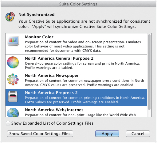
A Use the Suite Color Settings dialog to synchronize the color settings of all the applications in the Adobe Creative Suite that are installed on your system.
Note: Before using Bridge to synchronize the color settings among your Adobe Creative Suite programs, you should establish the correct settings in Photoshop (see the preceding page).
To synchronize the color settings among your Creative Suite applications
1. Choose File > Browse in Bridge (Ctrl-Alt-O/Cmd-Option-O).
2. In Bridge, choose Edit > Creative Suite Color Settings (Ctrl-Shift-K/Cmd-Shift-K). The Suite Color Settings dialog opens.
3. Click the same settings preset that you chose in the Color Settings dialog in Photoshop (e.g., North America Prepress 2), then click Apply. Bridge will change (synchronize) the color settings of the other Adobe Creative Suite applications to conform to those in the preset you have selected.
Customizing the color policies for Photoshop
Photoshop supports document-specific color, meaning that the profile that is embedded in a document controls how colors in that file are previewed onscreen, edited, and converted upon output. The current color management policies govern whether Photoshop honors or overrides a document’s settings if the color profile in the file, when opened or imported, doesn’t conform to the current color settings in Photoshop. If you chose the North America Prepress 2 setting in the Color Settings dialog (see page 8), the Ask When Opening policy (the safest option, in our opinion) is already chosen for you, and you can skip these steps.
To customize the color management policies for Photoshop
1. Choose Edit > Color Settings (Ctrl-Shift-K/Cmd-Shift-K). The Color Settings dialog opens.A
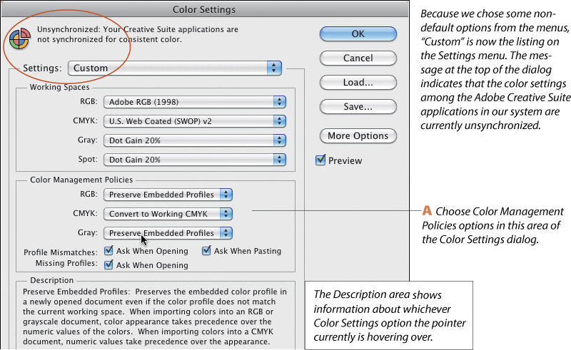
2. From each of the Color Management Policies menus, choose an option for files that you open or import into Photoshop:
Off to prevent Photoshop from color-managing the files.
Preserve Embedded Profiles if you expect to work with both color-managed and non-color-managed files, and you want each document to keep its own profile.
Convert to Working RGB or Convert to Working CMYK to have all files that you open or import into Photoshop adopt the program’s current color working space.
3. Optional: For Profile Mismatches, check Ask When Opening to have Photoshop display an alert when the color profile in a file you’re opening doesn’t match the current working space. Via the alert, you will be able to either convert the document colors to the current working space or keep the embedded profile in the document.
Check Ask When Pasting to have Photoshop display an alert if it encounters a color profile mismatch when you paste or drag and drop imagery into a document. Via the alert, you will be able to accept or override the current color management policy.
4. Optional: For Missing Profiles, check Ask When Opening to have Photoshop display an alert when opening a file that lacks a profile, giving you the opportunity to assign one.
5. Click OK.
Installing and saving custom color settings
For desktop color printing, we recommended choosing North America Prepress 2 as the color setting for Photoshop (see page 8). For commercial printing, you can let the pros supply the proper color settings: Ask your print shop for a .csf (custom settings) file, which should contain all the correct Working Spaces and Color Management Policies settings for the particular press they will be using for your project. Once you receive the .csf file, all you need to do is install it in the proper location as described below and, when needed, choose it from the Settings menu in the Color Settings dialog.
To install a .csf file in your system
1. In Windows, put the file in Program FilesCommon FilesAdobeColorSettings.
In the Mac OS, put the file in Users/[user name]/Library/Application Support/Adobe/Color/Settings.
2. The .csf is now available as a choice on the Settings menu in the Edit > Color Settings dialog.
If your print shop gives you a list of recommended settings for the Color Settings dialog instead of a .csf file, you can create your own .csf file that contains the recommended settings, as in these steps.
To save custom color settings as a .csf file
1. Choose Edit > Color Settings (Ctrl-Shift-K/Cmd-Shift-K). The Color Settings dialog opens.
2. Choose and check the settings that your print shop has recommended.
3. Click Save. In the dialog, enter a file name (we suggest including the printer type in the name). Keep the .csf extension (make sure Hide Extension is unchecked) and keep the default location. Click Save.
4. Click OK to exit the Color Settings dialog.
Acquiring printer profiles
Here we summarize how to acquire the proper printer profile(s) so you can incorporate color management into your specific printing scenario.
Most printer manufacturers have a website from which you can download either an ICC profile for a specific printer/paper combination or a printer driver that contains a collection of specific ICC printer/paper profiles. Be sure to choose a profile that conforms to the particular printer/paper combination you are planning to use.
To download the printer profile for your inkjet printer
1. Do either of the following:
Download the correct profile from the website for your printer. For Epson, visit epson.com; for Canon, visit canon.com. On both sites (at the time of this writing), you will need to click a “Drivers & Support” type of option first, then choose a printer category (e.g., InkJet) and model. Next, click a link for “Downloads” or “Drivers.” On the Epson site, you will need to go one step further and click a link to access profiles for specific paper types.
• On our blog at elaineandpeter.com, we illustrate the links for accessing the profiles on the Epson and Canon sites.
Download an ICC profile for a specific printer/paper combo from the website of a paper manufacturer, such as ilford.com or museofineart.com.
2. After visiting the website, install the profile you downloaded by following the instructions that accompany it.
On pages 448–449, we’ll show you how to use the profile you have downloaded to soft-proof your document onscreen.
Changing a document’s color profile
When the profile that is embedded in a document doesn’t conform to the current working space for Photoshop (which in our case is Adobe RGB), or the document lacks a profile altogether, you can use the Assign Profile command to assign the correct one. You may notice visible color shifts if the color data of the file is reinterpreted to conform to the new profile, but rest assured, the color data in the actual image is preserved. Do keep Preview checked, though, so you can see what you’re getting into.
To change or remove a file’s color profile
1. With a file open in Photoshop, choose Edit > Assign Profile. If the file contains layers, an alert may appear, warning you that the appearance of the layers may change; click OK.
2. The Assign Profile dialog opens.A Check Preview, then click one of the following:

A Use the Assign Profile dialog to either remove a color profile from a file or assign a different one.
To remove the color profile, click Don’t Color Manage This Document.
To assign the current working space, as established in the Color Settings dialog, click Working [the document color mode and the name of your chosen working space]. If you followed our steps on page 8, the menu should already be set to Adobe RGB (1998).
To assign a different profile, click Profile, then choose a profile that differs from your current working space.
3. Click OK. Using the File > Save As dialog, save your file in the Photoshop (.psd) format (see page 20). In that dialog, be sure to check ICC Profile (in Windows) or Embed Color Profile (in the Mac OS) to embed the assigned profile into the file.
The Convert to Profile command lets you preview the conversion of a document to a different output profile and intent, and then it converts the color data to the chosen profile. Use this command to convert a file to sRGB, if that color space is required for online Web printing. Note: This command performs a mode conversion and changes the actual color data in your file, so apply it to a copy of your file (see page 20).
To convert a file’s color profile
1. Choose Edit > Convert to Profile. In the Convert to Profile dialog, check Preview.B
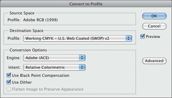
B Use the Convert to Profile dialog to convert your document to a different color profile. Here we switched our file from the Adobe RGB profile to the Working CMYK – U.S. Web Coated (SWOP) v2 profile (for commercial printing).
2. Under Destination Space, from the Profile menu, choose the profile to which you want to convert the file (it doesn’t necessarily have to be the current working space).
3. Under Conversion Options, choose an Intent (for the intents, see the sidebar on page 449).
4. Leave the default Engine as Adobe (ACE), keep the Use Black Point Compensation and Use Dither options checked and, if available, check Flatten Image to Preserve Appearance to allow Photoshop to merge all layers and adjustment layers into the Background.
5. Click OK.