6. Working with Charts

In this chapter, you discover just how easy it is to create and customize charts in Excel 2013. Topics include the following:
→ Altering the source data range
→ Formatting the plot and chart areas
Charts are graphical representations of data that enable you to visualize and communicate your data in a more meaningful way than with simple numbers in tables. In Excel, you not only have the capability to easily chart your data, but you can also quickly change the appearance of charts with a host of options. For instance, you can change titles, customize the legend, set axis points, add category names, and more.
When working with Excel charts, you see the Chart Tools contextual tab. This tab contains subtabs that expose the various commands you would use to design, layout, and format a chart.
In addition, when you click on a chart, you see several buttons to the right of the chart. These are helper buttons that provide an easy way to customize the various properties of the chart. These include the Chart Elements button, the Chart Style button, and the Chart Filter button.
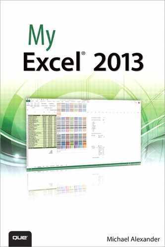
Creating a Chart
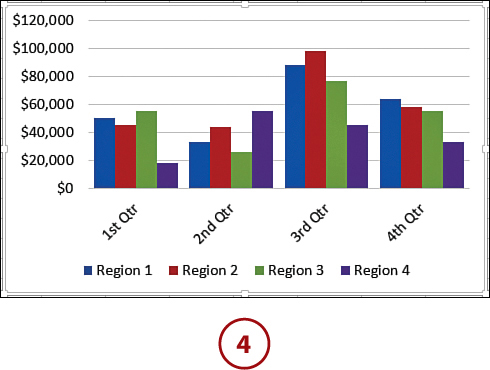
Interpreting numeric data by looking at numbers in a table can be difficult. Using data to create charts can help people visualize the data’s significance. For example, you might not have noticed in a spreadsheet that the same month of every year has low sales figures, but it becomes obvious when you make a chart from the data in that spreadsheet. The chart’s visual nature also helps others review your data without the need to review every number.
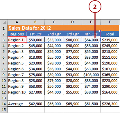
1. Select the cells you want to include in your chart.
2. Click the All Charts dialog launcher at the bottom-right corner of the Charts group on the Ribbon’s Insert tab.
3. Select the All Charts tab; then click the Chart Type icon for the chart you want to create.
4. Click the OK button to create your chart.
Creating Quick Charts with F11
You can quickly create a chart by selecting your data range and pressing the F11 key. When you do this, Excel automatically creates a chart and puts it on its own sheet tab.
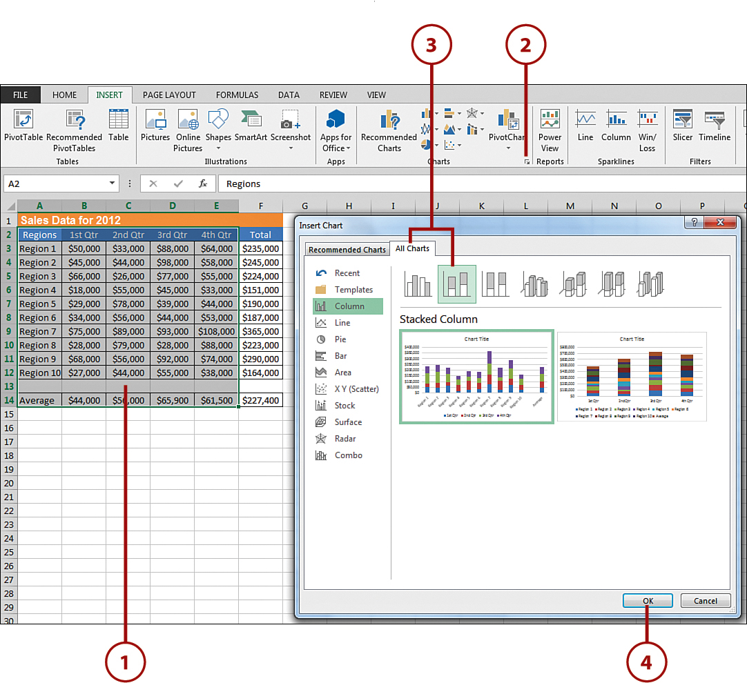
5. Click the Quick Layout command to choose a chart layout that includes a chart title.
6. Click the Chart Title box, and then type the name for the chart.

Regardless of your selection in step 6, you can always move your chart to another (perhaps new) worksheet. Simply right-click a blank area in the chart and click Move Chart. To place the chart in a new worksheet, click the New Sheet option and type a name for the new sheet. To move it to a different worksheet, click the Object In option button and select the worksheet from the drop-down list. Click OK and Excel moves the chart.
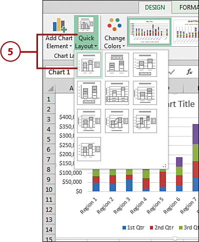
Changing the Chart Type
Charting is one of those skills you learn by doing. At first, you might not even know what type of chart you want to create until you see it. You can always select a different chart type for a chart so that it better represents the data.
1. Click the Change Chart Type command on the Chart Tools Design tab.
2. Select a new chart type and chart subtype in the Change Chart Type dialog box.
3. Click OK.
4. The updated chart type appears in your chart.
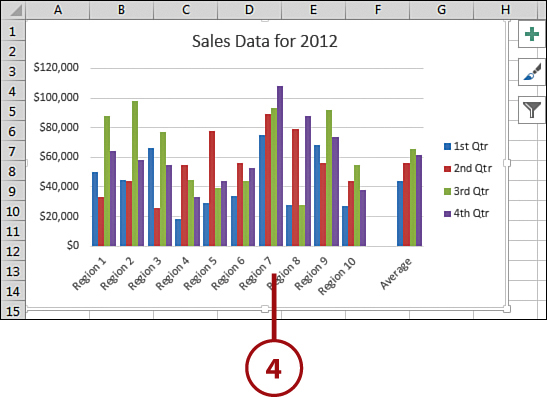
Altering the Source Data Range
Suppose you need to point your chart to a completely different data table. That is to say, the data that will feed your chart will be coming from a different location. In this scenario, you can reconfigure your chart to change its source data location.
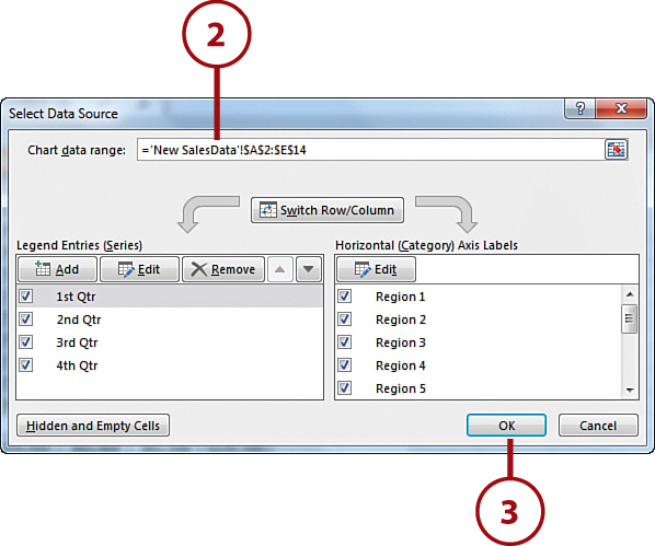
1. Click the Select Data command on the Design tab.
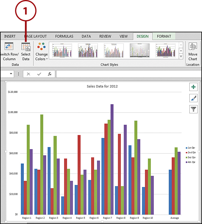
2. Click directly in your worksheet and select the new data range. While you’re doing this, you see moving dashes around the cells feeding the chart along with the Select Data Source dialog box. After you’ve selected your new data, press Enter. The Chart Data Range input box in the Select Data Source dialog box automatically updates.
3. Click OK.
Locating Incorrect Data
If you notice that one of the data points in your chart is way off the scale, this is a good sign that you might have entered data into your worksheet incorrectly. If this is the case, edit the worksheet data and the chart updates automatically. (See the task “Altering the Original Data” later in this chapter for help altering the original data.
Altering Chart Options
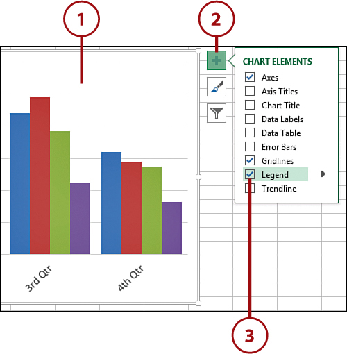
Excel offers you full control over the look and feel of your chart with many customization options. You can add or edit chart titles, alter your axes, add or remove gridlines, move or delete your legend, add or remove data labels, and even show the data table containing your original data. You can manage all this from the helper buttons that activate when you click the chart.
1. Click your chart and choose the Chart Elements button. Then click the arrow next to Chart Title, and choose More Options.
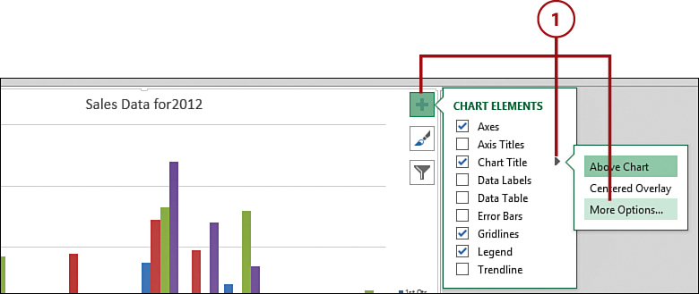
2. Click the arrow next to Fill to expand the Fill section.
3. Add a background color by checking Solid Fill and then choosing a color.
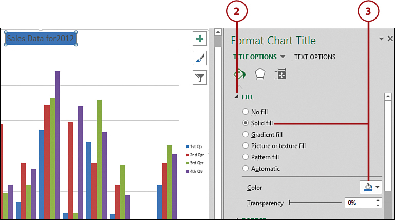
4. Go back to the Chart Elements button, click the arrow next to Axes, and then click More Options.

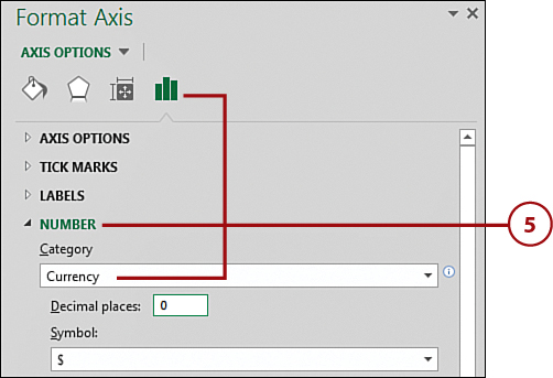
5. Click the Axis Options icon and expand the Numbers section. Customize the number formatting for your Axes here.
Formatting the Axes Gridlines
To change the pattern and scale of the gridlines, double-click the gridline, and then use the Format Major Gridlines pane to make your selections. Click OK when finished.
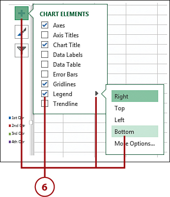
6. Go back to the Chart Elements button, and place a check in the Legend property. Click the Legend arrow, and review how altering the placement options affects your chart.
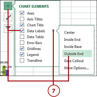
7. Go back to the Chart Elements button, and place a check in the Data Labels property. Click the Data Labels arrow, and review how altering the placement of data labels affects your chart.
8. Go back to the Chart Elements button, and place a check in the Data Table property. Click the Data Table arrow, and select how you want to show the data table (with or without the legend keys).

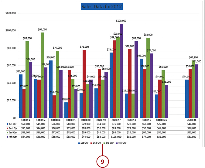
9. Review how your chart has changed.
Printing Charts
You can print a chart just like you print anything else in Excel. If you want to print just your chart (as opposed to the entire worksheet) select the chart, click the File tab on the Ribbon, and select the Print option.
Formatting the Plot Area
The plot area consists of a border and the location of the data points in your chart. You can alter the style, color, and weight of the border. You can also alter the color of the plot area.
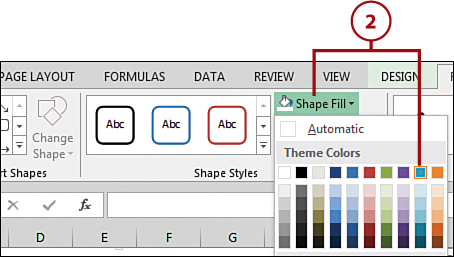
1. Click the Chart Elements drop-down on the Format tab; then choose Plot Area from the drop-down.
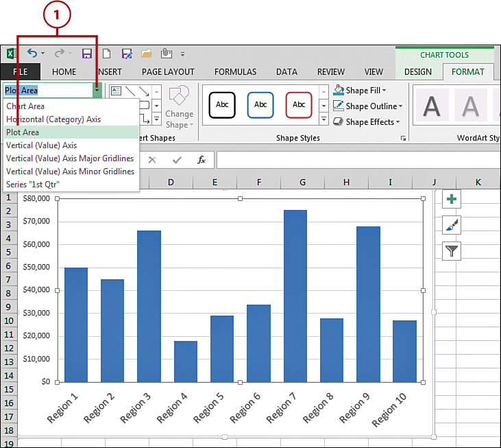
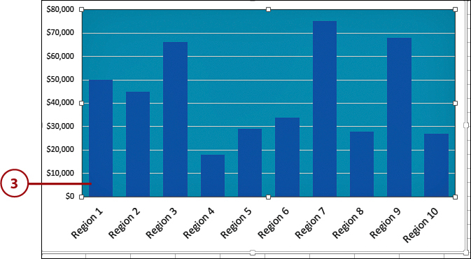
2. Click the Shape Fill button, and then choose a color to change the background color of the plot area.
3. Observe how your chart has changed.
Determining Which Area You’re In
If you are unsure whether you are in the chart area or the plot area, click directly on the chart. Look at the Chart Elements drop-down in the upper-left corner of the Format tab. This drop-down shows the name of the chart element that is currently active. You can also use this nifty drop-down to quickly switch from one element to another.
Formatting the Chart Area
The chart area consists of a border, the background, and all the chart fonts. You can alter the style, color, and weight of the border. You can also alter the color of the background. You can also change all the fonts and font styles in the chart.
1. Click the Chart Elements drop-down on the Format tab; then choose Chart Area from the drop-down.

2. Click the Shape Fill button, and then choose a color to change the background color of the plot area.

3. Observe how your chart has changed.
Formatting from the Home Tab
You can change the font and color of most chart elements by using the formatting commands on the Home tab. You can simply select the chart element and then go to the Home tab to easily change the font, alignment, color, and other format properties. This makes quick work of any formatting tasks you need to do on your charts.
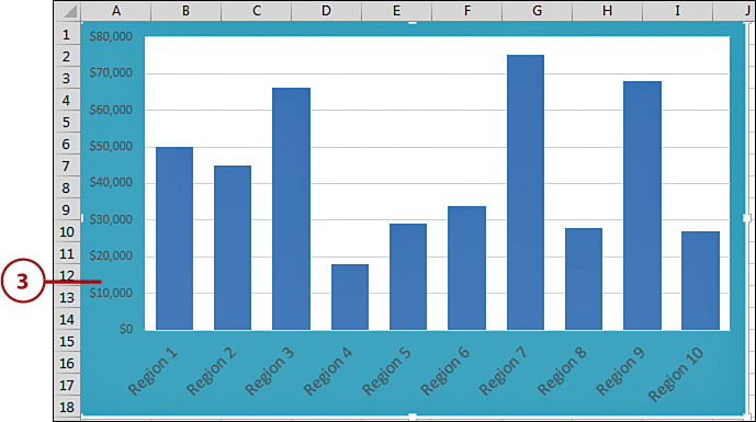
Formatting the Axis Scale
Excel automatically establishes the axis increments according to the maximum amount on the chart. Usually, this will suffice, but if you want to show more detail about actual numbers, it can be convenient to alter your value axis.
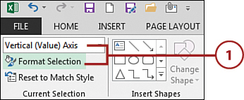
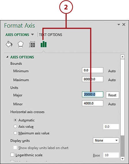
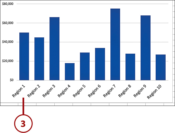
1. Click the Chart Elements drop-down on the Format tab; then choose Vertical (Value) Axis from the drop-down. Click the Format Selection command.
2. Click the Axis Options icon, and type the changes to the axis scale increments—for example, decrease the value in the Major unit field.
3. Review how your chart has changed.
Number Formatting and Alignment
To change the number format, expand the Number section on the Axis Options pane, and select the numeric format you want to use. To change the alignment of the axis so that they are vertical, click Text Options in the dialog box shown in step 2, and select a rotation for the axes under the Textbox section.
Altering the Original Data
A chart is linked to the worksheet data, so when you make a change in the worksheet, the chart is updated. If you want to change a value in the worksheet, edit it as you do normally. The chart is instantly updated to reflect the change. If you delete data in the worksheet, the matching data series is deleted in the chart.
1. Select the worksheet tab or range that contains the charted data.
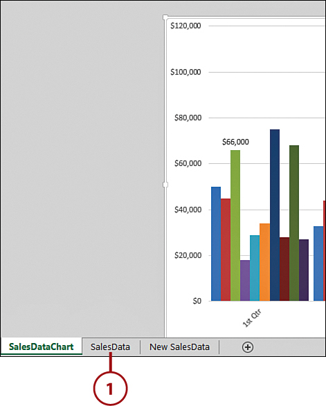
2. Click a cell that you want to alter or need to update.
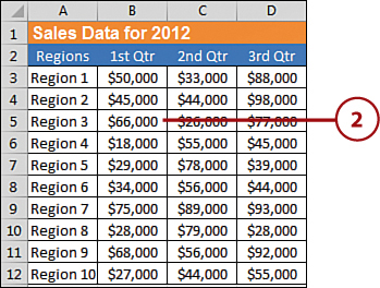
3. Type the new data and press the Enter key.

4. Go back to the chart and see how the edited data point has changed your chart.
Saving Changes
When working with charts, you want to make sure you save your changes often. You wouldn’t want to lose any changes you made in case your network goes down or your computer freezes.
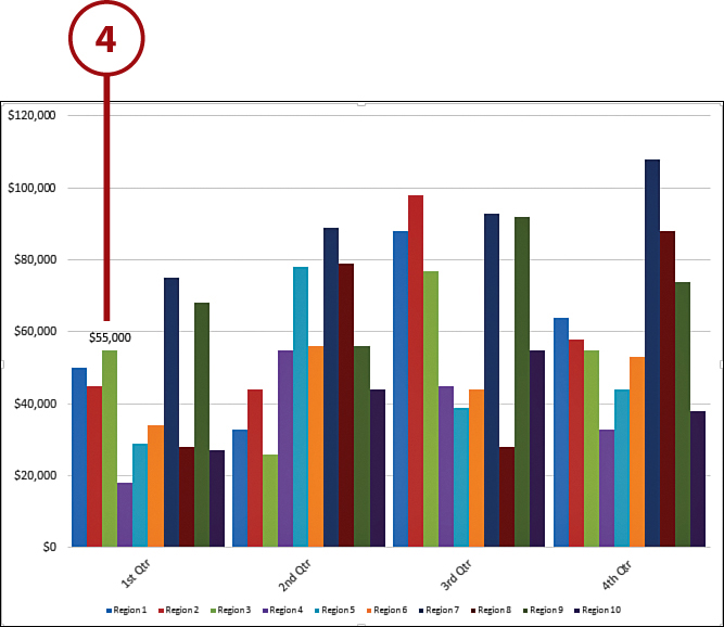
Adding Data to Charts
Suppose you want to expand your chart to include additional data. If so, you need to place the data on your original worksheet and indicate to Excel that you want it included in your chart.
1. After adding any new data you want to include in your chart to the original data range, click directly on your chart to see what data is currently referenced in the chart.
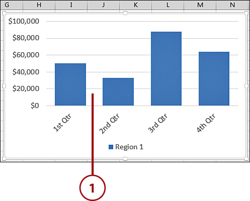
2. Click and drag the blue chart data line to include the newly added data.
3. Use the blue handle to drag the chart data line in the new location.
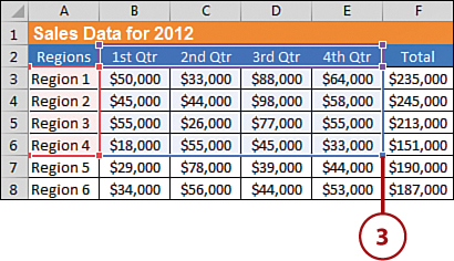
4. The chart automatically updates to include the new data.
Excluding Chart Data
You can also click and drag the blue chart data line to exclude data in your chart. Simply drag the blue line so that the data you want to exclude is no longer contained within the chart.
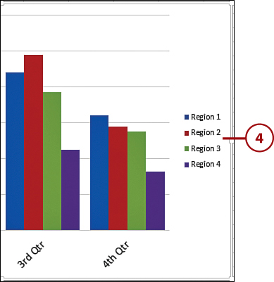
Adding a Legend
A legend helps a reader make sense of all the data points and colors shown in a chart. You typically don’t need a legend if you’re only plotting one data series. However, if you are plotting two or more data series in one chart, it’s definitely a best practice to have a legend. Considering that you will probably add data to your chart, going from one data series to many, it’s helpful to know how to add a legend after your chart has been created.
1. Click anywhere on your chart.
2. Click the Chart Elements Button.
3. Click the checkbox next to the Legend property.
4. Note that your chart now has a Legend.
Quickly Formatting Legends
Right-click the legend and choose Format Legend from the shortcut menu. From the dialog box that appears, you can alter the patterns, fonts, and even the placement of the legend.