
First things first; we will start with the creation of our first base application that we will re-use for most of the following recipes in this chapter, improving it one step (or more) at a time. This recipe will show you how to implement a basic application and help you get familiar with Visual Studio 2012 and Blend for Visual Studio 2012.
In order to use this recipe, you should have a Windows 8 operating system, Visual Studio 2012, and Blend for Visual Studio 2012. We will also need a Windows 8 developer license to create Windows Store apps, which we can get for free from Visual Studio 2012, as shown in the following image:

First we will open Visual Studio 2012 in Windows 8 and create a new project. For this we must perform the following steps:
- Select the Menu option from File | New Project (or press Ctrl + Shift + N).
- In the New Project window, we will select Visual C# from Installed | Templates. Then select the Windows Store app style and finally the Grid App (XAML) template. We will give it a proper name such as
OurFirstMetroApp, and location, and click on the OK button.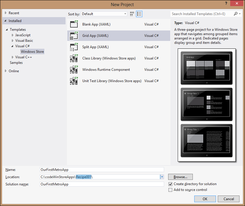
- We will build the solution from the menu option Build | Build Solution (or press F7) and then debug it from the menu option Debug | Start Debugging (we can also press F5 or click on the play icon on the actions bar). If everything is working properly, we should get the following output:
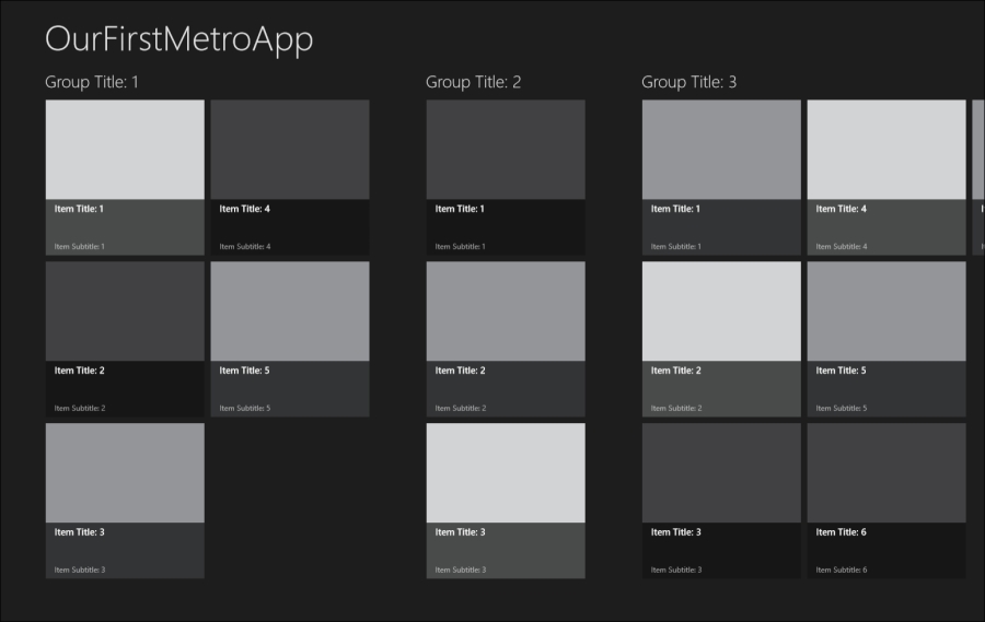
- Now, we can scroll horizontally, click (or touch if we have a tactile screen) on a group title to open the group view, and click on an item title to open the item view. In the item view, we have buttons at the edges of the screen to navigate through the group items.
- We will go back to the Windows 8 desktop mode, then to Visual Studio 2012 and stop the debugging session (or press Shift + F5).
- Next, we will go to Solution Explorer and double-click on the
Package.appxmanifestfile. - Once the Application Manifest Editor window opens, we will go to the Capabilities tab and uncheck the Internet (client) capability option, as our current application does not need outbound access to the Internet.
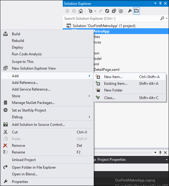
- To add a new item to the project, on the Visual Studio 2012 Solution Explorer right-click on the project and select Add | New Item… (or Ctrl + Shift + A).
- Select the Windows Store app style, and from there select the Basic Page item, name it
HelloPage.xaml, and then click on the Add button at the lower-right corner of the window.
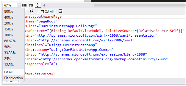
- Open HelloPage.xaml, expand the design view, and then click on the Unfold button on the section that separates the WYSWIG render view of the XAML from the XAML code. There we will select Fit all at the left-hand side of the screen.
- Let's add the finishing touches to our Visual Studio XAML workspace. To do so, we will expand the TOOLBOX and the DOCUMENT OUTLINE panels and pin them.
- To use our project-defined name, we will comment the page's
AppNameresource, which is now overriding the globalAppNameresource. We will go and comment the line defining this on the<Page.Resources>tag of HelloPage.xaml, which is located in the topmost area of the XAML code, similar to the following code:<Page.Resources> <!-- TODO: Delete this line if the key AppName is declared in App.xaml --> <!--<x:String x:Key="AppName">My Application</x:String>--> </Page.Resources>
- Next, we will add a grid control to the bottom section of the design area by dragging it from the TOOLBOX panel and dropping it just below the title. It will be added inside the first grid and will appear on the DOCUMENT OUTLINE panel following the hierarchy.
- We also want it to occupy all the available space on the grid row and column where we created it, so we will right-click on the grid, select Reset Layout, and then select All.

- As the grid will handle the body section's layout, we will name it
grBody. Select the grid and change the property Name on the Properties panel, or we can change it directly in the DOCUMENT OUTLINE panel. - Next, we will add a row separator to the
grBodygrid. We will move our cursor to the left-hand side of the grid, and an orange marker with the shape of an arrow will appear, indicating a grid separator. Clicking on that region, we will be able to add, modify, or delete a row. The same applies to the columns. We will add a row about 150 pixels from the bottom.
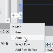
- We will continue and change the size of the row to a fixed one. Select the row and move the cursor to the left-hand side of the blue zone that defines the row manipulation section. A pop-up menu will appear where we will choose the Pixel option for a fixed bottom row.
- Next, we will add a TextBlock control on the top row of the grid that we just divided (adding a row separator creates two rows). We will reset the layout of the TextBlock control as we did previously with the grid.
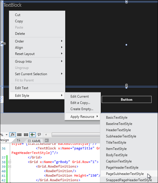
- Next, we will style the TextBlock using a default style by right-clicking on the TextBlock and then selecting the option Edit Style | Apply Resource | PageSubheaderTextStyle.
- To finish the TextBlock, we will edit the Text property in the Properties panel by writing
This is our First Windows Store App. - We will drag a Button control from TOOLBOX to the lower row of the grid that we added recently. We will change some of its properties in the Properties panel, setting its HorizontalAlignment and VerticalAlignment to Center, its FontSize to 20, its Name to
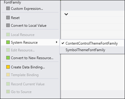
btnStart, and its Content toStart. - Next, we will change its font style property. For this we will click on the box next to the property and select System Resource and then ContentControlThemeFontFamily.
- We will double-click on the start button and then the code behind
HelloPage.xamlwill be seen, where an empty method has been created. There we will enter the following code (note that for this to work, we will have to add the data to the namespace):private void btnStart_Click(object sender, RoutedEventArgs e) { this.Frame.Navigate(typeof(GroupedItemsPage), "AllGroups"); } - We will open the
App.xaml.cscode behind the file and comment theNavigateinstruction on theOnLaunchedevent, adding a new one that brings us toHelloPage.xaml://if (!rootFrame.Navigate(typeof(GroupedItemsPage), "AllGroups")) if (!rootFrame.Navigate(typeof(HelloPage)))
- Next, we will save all from the menu or with the Ctrl + Shift + S shortcut.
- We will build the solution and debug our first Windows Store app. We should see that our application launches and shows the page we just added.
We created an application from the Grid Application template, which does a lot of work for us, creating an app that allows us to navigate through a hierarchy of groups and group items. We can explore them in the touch-ready Windows Store app GridView (the Windows Store app control that displays a grid of data items) and from there we can go to the group view and the item view, where we can navigate to other items.
If we look at the structure that has been created for us by the project template, we have the typical Properties and References sections of a Visual Studio .NET project. The App.xaml file is the entry point to our application and has the same meaning and overall structure as the same file on Silverlight, WPF, or Windows Phone projects containing defined or referenced global resources. When the application starts, it creates a frame-based navigation system, similar to that of the Windows Phone, and navigates to our first page, in our case, HelloPage.xaml.

To move between pages, the code behind App.xaml creates a frame and adds it as the application's main content. The navigation actions just change the page contained by the frame, and the navigation stack is maintained for us so we can go forward and navigate back automatically. The following diagram explains it clearly:

So, we can navigate to a particular page with the following instruction:
this.Frame.Navigate(typeof(GroupedItemsPage), "AllGroups");
The previous instruction indicates the page we want to navigate to and the navigation parameter. Additionally we can navigate back with the following instruction:
if (this.Frame.CanGoBack) {
this.Frame.GoBack();
}
Note that the CanGoback check is not obligatory, but not doing so can throw an exception.
We have also specified the application's capabilities through the Package.appxmanifest designer.
We added a basic page of type LayoutAwarePage, which provides layout awareness, that is, this page is now able to detect changes in how it is viewed. This can be either portrait, landscape, snapped, or filled. Being the two last ones (snapped and filled) special views of the application provided by the Windows Store App design style that our application is expected to support.
On our basic page, we deleted a resource so the page could get the app.xaml file predefined. The AppName resource added a grid with some layout and two controls to it, TextBlock and Button. Then we adjusted their layout and properties to change the default application behavior with the click event of the start button. We finally changed the default code of the App.xaml.cs OnLaunched method to navigate to our new page instead of the previous GroupedItemsPage location.
Moreover, we have been doing several tasks in various ways with Visual Studio 2012 so now we should be more familiar with it.
Other options to create our Windows Store app would be to create a blank application or a split application. The blank application creates an extremely basic application structure for us to fill. The split application shows information in a master-detail way, showing the master information on one half of the screen and the details on the other half.
There are also the classic Class Library and Unit Test Library templates.
We have built this first project as a grid application as we will use it for further recipes, adding more features to it so that it becomes a fully compliant Windows Store app style application.
With this recipe, we have also created an application and extended it with a first page and made it compliant with the Windows Store app style design and principles, providing a clean and open layout that minimizes distractions, with enough breathing room and a clear information hierarchy founded on a clean typography.