
Chapter 12. Because Looks Matter
If you’ve been in the web industry for even just a few days, I’m sure you’ve heard the mantra “content is king.” Whether you agree with it or not, it would be impossible to have any sort of website without content.
And content is what we’ve focused on in this book:
• How to identify content that is well suited for microformats
• How to structure content with POSH
• How to enrich your content by publishing microformats
But content alone just isn’t enough, especially with today’s web filled with tons of competing information. Content should—or, I hazard to say, must—look good. I mean, even kings have fancy clothes, right?
This is where CSS comes into play. If you are following today’s web standards (if not, then shame on you), you are using CSS to control the look of your website. And microformats do not restrict your ability to use CSS. In fact, the sets of class values from microformats provide nice, semantic styling hooks you can use instead of or in addition to custom classes.
The process of styling microformatted content is the same as that of styling non-microformatted content. If you have the CSS ability, you can style microformats any way you can imagine. I’ll prove it to you.
My friend Jason Nakai worked up a few designs for some of the microformat examples in this book. I’ve translated each into CSS, using the markup from the examples so you can see the wide range of presentation options you have and, hopefully, imagine a few more for your own content.
Now, I won’t be going into detail about the CSS. I’ll just be showing you the style rules and end results. Remember, this book is about microformats, not CSS.
Styling Links
Some of the easiest microformats to style are those used to define links, primarily because links are so simple. A link is just some text, and most CSS for links focuses on color, decoration such as underlines, and font weight.
A trend I’ve seen for some links, though, includes little icons preceding certain links to give users more context about those links. Our link-based microformats are perfect cases to apply this little design element.
XFN
As you may remember, XFN is really just one or more specific rel values assigned to links, indicating a social relationship with the people behind those links. If you’d like to make your XFN links stand out from your other links, you can use CSS attribute selectors to present an icon before these links.
Lucky you (and me, since I suck at pixel work), Wolfgang Bartelme created a few sets of microformats icons you can use for just such a purpose: http://bartelme.at/journal/archive/microformats_icons.
I’m going to use one of his XFN icons to style an example from Chapter 4 (pages 67–68) for a link to a friend (remember that value?).
The CSS
The CSS is extremely simple. I add a few declarations to make the link text itself look nice. Then, using attribute selectors, which I can use to target links with specific rel values, I indicate the icon should appear before the link text:

The end result
And with that little bit of CSS, any links that have a rel value of friend will appear as such (Figure 12.1).
Figure 12.1 Browser rendering of styled XFN friend link
VoteLinks
We can take this approach and apply it to any links with specific attribute values, including VoteLinks, which uses the rev attribute. Wolfgang Bartleme’s microformats icon collection includes a set for VoteLinks (which are adorable), but you can use anything you like. For this example from Chapter 3 (page 55), we’ll use the one Jason made for us.
The CSS
Once again, CSS attribute selectors come to the rescue:

The end result
So, without having to add any classes to my link, I get this cute little icon (Figure 2.2) before any links assigned rev="vote-against":
Figure 12.2 Browser rendering of styled VoteLinks vote-against link
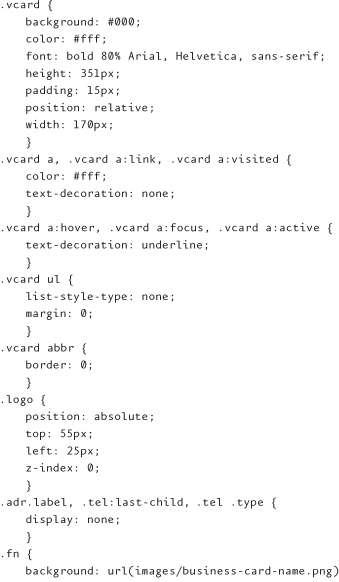
Styling hCard
It isn’t really common practice to style contact information as a business card on a website, but that doesn’t mean you can’t do it. So let’s! We’re going to use the hCard for the Badass Tattoo Company from Chapter 6 (pages 131–140).
The CSS
Here are the styles I chose to use:

The end result
I hope you noticed that the CSS for this example only uses the elements of my markup and the classes from hCard as the selectors. I didn’t have to add any additional markup, classes, or ids.
I will mention, though, that the CSS for this business card design (Figure 12.3) really only renders as intended in Safari, Chrome, and Firefox due to the rotated text. So, this may not be an ideal implementation. Nonetheless, I’m digging the text rotation.
Figure 12.3 Browser rendering of styled hCard

And, of course, IE 6 and 7 have some issues with positioning on top of not supporting the text rotation. But that’s what conditional comments are for, right? And there are some filters you can use to get IE to cooperate with the text rotation.
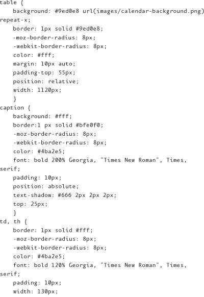
Styling hCalendar
Calendars, just like any content, can come in a wide variety of presentational flavors. For the <table>-based calendar from Chapter 7 (pages 181–192), we are going to create a clean and simple grid appearance.
The CSS
Here are the styles I chose to use:


Both IE 6 and IE 7 bork just a bit on this CSS. And interestingly (or not if you’ve been dealing with IE for a while), the problems are the same:
• Neither display the <caption> element positioned absolutely inside the <table>. Instead, the <caption> appears immediately before the <table>.
• Both render the <h3> content in a larger font size than is declared, apparently ignoring the cascade and the font size applied to the containing <div>.
For me, these issues aren’t deal breakers. However, especially if you work for an organization that requires IE 6 to look as close to the other browsers as possible, these issues should be resolved—to an extent.
Personally, I’d leave the <caption> display as is. The content renders just fine, and that is what is truly most important. As for the font size, I would use conditional comments to create IE-specific CSS.
The end result
For this look, I only had to add a couple of additional classes to certain <table> cells. For the <td> that would contain the current day’s information, I added class="today". And for the last few <td>s that aren’t part of the displayed month, I added class="otherMonth". I also added the cellpadding attribute to the <table>.
But nothing additional was needed for the hCalendar data itself. I just use the vevent property as my styling hook for that information. And voilà (Figure 12.4):
Figure 12.4 Browser rendering of styled hCalendar

Styling hAtom
Now let’s style an hAtom example, using the fictional Homer Simpson blog post from Chapter 9 (page 228–232).
The CSS
Here are the styles I chose to use:


The end result
I didn’t have to add a single class, id, or additional markup element for this presentation (Figure 12.5):
Figure 12.5 Browser rendering of styled hAtom

However, as in the hCard example, I’m using text rotation, which renders only in Safari and Firefox. So again, as in the hCard example, this particular CSS might not be ideal for you folks seeking cross-browser consistency. The rounded corners, though, nicely degrade to square corners for browsers that don’t support border-radius.
With the expected exceptions of IE 6 and IE 7 (both of which choke a bit on the positioning), the rest of the design translates identically across browsers.
Styling hRecipe
Last, but certainly not least, we’re going to style the hRecipe example from Chapter 11 (page 263).
The CSS
Here are the styles I chose to use:


The end result
To achieve this look, I did have to add a nonsemantic <div> inside my <div class="hrecipe">, containing all the other content. I also added a class to one of the <h2>s (instructHead), so I could target it for the image replacement.
Other than that, I relied entirely on the elements from the original markup example and the classes from the hRecipe example.
This particular look renders identically across standards-compliant browsers with the exception of the rounded corners, which display only in Firefox and WebKit browsers.
Figure 12.6 Browser rendering of styled hRecipe

IE 6, as one would expect, doesn’t recognize the advanced selectors and, as I’m sure you are aware, doesn’t support alpha transparency in the PNG used for headings.
But the content still renders beautifully; users can get the information they need. If IE 6 needs to look closer to how the other browsers render the presentation, turn to conditional comments.
Limited Only to Your CSS Skills
These are but a few examples of different looks for microformatted content. And while you may prefer a different approach to your CSS to achieve these looks, the point is anything you can do with CSS can be applied to microformatted content.
You are limited only by your imagination and your CSS skills.