
Chapter 1
Applied Creativity

Creativity in a Business Environment
Design is a process, a service, a way of thinking, and an activity that results in objects, systems, artifacts, and outcomes. These results must all work aesthetically, functionally, and commercially. In short, design is applied creativity.
Design is not just for designers. At the very least, it involves a client—someone with a problem, goal, or objective—who engages the designer to provide solutions or meet needs. Design can serve a person, company, product, service, or idea. The client usually has someone they are directing these efforts toward—a customer, community, or audience, and it is typically commissioned by one person, but intended for another. According to AIGA, the professional association for design, “The act of designing is an inherently powerful act. In that act, we share the stage with CEOs, government officials, civic leaders, passionate activists, and fellow citizens.” Getting a handle on the collaborative nature of design required to deal with all these variable factors is no small task.
The Design Council UK says, “Good design is a quantifiable benefit, not a cost. Its value can be measured economically, socially, and environmentally.” Design is a balance of many factors, some objective and some subjective. Clients’ business or organization requirements, technical parameters, cost and time constraints, are all measurable and objective things. While aesthetic preferences, interpretations of design elements like color and form, emotional reactions, and cultural influences are all subjective.
Everything manmade is designed by someone, so it makes sense to consider exactly how and why things are designed. Every business’ requires a designed identity, environment, business papers, sales and marketing materials, and a website. It’s inevitable. Recognizing this and investing in a great design, rather than letting it just happen, is a key ingredient in every successful business.
More and more, clients recognize the value of design. But not every client really understands how to work with a designer. Getting the best out of their design consultants, participating in the process, and effectively interacting with creative people takes practice. Some clients do it over and over. There are individuals who are tasked with this job in large organizations. Small business owners may hire a designer once and rarely after that, simply maintaining the design they started with.
Many designers have trouble managing the design process on their end as well. They have trouble planning and implementing. There are myriad details to deal with, and lots of personalities—from clients to design team to outside suppliers. When you boil it all down, the actual creative act of ideation, is about thirty percent of the project, with seventy percent of the time dealing with issues of facilitation, communication, technology, relationships, expectations, technical specifications, manufacturing, etc. In short, any given job will be largely dealing with management of the design process.
Project Profile in Applied Creativity
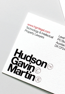
HGM Branding designed by Alt Group / Auckland, New Zealand
Hudson Gavin Martin (HGM) is a boutique legal practice formed by three partners, who advise on intellectual property and technology law in Australia. Multidisciplinary design studio, Alt Group, based in Auckland, New Zealand, worked to develop a visual identity, environment, and range of communication tools that challenged expectations of how legal service firms express their brand. “The experience was conceived of as an ongoing conversation that reveals ‘ideas’ that come in threes,” explains Alt managing director, Ben Corban. “Three is more than a partnership—it’s a team. Culture and customs offer up all sorts of threesomes, humorous and otherwise.”
RIGHT
The identity uses the copyright, trademark, and registered symbols to directly reference the firm’s core business. The registered symbol couldn’t be legally used until the logotype was registered with IPONZ (Intellectual Property Office of NZ). An interim “‘launch” logotype was produced with an asterisk and small copy (Registration Pending) in place of the ® symbol until registration was complete.

BELOW
Copy became a key part of the identity to assist in communicating the company culture and offering. “The three wise men, Hudson, Gavin, Martin, are cool, calm, and collected. They advise on clients’ equities, assets, and liabilities and are ready, willing, and able,” says Alt creative director Dean Poole. “A three-word copy approach was used across a range of collateral—for example, in the brochure above, the three-word groupings run into each other like concrete poetry.”

BELOW
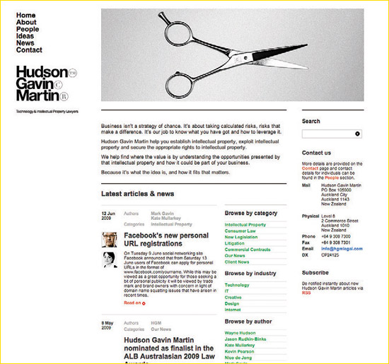
The company name is revealed in clean typographic signage, (below, top). The brand idea of three related words that symbolize Hudson Gavin Martin was extended to the environment through corporate art and environmental graphics as well. A custom carpet signals a welcome, with the words: Hop, Skip, and Jump. Text-based and image-only artworks reveal the trilogy of business—like the knife, fork, and spoon posters, (below).

BELOW
A hat trick placed on a triangle-shaped plinth, made from three bowler hats and a bronze apple, (above), continues the symbolic reference to the three-way partnership. In the boardroom hangs a modernist triptych constructed from red, green, and blue LEGO bricks. Framed posters, like Bacon Lettuce Tomato, (below, bottom), echo the three-word idea as well as picnics with a bright-red, checked background that suggests a tablecloth.

BELOW
Core elements of the Hudson Gavin Martin identity and the tools of the intellectual property trade—the ©, ® and ™ symbols were incorporated to spell out the word Christmas. “The concept of three is an important part of the Hudson Gavin Martin brand,” notes Alt creative director, Dean Poole. “Christmas was stated three times and the gift itself was in three parts—wine, a rolling pin, and a candle—all the ingredients for a celebration or three. A holy trinity, if you will.”

BELOW
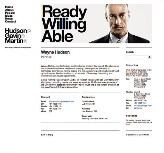
The copy strategy of three key words was extended into the website page headers—Hello, Hello, Hello; Signed, Sealed, Delivered; Shake, Rattle, Roll; Extra, Extra, Extra. The Hudson Gavin Martin site was built on a bespoke content-management platform to allow self-publishing of relevant issues based articles and campaign elements for recruitment and promotion.
Defining Design’s Power Role
Everything, but especially communication, is becoming increasingly complex. Things change so rapidly due to technology and new ways of interacting as human beings. It had given us more connectivity, but in many ways, less time to enjoy it. Plus product life cycles are shorter, and there is increased competition and a much higher demand for productivity and quality. There is also simply so much competition for everyone’s limited attention. We may have become multitaskers, but you have to wonder how well any of us is accomplishing the task at hand. With increased capabilities there are also increased expectations; therefore, there’s no feeling of ever really “advancing.”
The power of design is that it helps us to rise above these conditions and gets people connected with products and services in real and meaningful ways. Some things clients can expect design to help them accomplish:
• Establish or improve an image
• Identify them (clearly show who/what they are)
• Articulate the brand, its mission, and promises
• Differentiate them, make a product or service stand out from competitors
• Alleviate uncertainty and confusion in the marketplace
• Understand and track performance against competitors
• Boost aesthetic appeal
• Cut through overwhelming amounts of information
• Properly position the product or service
• Develop targeted message
• Package a product or service
• Communicate the benefits and advantages of a product or service
• Establish or improve customer connections/relationships
• Help develop new markets, audiences, customers
• Delight the audience
• Create emotional resonance
• Produce memorable experiences
• Inspire loyalty, commitment, and investment
• Connect with employees and stakeholders
• Aid in recruitment
• Reduce costs or improve ROI
• Increase sales and profits
• Harness technology to support goals
• Provide value to clients and their customers
• Be sustainable, responsible corporate citizens
• Create or enhance symbolic or perceptual values
• Create language and meaning
• Capture cultural trends, and tap into and shape the zeitgeist
Project Profile in Applied Creativity
Benjamin Bixby Identity designed by Iconologic and André Benjamin / Atlanta, Georgia USA
Brand design firm Iconologic worked closely with musician/actor/entrepreneur André Benjamin, a.k.a. André 3000, to develop the identity for his Benjamin Bixby menswear collection brand—its platform, name, and identity system. The balloon is found on most of the clothing. The team’s work mirrors the strong design point of view seen in the garments, one that both embraces and challenges tradition, and is meant to appeal to those with a distinct sense of adventure. This approach is evident in all of the sales and marketing materials as well.
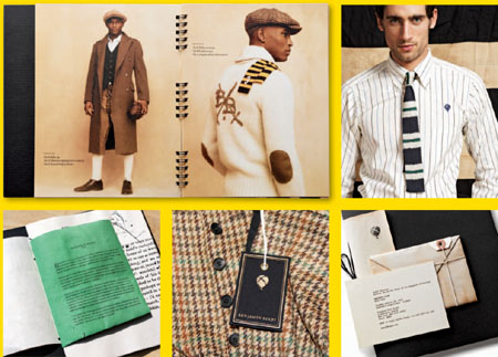
BELOW
“Our clients understand that the story they tell, the experience they become, and the image they embody must be designed with the same likeness and risk as the product they create,” says Iconologic creative director, Matt Rollins. “Risk is crucial to the process, and fearlessness brings great rewards.”
Design Idea Flow
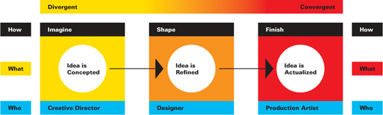
Flow of Design Ideas
As the design moves through the process toward completion, it is much more contained, logical, and apparent, which is why you’ll often find the visionary creative director establishing the look and feel and central concept—an imaginative solution—that gets presented to a client and is approved in theory. The design concept is then passed along to a senior designer. They incorporate changes as well as client or creative director feedback, to refine, shape, and further develop the design. It gets presented again, and is approved by the client. The design then moves on to a junior designer or production artist who actually implements it.
Collaborative or Solo Workflow
The traditional workflow of a design is to start with the highly creative expert and end with the highly technical one. Experience and skill levels vary, but so does specific design expertise. Those who come up with great ideas can’t always execute them. Different skills are required as the process progresses from rough idea to finished object. A designer should explain this to her clients. Doing so will alleviate the notion that the client is going from senior to junior staff member because the project is less interesting or requires less of the senior person’s time. The truth is, the client is better served as the project is handed to the next design team member with the most expertise in that phase of work. This disaggregating of the design tasks allows the best possible person to be focusing their talent on a particular aspect.
In the case of a solo designer with no additional team members, the designer must handle all aspects of the work. This requires them to be well rounded and good at all the tasks involved. Philosophically, some designers believe in one person handling a project from start to finish. The rationale being that this person is the most knowledgeable about the client and the project, although necessarily the specific task. They service the project based on a solid understanding of the design concept.
Clients should be made aware of which work-flow and service model their designer is using. Both methodologies have their advantages and disadvantages. Mostly, it is a case of the scale of the design firm, the project, and the client. When establishing a new client relationship, the designer/design team should clearly explain how they work and who the client will be working with specifically in each phase of the project.
Design Team Flow

Project Profile in Applied Creativity
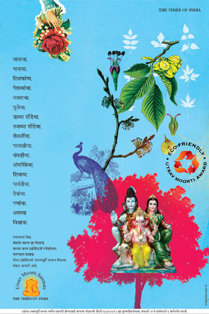
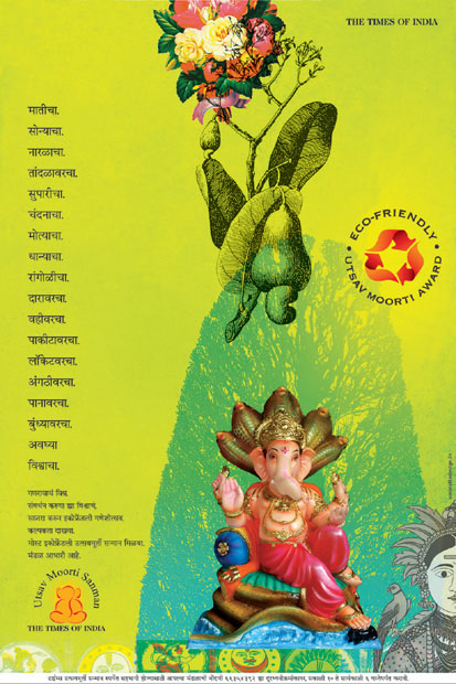
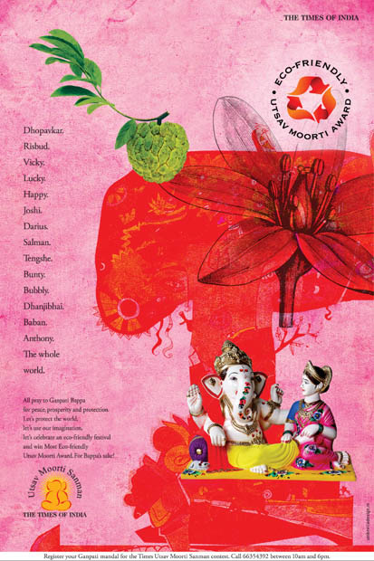
Times of India, Ganesha Campaign designed by Umbrella Design / Mumbai, India
The Times of India
Umbrella Design is one of few specialty design houses in India. Based in Mumbai (Bombay), the firm is lead by managing director Bhupal Rhamnathkar, executive creative director Deven Sansare, and chief operating officer Farhad F. Elavia. Umbrella Design has worked with the English-language daily newspaper, The Times of India, on their annual Ganesha festival ad campaign.
The campaign is bilingual, with one subject in English and three in Marathi, the state language, and tries to capture the spirit of the festival as it is celebrated by the people. “Since a new and relevant category, ‘Most Eco-friendly Decoration’ was added to the contest this year,” notes Rhamnathkar, “the focus of the campaign is the new category. We’ve also created a special graphic unit to highlight the new category.”
BELOW LEFT AND OPPOSITE
“At the beginning of the twentieth century, Indian nationalist and social reformer Bal Gangadhar Tilak decided to take Ganesha out of the house and into the street to celebrate the Hindu deity’s festival in public,” explains Umbrella Design executive creative director Deven Sansare. “Tilak’s agenda was to unite people under a common cause that would not be seen by the British colonial administration as political. Today, the practice continues and various organizations organize and celebrate ‘public’ Ganesha festivals.”
BELOW
It is a common practice in India to “see” and “find” the distinctive elephant form of Hindu god Ganesha in the most unlikely of objects. Taking that as the starting point, Umbrella Design developed the ecofriendly logo using the three-arrow recycle symbol, but also made it reminiscent of aspects of an elephant’s curving form.
Ways to Determine a Good Designer–Client Match
The following tips are key indicators for both clients and designers to use to determine compatibility and competence:
1 Background:
Research them. Do your homework and visit their website. Who are they? What do they make? How do they present themselves?
2 Expertise:
Is the designer’s previous experience relevant to the project at hand? What kind of projects is the designer capable of handling? Are they a problem solver? Regarding clients, how much control do they need/want over the design process?
3 Professionalism:
How do they conduct themselves? Do they have references? What is their attitude? Do they have good communication skills? Are they well connected to supplementary team members or experts required on the project?
4 Chemistry:
Do you like this person? Would you have a meal with them? Who exactly will be working on this project?
5 Parameters:
Does the time frame and budget work? Can you come to basic terms? Will this project be a priority or one of many?
Project Profile in Applied Creativity
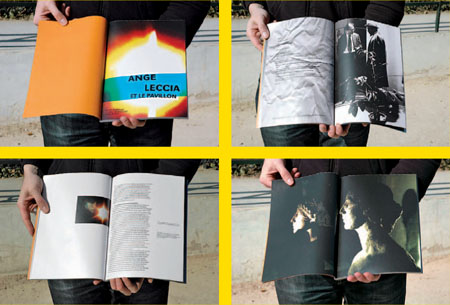
Leccia Catalog designed by Change Is Good / Paris, France
Contemporary French painter/photographer/filmmaker Ange Leccia is a lecturer at the Ecole des Beaux-Arts de Cergy-Pontoise. He also heads a research unit for young artists, called Le Pavillon, at the Palais de Tokyo, a museum dedicated to modern and contemporary art. He works primarily in photography and video. For Leccia’s video art installation at the Museum Bourdelle, the Paris-based design duo of José Albergaria and Rik Bas Backer, known as Change Is Good, created a catalog that reveals the artist’s work using full-size images in spreads without interruption, like a film. “This is a book that obliges the reader to see Ange Leccia’s video images first. For this, we left the book sheets uncut in order to have a book only with these dark mysterious images, a solution to give more depth to the work,” explains Albergaria. In order to fully view the catalog, the reader must slit open the pages—a very intriguing bindery solution. Once the pages are slit open, the book will never look the same again.
BELOW
The catalog for the art exhibition features video-captured images from the films of Ange Leccia, ten projects of Le Pavillon students, and the font URW Grotesk designed by Professor Hermann Zapf. The catalog’s pages actively engage the reader, and focus their attention on Leccia’s mysterious imagery.