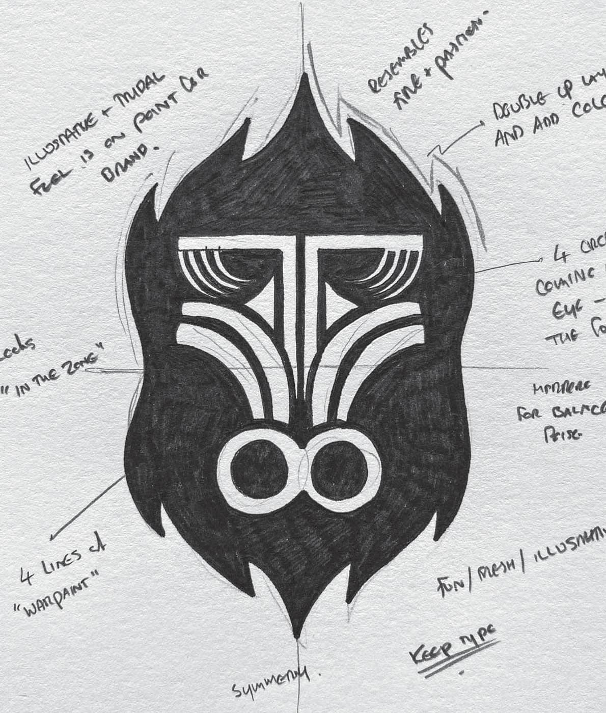
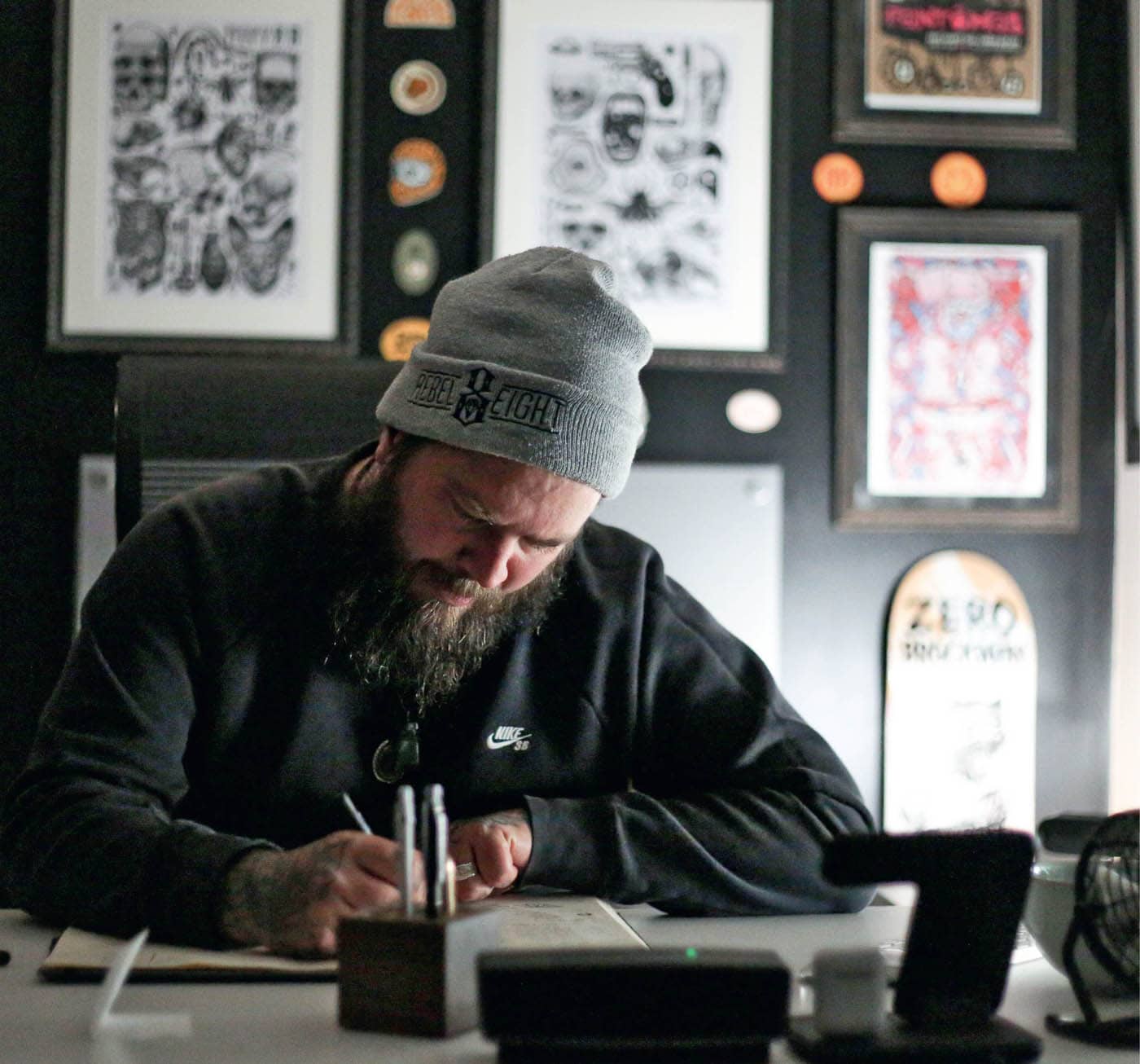
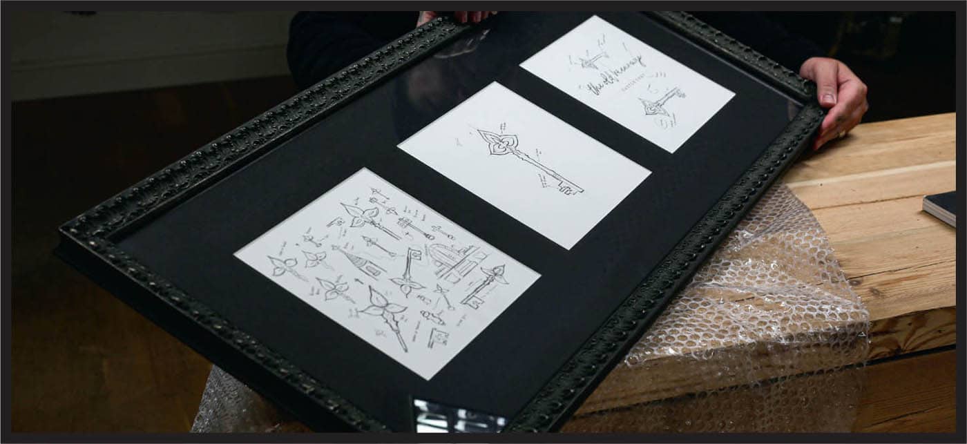
My passion for drawing started at a very early age, on a particular wall, and with a particular red crayon, but we won’t go back there again—sorry again, Dad! I draw so much throughout my logo process and the reason why is very simple: I just love it. Give me one hundred hours in a sketchbook over one hundred hours on a computer any day. I feel free in a sketchbook—that blank piece of paper screams opportunity with every page flip. When you’re excited every day, how can you not love what you do? We’re in the industry of selling ideas and telling stories. Drawing is such a powerful way to communicate, show progress, and visualize the power behind your thought process. The reason I get a lot of logo clients is not because of the final execution of the logo, but because I show the journey of its creation. Drawing gives you the ability to document every detail and communicate the reasoning behind your decision making. We want our clients to form an emotional connection to the work we create. Throughout history humans have handcrafted tools and formed unique attachments to them. I want you to see the process of logo design as the same process. Showing handmade workings and progress on paper allows your clients to form that same unique bond. Drawing has been proven to increase brain power, allowing us to enter a deep concentration for the task at hand and shut off the world around us. Check out the work by author and speaker Sunni Brown, whose research and TED Talk on the importance of doodling for problem solving is fascinating. Back to the client: looking at a designer’s drawings and their process of idea generation makes it easier for clients to understand our ideas and easier for us to sell them. What have you got to lose? Even spending ten to fifteen minutes at the beginning of a project sketching some ideas will help kick your brain into gear and give you something extra to share with your clients. Most importantly, it will bring your focus on the job at hand. LITTLE TIP The perception that drawing must be good is nonsense. See it as a process of formulating ideas. When you see drawing as a way of creating, rather than art, it becomes an extremely powerful asset to your process.WHY I DRAW
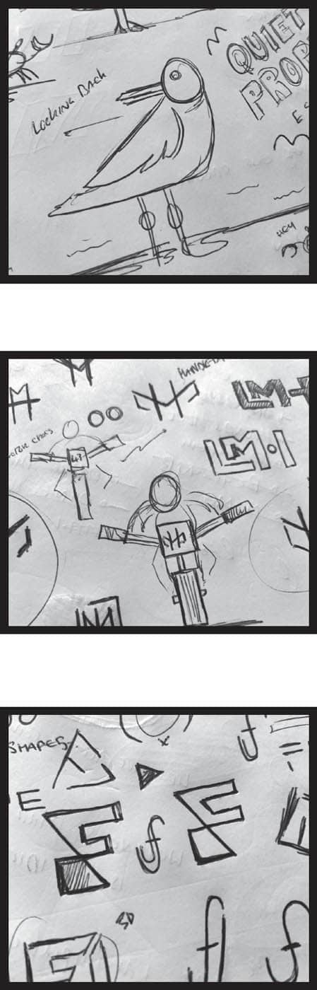

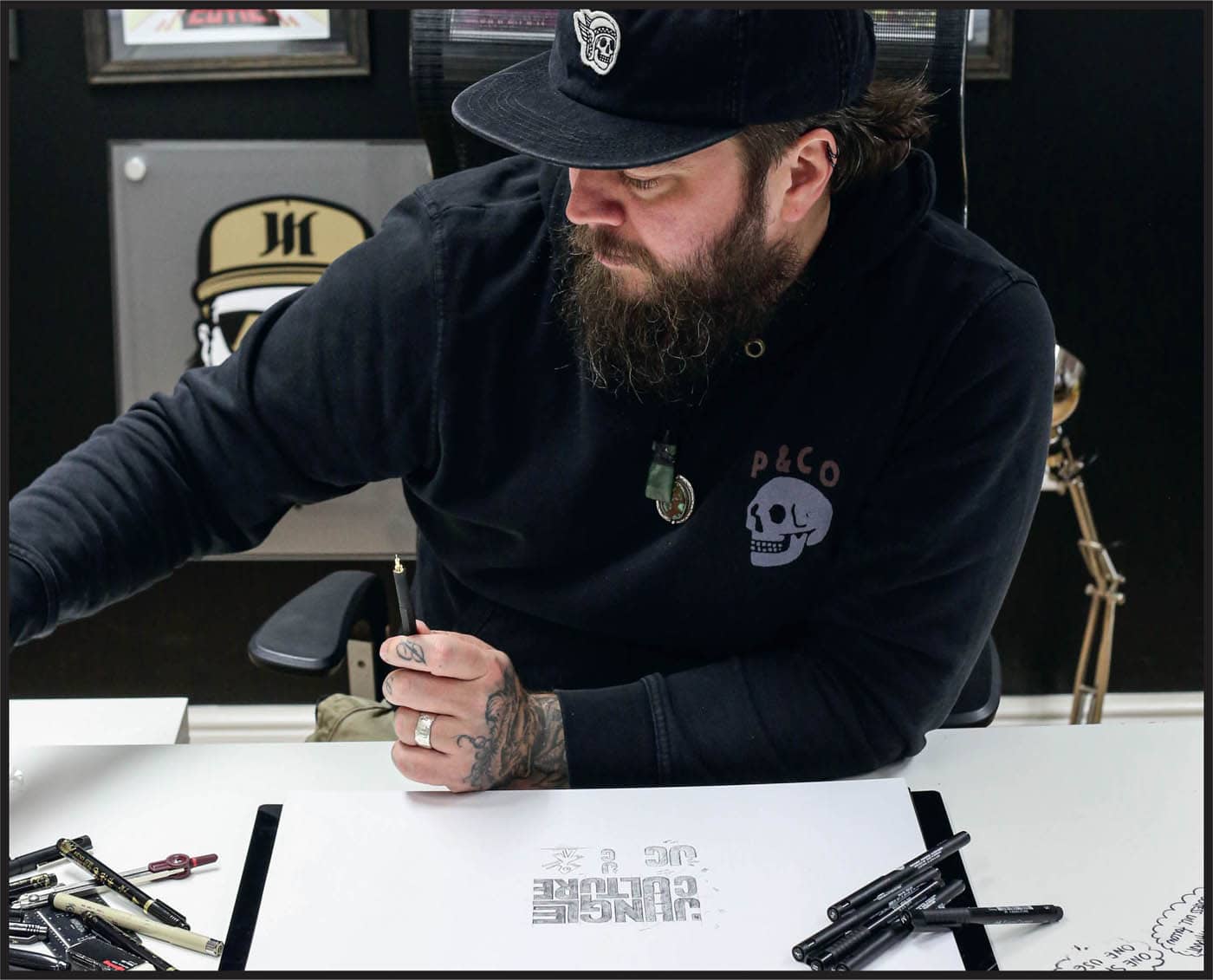
I’ve lost, broken, and used thousands of different types of pens and pencils—I even have a graveyard for the ones I don’t use anymore, which is a box stored in a cupboard. I don’t actually bury them in the garden. As with any skill that develops over time, you learn to perform better with specific tools. Certain drawing tools feel more comfortable to me. Some people may say that spending $50 on a pencil is madness, but they may also be the same people who spend $50 a week on take-out coffee. At least my pencil makes me money. You must prioritize what’s important when it comes to investing in yourself. You may feel you can’t afford a book or set of pens, but you can afford to buy a new pair of sneakers or computer game. Think about the equipment you’re purchasing as an investment in the future. LITTLE TIP The equipment you use, especially for drawing, doesn’t have to be anything special. You can use a tattered notebook and a half-chewed pencil. Buying the best equipment will not magically improve your skills, but putting in time and practice will. Ultimately your tools can get better over time as you have the resources to invest in better equipment. When I started I used a standard pencil and my light box was a window. Your brain is more important than the tools you use.MY WEAPONS OF CHOICE (A.K.A. MY DRAWING TOOLS)
BELOW IS A LIST OF ALL THE TOOLS I USE DAILY TO DRAW AND CONCEPTUALIZE MY IDEAS:
![]() PENCIL: My Rotring 800/0.5mm never leaves my side. I love the weight and the control it gives me when sketching. It just works great and never misses a beat.
PENCIL: My Rotring 800/0.5mm never leaves my side. I love the weight and the control it gives me when sketching. It just works great and never misses a beat.![]() PENS: Molotow and Sakura Pigma Microns are two favorite brands of pens. Both are great to work with and leave a quality finish.
PENS: Molotow and Sakura Pigma Microns are two favorite brands of pens. Both are great to work with and leave a quality finish.![]() SKETCHBOOK: I use an Artway A3 spiral sketchbook because the paper quality and weight are spot on for me. I have about sixty of these filled to the brim.
SKETCHBOOK: I use an Artway A3 spiral sketchbook because the paper quality and weight are spot on for me. I have about sixty of these filled to the brim.![]() RULER: Anyone who has seen me on YouTube or Instagram will know my love for Margaret, my little 6-inch stainless-steel ruler. She is a badass.
RULER: Anyone who has seen me on YouTube or Instagram will know my love for Margaret, my little 6-inch stainless-steel ruler. She is a badass.IF YOU’RE STARTING OUT, HERE ARE MY GENERAL RECOMMENDATIONS FOR TOOL SHOPPING:
![]() PENCIL: Regular drawing pencils are absolutely fine and I would go with an HB.
PENCIL: Regular drawing pencils are absolutely fine and I would go with an HB.![]() PENS: Any fine liner pens will work great. I recommend getting a pack of three or five that have different nib sizes to cover all the necessary details you need for thicker outer lines and thinner detail lines.
PENS: Any fine liner pens will work great. I recommend getting a pack of three or five that have different nib sizes to cover all the necessary details you need for thicker outer lines and thinner detail lines.![]() SKETCHBOOK: Most sketchbooks are portable, but they don’t have to be. I would suggest having a notebook for details and then a sketchbook for the more detailed process drawings. The reason I like spiral-bound sketchbooks is because they open flat and I can also remove pages for my clients if they ask for the drawings.
SKETCHBOOK: Most sketchbooks are portable, but they don’t have to be. I would suggest having a notebook for details and then a sketchbook for the more detailed process drawings. The reason I like spiral-bound sketchbooks is because they open flat and I can also remove pages for my clients if they ask for the drawings.![]() RULER: I like 6-inch rulers because they’re easier to work with at the scale I am drawing at. I’ve always used a metal ruler because they tend to keep their edge better than the plastic ones.
RULER: I like 6-inch rulers because they’re easier to work with at the scale I am drawing at. I’ve always used a metal ruler because they tend to keep their edge better than the plastic ones.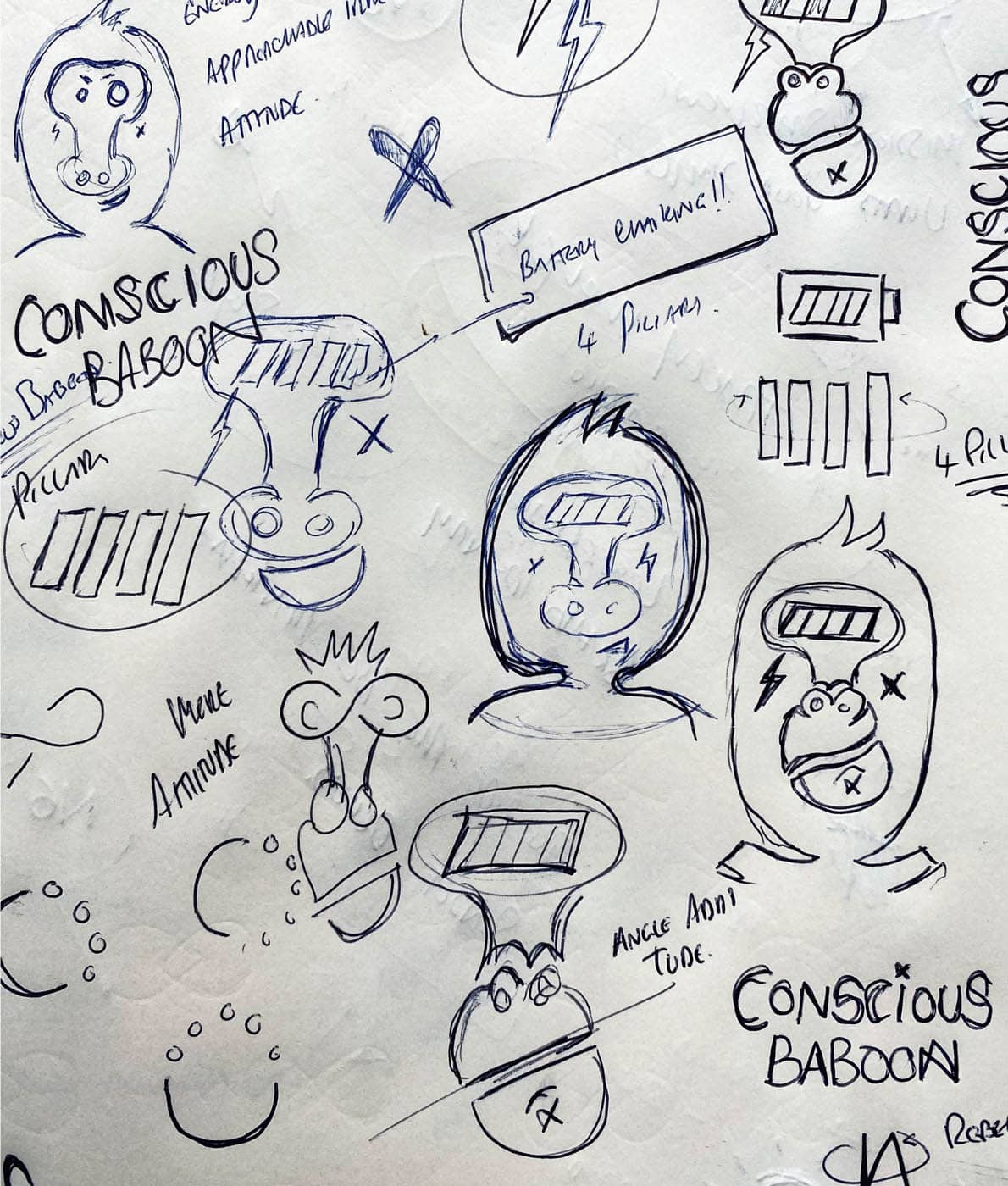
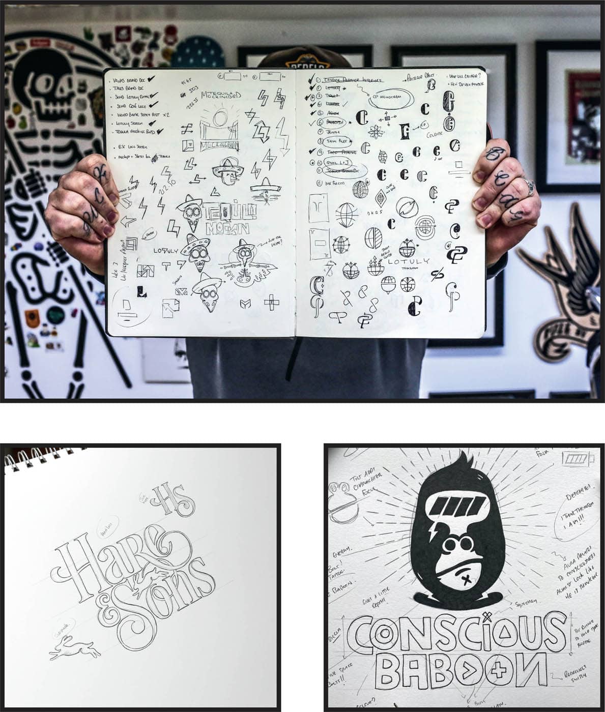
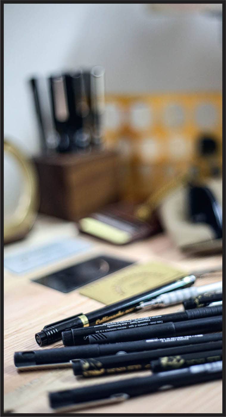
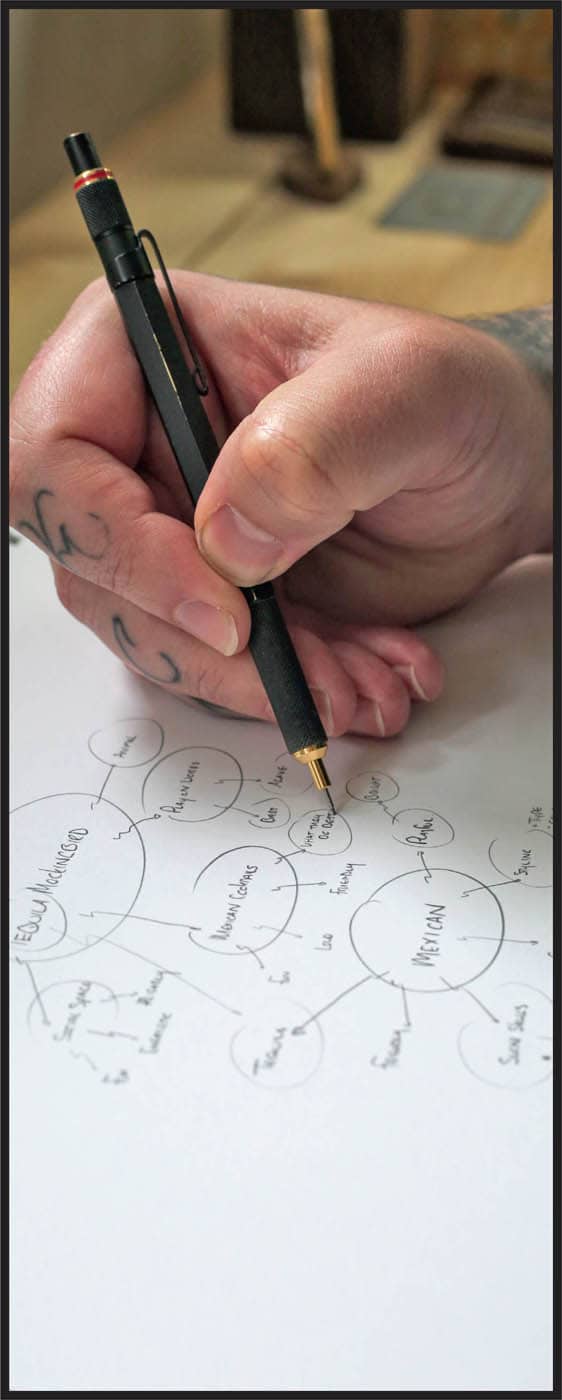
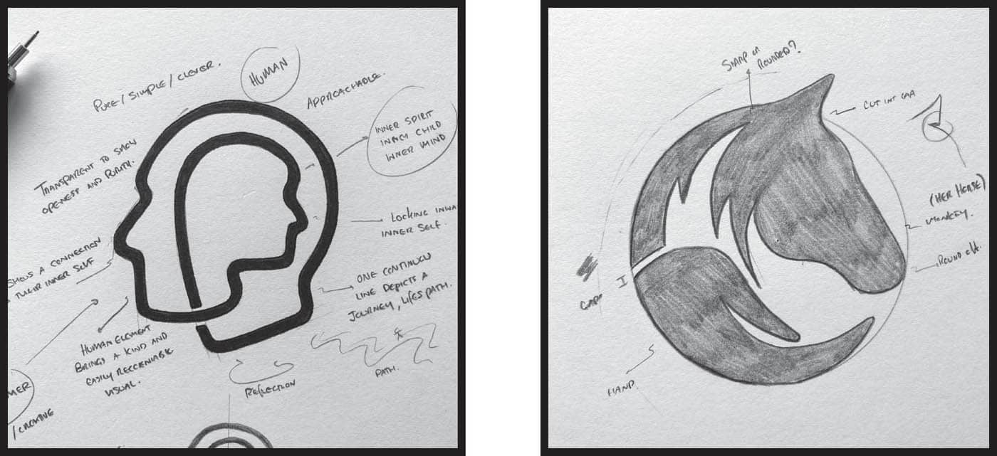
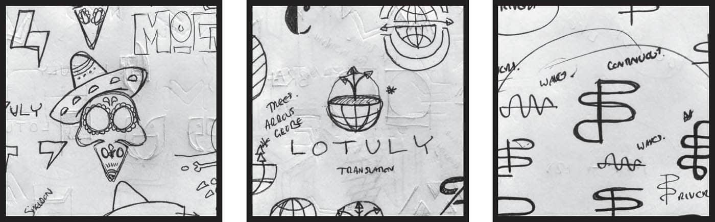
Having a good working process is important to keep projects running smoothly, and that process will be helpful when projects are going the opposite way. I’m one of those weirdos who loves working with clients, but you will run into some crazies along the way (in all honesty, that makes it all a little more exciting for me). An effective process will be your best friend in the good times and the bad. What do I mean by process? When it comes to logo design, I have a series of stages I go through to make logos for my clients. My job is to make the logo design process feel seamless, effective, and most importantly, fun for the client. Remember that this is an exciting time for your client. This is the birth (or rebirth, if they’re rebranding) of their idea. Don’t make it a clunky and arduous process that’s not enjoyable; they’re entrusting you with their baby, so make sure you look after it. Whenever I create a logo, I treat it as if it’s my own. I see myself as a part of the client’s company, and communicating that starts to build a strong relationship of trust. Having a well-defined process also makes your clients feel confident and makes them believe you know what you’re doing and that you have control of the situation. Often a project goes belly up because you allow the client too much room to get involved. The lack of a process allows your client the ability to take charge of the project. Clients hire you because they can’t do the job themselves. Take control, be transparent about the way you work, and never stray from that. Being in control of the project gives us the freedom to create our best work. LITTLE TIP When setting a delivery date for a client, build in a time cushion. Just because you can do something in a day doesn’t mean it should be delivered tomorrow. Giving yourself a buffer on projects gives you time to evaluate your decisions and sleep on your ideas. It will also give you a bit of wiggle room if life gets in the way. It’s easy to get confused by some of the terms that get thrown around in our creative niche. The importance of knowing who you are and what you do is key to defining your audience. We all start out as creatives and then slowly drill down into a specific area of expertise. Let’s start at the beginning with a breakdown of some of the titles in our industry: I consider myself a logo designer and brand identity designer. I create logos and play a key role in rolling out the visual elements for my clients, such as packaging, business cards, and other promotional content. Knowing your place in the industry allows you to double down on your powers and effectively communicate your skills. Word mapping is a visual organization technique I learned in science class when I was about ten or eleven years old. Although I have zero recollection of the subject matter it was for, it’s a very useful tool that I use today for creating ideas. I use this technique for idea creation because it helps get the creative juices flowing and aligns me with the task at hand. Word mapping, in its simplest form, is a way of associating words with other words. Doing this helps me see a much bigger picture, which translates into more possibilities. When I create these word maps, I’m not thinking about my answers too deeply, but I free-associate and write down the first word that comes into my head. I start with the key information from the brief, such as the company’s name, its values, the industry it’s part of, etc. I tend to begin with nine to twelve key points, or headers, to build a word map. LITTLE TIP When designing a logo, always ask yourself: Does this element need to be here? Simplicity is key, and if a design decision doesn’t add to the overall idea, then remove it. Be clinical and don’t diminish the other design elements for the sake of the one that’s not working. LITTLE TIP Always design using the information that’s in the brief; don’t opt for cliché industry graphics. Just because your client is in real estate doesn’t mean you have to include a house icon. Think deeper, think bigger—that’s when unique designs start to happen. This process produces a picture and gets my mind thinking about the creative possibilities, rather than the obvious solutions, like a design for a coffee shop having the logo as a coffee bean. While I’m creating these word maps my mind begins to build a puzzle. I am asking myself how can I associate “X” in a certain way, or is there a way I can cleverly show “Y” without doing the obvious? For example, how can I associate the fact that there are three people within the company or how can I cleverly show that they are a family-based business? I’m creating a story and making sure my design decisions, however subtle, relate to the information I’ve been given. I’ll run through a few examples of how my mind works while word mapping, and you’ll start to see how associating words with other words can open up options for creativity. My options are pretty thin with the initial three words (energy, partnership, and educate), and it’s difficult to think about the possibilities for creative direction with those three words alone. But with the added words that directly (or indirectly) relate to them, my options become plentiful. I could have two shapes that come together (partnership), the colors could be bright (energy), and the two shapes I’ve chosen could be linked (sharing). From this you can start to see the power of word mapping and how the technique can be a useful tool for idea creation. You don’t have to be obvious with your concepts; often the subtle details make the difference between a good design and a great one. Rapid prototyping is an idea generator, a way of starting to change words and thoughts into loose concepts. This process allows you to quickly and effectively figure out viable directions for your logo and allows you to see what is and isn’t worth exploring. After completing the word mapping process, I have a plethora of possible directions to play with, and it’s time to see what will work. I scan the word map for concepts and ideas and start to create visuals. At this stage I’m beginning to home in on elements I can visualize into a logo, but I’m executing them very loosely and not trying to perfect any particular direction. I can’t get absolutely every detail into a logo, so I typically choose three key elements to work with. Any more than that and the logo becomes a little too fussy and overcomplicated. Anything goes during this phase—there are no wrong ideas, and I don’t put any boundaries in place. I’m freely exploring directions that I believe I can make work. I’m not being too literal, and my main aim is to keep the design as minimal as possible so it will work in multiple sizes. Your ability to think like no one else is your creative gift. Remember, your design doesn’t have to be detailed to contain detail. You’ll find there is a simple way to communicate your ideas. When it comes to logo design, simple, clean, and clever designs stand the test of time. Always think of the application of a logo: Where will it be used, and how will it be printed? These are key to your decisions and execution.
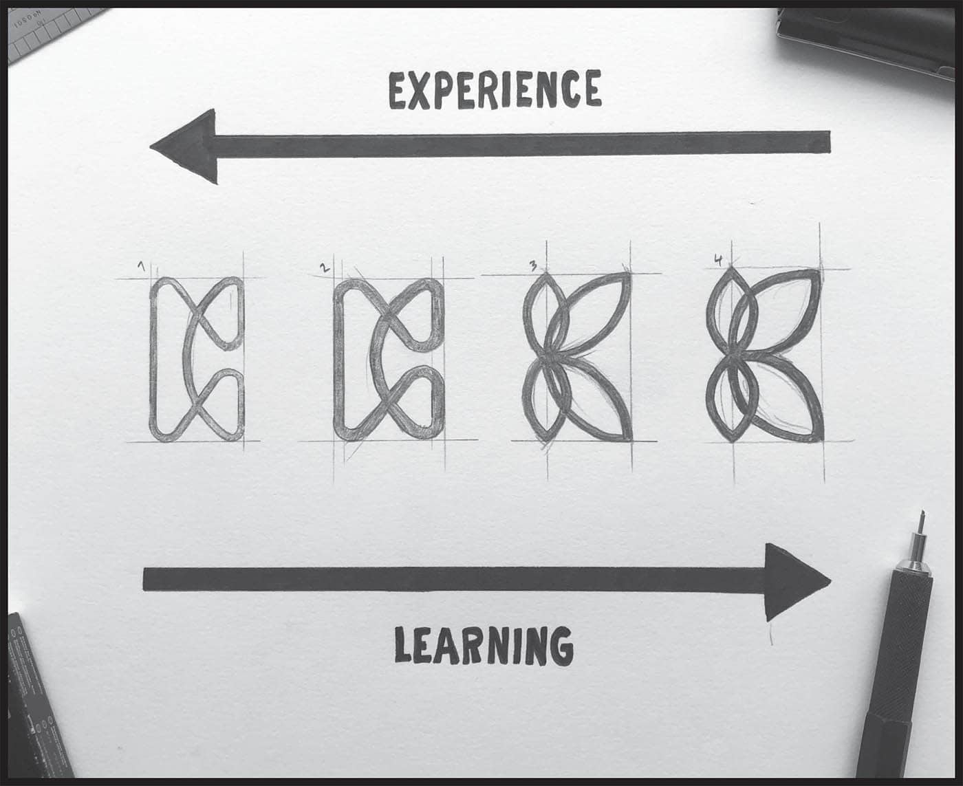
“ Here is a glimpse into how my mind associates words with ideas. This process takes practice and a willingness to let go. Once you open your mind to thinking a little differently and taking more risks, options for creative concepts are abundant. COMMUNITY Linking Elements STRENGTH Filled Objects HONESTY Transparent ShapesTHE LOGO PROCESS: AN OVERVIEW

KNOW YOUR INDUSTRY
![]() GRAPHIC DESIGNER: Graphic designers generally have a pretty broad skill set and a firm knowledge of many design disciplines. They communicate the need of the client through super awesome visuals, whether through print or digital. Most graphic designers will have a pretty good understanding of Adobe programs such as Photoshop, Illustrator, and InDesign, or their equivalents that are not Adobe-based.
GRAPHIC DESIGNER: Graphic designers generally have a pretty broad skill set and a firm knowledge of many design disciplines. They communicate the need of the client through super awesome visuals, whether through print or digital. Most graphic designers will have a pretty good understanding of Adobe programs such as Photoshop, Illustrator, and InDesign, or their equivalents that are not Adobe-based.![]() LOGO DESIGNER: Logo design is a niche within the graphic design industry. A logo designer’s main job is to create memorable designs for clients, which can be in the form of a symbol, type, or mark that helps identify their brand.
LOGO DESIGNER: Logo design is a niche within the graphic design industry. A logo designer’s main job is to create memorable designs for clients, which can be in the form of a symbol, type, or mark that helps identify their brand.![]() BRAND IDENTITY DESIGNER: Let’s call this logo designer plus. Brand identity designers create logos and then visualize them in a clear and clever way across a multitude of assets. They’ll show how the logo is to be used across a number of materials, from business cards to signage and everything in between.
BRAND IDENTITY DESIGNER: Let’s call this logo designer plus. Brand identity designers create logos and then visualize them in a clear and clever way across a multitude of assets. They’ll show how the logo is to be used across a number of materials, from business cards to signage and everything in between.![]() BRAND STRATEGIST: Brand strategists are involved in the big picture. They help define the company’s vision, goals, target audiences, and personality, among other key elements. Many brand strategists plan and execute the tasks at hand. They can get paid top dollar for their work, but that relates to the amount of time and effort needed to do their job.
BRAND STRATEGIST: Brand strategists are involved in the big picture. They help define the company’s vision, goals, target audiences, and personality, among other key elements. Many brand strategists plan and execute the tasks at hand. They can get paid top dollar for their work, but that relates to the amount of time and effort needed to do their job.
WORD MAPPING

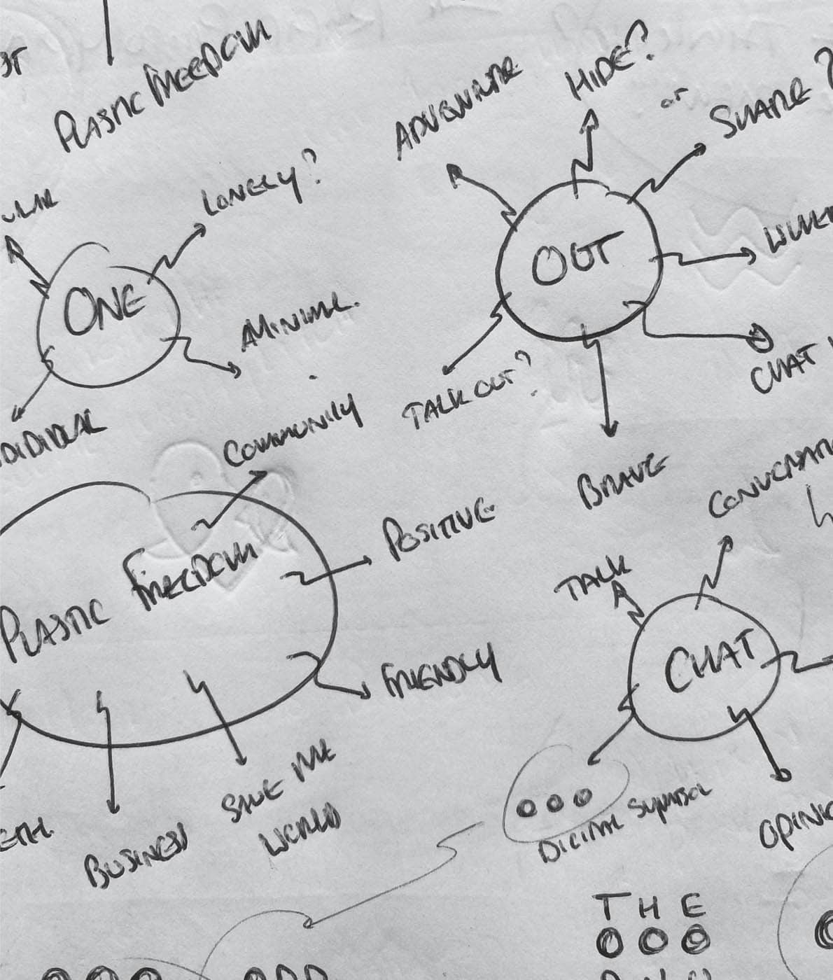
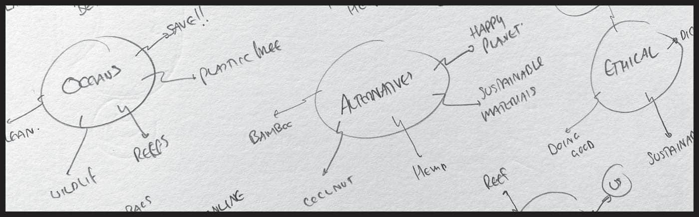
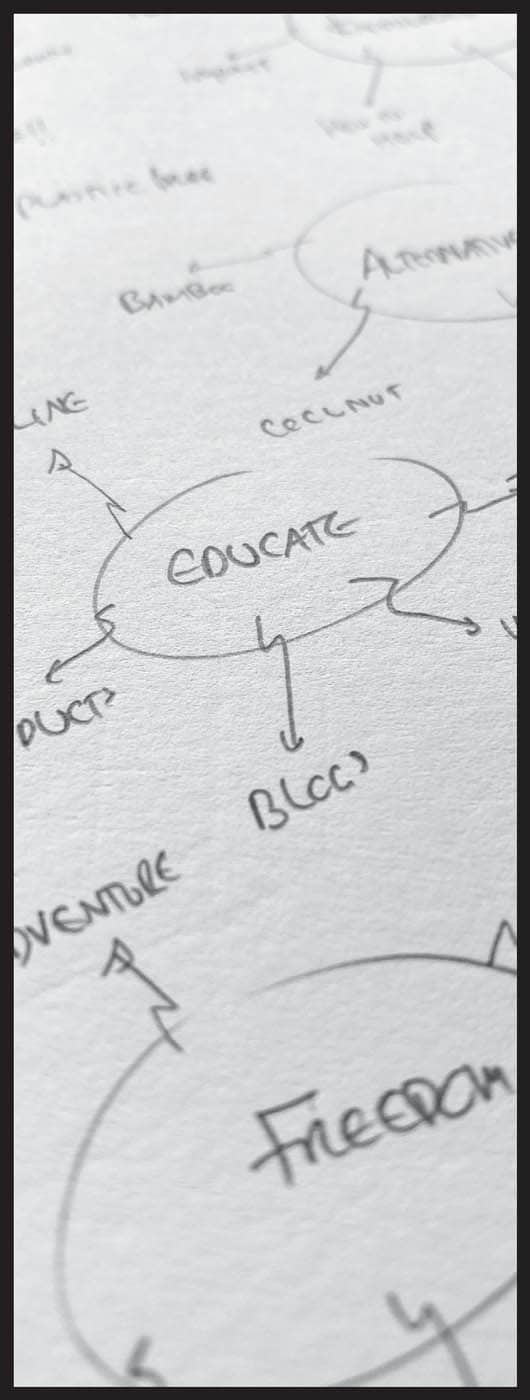
![]() ENERGY: speed, bright, electricity, movement, positive
ENERGY: speed, bright, electricity, movement, positive![]() PARTNERSHIP: two, together, friends, marriage, even split
PARTNERSHIP: two, together, friends, marriage, even split![]() EDUCATE: knowledge, sharing, learning, nurture, open
EDUCATE: knowledge, sharing, learning, nurture, openRAPID PROTOTYPING
YOUR CREATIVE GIFT IS YOUR ABILITY TO THINK LIKE NO ONE ELSE.
”
![]() COMMUNITY: can be visualized as the linking of more than one element, like a community coming together.
COMMUNITY: can be visualized as the linking of more than one element, like a community coming together.![]() STRENGTH: can be visualized as a solid presence. Bold shapes of color create balance and command attention.
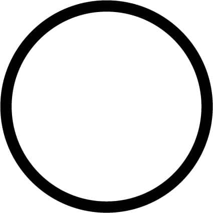
STRENGTH: can be visualized as a solid presence. Bold shapes of color create balance and command attention.![]() HONESTY: can be visualized as transparency, lending an honest and approachable feel.
HONESTY: can be visualized as transparency, lending an honest and approachable feel.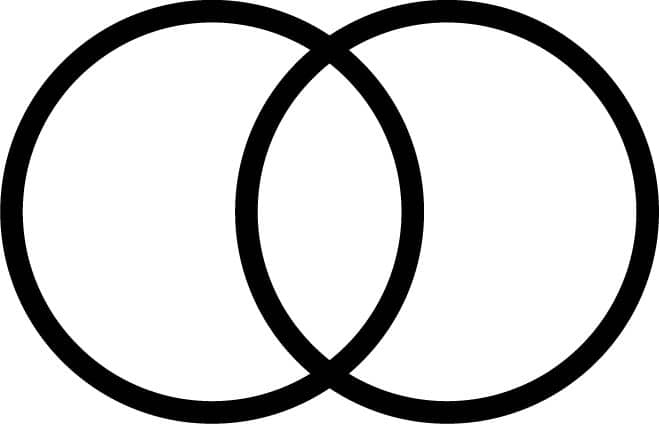


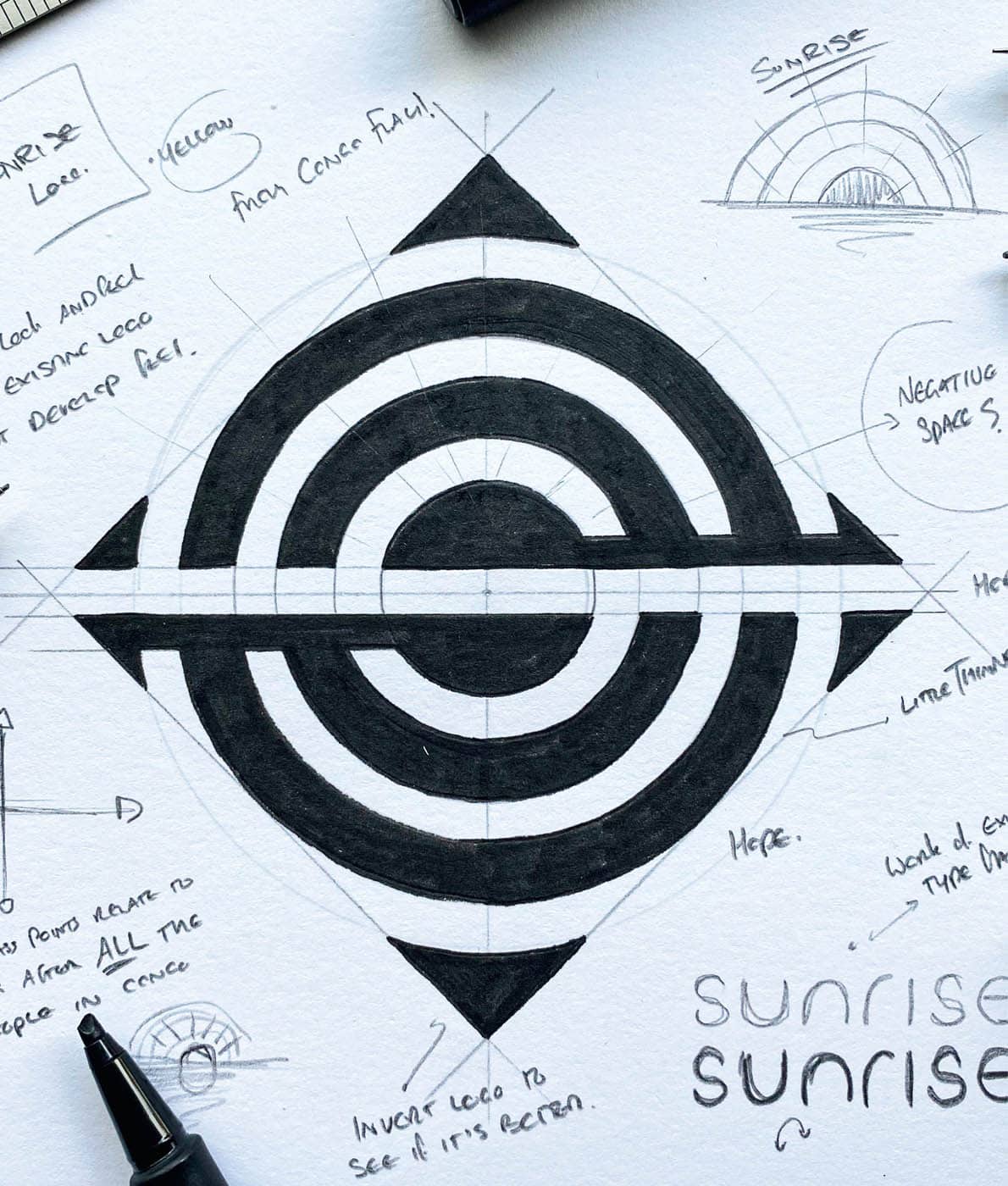
After word mapping and rapid prototyping, I make my final decision on the idea I want to run with and prepare the presentation for the client. I continue to refine the most powerful idea by asking myself more questions. If one of the answers is no, then I need to make some tweaks until all my answers are yes: I’m still working in my sketchbook at this stage, finalizing a more accurate version of the design. Continuing to work in the sketchbook gives me the freedom to explore any tweaks. Should the corners be rounded? Should that line be thicker? Do the gaps need to be bigger? These changes could all be done in the computer, and further tweaks will be made there after I’ve vectorized my design. But I like leaving no stone unturned before heading to the computer. Any extra time spent working in the sketchbook saves me time working digitally. Once I’m happy with the final sketch, I vectorize it in the computer. This is the process of taking a design and using computer software (such as Adobe Illustrator) to change it into a vector format, which allows you to scale the design without compromising the quality. Because of this capability, all logos should be created in vector format. To transfer my sketch, I simply take a photo of it on my smartphone and send it to the computer, where I import it into Illustrator. Next comes the vectoring process, where you can refine the details and use further gridding techniques to make your design as accurate as possible. I use grids at the end of my projects to bring accuracy to my final design, making sure all the gaps (spaces between elements) are equal, and all my elements are aligned. Setting up a specific grid before you have any ideas can restrict your creativity. Working to boundaries and rules stops you from exploring “outside the grid.” I believe you should use a grid to help execute your final idea, not dictate your decision making from the get-go. When coming up with our ideas, we want a blank canvas so there are no limits to what we can do. Remember that conforming to rules and setting strict boundaries can often have a negative effect on your creativity. LITTLE TIP Always take photos of each step of your design process. If you’re working digitally, take some screenshots to record your process. We are in the game of content creation, so sharing aspects of the way you work on social media is a great way to give back to the creative community. You can also share the journey with your clients. Once my design is ready, I create a series of mock-ups to show my client how I see the design working. I always show the design on visuals that pertain to its industry; for example, a brewery logo looks best on cans and bottles, and a design for a coffee roaster shines on bags and mugs. Showing your logo in context makes it easier for the client to understand its power, and you can sell it more easily. It’s our job to show the whole story and how we see it working. A lot of clients won’t have the vision to understand how it will work on a business card or a product they might have. Showing the logo successfully working across the assets they will use allows them to see the power of the design, rather than expecting the client to imagine what the logo could look like in a specific context. If the client can’t see it working, they may feel it will never work. Allowing your clients to use their imagination is the worst thing you can do. As soon as you do that, you’ve lost them.DEFINING AND REDEFINING IDEAS
![]() DOES THE IDEA FIT THE BRIEF?
DOES THE IDEA FIT THE BRIEF?![]() DOES IT TELL THE CLIENT’S STORY?
DOES IT TELL THE CLIENT’S STORY?![]() WILL IT WORK WHEN UTILIZED THROUGHOUT THEIR MATERIALS?
WILL IT WORK WHEN UTILIZED THROUGHOUT THEIR MATERIALS?![]() IS THIS THE BEST I CAN DO?
IS THIS THE BEST I CAN DO?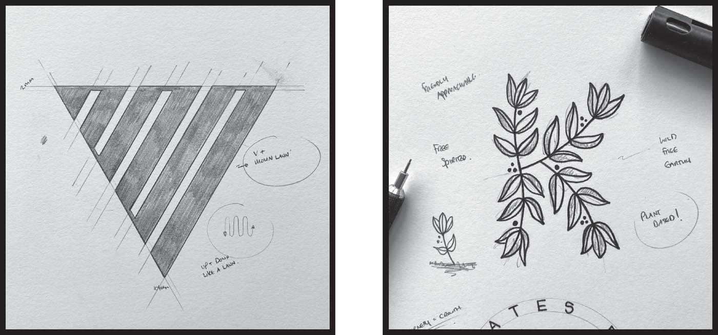


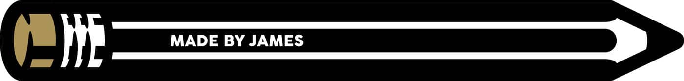
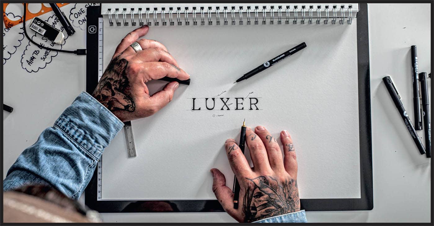
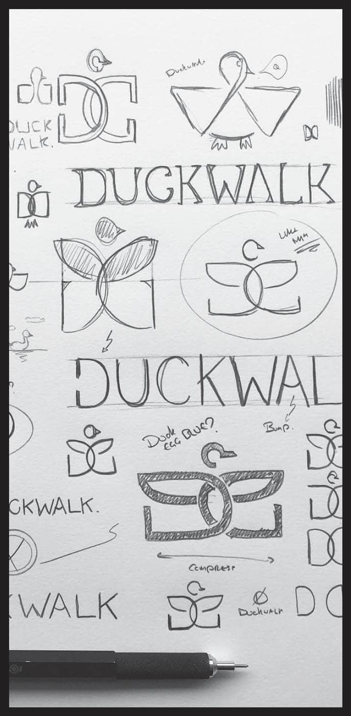
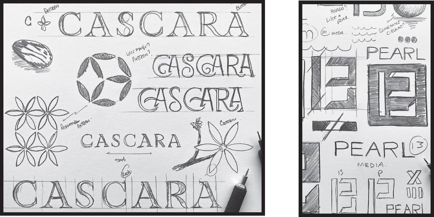
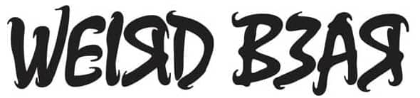
When I began my career in logo design I never thought about type. I’d work hard at creating a cool symbol or monogram and then find a free font to go with it. Numerous fantastic font families are now readily available, which is awesome for designers, and there is absolutely no problem with buying or using a free one for your project. I decided a while ago that this isn’t the way I want to go with logo design because I don’t want my creativity to stop at the symbol or logo mark. I love continuing the look and feel of a design into the type direction for my clients. I believe that occasionally the logo mark and logotype will need to work independently; sometimes the client will want to use one without the other, and this is why I like adding a little flavor to the type too. Even the smallest detail can make an ordinary type become extraordinary. Adding a custom feel to the type allows me to continue the storytelling aspect of the design. Creating a fully customized direction (bespoke logo mark and type) gives my clients that feel-good factor, since all the elements of the logo have been considered and thought out. Creativity shouldn’t stop at the logo mark. As designers we can keep that streak running all the way through to the type. The best thing you can do with a custom type direction is to focus on one element. You can subtly hide multiple thoughts and layer your ideas when working with symbols. With logotype design, however, you want to keep it simple, especially when there is a logo mark involved—you don’t want them wrestling for the viewer’s attention. LITTLE TIP Showing your client that your creativity is transferred into the type allows you to charge more for logo design and ultimately give your client a better offering. This practice can make you stand out among designers who leave the type alone. When I designed this Don Cuervo type I knew it was for a Mexican restaurant, so I want to add a little bit of that vibe into the type. Mexican lettering is known for its flare and the lettering often has little details added to the stems of the letters. I researched traditional Mexican lettering and added a little bit of that styling into my logotype. I wanted to create a direction for the Weird Bear logotype that was memorable and complemented the name, so I did a play on the word “weird.” Adding random curves and wobbly edges to the type and making all the letters not conform to the normal practices of alignment allowed me to create a custom type that aligned itself with the name and the client’s vision for the company. Flipping letters and using the 3 as the letter E, representative of the founder’s three children, adds personality and story to the design. You can see from these examples the distinctiveness that custom type can bring to the overall identity of a logo. The next time you get a logo project, why not take all of that energy and add it to the custom type as well? Here are some ways you can practice creating bespoke type.CREATING CUSTOM TYPE
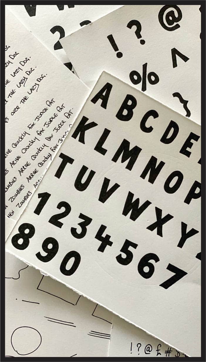


![]() HAND-DRAWN: Creating hand-drawn type is my favorite way to develop cool type directions for my clients, especially businesses that have organic and eco-friendly components. Hand-drawn edges add an approachable and ethical vibe to type. Work on individual letters or a whole name or word in your sketchbook, then take a picture of your work and create the vector files in Adobe Illustrator.
HAND-DRAWN: Creating hand-drawn type is my favorite way to develop cool type directions for my clients, especially businesses that have organic and eco-friendly components. Hand-drawn edges add an approachable and ethical vibe to type. Work on individual letters or a whole name or word in your sketchbook, then take a picture of your work and create the vector files in Adobe Illustrator.![]() USE AN EXISTING FONT AS A BASE: Find a font that you like, print out the name or word you want to work with, and draw over it using a light box. This allows you to add flair and cool quirks while not having to worry about layout and spacing. Try this using your name and creating five different variations. Use a copyright-free font if you’re creating something for a client. If you’re just practicing, use any font you like. You can add serifs, make it bolder, remove parts of the letters, have certain letters linking, etc. This exploration and playfulness with type can benefit future client work because you can start to add that flair to the real-world projects.
USE AN EXISTING FONT AS A BASE: Find a font that you like, print out the name or word you want to work with, and draw over it using a light box. This allows you to add flair and cool quirks while not having to worry about layout and spacing. Try this using your name and creating five different variations. Use a copyright-free font if you’re creating something for a client. If you’re just practicing, use any font you like. You can add serifs, make it bolder, remove parts of the letters, have certain letters linking, etc. This exploration and playfulness with type can benefit future client work because you can start to add that flair to the real-world projects.![]() DESTROY AND REBUILD IN ADOBE ILLUSTRATOR: As an alternative to drawing, find a free font online and play with it in Illustrator. Smash it apart, make the letters bolder, add angles, curve some parts, flip letters—destroy it and build it back up until it works for you. This is a great way to practice playing with type, and the results are always fun.
DESTROY AND REBUILD IN ADOBE ILLUSTRATOR: As an alternative to drawing, find a free font online and play with it in Illustrator. Smash it apart, make the letters bolder, add angles, curve some parts, flip letters—destroy it and build it back up until it works for you. This is a great way to practice playing with type, and the results are always fun.
A logo is just one part of a brand identity and, in the grand scheme of things, an even smaller part of the brand as a whole. As I mentioned earlier, a logo is a recognizable symbol, and the brand identity is a collection of assets to which the logo is applied. I believe logo designers should also be brand identity designers. And, most people who call themselves logo designers are actually brand identity designers. If you have mocked up a logo on a business card, letterhead, or even a bit of signage, you are well on your way to being a brand identity designer. The identity is what people see, and that can be colors, typography, packaging, print examples, and online elements that are part of web design, social media, and even video. The most important thing to bear in mind when creating powerful brand identities is consistency. It’s important for logo designers to practice brand identity and add it to their offering because we are storytellers. Imagine the logo being the title of the book and the brand identity being everything else. The logo may grab people’s attention, like the title of a book, but the content keeps you engaged and talking about it. That’s brand identity. LITTLE TIP I like to approach my presentations with what I call a six-four-two scenario: Six of my mock-ups are industry specific, four are for other relevant options such as business cards and general paper options, and two are outdoor options, such as signage, trade stands, and vehicles. This depends on the project, so alter yours accordingly. Our job is to show clients the logo working in situ. As I mentioned previously, allowing clients to use their imagination leaves you with little control over the design. Building the identity around your logo design helps sell the concept you’re presenting. As an added win, you’ll show the client that you’ve thought about the relevant touch points. Here are some things to consider when creating a brand identity: However you decide to share your ideas with the client, make sure you leave no stone unturned. Relate your ideas passionately and explain how you’ve made your decisions. Make the process enjoyable and sell your ideas with as much love as you put into creating them.BUILDING BRAND IDENTITIES
![]() SHOW THE LOGO WORKING IN MULTIPLE SIZES: A logo must work in multiple sizes in most circumstances because it will likely be used and viewed multiple ways and on different platforms, such as print, computer screens, mobile devices, etc. Be sure to ask where the logo will be featured and presented at the beginning of the project, and then prove that it works in those situations.
SHOW THE LOGO WORKING IN MULTIPLE SIZES: A logo must work in multiple sizes in most circumstances because it will likely be used and viewed multiple ways and on different platforms, such as print, computer screens, mobile devices, etc. Be sure to ask where the logo will be featured and presented at the beginning of the project, and then prove that it works in those situations.![]() SHOW THE LOGO WORKING WITHIN THE SPECIFIC INDUSTRY: Make sure there are a number of industry-specific mock-ups within your presentation. If the client is an apparel company, make sure you show the logo working in the right context for them: printed on T-shirts, embroidered onto hats, printed on bags for packaging, etc.
SHOW THE LOGO WORKING WITHIN THE SPECIFIC INDUSTRY: Make sure there are a number of industry-specific mock-ups within your presentation. If the client is an apparel company, make sure you show the logo working in the right context for them: printed on T-shirts, embroidered onto hats, printed on bags for packaging, etc.![]() ADD YOUR OWN IDEAS: Thinking above and beyond what the client has asked for is a great way to add value to your work. Think of clever and creative ways the logo could be used to help build the brand identity—can it be replicated to create a pattern? If the client mentions that one day the company hopes to have an app, show them the design that way. Anything you can do to help sell the idea is only going to help you.
ADD YOUR OWN IDEAS: Thinking above and beyond what the client has asked for is a great way to add value to your work. Think of clever and creative ways the logo could be used to help build the brand identity—can it be replicated to create a pattern? If the client mentions that one day the company hopes to have an app, show them the design that way. Anything you can do to help sell the idea is only going to help you.

ONCE YOU HAVE THE DESIGNS READY TO SHARE WITH THE CLIENT YOU CAN PRESENT THEM IN A FEW WAYS:
![]() Attach them to an email with an explanation of your decision-making process
Attach them to an email with an explanation of your decision-making process![]() Create a pdf of your designs and include text on your process
Create a pdf of your designs and include text on your process![]() Present your ideas via videoconference and talk through your thoughts
Present your ideas via videoconference and talk through your thoughts
I’ve made many mistakes in my career, but I’ve learned from all of them. On the following pages I’ll share the way I’ve handled challenging situations that all designers face, and will face, over the course of their careers. Designers are open and caring to a fault and our passion for what we do is probably our biggest weakness. But to truly turn this hobby into a long and successful career we need to learn how to assert ourselves as professional businesspeople. We need structure, and we need to be able to react to situations in positive ways so we can work effectively. How can we make money? What should we do when things go wrong? How can we grow into the creatives we want to be? There must be a system in place for us to be able to express ourselves. How we handle our day-to-day business and interaction with our clients often gives us the clarity needed to be at our maximum creativity. So, hold on to your trucker hats, team—here’s some advice and information that I’m sure will help you on your creative journey. The techniques I’ve shown you have helped me create unique and memorable logos. Seeing the project as a whole and breaking it down into a series of related words allows me to explore every possibility, instead of being confined to a single idea, a set of boundaries, or the go-to industry standard. The gift we possess is our ability to interpret things in different ways. Rather than going for the obvious, I like playing with subtlety and exploring the limits. We’re taught that good design is obvious, but I think this phrase produces lazy creativity. Can’t good design be well thought out, make people engaged, and still be effective? Does an art supply logo need to have a paintbrush or pencil? Does a garden maintenance company have to have a lawnmower? Yes, that works for the industry, but does it really push the boundaries of creativity? The safe and obvious option may not always be the right one. When I go through my idea generation process, I think of abstract ways to visualize certain elements. I create a logo for the brief, rather than creating a logo for the industry. I don’t cloud my judgment by restricting myself to industry norms, and instead try to explore the feelings, words, and stories from an individual brief. The brief and the human putting it together for you have a story behind them. Visualize that rather than the classic paradigm for any particular business. Adding personal details to a design can help your clients form deeper attachments to your work. For example, in the Vexquisit logo I added an animal because the CEO has a deep love for them. As you go through your process, don’t think, how can I make this as obvious as possible? Instead, consider, how can I make this unique for my client? The next time you come up with an idea, ask yourself, have I pushed the boundaries of this project brief? Have I explored more than the obvious options? Your answers will help you look at the design process with a more open mind. LITTLE TIP When working with a client, always ask for the company’s history or the background of the people running it. This gives you great details for idea generation that can add unique elements to a logo. Delegating work is not about losing control, but about gaining the freedom to be more effective. Keeping your eye on the bottom line is important in the early days of any business—we have to do everything we can to stay afloat. When I was starting out, I was a web designer, illustrator, email marketer, idea generator, graphic designer, animator, administrator, accountant, and director—it’s tiring just writing all of that. This created a massive void in my productivity. I handled a huge number of things, but since I wasn’t proficient in many of them, I lost money and squandered time. We can’t do everything. This slippery slope can lead to burnout and depression, and also result in a massive waste of time, energy, and talent. Understanding the power of delegation is the only way to make progress on your creative journey. I don’t mean you should sit in a chair and bark orders at other people while taking zero responsibility for anything. Delegate in a way that gives you the opportunity to do what you do best. This allows others who excel at things you don’t to become involved and lighten your load. To have longevity as a designer in a chosen field, you need to learn how to collaborate with others. LITTLE TIP Local colleges and universities are great places to find skilled young designers who need real-world experience. Contact the institution’s internship program to see how you can participate. “ Everything seems perfect in this crazy social media world: idyllic holidays, beautiful plates of food, even (and scarily depressing) flawless selfies. I urge you to look at creativity in a different way. Imperfections are what make us and our work perfect. Striving for perfection prevents you from becoming a fantastic designer with an epic career. Growth as a creative person is an individual journey, one you must embrace and be patient with. I’ve looked at other designers’ work and thought, “Crappo, they are way better than I am.” This is the classic imposter syndrome thought process that kills creativity. If you’ve ever doubted your skills, or thought you’re not good enough, then welcome to being a creative. Many of us were told growing up that being a perfectionist is important. That might be true for brain surgeons or rocket scientists, but people in creative fields? Not so much. It’s easy to forget how much we all have in common. Instead, we compare our abilities to draw, paint, or write, and think of them as the only barometers of success. We’re all on the same path—some are at the beginning, some in the middle, and some at the end—but the path is the same. We want to be successful. Instead of creating barriers, why not harness this knowledge as fuel to create? There is only one you on this planet, so show the world that person, including all your little quirks and nuances. Proudly put your work out into the world, whether it’s finished or not. Trust me, it’s better to be judged for trying than to judge yourself for not trying at all. Be brave. The following are a few ways I keep myself motivated and driven to grow. I like to keep myself guessing and my mind open to new things, but whatever I do it will always be based around my life and logo design. BE CONSISTENTLY: Always be true to my mission to help people get better at logo design as well as share my honest thoughts and authentic self. I’m always sharing knowledge but in different ways to keep it fresh and interesting, and its “consistently” around logo design and creativity. UNPREDICTABLY: Share my knowledge through drawing, video, and writing. This is unpredictable because people don’t know what I am going to share next. They come to my feed to be inspired with an animation, a client project, a motivational carousel: I keep it changing and unpredictable. CONSISTENT: Maintain my personal style and ways of communicating. The knowledge I share is consistently about creativity and logo design, which allows me to have fun, to continue to grow my mind and skills, as well to keep my following engaged. I learned this from Bob Iger, former executive chairman of the Walt Disney Company, and it’s been a great way of growing personally and creatively. PRESENT ME: Continue to offer my knowledge freely and build my company. Wake up, work hard, stay humble. FUTURE ME: What can I do to help more people and be more accessible? What technology can I use to make my mission easier? How is the world moving, and where do I want to be ten years from now? The day I think I have this creative game all figured out is the day I hang up my trucker hat and put the pencils away. No one person is the best at anything, so this ideology helps me stay grounded and focused on the task at hand. I landed my first design agency position in 2005. One of my tasks was to Photoshop a number of images for a local architectural firm, and then liaise with a framer to get the images beautifully mounted for the firm’s new office walls. I spent a few weeks making sure the ten-plus images where correctly edited and the artwork was good enough to be printed. I took these to have them printed and framed, and the framer asked me several questions about a process I didn’t understand. I nodded as he spoke so he wouldn’t think I was clueless, which I was. When I went to collect the finished artwork a few days later, the imagery was unmounted. This wasn’t what the client asked for, the result of failing to correctly answer one of the framer’s questions. Subsequently, all the images had to be reframed, and the extra work cost my boss a chunk of money. Failure is such an important learning tool and helps us grow professionally and personally. Making mistakes is part of being human, but making the same mistakes repeatedly shows a lack of self-awareness. If you continue making the same mistakes you may need to reassess your learning process, your comprehension, and how you execute decisions. “ LITTLE TIP Curiosity may have killed the cat, but it saved the creative. Never rely on inspiration from only one source or industry. The world is abundant with value, knowledge, and advice. Answers to your questions are out there, so go find them (P.S.: No cats were harmed in the making of this tip.). Seeking inspiration and learning from multiple sources is a massive contributor to learning.
Allowing our creativity to blossom, making mistakes, doing bad work, and generally thinking we suck is important and part of the process, and shouldn’t be missed. When I was a young designer, I was bad at logo design and web design, my layouts were atrocious, my software skills were laughable, and I struggled to voice my ideas and opinions, as I always felt I was wrong. These feelings are common, but they didn’t deter me from pursuing my dream of being a designer. I knew from a young age that the creative industry was for me. I loved it. The thought of turning my hobby into a career was the most wonderful thing, but I knew it wouldn’t happen overnight. I had to be patient, I had a lot to learn, and I needed to be persistent and practice daily to keep the dream alive. Becoming anything takes sacrifice, hard work, and patience. Patience is just as important as practice when it comes to being a successful creative. If you’ve been in the industry for six months, don’t compare yourself to someone who has a decade of experience. Don’t rush and cut corners for quick gratification or to collect likes on Instagram. Remember why you started in the first place and put in every ounce of effort you can to make your dreams come true. If you ever feel anxious or worried that you’re not good enough, shift your focus. Take a step back and focus on the things you have achieved instead of the things you haven’t. Your creative career will likely span more than forty years, so stop judging yourself after one or two. “MY LOGO PROCESS TIPS
IDEAS FOR IDEAS

THE IMPORTANCE OF COLLABORATION
I GUARANTEE THE COST OF HIRING PART-TIME HELP TO ASSIST WITH ACCOUNTING OR DESIGN IS MUCH LESS EXPENSIVE THAN TAKING A FEW WEEKS OFF DUE TO BURNOUT. ASKING FOR HELP IS NOT A WEAKNESS—IT’S A SMART PROFESSIONAL CHOICE.
”
CREATIVE GROWTH

BE CONSISTENTLY, UNPREDICTABLY CONSISTENT
KEEP ONE FOOT IN THE PRESENT AND ONE FOOT IN THE FUTURE
I REMEMBER THAT THERE ARE 1,000 PEOPLE BETTER I AM (WHICH THERE ARE)
THE PROCESS OF FAILURE LEARNING
FAILURE IS SUCH AN IMPORTANT LEARNING TOOL.
”
ALLOWING YOURSELF TO BE TERRIBLE
I NOW HAVE ZERO PRESSURE TO BE RIGHT ALL THE TIME.
”
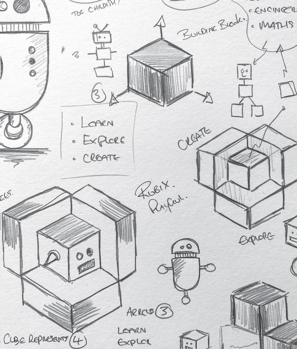
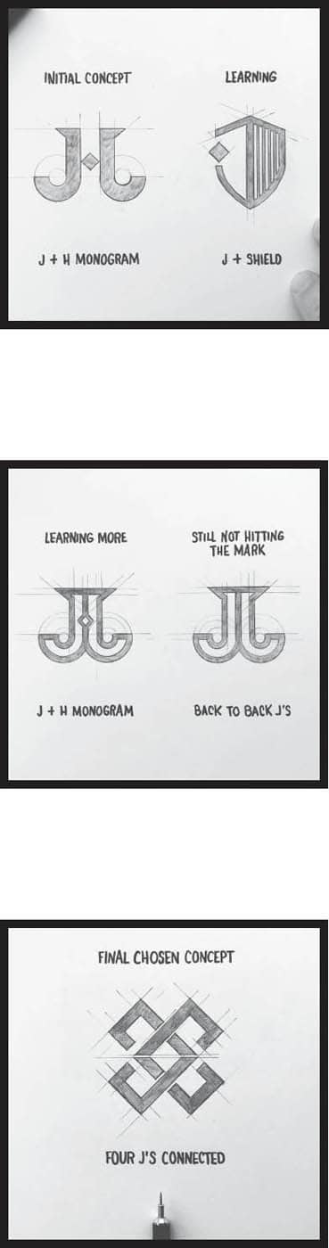
I used to get down on myself—a lot. As creators, we all have an emotional attachment to our work, and that’s an awesome thing. We’ve put our heart and soul into it. As I’ve progressed in the industry, I realize that feedback, both positive and negative, is part of the creative process. Often the work we create that doesn’t make the cut is not bad at all, it was just not right for the client. This mindset shift has helped me be more in control of the work I create. I no longer see rejected ideas as a slap in the face; they’re part of the process that allows me to think about the possibilities for new ideas. I get the chance to do something even better for the client. Producing work that doesn’t make the cut isn’t a failure, but a way of learning and gaining experience. This thinking has given me so much more headspace when it comes to creating ideas. I now have zero pressure to be right all the time. For example, the drawings on this page are from a recent logo project I did for a company called Jackhammer and the concepts I developed to reach the final design. This clothing company that specializes in men’s workwear and apparel was started in 2011 by four college buddies, all of whom had an engineering background and a love for fashion. I thought the initial concept I presented to the company was cool, and the client liked it, but it wasn’t working for them. There was too much emphasis on the letter H being added to the logo—it didn’t work, especially since Jackhammer is one word. After a few more tweaks and going back to the brief, I realized I hadn’t integrated a key piece of information: the company was started by four friends. I altered the design so the final iteration depicted four interlocking J shapes. The logo celebrated them and what they came together to create. Without being wrong a few times I would never have gotten to this final design. The key to becoming a successful designer is remaining passionate about all the work you do while accepting the possibility that not everything you’ll create will be right. Every design you do won’t be a home run—and if they were, you’d get bored pretty quickly. Adopting simple word changes can help this new way of thinking take root in your mind. NEGATIVE THINKING: I HAVE TO DO ANOTHER LOGO. WHICH DESIGNER ARE YOU?REPLACE THE WORD FAILURE WITH EXPERIENCE
POSITIVE THINKING: I GET TO DO ANOTHER LOGO.