What was true in trying to understand our data is true for trying to understand our classifier: visualization is the first step in understanding a system. We know the SVM somehow came up with a decision boundary that allowed us to correctly classify 80 percent of the test samples. But how can we find out what that decision boundary actually looks like?
For this, we will borrow a trick from the guys behind scikit-learn. The idea is to generate a fine grid of x and y coordinates and run that through the SVM's predict method. This will allow us to know, for every (x, y) point, what target label the classifier would have predicted.
We will do this in a dedicated function, which we call plot_decision_boundary. The function takes an SVM object, the feature values of the test set, and the target labels of the test set as inputs:
In [11]: def plot_decision_boundary(svm, X_test, y_test):
To generate the grid (also called a mesh grid), we first have to figure out how much space the data samples in the test set take up in the x-y plane. To find the leftmost point on the plane, we look for the smallest x value in X_test, and to find the rightmost plane, we look for the largest x value in X_test:
In the following steps, you will learn how to visualize a decision boundary:
- We don't want any data points to fall on the border, so we add some margin of + 1 or - 1:
... x_min, x_max = X_test[:, 0].min() - 1, X_test[:, 0].max() + 1
- We do the same for y:
... y_min, y_max = X_test[:, 1].min() - 1, X_test[:, 1].max() + 1
- From these boundary values, we can then create a fine mesh grid (with sampling step h):
...          h = 0.02  # step size in mesh
...          xx, yy = np.meshgrid(np.arange(x_min, x_max, h),
...                               np.arange(y_min, y_max, h))
...          X_hypo = np.c_[xx.ravel().astype(np.float32),
...                         yy.ravel().astype(np.float32)]
Here we make use of NumPy's arange (start, stop, step) function that creates linearly spaced values between start and stop, and the step size (interval).
- We want to treat each of these (xx, yy) coordinates as hypothetical data points. So we stack them column-wise into an N x 2 matrix:
... X_hypo = np.c_[xx.ravel().astype(np.float32),yy.ravel().astype(np.float32)]
- Now we can pass the X_hypo matrix to the predict method:
... _, zz = svm.predict(X_hypo)
- The resulting target labels zz will be used to create a colormap of the feature landscape:
...          zz = zz.reshape(xx.shape)
...          plt.contourf(xx, yy, zz, cmap=plt.cm.coolwarm, alpha=0.8)
This creates a contour plot, on top of which we will plot the individual data points colored by their true target labels:
... plt.scatter(X_test[:, 0], X_test[:, 1], c=y_test, s=200)
- The function can be called with the following code:
In [12]: plot_decision_boundary(svm, X_test, y_test)
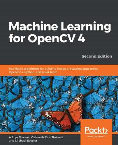
The result looks like this:

Now we get a better sense of what is going on!
The SVM found a straight line (a linear decision boundary) that best separates the blue and the red data samples. It didn't get all the data points right, as there are three blue dots in the red zone and one red dot in the blue zone.
However, we can convince ourselves that this is the best straight line we could have chosen by wiggling the line around in our heads:
- If we rotate the line to make it more horizontal, we might end up misclassifying the rightmost blue dot—the one at coordinates (2, -1)—which could come to lie in the red region right over the horizontal line
- If we keep rotating the line in an effort to make the three blue dots on the left fall in the blue zone, we will unavoidably also put the one red dot that is currently over the decision boundary, the one at coordinates (-1.5, -1), into the blue zone
- If we make more drastic changes to the decision boundary, and make the straight line almost vertical, in an effort to correctly classify the three blue dots on the left, we end up putting the blue dots in the lower right into the red zone
Thus, no matter how we wiggle and rotate the line, if we end up correctly classifying some currently misclassified points, we also end up misclassifying some other points that are currently correctly classified. It's a vicious cycle! Also, another point to note is that the decision boundary is always selected based on the training data.
So what can we do to improve our classification performance?
One solution is to move away from straight lines and onto more complicated decision boundaries.