
Chapter 7: Understanding ML Models
Now that we have built a few models using H2O software, the next step before production is to understand how the model is making decisions. This has been termed variously as machine learning interpretability (MLI), explainable artificial intelligence (XAI), model explainability, and so on. The gist of all these terms is that building a model that predicts well is not enough. There is an inherent risk in deploying any model before fully trusting it. In this chapter, we outline a set of capabilities within H2O for explaining ML models.
By the end of this chapter, you will be able to do the following:
- Select an appropriate model metric for evaluating your models.
- Explain what Shapley values are and how they can be used.
- Describe the differences between global and local explainability.
- Use multiple diagnostics to build understanding and trust in a model.
- Use global and local explanations along with model performance metrics to choose the best among a set of candidate models.
- Evaluate tradeoffs between model predictive performance, speed of scoring, and assumptions met in a single candidate model.
In this chapter, we're going to cover the following main topics:
- Selecting model performance metrics
- Explaining models built in H2O (both globally and locally)
- Automated model documentation through H2O AutoDoc
Selecting model performance metrics
The most relevant question about any model is, How well does it predict? Regardless of any other positive properties that a model may possess, models that don't predict well are just not very useful. How to best measure predictive performance depends both on the specific problem being solved and the choices available to the data scientist. H2O provides multiple options for measuring model performance.
For measuring predictive model performance in regression problems, H2O provides R2, mean squared error (MSE), root mean squared error (RMSE), root mean squared logarithmic error (RMSLE), and mean absolute error (MAE) as metrics. MSE and RMSE are good default options, with RMSE being our preference because the metric is expressed in the same units as the predictions (rather than squared units, as in the case of MSE). All metrics based on squared error are sensitive to outliers in general. If robustness to outliers is a requirement, then MAE is a better choice. Finally, RMSLE is useful in the special case where under-prediction is worse than over-prediction.
For classification models, H2O adds the Gini coefficient, absolute Matthews correlation coefficient (MCC), F1, F0.5, F2, Accuracy, Logloss, area under the ROC curve (AUC), area under the precision-recall curve (AUCPR), and Kolmogorov-Smirnov (KS) metrics. In our experience, AUC is the most commonly used metric in business. Because communication with business partners and executives is so vital to data scientists, we recommend using well-known metrics when their use is appropriate for the job. In the case of AUC, it does a good job with binary classification models when data is relatively balanced. AUCPR is a better choice for imbalanced data.
TheLogloss metric, based on information theory, has some mathematical advantages. In particular, if you are interested in the predicted probabilities of class membership themselves and not just the predicted classifications, Logloss is a better choice of metric. Further documentation on these scoring options can be found at https://docs.h2o.ai/h2o/latest-stable/h2o-docs/performance-and-prediction.html.
Leaderboards created in AutoML for a classification problem include AUC, Logloss, AUCPR, mean per-class error, RMSE, and MSE as performance metrics. The leaderboard for the check AutoML object created in Chapter 5, Advanced Model Building – Part 1, is shown in Figure 7.1 as an example:

Figure 7.1 – An AutoML leaderboard for the check object
In addition to predictive performance, additional metrics of model performance may be important in an enterprise setting. Two of these included by default in AutoML leaderboards are the amount of time required to fit a model (training_time_ms) and the amount of time required to predict a single row of the data (predict_time_per_row_ms).
In Figure 7.1, the best model according to both AUC and Logloss is a stacked ensemble of all models (the model in the top row). This model is also the slowest to score by an order of magnitude over any of the individual models. For streaming or real-time applications in particular, a model that cannot score quickly enough may automatically be disqualified as a candidate regardless of its predictive performance.
We next address model explainability for understanding and evaluating our ML models.
Explaining models built in H2O
Model performance metrics measured on our test data can tell us how well a model predicts and how fast it predicts. As mentioned in the chapter introduction, knowing that a model predicts well is not a sufficient reason to put it into production. Performance metrics alone cannot provide any insight into why the model is predicting as it is. If we don't understand why the model is predicting well, we have little hope of being able to anticipate conditions that would make the model not work well. The ability to explain a model's reasoning is a critical step prior to promoting it into production. This process can be described as gaining trust in the model.
Explainability is typically divided into global and local components. Global explainability describes how the model works for an entire population. Gaining trust in a model is primarily a function of determining how it works globally. Local explanations operate instead on individual rows. They address questions such as how an individual prediction came about. The h2o.explain and h2o.explain_row methods bundle a set of explainability functions and visualizations for global and local explanations, respectively.
We start this section with a simple introduction to Shapley values, one of the bedrock methods in model explainability, which can be confusing when first encountered. We cover global explanations for single models using h2o.explain and local explainability with h2o.explain_row. We then address global explanations for AutoML using h2o.explain, which we use to demonstrate the role of explainability in model selection. We illustrate the output of these methods using two models developed in Chapter 5, Advanced Model Building – Part 1. The first, gbm, is an individual baseline model built using default values with the H2O Gradient Boosting Machine (GBM) estimator. The second is an AutoML object, check. These models are chosen as examples only, acknowledging that the original baseline model was improved upon by multiple feature engineering and model optimization steps.
A simple introduction to Shapley values
Shapley values have become an important part of ML explainability as a means for attributing the contribution of each feature to either overall or individual predictions. Shapley values are mathematically elegant and well-suited for the task of attribution. In this section, we provide a description of Shapley values: their origin, calculation, and how to use them for interpretation.
Lloyd Shapley (1923-2016), a 2012 Nobel Prize winner in Economics, derived Shapley values in 1953 as the solution to a specific problem in game theory. Suppose a group of players working together receives a prize. How should that award be equitably divided amongst the players?
Shapley started with mathematical axioms defining fairness: symmetry (players who contribute the same amount get the same payout), dummy (players who contribute nothing receive nothing), and additivity (if the game can be separated into additive parts, then you can decompose the payouts). The Shapley value is the unique mathematical solution that satisfies these axioms. In short, the Shapley value approach pays players in proportion to their marginal contributions.
We next demonstrate the calculation of Shapley values for a couple of simple scenarios.
Shapley calculations illustrated – Two players
To illustrate the calculation of a Shapley value, consider the following simple example. Two musicians, John and Paul, performing on their own can earn £4 and £3, respectively. John and Paul playing together earn £10. How should they divide the £10?
To calculate their marginal contributions, consider the number of ways these players can be sequenced. For two players, there are only two unique orderings: John is playing and is then joined by Paul, or Paul is playing and is then joined by John. This is illustrated in Figure 7.2:

Figure 7.2 – Unique player sequences for John and Paul
The formulation as unique player sequences allows us to calculate Shapley values for each player. We illustrate the calculation of the Shapley value for John in Figure 7.3:

Figure 7.3 – Sequence values for John
John is the first player present in sequence 1, thus the Shapley contribution is just the marginal value v(J) = 4. In the second sequence, John joins after Paul. The marginal value for John is the joint value of John and Paul, v(JP), minus the marginal value of Paul, v(P). In other words, 10 – 3 = 7. The Shapley value for John is the average of the values for each sequence: S(J) = 11/2 = 5.5. Therefore, John should receive £5.50 of the £10 payment.
The Shapley value for Paul is calculated in a similar fashion (obviously, it could also be calculated by subtraction). The sequence calculations are shown in Figure 7.4:

Figure 7.4 – Sequence values for Paul
In the first sequence in Figure 7.4, Paul joins after John, so the sequence value is the joint, v(JP) = 10, minus the marginal for John, v(J) = 4. The second sequence is just the marginal value of Paul: v(P)=3. The Shapley value for Paul is S(P) = 9/2 = 4.5.
These calculations are easy and make sense with two players. Let's see what happens when we add a third player.
Shapley calculations illustrated – Three players
Suppose a third musician, George, joins John and Paul. George earns £2 on his own, £7 performing with John, £9 performing with Paul, and £20 when all three play together. For clarity, we summarize the earnings in Figure 7.5:

Figure 7.5 – Earnings for John, Paul, and George
Because there are three players, there are 3! = 6 unique sequences in which John, Paul, and George can arrive. The calculations for the Shapley value for John in this three-player scenario are summarized in Figure 7.6:
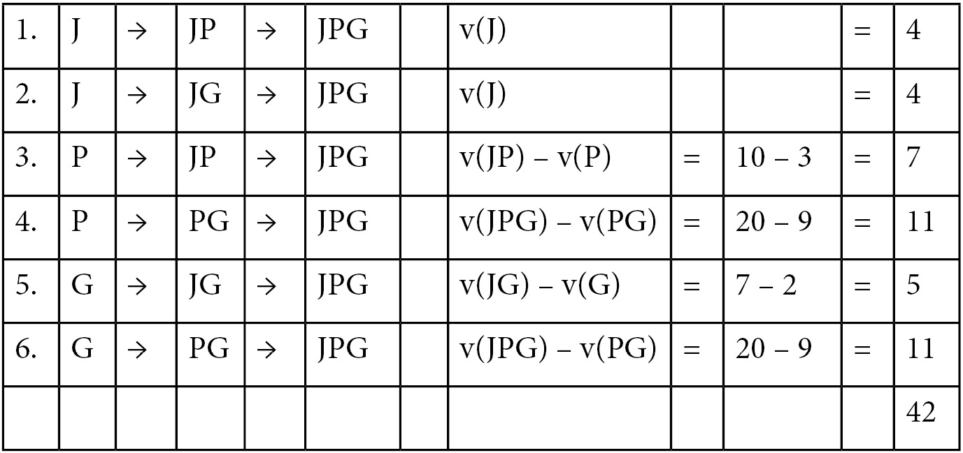
Figure 7.6 – Arrival sequences and values for calculating the Shapley value for John
In Figure 7.6, sequences 1 and 2 are straightforward: John is the first player, so the v(J) value is all that is needed. In sequences 3 and 5, John is the second player. The sequence values are calculated by taking the joint value of John and the first player and then subtracting the marginal value of that player. Sequences 4 and 6 are identical: John is the last player. His marginal contribution is calculated by taking the three-way interaction, v(JPG), and subtracting the joint value of Paul and George, v(PG). The Shapley value is S(J) = 42/6 = 7.
We could continue and find the Shapley values for Paul and George in the same manner.
Calculating Shapley values for N players
As you can see, Shapley value calculations can quickly become overwhelming as the number of players, N, increases. The Shapley sequence calculations depend on knowing the values for the main effects and all the interactions from two-way to N-way, as in Figure 7.5. In addition, there are N! sequences to be solved. The computational task increases dramatically as the number of players increases.
In the context of a predictive model, each feature is a player and the prediction is the shared prize. We can use Shapley values to attribute the impact of each feature on the final prediction. With some models having dozens or hundreds or possibly, even more, features, computing Shapley values in the real world is non-trivial. Fortunately, a combination of modern computing and mathematical shortcuts for computing Shapley values for certain families of models makes Shapley calculations tenable.
Whether in simple examples as we have shown or in large complex ML models, the interpretation of Shapley values is the same.
We next turn our attention to global explanations for single models.
Global explanations for single models
We illustrate single model explanations using the baseline GBM model built in Chapter 5, Advanced Model Building – Part 1. We labeled this model gbm and documented its performance in Figure 5.5 through to Figure 5.10.
The basic command for global explanations is as follows:
model_object.explain(test)
Here, test is the holdout test dataset used in model evaluation. Additional optional parameters include the following:
- top_n_features: An integer indicating how many columns to use in column-based methods such as SHapley Additive exPlanations (SHAP)) and Partial Dependence Plots (PDP). Columns are ordered according to variable importance. The default value is 5.
- columns: A vector of column names to use in column-based methods as an alternative to top_n_features.
- include_explanations or exclude_explanations: Respectively, include or exclude methods such as confusion_matrix, varimp, shap_summary, or pdp.
For a single classification model such as gbm, this command will display the confusion matrix, variable importance plot, SHAP summary plot, and partial dependence plots for the top five variables in order of importance.
We demonstrate this using our gbm model with the gbm.explain(test) command and discuss each display in turn.
The confusion matrix
The first output result is the confusion matrix, shown in Figure 7.7:
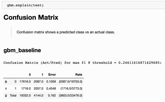
Figure 7.7 – Confusion matrix for the GBM baseline model
A nice feature of the explain method is that simple summary descriptions are provided for each display: Confusion matrix shows a predicted class vs an actual class. In Figure 7.7, the confusion matrix for gbm shows true negatives (17,616), false positives (2,087), false negatives (1,716), and true positives (2,057), along with a false positive rate (10.59%) and a false negative rate (45.48%).
The variable importance plot
The second visualization from the explain method is the variable importance plot, shown in Figure 7.8:
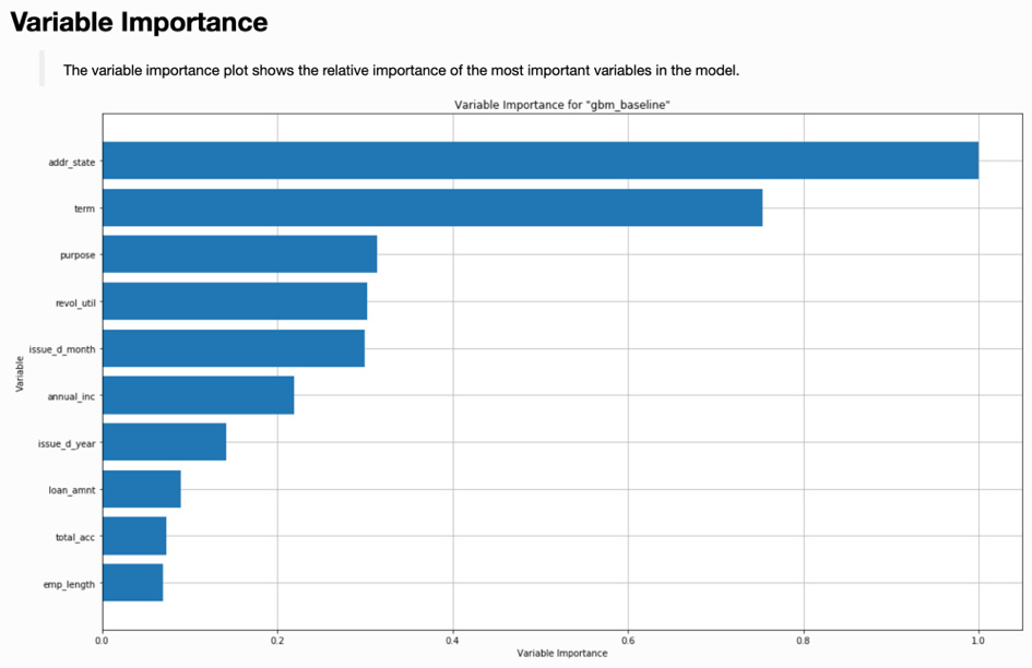
Figure 7.8 – Variable importance plot for the GBM baseline model
Note that the variable importance plot in Figure 7.8 is identical to the plot displayed in Figure 5.10 that we created manually using the varimp_plot command. Its inclusion here is one of the benefits of using the explain method.
The SHAP summary plot
The third visualization output by explain is a SHAP summary plot. SHAP, based on Shapley values, provides an informative view into black-box models. The SHAP summary plot for the GBM baseline model is shown in Figure 7.9:

Figure 7.9 – SHAP summary plot for the GBM baseline model
Let's explain in a little more detail the SHAP summary plot in Figure 7.9. There is a lot going on in this informative plot:
- On the left-hand side, we have features (data columns) listed in order of decreasing feature importance based on Shapley values. (Note that Shapley feature importance rankings are not necessarily identical to the feature importance in Figure 7.8.)
- On the right-hand side, we have a normalized feature value scale going from 0.0 to 1.0 (blue to red as output by H2O). In other words, for each feature, we code the original data values by color: low original values as blue transitioning through purple for middling values, and ending with high original values as red (they show as varying shades of gray in this figure).
- The horizontal location of each observation is determined by its SHAP value. SHAP values measure the contribution of each feature to the prediction. Lower SHAP values are associated with lower predictions and higher values are associated with higher predictions.
With that initial understanding, we can make the following observations:
- Features that have red values to the right and blue values to the left are positively correlated with the response. Since we are modeling the probability of a bad loan, features such as longer term (term) or higher revolving utilization (revol_util) are positively correlated with loan default. (Revolving credit utilization is essentially how large a customer's credit card balances are month-to-month.)
- Features with red values to the left and blue values to the right are negatively correlated with the response. So, for example, higher annual income (annual_inc) is negatively correlated with a loan going into default.
These model observations from the SHAP summary plot make intuitive sense. You might expect someone who carries a larger credit card balance or makes a lower annual income to have an increased probability of defaulting on a loan.
Note that we can get the same plot using the gbm.shap_summary_plot(test) command.
Partial dependence plots
The fourth visualization output by explain is a set of partial dependence plots. The specific plots shown depend on the top_n_features or columns optional parameters. By default, the top five features are shown in order of decreasing variable importance. Figure 7.10 displays the partial dependence plots for the address state:

Figure 7.10 – Partial dependence plot for address state
Figure 7.11 displays the partial dependence plot for the revolving utilization variable:

Figure 7.11 – Partial dependence plot for revolving utilization
The partial dependence plots output by explain include a representation of sample size (the shaded area starting from the bottom of the graph) overlayed by the mean response and its variability (the line surrounded by a shaded region). In the case of categorical variables, the mean response is a dot with bars indicating variability, as in Figure 7.10. In the case of numeric variables, the mean response is a dark line with lighter shading indicating variability, as in Figure 7.11.
Note that we can create a partial dependence plot for any individual column using the following:
gbm.pd_plot(test, column='revol_util')
The global individual conditional expectation (ICE) plot
ICE plots will be introduced later in the Local explanations for single models section. However, for completeness, we include a global version of the ICE plot here. Note that this plot is not output by explain. The gbm.ice_plot(test, column='revol_util') command returns a global ICE plot as shown in Figure 7.12:

Figure 7.12 – Global ICE plot for revolving utilization
The global ICE plot for a variable is an expansion of the partial dependence plot for that variable. The partial dependence plot displays how the mean response is related to the values of a specific variable. Shading, as shown in Figure 7.11, indicates the variability of the partial dependence line. The global ICE plot amplifies this by using multiple lines to represent the population. (In the case of categorical variables, the lines are replaced by points and the shading by bars.)
As shown in Figure 7.12, the global ICE plot includes lines for the minimum (0th percentile), the deciles (10th percentile through 90th percentile by 10s), the maximum (100th percentile), and the partial dependence itself. This visually portrays the population much more accurately than partial dependence alone. Percentiles that parallel the partial dependence line correspond to segments of the population for which the partial dependence is a good representation. As is often the case, the behavior of the minimum and maximum of a population may be quite different than the mean behavior described by the partial dependence line. In Figure 7.12, there are three lines that are different from the others: the minimum, the maximum, and the 10th percentile.
We next turn our attention to local explanations for single models.
Local explanations for single models
The h2o.explain_row method allows a data scientist to investigate local explanations of a model. While global explanations are used for understanding how the model represents the overall population, local explanations give us the ability to interrogate a model on a per-row basis. This can be especially important in business when rows represent customers, as is the case in our Lending Club analysis.
When predictive models are used to make decisions that impact customers directly (for instance, not approving a loan application or raising a customer's insurance rates), global explanations are not sufficient to satisfy business, legal, or regulatory requirements. This is where local explanations are critical.
The explain_row method returns these local explanations for a specified row_index value. The gbm.explain_row(test, row_index=10) command provides a SHAP explanation plot and multiple ICE plots for columns based on variable importance. As with partial dependence plots, the top_n_features or columns parameters can optionally be provided.
The resulting SHAP explanation plot is shown in Figure 7.13:

Figure 7.13 – SHAP explanation for index = 10
SHAP explanations show the contributions of each variable to the overall prediction based on Shapley values. For the customer displayed in Figure 7.13, the positive SHAP values can be thought of as increasing the probability of loan default, while the negative SHAP values are those decreasing the probability of default. For this customer, the revolving utilization rate of 78.5% is the largest positive contributor to the predicted probability. The largest negative contributor is the annual income of 90,000, which decreases the probability of loan default more than any other variable. SHAP explanations can be used to provide reason codes that can help explain the model. Reason codes can also be used as the basis for sharing information directly with the customer, for instance, in adverse action codes that apply to some financial and insurance-related regulatory models.
We next visit some of the ICE plots output from the explain_row method.
ICE plots for local explanations
ICE plots are individual or per-row counterparts of partial dependence plots. Just as partial dependence plots for a feature display the mean response of the target variable while varying the feature value, the ICE plot measures the target variable response while varying the feature value for a single row. Consider the ICE plot for the address state displayed in Figure 7.14 as a result of the gbm.explain_row call:

Figure 7.14 – ICE plot for address state
The vertical dark dashed line in Figure 7.14 represents the actual response for the row in question. In this case, the state is NJ (New Jersey) with a response of approximately 0.10. Had the state for this row been VA (Virginia), the response would have been lower (about 0.07). Had the state for this row instead been NV (Nevada), the response would have been higher, around 0.16.
Consider next Figure 7.15, the ICE plot for the term of the loan:

Figure 7.15 – ICE plot for the loan term
The SHAP explanation value in Figure 7.13 for a term of 36 months was the second-largest negative factor (it reduced the probability of loan default the most after annual income, which was the largest). According to Figure 7.15, a loan term of 60 months would have resulted in a default probability of slightly more than 0.35, significantly higher than the approximate 0.10 probability of default with a term of 36 months. While SHAP explanations and ICE plots are measuring two different things, their interpretations can be used jointly to understand the behavior of a particular prediction.
The last ICE plot we consider is for revolving utilization, a numerical rather than categorical feature. This plot is shown in Figure 7.16:

Figure 7.16 – ICE plot for revolving utilization
Revolving utilization was the most significant positive factor (increasing the probability of loan default) according to the SHAP explanations in Figure 7.13. The ICE plot in Figure 7.16 shows the relationship between response and the value of revolving utilization. Had revol_util been 50%, the probability of loan default would have been reduced to approximately 0.08. At 20%, the probability of default would be approximately 0.05. If this customer were denied a loan, the high value of revolving utilization would be a defensible reason. Results of the corresponding ICE plot can be used to inform the customer of steps they could take to qualify for the loan.
Global explanations for multiple models
In determining which model to promote into production, for instance, from an AutoML run, the data scientist could rely purely on predictive model metrics. This could mean simply promoting the model with the best AUC value. However, there is a lot of information that could be used to help in this decision, with predictive power being only one of multiple criteria.
The global and local explain features of H2O provide additional information that is useful for evaluating models in conjunction with predictive attributes. We demonstrate it using the check AutoML object from Chapter 5, Advanced Model Building – Part 1.
The code to launch global explanations for multiple models is simply as follows:
check.explain(test)
This results in a variable importance heatmap, model correlation heatmap, and multiple-model partial dependence plots. We will review each of these in order.
Variable importance heatmap
The variable importance heatmap visually combines the variable importance plots for multiple models by adding color as a dimension to be viewed along with variables (as rows) and models (as columns). The variable importance heatmap produced by check.explain is shown in Figure 7.17:

Figure 7.17 – Variable importance heatmap for an AutoML object
Variable importance values are coded as a color continuum from blue (cold) for low values to red (hot) for high values. The resulting figure is visually meaningful. In Figure 7.17, vertical bands correspond to each model and horizontal bands correspond to individual features. Vertical bands that are similar indicate a high level of correspondence between how models use their features. For instance, the XGBoost_1 and XGBoost_2 models (the last two columns) display similar patterns.
You also see horizontal bands of similar color for variables such as delinq_2yrs, verification_status, or to a lesser extent, annual_inc. This indicates that all the candidate models treat these variables with comparable importance. The term variable in the last row is the most visually striking, being heterogeneous across models. These models don't agree on its absolute importance. However, you must be careful not to read too much into this. Notice that for term, the relative importance is the same for six of the ten models (all but the blue squares: DRF_1, GBM_4, XGBoost_2, and XGBoost_1). For these six models, term is the most important feature although its exact value varies widely.
The code to create this display directly is as follows:
check.varimp_heatmap()
Let's next consider the model correlation heatmap.
Model correlation heatmap
The variable importance heatmap allows us to compare multiple models in terms of how they view and use their component variables. The model correlation heatmap addresses a different question: How correlated are the predictions from these different models? To answer this, we turn to the model correlation heatmap in Figure 7.18:
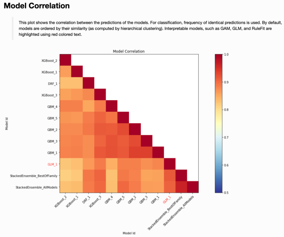
Figure 7.18 – Model correlation heatmap for an AutoML object
The darkest blocks along the diagonal of Figure 7.18 show a perfect correlation between a model and itself. Sequentially lighter shading describes decreasing correlation between models. How might you use this display to determine which model to promote to production?
This is where business or regulatory constraints can come into play. In our example, StackedEnsemble_AllModels had the best model performance in terms of AUC. Suppose that we are not allowed to promote an ensemble model into production, for whatever reason. The single models that are most highly correlated with our best model include XGBoost_3, GBM_5, and GLM_1. These could then become candidates to promote into production, with a final decision based on additional criteria (perhaps the AUC value on the test set).
If one of those additional criteria is native interpretability, then GLM_1 for this AutoML object is the only choice. Note that interpretable models are indicated with a red-colored font in the model correlation heatmap.
We can create this display directly using the following:
check.model_correlation_heatmap(test)
Let's move on to introduce partial dependence plots for multiple models in the next subsection.
Multiple-model partial dependence plots
The third output from the explain method for multiple models is an extension of the partial dependence plot. For categorical variables, plot symbols and colors corresponding to different models are displayed on an individual plot. Figure 7.19 is an example using the term variable:

Figure 7.19 – Multiple model partial dependence plot for a loan term
For numeric variables, multiple models are represented by different colored lines on the same partial dependence plot. Figure 7.20 is an example of this using the revol_util variable:
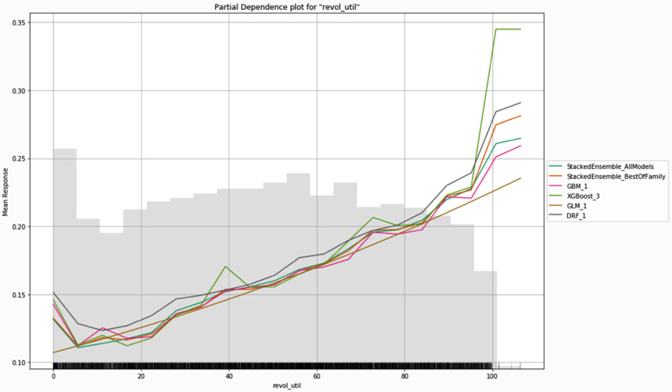
Figure 7.20 – Multiple model partial dependence plot for revolving utilization
In Figure 7.19 and Figure 7.20, the competing models yield very similar results. This is not always the case. For example, Figure 7.21 shows the multiple model partial dependence plot for annual income:

Figure 7.21 – Multiple model partial dependence plot for annual income
Although most of the models in Figure 7.21 are similar for lower incomes, they diverge rather drastically as incomes increase. This is partially due to the very small sample sizes in the tails of the annual income distribution. The data scientist may also decide to disqualify certain models based on unrealistic or unreasonable tail behavior. For example, based on our experience, it does not make sense for loan default risk to increase as annual income increases. At worst, we would expect no relationship between income and default beyond a certain point. We are more likely to expect a monotonic decrease in loan default as income increases. Based on this reasoning, we would remove the models for the top two lines (DRF_1 and GBM_1) from consideration.
As with other explain methods, we can create this plot directly using the following command:
check.pd_multi_plot(test, column='annual_inc')
We next visit model documentation.
Automated model documentation (H2O AutoDoc)
One of the important roles a data science team performs in an enterprise setting is documenting the history, attributes, and performance of models that are put into production. At a minimum, model documentation should be part of a data science team's best practices. More commonly in an enterprise setting, thorough model documentation or whitepapers are mandated to satisfy internal and external controls as well as regulatory or compliance requirements.
As a rule, model documentation should be comprehensive enough to allow for the recreation of the model being documented. This entails identifying all data sources, including training and test data characteristics, specifying hardware system components, noting software versions, modeling code, software settings and seeds, modeling assumptions adopted, alternative models considered, performance metrics and appropriate diagnostics, and anything else necessary based on business or regulatory conditions. This process, while vital, is time-consuming and can be tedious.
H2O AutoDoc is a commercial software product that automatically creates comprehensive documentation for models built in H2O-3 and scikit-learn. A similar capability has existed in H2O.ai's Driverless AI, a commercial product that combines automatic feature engineering with enhanced AutoML to build and deploy supervised learning models. AutoDoc has been successfully used for documenting models now in production. We present a brief introduction to automatic document creation using AutoDoc here:
- After a model object has been created, we import the Config and render_autodoc modules into Python:
from h2o_autodoc import Config
from h2o_autodoc import render_autodoc
- Next, we will specify the output file path:
config = Config(output_path = "autodoc_report.docx")
- Then, we will render the report by passing the configuration information and model object:
doc_path = render_autodoc(h2o=h2o, config=config,
model=gbm)
- Once the report is created, the location of the report can be indicated using the following:
print(doc_path)
Figure 7.22 shows the table of contents for a 44-page report created by H2O AutoDoc in Microsoft Word:
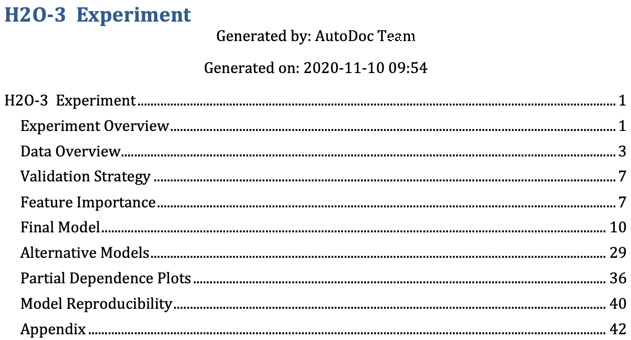
Figure 7.22 – Table of contents for model documentation created by H2O AutoDoc
The advantages of thorough documentation produced in a consistent manner with a minimal amount of manual effort are self-evident. Output as either a Microsoft Word document or in markdown format, the reports can be individually edited and further customized. Report templates are also easily edited, allowing a data science team to have a different report structure for different uses: internal whitepaper or report for regulatory review, for example. The AutoDoc capability is consistently one of the best-loved features for H2O software for the enterprise.
Summary
In this chapter, we reviewed multiple model performance metrics and learned how to choose one for evaluating a model's predictive performance. We introduced Shapley values through some simple examples to further understand their purpose and use in predictive model evaluation. Within H2O, we used the explain and explain_row commands to create global and local explanations for a single model. We learned how to interpret the resulting diagnostics and visualizations to gain trust in a model. For AutoML objects and other lists of models, we generated global and local explanations and saw how to use them alongside model performance metrics to weed out inappropriate candidate models. Putting it all together, we can now evaluate tradeoffs between model performance, scoring speed, and explanations in determining which model to put into production. Finally, we discussed the importance of model documentation and showed how H2O AutoDoc can automatically generate detailed documentation for any model built in H2O (or scikit-learn).
In the next chapter, we will put everything we have learned about building and evaluating models in H2O together to create a deployment-ready model for predicting bad loans in the Lending Club data.